Saturday, October 31, 2009

BSE Sensex Index Chart Pattern - Oct 30, '09

The BSE Sensex index chart pattern is undergoing a much-needed correction. In last week's analysis, I had made the following comment:-

'Looks like the bears have a slight edge, and another 5% fall could be on the cards. That would take the index to the crucial support level of 16000.'

Against expectations, the bulls failed to put up much of a fight. The index lost 915 points (almost 5.5%) for the week, and has so far lost 9% from the 52 week high of 17493 made on 'muhurat' trading on Oct 17 '09. The bears managed to get the upper hand, as the FII selling pressure overwhelmed the buying by domestic institutions.

Likely supports at the 50 day EMA and the 16000 level were broken easily. What are the possible next moves for the Sensex? Since it has been a year since the bear market low of 7700 in Oct '08, let us look at the one year bar chart pattern of the BSE Sensex index:-

Sensex_Oct3009

Will the correction continue next week, or will there be a good bounce back? What level can the BSE Sensex bounce up to? How low can it fall? Those are tough questions to answer, but let us try and attempt to find out the different levels possible.

The 50 day EMA has flattened a bit but remains well above the rising 200 day EMA. So there is no immediate threat to the bull market, even though the Sensex has dipped below the 50 day EMA. The index had gone below the medium term average back in July '09, only to jump back up.

The top made in Jun '09 was at 15600. The 3% whipsaw lee-way from 16000 gives a level of 15520. The bulls may try to muster support between 15520 and 15600, if the bears continue their rampage. Below that, the 200 day EMA at 14300 can provide support. Beyond that, the gap area between 12300 and 13200 should stem any further fall.

Can the Sensex go down even further? Sure it can, but I wouldn't bet on it at this stage. As of now, the best case scenario looks like a bounce from the 15520-15600 zone. And the worst case looks like a support at the 'gap'.

Can the Sensex bounce up next week itself? That is a possibility, given the oversold nature of the technical indicators. The RSI has almost entered the oversold zone. The MACD is in negative territory and well below the signal line. The slow stochastic is deep in the oversold zone. The Aroon Up has had a bearish cross below the Aroon Down.

An oversold market can stay oversold for a while, but an upward bounce can happen anytime. How high can the Sensex bounce up? The lower trend line of the 'rising wedge' pattern (through which the Sensex broke downwards) is now near the 18000 level. The upward target from my earlier 'gap analysis' was at 17800. So on a bounce up, the maximum target can be the 17800-18000 level.

If the Sensex does get there, don't get in. That would be an excellent selling opportunity. In fact, any rise to the 17000 level can be used for selling. Remember that only an intermediate uptrend has been broken. So what we are witnessing now is possibly an intermediate downtrend, and not a resumption of the bear market.

The other possibility is that the BSE Sensex index continues in a sideways consolidation within a broad range of 13000 to 18000 (like it has done since the election results were declared in May '09) for a few more months. That will be a frustrating period for bulls and bears, but traders will be able to cash in.

Bottomline?  The BSE Sensex chart pattern has joined world indices in a long-awaited correction. The strategy should be to 'sell on every rise'. Keep a buy list ready for better buying opportunities. Don't jump in to start buying now - just because a few stocks have dropped a lot.

Friday, October 30, 2009

Stock Index Chart Patterns - Shanghai Composite, Hang Seng, Korea KOSPI - Oct 30, '09

The chart patterns of many Asian indices made their bear market lows between the last week of Oct '08 and the first week of Nov '08. A year has passed, and it would be interesting to have a look at the long-term chart patterns.

Shanghai Composite index chart

ShanghaiComp_Oct2909 

The Shanghai Composite index made its 52 week low of 1679 on Nov 4 '08. The strong bull rally propelled the index to a high of 3478 on Aug 4 '09 - a spectacular rise of 107% from the low. But the index had made a high of 6124 on Oct 16 '07. So, the 'spectacular rise' managed to retrace only 40% of the entire bear market fall.

Till the 50% Fibonacci retracement level is conquered, technically we have seen a strong bull rally in a bear market. That leaves open the possibility of the Shanghai Composite index moving down below the 200 day EMA once more.

After hitting the high of 3478, the index faced a good corrective move that thrice went down towards the long-term average, but the 200 day EMA provided strong support. Today's close was marginally below the 3000 level, which the index seems unable to surpass with conviction of late.

The slow stochastic has dipped from the overbought zone. So has the RSI. The ROC is right at the '0' level. The MACD has moved into the positive zone and is above the signal line. Bit of a mixed signal from the technical indicators. Not unusual for an index consolidating sideways.

Hang Seng index chart

HangSeng_Oct2909

The Hang Seng index made its bear market low at 10676 on Oct 27 '08. It didn't have a one-way bull rally like its mainland cousin, but made a higher low of 11345 on Mar 9 '09 before starting to rally. It made its recent high of 22620 last Friday (Oct 23 '09) - a 112% rise from the low one year back.

The rally was less sharp than the Shanghai Composite's, but the Hang Seng index managed to retrace 56% of the entire bear market fall from the high of 31958 on Oct 30 '07. Today's close of 21753 means the index is still above the 50% Fibonacci retracement level, and therefore, technically more bullish than the Shanghai Composite.

The slow stochastic and the RSI has dropped to their 50% levels. The ROC is at the '0' mark. The MACD is positive and above the signal line. Mixed signals here as well - reflecting the slowing upward momentum of the Hang Seng index. Note that the 50 day EMA has provided support during recent corrective moves, and both the 50 day and 200 day EMA are moving up with decent speed.

KOSPI (Korea) index chart

Kospi_Oct2909

The KOSPI (Korea) index also made its low of 892 on Oct 27 '08. The rally took the index to a high of 1723 on Sep 23 '09 - a gain of 93%. The gain from the low didn't hit three figures, but the index retraced nearly 70% of the entire bear market fall from the high of 2085 made on Nov 1 '07. Technically, the KOSPI index chart pattern is the most bullish of the three.

However, the index has been in a corrective move since the Sep '09 high, and this is evident from the technical indicators. The slow stochastic and RSI are both below their 50% levels. The ROC is in negative territory. The MACD is also slightly negative.

Bottomline? The long term chart patterns of the Asian stock market indices are showing some consolidation after strong bull rallies. Wait for the corrections to play out before deciding the next move. Further corrections can't be ruled out.

Thursday, October 29, 2009

What does the Debt/Equity ratio indicate?

An important measurement of a company's financial health is the Debt/Equity ratio. In an earlier article, I had discussed about assessing a company's financial health by calculating the 'Current ratio' and 'Quick ratio'.

The usually applicable definition of the Debt/Equity ratio is:

Debt/Equity ratio = Total debt / Shareholder's equity

Total debt includes both short term and long term debt, such as, secured and unsecured loans, mortgage payments. Shareholder's equity includes equity shares and reserves. (Preference shares can be a part of debt or of equity, depending on the terms of issue.)

Accountants some times use 'total liabilities' instead of 'total debt' in the Debt/Equity ratio to assess a company's true financial health. There is logic behind such a definition. But we will use the commonly accepted definition mentioned.

What does the Debt/Equity ratio indicate? It measures how much money a company can borrow over the long term without running into payment problems. When a company keeps borrowing, its fixed costs keep increasing due to the interest payments.

Is that a bad thing? Not necessarily. A newly formed company and/or one that is on a high-growth path may not be able to raise much equity capital because of lack of track record or the state of the stock market (or because it has already raised a lot of equity). Recourse to debt may be the only option for growth and survival.

As long as the interest and principal repayment costs can be covered by the cash generated from operations, there should be no problems at all. A company that can earn 17% on every Rupee invested and is able to borrow at 12%, will be foolish not to borrow when business is good. Every additional Rupee earned after fixed costs are covered, goes straight to profits.

Trouble starts when a company tries to grow too fast too soon and takes on too much debt. When the going is good, it can make bumper profits. During a business downturn, the high fixed costs can reduce the earnings drastically. And if a company has a long receivables cycle, or huge inventory (like in manufacturing and retail) then it may face difficulty in making payments, and to make matters even worse, need to borrow more (a la Pantaloon).

Ideally Debt/Equity ratio should be less than 1, and the lower the better. But this is a thumb-rule. For certain industries like auto manufacturing, the ratio can be 2 or more. One needs to make peer comparison in a sector or industry to arrive at typical ratios.

Bloated equity can obviously lower the Debt/Equity ratio. Is that good or bad? Given a choice, I'd prefer a company with high equity than one with high debt. Why? There are no fixed costs involved with equity shares. If business is good, more dividend payout may be involved. If business is bad, dividend payment can be slashed. Interest payments due to high debt will need to be paid regardless.

There are downsides to bloated equity. With too many shares available in the market, stock prices tend to stay depressed. Also, each individual shareholder may end up with a smaller percentage of the company's equity if shares are issued to FIIs and private equity investors. This should not affect small investors holding a couple of hundred shares.

Too small an equity capital restricts the ability of a company to borrow large sums of money. Most loans are sanctioned as a percentage of shareholder's equity. That is why you may find a huge bonus issue (like 5:1 or 10:1) preceding a company's intention to take on a big loan - for growth or an acquisition.

What about companies with Debt/Equity ratio close to zero? These are usually stalwart businesses that have been around for years and generate a huge amount of cash flow from operations. FMCG companies are a good example. Because they are in a mature sector, growth is typically in single digits. Taking on additional debt is meaningless, because internal accruals may be sufficient for any expansion.

Wednesday, October 28, 2009

Stock Chart Pattern - Canara Bank

The stock chart pattern of Canara Bank seems to indicate that market players were not particularly impressed by the 72% increase in net profits in Q2 '09 (Rs 910 Cr vs. Rs 529 Cr in Q2 '08).

Why? This article reveals the story. The increase in Net interest income (NII) was just above 14%. The increase in net profits was mainly due to huge gains made in treasury and foreign exchange operations - which are not the 'core' business of Canara Bank. If these one-off gains are removed, the comparable net profits would actually be Rs 425 Cr (lower by more than Rs 100 Cr).

The provisions were more than doubled to Rs 500 Cr, of which nearly a half was for Non-performing assets (NPAs). Net NPAs increased by 30%. Yield on advances dropped by 8%. CASA (Current account Savings account) deposit ratio dropped by 7.5%. The only silver lining was the 60% increase in infrastructural lending.

Let us have a look at the one year bar chart pattern of Canara Bank:-

CanaraBank_Oct2809

After making a rounding bottom pattern with a low of 144 on Mar 17 '09, the stock more than doubled in value, hitting a high of 297 on May 20 '09. A correction took the stock down to a low of 232 on Jun 16 '09 - retracing nearly 42.5% of the rise and completely filling the 'gap' made on May18 '09.

A rectangular sideways consolidation lasted four months, after which the stock broke upwards on Sep 15 '09 on decent volumes. Another short sideways consolidation ended with a sharp upward breakout on Oct 7 '09 on good volume.

The stock quickly made a new high of 395 on Oct 17 '09 - which was just 26 points short of the bull market high of 421 made on Jan 3 '08. The new high was made on reducing volumes. A bearish rounding top was beginning to form when the Q2 '09 results hit the market.

The stock has fallen three days in a row on big volumes, and got support at the 50 day EMA today. If the support from the 50 day EMA does not hold, look for support at the previous top of 295, and at the 200 day EMA.

The MACD is positive, but has dropped below the signal line. The slow stochastic has entered the oversold zone. Both indicators are reflecting the bearishness on the chart.

Canara Bank is the second largest PSU bank behind State Bank of India, and a regular dividend payer. Readers may know of my aversion to PSU stocks because of government interference in management and lack of transparency - not to speak of shoddy customer service.

I have been a customer of the bank for nearly 30 years - the only reason being the proximity of a branch across the street from where I live. The lack of knowledge of staff members and disrespect for customers are truly unbelievable! So I have a strong bias against the bank.

Bottomline? The stock chart pattern of Canara Bank looks like there might be some more correction. If you like PSU banks, you may want to look at SBI (because it is the leader) or Bank of India. If you are really keen on Canara Bank, wait for it to fall to the 200-230 zone.

(Note: This stock chart pattern analysis was suggested by reader Mani.)

Tuesday, October 27, 2009

How to use Financial News - revisited

With results season upon us, financial news is flooding the airwaves and the pink sheets. Some companies are declaring better than expected results - like Tata Motors and ITC. Others are disappointing the market with poor Q2 '09 shows - like Punj Lloyd and Tata Steel. A few had so-so results - like L&T.

I had written an earlier post on this subject when the market was down in the dumps. At that time, my suggestion was to categorise each item of financial news into 'great news', 'good news', 'bad news' and 'worse news'.

The stock market is in a much healthier state now, but is in the throes of a good correction. Does that put a spin on the decision making process? Not really. The same categorisation principle applies.

Let us take the examples of the companies mentioned above.

Tata Motors and ITC pleasantly surprised the market. The Jaguar-Land Rover deal was supposed to weigh down the former, and the bad monsoon was expected to affect the FMCG sector. The Tata group's huge resource raising capability helped to manage the large debt; plus the pick-up in commercial vehicle sales was 'good news'. So was ITC's considerable profits from cigarettes and reduced losses from FMCG.

What happens with such 'good news'? Stock prices usually perk up, which is used by smart investors to sell. Within a few days, the stocks tend to trade near their earlier range.

Punj Lloyd and Tata Steel declared results that were way below consensus estimates. Tata Steel's Corus debt hangover and poor offtake of steel in Europe wasn't entirely unexpected. But it is a fundamentally strong and well-managed company. The selling pressure on 'bad news' can provide re-entry points for smart investors.

Punj Lloyd's is a case of 'worse news'. Why? The management had given the impression that the Simon Carves UK penalty issue was not a big problem and will get resolved soon. Far from it. On top of their singular inability to generate cash from their core operations which led to their huge debt burden, the effort at hoodwinking investors have not gone down well at all.

The stock is falling off a cliff but still trading at a P/E of 19 at today's closing price of 202. Investors should not make the mistake of using this fall as a buying opportunity. Instead, sell at every rise. I won't be surprised if it revisits its March '09 low. A stock to avoid.

L&T's case is a little strange. While their results were not a major disappointment, the low rate of conversion from their huge order book is a concern for the market. This is not a buy on 'bad news' yet, because of the valuations. Patient investors should wait before re-entering.

The 'bad news' about Idea's results could be a harbinger of the overall derating of telecom stocks. Bharti's stock price got battered by 7% in anticipation of similar 'bad news'.

There has been no 'great news' among the financial news in the results season so far. The economy is still recovering, and unless the export-import business picks up to its earlier glory, the stock market may fail to reach greater heights.

Related post

Should Indian investors switch out of Telecom Sector stocks?

Monday, October 26, 2009

Dow Jones (DJIA) index chart pattern - Oct 23, '09

There wasn't much progress in the Dow Jones (DJIA) index chart pattern last week. A new high of 10158 was made on Oct 21 and the index closed above the 10000 mark on 3 days. But the momentum could not be sustained, and the Dow closed almost 24 points lower for the week. That made it a 'reversal week' - a higher high and a lower close.

The 50% Fibonacci retracement level of the entire bear market fall is at 10360, and till the Dow closes above it convincingly, the future of this bull rally may remain a question mark. The good results declared by Amazon and Apple were not enough to coax the index upwards.

Let us have a look at the 6 months bar chart pattern of the Dow Jones (DJIA) index to see whether the bull rally is under any threat:-

Dow_Oct2309

The 20 day EMA provided support during the mid-week correction. All three EMAs are moving up, and there seem to be no chance for the bears to get the upper hand.

The low volumes remain a concern. The negative divergences in the technical indicators show that the momentum of the bull rally may be slowing down.

The slow stochastic is in the overbought zone. The RSI is moving up towards its overbought zone. The MFI is above the 50% level. The MACD is falling but is above the signal line. No bearishness is visible.

An interesting game of 'dare' is playing out between USA and China. The latter refuses to revalue its currency. So the dollar is being allowed to slide. The Obama administration has stopped short of imposing trade sanctions - though duties on Chinese tyres is a warning signal.

Bottomline? The Dow Jones (DJIA) index chart pattern continues to look bullish. At the time of writing this post, the index has moved above the 10000 level again. Will it clear the hurdle at 10360? Investors should wait and watch.

Sunday, October 25, 2009

Stock Index Chart Patterns - FTSE 100, CAC 40, DAX - Oct 23, '09

FTSE 100 index chart

FTSE_Oct2309

The FTSE 100 index managed to close marginally higher - unlike its neighbours across the channel - during a sideways week of trading. There was resistance at the 5300 level and support from the 20 day EMA.

The volumes remain a concern - two of the up days on Oct 19 and 23 had lower volumes than down days on Oct 20 and 22. Bull markets require strong volumes to survive. The negative divergences in the technical indicators is also a worry.

All three EMAs are moving up. The slow stochastic remains in overbought zone. The RSI and MFI are both above the 50% level. Only the MACD has slipped a bit below the signal line.

The FTSE 100 has been making higher tops and bottoms, but of late the upward momentum is slowing. In the past one month, the index has barely gained 2%.

DAX index chart

DAX_Oct2309

The DAX index made a new high of 5888 on Oct 20 but could not sustain the up ward momentum and had a 'reversal day' on Oct 23 to close 3 points lower for the week. The 20 day EMA, which has flattened, provided good support.

The volumes have been so-so. The technical indicators look a little weaker than those of the FTSE, and the negative divergences are worrisome. The slow stochastic has dropped from the overbought zone. The RSI is above the 50% level, but the MFI could not move above the mid-point. The MACD is touching the signal line.

The DAX index has gained less than 1% in the past one month.

CAC 40 index chart

CAC_Oct2309

The CAC 40 index made a new high of 3914 on Oct 20, but could not sustain the upward momentum either, and closed 19 points lower for the week. Another 'reversal day' at the end of the week on good volumes - just like the previous week - doesn't augur well for the bulls.

Both the 20 day and 50 day EMAs are beginning to flatten, though the 200 day EMA is still moving up. The slow stochastic has dropped below the overbought zone. Both the RSI and MFI are above the 50% levels. The MACD has slipped below the signal line.

Negative divergences in the technical indicators put a question mark on the sustainability of the bull rally. Note that the CAC 40 index is 14 points below its closing level a month ago.

Bottomline? The chart patterns of the European indices show that the momentum of the bull rallies are slowing, with negligible gains in the past one month. Keep trailing stop losses and take partial profits.

Saturday, October 24, 2009

BSE Sensex Index Chart Pattern - Oct 23, '09

In last week's analysis of the BSE Sensex index chart pattern, it was observed that the upward momentum of the bull rally was slowing. There were negative divergences in the technical indicators and volumes remained lack lustre. I had advised caution and booking of partial profits.

On another holiday-shortened week, the Sensex hit a new high of 17457 on Tue, Oct 20 '09 - which turned out to be a 'reversal day' (i.e. a higher high but a lower close). Two days of mild correction was followed by a marginally higher close by the weekend.

Naturally, the question on every investor's mind must be: What now? Is this the beginning of the correction? Or, is it the pause before the next rise? A lot would depend on FII action. They were net sellers last week.

Let us look at the 6 months bar chart pattern of the BSE Sensex index to try and find some answers:-

Sensex_Oct2309

The entire trading following the gap-up opening on May 18 '09, can be enclosed within a bearish 'rising wedge pattern'. The up-trend line connecting the bottoms made on Jul, Aug, Sep and Oct '09 was finally broken on the down side on Thu, Oct 22 '09. The index pulled back towards the trend line on Fri, Oct 23 '09.

For the bears, this is good news. As per trend line theory, break of a trend line means the end of the trend.  The pullback to the trend line confirms the break, and is a good opportunity to sell.

But bulls can take heart from two factors. The downward break hasn't met the 3% whipsaw leeway yet, and needs to close below 16500 for the end of the up trend to be confirmed.

Also, the 20 day EMA has provided solid support so far. Even if the BSE Sensex drops below its short-term average, the 50 day EMA and the Aug '09 top of 16000 should provide good support.

Shorting the index is not advised till the level of 16000 is broken. A bout of FII buying next week may again take the index up towards the gap-analysis target of 17800.

What are the technical indicators signalling? The RSI is at the 50% level, which is neutral. The MFI is just above the 50% level, mildly bullish. The slow stochastic has dropped sharply below its mid-point, bearish. The MACD is positive, but has slipped below the signal line, mildly bearish.

Looks like the bears have a slight edge, and another 5% fall could be on the cards. That would take the index to the crucial support level of 16000.

Bottomline? The BSE Sensex index chart pattern is in a corrective mood. But the bears haven't quite got the upper hand yet. Buying not advised. Partial profit booking may continue.

Friday, October 23, 2009

Stock Index Chart Patterns - Shanghai Composite, Hang Seng, Taiwan TSEC - Oct 23, '09

Shanghai Composite index chart

ShanghaiComp_Oct2209

A nice little up trend in the Shanghai Composite chart took the index above the psychological resistance of the 3000 level to a new monthly high of 3123 today (Fri, Oct 23 '09).

The technical indicators, which were mildly bullish last week, are looking a lot stronger now. The 20 day EMA is trying to edge above the 50 day EMA, and both have started to move up.

The slow stochastic has entered the overbought zone. The RSI is about to do likewise. The ROC has moved up nicely. The MACD has moved into positive territory.

The bears tried their best to knock the index below the 200 day EMA, but the long term average provided strong support. Ride with the bulls.

Hang Seng index chart

HangSeng_Oct2209

Just a hint of a correction in the Hang Seng index mid-week was quickly snuffed out by the bulls. A new high of 22620 was made intra-day today. The brief correction earlier this month was well supported by the 50 day EMA.

All three EMAs are continuing their upward momentum. The slow stochastic stayed in the overbought zone right through the week. The RSI remained just below its overbought zone. A bit of a dip in the ROC should get rectified. The MACD remained positive and above the signal line.

The bulls are in full command.

Taiwan (TSEC) index chart

TSEC_Oct2209 

A new high of 7812 was made on Tue, Oct 20 '09 by the Taiwan TSEC chart after which the runaway bulls took a short breather. The index fell to the 20 day EMA, from where it bounced up today after receiving good support.

The slow stochastic has dipped below the overbought zone. The RSI is moving down but remains above the 50% level. The ROC has dropped towards the '0' line but remains above it. The MACD has fallen below the signal line but stayed in positive territory. The negative divergences in the RSI, ROC and MACD remain a concern.

Bottomline? The Shanghai Composite index chart seems to have shaken off the bear hug. The effect is quite visible on the Asian indices, where the bulls are back in control. Keep trailing stop-losses and enjoy the ride.

Thursday, October 22, 2009

Are you an irrational investor?

Otherwise perfectly logical and rational people tend to become irrational when they become investors. Why does it happen? An entire field of academic study has grown around this riddle - called Behavioral Finance.

One of the questions I often face goes like this: 'I bought XYZ Co. at 450 and was thrilled to see it go to almost 550 but didn't sell. Now its at 100. Should I buy more to bring down my average cost? When can I expect to get back my original price?'

A rational investor should have sold when the price rose 100 points in a short period, or when it came down from 550 to 450. At worst, he should have sold when the price dropped to 400.

Instead, he hung on till the price dropped to 25, but didn't buy then. Now that the price is up past 100 he wants to buy again. If I'm brutally honest, my answer to the two questions would be 'No' and 'Never'. He would be better off getting out now. Unfortunately, loss-aversion - another irrational trait - may keep him from doing just that.

That may be an extreme example, but it isn't that far fetched. Here is another one. Say you've bought a stock at 250, following which the stock drops to 175. You decide to hold on because you've done your homework and the fundamentals are strong.

Eventually, the stock starts rising again and reaches 225. What would you do? Sell and book a small loss? Or, hold on at least till you get back your cost price of 250? Chances are, you'll opt for the latter - only to see the stock hit 230 and start falling like a brick. You eventually book a loss at 200.

Let's look at another situation. You buy a stock at 50, and within a week it starts to soar, and soon reaches 80. You decide to ride the wave. Within 6 months, the stock hits 110. More than double your original investment! You are elated, and book profits.

The stock consolidates for a while, and then takes off again. You watch in horror as it scales 150, 200, 250, 300 within the next few months. The person who bought from you at 110 made more money, though you had entered at a much lower cost.

Holding on too long when a stock is falling, or getting out too soon when a stock is rising, or expecting to get back the cost price are common mistakes that tend to get repeated. But such irrational investor behavior can be corrected through awareness and experience.

A little more complicated behavior pattern but equally disastrous for your wealth is not knowing that you don't know something. An example of that happened after a recent post on the telecom sector. I had suggested that the best of the telecom sector may be behind us and investors should switch to other sectors.

I received several arguments about Bharti Airtel being a great company that looks after its customers, plenty of growth is still left in the sector, buying Bharti after the recent correction would be a smart move, and so on.

Did the telecom sector suddenly turn bad? No. But the signs of saturation were clearly visible. Introduction of even lower call rates and delay in 3G spectrum auction were the last straws. Poor subscriber additions for the leading players confirmed that the tide is turning.

Most investors, particularly those who had entered the sector early and made huge gains, may find it difficult to accept that a major shift is happening in the telecom sector. It is gradually becoming a slow-growth stalwart sector from being a fast-growth sunrise sector.

Accepting and learning from your mistakes and acknowledging that you may not know as much as you think you know are the steps towards becoming a rational investor rather than remaining an irrational investor.

Wednesday, October 21, 2009

Stock Chart Pattern - Unitech Ltd (An update)

The stock chart pattern of Unitech Ltd was almost down for the count in end Mar '09, groggily raising its head above the 20 day EMA - after making a bottom at 22 in Nov '08 from a high of 547 in Jan '08. A whopping fall of 96%, from which most stocks are unlikely to ever recover.

The high trading volumes and a sharp rise in the slow stochastics indicated accumulation that could lead to an upward breakout. But I had cautioned investors about a strong resistance zone between 50-60.

Realty sector stocks are not exactly my favourite. Most managements show lack of transparency in transactions, try to take buyers for a ride, use dubious accounting practices, and generate tons of 'black' money. I doubt if Unitech is an exception.

Many investors fell for the hype about realty stocks in 2007 and joined the bandwagon late at highly inflated prices. Some may be holding on, hoping to get back their 'buy price'. The more adventurous among them may have 'averaged down' and put more good money after bad.

Let us look at the 1 year bar chart pattern of Unitech Ltd to check if there has been any significant improvement:-

Unitech_Oct2109

The stock moved above the 50 day EMA shortly after I wrote the earlier post, and faced resistance at the 50-60 level twice before breaking above it. The resistance level then became a support level, as the stock corrected from 104 on Jun 5 '09 to 61 on Jul 9 '09. The 43 point drop corrected the rise from the bottom of 22 by 52% - close enough to the 50% Fibonacci retracement level.

The Unitech stock has subsequently been in a sideways consolidation pattern and made a higher top of 118 on Sep 8 '09. The rise from 22 to 118 is a spectacular gain of 436% in less than a year. But before one gets too excited about this rise, one should note that this 'spectacular' rise has merely retraced 18% of the entire bear market fall of 525 points.

The stock is just 6 points above its 50 day EMA, which in turn is just 7 points above the 200 day EMA. Even a mild correction can drop the stock below its long term moving average.

The RSI is just below the 50% level, but is rising. The MACD is barely positive. The on-balance volume is flat - indicating that buyers and sellers are evenly matched at current price. The slow stochastic has moved above the 50% level. The technical indicators are signalling the indecision amongst investors.

Bottomline? The stock chart pattern of Unitech Ltd has recovered well from its bottom, but is unlikely to give further huge returns any time soon. A stock to be avoided.

Tuesday, October 20, 2009

A Parable about Cash Flows

This is a story about what happens when cash flows turn negative.

A young nephew, Amar, graduated from engineering college with distinction and completed his MBA before joining the India office of a multinational company back in 2003. He rented an apartment on the outskirts of town, bought a two-wheeler with most of his first month's salary as a down payment and worked late into the night. Within 3 years, he became a manager with a big salary hike in another foreign outfit, albeit a much smaller one.

Bowing to his parents wishes and choice, Amar got married. The young couple bought a flat in an upscale area of town. Furnished it with the latest and costliest appliances. Got a spanking new Honda Accord. Started throwing lavish parties for their friends. Took holidays in Europe and Australia. Invested in the stock market big time. In other words, they started living the good life.

Naturally, I felt proud but anxious and couldn't help asking how he was managing his cash flows. Amar laughed and said: We have so much cash that we don't know what to do with it. Unlike your generation, we don't pay up front. That's so old-fashioned. Nowadays, it is all about loans and EMIs and credit cards.

I asked: What about a rainy day? He couldn't hide his derisive tone: You saved all your life for a rainy day - and now you're too old to enjoy your money. We want to enjoy now, when we are still young.

Two years later, the economic down turn proved disastrous for Amar's employer, who shut shop in India. For a few months, Amar maintained his lavish lifestyle, thanks to some savings. But the job market proved a tough nut. The EMIs and credit card payments began to hurt.

Chastened, he came to me for a loan - only temporary, he said, and will be paid back as soon as he landed another job. I laid down several conditions. He would need to sell his flat, his car and pay off his credit card debts. Amar was appalled. What would his friends think? How could he go back to a rented apartment?

Two months later, he managed to land a job - but at less than half his earlier salary. His flat and car were gone. He rented a small apartment, bought a second-hand car and started rebuilding his life.

Just how important is cash flows for a business or even a household? If you have ever run either, you know that if the cash flow stops or gets reduced, the business (or household) will soon be in dire straits.

In several investment forum discussion threads, I have been warning investors to avoid stocks that have negative cash flows from operations. More so for companies that declare 'profits' and pay taxes and dividends on such 'profits'.

The typical reaction from young investors is: 'Cash flows are not everything. There are several other criteria for picking stocks. Growing companies burn a lot of cash.' 

I point out that the cash flow statement has three parts. The first part is the cash flow from operations. If that is negative, there are only two ways that the company can pay for its expansion and other liabilities. By borrowing money, or issuing shares (or doing both). These can be resorted to, up to a point. Too much debt or a bloated equity capital will drown the company.

Looking at cash flows - or any other fundamental indicators - may be unimportant for trading purposes. But for long-term investments, the cash flow statement in any Annual Report is the most important information that needs to be checked first.

Notes:

1. The name of my nephew could just as well be Akbar or Anthony, since he is a figment of my imagination.

2. Do you think cash flows from operations is worth making a song and dance about? If yes, why? If no, what do you think are likely options for companies that show negative cash flows from operations year after year?

Monday, October 19, 2009

Dow Jones (DJIA) index chart pattern - Oct 16, '09

The following observation was made in last week's analysis of the Dow Jones (DJIA) index chart pattern:-

'The Dow chart pattern is looking very similar to the European indices, which look to be in buoyant moods. An attempt at crossing the psychological level of 10000 is on the cards.'

The previous high of 9938, made in Sep 23 '09, and the psychological level of 10000 fell by the way side as the Dow chart surged to a new high of 10087 before closing the week just 4 points shy of 10000.

At the time of writing this post, the Dow is hovering near the 10100 mark - barely 250 points away from the 50% Fibonacci retracement level of the entire bear market fall from 14280 (Oct 11 '07) to 6440 (Mar 9 '09). Technically, that would be an important resistance to cross for the bull market to sustain.

Let us have a look at the 3 months bar chart pattern of the Dow Jones (DJIA) index:-

Dow_Oct1609

The previous top of 9938 acted as a support level when the Dow closed last week at 9996. That gives an indication that the index may not only move higher this week, but take out the 10360 (50% Fibonacci retracement) level.

Q309 corporate results declared so far have been quite encouraging for the bulls. While a full-fledged recovery of the economy may not happen till consumer spends start to improve and employment figures start picking up, the worst seems to be behind us and a 1929-like depression has been avoided.

Volumes remain modest and that is a concern. The other concern is the negative divergences in the technical indicators, which are otherwise looking quite positive. All three EMAs are moving up. The slow stochastic has entered the overbought zone. The RSI is getting ready to do so. The MFI has moved up to the 50% level. The MACD is now above the signal line and moving up.

Bottomline? The Dow Jones (DJIA) chart pattern is looking bullish. Keep trailing stop-losses and ride the rally. Watch out for resistance near the 10360 level.

Sunday, October 18, 2009

Stock Index Chart Patterns - FTSE 100, CAC 40, DAX - Oct 16, '09

FTSE 100 index chart

FTSE_Oct1609

In last week's analysis of the FTSE 100 index chart pattern, I had mentioned that to maintain the momentum of the bull rally, the index needs to make new highs. That is exactly what the FTSE did last week.

The index kept making new highs on decent volumes. But note what happened on Fri, Oct 16 '09. A new high of 5273 during the day ended with a lower close. A 'reversal day' pattern on good volume. The bears finally managed to stall the bull juggernaut.

Despite the smart rally and the new high, the index could not move above the up trend line joining the Jul '09 and Sep '09 bottoms. This gives another opportunity to investors for booking profits.

The three EMAs are moving up nicely and there is no immediate threat to the bulls. But all the technical indicators are showing negative divergences. This has been a feature of this bull rally - negative technicals have been swamped by a flood of liquidity time and again.

The slow stochastic is about to drop below the overbought zone and the %K is below the %D line. The RSI is above the 50% level but made a much lower top. So did the MFI, which has slipped below the 50% level. The MACD is positive but couldn't move above the signal line.

DAX index chart

DAX_Oct1609

The DAX index chart pattern continues to behave much like that of the FTSE. New highs followed by an end of the week 'reversal day' pattern on strong volume that halted the bull charge. EMAs are moving up, but the technical indicators are showing negative divergence. The only difference between the two charts is that the MACD managed to move above the signal line.

CAC 40 index chart

CAC_Oct1609

The CAC 40 index chart pattern is behaving a lot like its European neighbours, exhibiting similar patterns of new highs followed by a 'reversal day' on the highest volume of the week. Negative divergences are visible in the technical indicators. The 20 day EMA has flattened a bit, while the 50 day and 200 day EMAs are still moving up.

Bottomline? The chart pattern of the European indices looked bullish for most of the week. But the 'reversal day' patterns are casting  doubts about the continuation of the bull rally. Unless consumers start to spend, the underlying economy will remain weak. Profit booking recommended.

Saturday, October 17, 2009

BSE Sensex Index Chart Pattern - Oct 16, '09

The BSE Sensex chart pattern made a new high during the holiday shortened week, and closed absolutely flat after the special Diwali 'muhurat' trading session today (Sat, Oct 17 '09). This wasn't unexpected, as traders only make token purchases and sales during the auspicious first day of the business year.

Last week's analysis of the BSE Sensex chart pattern had the following observation, which proved quite prophetic:-

'Bull markets climb a wall or worry, and a large inflow of liquidity can nullify all technical analysis - as has happened a few times during this bull rally. So avoid shorting the market.'

FIIs pumped in a lot of cash last week. Strong selling by the domestic institutional investors could not stop the bull charge. But volumes were uninspiring, which remains a concern for the sustainability of the bull rally. But Q209 results announced so far have been quite encouraging, so the party may continue a bit longer.

There is anecdotal evidence about investors, waiting with cash for buying on the next correction, becoming impatient about redeploying the funds back into the stock market. When the last of the doubters join the bull band wagon is when the correction will happen in right earnest.

Let us have a look at the 3 months bar chart pattern of the BSE Sensex index:-

Sensex_Oct1609 

All three EMAs are moving up in tandem with the index. However, the upward momentum is slowing. Up days on Oct 12 and Oct 16 had lower volumes than the previous down day volumes.

The technical indicators are bullish, but showing negative divergences. The RSI and MFI are both above their 50% levels, but made lower tops. The slow stochastic has entered the overbought zone. The MACD has moved up to touch the signal line, but has also made a lower top.

Till the FII cash flow changes direction, the bulls will not give up their stranglehold on the market. As long as the FIIs keep buying, the dollar will remain weak against the rupee, making it worthwhile for them to keep investing more.

Bottomline? The stock chart pattern of the BSE Sensex index is less than 500 points below the near-term target of 17800. Caution is advised. Maintain stop losses, and keep booking partial profits.

Friday, October 16, 2009

Stock Index Chart Patterns - Shanghai Composite, Hang Seng, Singapore Straits Times - Oct 16, '09

Shanghai Composite index chart

ShanghaiComp_Oct1509

A full week's trading after a long holiday saw the refreshed bulls lead a new charge, as the Shanghai Composite index managed to inch above its 50 day EMA. The 3000 level proved a strong resistance as the index failed to close above the psychological level.

The technical indicators are showing mild bullishness - an improvement over what was observed 2 weeks back. The slow stochastic has gone above the 50% level. The RSI and ROC are both at the 50% levels. The MACD is negative but is now above the signal line.

The 20 day EMA is below the 50 day EMA, but it seems to be making an effort to move above the medium term average. It failed in its previous attempt last month. Another failure could lead to a deeper correction.

The Shanghai Composite is 500 points below its previous high of 3478, made on Aug 4 '09. Till a higher top is made, the bull market will not resume.

Hang Seng index chart

HangSeng_Oct1509

There was no stopping the bulls as the Hang Seng index made a new high of 22250 on Thu, Oct 15 '09 on good volumes, and closed for the week exactly at its previous top of 21930 made on Sep 17 '09.

There has been a significant improvement in all the technical indicators. The slow stochastic has just entered the overbought zone. The RSI and ROC are both above their 50% levels. The MACD is positive and above its signal line. All three EMAs are moving up together with the index.

The Hang Seng index chart is in much better shape than its mainland big brother. But there are some concerns about the bull market's sustainability. All four technical indicators are exhibiting negative divergences by failing to make new highs.

Straits Times (Singapore) index

Straits Times_Oct1509

The Singapore Straits Times index chart was struggling to cross the 2700 level when I had last looked at it 3 weeks back. The index failed to make much progress, and consolidated sideways before finally breaching its previous top of 2707 made on Sep 10 '09 as it made a new high of 2740 on Thu, Oct 15 '09.

The index closed the week at 2708, just a point above its previous top. The technical indicators are all looking bullish, much like its Hong Kong counterpart. The negative divergences are also clearly visible, putting a question mark on the future of the bull market.

Bottomline? The Shanghai Composite index chart hasn't quite shaken off the bears. The Hang Seng and Straits Times charts are looking bullish, but the bears seem to be hiding in the shadows and waiting for a suitable opportunity to pounce. Maintain strict stop losses.

Thursday, October 15, 2009

About Current Ratio and Quick Ratio

In-depth interpretation and analysis of financial ratios are best left to CAs and CFAs. For ordinary small investors, understanding the concepts behind the Current Ratio and the Quick Ratio enables a reasonable assessment of the financial health of a company.

If you are the kind of investor who only looks at the Profit and Loss statement in an Annual Report to check the Net Profit and Dividend amounts before tossing it in the dustbin, then you need to make a little more effort to become a better investor.

Look at the Cash Flow statement to check that the Cash Flow from Operating activities is positive. Then, calculate the Current and Quick ratios.

Current Ratio

This ratio is obtained by dividing the Current Assets figure in the Balance Sheet by the Current Liabilities. A good ratio is between 1.5 and 2. A ratio of 1.0 or less may mean that the company may face difficulty in meeting its short-term debt obligations. A ratio of 3 or more may not necessarily be better, as explained below.

Current Ratio

The range of Current Ratios are different for different industries and sectors. So, comparing the ratio with the company's competitors will give a better idea of industry norms and the company's position.

Current Assets typically comprise: inventories, cash and cash equivalents, accounts receivables (debtors), loans and advances.

Current Liabilities include: interest payments, accounts payables (creditors), provisions for payments of taxes, dividends, retirement and other benefits.

The Current Ratio indicates whether the company will be able to meet its payment obligations that become due within the year. It can do this by using the cash, or by collecting payments from its debtors, or by quickly turning over inventory to generate cash.

Too high a Current Ratio could mean:

(a) too much inventory - which may not be good because it may be valued at a cost which can't be realised later; this is particularly true of the retail industry, where inventories often need to be marked down for discount sales due to spoilage or change in fashion

(b) poor debt collection, or inadequate credit facilities from suppliers -indicating management inefficiency or a poor business model.

Quick Ratio

Due to concerns mentioned above, the Quick Ratio is often used as a better test of a company's liquidity position. That is why it is some times called a Liquidity Ratio or Acid Test Ratio.

The Quick Ratio is obtained by subtracting inventories from the Current Assets figure, before dividing by the Current Liabilities.

Quick Ratio

A ratio of 1.0 is considered good enough. It can be higher for certain industries, but too high a ratio may indicate management inefficiency.

What is the reason for subtracting inventories? The first reason has been mentioned already - the cost of inventories in the Balance Sheet may not reflect the real value. The second, and more important reason is that it may not be easy for a company to turn inventory into cash fast enough to meet payment obligations.

Wednesday, October 14, 2009

Stock Chart Pattern - SpiceJet

Before starting the technical analysis of the stock chart pattern of SpiceJet (a reincarnation of ModiLuft), I need to clarify why I'm writing about a stock from the airline sector that is in perennial doldrums worldwide.

The airline industry in India has been a tale of missed opportunities, poor service, government intervention, over-estimation of passenger traffic, hubris of owners with little or no experience in the travel industry and mounting losses.

What attracted me to the SpiceJet stock? Firstly, it is a low-cost airline. In the USA - the 'mecca' of air travel - only low-cost airlines like JetBlue and SouthWest make any money.

Secondly, its Jun '09 (Q1) results. 21% growth in passengers, that led to a 15% growth in revenues and a Rs 26 Crore net profit, compared with a Rs 129 Crore loss in Q1 '08. (Jet Airways posted a loss of Rs 225 Crore in Q1 '09 against a profit of Rs 143 Crore in Q1 '08.)

Most importantly, the company has got financial backing from billionaire Wilbur Ross, who has invested about Rs 350 Crores that has given the company financial stability and provided relief from cash flow problems.

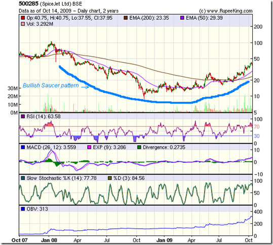
Needless to say, the stock price has reacted very favourably, as the 2 years bar chart pattern of SpiceJet will show:-

SpiceJet_Oct1409

After making a high of Rs 100 in Jan '08, the stock dropped more than 90% during the bear market. A sideways consolidation, followed by a bull rally, took the stock to the Rs 28 level in early Jun '09, above the 200 day EMA.

A strong correction quickly brought the stock below both the 50 day and 200 day EMA, to the Rs 17 mark, when the news of the positive Q1 '09 results were declared.

A sharp rally on good volumes followed, as the stock entered a bull market, moving above the medium term and long term averages to Rs 43. It is facing some resistance at the 38.2% Fibonacci retracement level of the entire bear market fall.

Notice the bullish saucer pattern that the stock has formed. That means it can reach its previous high in the medium term, giving it a 100% upside target. Provided that the Q2 '09 results are not too disappointing. The monsoon months are not the best period for air travel.

The RSI has slipped below the overbought zone. So has the slow stochastic. The MACD is mildly positive and just above the signal line. The clincher is the OBV. After steady accumulation by smart investors, volumes have perked up strongly for the past month.

Bottomline? The stock chart pattern of SpiceJet indicates that there is plenty of upside left. But the fundamentals have a long way to improve to reach investment-worthy levels. This one is for investors with large risk appetites. Can be bought on dips with strict stop-loss.

Tuesday, October 13, 2009

Does the Price of a Stock reflect its Value?

"Price is what you pay. Value is what you get." - Warren Buffett

Many small investors face a problem with stocks that have a 'high price'. They don't want to buy them, because they feel they can't afford them. They prefer to buy stocks that have a 'low price', because they appear more affordable and capable of giving high returns.

Last weekend, I was discussing the state of the markets with a friend and inevitably the discussion veered towards what stocks are worth buying now. I suggested that he look at a medical devices stock trading at 200 or a hospitality stock trading at 80.

His response was typical. He wanted to buy the 'cheaper' stock. I pointed out that the cheaper stock was actually more expensive on several counts - it had a Re 1 face value (vs. Rs 10 for the other), its net profit margin was less than half, and its Return on Equity (RoE) was just about a fifth.

What he said next left me speechless: 'When I can buy 1250 shares with Rs 1 Lakh, why should I buy only 500?' 

Such an approach to investments is illogical. This fixation on price and affordability is one of the prime reasons why small investors do not become successful investors. It is like saying: 'I can't afford the price of gold, so I'll buy some brass instead.'

The 'Efficient Market' theory was postulated by French mathematician Louis Bachelier in 1900 and developed further by Eugene Fama in his PhD thesis at the University of Chicago in the 1960s. It states that stock prices reflect all available information and adjusts to any new information as and when it becomes known.

It is very unlikely that an individual investor can consistently outperform the market indices because the financial news and information he uses for his stock selections is already available to every one else. Any future information will only be available on a random basis, and will affect stock prices randomly. Therefore, investors will be better off investing their money in a good index fund.

The Efficient Market theory anticipates rational behaviour from investors. But by nature, human beings tend to be irrational. And nowhere more so than in the stock market. Otherwise, why would they enter when the market has already gone up, and refrain from buying at the depths of a bear market?

Experienced investors learn to pick up value-stocks that may appear expensive but are cheap on a valuation basis - at or near market bottoms. Inexperienced investors chase after cheaper growth-stocks that are actually more expensive value-wise.

To answer the question: a stock's price tends to reflect its underlying value in the longer term. In the shorter-term, price and value mismatches do happen, that allow smart investors to build wealth.

Monday, October 12, 2009

Stock Index Chart Patterns - Dow Jones (DJIA) and Bovespa (Brazil), Oct 9, '09

Dow Jones (DJIA) index chart

Dow_Oct909

The Dow Jones (DJIA) index got good support at the 50 day EMA and jumped up swiftly to gain back the prior week's losses and reach a new closing high of 9865. The index seems poised at an interesting juncture - less than 50 points away from its previous high of 9938, made on Sep 23 '09.

All three EMAs are moving up, but volumes remain muted. The slow stochastic has changed directions and crossed the 50% level. The RSI and MFI are both below their 50% levels and moving sideways. The MACD has moved up to touch the signal line.

The Dow chart pattern is looking very similar to the European indices, which look to be in buoyant moods. An attempt at crossing the psychological level of 10000 is on the cards.

Bovespa (Brazil) index chart

My previous look at the Brazil Bovespa index chart pattern was 4 week's back. At that time, the index had just completed a correction down to the 50 day EMA and jumped back up (just like the Dow did last week). Since then, the bulls have been relentlessly charging and the index gained 9% while the Dow managed just a 2% gain.

Bovespa_Oct909

A quick glance at the 3 months bar chart pattern of the Bovespa shows that the Brazilian index is on much stronger footing. The slow stochastic is well entrenched in the overbought zone. Both the RSI and MFI are above their 50% levels. The MACD is moving up and is above the signal line.

All the three EMAs are moving up smartly. But the new high on Oct 9 '09 was on much lower volume. Could it be a sign of buying exhaustion? The negative divergences in the RSI and MFI are the other concerns.

The Dow has gained more than 50% from its Mar '09 low. The Bovespa has gained more than 100% since its Oct '08 low. At some point, both indices should face deeper corrections, as it has been a one-way rally so far for both. When? That's a million dollar question.

Bottomline? The Dow Jones (DJIA) and Bovespa (Brazil) index chart patterns are in bullish moods. Keep tight stop losses and enjoy the ride.

Sunday, October 11, 2009

Stock Index Chart Patterns - FTSE 100, CAC 40, DAX - Oct 9, '09

FTSE 100 index chart

FTSE_Oct909

In last week's analysis of the FTSE 100 chart pattern it was observed that the up trend line joining the Jul '09 and Sep '09 bottoms was broken and a pullback towards the trend line was expected. That is exactly what the FTSE did - providing good opportunities for selling.

Remember that as per trend analysis theory, a trend remains in place till it is broken. The three EMAs are still moving up, so the bull rally continues. But to gather momentum, the index needs to make new highs.

The slow stochastic has changed direction and moved up sharply, but the other indicators are looking bearish. Both the RSI and MFI are below their 50% levels and the MACD is below the falling signal line. IT should be an interesting tussle between the bulls and bears next week.

DAX index chart

DAX_Oct909

The DAX got good support at the 50 day EMA and also had a pullback towards the trend line connecting the Jul '09 and Sep '09 bottoms. But the volumes haven't been inspiring for the up move to continue much longer.

The technical indicators are looking a lot like those of the FTSE. The RSI is touching the 50% level, but the MFI is way below. The MACD has moved up a bit but remains below the signal line.

CAC 40 index chart

CAC_Oct909

The CAC 40 chart pattern looks similar to its neighbour's, with the technical indicators looking slightly weaker. The volumes have tapered off. The 20 day EMA has started to flatten out.

Unless the index can move above the prior week's high of 3845 made on Sep 29 '09, the bull rally may be over. A bearish lower top and lower bottom pattern is getting formed.

Bottomline? The stock index chart patterns of the European indices are indicating a desperate fight back by the bulls to regain control. But with every passing day, the rally is getting weaker. Investors should start book profits and save the cash for buying after a proper correction.

Saturday, October 10, 2009

BSE Sensex Index Chart Pattern - Oct 9, '09

A full week of trading without much progress in either direction for the BSE Sensex. The chart pattern is tantalisingly poised and may move either way. Let us first take a look at the 6 months bar chart pattern of the BSE Sensex index:-


The Sensex broke above the trend line connecting the tops of the rising wedge pattern almost a month back but has continued to move sideways, and has failed to cross the previous high of 17200. Last week the index alternated between lower and higher closes, and is now resting on the trend line. As we will see in the 3 months bar chart pattern of the BSE Sensex, the index is also resting on the 20 day EMA, which has provided good support to recent corrections.


While there is a possibility of the Sensex moving up again - particularly if the FIIs start pouring in money, the chances of a break downwards is increasing. As the three EMAs are still merrily moving up, the distance between the 50 day EMA and 200 day EMA has increased more than 2000 points. This indicates a likely correction in the near future.

The technical indicators are all looking bearish. The RSI, MFI, Aroon, MACD and slow stochastic are all in the positive zone but are moving down steadily. Most importantly in the shorter term, market sentiments seem to be turning bearish, as good news (like the Reliance Industries 1:1 bonus after 12 years, and the Q209 results of Infosys that turned out better than consensus estimates) failed to produce any buying interest.
Watch out for a downward break below the lower trend line joining the bottoms of the rising wedge pattern. That may start an 'end run' that could lead to a sharp correction. The rising wedge pattern is quite bearish and is usually followed by a sharp downward break.
Bull markets climb a wall or worry, and a large inflow of liquidity can nullify all technical analysis - as has happened a few times during this bull rally. So avoid shorting the market.
Bottomline? The chart pattern of the BSE Sensex index is poised at a crucial support level. Stay on the sidelines and watch the unfolding battle between the bulls and bears. Keep tight stop-losses and book partial profits at every opportunity.

Friday, October 9, 2009

Stock Index Chart Patterns - Hang Seng, Malaysia KLCI, Taiwan TSEC - Oct 2, '09

Hang Seng index chart

HangSeng_Oct0909

The extended vacation at the Shanghai market enabled the bulls to regroup. After receiving strong support at the 50 day EMA, the Hang Seng index jumped back above the 20 day EMA in a determined effort to attempt a new high. The bears managed to stop the bull charge, as the index closed almost flat on Fri, Oct 9 '09.

Nevertheless, the Hang Seng closed more than 5.5% higher for the week. The up trend line joining the bottoms made in Apr '09 and Jul '09 provided support to the recent correction. All three EMAs are moving up again, and the bull market is intact after a healthy correction.

The volumes haven't picked up much, which puts a question mark on the sustainability of the rise. The technical indicators are giving mixed signals. The slow stochastic has bounced off nicely from the oversold zone, but hasn't crossed the 50% level yet. Both the RSI and MFI are below their 50% levels. The MACD has moved up but remains below the signal line.

Watch out for the previous top of 21930 made on Sept 17 '09. That needs to be cleared by the bulls.

Malaysia (KLCI) index chart

The Malaysia KLCI index was looking stronger than the Hang Seng four week's back. Let us see if there has been any change in sentiments since then.

KLCI_Oct0909

The KLCI index continues to look stronger than the Hang Seng. The minor correction received support from the 20 day EMA as the bulls renewed their charge. Today (Oct 9 '09) the index made a new high of 1237 before closing at 1234 - but has managed to gain only 2% in the past four weeks.

Volumes continue to disappoint. The slow stochastic is in the overbought zone. The RSI is at the 50% level. The MFI is just above the 50% level. The MACD has moved above the signal line.

Taiwan (TSEC) index chart

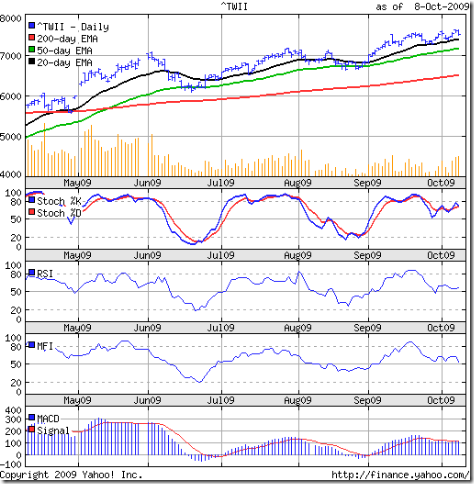
TSEC_Oct0909

The bulls are in control of the Taiwan TSEC index, which made a new closing high of 7609 on Wed, Oct 7 '09. After making a higher high of 7636 on Oct 8 '09 the index fell back and closed at 7503 - a 'reversal day' pattern. It jumped back up and closed at 7572 today - but made an 'inside day' pattern (higher low but lower high), which suggests indecision.

The technical indicators made lower highs - showing negative divergences. The slow stochastic is just below the overbought zone. The RSI is above the 50% level. So is the MFI. The MACD is touching its signal line.

Bottomline: The Asian index chart patterns continue to look bullish, but the upward momentum has slowed down. The Shanghai Composite rose nearly 5% today after a long holiday break. The Chinese index is still in a correction mode, and holds the key to further up moves of the Asian indices. Keep tight stop losses.

Thursday, October 8, 2009

1:1 Bonus announcement by Reliance Industries - is it good news for investors?

Reliance Industries made the bonus announcement after the Indian stock markets closed for trading on Oct 7 '09. Today (Oct 8 '09), the stock closed up by less than 1% at 2120 - still more than 15% below its high of 2490 on May 19 '09.

A 1:1 bonus - particularly when announced after 12 years in the midst of a strong bull rally - should have elicited joy and buying euphoria among market participants. Why? Because bonus shares are considered to be beneficial to shareholders. From Reliance, the 'gift' should have appeared an extra special one.

In reality, it should make no difference to a shareholder's wealth. No doubt bonus issues offer 'free' shares on which dividends are paid in the future. But the share price is adjusted downwards depending on the bonus ratio. In the case of a 1:1 bonus, 100 shares will become 200 shares, but the share price prevailing on the record date will get halved after the bonus issue.

A shareholder's wealth remains the same - double the shares at half the price. What can happen after the bonus issue? One year later, dividends are likely to be paid on the enhanced quantity of shares, but the dividend payout ratio is usually maintained by reducing the dividend percentage. The total dividend received by the shareholder remains the same.

There is a downside as well. After receiving the bonus shares, many shareholders sell the original quantity - specially if bought less than a year back - to book a short-term loss and get a tax break by adjusting the loss against short-term profits. This selling pressure pushes the stock price below the already halved ex-bonus price. So the actual wealth of shareholders, who do not avail the tax break, may go down after the bonus shares are issued.

But there are long term benefits if the company continues to perform well in the future - and Reliance should do so. (A bonus announcement is management's way of communicating a bright future to shareholders.) The dividend payments gradually increase, and the investor receives a higher amount each subsequent year.

Why the muted buying? Several reasons. The company's performance over the next few quarters are not likely to be exciting. The KG basin gas selling fiasco and the ongoing public feud amongst the Ambani siblings is creating negative ripples in Government circles, and uncertainty among large shareholders.

Reliance had out-performed the Sensex by gaining 167% from its Oct 27 '08 low of 930 to its May 19 high of 2490. Subsequently, the stock has under-performed by going through a 4 months long sideways consolidation.

If 'good news' doesn't move a stock up sufficiently, it is an indication that there is no longer enough buying interest in the stock. The fact that the Sensex is in some sort of a topping formation is also restricting the bulls at the Reliance counter.

Existing investors may continue to hold. New entrants can make a token purchase at current price, and buy more on dips. (I stay far away from any stock with the 'Reliance' name in it.)

Related post

Why rely on Reliance?

Wednesday, October 7, 2009

Stock Chart Pattern - State Bank of India (An update)

When I analysed the stock chart pattern of State Bank of India back in Mar '09, it had dropped from its peak of 2396 made on Jan 14 '08 to a low of 894 on Mar 9 '09 - a 63% drop, matching the fall of the Sensex.

It had bounced up to the 1000 level where it had received resistance from the 20 day EMA. All the technical indicators were looking very bearish, and I had expected the up move to get terminated at the 1100 level.

The up move only faced a short-term correction after hitting the 1100 level, before embarking on a strong rally. The pattern mirrored the Sensex, post election results from May 18 '09 onwards.

A look at the 1 year bar chart pattern of State Bank of India will show a prolonged consolidation within a symmetrical triangle followed by an upward break out on decent volumes:-

SBI_Oct709

The State Bank stock made a new high of 2235 on Sep 30 '09 - outperforming the Sensex by rising 150% from its Mar '09 low, and retracing 89% of its bear market fall. But it looks like an intermediate top has been made.

Why? Several reasons. A bearish rounding top formation. Increasing distance between the 50 day and 200 day EMAs. Negative divergences in the RSI, MACD and slow stochastic. All these point to a healthy correction.

Note how the 50 day EMA has provided strong support to the up move from end-Jul '09 onwards. It should provide resistance to the down move. Below that, the 200 day EMA should provide stronger support.

Bottomline? The stock chart pattern of State Bank of India seems to be getting ready for a decent correction. Will the Sensex follow suit? Partial profit booking advised. Remember that this is the top pick among PSU bank stocks. At some point in time, its subsidiaries should get merged with it and create an even bigger entity.

Tuesday, October 6, 2009

Should Indian investors switch out of Telecom Sector stocks?

Indian investors have several choices about investing in the Telecom Sector. But should they use the correction in the telecom sector stocks to jump in or bail out? Let us have a look at the players.

There is the behemoth of fixed line services - MTNL, whose stock has promised much and delivered little. BSNL is yet to be listed, but its performance leaves a lot to be desired. Both had misused their earlier monopoly by taking customers for granted and providing atrocious services.

Now they are trying to hang on to reducing market shares in a shrinking market. Both joined the wireless services bandwagon late. Efforts to provide new-age services like broadband (mostly ADSL) and IPTV have been marred by poor technology, slow implementation and lack of a service orientation.

Then there are the myriad wireless service providers, of whom Bharti Airtel has been the clear leader and Reliance Communications (RCom) the follower. This is one area where the Tatas have not done well at all. The other players are fighting to reach critical mass.

The 'hockey-stick' style growth in mobile telephony is showing signs of maturity. While subscriber growth continues to be good, ARPUs (Average Revenues per User) have been steadily falling. Strict government regulations on spectrum allocations, geographical operations, equipment purchase, and high licence fees leave very little room for flexibility in operations.

The service has become commoditised - with every one offering similar call plans and rates. The industry is very capital intensive with low sales to asset ratio. A Rupee needs to be spent for every Rupee earned. Ongoing maintenance and upgradation of technology is a constant drain on resources. Trying to generate new revenue sources through satellite TV services have further added to costs.

The last straw seems to be the entry of new overseas competitors like Virgin and DoCoMo. With per-second billing rates likely to become the industry standard, ARPUs will drop faster. This will benefit consumers but not the service providers. EPS will take an immediate hit, and the stocks are already being derated.

Lastly, there are the fringe players. Handset, network and switching equipment manufacturers are mostly MNCs, unlisted in India. The odd MRO-Tek has been around for years without the stock doing anything remarkable.

The value-added software providers space looks interesting, but has small players. Subex is making losses. OnMobile has good pedigree but the stock is expensive. Geodesic and Tanla seem to be doing well, but it is difficult to assess if their business models are sustainable and scalable.

So, the short answer to the question is: Yes. Why not invest in sectors where growth is visible and the future is less ambiguous?

(Many readers may not agree with my bearish views about the Telecom sector. I would like to hear your counter arguments.)

Monday, October 5, 2009

Dow Jones (DJIA) Index Chart Pattern - Oct 2, '09

In last week's discussion about the Dow Jones (DJIA) index chart pattern, I had warned about a larger correction due to the break of the up trend line and the weakness in the technical indicators. The concluding remarks were:-

'The Dow Jones (DJIA) index chart pattern looks like it is in the last stage of the bull rally. If you haven't booked profits yet, try to sell when the index attempts a pullback to the trend line.'

To add fuel to the fire, the unemployment figures were worse than the consensus estimate and almost touched double figures. The possibility of a double-dip recession is on the cards.

The 6 months bar chart pattern of the Dow Jones (DJIA) index is looking a lot like its European cousins from across the pond:-

Dow_Oct0209

The expected happened on Sep 28 and 29. A pullback effort by the bulls took the index up to the trend line connecting the Jul '09 and Sep '09 bottoms - providing excellent opportunity to the bears to press their 'sell' buttons.

Four straight down days on good volumes sent the Dow down to its 50 day EMA, where it got good support. The 20 day EMA has turned down but the 200 day EMA is still rising, so there will be some fight back from the bulls.

The technical indicators are pointing to a deeper correction. The RSI, MFI and slow stochastic have dropped sharply below their 50% levels. The MACD is well below the signal line and falling fast.

Bottomline? The Dow Jones (DJIA) index chart pattern is finally going through the much expected correction. Bulls can hope that the correction will be a shallow one. The fundamentals point otherwise and their hopes may be belied.

Sunday, October 4, 2009

Stock Index Chart Patterns - FTSE 100, CAC 40, DAX - Oct 2, '09

FTSE 100 index chart

FTSE_Oct209

The bull rally for the FTSE 100 index faced strong head winds last week, closing below the 20 day EMA for the first time since Jul '09. In the process, the up trend line connecting the two previous bottoms - in Jul '09 and Sep '09 - was broken. A pullback to the trend line can happen next week, and the opportunity should be used for profit booking.

Good volumes on four down days in a row (Sep 29, 30, Oct 1, 2) indicates that the smart money is exiting. The 20 day EMA has turned down. The 50 day EMA has flattened. The 200 day EMA is still moving up, and as long as the index stays above it, the bulls will try to fight back.

The technical indicators show that the bears have managed to gain the upper hand after a long time. The slow stochastic has dropped sharply from the overbought zone and is about to go below the 50% level. The RSI and MFI have both dropped to their 50% levels. The MACD has dropped sharply and is well below the signal line.

DAX index chart

DAX_Oct209

The DAX index could not escape the wrath of the bears either, and also had four straight down days on good volumes. The up trend line joining the Jul '09 and Sep '09 bottoms was broken as well. The three moving averages look similar to those of the FTSE.

The 50 day EMA provided support to the index, but the technical indicators are looking more bearish and the medium-term average can get penetrated next week.

The slow stochastic has dropped below the 50% level from the overbought zone. Both the RSI and MFI have moved sharply below the 50% levels. The MACD is still positive, but below the signal line.

CAC 40 index chart

CAC_Oct209 

The CAC 40 index has fallen prey to the bears, much like its European neighbours. Four straight down days on good volumes, break of the up trend line, weak technical indicators - all point to a further continuation of the correction. Any pullback to the up trend line would be a profit booking opportunity.

Bottomline? The stock index chart patterns of the European indices seem to be correcting due to the 'Butterfly Effect' of the on-going correction in the Shanghai Composite index. A fall below the 200 day EMA could send the indices back to a bear market.