Monday, March 31, 2014

Stock Index Chart Patterns: S&P 500 and FTSE 100 – Mar 28, ‘14

S&P 500 Index Chart

S&P 500_Mar2814

The following comments were made in last week’s analysis of the daily bar chart pattern of S&P 500: “All three technical indicators are in bullish zones, but showing negative divergences by touching lower tops. A consolidation or corrective move is likely. Has the index formed a ‘double top’ reversal pattern? Technically, the answer is ‘no’.”

The index corrected down below its 20 day EMA but found good support from its rising 50 day EMA and the 1840 level before bouncing up. By not falling below its previous low of 1840, the possibility of a ‘double top’ reversal has been avoided.

For the past 4 weeks, the index has been consolidating within a rectangular band between 1840 and 1880. Rectangular consolidations tend to be continuation patterns, but can be reversal patterns also – hence are unreliable. In other words, the break out from the rectangle has to be awaited before initiating any buy/sell decision.

Daily technical indicators are turning bullish. MACD is below its signal line in positive territory, but has stopped falling. RSI has bounced up above its 50% level. Slow stochastic is moving up towards its 50% level. Note that during a period of consolidation, indicators often give conflicting signals.

The important thing to remember is that an upward break out above 1880 should be accompanied by a volume surge. A break below 1840 does not require strong volume support.

Stay invested with a stop-loss at 1840.

FTSE 100 Index Chart

FTSE_Mar2814

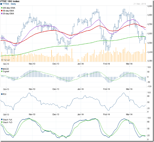
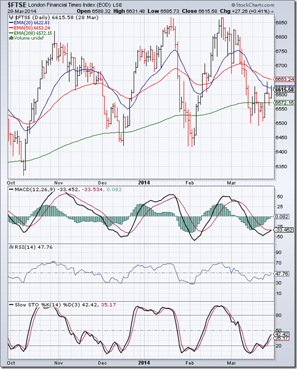
The 6 months daily bar chart pattern of FTSE 100 managed to temporarily wriggle out of a strong bear grip by closing above its 200 day EMA and the 6600 level, but failed to overcome the resistance from its falling 20 day EMA. The bears will remain in control unless the index convincingly moves above its falling 50 day EMA.

The index is consolidating within a rectangular band between 6500 and 6630. Rectangles tend to be continuation patterns but are unreliable. That means a downward break below 6500 is likely. However, waiting for the eventual break out would be prudent. Stay invested with a stop-loss at 6500.

Technical indicators are in bearish zones, but turning bullish. MACD is about to cross above its falling signal line in negative territory. RSI is gradually moving up towards its 50% level. Slow stochastic has emerged from its oversold zone and rising towards the 50% level. At the time of writing this post, the index is trying to break out above 6630.

Bottomline? Daily bar chart patterns of S&P 500 and FTSE 100 are consolidating sideways within ‘rectangle’ patterns. The eventual break out from the rectangles can be in either direction. Stay invested with suitable stop-losses.

Sunday, March 30, 2014

BSE Sensex and NSE Nifty 50 index chart patterns – Mar 28, 2014

An appreciating Rupee, falling inflation, contracting Current Account Deficit, growing exports and concerns about economic slowdown in China and many emerging markets have turned India into a favoured destination for overseas investors.

RBI extended the deadline for implementation of Basel III capital raising norms by a year. PSU banks celebrated the news. With inflation coming under control, RBI is expected to maintain status quo on interest rates.

Both Sensex and Nifty indices are at life-time highs – in ‘blue sky’ territory with no known resistances. Does that mean they will continue to move higher? For how long? Till elections, or even after that? Let us see whether the price charts can throw some light.

BSE Sensex index chart

Sensex_Mar2814

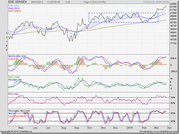
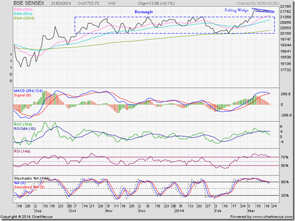
The daily closing chart pattern of Sensex shows an upward break out from the rectangular consolidation zone, followed by a further consolidation within a small ‘falling wedge’ pattern and another up ward break out from the wedge.

Rectangles have measuring implications: the height of the rectangle (about 1150 points) should be added to the top level of the rectangle (about 21350) to arrive at a minimum target of 22500. Sensex is just 160 points short of the target.

Technical indicators are bullish, but looking overbought. MACD has re-entered its overbought zone. ROC has crossed above its 10 day MA in positive zone. RSI has dropped to the edge of its overbought zone. Slow stochastic is inside its overbought zone.

All four indicators are showing negative divergences by failing to reach new highs with Sensex. A correction or consolidation can be expected. The pause will enable the index to move even higher.

With macro-economic conditions turning favourable, even a fractured mandate in the elections may not cause a huge fall.

NSE Nifty 50 index chart

Nifty_Mar2814_LT

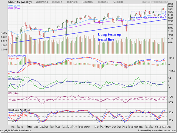
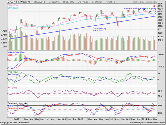
The weekly bar chart pattern of Nifty has thumbed its nose at all the naysayers to soar to lifetime highs. The 5 months long consolidation within a ‘rectangle’ had given a good opportunity to accumulate fundamentally strong stocks. Hope blog readers paid heed to my exhortations to buy.

The upward break out from the rectangle has measurement implications: the height of the rectangle (about 400 points) should be added to the top level of the rectangle (about 6350) to arrive at a minimum target of 6750. Nifty is just 50 points short of the target.

Technical indicators are bullish, but looking overbought. MACD is rising above its signal line towards its overbought zone. ROC has crossed above its 10 day MA and about to enter its overbought zone. RSI has reached the edge of its overbought zone. Slow stochastic is inside its overbought zone.

A correction or consolidation may be around the corner. Remember that markets can stay overbought for a long time – so don’t be surprised if Nifty continues to rise. Whatever you do, don’t try to short the index when bulls are in complete control.

Bottomline? Chart patterns of BSE Sensex and NSE Nifty indices are in ‘blue sky’ territory with no known resistances. If you have invested at lower levels, enjoy the ride but maintain a trailing stop-loss to protect profits. If you have that ‘missed the bus’ feeling, suppress your impulse to jump in. Most of the low-hanging fruits have been plucked. Be very selective about the stocks you do choose to enter.

Friday, March 28, 2014

Stocks in the news this week (Mar 28, ‘14)

With Sensex and Nifty touching new highs on a daily basis, the last of the bears may be throwing in the towel – as can be seen from a host of stocks breaking out of long downtrends or consolidation zones.

Even stocks of realty companies are beginning to show signs of life after being shunned by investors. Charts of a couple of them are given below.

When stock indices start moving higher daily, many small investors suddenly realise they are ‘missing the bus’ and jump in feet first. The smart thing to do would be to wait for a correction and then enter.

These are not recommendations to buy or sell. Please do your due diligence before taking any decision.

Ambuja Cement

AmbujaCem_Mar2814

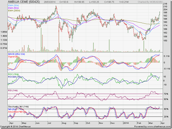
Infrastructure stocks have been out of favour for a while now, and Ambuja Cements has been no exception. The stock had been trading sideways with a downward bias, but appears to have formed a bottom at 150. The recent price spurt after a period of sideways consolidation was on news of a court decision permitting amalgamation with parent company Holcim.

ROC, RSI and Slow stochastic are showing negative divergences by failing to touch new highs. MACD is in overbought zone. A correction may follow.

Godrej Properties

GodrejProp_Mar2814

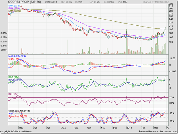
After a long bear phase, the stock price of Godrej Properties was making a ‘rounding bottom’ bullish pattern. The final volume spurt that caused a break out above the falling 200 day EMA was due to announcement of new residential projects at Pune and Chennai.

All four technical indicators are looking overbought. Expect a correction or consolidation.

Oberoi Realty

OberoiRealty_Mar2814

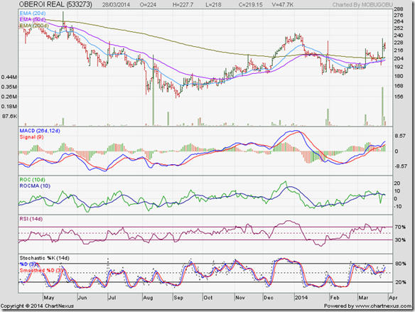
The stock of Oberoi Realty was struggling to get out of a bear market. A high volume price spurt above its 200 day EMA was caused by news of acquisition of a large land parcel in Borivali from the Tatas.

Oberoi was a debt-free realty company – a rarity. But it will now be saddled with a large debt for the land purchase. Remember that it will take a couple years for the company to monetise the land by building and selling residential flats.

Talwalkars

Talwalkar_Mar2814

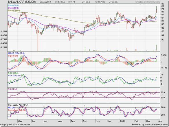
The stock price of Talwalkars has been struggling to get back into bull territory for the past 6 months. The high volume rise to a new high was on news of a likely stake sale.

Wednesday, March 26, 2014

Is it a good time to buy IT stocks? – a guest post

Restrictions on gold imports, lower capital goods imports due to a slowing economy and strong FII inflows have contributed to a strengthening Rupee and a lower Current Account Deficit. While that may be good for the Indian economy, it may not be so great for exporters.

Most Indian IT companies generate a significant amount of revenues from exports. A depreciating Rupee had helped companies to increase profits. But a strengthening Rupee has led to profit booking in IT stocks, which are trading below their recent highs.

In this month’s guest post, Nishit makes a strong case for using the corrections to enter IT stocks now. What do you think? Do you feel IT stocks are too expensive? Good things in life usually are.

------------------------------------------------------------------------------------------------------------------------------------------

IT stocks have corrected from their recent highs. The corrections range from at least 10% from the tops in case of TCS and HCL Tech and 15% in case of Infosys. So, is it a good time to buy IT stocks? Let us try and examine the pros and cons.

Why have the IT stocks corrected? The rupee has strengthened 5-6% since January 2014 due to lower gold imports and FII inflows in the hope of a Narendra Modi led Government being sworn in. A strengthening rupee hits the profit margins of all exporters, including IT companies.

The upside to the profits is capped for the time being because of rupee appreciation. Also, IT stocks have run up in the past 1 year. TCS itself has gone up 70-80% from its lows and Infosys has doubled from its lows.

TCS recently had a con-call where it expects 2015 to be a stronger year than the current year. Overall, the IT stocks are dependent on the US and European economies which are slowly recovering back to normalcy. So, the core business of the IT companies which is the main driver for growth is doing just fine.

Now, a strengthening rupee is just an excuse for booking profits. If no strong Government comes at the centre then expect the markets to tank and the rupee to trade in the 66-68 band.

Let us look at the valuations right now. Infosys trades at a P/E of 19 and TCS at 23. None of these stocks are frightfully expensive if one looks at their growth prospects.

If one were to look at Indian IT, I would not look beyond TCS, Infosys and HCL Tech at the moment. These 3 stocks capture the essence of Indian IT.

What happens if Narendra Modi wins? The rupee may appreciate further but the Government would not let it appreciate beyond a point as exports would get hit.

TCS and other IT stocks would act as a hedge for the portfolio as also an investment option. With a 3 year horizon, they look a pretty solid bet.

IT stocks are not dependent on Government policies, have operating margins of 25-30%, have strong brand names. They cancel out most of the negatives which hang over the Indian markets right now.

There are many players listed on the stock market in IT but Infosys, TCS and HCL Tech represent the best bets. TCS from sheer size and scale, HCL Tech for its strength in the Infrastructure management space, and Infosys with the wild card of Narayanmurthy cleaning up the house.

------------------------------------------------------------------------------------------------------------------------------------------

(Nishit Vadhavkar is a Quality Manager working at an IT MNC. Deciphering economics, equity markets and piercing the jargon to make it understandable to all is his passion. "We work hard for our money, our money should work even harder for us" is his motto.

Nishit blogs at Money Manthan.)

Tuesday, March 25, 2014

WTI and Brent Crude Oil charts: an update

WTI Crude chart

WTI Crude_Mar2414

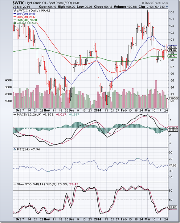
In the previous post, the daily bar chart pattern of WTI Crude oil was expected to correct due to negative divergences visible on the technical indicators. Oil’s price dropped and closed below its 200 day EMA accompanied by a volume spurt on Mar 12 ‘14.

After spending a couple of days in bear territory, oil’s price gradually moved up above its 200 day EMA. But the rally has been far from convincing because volumes have been sliding with stronger volumes on down days. Oil’s price is in the process of forming a bearish ‘rising wedge’ pattern from which the likely break out is downwards.

Technical indicators are looking bearish. MACD has dropped into negative territory below its falling signal line, but trying to turn around. RSI is just below its 50% level. Slow stochastic has emerged from its oversold zone.

On longer-term weekly chart (not shown), oil is trading above all three weekly EMAs but technical indicators are turning bearish. A drop below its recent low of 97.50 can take oil’s price down to 93.

Brent Crude chart

BrentCrude_Mar2414

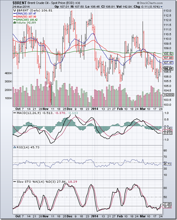
The following comments in the previous post on the 6 months daily bar chart pattern of Brent Crude oil are repeated here: “All three EMAs have converged together and oil’s price is trading below them. There could be a quick drop towards 104.”

Oil’s price dropped down to 105.50 before recovering a little. Since touching a high of 112 at the beginning of the month, a bearish pattern of lower tops and lower bottoms has formed. All three EMAs are falling and oil’s price is trading below them in a bear market.

Daily technical indicators are in bearish zones. MACD has stopped falling, but remains below its falling signal line in negative territory. RSI is below its 50% level. Slow stochastic has emerged from its oversold zone.

On longer-term weekly chart (not shown), oil is trading above its 200 week EMA but technical indicators have turned bearish. A drop below its recent low of 105.50 can take oil’s price down to 103.

Monday, March 24, 2014

Stock Index Chart Patterns: S&P 500 and FTSE 100 – Mar 21, ‘14

S&P 500 Index Chart

S&P 500_Mar2114

The daily bar chart pattern of S&P 500 recovered quickly from its previous week’s corrective move below its 20 day EMA. It rose to touch a new intra-day high on Mar 21 ‘14 that was marginally higher than its previous high touched on Mar 7 ‘14, but formed a ‘reversal day’ pattern with a big spurt in volumes.

All three technical indicators are in bullish zones, but showing negative divergences by touching lower tops. A consolidation or corrective move is likely. Has the index formed a ‘double top’ reversal pattern? Technically, the answer is ‘no’. Why?

First, the volume. The formation of the second top should be on lower volumes. Second, on a closing basis, the second top was much lower. Third, the index has not yet dropped below the ‘valley’ between the two tops. At the time of writing this post, the index is trading just a point higher.

All three EMAs are rising and the index is trading above them. The long-term bull market keeps charging ahead.

FTSE 100 Index Chart

FTSE_Mar2114

The following remarks were made in last week’s analysis of the daily bar chart pattern of FTSE 100: “The index may pullback towards its 200 day EMA in an effort to return to bull territory. The dip is an adding opportunity.”

The index pulled back and crossed above its 200 day EMA and the 6600 level but could not remain in bull territory for long. It closed below its 200 day EMA for the second straight week but gained about 30 points.

Daily technical indicators are bearish, but beginning to correct oversold conditions. MACD is still falling below its signal line in negative territory, and is just above the edge of its oversold zone. RSI has bounced up from the edge of its oversold zone. Slow stochastic is trying to emerge from its oversold zone.

Bottomline? Daily bar chart patterns of S&P 500 and FTSE 100 indices are still in the midst of bull market corrections. S&P 500 is recovering from a sharp bear attack and is trading near its lifetime high. FTSE 100 is struggling to get out of a strong bear grip, but appears to have formed a higher bottom at about 6500. Stay invested.

Sunday, March 23, 2014

Sunday musings: ask questions first and shoot later

In the American ‘Wild West’, shooting first and asking questions later was simply a survival strategy. If you didn’t shoot first, you were probably going to end up dead. That mentality prevails even today. The invasion of Iraq by the US is a classic example.

Politicians are adept at shooting off with their mouths first – particularly during election campaigns. If an opponent is seen as a potential threat, slander and muckraking begins straightaway. One can always apologise later, but the stigma often sticks. Narendra Modi will never escape the spectre of the Godhra riots. Arvind Kejriwal is the butt of jokes for being too honest.

The proverb has two connotations – to act boldly, or, to act without weighing the consequences. When a group of peaceful protesters suddenly morph into a vicious stone-throwing mob, ‘weighing the consequences’ could lead to the situation getting completely out of hand. Shooting first – with rubber bullets or water cannons – may be the only choice.

Inexperienced investors – and sometimes even seasoned ones – often fall through the crack between the two meanings. Quickly buying or selling a stock because it has suddenly spurted or crashed is considered bold behaviour. Justifications are then provided or sought to prove that it was a smart move.

A recent example has been the stock price of KSB Pumps. After consolidating in the range of 180-240 for 18 months, the stock broke out to 280, pulled back to 240 and then in a sudden price spurt rose past 340. Investment forums are now full of chatter about why this is a great stock to buy. One contrarian(?) investor confidently stated that he had sold at 280 because the stock was overvalued.

In the world of investments, a survival strategy is to ask questions first and shoot later. Too often investors get into trouble by buying a stock or shorting an index at exactly the wrong time. Probably they don’t want to ‘miss the bus’ – not realising that a little patience would enable them to catch the next bus.

Saturday, March 22, 2014

BSE Sensex and NSE Nifty 50 index chart patterns – Mar 21, 2014

In a belated effort to trim its fiscal deficit, the government raised more than Rs 8000 Crores by selling stakes in Axis Bank and several PSU units. The revised divestment target – considerably lower than the earlier planned target – has been met.

US Fed’s announcement of a further reduction of QE3 bond buying by US $10 Billion was taken more or less in stride by the Indian market. A slow down in the Chinese economy and struggling economies in several emerging markets is making India a favourite of the FIIs.

A recent study undertaken by HDFC Bank in three states (Gujarat, Maharashtra, MP) has shown that rural India is less despondent about the economy than urban India. The various measures undertaken by the UPA for rural upliftment has apparently borne some positive results. It will be interesting to see whether economic benefit turns into votes during the general election.

BSE Sensex index chart

Sensex

After an upward break out from the rectangular consolidation zone two weeks back, the mild pullback on the daily closing chart pattern of Sensex has turned into another consolidation pattern - a bullish ‘falling wedge’. An upward break out from the ‘wedge’ is the likely outcome in the near term.

An upward break out from any consolidation zone – including the ‘falling wedge’ – should be accompanied by a surge in volumes. Otherwise the break out may turn out to be a ‘false’ one. All three EMAs are rising together and the index is trading above them. Bulls are regaining complete control of the chart.

Daily technical indicators are in bullish zones after correcting overbought conditions. MACD has turned down to touch its signal line at the edge of its overbought zone. ROC has crossed below its 10 day MA and moving down towards the ‘0’ line. RSI has dropped to the edge of its overbought zone. Slow stochastic has slipped below its overbought zone.

The market is providing another opportunity to add fundamentally strong stocks to your portfolio.

NSE Nifty 50 index chart

Nifty

For the third straight week, the weekly bar chart pattern of Nifty touched a new lifetime high (6575) but closed slightly lower – forming a ‘reversal week’ pattern. Such a pattern can mark the end of an intermediate move, so some correction is possible. However, a change of trend is unlikely.

The week’s volume bar is much shorter due to the holiday on Monday on account of ‘Holi’. A short duration trading today (Sat. Mar 22) has not materially altered the chart pattern.

Weekly technical indicators are bullish. MACD has crossed above its signal line below its overbought zone. ROC has crossed above its 10 week MA in positive territory. RSI is just below its overbought zone. Slow stochastic has entered its overbought zone.

Nifty is trading above its two weekly EMAs and the long-term up trend line. Dips should be used to add.

Bottomline? Chart patterns of BSE Sensex and NSE Nifty indices are consolidating a bit after breaking out above their respective ‘rectangle’ patterns. Both indices are in long-term bull markets and should continue to move higher. Stay invested. Or, book partial profits and use dips to add.

Thursday, March 20, 2014

Stocks in the news this week (Mar 20, ‘14)

Every week a few stocks make headlines for various reasons. Investors often get excited or perturbed by a sudden spurt or crash in prices, and jump in to buy or sell. That is exactly what they should not do.

The trick to making money in the stock market is to remain unfazed by daily news flow. If you own or have been tracking a stock and suddenly see a price spurt or crash, by all means try to find out the reasons.

If you neither own nor track a stock, don’t get interested just because there is a sharp price fluctuation. Do your due diligence and then decide whether you should get interested at all. Investment opportunities arise regularly. You should make a considered decision whether to avail of such opportunities or not.

Here are the charts and brief analysis of a few stocks in the news this week.

Amtek India 

Amtek

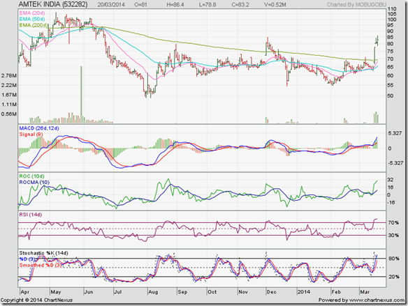
Like many auto ancilliary stocks, Amtek India has been struggling in a bear market. It is a profit making company with decent cash flows from operations but has huge debt on its books. The recent price spurt is on news of an acquisition in Germany. Technical indicators are looking overbought. A pullback towards its 200 day EMA is possible.

Eveready

Eveready

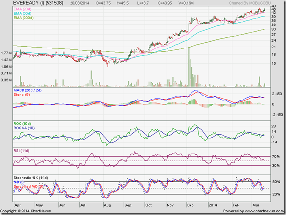
Eveready has been in a bull rally since Sept ‘13, but the company is trading at a high valuation because of meagre profits. Daily technical indicators are showing negative divergences by failing to touch new highs with the stock’s price. News of a price hike caused a small price spurt.

Mukand

Mukand

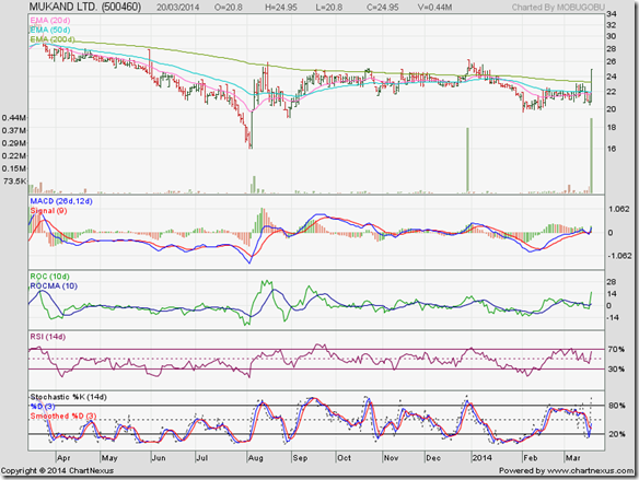
Mukand is a company that has long fallen from its glory days. It is making losses for the past few years and is in a bear market. Today’s price spurt is on news that promoters have hiked their stake from about 54% to 73% – post a recently concluded rights issue.

Polaris Fin

Polaris

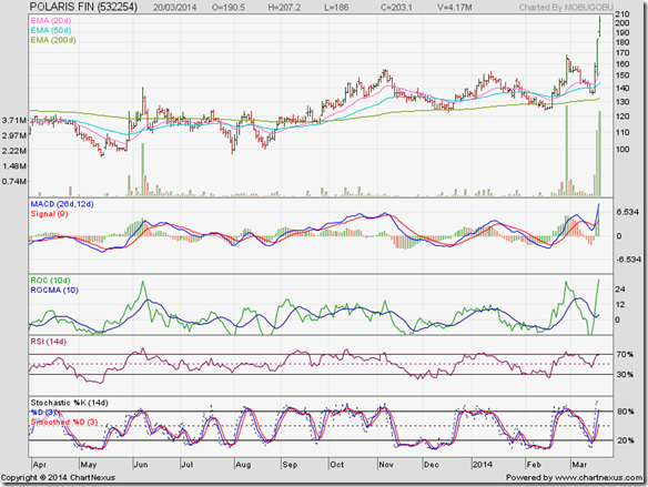
Polaris stock has been moving sideways with a slight upward bias. The sudden price spurt is on news of demerging its product business into a separate listed company. Technical indicators are looking overbought. A price correction should follow.

Tuesday, March 18, 2014

Gold and Silver charts: an update

Gold Chart Pattern

Gold_Mar1814

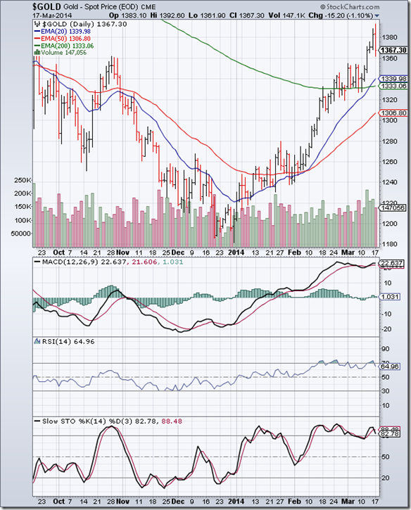
The daily bar chart pattern of gold consolidated sideways between 1330 and 1350 for 7 trading sessions during which it managed to close above its 200 day EMA every day. On Wed. Mar 12, gold’s price broke out above 1350 on strong volumes, rose to nearly touch the 1400 level on Mon. Mar 17, but formed a ‘reversal day’ pattern (higher high, lower close) and corrected down.

The 20 day EMA has crossed above the 200 day EMA, but the ‘golden cross’ of the 50 day EMA above the 200 day EMA is still awaited. Gold’s price has gained 210 points (18%) year-to-date from its Dec 31 ‘13 low, which is less than the minimum 20% gain required for a bull market to begin.

Technical indicators are showing negative divergences by failing to touch new highs with gold’s price, and are correcting from overbought conditions. A correction will help bulls to charge higher in a bid to reverse the bear market. As mentioned in the previous post, expect resistance from the zone between 1425 and 1525.

On longer term weekly chart (not shown), gold’s price has moved above its 20 week and 50 week EMAs, but is facing resistance from its 200 week EMA. Technically, the long-term bear market is intact.

Silver Chart Pattern

Silver_Mar1814

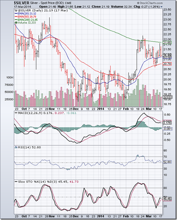
The daily bar chart pattern of silver is facing difficulty in shaking off the bear stranglehold. Silver’s price dropped to its rising 50 day EMA, received good support, and bounced up strongly towards its falling 200 day EMA.

Bears stepped up their selling, and silver’s price tumbled towards its 20 day EMA. Daily technical indicators are turning bearish. MACD is still positive, but sliding below its falling signal line. RSI bounced up from its 50% level, but is falling towards it again. Slow stochastic moved up sharply from its oversold zone, but stopped short of its 50% level.

On longer term weekly chart (not shown) silver’s price is above its 20 week EMA but trading below its falling 50 week and 200 week EMAs. There is no sign of reversal of the long-term bear market.

Monday, March 17, 2014

Stock Index Chart Patterns: S&P 500 and FTSE 100 – Mar 14, ‘14

S&P 500 Index Chart

S&P 500_Mar1414

Note the following remarks from last week’s analysis of the daily bar chart pattern of S&P 500: “Bulls are clearly on top. But don’t expect the bears to give further ground without a fight. Several technical indications point to a correction.”

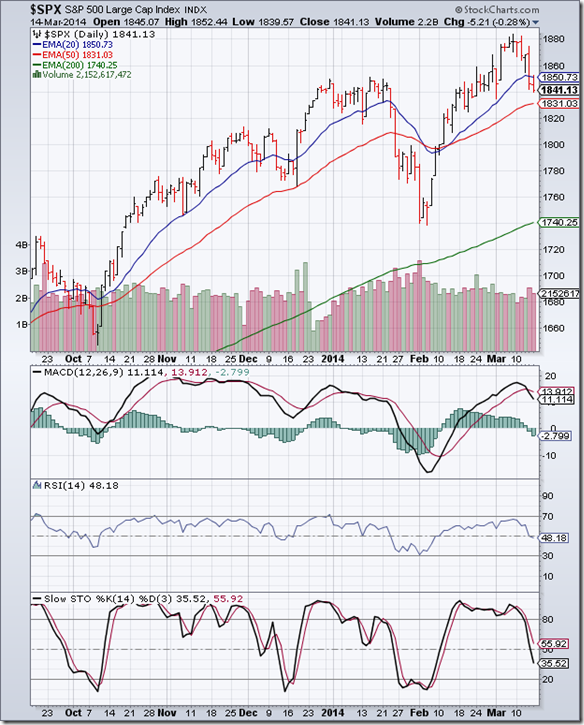
The index started to correct from Monday (Mar 10) and ended the week by falling sharply below its 20 day EMA on strong volumes – losing about 2% for the week. There is no immediate threat to the long-term bull market since the index is trading more than 100 points above its rising 200 day EMA.

Daily technical indicators are looking bearish. MACD is positive, but falling below its signal line. RSI has slipped below its 50% level. Slow stochastic has dropped below its 50% level. The correction may not be over yet. The dip can be used to add.

Initial jobless claims were lower than expectation, while retail sales revived somewhat in Feb ‘14. Both data points are indicative of a recovering economy.

FTSE 100 Index Chart

FTSE_Mar1414

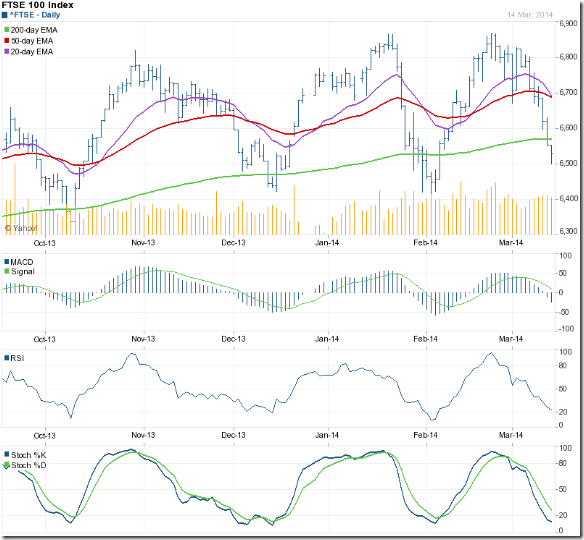
The daily bar chart pattern of FTSE 100 breached the support from its 50 day EMA and the 6700 level on Monday (Mar 10) and then fell sharply below its 200 day EMA – all the way down to the 6500 level before bouncing up a bit.

Daily technical indicators are looking oversold. MACD has dropped into negative territory below its falling signal line. RSI has reached the edge of its oversold zone. Slow stochastic has entered its oversold zone.

The index may pullback towards its 200 day EMA in an effort to return to bull territory. The dip is an adding opportunity.

Improving economic conditions in the eurozone – Britain's largest trading partner – and rising consumer demand drove output and orders higher in the first quarter of the year. However, Britain's trade position worsened in January, as diminishing demand for British goods abroad triggered a fall in exports.

Bottomline? Daily bar chart patterns of S&P 500 and FTSE 100 indices are in the midst of bull market corrections. Regular corrections enable indices to move higher. The dips are providing adding opportunities.

Sunday, March 16, 2014

Sunday musings: there is nothing holy about the colour of money

At a convocation of a local management institute, a businessman had the following words of advice to the graduating students: There are two kinds of women in this world – those who like to be pursued and those who prefer to be left alone. Ma Durga’s two daughters exemplify the difference.

Ma Saraswati (Goddess of Learning) likes to bestow her blessings on any one who pursues her persistently and sincerely. Ma Lakshmi (Goddess of Prosperity) is more choosy – preferring to shower her blessings on those few who are prepared to wait for her arrival at her chosen time. If she feels unwelcome, she doesn’t stay for long.

Not too long ago, India was a poor country but it valued education. The well-educated had a pride of place in society even if they were not wealthy. When Swami Vivekananda visited the USA 120 years ago, he was a penniless monk who depended on the charity of others. But he won the hearts and minds of everyone (save the orthodox Christians) because of his demeanor, knowledge and wisdom.

‘Progress’ has changed our outlook towards life. Education is no longer a lifelong pursuit, but a means to become rich. Many engineers join management institutes and specialise in Finance or Marketing or HR in a race to get hired by an investment bank or a consulting company at seven figure salaries. The engineering degree goes to waste.

Very few doctors are able to diagnose and cure people. They prescribe several tests at a diagnostic centre and prefer to go on foreign junkets bankrolled by drug companies instead of spending their time on learning about latest innovations in their fields of speciality. Unnecessary operations are carried out where a simple regimen of medicines and exercises would suffice.

Semi-educated ruffians join politics and become MLAs and MPs with a single motive – to get immensely wealthy in a short period. Instead of serving the people, they expect people to serve them. They realise too late that amassing money of the wrong colour can turn them into state guests for a long time.

Legendary investors have imparted their experiences and wisdom through thick tomes that clearly chalk out how to go about building wealth through well-planned investments over the long-term. A short-list of such books have been put up on this blog since inception.

How many have read those books? Of the few who have done so, how many have read them more than once? But there has been less hesitation in wasting money on F&O contracts or in chasing after mythical multibaggers in an effort to get rich quickly. 

Most small investors fall into the trap of forsaking Ma Saraswati in the mindless pursuit of Ma Lakshmi - with tragic consequences. Blessings are received from neither.

Related Post

The futile quest for the mythical 'multibagger'

Saturday, March 15, 2014

BSE Sensex and NSE Nifty 50 index chart patterns – Mar 14, 2014

There was good news and bad news last week. First the good news. Both CPI and WPI inflation are coming down - due to lower food prices and higher base effect. The IIP number was marginally positive at 0.1% – not really good, but better than being negative. FIIs were net buyers through the week.

Now the bad news. Russia is refusing to vacate the Crimea region of Ukraine and is trying to annex the region – earlier a part of Russia - through a ‘referendum’. USA and EU have threatened economic sanctions, which have led to a rise in gold’s price and a drop in global stock markets. DIIs were net sellers through the week, and almost matched FII buying.

Several pre-election polls are pointing to a NDA victory – which the market has discounted already. In case of a likely coalition government, there is a possibility that NaMo may not be acceptable as the PM. The current bickering about seat allotments and accommodation of tainted leaders is a sign that all is not well within the BJP.

BSE Sensex index chart

SENSEX_Mar1414

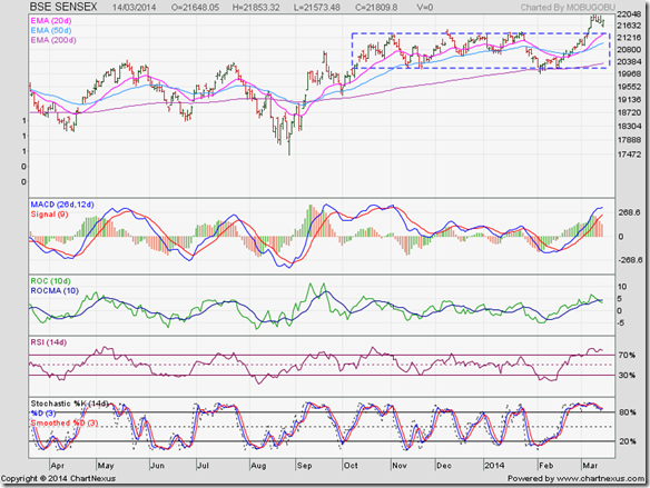
The following remarks were made in last week’s analysis of the daily bar chart pattern of Sensex: “Such sharp break outs are often followed by a pullback to the break out point – which is the top of the rectangle (at about 21400). The pullback – if it occurs – will be a buying opportunity.”

The pullback is in progress and is providing a buying opportunity for those who may have missed out on buying on the upward break out from the rectangle a week ago. Note that the 20 day EMA is at the same level as the top of the rectangle – which should provide good support to the index next week.

Daily technical indicators have started correcting from overbought conditions. MACD is inside its overbought zone, but is in the process of turning down. ROC has crossed below its 10 day MA in positive territory. RSI is inside its overbought zone and forming a small double-top reversal pattern. Slow stochastic is also inside its overbought zone, but has started to slide down.

A test of support from the top of the rectangle is on the cards. If you are still waiting for a big crash to buy at much lower levels, you may have a long wait.

NSE Nifty 50 index chart

Nifty_Mar1414

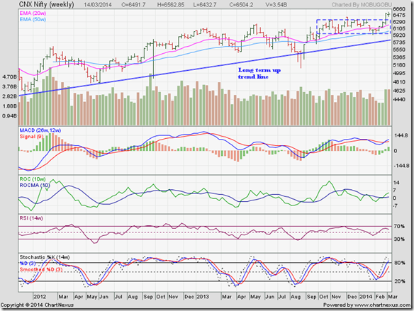
The following comments were made in last week’s analysis of the weekly bar chart pattern of Nifty: “Though Nifty has touched a lifetime high, all four technical indicators are below their Nov ‘13 highs. The negative divergences may lead to a corrective pullback towards the top of the rectangle, which should be used as an adding opportunity.”

After three straight higher weekly closes that culminated in a lifetime high, Nifty’s weekly bar formed a ‘reversal week’ pattern (higher high, lower close) backed by strong volumes. A pullback towards the top of the rectangle has started.

Weekly technical indicators are looking bullish. MACD has crossed above its signal line in positive territory. ROC has crossed above its 10 week MA into positive zone. RSI is above its 50% level, but turning down. Slow stochastic has entered its overbought zone.

Use the pullback to add fundamentally strong stocks to your portfolio.

Bottomline? Chart patterns of BSE Sensex and NSE Nifty indices have started pulling back after breaking out above their respective ‘rectangle’ consolidation patterns. Both indices are in long-term bull markets and should continue to move higher. Use dips to add fundamentally strong stocks. If you are unsure of how to pick stocks, buy units of a good balanced fund.

Wednesday, March 12, 2014

Nifty chart: a mid-week update (Mar 12 ‘14)

Nifty_Mar1214

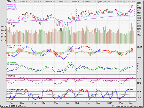
After last week’s fireworks when Nifty broke out on strong volumes above its rectangle consolidation zone of the past 5 months, it has been a time of consolidation in a narrow range. Can there be a pullback down to the top of the rectangle?

Daily technical indicators are inside their respective overbought zones, but showing some signs of a correction. A drop towards the rectangle is a possibility. If it does occur, it will be an adding opportunity.

DIIs have significantly stepped up their selling, and almost matched FII buying this week. That has kept the index from moving higher. Once the selling gets fully absorbed, Nifty should resume its up move.

Sector rotation is visible, but small investors should refrain from moving in and out of different sectors in a bid to maximise returns. More often than not it leads to losses.
Also, going short in anticipation of a big correction is very risky. Going short pays off during a bear phase, because risks are lower. In a bull phase, stay invested and let your portfolio grow.

Tuesday, March 11, 2014

WTI and Brent Crude Oil charts: bears flex their muscles

WTI Crude chart

WTI Crude_Mar1014

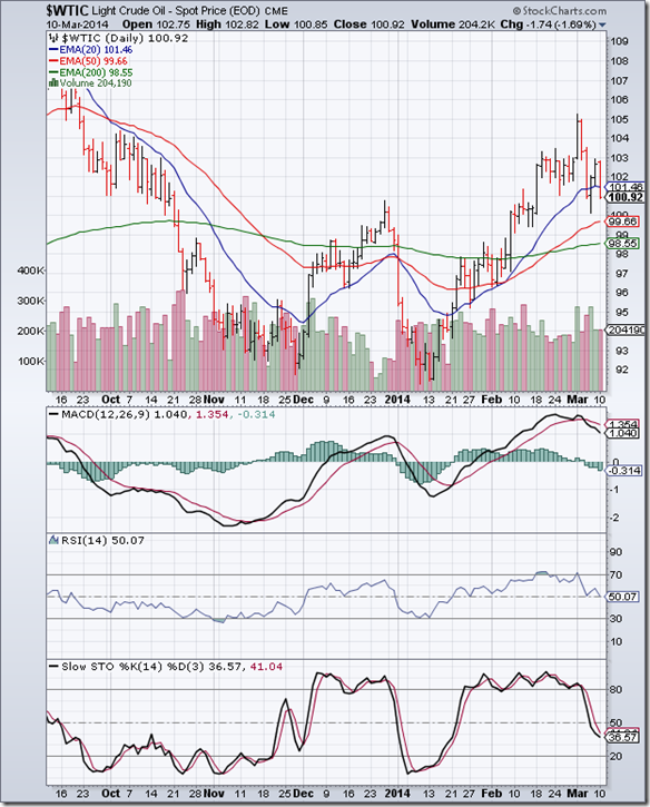
The daily bar chart pattern of WTI Crude oil broke out upwards from a ‘flag’ consolidation pattern to reach the 105 level on Mon. Mar 3 ‘14 – its highest level in 5 months. Volumes were strong – which usually validates an upward break out.

But the break out turned out to be a ‘false’ one. Why? There is a technical reason and a fundamental reason. All three daily technical indicators touched lower tops inside their respective overbought zones while oil price touched a 5 months high. That warned of a possible correction.

Fundamentally, equity prices dropped and commodity prices surged globally due to Russia’s ‘occupation’ of Crimea. When fears of a war subsided, bears came to the fore. Volumes have been strong on down days.

Technical indicators have corrected from overbought zones, and are beginning to turn bearish. MACD is falling below its signal line in positive territory. RSI is seeking support from its 50% level. Slow stochastic has fallen below its 50% level. Oil’s price may correct some more.

The 50 day EMA has crossed above the 200 day EMA – the ‘golden cross’ technically signalling a return to bull territory. On longer-term weekly chart (not shown), oil is trading above all three weekly EMAs. The current dip is providing a buying opportunity.

Brent Crude chart

BrentCrude_Mar1014 

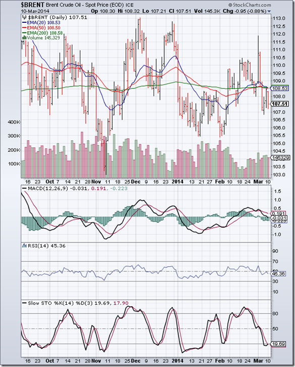
The daily bar chart pattern of Brent Crude oil continues to trade sideways, oscillating about its 200 day EMA. The following suggestion was made in the previous update: “The way to make money in such a situation is to do shorter-term trading (in the range between 104 and 112).”

Note that oil’s price spiked up to 112 on Mon. Mar 3 ‘14 on fears of a war in Ukraine. Bears took the opportunity to sell. All three EMAs have converged together and oil’s price is trading below them. There could be a quick drop towards 104.

Daily technical indicators are looking bearish. MACD is below its falling signal line and has entered negative territory. RSI is below its 50% level. Slow stochastic is trying to emerge from its oversold zone.

On longer-term weekly chart (not shown), oil’s price may move down to test support from its 200 week EMA.

Monday, March 10, 2014

Stock Index Chart Patterns: S&P 500 and FTSE 100 – Mar 07, ‘14

S&P 500 Index Chart

S&P 500_Mar0714

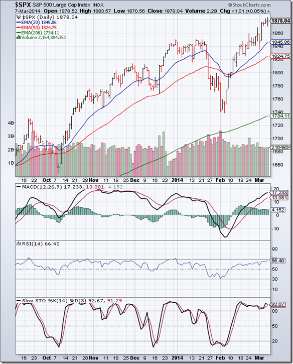
The bull rally from the Feb ‘14 low of 1740 continued unabated. The daily bar chart pattern of S&P 500 rose to touch new lifetime intra-day and closing highs on Mar 7 ‘14. The selling on Mon. Mar 3 – triggered by Russia’s ‘invasion’ of Crimea – subsided after the index received good support from its rising 20 day EMA.

All three EMAs are rising in tandem and the index is trading above them. Bulls are clearly on top. But don’t expect the bears to give further ground without a fight. Several technical indications point to a correction.

Note the volumes. They have been quite flat, with volumes on the 2 down days matching volumes on 3 up days. Volume peaks are coming down as the rally progresses. The index is trading more than 150 points above its 200 day EMA. The last time that happened (in Jan ‘14), a sharp correction followed.
Daily technical indicators are in bullish zones, but looking overbought. MACD is inside its overbought zone and its upward momentum is diminishing. RSI is just below its overbought zone. Slow stochastic has remained inside its overbought zone for almost a month.

The economy keeps growing but sluggishly. New job additions in the private sector and initial jobless claims were lower than expectations. The Services ISM number was also below expectations but showed growth. Looks like the index and the economy are taking QE3 tapering in their strides.
FTSE 100 Index Chart

FTSE_Mar0714

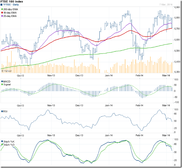
The daily bar chart pattern of FTSE 100 dropped below the 6700 level and its 50 day EMA (on Mon. Mar 3) as news of Russia’s ‘occupation’ of Crimea shook investor confidence. Fears of a war receded the next day. The index jumped up to close above the 6800 level.

By the end of the week, the index slipped down to test support from its 50 day EMA once again. Though it managed to close above the 6700 level, the index lost almost 100 points for the week.

Daily technical indicators have corrected from overbought conditions and are looking bearish. MACD is still positive, but falling below its signal line. RSI has slipped below its 50% level. Slow stochastic is falling rapidly towards its 50% level. A drop below 6672 (intra-day low on Mar 3) will form a bearish pattern of lower tops and lower bottoms.
Bottomline? Daily bar chart patterns of S&P 500 and FTSE 100 indices are in long-term bull markets. S&P 500 managed to shake off fears of a war in Ukraine by touching a new lifetime high, but is looking overbought. FTSE 100 seems to be in the midst of another corrective move. Stay invested, but be ready to face a correction.
Sunday, March 9, 2014

Sunday musings: the Art of Philosophical Investments

As per Wikipedia: Philosophy is the study of general and fundamental problems, such as those connected with reality, existence, knowledge, values, reason, mind, and language. Philosophy is distinguished from other ways of addressing such problems by its critical, generally systematic approach and its reliance on rational argument. In more casual speech, by extension, "philosophy" can refer to "the most basic beliefs, concepts, and attitudes of an individual or group".

By logical extension, “Philosophical Investments” can refer to basic beliefs, concepts and attitudes of an investor towards investments. So, where is the ‘art’ in it? The ‘art’ is in introspecting and analysing your own beliefs, concepts and attitudes towards investments to understand whether you are proceeding along the right path towards building long-term wealth.

A favourite book during my early school days was an abridged edition of the epic “Mahabharata”. The trials and tribulations of the ‘good’ and the relative prosperity of the ‘evil’ are reflected in modern day life as well. The fascination with the epic story continued as I grew older – and had a significant influence over my own beliefs and attitudes.

A couple of questions that bothered me were: Why didn’t Sri Krishna – who is supposed to be an incarnation of God – give his good advice to Duryodhana? Wouldn’t it have prevented the great war at Kurukshetra that decimated both sides?

Turns out Sri Krishna did try to drill some sense into Duryodhana’s brain, but was stumped by Duryodhana’s response, which went somewhat along the following lines: “You don’t need to preach to me about ‘good’ and ‘evil’. I understand the difference. But I have a problem. Despite knowing what is ‘evil’, I have this uncontrollable urge to do ‘evil’ things.”

There is a Duryodhana latent in all of us. We wouldn’t be human otherwise. Why else would we hang on to a stock that is falling like a stone in the hope of getting back our break-even price? Or, enter into an F&O contract just to make some quick profits without knowing the first thing about how to set a stop-loss? Or, buy a stock simply on the recommendation of a friend or an expert without making proper financial and asset allocation plans?

The question you need to ask yourself before you invest a single Rupee is this: Am I in it for the long-term, or am I looking for some easy money and cheap thrills?

If you are serious about long-term wealth building, read investment books, talk to experienced investors and make proper financial and asset allocation plans before jumping into the stock market.

For easy money and cheap thrills, you can always play ‘teen patti’ with your friends on weekends. It will be more enjoyable and you will lose a lot less money.

("The battlefield of Kurukshetra only provides the occasion for the dialogue between Arjuna and Krishna. The real Kurukshetra is the human heart…" ~ M. K. Gandhi)

Saturday, March 8, 2014

BSE Sensex and NSE Nifty 50 index chart patterns – Mar 07, 2014

The trading week began with a whimper and ended with a bang. Russia’s ‘invasion’ of the Crimea region in Ukraine sent global stock indices crashing down on Mon. Mar 3. Markets started recovering from the next day when it became clear that Russia was just flexing its muscles and not really starting a war.

But what caused the sudden spurt in volumes on Fri. Mar 7 as both Sensex and Nifty broke out upwards from the ‘rectangle’ consolidation zones of the past 5 months? Was it FII buying due to the contraction in India’s Current Account Deficit? But the deficit contracted because of import restrictions on gold and reduced import of capital goods due to slowdown in the economy. Those are not positive signs for the stock market.

Did the latest poll projections predicting an NDA win prod bulls to go on a buying spree? Or, was it just a technical break out because buyers overwhelmed sellers – as often happens after a long period of sideways consolidation? May be, all of the above? The reasons are not important.

What is important is that both indices are at lifetime highs in Rupee terms. In US Dollar terms, both indices are more than 20% lower than their levels back in Apr ‘11. That means FIIs are not going to stop buying any time soon.

BSE Sensex index chart

SENSEX_Mar0714

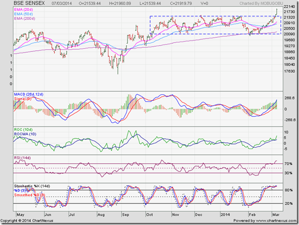
Riding on a strong volume spurt (not shown in chart above), the daily bar chart pattern of Sensex convincingly broke out of the ‘rectangle’ consolidation zone to touch lifetime intra-day, intra-week and daily/weekly closing highs. The increase in volumes provides validity to the break out.

All four technical indicators are looking overbought – so a correction or consolidation may be around the corner. Such sharp break outs are often followed by a pullback to the break out point – which is the top of the rectangle (at about 21400). The pullback – if it occurs – will be a buying opportunity.

Rectangles have measuring implications. The height of the rectangle is about 1300 points. The index should rise 1300 points from the top of the rectangle – to 22700. That is the minimum target. Bull rallies often exceed their targets. Note that the indices don’t understand arithmetic. Targets are based on empirical observations of similar chart patterns.

This is not the time to sell. In a bull market, you make money by staying invested or adding on dips. You sell when there is euphoria all around and index movements make front-page headlines.

NSE Nifty 50 index chart

Nifty_Mar0714

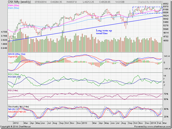
The weekly bar chart pattern of Nifty broke out with a volume spurt above the ‘rectangle’ consolidation zone within which it was trading for the past 5 months. The volume support validates the break out. Nifty should now move up to its first target of 6750, but don’t expect a straight line rally. There is likely to be some correction along the way.

All four technical indicators are in bullish zones but not looking overbought yet. MACD has formed a bullish ‘rounding bottom’ pattern to cross above its signal line in positive zone. ROC has crossed above its 10 week MA into positive territory. RSI and Slow stochastic are above their respective 50% levels, and moving up towards their overbought zones.

Though Nifty has touched a lifetime high, all four technical indicators are below their Nov ‘13 highs. The negative divergences may lead to a corrective pullback towards the top of the rectangle, which should be used as an adding opportunity.

Bottomline? Chart patterns of BSE Sensex and NSE Nifty indices have broken out above their respective ‘rectangle’ consolidation patterns to touch lifetime highs. Increase in trading volumes validated the break outs. Both indices are in long-term bull markets and should continue to move higher. Stay invested, and use any dips to add fundamentally strong stocks.

Thursday, March 6, 2014

Sensex at a new high – which sectors should you pick for investing?

After 5 months of sideways consolidation within a ‘rectangle’ pattern, Sensex appears to have broken out to close at a new lifetime high. Since a previous break out in Dec ‘13 had turned out to be a ‘false’ one, it may take a few more days to convince the doubters of this break out.

From the BSE sectoral charts below, it will be clear that not all sectors are participating equally in the bull market. Some have been frontrunners; others are consolidating or breaking out of consolidations; and a couple are still in bear markets.

There are two ways to play the Sensex bull market break out: (1) stick to the sectors already in a bull run and use dips to add; (2) invest in the sectors that are breaking out of consolidations. Sectors in bear markets should be avoided.

BSE Auto Index

BSE Auto Index_Mar14

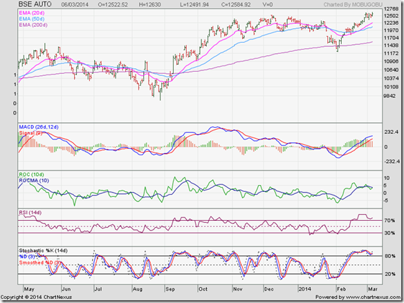
Despite declining auto sales of late, BSE Auto sector is in a bull market. It is consolidating after touching a new high. Daily technical indicators are looking overbought. Some more consolidation can be followed by new highs.

BSE Bankex

BSE BANKEX_Mar14

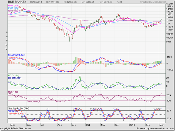
BSE Bankex is moving sideways and desperately trying to stay in bull territory. Technical indicators are looking overbought. Some more correction/consolidation is likely. Private sector banks are performing well. Public sector banks are burdened with NPAs and keeping the sector in limbo.

BSE Capital Goods Index

BSE Capital Goods Index_Mar14

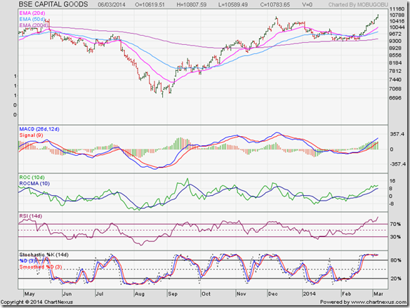
BSE Capital Goods index received good support from its 200 day EMA and has broken out to a new high. Technical indicators are looking overbought, which means a correction/consolidation is around the corner. Stock specific buying recommended.

BSE Consumer Durables Index

BSE Consumer Durables Index_Mar14

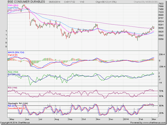
Technically, BSE Consumer Durables index is in a bear market, though the index is trading above its 200 day EMA. Technical indicators are looking overbought. A correction is likely. Wait for a convincing move past 6365 to enter.

BSE FMCG Index

BSE FMCG Index_Mar14

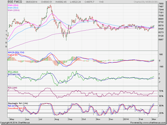
After leading the Sensex till Jul ‘13, BSE FMCG index has been in a sideways consolidation. All three EMAs are converging, which is usually followed by a sharp move. Technical indicators are in bullish zones. The sharp move is likely to be upwards.

BSE Healthcare Index

BSE Healthcare Index_Mar14

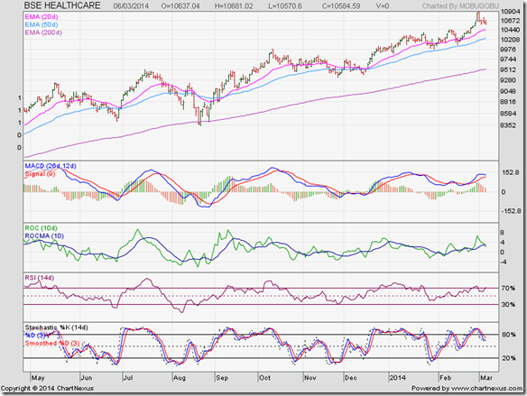
BSE Healthcare index is in a runaway bull market. That means dips can be used to add. Most stocks are trading at high valuations. That doesn’t mean they can’t move even higher. Technical indicators have corrected from overbought conditions but remain in bullish zones.

BSE IT Index

BSE IT Index_Mar14

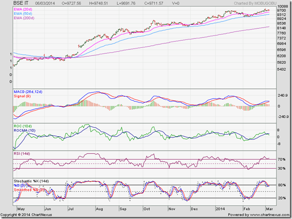
BSE IT index is also in a runaway bull market. Note that all three EMAs had converged in Jun ‘13, followed by a ‘gap up’ upward break out in Jul ‘13. That ‘gap’ has remained unfilled, and is likely to act as support in future.

BSE Metal Index

BSE Metal Index_Mar14

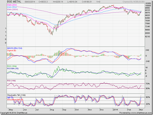
BSE Metal index rallied back into bull territory from its Aug ‘13 low, but formed a ‘rounding top’ bearish pattern to slip below all three EMAs. The index needs to cross above its Feb ‘14 top of 9433 to break out of the current downtrend. Technical indicators are looking bullish.

BSE Oil & Gas Index

BSE Oil & Gas Index_Mar14

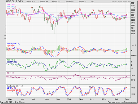
BSE Oil & Gas index has gone nowhere in the past year. It has formed a bullish ‘rounding bottom’ pattern to break out above all three EMAs, but technical indicators have become overbought. A correction is likely.

BSE Power Index

BSE Power Index_Mar14

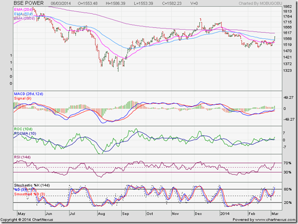
BSE Power index made a couple of forays into bull territory in Dec ‘13 and Jan ‘14. Bears used the opportunities to sell. The sector has too many regulations and is dominated by bankrupt PSUs. Strong reform measures are required to get the sector back on track.

BSE Realty Index

BSE Realty Index_Mar14 sen

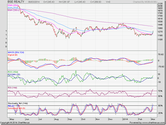
BSE Realty index is in a long-term bear market with not much hope of revival. The only silver lining is that large and respected players like Tata, Mahindra, Godrej are entering the sector, which is dominated by a bunch of crooked entities. Avoid real estate stocks; buy real estate.

Wednesday, March 5, 2014

Nifty chart: a mid-week update (Mar 05, ‘14)

The suspense regarding general election dates are over. Polling will be staggered over 5 weeks from April 7 to May 12, with results announcement on May 16. That sets the stage for a pre-election rally – or, does it?

After the poor Q3 GDP number of 4.7%, came some good news: Q3 Current Account Deficit narrowed to US $4.2 Billion against $5.2 Billion in Q2 and a massive $31.9 Billion a year ago. Restriction on gold imports plus improvement in exports played their parts.

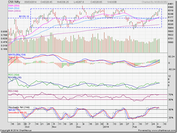
Nifty has surged to the upper edge of the rectangle within which it has been consolidating for 5 months – thanks to renewed buying by FIIs. Will it finally break out of the rectangle, or will it continue to consolidate within it?

Nifty_Mar0514

All technical signs appear to be bullish. Technical indicators are in bullish zones, though RSI and Slow stochastic are looking overbought. The 20 day EMA has crossed above the 50 day EMA after forming a bullish ‘rounding bottom’ pattern. All three EMAs are rising and the index is trading above them.

Logically, Nifty should break out above the rectangle soon. But the stock market moves on sentiment rather than logic in the near term. It was negative sentiment due to Russia’s ‘occupation’ of Crimea that caused a drop on Monday (Mar 3). As war tensions eased on Tuesday, sentiment turned positive and Nifty resumed its rally.

In candlestick parlance, Nifty may be forming an ‘evening star doji’ which can lead to a trend reversal. So, a break out may occur only after a correction. The likely dip can be bought.

Since rectangles tend to be unreliable, it is better to wait for the eventual break out. Note the ‘false’ break out that occurred on Dec 9 ‘13. An upward break out should be accompanied by a significant increase in volumes.

Tuesday, March 4, 2014

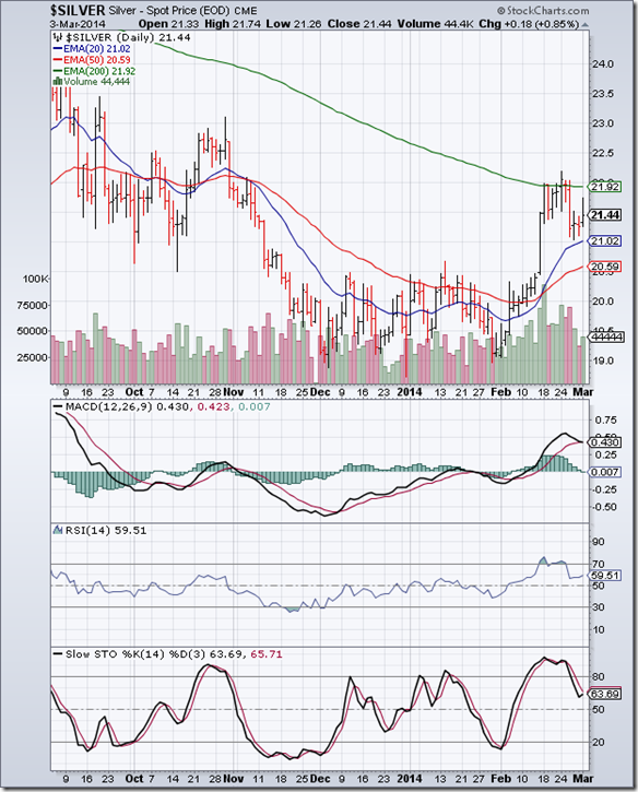
Gold and Silver charts: bulls gaining control?

Gold Chart Pattern

Gold_Mar0414

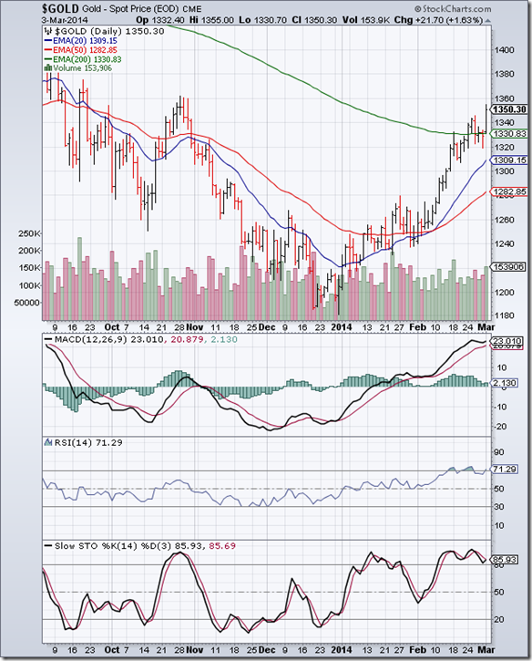
For the first time in more than a year, the daily bar chart pattern of gold crossed above its 200 day EMA last week to a 4 months high – only to form a ‘reversal day’ pattern (higher high, lower close) on Wed. Feb 26 and slip below its long-term moving average.

All three technical indicators were inside their overbought zones, with RSI and Slow stochastic forming ‘double top’ reversal patterns. Just when it appeared that the 2 months long rally was coming to an end, Russia ‘invaded’ the Crimea region of Ukraine sending global stock markets crashing down.

Gold’s price soared above the 1350 level into bull territory. Is the bear market finally coming to an end? Or is it another bear market rally that will trap unwary bulls? Let us look at some of the technical signals.

All three technical indicators are in their overbought zones, and showing negative divergences by failing to touch new highs with gold’s price. A pullback towards the 200 day EMA is likely. Will the pullback be a buying opportunity? Depends on your investment outlook and whether gold’s price manages to remain above its 200 day EMA or not.

The 20 day EMA has crossed above its 50 day EMA and both are rising; the 50 day EMA has formed a bullish ‘rounding bottom’ pattern. These are bullish signs. But till the 50 day EMA can cross above the 200 day EMA (‘golden cross’), gold will technically remain in a bear market.

In case gold’s price bounces off its 200 day EMA and moves higher, expect strong resistance from the zone between 1425 and 1525. Bulls have their work cut out.

On longer term weekly chart (not shown), gold’s price is facing resistance from its falling 50 week EMA and is trading 40 points below its sliding 200 week EMA. Bears may appear to be losing control in the near term, but the long-term bear market is still intact.

Silver Chart Pattern

Silver_Mar0414

The daily bar chart pattern of silver closed above its 200 day EMA on Mon. Feb 24 for the first time in more than a year. Bears used the opportunity to press sales. Silver’s price dropped to the 21 level, where it received good support from its rising 20 day EMA.

All three technical indicators have corrected from overbought conditions but remain in bullish zones. Bulls may try to break out above the 200 day EMA once again.

On longer term weekly chart (not shown), silver is trading below its 50 week and 200 week EMAs in a long-term bear market.

Monday, March 3, 2014

Stock Index Chart Patterns: S&P 500 and FTSE 100 – Feb 28, ‘14

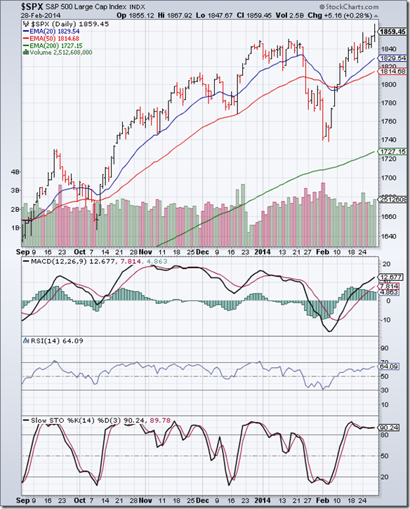
S&P 500 Index Chart

S&P 500_Feb2814

The 6 months daily bar chart pattern of S&P 500 rose to touch new lifetime and closing highs on Fri. Feb 28 ‘14. The bull rally seems to be unstoppable. All three EMAs are rising and the index is trading above them. Volumes have started to pick up.

Technical indicators are bullish, but beginning to look overbought. MACD is rising above its signal line in positive territory and is about to enter its overbought zone. RSI is gradually moving up towards its overbought zone. Slow stochastic is inside its overbought zone, but showing negative divergence by failing to touch a new high along with the index.

War drums are beating in Crimea, as Russia has sent soldiers into Ukraine in a bid to overturn the new regime. Whether war will actually break out or not is debatable. But the concern has sent oil and gold prices soaring and stock prices crashing globally. At the time of writing this post, the index has started to correct.

Book partial profits.

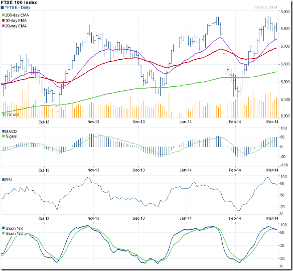
FTSE 100 Index Chart

FTSE_Feb2814

The 6 months daily bar chart pattern of FTSE 100 reached within a point of its Jan ‘14 top (of 6867) on Tue. Feb 25 ‘14, but formed a ‘reversal day’ pattern (higher high. lower close) and started to correct.

The index received good support from its rising 20 day EMA and closed the week above the 6800 level. Daily technical indicators reached their respective overbought zones that warned about a possible correction.

At the time of writing this post, the correction has gathered strength on fears of a possible war in Ukraine. The index has lost more than 100 points and is struggling to stay above the 6700 level.

Bottomline? Daily bar chart patterns of S&P 500 and FTSE 100 indices are again facing bull market corrections, this time only partly due to technical reasons. Concerns about a war in Ukraine has made bulls jittery. Time to take some profits off the table.

Sunday, March 2, 2014

BSE Sensex and NSE Nifty 50 index chart patterns – Feb 28, 2014

Bad news on the economic front keeps piling up. Contraction in industrial production and slowdown in capital expenditure due to high interest rates led to a lower than expected Q3 GDP growth rate of 4.7%. Fiscal deficit during Apr ‘13 to Jan ‘14 has already exceeded the target for the whole year.

The good news is that the services and export sectors are growing. In a bid to boost production, the government has cleared a slew of projects under the ministries of road and shipping. That may not have much effect on GDP growth for this financial year.

For the month of Feb ‘14, FIIs were net buyers once again after being net sellers in Jan ‘14. Even DIIs were net buyers for the first time since Aug ‘13. The net buying by FIIs and DIIs contributed to the strong rallies visible in Feb ‘14 on Sensex and Nifty charts below.

BSE Sensex index chart

SENSEX_Feb2814

Sensex overcame the resistance from the 20750 level – which is the mid-point of the rectangle – to move up close to the top edge of the ‘rectangle’ within which it has been consolidating for 5 months.

The index is trading above all three EMAs and is back in bull territory. The 20 day EMA has formed a bullish rounding bottom pattern and is ready to cross above the 50 day EMA.

Daily technical indicators are bullish, but looking overbought. MACD is rising sharply above its signal line in positive territory. The signal line has formed a bullish ‘rounding bottom’ pattern. ROC is moving up towards its overbought zone above its rising 10 day MA. RSI has just entered its overbought zone, where it doesn’t like to stay for long. Slow stochastic is well inside its overbought zone.

Expect some profit booking to emerge as Sensex approaches to test the 21350 level – which is the top edge of the ‘rectangle’. A break out above the rectangle should be accompanied by a significant increase in volumes, otherwise the break out may turn out to be a false one (like in Dec ‘13).

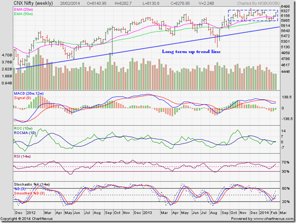
NSE Nifty 50 index chart

Nifty_Feb2814

The weekly bar chart pattern of Nifty is trading above both its 20 week and 50 week EMAs in a bull market and closed more than 120 points higher for the week. Trading volumes remain a concern. Without a pick up in volumes, the rally may taper off as the index approaches the top edge of the ‘rectangle’ (at about 6350).

Weekly technical indicators are turning bullish. MACD is forming a bullish ‘rounding bottom’ pattern in a bid to cross above its falling signal line in positive zone. ROC is facing resistance from its falling 10 week MA at the ‘0’ line. RSI has moved above its 50% level. Slow stochastic has climbed towards its 50% level, but hasn’t crossed it yet.

Expect the index to test the upper edge of the ‘rectangle’ in an effort to break out above it. If it does break out, there should be a spurt in volumes. Otherwise the break out may be a ‘false’ one (like in Dec ‘13).

Bottomline? Chart patterns of BSE Sensex and NSE Nifty indices seem to be getting ready to break out above their respective ‘rectangle’ consolidation patterns. An increase in trading volumes will be the key. Both indices are in long-term bull markets. Use dips to add fundamentally strong stocks.