Friday, February 28, 2014

WTI and Brent Crude Oil charts: an update

WTI Crude chart

WTI Crude_Feb2714

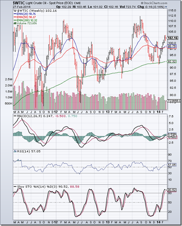
The 3 years weekly bar chart of WTI Crude oil has been in a bull market, which is technically indicated by a rising 200 week EMA and the 50 week EMA staying above the 200 week EMA throughout. The 20 week EMA has criss-crossed the 50 week EMA, which is an indication of shorter-term fluctuations.

Note that oil’s price dropped below its 200 week EMA into bear territory several times. But the long-term bull market remained intact because the 50 week EMA never dropped below the 200 week EMA (‘death cross’).

The strategy to follow in a long-term bull market is to buy the dips. Quite a few buying opportunities were provided when oil’s price dropped below its 50 week EMA.

Weekly technical indicators are looking bullish. MACD has just entered positive territory above its signal line. RSI has moved above its 50% level, but its upward momentum is receding. Slow stochastic is inside its overbought zone, but turning down. There may be some correction or consolidation in the near term.

Brent Crude chart

BrentCrude_Feb2714

The 3 years bar chart pattern of Brent Crude oil has been in a long-term bull market, as it is trading above its rising 200 week EMA. The 50 week EMA has remained above the 200 week EMA throughout.

Note that for the past 2 years, oil’s price has been consolidating sideways within a large symmetrical triangle – forming higher bottoms and lower tops. The way to make money in such a situation is to do shorter-term trading (in the range between 104 and 112).

Weekly technical indicators are mildly bearish. MACD and its signal line are entangled together and moving sideways just below the ‘0’ line. RSI and Slow stochastic have slipped below their respective 50% levels. The consolidation is likely to continue some more.

Wednesday, February 26, 2014

All you want to know about the ‘Vote on Account’ – a guest post

All pre-election market surveys are pointing to the end of UPA’s 10 year stint at running the central government. General elections are around the corner. If the surveys are to be believed, an NDA-led coalition is most likely to form the next government.

In an election year, it makes no sense for the Finance Minister to present a comprehensive budget. Instead, a ‘Vote on Account’ is presented to Parliament for approval of the present government’s expenditure till the new government takes over. The new Finance Minister will then announce a full budget.

More often than not, the ‘Vote on Account’ is a non-event as the present government’s policies are carried forward for a short period of time. At best, some tinkering with existing policies are done to alleviate problems in a few areas. That is precisely what the Finance Minister did.

In this month’s guest post, Nishit takes a look at some of the measures announced, and the likely effect on the stock market.

------------------------------------------------------------------------------------------------------------------------------------------

The interim Budget has come and gone. So, how does one read into it? First of all, what is the interim budget or vote-on-account? It is merely a permission taken by the Government from the Parliament to continue with its expenses for a limited period of time.

This is because there will be a new Government sworn in by end of May and it would be the prerogative of that Government how they want to decide the economic policies for India. Typically in vote-on-account, no major decisions are taken and it is basically a continuation of the status quo.

A few things do stand out in this year’s vote-on-account. First, excise duty reduction of 4% on the sale of automobiles. Now, this is a major relief to the Automobile sector and also a car buyer’s dream. The last time such an exemption was allowed was in March 2008. Assuming a car is costing about Rs 6 lakhs, there is a straight saving of up to Rs 24000. Also, to be noted is that this exemption is only till June. Whether it continues in the full year budget is the next government’s prerogative.

If anyone is planning to change their vehicle in the next 1 year, next 3 months is the time to do it. During the months of April-May, car companies offer larger discounts since the March-end rush to gain depreciation benefits is out of the way.

There is a further 2% excise duty reduction on white goods like AC, refrigerators and Mobile Phones. Now, these translate into miniscule reductions of say Rs 600 on an AC worth Rs 30000. So, this is purely a sentiment booster.

The Government has done financial jugglery of containing the fiscal deficit to 4.6% by rolling over subsidies worth about Rs 35000 Crores to be paid to Oil Marketing companies to the next year. This helps achieve the target fiscal deficit number and shifts the subsidy headache on to the next Government.

Also, a lower CAD (Current Account deficit), the difference between dollars earned and dollars spent, of US $45 Billion will help the Rupee become stronger.

All in all, a budget that had nothing great to offer but which also did not offer too many populist measures. All eyes would now be on the first budget by the new Government.

If the Finance Minister had gone in for a populist budget, the market could have tanked. Now, as I see it, the chances of a full fledged market crash before the elections is fading and seems far less likely. The next 3 months could see range bound stock specific moves in the markets.

------------------------------------------------------------------------------------------------------------------------------------------

(Nishit Vadhavkar is a Quality Manager working at an IT MNC. Deciphering economics, equity markets and piercing the jargon to make it understandable to all is his passion. "We work hard for our money, our money should work even harder for us" is his motto.

Nishit blogs at Money Manthan.)
Monday, February 24, 2014

Stock Index Chart Patterns: S&P 500 and FTSE 100 – Feb 21, ‘14

S&P 500 Index Chart

S&P 500_Feb2114

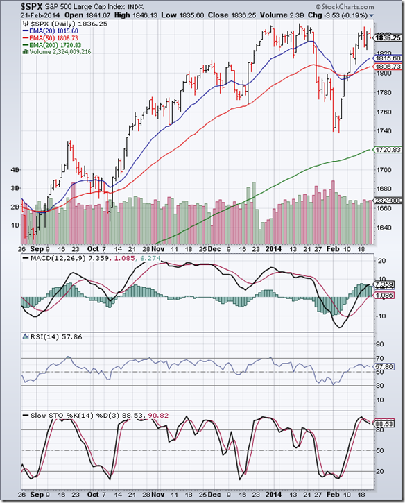
In a holiday-shortened week, the 6 months bar chart pattern of S&P 500 consolidated sideways and closed marginally lower for the week. The Jan ‘14 top of 1851 was tested twice without getting breached. All three EMAs are rising with the index trading above them.

The consolidation should help bulls to gather strength to push the index to a new lifetime high. However, volumes remain a concern. On the two down-days during the week, volumes were higher. Is the ‘smart money’ using the rally to bail out?

Daily technical indicators are looking bullish. MACD is rising above its signal line in positive territory. RSI is moving sideways above its 50% level. Slow stochastic is inside its overbought zone, but slipping a little. Stay invested.

Economic news continues to be mixed. Housing starts and existing home sales dipped – but blame it on the unusually harsh winter. Rail traffic has softened. Initial claims of unemployment was slightly higher than expected at 336,000. Manufacturing data was a bit more encouraging.

FTSE 100 Index Chart

FTSE_Feb2114

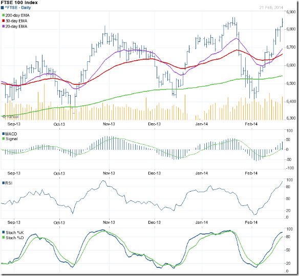
The following were the concluding comments in last week’s analysis of the daily bar chart pattern of FTSE 100: “Technical ‘health’ of the chart has been restored. Time to add to existing holdings.” The index sailed past the 6700 and 6800 levels before pausing just short of the Jan ‘14 top of 6867.

All three EMAs are rising and the index is trading above them. Bulls will regain complete control after the index crosses above its Jan ‘14 top. Some correction/consolidation is possible before that.

Daily technical indicators are bullish, but looking overbought. MACD is rising above its signal line and is just below the edge of its overbought zone. RSI and Slow stochastic are well inside their respective overbought zones, with the Slow stochastic showing signs of slowing upward momentum.

Bottomline? Daily bar chart patterns of S&P 500 and FTSE 100 indices have recovered from sharp bull market corrections, and look ready to climb higher. Both indices are very close to previous tops. Some caution is advised. Stay invested, but maintain stop-losses.

Sunday, February 23, 2014

BSE Sensex and NSE Nifty 50 index chart patterns – Feb 21, 2014

FIIs were net buyers during all 5 days of the week – for the first time in Feb ‘14. However, they remain net sellers in Feb ‘14. DIIs have turned net sellers. Forex reserves were up by $1.45 Billion. Glaxo Pharma’s ongoing open offer should add to the forex kitty.

The selling in emerging markets by FIIs seems to have abated, but the subsequent buying hasn’t been strong enough to move Sensex and Nifty out of their rectangular consolidation zones. Both indices are trading above their long-term moving averages. Fears of a big crash have subsided.

With Q3 results out of the way, all eyes will be on the forthcoming general elections. The latest opinion polls show that NDA is likely to gain more seats at the expense of UPA, but may fall about 35-40 seats short of a majority. The uncertainty of either a hung parliament or a weak coalition is keeping buying interest in check.

BSE Sensex index chart

SENSEX_Feb2114

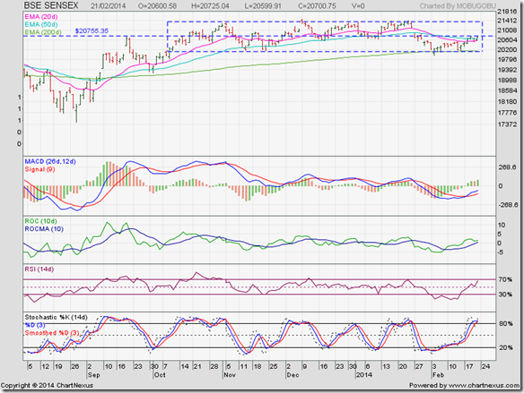
The daily bar chart pattern of Sensex is struggling to climb above its 20 day and 50 day EMAs because of resistance from the 20750 level (which happens to be at the middle of the rectangle). It is often seen on price charts that the mid-point of a rectangle acts as a support/resistance level.

Daily technical indicators are looking bullish. MACD has crossed above its signal line in negative zone, with the signal line forming a bullish ‘rounding bottom’ pattern. ROC is positive and above its 10 day MA, which has formed a ‘rounding bottom’ bullish pattern. RSI has moved up to the edge of its overbought zone. Slow stochastic is inside its overbought zone, but showing a slowdown in upward momentum.

The index may try to cross above the 20750 level, but is unlikely to break out from the rectangle in a hurry. Hold on to your portfolios or add selectively.

NSE Nifty 50 index chart

Nifty_Feb2114

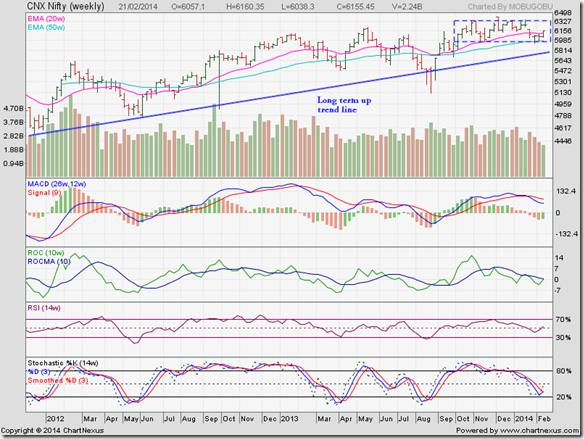
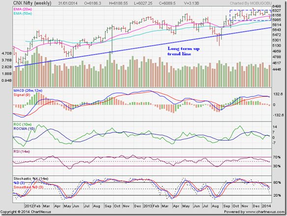
The weekly bar chart pattern of Nifty has closed above its 20 week and 50 week EMAs in a clear sign that bulls are regaining control. However, sliding volumes raises concerns that Nifty may not be able to break out above the rectangular consolidation zone any time soon.

The long-term up-trend line (in blue) is intact, which means the up-trend that started from the low touched back in Dec ‘11 remains in force. There is an old stock market adage: “The trend is your friend.” Remember it.

Weekly technical indicators are beginning to give bullish signals. MACD is falling below its signal line in positive territory, but not as rapidly as earlier. ROC is about to cross above its 10 week MA into positive territory. RSI has moved above its 50% level. Slow stochastic has bounced up from near the edge of its oversold zone.

Bottomline? Chart patterns of BSE Sensex and NSE Nifty indices continue to trade within ‘rectangle’ consolidation patterns. Longer they consolidate, stronger will be the eventual breakout. Both indices are in long-term bull markets. Dips provide opportunities to add fundamentally strong stocks. Maintain suitable stop-losses in case bears become active.

Friday, February 21, 2014

IT Sector stocks – an update

Despite the global economic slowdown, or perhaps because of it, IT sector companies have been relative outperformers in the Indian stock market. Devaluation of the Rupee against the US Dollar has been an added boon.

Large-cap IT stocks have done particularly well. Mid-cap IT stocks haven’t been far behind. But small-cap stocks in general have faced a rough time. In the IT sector, retaining talent is a challenge. That is where smaller companies are at a disadvantage.

IT services remain the major revenue earner. Consulting business is yet to catch on in a big way. With increasing visa impediments – particularly in the USA - the larger companies have focussed on offshore and India businesses. Software product development activity is mostly limited to MNCs.

HCL Tech

HCL Tech_Feb14

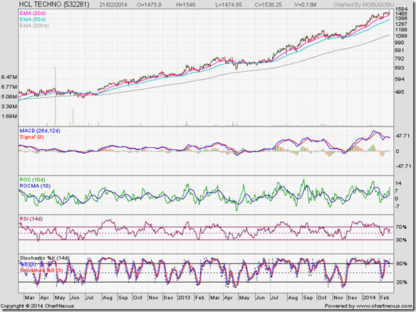
The stock has gained more than 200% since the bull run began back in Aug ‘12. Daily technical indicators have corrected from overbought conditions but showing negative divergences by failing to touch new highs with the stock price. There are rumours of a stake sale. May be a good idea to take some profits home.

Infosys

Infosys_Feb14

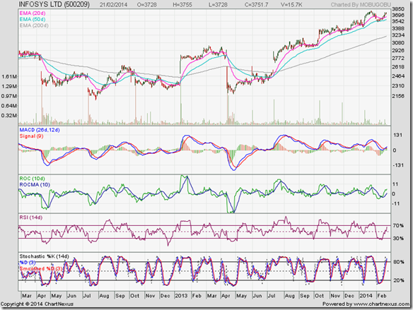
Lack of leadership and so-so performance kept the stock in a sideways range till Narayanamurthy took back the reins. Lot of top-level executive departures have put a question mark on succession issues. The market is obviously encouraged by an improvement in performance.

KPIT Cummins

KPIT Cummins_Feb14

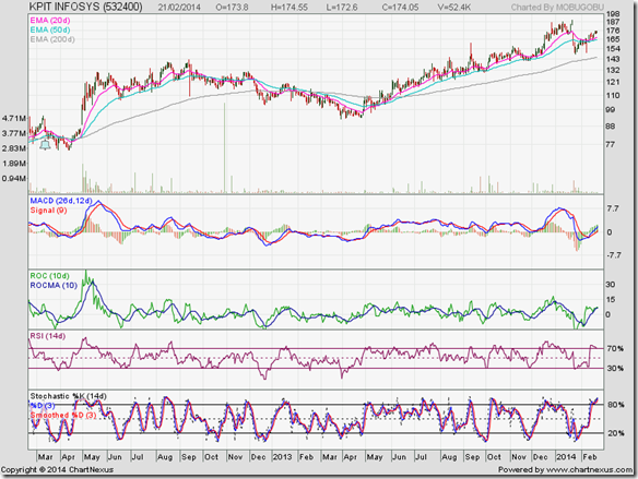
After an 8 months bear phase (from Sep ‘12 to Apr ‘13), the stock is back in a bull market. Q3 result disappointed the market, causing a sharp fall. Can be added on dips.

Mindtree

Mindtree_Feb14

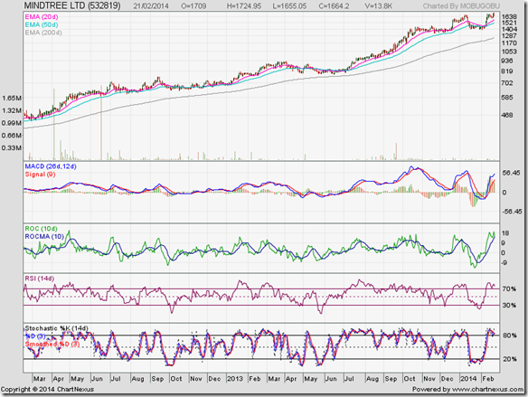
The stock is in a terrific bull run, gaining 300% in the past 2 years. Founder and CEO Ashok Soota’s departure has been long forgotten. The stock is looking overbought and ripe for a correction. Dips can be used to add.

MPhasis

Mphasis_Feb14

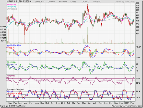
This stock has gone nowhere in the past 2 years. Likely drop in business from parent HP and possibility of sale of HP’s entire stake has kept the stock price in a sideways range. Avoid.

Oracle Financials

Oracle Fin_Feb14

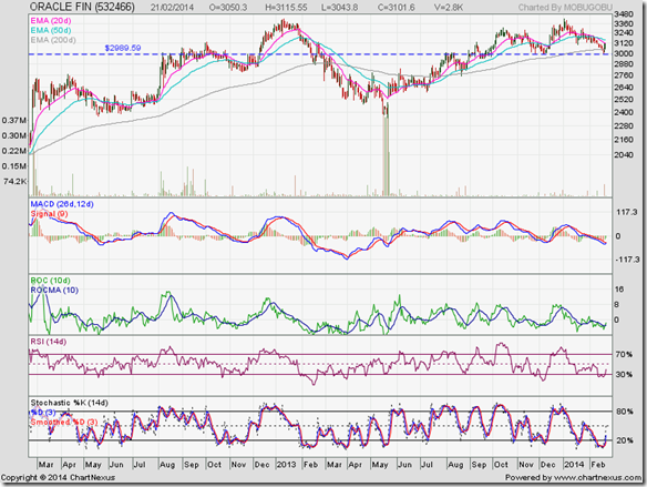
The stock price is undergoing a correction after touching 3400 in Jan ‘14 – its previous top was also 3400 touched in Jan ‘13. If the stock price falls below the support/resistance level of 2990, the possibility of a bearish double-top pattern may open up.

Tata Elxsi

Tata Elxsi_Feb14

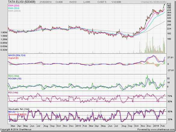
After a prolonged sideways consolidation that tested the patience of most investors, the stock has broken out sharply and tripled in 5 months. Daily technical indicators are looking overbought. Part profits can be booked.

TCS

TCS_Feb14

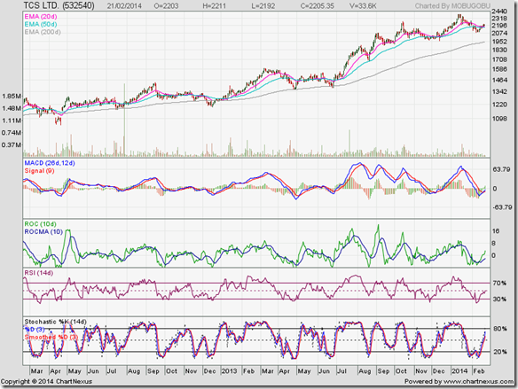
The ‘big daddy’ of IT companies has been in a steady bull market with frequent corrections that have kept the chart ‘healthy’. This is a stock that every investor should have in their portfolio. All dips are adding opportunities.

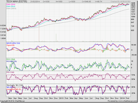
Tech Mahindra

Tech Mahindra_Feb14

It is a great credit of the M&M management that Satyam Computers has been so well integrated with the company, turning Tech Mahindra’s stock into an outperformer with gains of more than 200% in 2 years. Add on dips.

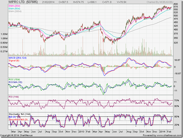
Wipro

Wipro_Feb14

Even after sorting out management issues, Wipro’s performance has been tepid. The stock has returned to a bull market, but gains have been moderate. Switch.

Related Post

IT Sector stocks – time to change the game plan?

Wednesday, February 19, 2014

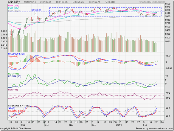
Nifty chart: a mid-week update (Feb 19, ‘14)

The Finance Minister presented a ‘Vote on Account’ rather than a full budget because 2014 is an election year. It was expected to be a non-event and it was. Barring some sops to the struggling auto industry and some lofty target setting for tax collections, there wasn’t much to get excited about.

So, why has the Nifty rallied for 4 straight days? No prizes for guessing that FIIs have again turned net buyers, while DIIs have turned net sellers. Trading volumes haven’t been great, which raises questions about the sustainability of the rally.

The good news is that Nifty has closed above its 20 day and 50 day EMAs. It has retraced 50% of its fall from the Jan ‘13 peak of 6355 to the Feb ‘14 trough of 5933. Both are bullish signs. The bad news is that the index has not yet crossed the half-way point between the upper and lower edges of the ‘rectangle’ within which it has been consolidating since Oct 9 ‘13.

Nifty_Feb1914

What is the significance of the half-way point of the ‘rectangle’? For explanation, a dotted horizontal line has been drawn through the middle of the ‘rectangle’ (at 6160). In one of those coincidences visible on many price charts, note how this particular level has acted as a support/resistance level.

Daily technical indicators are turning bullish. MACD has crossed above its signal line in negative territory. The signal line is in the process of forming a bullish ‘rounding bottom’ pattern. ROC has crossed above its 10 day MA into positive territory, but its upward momentum has slowed down. The 10 day MA has formed a bullish ‘rounding bottom’ pattern. RSI has crossed above its 50% level. Slow stochastic has just entered its overbought zone.

Bulls have successfully defended the lower edge of the ‘rectangle’, as the index didn’t close below the ‘rectangle’ even for a single day. But the current rally is lacking buying support. Expect some more consolidation within the ‘rectangle’ till political alignments for the election become clearer.

Tuesday, February 18, 2014

Gold and Silver charts: an update

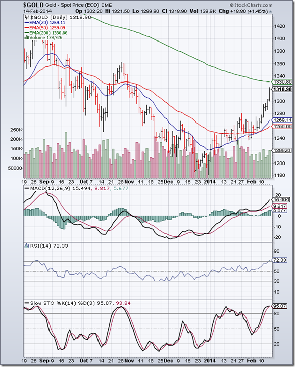
Gold Chart Pattern

Gold_Feb1714

The daily bar chart pattern of gold has been rallying strongly for the past 8 trading sessions – gaining almost 140 points from its Dec ‘13 low. The 20 day EMA has crossed above the 50 day EMA. The 50 day EMA has formed a saucer-like ‘rounding bottom’ pattern which has bullish implications.

Has the long bear phase since the Sep ‘11 top come to an end? Technically, the answer is: Not yet. The 200 day EMA is still falling and gold’s price is yet to cross above it. Daily technical indicators are looking overbought, which means a price correction may be around the corner.

If gold’s price touches a higher bottom (than its previous bottom of 1240) after the likely correction and resumes its up move past its 200 day EMA, the bear phase may come to an end. If 1240 is breached on the way down, bears are likely to regain control.

On longer-term weekly chart (not shown), gold’s price has risen above its 20 week EMA but is trading below its falling 50 week and 200 week EMAs. Bulls still have a lot of work to do.

Silver Chart Pattern

Silver_Feb1714

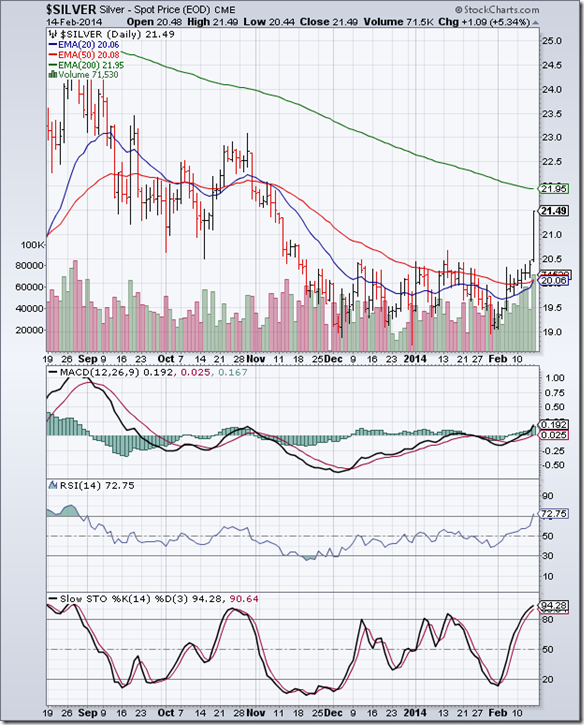
The daily bar chart pattern of silver shows a sharp jump towards its falling 200 day EMA, backed by strong volumes. The 20 day EMA is about to cross above its 50 day EMA, which is bullish in the near term.

However, daily technical indicators are looking overbought. MACD has risen above its signal line into positive territory. RSI and Slow stochastic have entered their respective overbought zones. Some price correction is likely before silver can continue with its up move.

On longer term weekly chart (not shown), silver’s price is above its 20 week EMA but below its falling 50 week and 200 week EMAs. It is too early to call an end to the bear market.

Monday, February 17, 2014

Stock Index Chart Patterns: S&P 500 and FTSE 100 – Feb 14, ‘14

S&P 500 Index Chart

S&P 500_Feb1414

In last week’s analysis of the daily bar chart pattern of S&P 500, the following remarks were made: “The index has retraced more than 50% of its fall from the Jan 15 top of 1851 to the Feb 5 low of 1738. The correction appears to be over. The long-term bull market is intact.”

The index easily climbed past its 20 day and 50 day EMAs to touch an intra-day high of 1842 on Fri. – just 9 points short of its lifetime high of 1851. The 20 day EMA has crossed above the 50 day EMA. Bears appear to be out for the count.

Volumes remain a concern though. The 100 points rally from previous week’s low of 1738 was accompanied by falling volumes. Rallies require good volume support to sustain.

Daily technical indicators are looking bullish. MACD has crossed above its signal line and entered positive territory. RSI has moved above its 50% level. Slow stochastic has entered its overbought zone. A rise past 1851 should restore complete control to bulls.

Add/hold existing positions.

FTSE 100 Index Chart

FTSE_Feb1414

The daily bar chart pattern of FTSE 100 faced a couple of days’ resistance from its 20 day EMA before smartly moving above its 20 day and 50 day EMAs. On Wed. Feb 12, the index touched an intra-day high of 6708 – retracing more than 50% of its fall from the Jan 21 high of 6867.

Profit booking briefly dropped the index below its 20 day and 50 day EMAs on Thurs. But the index managed to close above all three EMAs by the end of the week.

Daily technical indicators are flashing bullish signals. MACD is still negative, but is rising above its signal line. RSI and Slow stochastic have risen above their respective 50% levels. Bulls are back on the driver’s seat.

Technical ‘health’ of the chart has been restored. Time to add to existing holdings.

Bottomline? Daily bar chart patterns of S&P 500 and FTSE 100 indices are back in bull territories after recovering from strong bear attacks. The corrections have improved the technical ‘health’ of the charts. Both indices should move to new highs. Add/hold.

Saturday, February 15, 2014

BSE Sensex and NSE Nifty 50 index chart patterns – Feb 14, 2014

Lower food prices caused a percentage point drop in both WPI and CPI inflation to multi-month lows. RBI may be inclined to keep interest rates unchanged though GDP growth remains below 5%. Once food prices start increasing again during the summer months, inflation is likely to creep up again.

A few large corporates announced good Q3 results during the week. SBI and DLF were not among them. Expectedly, smaller companies are bearing the brunt of the economic slowdown. Signs of pick up in growth in Germany and France were cheered by global markets.

FII and DIIs were net sellers during the week – but the amounts were small. Sensex and Nifty are now into the 5th month of rectangular sideways consolidations – seeking support from the lower edges of their respective rectangles. Will the supports hold? Let us look at the charts below.

BSE Sensex index chart

SENSEX_Feb1414

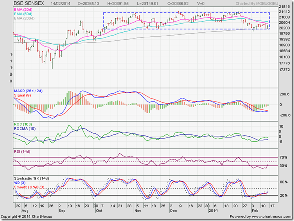
The weak rally on the daily bar chart pattern of Sensex faced resistance from its falling 20 day EMA and dropped to the lower edge of the rectangle – where it also received support from its 200 day EMA. That is the good news.

The bad news is that FIIs are still selling, though they were net buyers on Wed. and Thurs. If they continue to sell, the 200 day EMA will be breached. Investor sentiment continues to be negative, and the index is facing sharp intra-day volatility.

Daily technical indicators are in bearish zones, but showing signs of correcting oversold conditions. MACD is deep inside negative territory and moving sideways below its falling signal line. ROC is also moving sideways in negative zone, but is above its 10 day MA and trying to enter positive territory. RSI has emerged from its oversold zone after 8 trading sessions. Slow stochastic is attempting to move up towards its 50% level.

Add or hold on to existing portfolios, but maintain stop-losses in case bears renew their selling.

NSE Nifty 50 index chart

Nifty_Feb1414

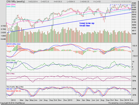
The weekly bar of Nifty stayed between its two weekly EMAs – facing resistance from the 20 week EMA and getting good support from the 50 week EMA and the lower edge of the rectangle within which the index has been consolidating for more than 4 months.

The long-term up trend line (in blue) is rising, with the index trading above it. Despite all the scams, poor governance, high inflation, low growth, poor investor sentiment, the index is in a long-term bull market. Remember the old saying: Bull markets ‘climb a wall of worries’.

Weekly technical indicators are looking bearish. MACD is falling below its signal line in positive territory. ROC is below its 10 week MA in negative zone and moving down towards its oversold zone. RSI is below its 50% level, but trying to turn up. Slow stochastic is about to enter its oversold zone.

A drop towards the blue up-trend line – currently at about 5800 – is a possibility. Bulls are likely to defend the lower edge of the rectangle (at 5970).

Bottomline? Chart patterns of BSE Sensex and NSE Nifty indices are trading within ‘rectangle’ consolidation patterns. Both indices are in long-term bull markets. Dips are opportunities to add fundamentally strong stocks to your portfolios. But maintain suitable stop-losses in case more selling pressure emerges.

Wednesday, February 12, 2014

Nifty chart: a mid-week update (Feb 12, ‘14)

The IIP number was –0.6%, which means a contraction in India’s industrial production for the third straight month. But it was better than the consensus estimate of –0.8%. There was some good news too.

CPI inflation for Dec ‘13 was 8.79% – lower by more than a percentage point from the previous month – thanks to moderation in food prices. Exports rose and imports contracted, helping to reduce the current account deficit. The Rupee gained a bit against the US Dollar.

Tata Motors and Tata Steel positively surprised the market with their Q3 results. But that didn’t boost their stock prices much. Nifty has recovered almost 170 points from last week’s low of 5933, mainly because of DII buying support. FIIs have been in profit booking mode in Feb. 

Nifty_Feb1214

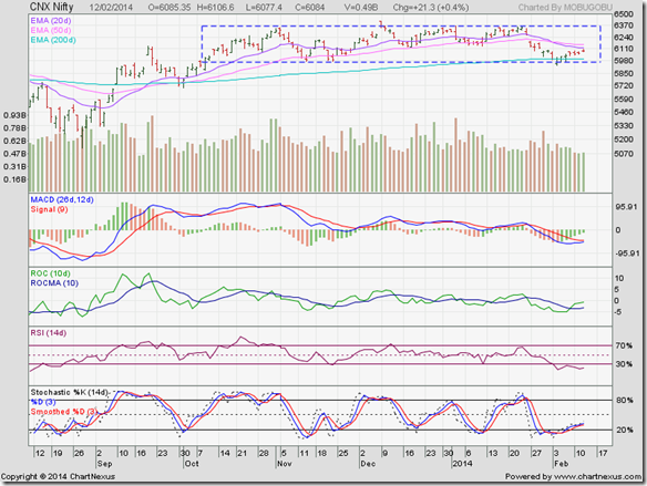
Nifty continues to trade within the ‘rectangle’ consolidation zone, gradually recovering from the brief drop below the rectangle and its 200 day EMA. The rally has been weak, and is facing resistance from the falling 20 day EMA.

The good news is that Nifty is in bull territory above its 200 day EMA. The bad news is that the 20 day EMA is below the 50 day EMA – which is short-term bearish. Also, the index has yet to retrace 50% of its fall from its Jan ‘14 high of 6355 to its Feb ‘14 low of 5933 – keeping the intermediate down trend in force.

Daily technical indicators are in the process of recovering from oversold conditions, but remain in bearish zones. MACD is about to touch its falling signal line in negative zone. ROC has crossed above its 10 day MA, but is yet to enter positive territory. RSI is showing weakness by staying inside oversold territory for the 7th straight day. Slow stochastic has managed to climb out of its oversold zone.

The consolidation within the rectangle is likely to continue for some more time. Times like these scare away many small investors, while experienced investors use such index weakness to add to their holdings by keeping suitable stop-losses (or hedging in the F&O segment).

Tuesday, February 11, 2014

WTI and Brent Crude Oil charts: bull rallies fizzling out?

WTI Crude chart

WTI Crude_Feb1014

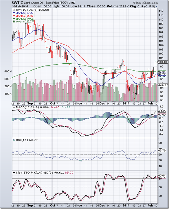
The 6 months daily bar chart pattern of WTI Crude oil used its rising 20 day EMA as a good support and rallied above its 200 day EMA to the 100 level in bull territory. Just when it looked all set to cross past its Dec ‘13 top of 101, bears probably decided enough was enough.

Daily technical indicators are bullish but looking overbought. MACD is rising above its signal line in positive territory, and seems ready to enter its overbought zone. RSI is a little below its overbought zone. Slow stochastic is inside its overbought zone and showing negative divergence by touching a lower top.

Strong down day volumes is an indication that bears are in no mood to relent. Expect a pullback down to the 200 day EMA and a likely return to bear territory. The rally was fuelled by technically oversold conditions and a rise in demand due to freezing weather across USA. Normalcy and lower prices should return.

Brent Crude chart

BrentCrude_Feb1014

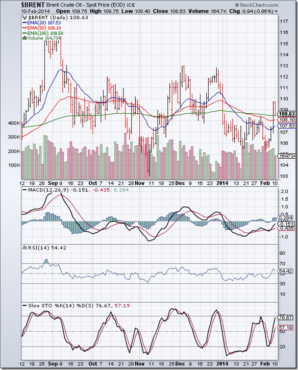
After languishing below its 200 day EMA since the beginning of the year, the 6 months daily bar chart pattern of Brent Crude oil made a desperate dash past its 200 day EMA into bull territory. Selling pressure saw a pullback down to the 200 day EMA.

The pullback may not be a buying opportunity for a couple of reasons: 1) the break out above the 200 day EMA on Fri. Feb 7 was accompanied by rising volumes, but not a significant increase in volumes; 2) technically, oil is in a bear market following the ‘death cross’ of the 50 day EMA below the 200 day EMA.

Daily technical indicators are looking bullish. MACD is rising above its signal line in negative zone, and appears ready to enter positive territory. RSI is above its 50% level, but turning down. Slow stochastic is climbing towards its overbought zone.

Some price consolidation is likely before bears can regain control. Slowing growth in China and emerging economies may lead to lower demand and lower prices.

Monday, February 10, 2014

Stock Index Chart Patterns: S&P 500 and FTSE 100 – Feb 07, ‘14

S&P 500 Index Chart

$SPX-001-001

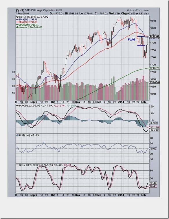
The following cautionary comment was made in last week’s analysis of the daily bar chart pattern of S&P 500: “The index seems to be forming a bearish ‘flag’ pattern from which the likely break out is downwards.” A drop below the Dec ‘13 low of 1768 was expected to be followed by a test of the 200 day EMA.

Why? Because the downside target from the ‘flag’ was 1720 – which was close to the level of the 200 day EMA. As often happens during corrections, the downside target wasn’t met. The index fell sharply on strong volumes to an intra-day low of 1740 on Monday, and then touched 1738 on Wed. Feb 5.

Just when it looked like the 200 day EMA will get tested, bulls fought back spiritedly. The index recovered all the way towards the 1800 level, but faced resistance from the 50 day EMA. The index has retraced more than 50% of its fall from the Jan 15 top of 1851 to the Feb 5 low of 1738. The correction appears to be over. The long-term bull market is intact.

Daily technical indicators are recovering from oversold conditions, but remain in bearish zones. MACD is trying to emerge from its oversold zone, but remains below its falling signal line. RSI has bounced up strongly from the edge of its oversold zone, and is just below its 50% level. Slow stochastic has emerged from its oversold zone, but is well below its 50% level.

Bulls have a little more work to do before they can regain full control.

FTSE 100 Index Chart

FTSE_Feb0714

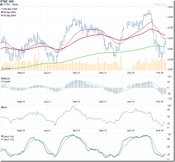
The daily bar chart pattern of FTSE 100 slipped to an intra-day low of 6417 (on Tue. Feb 4), which was lower than its previous low of 6422 touched on Dec 16 ‘13. Strong volumes raised concerns about further downside.

A combination of short covering and value buying led to a recovery of sorts. The index closed above its 200 day EMA by the end of the week, but faced resistance from its falling 20 day EMA.

The correction from the Jan 21 high of 6867 to the Feb 4 low of 6417 covered 450 points. The 50% Fibonacci retracement target is 6642. Friday’s intra-day high of 6596 means the correction is not yet over.

Daily technical indicators are recovering from oversold conditions, but look bearish. MACD is trying to emerge from its oversold zone, and remains below its falling signal line. RSI has come out of its oversold zone, but its upward momentum looks weak. Slow stochastic has just emerged from its oversold zone.

Expect some more correction/consolidation before bulls can regain control.

Bottomline? Daily bar chart patterns of S&P 500 and FTSE 100 indices are recovering from strong bear attacks, but facing technical resistances. Long-term bull markets are intact. The corrections should improve the technical ‘health’ of the charts and enable both indices to move higher. Add/re-enter on convincing moves above the respective 50 day EMAs.

Saturday, February 8, 2014

BSE Sensex and NSE Nifty 50 index chart patterns – Feb 07, 2014

Q3 results season is coming to an end. On aggregate, results have been better than expected – though margin pressure is quite evident. IT, Pharma, FMCG have continued to do well. So have private banks. Auto sector is in a slump – particularly commercial vehicles. PSU banks, metals, cement, construction companies are lagging behind.

In a reversal of roles last week, FIIs were net sellers to the tune of Rs 2700 Crores while DIIs were net buyers to the tune of Rs 3200 Crores. Both Sensex and Nifty indices received good support at the lower edge of the rectangles within which they have been trading for the past 4 months.

Is the correction over, or is it just a lull before the next selling storm? Sensex and Nifty charts (below) are showing patterns that indicate that the correction may continue a bit longer but an intermediate bottom may be in place.

BSE Sensex index chart

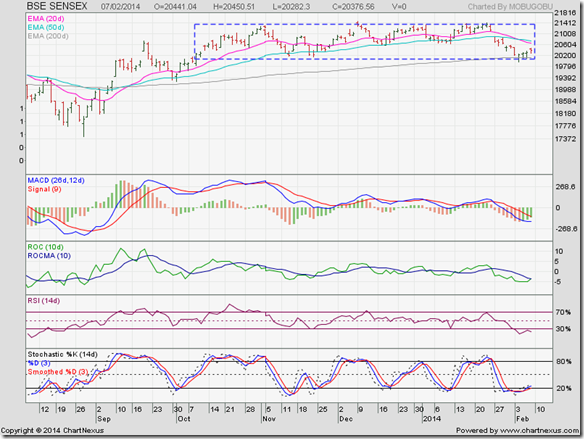
SENSEX_Feb0714

The good news for bulls is that Sensex breached the lower edge of the rectangle and the 200 day EMA only on intra-day basis, and managed to close above the two support levels during the past week. That means the sideways consolidation within the rectangle continues.

The bad news is that the rally from the week’s low of 19963 (touched on Feb 4 ‘14) has been weak. The index is trading below its falling 20 day and 50 day EMAs. Unless strong buying support emerges soon, the index may drop below the rectangle and the 200 day EMA into bear territory.

Daily technical indicators are bearish and looking oversold. MACD is below its signal line and deep inside negative territory, but has stopped falling. ROC is negative, but trying to cross above its falling 10 day MA. RSI has spent the entire week inside oversold zone where it usually doesn’t stay long. Slow stochastic is trying to emerge from its oversold zone.

The dip is providing a good opportunity to add fundamentally strong stocks to your portfolio. But remember to maintain stop losses in case bears resume their attack.

NSE Nifty 50 index chart

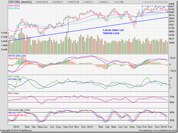
Nifty_Feb0714

The long-term weekly bar chart pattern of Nifty breached the lower edge of the rectangle and its 50 week EMA intra-week, but closed above the support levels by the end of the week. The sideways consolidation within the rectangle remains intact. So does the long-term bull market.

In candlestick parlance, the weekly bar of Nifty has formed a ‘dragonfly doji’. That means the index may have formed an intermediate bottom at last week’s low of 5933. Which way is Nifty going to move next? Any one who can answer that question should make some serious money!

Weekly technical indicators are looking bearish. MACD is falling below its signal line in positive territory. ROC has dropped below its 10 week MA into negative territory. Both RSI and Slow stochastic have fallen below their respective 50% levels. The correction may not be over yet.

Bottomline? Chart patterns of BSE Sensex and NSE Nifty indices are correcting within ‘rectangle’ patterns. Both indices are in long-term bull markets. This is a good opportunity to gradually add fundamentally strong stocks to your portfolios. But maintain stop-losses in case the lower edges of the rectangles get convincingly breached.

Friday, February 7, 2014

7 Steps To A Successful Investment Journey

Yogi Berra was one of the greatest catchers in the history of baseball. He was also a successful coach and manager – mainly associated with the New York Yankees. He dropped out of school after the 8th grade, and was known for his garbled quotes. Here are a couple of examples:

  • "I didn't really say everything I said."
  • "You've got to be very careful if you don't know where you're going, because you might not get there."

The second quote is required reading for most small investors who enter the stock market without necessary preparation. The same people who spend time and energy in researching and analysing cell phones, TVs, washing machines before buying them think nothing about spending thousands on a stock based on a tip from a friend or a TV ‘expert’.

To quote Yogi Berra again: “You can observe a lot just by watching.” Find out how well-known successful investors have made money – what works and what doesn’t work in the stock market. Successful investing has to be a well though-out strategy based on clear goals, plans and time frames.

Here is an article from investopedia.com that will show you the way:

http://www.investopedia.com/articles/basics/06/sevensteps.asp?

Wednesday, February 5, 2014

Sensex – a mid-week update (Feb 05, ‘14)

In a previous post on Sensex, the following were the concluding remarks: “Some more correction can’t be ruled out, but buying interest is likely to emerge if Sensex drops to the lower edge of the rectangle (at about 20100).”

Sensex not only dropped to the lower edge of the rectangle – within which it has been trading for the past 4 months – it dropped below its 200 day EMA and the psychological 20000 level on intra-day basis. The index has since recovered a bit as value buying emerged.

Is the correction over, or is it just the first leg of a much bigger fall? Let us look at the patterns formed on the daily bar chart of Sensex (below) for likely answers.

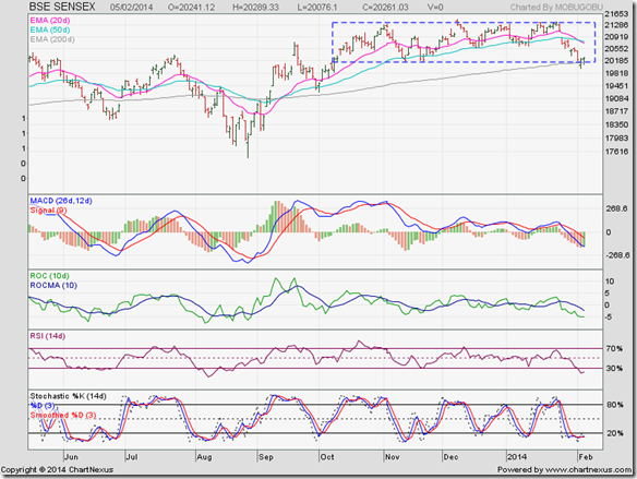
SENSEX_Feb0514

Technically, the intra-day drop below the rectangle and the 200 day EMA is not a convincing one. Why? Two reasons. First, the index failed to close below the rectangle and the 200 day EMA. Second, the intra-day drop was within the ‘3% whipsaw leeway’.

Does that mean the correction is over? Not really. In fact, the 20 day EMA has crossed below the 50 day EMA, and both EMAs are falling. That is a bearish signal. However, the daily technical indicators are looking oversold. So, a rally from the current level is a possibility.

Why did the Sensex stop falling after it breached its 200 day EMA intra-day? Yes, value buying did emerge. But there is also a technical reason.

The rise from the Aug ‘13 low to the Dec ‘13 high was about 4000 points. The drop from the Dec ‘13 high to Tuesday’s low was about 1500 points; i.e. a 37.5% retracement of the rise – which is close to the Fibonacci retracement level of 38.2%. That makes it a likely turning point.

During the first three trading days of Feb ‘14, FIIs have been net sellers while DIIs have been net buyers. If FIIs continue selling, the index will fall more. Expect bulls to defend the lower edge of the rectangle – like they did back in Nov ‘13.

Tuesday, February 4, 2014

Gold and Silver charts: struggling in long-term bear markets

Gold Chart Pattern

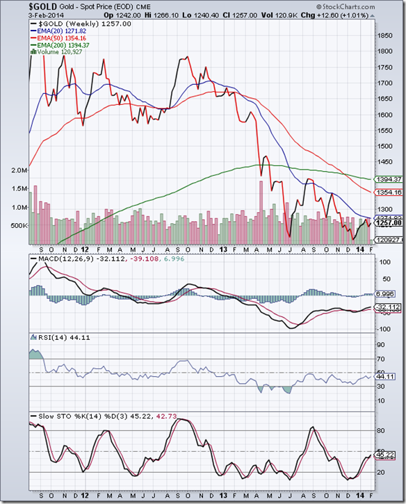
gold_Feb314

The long-term weekly closing chart pattern of gold has been rallying from its Dec ‘13 low, but has failed to overcome resistance from its falling 20 week EMA. Gold is trading below all its three weekly EMAs, and remains in a long-term bear market. Bears are selling on every rise.

Weekly technical indicators are in bearish zones, but showing some upward momentum. MACD has crossed above its signal line in negative territory. RSI has been trying to move above its 50% level since Aug ‘13, but without much success. Slow stochastic is moving up towards its 50% level.

Note that MACD and RSI touched higher bottoms in Dec ‘13 while gold’s price dropped lower. The positive divergences had indicated the likelihood of a rally.

The rally may continue a bit longer. Strong volumes on down weeks indicate that bears are not about to give up their control any time soon.

Silver Chart Pattern

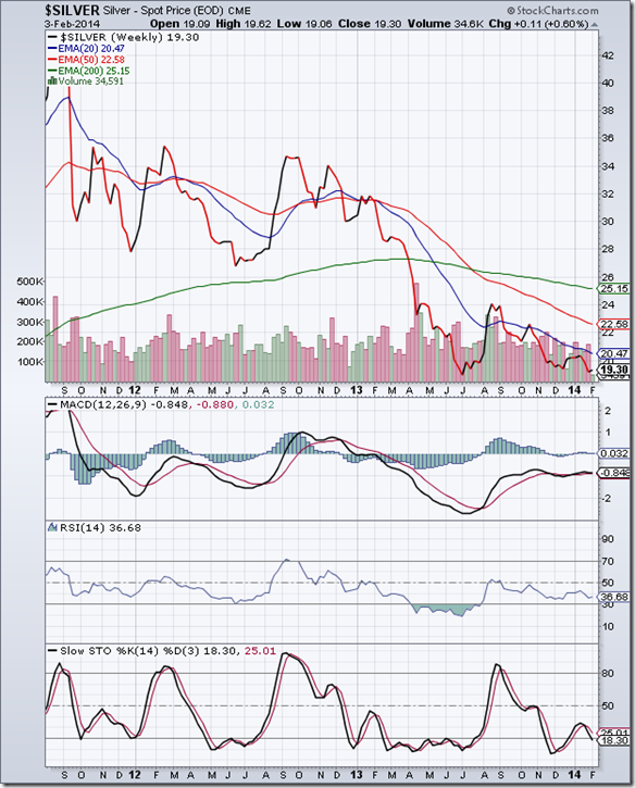
silver_Feb314

The weekly closing chart pattern of silver remains in a down trend in a long-term bear market, touching lower tops and lower bottoms after a sharp rally back in Aug ‘13. All three weekly EMAs are falling and silver’s price is trading below them.

Weekly technical indicators are in bearish zones. MACD is moving sideways - entangled with its signal line in negative zone. RSI is well below its 50% level. Slow stochastic is about to re-enter its oversold zone.

Silver’s price is likely to drop to a new low.

Monday, February 3, 2014

Stock Index Chart Patterns: S&P 500 and FTSE 100 – Jan 31, ‘14

S&P 500 Index Chart

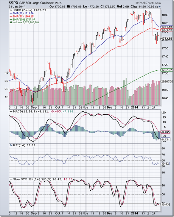
S&P 500_Jan3114

After the steep fall below its 20 day and 50 day EMAs in the previous week, the 6 months daily bar chart pattern of S&P 500 consolidated sideways between 1770 and 1800. The index seems to be forming a bearish ‘flag’ pattern from which the likely break out is downwards.

Daily technical indicators are bearish and beginning to look a bit oversold. MACD is falling below its signal line in negative territory. RSI is below its 50% level. Slow stochastic is inside its oversold zone. Higher volumes on down days are an indication that bears are dominating.

Continued tapering of QE3 and a growth slowdown in emerging markets seem to have spooked bulls, and a long overdue correction has set in. A drop below the Dec ‘13 low of 1768 may lead to a test of the rising 200 day EMA for the first time since Nov ‘12.

Q4 GDP growth at 3.2% was higher than expected, but lower than the Q3 number. Housing market is still weak, with new and existing home sales dipping. Initial claims of unemployment rose more than expected and nearly touched the 350K mark. Growth hiccups continue.

FTSE 100 Index Chart

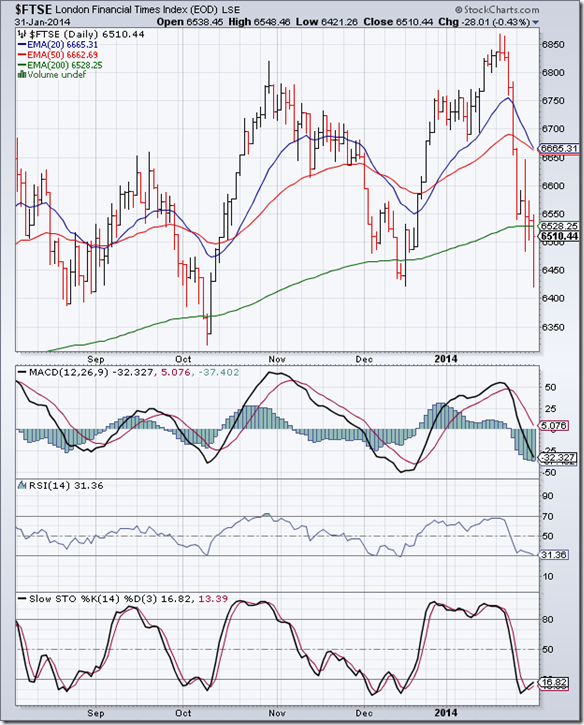
FTSE_Jan3114

Previous week’s sharp correction on the 6 months daily bar chart pattern of FTSE 100 continued last week. The index breached its 200 day EMA and closed below it for the week. The good news for the bulls is that the Dec ‘13 low of 6422 was not breached, and the index recovered most of its losses on Friday.

Daily technical indicators are bearish but looking oversold. MACD has dropped sharply below its signal line into oversold zone. RSI is at the edge of its oversold zone. Slow stochastic is trying to emerge from its oversold zone. At the time of writing this post, the index is trying to move above its 200 day EMA.

The UK's services and manufacturing sectors were the drivers of 0.7% growth in the fourth quarter, taking the annual growth rate to 1.9%, the strongest since 2007 before the financial crisis took hold.

Bottomline? Daily bar chart patterns of S&P 500 and FTSE 100 indices are facing strong corrections. Long-term bull markets are intact. The dips are adding opportunities. But waiting for the corrections to play out may be prudent.

Saturday, February 1, 2014

BSE Sensex and NSE Nifty 50 index chart patterns – Jan 31, 2014

A global sell-off in equity markets dropped both Sensex and Nifty indices towards the lower edge of the rectangular consolidation patterns within which both indices have been trading for the past 4 months.

Concerns about slowing growth and a possible credit crisis in China led to the initial sell-off. Growth concerns and currency instabilities in emerging economies and a rate hike by RBI further strengthened the bears. FIIs and DIIs were net sellers last week - and for the entire month of Jan. ‘14.

Is it the beginning of the crash that every one was expecting? Is it time to move into cash and await the bear onslaught? The headlines and TV experts may make you believe so. What are the charts foretelling? Let us have a look.

BSE Sensex index chart

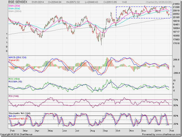
SENSEX_Jan3114

Sensex opened with a downward gap on Mon. Jan 27 that pushed the index below its 20 day and 50 day EMAs. Another downward gap on Thurs. Jan 30 saw the index fall towards its 200 day EMA and the lower edge of the rectangle.

Observant readers may notice that Sensex recovered considerably from its Thursday low and closed almost near the day’s high. (In candlestick terminology, a ‘hammer’ has formed – which means the correction may be coming to an end.)

Daily technical indicators are looking bearish and a bit oversold. MACD has fallen sharply below its signal line into negative zone. ROC is below its 10 day MA - trying to turn up from near the edge of its oversold zone. RSI has dropped to the edge of its oversold zone (and is showing positive divergence by not falling lower). Slow stochastic is inside its oversold zone.

Some more correction can’t be ruled out, but buying interest is likely to emerge if Sensex drops to the lower edge of the rectangle (at about 20100).

NSE Nifty 50 index chart

Nifty_Jan3114

The weekly bar chart pattern of Nifty shows a downward ‘gap’ and a close below the 20 week EMA. The correction should not have come as a surprise because of the following comments in last week’s analysis: “…weekly bar has formed a ‘shooting star’ pattern (in candlestick terminology), which can have bearish implications. Also, weekly volumes indicate that bears may be gaining the upper hand.” 

Despite the global sell-off by FIIs, Nifty continues to trade above its long-term up trend line (in blue) and its 50 week EMA. The long-term bull market is under no threat as yet.

Weekly technical indicators are turning bearish. MACD has crossed below its signal line in positive territory. ROC has crossed below its 10 week MA and about to re-enter negative territory. RSI has slipped below its 50% level. Slow stochastic is about to do the same.

Some more correction is possible. The dip can be used to add.

Bottomline? Chart patterns of BSE Sensex and NSE Nifty indices are undergoing corrective moves within ‘rectangle’ patterns. Both indices are in long-term bull markets, so the eventual break outs from the rectangles are expected to be upwards. However, rectangles can be unreliable. This is a good opportunity to gradually add fundamentally strong stocks to your portfolios. But maintain stop-losses.