Bollinger Bands are a technical analysis tool, developed about 30 years ago by John Bollinger. Before we get into the nitty-gritty of what these bands are and why investors might find them to be a useful tool, a few words about a statistical concept called ‘standard deviation’.
Standard deviation, in layman’s language, means the amount by which a series of measurements vary from the average value of the measurements. Let us say, we are measuring each day’s maximum temperature, and the figures for 5 days are 24, 25, 25, 26, 30. That gives an average value of (24+25+25+26+30)/5 = 26. The absolute variations from the average are –2, –1, –1, 0, 4 respectively for the 5 days. A series of arithmetical manipulations are done on these variation data (squaring, adding, averaging and taking the square root of the average) to arrive at the standard deviation.
Investors need not be math wizards to understand and apply the Bollinger Bands tool - thanks to readily available charting software. But it is always good to know the concept behind the tool. So, what are Bollinger Bands?
It is a technical tool to measure the volatility in prices of a stock or commodity. It consists of a band with three lines. The one in the middle is a 20 period simple moving average (SMA) of the price. The two other lines – one 2 standard deviations above and the other 2 standard deviations below the 20 period SMA – complete the band.
Volatility is measured by standard deviation. As volatility increases, the Bollinger Bands automatically widen. When volatility decreases, the bands contract. Since standard deviation is calculated using a 20 day SMA, a 20 day SMA is also used as the middle line in the daily price charts.
The 20 day SMA with the upper and lower bands 2 standard deviations away is the most commonly used set-up in Bollinger Bands. But other combinations can also be used, depending on price volatility and investment styles. Standard deviation values are higher for stocks (or commodities) trading at higher prices than those trading at lower prices. A higher value of standard deviation doesn’t necessarily mean higher volatility.
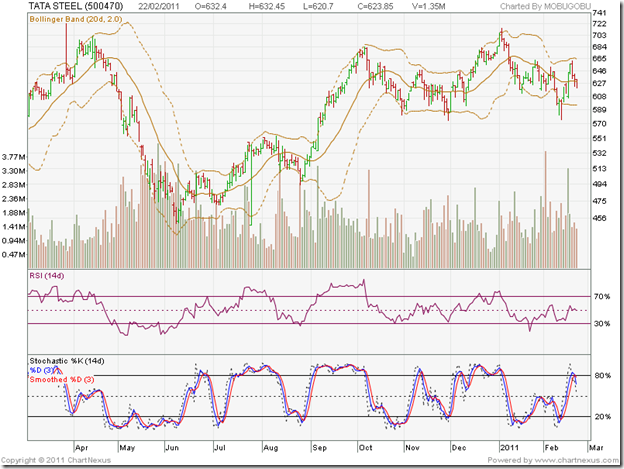
Now let us take a look at Bollinger Bands drawn on the 1 year bar chart pattern of Tata Steel:
How do we interpret Bollinger Bands? They do not give ‘buy’ or ‘sell’ indications by themselves, but are used together with other technical indicators to confirm a ‘buy’ or ‘sell’ decision. A contraction of the bands can be used as an early indication of a price rise. Note the contractions in Jun ‘10, Aug ‘10 and Nov ‘10, which were followed by sharp up moves.
If prices keep touching the upper band on a regular basis, it is a sign of ‘overbought’ conditions, usually followed by a correction. Sep ‘10 and Dec ‘10 show such overbought conditions. If prices keep touching the lower band regularly, it is a sign of ‘oversold’ situation, usually followed by a rally. May ‘10 and Jun ‘10 are examples of oversold situation.
Note that the RSI and slow stochastic also confirmed the overbought and oversold conditions on the stock chart. Charts can remain overbought or oversold for long periods. So, selling when the price touches the upper band or buying when price touches the lower band may not be a good idea. A useful strategy when the chart is overbought is to maintain the 20 day SMA (middle line) as a trailing stop-loss. (If you have read my eBook, you will know what a trailing stop-loss is used for. If you haven’t read my eBook yet, why not? It is FREE.)
Some times the price moves above the upper band, or below the lower band. That doesn’t mean that these are sell or buy signals. It gives an indication of relatively higher or lower prices. Note that in Feb ‘11, the stock reached a lower bottom (below the lower band) while the RSI made a higher bottom. This positive divergence gave a ‘buy’ signal.
In Jun ‘10, the stock also reached a lower bottom, but failed to even touch the lower band. This was an early sign of a possible trend reversal. A ‘buy’ signal was generated because the RSI made a higher bottom.

No comments:
Post a Comment