Friday, July 31, 2009

KOSPI (Korea) Index Chart Pattern - Jul 30, 2009

More than three months back, I had analysed the technical chart pattern of the KOSPI (Korea) index. While the BSE Sensex made a new high today, I thought of taking another look at the KOSPI index - not only to see what it has been up to lately, but also to check if it reached any of the levels that the earlier analysis had suggested.

Here is the observation made about the up side:-

'There is no long term resistance below 1500. So another 10% upside is quite likely before any serious correction can happen.'

Today (Friday, July 31, '09), the KOSPI index closed at 1557 - making a new high, just like the Sensex did. On Apr 24, '09, when I had written the earlier article, the KOSPI index had hit a high of 1375. A 10% upside meant a level of 1512. That target has been achieved.

An observation was made about the down side as well:-

'The MACD has stopped moving up for the past few trading sessions. Both the ROC and RSI have made lower highs while the KOSPI continues to make higher tops. This is a 'divergence' that can stop the rally and bring the index down below its 200 day EMA. May be not right away - but the possibility exists.'

The index reacted the following week, and dropped to the 200 day EMA on Apr 28, '09. But it failed to penetrate the long-term average. The rally lost steam and the index consolidated sideways around the 1400 level for almost 10 weeks, before breaking upwards out of the range last week. (On May 25, '09, the KOSPI tested the support of the 200 day EMA on an intra-day basis.)

So, what is the point? Am I trying to prove that I'm an expert at technical analysis? Not quite. This is just to demonstrate that some times, technical analysis can provide remarkably accurate indications about future levels of a stock or an index.

However, since it is not a science but an art (i.e. skill), developed through practice and experience, it can be inaccurate more often than not. While it may be useful to know what the likely up sides and downsides can be, it is better not to rely on technical analysis completely.

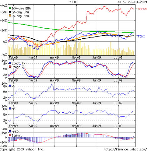
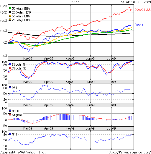
Enough philosophy for one day. Now a look at the 6 months closing chart pattern of the KOSPI (Korea) index (in blue) with the Shanghai Composite index (in red) superimposed for comparison:-

Kospi_Jul3009

The China index has comfortably outperformed the Korean one, but the one way up move with only minor corrections makes me a little uncomfortable.

The Korean index had a sharp rally followed by a good sideways consolidation. It has now resumed its rally, which can be more sustainable because of the 'base building' at the 1400 level.

The slow stochastic has entered the overbought zone. The RSI is flat and just below the overbought zone. The MFI has moved up and just entered its overbought zone. The MACD is  positive and above its signal line. The 20, 50 and 200 day EMAs have all begun to move up along with the index. The bulls seem to have things pretty much under control.

Bottomline? The KOSPI (Korea) index chart pattern has gained less than the Shanghai Composite index or the BSE Sensex index since the rally began in Mar '09. That tells me that some more upside is possible. Investors may adopt a buy-on-dips strategy with a trailing stop-loss and ride the bull.
Thursday, July 30, 2009

Stock Chart Pattern - Exide Industries

The stock chart pattern of Exide Industries has an interesting variation of the cup-and-handle formation, which I will discuss a little later.

It is the strong fundamentals that attracted me to the stock. I'm not particularly fond of the auto-ancilliary sector, which is dependent on the cyclical automobile and commercial vehicles sectors.

There are too many players and too little control over fly-by-night outfits producing spurious parts. To compete, better known names can't afford to sell at prices that will generate better margins.

There are a few notable exceptions that command a leadership position in terms of product quality and management strength. Exide is one. Mico Bosch is another.

Over the years, Exide has become the brand of choice for automotive and industrial storage batteries. Increasing sales and margins, strong cash flows from operations, judicious capacity and market expansions - all point to a suitable stock for a long-term portfolio.

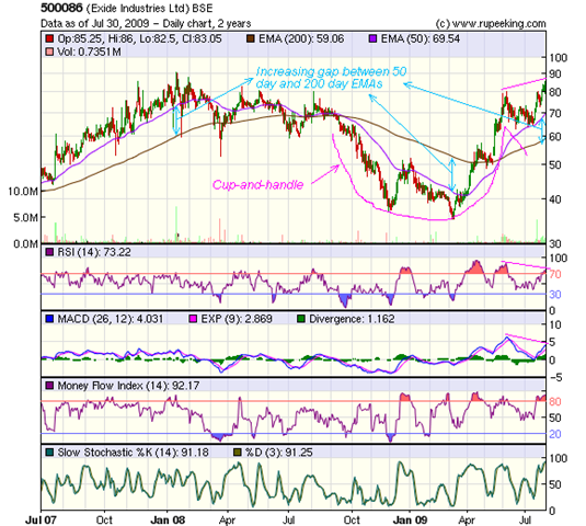
Let us take a look at the 2 years bar chart pattern of Exide Industries:-

Exide_July3009 

The pattern in the chart does not have a smooth rounded bottom. Instead it has a double-bottom at 38 in Dec '08 and 35 in Mar '09. Nevertheless, the cup-and-handle pattern is quite apparent.

The more interesting point is that after a brief downward channelled correction that formed the 'handle', the stock not only broke out of the channel on high volume but also managed to move above the 'cup' edge at 80.

The bullish pattern has been completed, and technically the stock should move into a higher orbit. However, there are a few speed-breakers on the way that may slow down the rally.

The RSI and MACD have negative divergences from the stock price. The MFI and slow stochastic haven't shown divergences, but both are in overbought zones.

Then we have to contend with the increasing gaps between the stock price and its 50 day EMA, and between the 50 day and 200 day EMAs. The previous two occasions that this happened - in Jan '08 and Mar '09 - there were trend reversals. I'm not expecting a trend reversal this time, but a deep correction may be in the offing.

Last, but not the least, is the previous high of 90 (for this Re 1 face-value stock), made in Jan '08. Previous highs have a tendency to become resistance levels.

Bottomline? The stock chart pattern of Exide Industries is beginning to look overbought and ripe for a correction. Existing holders can book partial profits. Those wanting to enter may wait to get a better price between 60 and 70.

Wednesday, July 29, 2009

Stock Chart Pattern - Marico Ltd

Before analysing the stock chart pattern of Marico Ltd, it may not be out-of-place to look at their Q1 results and some projections.

Consolidated net sales grew 16.8% Year-on-Year and volumes rose 14%. Gross margins expanded 3.5% due to a fall in prices of raw materials. Advertising costs increased by 1% to 12.2% of sales and other expenditure increased by 2%. PAT grew 29.6% Year-on-Year to Rs 60 Crores.

These figures look pretty impressive. Positive cash flows from operations and regular dividends are other plus points. Debt is increasing to fuel the growth in overseas markets. The high percentage of advertising expense-to-sales is another concern.

As per a report by Motilal Oswal, the PAT is expected to grow at the rate of 20% for the next three years. At the current price, the stock is trading at 22 times its projected EPS of 3.9 in '09-'10 and 18 times its projected EPS of 4.8 in '10-'11.

Fundamentally, this is another strong stock from the FMCG sector and the 'BUY' call seems justified. The 2 years bar chart pattern of Marico Ltd gives a different picture:-

Marico_Jul2909

The Re 1 face value stock made a top at 83 and a bottom at 47 in Jan '08. The bear market in the stock lasted till Nov '08. It tested the Jan '08 low twice - once in Oct '08 and once in Nov '08.

The up move that started from Nov '08 took the stock above its 200 day EMA in Feb '09 and its 50 day EMA crossed the long-term average in Mar '09. The stock moved into a bull market when the BSE Sensex index was making its bottom!

From Apr '09, the rally became stronger with higher volumes. Earlier this month, the stock sailed past its previous high and recently hit 91 before starting a bit of consolidation.

The bull rally is definitely looking stretched. Except for the MACD, which is a lagging indicator, the other three - RSI, MFI and slow stochastic - have all corrected from overbought zones and are showing negative divergences from the stock chart.

But most ominous is the difference between the stock, its 50 day and 200 day EMAs - which typically warns of a change of trend. In Jan '08, the stock went way above its 50 day EMA, which in turn was way above its 200 day EMA. The stock had corrected sharply.

In Nov '08, the opposite happened. The stock was way below the 50 day EMA, which was well below the 200 day EMA. The stock shot up shortly thereafter.

Bottomline? We have a similar situation on the stock chart pattern of Marico Ltd to that of Jan '08. Will the pattern repeat? With technical analysis, one can never be certain. Just let me ask you this - after seeing this pattern, will you bet on the up side or on a correction? If it corrects, how low can it go?

(Thanks to reader Eswar for suggesting this stock.)

Tuesday, July 28, 2009

Are the stock and currency markets interdependent?

The BSE Sensex index continues to move in a sideways consolidation range between 13500 and 15600, apparently unaffected by the RBI's recent policy announcement of keeping interest rates unchanged.

A prolonged period of sideways movement puts investors in a quandary. Those who missed the rally are itching to get in. Those who were smart enough to invest at lower levels are sitting on big profits, but worried about a crash around the corner.

This is a good time to do nothing - as far as transacting in the stock market is concerned. Use the lull period to do research on individual stocks and brush up on the fundamentals of money supply and how they affect different markets.

The short answer to the question is: Yes, both markets are interdependent locally and globally. The long answer follows.

There is little direct relationship - most of it is through indirect effects of money flows, global businesses, inflation rates and interest rates. It may not be out of place to mention here that the forex market is massive, about $1.5 Trillion per day - a week's trading is equivalent to twice the annual turnover of the New York stock exchange! Interested readers may want to read this article.

Think about the Dow, which had a strong rally last week. Investors from outside the USA, whose domestic markets may not be performing so well - France, for instance - may decide that it is time to enter the US market.

They convert a sackful of euros into US dollars. Depending on the size of the sack, the euro will go down in value relative to the US dollar. May be currency traders figure out that some thing is going on and start to buy US dollars and sell euros.

Investors in Germany decide to join the party. More euros are sold to buy dollars to invest in the US market. With foreign investors pumping in money, both the dollar and the Dow start to rise, as the euro drops.

The opposite happens if the Dow tanks. Foreign investors pull out of US stocks, convert dollars to euros that makes the euro appreciate and the dollar depreciate. The logical conclusion should be that the level of a stock index is directly proportional to the value of the underlying currency.

But it is more complicated than that. Let us take the example of CocaCola. It now sells more outside the US than within the US. For argument's sake, let us assume that the bulk of its sales are from the euro countries. If the dollar tanks and euro appreciates, CocaCola's US sales and profits may suffer but their higher euro-zone profits will more than cover the gap.

CocaCola may declare better Q2 profits, as may IBM and Microsoft and others if they sell more in the euro-zone. End result? The Dow may shoot up if the index components make super profits, while the dollar tanks.

With FIIs pumping in money, the BSE Sensex index nearly doubled from its Mar '09 lows. Logically, the Rupee should have gained against the US dollar. But it is at a lower level now than a year back.

I have a couple of questions for readers:

Why do you think the Rupee depreciated when the Sensex went up?

Why do you think the RBI left interest rates unchanged?

(Thanks to reader Rajeev, for suggesting that I write something about the interdependencies of the different markets. This post is already too long. I plan to write about the bond market and commodities market in future posts.)

Related Posts

How you can stay ahead by being interested in interest
What the CRR-SLR-Repo cuts mean for investors

Monday, July 27, 2009

Dow Jones (DJIA) Index Chart Pattern - Jul 24, '09

Last week's Dow Jones (DJIA) index chart pattern prompted the observation that the technical indicators were pointing to a continuation of the up move in the short term.

The Dow made new highs right through last week and has closed above its long-term moving average for seven consecutive days.

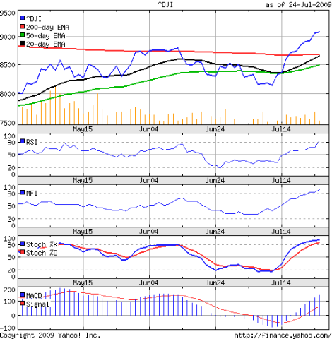
So, have the bulls finally got the better of the bears? Let us have a look at the 3 months closing chart pattern of the Dow Jones (DJIA) index to read the signs from the technical indicators:-

Dow_Jul2409

First, the EMAs. The 200 day EMA has stopped falling and is beginning to flatten. The Dow is above it. That meets the first condition of a bull market.

The 20 day EMA is almost touching the 200 day EMA from below, and should be crossing it this week. That will meet the second condition. The 50 day EMA is still a couple of hundred points below the 200 day EMA. When it crosses the long-term average, there will be no further doubt that this is a new bull market.

The RSI is about to enter the overbought zone. The MFI and slow stochastic are firmly in their respective overbought zones. The MACD is strongly positive and well above its signal line. All four indicators are bullish.

It seems that the bears are now on the mat and the referee has started the count. So, is it going to be a sunny summer for the bulls? 

Unfortunately, there is a large dark cloud looming on the horizon that may pour a lot of cold rain on the bull party. Check out the volumes. In May '09, they were strong. In June '09, when the Dow was flirting with its 200 day EMA, the volumes were lower. Now that the index is bounding up and away from its long term average, the volumes are going southwards.

Just like blood pressure has to be maintained for a human being's survival, volume 'pressure' needs to be maintained for an up move to prosper. If the volumes are not strong enough, an up move can continue for a while but will eventually collapse.

The Q2 results declared so far have been a mixed bag. AmEx, Amazon and Microsoft's results were disappointments. For the sake of the bulls, I hope that the bears are not trying to get even by setting up a 'bull trap'.

Bottomline? The Dow Jones (DJIA) index chart pattern is firmly in the control of the bulls. The overbought nature of the markets and low volumes should lead to a correction. Investors should remain patient for a better entry point.

Sunday, July 26, 2009

Hang Seng Index Chart Pattern - Jul 24, '09

When I last looked at the Hang Seng index chart pattern two weeks back, it was headed down and was definitely looking weak. The 50 day EMA had provided support right through the months of Apr, May and Jun '09. It came to the rescue of the index once again.

The subsequent sharp rally took the Hang Seng index above all three EMAs, which are moving up along with the index. The bull market not only survived a bear mauling but kicked back strongly.

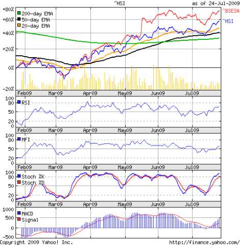
The 6 months closing chart pattern of the Hang Seng index (in blue) has been compared with the BSE Sensex index (in red), so the levels are in percentages. The post-election jump is the major cause of the outperformance of the Indian index by about 20%. Otherwise, both indices have moved in tandem.

Hang Seng_Jul2409 

Note that the recent rally has taken the Hang Seng to a new high, whereas the BSE Sensex has not been able to follow suit. The new high was made on much lower volumes, which is not a good sign.

The technical indicators are supporting the up move. Both the RSI and MFI are above their 50% levels and moving up. But they have made lower tops - which are negative divergences. The MACD is well into the positive zone and much above its signal line, but has also made a lower top. Only the slow stochastic is truly reflecting bullishness and entered the overbought zone.

What next? The Hang Seng index made a top at 32000 in Oct '07. It made a bottom at 10700 one year later, for a total drop of 21300 points. The 38.2% Fibonacci retracement of the entire fall was at 18850 (= 21300x0.382 + 10700). That level proved a strong resistance till it was broken during last week's rally. It is interesting how the Fibonacci levels show up in chart patterns time and again.

The next target on the up-side should be the 50% Fibonacci retracement level of the entire fall, which is at 21350. Should the technical weakness due to lower volumes and negative divergences lead to another bear attack, the support should be provided by the earlier resistance level of 18850 and the 20 day EMA.

Bottomline? The Hang Seng index chart pattern shows that the bulls have the upper hand for now. The bears can regroup for a counter attack any time. Keep taking profits off the table.

Saturday, July 25, 2009

BSE Sensex Index Chart Pattern - Jul 24, '09

In the analysis of the BSE Sensex index chart pattern last week, I had mentioned that the Sensex may try to break above its previous high of 15600, but the bears won't give up without a fight.

The tussle between the bulls and bears continued - with the bulls getting an edge by the weekend, but the bears had the satisfaction of inflicting sufficient damage mid-week that left the 15600 level intact.

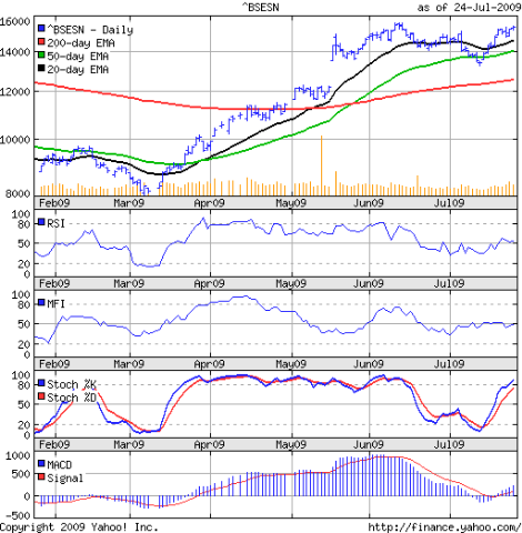
Let us take a look at the 6 months bar chart pattern of the BSE Sensex index and observe some of the developing possibilities:-

Sensex_Jul2409

The entire trading from the gap-up opening of May 18, '09 to the 'reversal day' of July 6, '09 formed a head-and-shoulders topping pattern on the Sensex chart.

There was volume confirmation as well. Volumes were much higher on May 19, '09 when the left shoulder was formed; on July 6, '09, the right shoulder was formed on strong but lower volumes.

The gurus of technical analysis, Edwards and Magee, have stated that the head-and-shoulders pattern is a 'dangerously toppy situation' even without volume confirmation.

The Sensex broke the neckline and fell about 1000 points to 13220 on July 13, '09. Interestingly, a similar topping pattern was formed on the Dow chart as well as on several individual stock charts.

Just when every one and his brother-in-law were expecting a more severe correction, the market bounced strongly upwards, negating the head-and-shoulders pattern. So, is everything hunky-dory for the bulls?

Not yet. There are a few things that are bothersome about the new bull fervour. Let us consider them one-by-one.

** There is no doubt that the head-and-shoulders pattern had formed. Though the bulls managed to negate it, the underlying weakness that led to the pattern may not have gone away entirely. Bearish.

** Even after a 2000 point rise, from 13220 to 15380, the Sensex remains within a sideways rectangular consolidation pattern. Till it breaks above 15600 convincingly, the consolidation may continue. Neutral.

** If the Sensex does cross 15600 and goes to 16000 or so, and then turns back down and makes a low that is lower than 13220, we will get a higher high and a lower low. This would lead to a bearish 'broadening formation'. Bearish.

** The possibility of a bearish 'island reversal' remains open as long as the Sensex trades in a range and the gap remains unfilled. Bearish.

** If the Sensex drops from its current level, it may indicate a 'double top'. Bearish.

We have four bearish possibilities and one neutral possibility acting as brakes to an up move. That doesn't mean that the bulls won't win the battle.

Finally, the technical indicators. Both the RSI and MFI are at their 50% levels. But both have made lower tops while the Sensex may have made a 'double top'. The negative divergences and the possible 'double top' on the Sensex are bearish.

The MACD is slightly positive, but like the RSI and MFI, has made a lower top. The slow stochastic has made a dash towards the overbought zone and is showing strong bullishness. All three EMAs are moving up and the Sensex is above them, so the bulls are still in control of this market.

Bottomline? The BSE Sensex index chart pattern has thrown up several possibilities, and technically at least, the bears may try to wrest the initiative. But the bulls are in control for now. Wherever profits are available, take some home. Or, keep strict stop losses and enjoy the fight.

Friday, July 24, 2009

Stock Chart Pattern - Cranes Software

Some readers may question why I am even bothering to look at the chart pattern of Cranes Software, and they may be amply justified in doing so.

Here are some of the reasons why I like the company. Not only is it a software products company - and the breed is rare in India - it is a leader in the profitable niche of scientific research and engineering design simulation. Cranes owns some of the better known brands internationally, most of which were added to their products portfolio through judicious acquisitions. It also has tie-ups with leading international companies.

Mar '09 top line was at Rs 530 Cr, with 450 Cr realised from exports. In spite of the economic down turn, Cranes Software was able to generate Rs 124 Cr in profits after tax. Increasing cash flows from operations and regular dividends are other positive features.

So why is the market shunning the stock? It is the Rs 800 Cr debt, hanging like the proverbial shining sword suspended from the ceiling by a single horse's hair above the neck of the sycophant Damocles. The company is trying to raise around Rs 300 Cr by selling stakes in two of its subsidiaries.

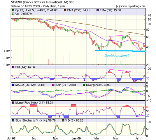
The one year bar chart pattern of Cranes Software doesn't instill too much confidence at all - and therein may lie the seed of opportunity:-

Cranes_Jul2309

Ever since hitting a high of 174 (for this Rs 2 face-value stock) back in Dec '07, the stock has been sliding steadily down with very little sign of a bottom being in place. The recent low of 34, made on July 13, '09 is actually its 52 week low. Maybe, the double bottom formation will finally halt the long bear market phase.

The stock is well below its downward sloping 200 day EMA. The 50 day EMA is also quite a bit below the long-term average, and both EMAs are moving down. Last week's rally took the stock up to its medium-term average, where it faced resistance and moved down again.

The technical indicators are not encouraging. A volume spike on July 20, '09 took the stock to the 50 day EMA and the MFI to the overbought level. Subsequently volumes have come off somewhat. The RSI moved out of the oversold zone, but remains below 50% level. The slow stochastic shot up from its oversold zone and went above the 50% level, but the %K has now slipped below the %D line. The MACD is above its signal line but in negative territory.

Volumes have been sharply higher on recent up days - which hints at informed buying. There is good support at 39 and 34 levels. So watch out for any breach of these levels. If the company is able to raise the funds within the next 3 months or so, this stock could zoom. Should the stock manage an up move, resistance zones will be at 45-49 and 60-65.

Bottomline? The stock chart pattern of Cranes Software is a reminder of what can happen if the pursuit of growth by acquisition leads to too much debt. Even good cash flows from operations may not be enough to survive. This is not for the faint-of-heart. Intrepid investors should maintain strict stop loss at Rs 33.

(A question for readers: Why is the stop loss set at 33 and not at the 52 week low of 34?)

Thursday, July 23, 2009

CAC 40 (France) index chart pattern - Jul 22, '09

The last time I looked at the chart pattern of the CAC 40 index was in early April '09. The French index was still in a bear market, way below its 200 day EMA and looking quite weak - even though it had started to rally with the world indices from March '09.

The 6 months closing chart pattern of the CAC 40 index (in blue), with the BSE Sensex index (in red) superimposed for comparison, shows that the French index has not only under-performed the Indian index but it has also failed to enter a bull market:-

CAC_Jul2209

The global stock market rally that began in Mar '09 took the CAC 40 index upto the 3400 level. Several efforts to breach that level on the up side was strongly resisted by the 200 day EMA.

The index seemed to get disheartened and gave up its efforts to enter a new bull market. The subsequent correction brought it below its 20 day and 50 day EMAs, and the index made a bearish rounding top formation.

Just when it looked like all was lost for the bulls, note the interesting positive divergence in the RSI that led to a renewed upsurge that began last week. The RSI made a higher bottom while the CAC 40 made a lower one on Jul 10, '09.

But the volumes have started to recede as the index moved higher. The upward momentum has definitely slowed after crossing the 3300 level, and the index is once again facing resistance from its 200 day EMA.

All the technical indicators are supporting the up move. The MACD is marginally positive and above its signal line. The RSI and MFI have moved beyond the 50% levels. The slow stochastic has entered the overbought level.

However, a couple of negative divergences have appeared, and I'm sure observant readers will spot them. If not, ask me and I'll be happy to explain.

Bottomline? The CAC 40 index chart pattern has still not lost its weakness - specially when compared with the BSE Sensex index. It may make another valiant effort to conquer the resistance of the 200 day EMA. Smart investors should book profits.

Wednesday, July 22, 2009

Stock Chart Pattern - Bharat Bijlee

The stock chart pattern of Bharat Bijlee has an important lesson for small investors who are interested in mid-cap and small-cap stocks. While such stocks can give whopping returns during the later stages of a bull market, they can fall off a cliff when the bears take control.

Bharat Bijlee is not one of many fly-by-night, chameleon-like operations that dot the mid-cap field. It has been around for quite a while. Its supposedly mundane business of manufacturing electrical motors and distribution transformers, with sales to a number of State Electricity Boards with long payment cycles, has still thrown off decent positive cash flows from operations.

This has enabled the company to finance its expansion and growth through internal accruals and debt, leaving the small equity capital of Rs 5.65 Crores intact for the past several years. Last year, both the top line and bottom line were hit by the economic downturn and the increased prices of raw materials.

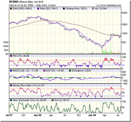
The 2 year closing chart pattern of Bharat Bijlee shows how badly the bears have mauled this profitable, dividend paying, well-managed small-cap company:

Bharat Bijlee_jul2109

After hitting a high of 3950 in Jan '08, the stock had a one way fall to a low of 301 on Mar 13, '09 - dropping more than 90% from its peak. Such a huge fall is technically very negative, as it may take the stock a long time to retrace even 50% of the fall.

A 'V' shaped recovery, accompanied by heavy volumes, took the stock up to 1015 on June 4, '09 - a rise of about 235% in less than 2 months. After a brief sojourn above the 200 day EMA, the stock has been consolidating in a downward sloping trend channel and has slipped below both the 20 day and 50 day EMAs.

Notice how the 20 day EMA moved down after touching the 200 day EMA. Unless the short-term and mid-term moving averages go above the 200 day EMA, the bull market will remain elusive for Bharat Bijlee.

The RSI, MFI and slow stochastic have bounced off oversold regions. The MACD is negative. Looks like the consolidation in the downward channel may last a while longer.

Bottomline? At today's closing price of 785, the stock is available at a P/E ratio of 9.2. The stock chart pattern of Bharat Bijlee may be providing an entry point for really patient investors. With the current emphasis on building the power infrastructure in India, the stock can hit 1500 in a year's time.

Tuesday, July 21, 2009

What exactly is the Margin of Safety?

The heading of Chapter 20 of Benjamin Graham's 'The Intelligent Investor' (4th edition) reads: "Margin of Safety" as the Central Concept of Investment.

What is the Margin of Safety as applicable to stock investments? It is the amount by which a stock's price is lower than the intrinsic, or underlying, value of the stock.

There are several methods by which one can arrive at the intrinsic value of a company's stock - and I plan to write a post about it in future. Suffice it to say that none of these methods can give an exact value. At best it will be a reasonably close approximation.

Here is a definition from the master:

'Over a ten-year period the typical excess of stock earning power over bond interest may aggregate 50% of the price paid. The figure is sufficient to provide a very real margin of safety - which, under favorable conditions, will prevent or minimize a loss. If such a margin is present in each of a diversified list of twenty or more stocks, the probability of a favorable result under "fairly normal conditions" becomes very large.'

Some terms may require a bit more explanation. By 'bond interest', Graham means yield from strong corporate bonds. Since the bond market in India is underdeveloped, we will use Fixed Deposit(FD) interest in a public sector bank as an equivalent guideline. 'Stock earning power' is the same as earnings yield, which is the inverse of the P/E ratio.

Enough talk. Time for some concrete examples.

(a) Company XYZ has declared its results and has an EPS (i.e. earnings per share, calculated by dividing the net profit by the number of equity shares) of 10. The recent market rally has taken the stock's price to 150. That gives a P/E ratio of 15.

The earnings yield is E/P= 1/15= 6.7%. This is lower than the current FD interest rate of 8%. The Margin of Safety is a negative 1.3% (=6.7-8). What does it mean? The current yield from the stock is less than that from a risk free FD.

(b) Company PQR also has an EPS of 10. But its price hasn't moved up as much as XYZ, and is currently trading at 100. The P/E is 10 and the earnings yield= E/P= 10%. The Margin of Safety is 2%. That gives an excess of only 20% over the FD interest, which doesn't meet Graham's criterion of 50% excess over a 10 year period.

(c) Company ABC has a lower EPS of 9, and its price is also lower at 63. The P/E is 7; earnings yield= E/P= 14%; Margin of Safety is 6%. This meets Graham's criteria, because the excess of stock earning power over FD yield is 60% over 10 years. The greater risk of owning the stock is adequately covered by the margin of safety.

Does it mean that you rush out to buy Company ABC? Not yet. You still have to perform a detailed fundamental analysis using Graham's criteria mentioned in my earlier blog post about stock picking (link given below).

These examples have been simplified by excluding the effects of inflation and any tax incidence. But the 'Central Concept of Investment' is de-risking your portfolio by maintaining adequate margin of safety for each stock that you select.

Even by using the Margin of Safety method, you may pick a stock or two that go down. That is why Graham has mentioned owning about 20 stocks, so that in aggregate, the portfolio will gain over the long term.

Graham passed away in 1976. How relevant are these figures and methods in today's environment? Apparently, they work just as well, as John Reese has mentioned in his book, The Guru Investor.

Individual investors can tweak the figures to suit their investment style and risk tolerance. Remember that it is just as important to protect the downside of your portfolio while you try to build long term wealth through stock investments.

For those readers, who are beginning to get a little tired of my exhortations towards the slow but steady value investing concept of wealth building, I have some good news.

By keeping a higher margin of safety, even fundamentally weak stocks can be bought when they sink to abysmal depths during bear markets. Just look at the prices of Satyam, Suzlon, Unitech when they hit their recent bottoms, and compare with current prices. But that would be succumbing to the 'greater fool' theory!

Related posts

How to pick Stocks for Investment - Part III
How to build wealth using a buy and hold strategy

Monday, July 20, 2009

Dow Jones (DJIA) Index Chart Pattern - Jul 17, '09

What a difference in the chart pattern of the Dow Jones (DJIA) index in a week! Just when it looked like the bulls were on the mat and about to be counted out, they miraculously jumped up and started pulverising the bears with renewed verve. It was straight out of a WWF show!

In last week's discussion, I wrote about the following possibility:

'Bulls will try to find some comfort from the RSI and MFI, which are below the 50% levels, but still not in oversold zones. They may try to inject some life back into the index, which will be an opportunity to book profits.'

Dow_Jul1709

The Dow got rejuvenated and ended up with two successive closes above its 200 day EMA. The 20 day EMA bounced off the 50 day EMA and both averages have started to move up again. The short and medium term averages are quite a bit below the longer term one. Till they move above the 200 day EMA, the index will technically remain in a bear market.

The MACD has moved above its signal line and entered positive territory. The slow stochastic has leaped up from the oversold zone and is now poised below the overbought zone. The RSI and MFI have moved above the 50% levels. The technical indicators are now pointing to a continuation of the up move in the shorter term.

Seems like the bears got trapped badly last week. Why? Look at the volumes. They were significantly higher during the up move in April and May '09. Last week's volumes barely equalled the lower volumes during the June '09 index slide. I reckon it was short covering that pulled the DJIA up.

Look closely at the RSI and MFI. The former had dipped slightly and the latter flattened as the Dow closed higher. These negative divergences may limit the rise of the index.

The buying was probably the effect of news about profits declared by Goldman Sachs and JP Morgan. I'm not sure how much of the profits came from normal banking operations and how much got generated by treasury activities.

Even Paul Krugman wasn't particularly impressed with the GSachs activities - as he wrote in this article.

Bottomline? The Dow Jones (DJIA) index chart pattern reveals another attempt to enter a bull market. Will the bulls flatter to deceive, again? Savvy investors should use the opportunity to take profits off the table.

Sunday, July 19, 2009

BSE Sensex Index Chart Pattern - Jul 17, '09

In last week's discussion about the BSE Sensex index chart pattern, I had written about three possible outcomes:

1. An 'island reversal'
2. The BSE Sensex taking support at the gap and moving up again
3. The BSE Sensex closing the gap first and then moving up

Island reversals occur infrequently - but the possibility still remains open, as a 'gap down' opening that remains unfilled for a while would cause such a reversal.

I had accorded a lower priority of the BSE Sensex chart taking support at the gap because of the bearish sentiments in the overseas markets, as well as at home.

But the FIIs had the last laugh as usual. A spurt of buying seemed to trap the bears, who resorted to short covering that made the index jump.

The Sensex hit a low of 13200, which was below the previous low of 13500 that defined the top of the gap.

Please remember that in technical analysis - which is an art and not a science - exact values should not be used to avoid 'whipsaws'. A 3% tolerance is supposed to take care of this problem, which gives a level of 13100 from the level of 13500.

Since the Sensex recovered before piercing the 13100 level, the gap remains unfilled as per technicals. The island of trading and the gap has been marked in the 2 years weekly bar chart pattern of the BSE Sensex index (top chart).

Let us now look at the 6 months closing chart pattern of the BSE Sensex (bottom chart) for some clues to future movements.

After a brief sojourn below the 20 day and 50 day EMAs, the index has jumped above both the moving averages and remains in a bull market. Volumes have supported last week's up move. The slow stochastic has risen sharply from the oversold region and gone above the 50% level. That's the good news for bulls.

The MACD is marginally negative and touching its signal line. The MFI has remained at the 50% level, while the Sensex moved up - a negative divergence. But look at the RSI. It has moved down after touching the 50% level.
Looks like the bears will hardly give up without a fight.

In the 2 years chart, the RSI is still in the overbought zone. The slow stochastic is just below its overbought zone and the %K is below the %D line. The MACD is positive, but moving down towards its signal line.

Bottomline? The BSE Sensex index chart pattern is looking bullish again, but the technical indicators are giving conflicting signals. The Sensex may try to break above its previous high of 15600 to reach the immediate target of 16000. Keep taking partial profits home, and suppress the urge to jump in.

Friday, July 17, 2009

Bovespa (Brazil) index chart pattern - July 16, '09

The last time I took a look at the Bovespa index chart pattern 3 months ago, the Brazilian index was looking a lot stronger than the BSE Sensex index. With this week's strong performance of the Sensex, I thought it may be worthwhile to have another look at the Bovespa index chart.

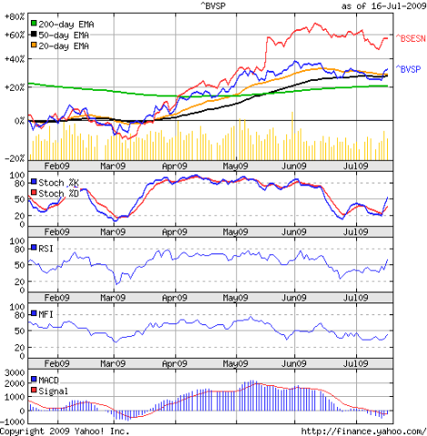
It wasn't surprising to find that the BSE Sensex chart (in red) is now outperforming the Brazil index (in blue). The Sensex has been superimposed on the Bovespa 6 months closing chart pattern for comparison - so the index levels are replaced by percentage levels:-

Bovespa_Jul1609

The two indices lock-stepped along till the middle of May '09. The election results in India was seen as a big positive by the stock market, and the big gap-up jump on May 18, '09 took the BSE Sensex index way above the Bovespa index. Notice how the Brazil index also moved up on May 18, '09 - when there was no euphoria due to election results.

What is more interesting is the way the two chart patterns behaved subsequently. Minus the gap, both have moved sideways with a downward bias, including the sharp rise during this week. Just goes to show that the two emerging markets are dancing to the same FII tune.

Let us look at the technicals. The ^BVSP spent a bit of time below its 50 day EMA, dragging the 20 day EMA down towards the medium term average. This week's up move (which seems to be continuing on Friday, July 17, '09 at the time of writing this post) has once again taken the index above all three moving averages.

The slow stochastic has bounced up sharply from the oversold zone and moved above the 50% level, indicating a trend change. A similar move last month proved to be a 'false' indication. Another example of why a single technical indicator is not to be relied upon.

The RSI gave a better signal, as it made a higher bottom while the index was making a lower one - a positive divergence. The MFI has started to move up after making two bottoms above the oversold region, but remains below the 50% level.

The MACD is still in the negative region - proving that it is a 'lagging' indicator - but is trying to move above its signal line. Volumes have picked up to support the up move.

Bottomline? The Bovespa (Brazil) index chart pattern shows that the recent up move may be getting stronger, as bears appear to have been trapped. Don't fight the trend - but keep booking partial profits.

Thursday, July 16, 2009

Stock Chart Pattern - JK Lakshmi Cement

The stock chart pattern of JK Lakshmi Cement shows that it is one of those resilient stocks that are not too bothered by the gyrations of the BSE Sensex index.

The cement sector has not been a great favourite of mine. The large investments needed for expansion, frequent swings between shortages and over-supply, too many units of various sizes, regional market domination by different players, had all contributed to low margins for this cyclical sector.

The national highway project caused a sea change in the prospects of the cement industry. Coupled with the growth of the infrastructure and construction sectors led to a boom period for the industry. From a loss-making company at the beginning of this decade, JK Lakshmi Cement has turned around to become one of the smaller but stronger players.

What I like most about the company is its continuous efforts at cost reduction by building a captive power plant, a waste heat recovery system, and switching between different fuel inputs that increased profitability and generated a ton of positive cash flow from operations.

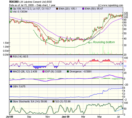
More details about the company can be found from this article. An analysis of the one year bar chart patter of the JK Lakshmi Cement stock follows:-

JKLakshmi Cement_Jul1509

The stock made a rounding bottom pattern before starting its rally a little ahead of the Sensex. From a low of 35 on Mar 3, '09 it hit a high of 116 on Jun 3, '09 - a rise of 230% in 3 months.

The BSE Sensex index made a huge upward gap on May 18, '09 and then went on to form a head-and-shoulders pattern. No such gap is there in the chart above, because the stock had already moved up on high volumes on May 14 and may 15, '09.

After hitting the Jun '09 high, the stock has entered a sideways consolidation between the levels of 95 and 116, with good support from the 20 day EMA, and correcting only 26% of the up move. The Sensex corrected 31.5% of its rise from 8047 to 15600.

The RSI and slow stochastic have both moved above the 50% levels. In the process, they have made higher bottoms while the stock remained flat. This positive divergence may lead to a further up move. The OBV is tracking the stock with a slight upward bias. But the MACD is below its signal line and moving down - a negative divergence.

Contradicting signals from technical indicators are not unusual when the stock chart pattern is consolidating. A breakout can go either way. This is what makes technical analysis so exasperating some times!

Bottomline? The stock chart pattern of JK Lakshmi Cement makes it a good candidate for investment. Wait for a breakout above 116 to add. On a break down below 95, await the down move to play out before entering.

Wednesday, July 15, 2009

Stock Chart Pattern - Great Eastern Shipping

Before I start discussing about the stock chart pattern of Great Eastern Shipping, I would like to thank reader Abhijit for suggesting this particular stock.

I have long admired the performance of Great Eastern Shipping. Fundamentally strong, with very good profit margins, strong cash flows from operations, low P/E ratio, regular dividends - all the hallmarks of a stock that should adorn any long-term portfolio.

Yet, I never got around to buying the stock. I could never figure out why or when the Baltic Dry freight index would go up or down. What was its exact relationship with the profitability of shipping companies. Whether buying or selling or leasing ships and rigs made more sense at a particular time or not.

In other words, the shipping industry does not fall within my 'circle of competency'. If one doesn't have some knowledge about how an industry or sector works, it is better to avoid investing in that sector. There are plenty of good stocks in a lot of different sectors.

For those who understand - or know some one that understands - the nitty-gritty of the shipping industry, Great Eastern Shipping should be their number one choice.

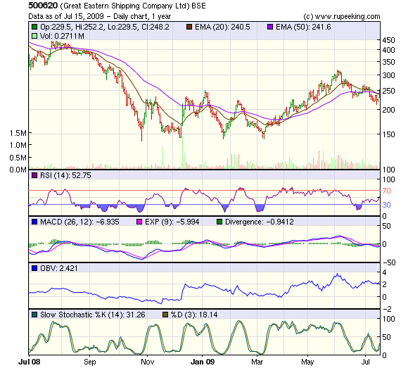
A look at the one year bar chart pattern of Great Eastern Shipping will indicate that there are a couple of interesting recent formations:-

GEShipping_Jul1509

The stock entered a sideways rectangular consolidation pattern - much like that of the BSE Sensex index - after the low of Rs 139 made on Oct 27, '08. It subsequently made lows of 144 in Dec '08, 142 in Jan '09 and 143 in Mar '09.

The triple bottom was followed by a rally - again tracking the BSE Sensex index - from 143 to 316 in Jun '09, a gain of 120%. But the high of 316 only equalled the high made in Oct 1, '08. The later part of the rally from May '09 onwards was on much higher volumes.

Note how the stock was making new highs right through April, May and early June '09 whereas the RSI remained almost flat around the 70% level. This negative divergence led to a sharp correction, that took the stock down to 212 on July 13, '09 - a correction of 60% of the entire rise from 143 to 316.

The 60% correction is close to the Fibonacci correction level of 61.8%. If the stock went below the 61.8% level, then technically, the it would have re-entered the bear market. Here came another interesting twist to the tale.

While the stock was making lower bottoms of 229 in Jun '09 and 212 in Jul '09, the RSI made higher bottoms - a positive divergence. The up moves of Tuesday (Jul 14) and Wednesday (Jul 15) - again tracking the Sensex - moved the stock up sharply above the confluence point of the 20 day and 50 day EMAs as well as above the down-sloping trend line connecting the lower tops of Jun and Jul '09.

By the smallest of margins, the stock has managed to survive the bear onslaught - at least for the time being. The technical indicators seem to be supporting an up move.

The MACD is negative and below its signal line. But it is turning up and may cross the signal line soon. The slow stochastic has moved up sharply from the oversold region. The OBV is tracking the stock, as it is supposed to do. The volume is also supportive.

Bottomline? The stock chart pattern of Great Eastern Shipping is suggesting that for interested investors, this may be a good time to enter. But buy only a small quantity. Why? The stock has a tendency to track the Sensex - which had a 'pullback' to the neck-line of a bearish head-and-shoulders formation. Should the Sensex crack downwards, the stock may follow suit.

Tuesday, July 14, 2009

Are you an investor or a speculator?

"Avoiding where others go wrong is an important step in achieving investment success. In fact, it almost ensures it."
- Seth Klarman, 'Margin of Safety'

If you are like me, your first foray into the stock market was probably buying 100 shares of a 'cheap' stock on a friend's tip. That's speculation. No wonder I ended up losing money!

The characteristics of a speculator and investor are almost exact opposites of each other. How can you tell if you are one or the other? Here are some indications:-

1. On a whim, you go to the railway station, buy a platform ticket and jump on to the first train that is departing, without having any idea where it is going. Isn't it exciting? You are a speculator.

You plan ahead and make your seat reservation a month in advance; go to the railway station a half hour before the scheduled departure; board the train, find your reserved seat and settle down for the journey, knowing how long it will take to reach your destination. You are an investor.

2. It is a Sunday. Some friends visit unannounced at 7 pm. You serve them tea and refreshments. At 8 pm you suggest going to the movies. All of you agree and go to the nearest multiplex, but find that all shows are 'house full'. So you go to the food court and have 'idlis' or burgers instead. You are a speculator.

You call up a few friends mid-week and ask them if they would like to catch a movie next Sunday. They agree. You go to the nearest multiplex and buy tickets in advance for Sunday's show. On Sunday, your friends arrive. You serve them tea and refreshments. Then all of you go and watch the movie. Afterwards, you grab 'idlis' or burgers at the food court. You are an investor.

3. You have recently graduated from college and are looking for a job. You buy some newspapers and go through the 'Jobs' columns. You circle the addresses of several companies, and send across your resumes. The process is repeated for several weeks without much success. You are a speculator.

You are still in college. During the summer vacation, you work as an apprentice for free in a company owned by a friend of your older brother. Next summer, you repeat the process. After graduation, you get a job offer from your brother's friend, who has not only come to know and trust you, but is impressed with your diligence and forethought. You are an investor.

4. You hear that a new highway is going to be built to bypass the town where you live. The proposed highway is supposed to pass through some inhabited villages. You visit the villages and buy up a few parcels of land, hoping to make a killing when the land acquisition for the project starts. But the villagers have political clout and block the land acquisition. After a few years, the highway is built bypassing the villages where you bought land. You sell at a loss. You are a speculator.

You wait for the land acquisition process to be completed and the highway construction to begin. Then you buy a plot of land near the highway, and build a convenience store-cum-motel. You are an investor.

5. You find out that Gruh Finance is a subsidiary of HDFC. You feel HDFC is too expensive and buy shares of Gruh Finance instead. But because of its regional bias and smaller size, the company never becomes the 'next HDFC'. After holding for some time, you sell the shares at a decent profit. You are a speculator.

You find out that HDFC is the company most respected by the FIIs because of its conservative and sound management. You wait for a price dip and buy a small quantity. You remain patient, and keep buying small quantities on every substantial dip and just keep holding. You are an investor.

I could go on, but you get the idea. Whims and tips and gut-feel may work very well in a bull market. But in a sideways trend or a bear market, the huge gains through speculation get wiped out fast by huge losses.

There are no short cuts to investment success. Diligence, discipline and the ability to analyse company fundamentals require effort and patience. It is not rocket science and can be learned. Why not start today? Why depend on others? There are no better way to ensure success in building wealth through stock market investments, than taking charge of your own investment decisions.

You neither have the time nor the inclination to do the hard work? Still want to benefit from the stock market? Buy a couple of index funds and a couple of balanced funds. Your long term returns won't be insignificant.

Related Posts

Should you invest in Balanced Funds?
Two Index Funds that track the Nifty 50
Your portfolio of stocks and mutual funds - why you shouldn't diversify

Monday, July 13, 2009

Dow Jones (DJIA) Index Chart Pattern - Jul 10, '09

Last week, the Dow Jones (DJIA) index chart pattern had slipped below all its three moving averages and seemed southbound. I had made the following observation:-

"
The 20 day EMA has turned down, and once that moves below the 50 day EMA as well, it will be 'game over' for the bulls."

The Dow made a futile effort to move up during the first two days of the week, but the resistance from the 50 day EMA proved to be too strong.

The short term moving average got supported by the 50 day EMA on the way down, keeping the index a whisker away from a full-fledged bear market.

Volumes have tapered off. The slow stochastic is well into the oversold region. The MACD is in the negative zone and well below its signal line. All three indicators are signalling that the down move may gain in strength.

Bulls will try to find some comfort from the RSI and MFI, which are below the 50% levels, but still not in oversold zones. They may try to inject some life back into the index, which will be an opportunity to book profits.

Bottomline? The Dow Jones (DJIA) chart pattern is clearly showing that the 'green shoots' analogy was unsuitable for the state of the economy and the stock market. Looks like this will be a summer of discontent for the bulls.

Sunday, July 12, 2009

Hang Seng Index Chart Pattern - Jul 10, '09

At the conclusion of last week's discussion, I had made the following observation:-

'The Hang Seng index chart pattern may head down some more.
Watch out for supports from the 20 day and 50 day EMAs. Bears may take control if the second support breaks.'

Like an obedient school boy, the index moved down below the short-term average and took support at the 50 day EMA.

The 6 months closing chart pattern of the Hang Seng (in blue) is now beginning to track the Dow Jones (DJIA) index (in red) more closely on the way down.

The slow stochastic, after a brief bounce above the oversold zone, is heading down again. The MACD is about to slip into the negative zone, as it continues to remain below the signal line. Both these indicators, as well as the dismal volumes, are indicating a further correction.

The RSI and MFI are providing some solace to the bulls, by climbing back up to their 50% levels. There may be a small bounce up from the 50 day EMA and the support level of 17400.

The bullish fervour seems to be ebbing. On a break below the above two supports, the index is likely to fall to the 200 day EMA, and the next support level of 16000.

Bottomline? The Hang Seng index chart pattern shows that the bulls may not have thrown in the towel yet, but prudent investors should book profits at every rise.

Saturday, July 11, 2009

BSE Sensex Index Chart Pattern - Jul 10, '09


The following observations were made during last week's discussion about the BSE Sensex index chart pattern:-

'
If the Dow continues to fall, the FIIs may decide to pull out in a hurry. The sparks of the fledgling bull market in India may get extinguished. If such a flight of capital happens - and I'm not saying that it will - the budget on Monday, July 6 '09 could provide just the trigger for it.'

Sure enough, the high fiscal deficit, left uncovered in the budget, provided the trigger for the flight of FII capital. The
2 years weekly bar chart pattern (on top) and the 1 year daily bar chart pattern of the BSE Sensex index shows that the stage is set for a possible chart pattern formation that I had noticed a few weeks back - an 'island reversal'.

Island reversals occur only once in a long while, but if they do, they are very good indicators of termination of intermediate moves. They often form part of an overall chart pattern, such as a head-and-shoulders.

So far, we have seen a deep bear market correction from the top made in Jan '08, followed by an intermediate up move. On both the 1 year daily chart and 2 years weekly chart, the 'gap' made on Monday, May 18, '09 is clearly visible. The head-and-shoulders pattern at the top of the intermediate up move is also apparent in the 1 year chart.

Observant readers will note that a similar head-and-shoulders pattern had formed on the daily chart during Aug '08 and Sep '08, prior to the huge fall in Oct '08. Does that mean the pattern will repeat? It might - but then again - it might not. Technical analysis is not a science, so trying to predict on the basis of past patterns may be foolhardy.

So let's talk about the possibilities. There are three likely outcomes:-

1. Monday, July 13, '09 could prove an unlucky day for the bulls if the BSE Sensex index opens with a downward gap, which does not get filled for some time. That would create the 'island reversal' we have been discussing. Why? Because all the trading from May 18, '09 onwards happened above the gap, forming an 'island' of trading, isolated from the main chart pattern.

That would open downward targets of 12500 and 11500. Those two levels correspond approximately to the 38.2% and 50% Fibonacci retracements of the intermediate up move from 7700 to 15600. 12500 also happens to be in the middle of the gap area and near the downward target of 12800 for the head-and-shoulder formation.

2. The Sensex closed last week at 13500, near the top of the gap. There is a possibility that the gap provides support and the Sensex continues in its intermediate up move for a while longer, targeting the 16000 level. This option should have the lowest probability.

3. The index can go down to meet its head-and-shoulders target, which will partially fill the gap, or go down to 11500 to completely fill the gap before starting its next up move. Because of the infrequent occurence of island reversal, this option is the most likely of the three.

On the longer term chart, both the RSI and slow stochastic are exiting overbought zones, indicating bearishness. The ROC is mildly bearish - still above the '0' line but dropping rapidly. The MACD is positive, but trying to go below its signal line.

Bottomline? Next week's trading will provide pointers to the future direction of the BSE Sensex index chart pattern. The weekend can be used for researching and shortlisting fundamentally sound stocks for one's 'buy list'.


Friday, July 10, 2009

Stock Chart Pattern - Dhanalakshmi Bank

There is a very good reason why I chose to write about the stock chart pattern of Dhanalakshmi Bank. It is not because of any of the following reasons:-

1. It is a small but 80 years old private bank based in Kerala
2. Slow and steady growth with a regional bias has been its motto
3. Reasonable profits and dividends - with occasional blips
4. The major shareholder was forced to divest a part of his stake to adhere to RBI strictures
5. Recent induction of a professional management team, headed by a former executive from the Anil Ambani group
6. A change of strategy and direction - by going pan-India with new branches and new business activities.

All of the above reasons, taken together, makes it a potential high-growth prospect. Smart investors have already taken positions and pulled the stock price up from a low of Rs 37 in Mar '09 to Rs 119 in Jun '09 - a gain of more than 200% in 3 months!

But that is not what really intrigued me. Many other companies with much poorer credentials performed even better during the recent market rally. It was something I spotted in the 6 months closing chart pattern of Dhanalakshmi Bank (in blue) when compared with the chart pattern of the BSE Sensex index (in red).

During the rally in Mar '09, the stock tracked the index right up to the budget in the middle of May '09. Post-budget it pulled sharply upwards, and has been consolidating sideways - much like the Sensex.

Now look at the interesting positive divergence in Jul '09. The Sensex has started to correct as the FIIs are pulling out, but the Dhanalakshmi Bank stock is proving quite resilient. During today's (Fri. Jul 10, '09) sharp fall in the Sensex, the stock took support from its 20 day EMA, and actually went up by a Rupee on a volume of more than 100,000 shares. Smart investors are not selling. In fact, they are buying more!

The RSI and MFI are around the 50% levels, indicating indecision. The MACD is still in positive zone, though it has been sliding and remains below the signal line. But the slow stochastic has bounced up from near the oversold zone and has moved up above the 50% level. This is definitely supporting the bullish undertone.

One of the interesting exercises one can perform during bear phases - and we seem to be in one right now - is to look for stocks that are not falling as much as the Sensex. The usual suspects are the stocks in the pharmaceuticals and FMCG sectors. Are there others?

Make a list of a few of these resilient stocks. Do a quick fundamental check about their cash flows, debts, dividend payments. Track the short listed stocks as the Sensex heads down. One or two that fall the least are likely candidates for investment.

Bottomline? The stock chart pattern of Dhanalakshmi Bank makes it a suitable candidate for the short list of resilient stocks. But it isn't the only one. Look for other, may be better, candidates.

Thursday, July 9, 2009

Is there a relation between Stock Market success and your Intelligence Quotient (I.Q.)?

What are some of the character traits of people who have a high I.Q.?

1. Quick on the uptake - ability to grasp new concepts faster
2. Curiosity - eager to learn and try new things
3. Out-of-the-box thinking - looking for alternative and unconventional solutions - the story of how Columbus made an egg stand on a table without spilling its contents comes to mind;
4. Inability to concentrate on routine or boring tasks
5. Intolerant towards those who can't or won't follow their arguments and advice

I'm generalising here. You may not agree about some of these traits, or, may think of other characteristics that apply better.

The point is, the above traits of a high I.Q. person are not conducive to achieving fame and fortune in the stock market. The most well-known example is that of Sir Isaac Newton, discoveror of Gravity and the Laws of Motion. He lost his shirt by investing in stocks.

People with high I.Q. excel in fields like science, mathematics, economics, engineering. There are set formulae with predictable results. Stock market investments don't work as per formulae. Even detailed analysis may lead to wrong choice of a stock. Unforeseen things happen. It is part of the game.

Intelligent people find this difficult to accept. They are accustomed to success, not failure. Their ego gets in the way - "How can I be wrong?" So, they hang on to their shares, convinced that the market is wrong and the share price will soon hit the roof.

When it dawns on them that they are still losing money, they try to think of 'smarter' alternatives, like 'hedges', 'averaging down' and 'puts'. A bad situation gets worse.

The attitude of a sales person works better in the stock market. Failure and success are accepted with equanimity. He may not be very bright, but has learned to be diligent in regularly updating his prospects list.

When one door gets shut on his face, he just moves on to the next prospect on the list. When he makes a sale, he is pleased but not elated. Each day is the same as the day before. Routine work. Not very creative. But a plan of action that works and meets targets.

That was the long answer. The short answer? Stock market success and high I.Q. tend to be inversely proportional.

Wednesday, July 8, 2009

Stock Chart Pattern - Colgate Palmolive India

The 3 years weekly bar chart pattern of Colgate Palmolive India is another example of how strong, well-managed companies in the FMCG sector move according to their own rhythms.

While the rest of the stock market was in a rush to reach a new high, Colgate made a low in early 2007. It then followed the Sensex to make a new high in Jan '08.

But look what happened when the Sensex dropped from 21200 to 7700 - a fall of nearly 64%. Colgate fell only about 35% during this period.

When the Sensex rallied by a little over 100% from 7700 to 15600, Colgate wasn't left far behind, and rose by more than 90%. Now that the Sensex has been in a corrective down move, Colgate is not falling but making new highs.

The stock chart pattern of Colgate is not very different from that of Hindustan Unilever - which is also in a long-term bull market. I leave it as an exercise for readers to draw a parallel up trend channel starting from the high of 2006 and the low of 2007. You will note that this channel got penetrated twice on the up side. Both times the stock chart pattern reverted back to the up trend channel.

The spectacular growth of the Colgates and HULs took place about two decades back - when 1:1 bonuses were a regular feature. Such companies have now become stalwarts that provide steady growth, good dividends, a downside protection during bear phases.

You won't get rich overnight by owning such a stock. But investing a decent percentage of your core portfolio in FMCG and pharma sector will let you sleep well when the bears are on the prowl.

A quick look at the technicals. The OBV continues to move up - showing investor interest shifting from the 'momentum' stocks to safer havens. The MACD is also up sharply and the gap with its signal line is increasing. Both the RSI and slow stochastic are in the overbought zone.

A stock can stay overbought for quite some time. But the fact that the Colgate chart pattern has penetrated above the upward channel means some caution should be exercised. The lower volumes also indicate that the upward move may be slowing.

Bottomline? This isn't the best time to enter the stock. A fall to Rs 500 or so may be a better entry point.


Tuesday, July 7, 2009

How to Profit from the Cup-and-Handle Chart Pattern

An interesting addition to the technical analysis tool set is the Cup-and-Handle chart pattern. It is very much like a bullish 'saucer' or 'rounding bottom' pattern, but provides additional points of entry.

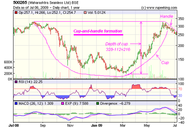
There is no better way to learn about new stock chart patterns than to look at a practical example. I have chosen the 1 year bar chart pattern of Maharashtra Seamless, because it has made a classic, and clearly identifiable, cup-and-handle pattern:-

Mah Seamless_Cup-and-handle_Jul0609

The stock made a previous high of Rs 328 in Aug '08 before continuing its bear market down move. It finally made a low of 112 in Mar '09, before embarking on a sharp rally with the rest of the market. In the process, it made a 'rounding bottom' bullish pattern.

The stock went all the way up to Rs 325 in Jun '09 - nearly tripling in value from its Mar '09 low. Not unexpectedly, it faced resistance near its previous high, and the first attempt on Jun 5 '09 failed to go past it. Three subsequent attempts on lower volumes also failed.

The stock then entered a corrective downward sloping channel that has taken it towards its 50 day EMA at Rs 250, where it is currently seeking support.

The horizontal line connecting the two tops of Aug '08 and Jun '09 forms the top rim of the 'cup' at Rs 328. The 'rounding bottom' pattern completes the body of the 'cup'. The downward sloping corrective channel is the 'handle' of the 'cup'.

The progress of the 'handle' needs to be closely observed, because it can provide clues to what might happen next. The depth of the cup is a move of Rs 216 (= Rs 328 - Rs 112).

The 'handle' can retrace between a third and a half of the 'cup' depth. That means a retracement of between Rs 72 (=Rs 216/3) and Rs 108 (=Rs 216/2). So, the correction of the 'handle' should stop in the price zone between Rs 256 (=Rs 328 - Rs 72) and Rs 220 (=Rs 328 - Rs 108).

On completion of this corrective move, the stock price should break up wards again. This provides three possible entry points - should you be interested in entering this stock.

1. The first, and riskiest, point of entry is any time the stock goes below Rs 256 - like it has done now. Why riskiest? Because the 'handle' can go below the Rs 220 level and possibly negate any up move for now.

(There are other reasons why you may want to enter now. Rs 250 is a support/resistance level - as can be observed from the chart patterns made in Jul '08 and Sep '08 (supports) and Oct '08 and May '09 (resistances). The 50 day EMA is another likely support. The RSI has entered oversold region.)

2. The second, and less risky, point of entry will be when the stock breaks out upwards from the downward sloping trend line of the 'handle' formation.

3. The third, and safest point of entry will be when the stock moves above the cup rim level of Rs 328.

The Cup-and-Handle stock chart pattern usually shows up as a continuation pattern in a bull phase. In this case, however, it has formed a bottoming pattern. (There are some other stocks that are also showing a similar formation. Curious readers may want to try and find out some of  these stock charts, as an exercise.)

An inverse Cup-and-Handle can form in bear phases or at market tops - as a variation of the rounding-top bearish pattern.

Here are some questions for my readers. What do you think about the 'handle' formation? Why is it happening? Is it an 'accumulation' or a 'distribution' pattern? (Just use your common sense, and provide your answers in the 'Comments' link, or email me directly.)

Related Posts

Stock Chart Pattern - Maharashtra Seamless
Stock Chart Pattern - Sanghvi Movers
How strong is the Relative Strength Index (RSI)?

Monday, July 6, 2009

Dow Jones (DJIA) Index Chart Pattern - Jul 3, '09

In the previous week's discussion, the Dow Jones (DJIA) index chart pattern seemed to have had its run in the sun. The brief dalliance with a new bull market barely lasted a week in early June '09, when the index moved above its 200 day EMA.

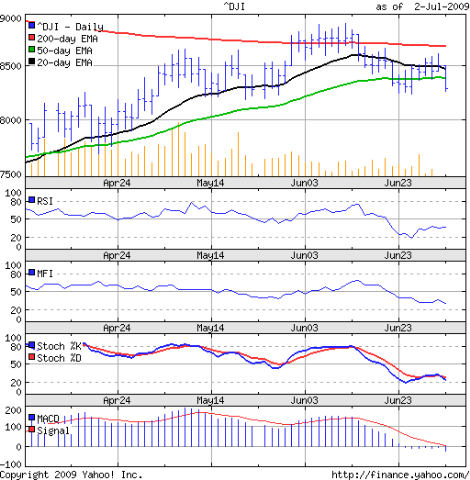
The higher unemployment figures last week proved to be the last straw. The 3 months bar chart pattern of the Dow Jones (DJIA) index dropped below its 50 day EMA and is now below all the three moving averages. The 20 day EMA has turned down, and once that moves below the 50 day EMA as well, it will be 'game over' for the bulls.

Dow_Jul0209

The holiday shortened week saw very low volumes. The RSI bounced up from the oversold region and moved sideways below the 50% level. The indicator provided a faint ray of hope for the bulls.

The MFI is headed down towards the oversold zone. So is the slow stochastic, after a brief respite. The MACD has been in the negative for 7 straight sessions. Its signal line will join it in bear territory soon. The DJIA seems to be in a mood to sing an old Allman Brothers song: 'Well I'm Southbound'.

Is there no hope at all for the bulls? Not quite. May factory orders were a little better than expected. Housing prices fell more slowly. Oil prices went below the $70 mark. Q2 results may be a little better than Q1, as per estimates. Nothing to crow about, but the free fall in the economy has been arrested some what.

Bottomline? The bulls may try to make a last stand. But the Dow Jones (DJIA) index chart is unlikely to move up in a hurry. Await Q2 results before re-entering.

Sunday, July 5, 2009

Hang Seng Index Chart Pattern - Jul 3, '09

Last week's discussion about the Hang Seng index chart pattern concluded with this comment:-

'Keep taking profits and wait for a deeper correction to re-enter.'

Not much of a correction happened last week. The index made a feeble attempt to clear the 19000 level - its third failure since the beginning of June '09 - and then fell back on its 20 day EMA for support.

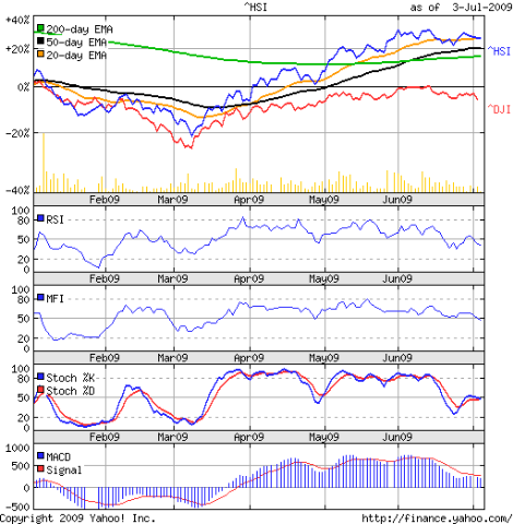
The 6 months closing chart pattern of the Hang Seng index (in blue) has been compared with the Dow Jones (DJIA) index (in red), so percentage values have been used instead of absolute values:-

Hang Seng_Jul0309

Notice how the two indices tracked each other to the Mar '09 bottom. The subsequent rally took the Hang Seng up by 50%, but the Dow rose only half of that.

Both indices have made lower tops before moving down wards. But the Hang Seng remains in a bull market, whereas the Dow never even entered it and is back in a firm bear grip.

The technical indicators are mirroring the weakness in the Hang Seng. The MFI, RSI and slow stochastic have all slipped below the 50% level. The MACD is positive but below its signal line. Volumes are petering off.

Bottomline? The Hang Seng index chart pattern may head down some more. Watch out for supports from the 20 day and 50 day EMAs. Bears may take control if the second support breaks. 

Saturday, July 4, 2009

BSE Sensex Index Chart Pattern - Jul 3, '09

Last week's discussion about the BSE Sensex index chart pattern had the following observation:-

'The short-lived corrections in the BSE Sensex index chart pattern is hinting towards an attempt to hit the 16000 level.'

The Sensex managed to stay above its 20 day EMA through the week. The late surge on Friday could not take it even to the 15000 level.

What is so great about the 16000 level? Just an arithmetical target. It happens to be at the 61.8% Fibonacci retracement of the entire bear market fall from 21200 (in Jan '08) to 7700 (in Oct '08). That is the 'last hope' level for the bears - to try and regain control of the market.

Before we take a look at the 3 months closing chart pattern of the BSE Sensex index (in blue), please note that the closing chart pattern of the Dow Jones (DJIA) index (in red) has been superimposed for comparison. The intention is not to prove that the emerging market economies are on a firmer footing than that of the USA (which they are!), but to warn investors that when the 'big brother' stumbles, the 'baby brother' can tumble.

Sensex_Jul0309

To help in comparing the two indices, percentage values instead of absolute index levels have been used. The DJIA had a maximum gain of 10% since early April '09, most of which it has lost. Last Thursday's close has taken it below all its three EMAs.

The Sensex had a maximum gain of 50% in the same period, most of which has been retained. The index is above all its three EMAs. This divergence between the Dow and the Sensex is the primary reason for my concern.

Through most of the bear market between Jan '08 to Mar '09, the DIIs (Domestic Institutional Investors) were buying while the FIIs (Foreign Institutional Investors) were selling. The DII buying could not stem the rot.

From Mar '09 onwards, the FIIs re-entered the Indian market and started buying heavily. That was one of the main reasons why the Sensex marched up. If the Dow continues to fall, the FIIs may decide to pull out in a hurry. The sparks of the fledgling bull market in India may get extinguished.

If such a flight of capital happens - and I'm not saying that it will - the budget on Monday, July 6 '09 could provide just the trigger for it. Why? Because too many positive expectations seem to have been built in to the index level already. Some stocks have gone up 4 or 5 times from their recent low levels in less than 4 months.

A quick check of the technicals. The 20 day EMA remains flat. The 50 day and 200 day EMAs are moving up very gradually. The MFI has turned up, but is still below the 50% level. Likewise for the RSI. The MACD is positive, but below its signal line. The slow stochastic is below the 50% level as well, but there has been a bullish crossover of the %K line above the %D line. The volume is disappointing.

Bottomline? In spite of the huge post-election jump on May 18 '09, the BSE Sensex chart pattern has not been able to completely shake off the bears. Any budget-related up move can be used to book partial profits. This is not the time to enter.

Friday, July 3, 2009

FTSE 100 Index Chart Pattern - Jul 3, 2009

It has been a month since I last looked at the FTSE 100 index chart pattern. The index was flirting around with its 200 day EMA while the 4500 level was playing the role of the stern aunt - trying to keep the index at arm's length.

The FTSE actually managed 6 consecutive closes above the 200 day EMA after my previous article, and that pulled the 20 day EMA marginally above the long-term moving average.

The 3 months bar chart pattern of the FTSE 100 index shows that all hopes of a new bull market were belied:-

FTSE_Jul0209 

The negative divergences in all the technical indicators - which made lower tops while the FTSE was consolidating sideways - finally broke the efforts by the index to keep its nose above the 200 day EMA.

The slow stochastic has slid into the oversold zone and is struggling to get out. The MACD has not only entered the negative zone but is also below its signal line. The ROC has been in the negative zone for a while, and a couple of efforts to get into the plus side has failed. The RSI is moving sideways, just above the oversold zone.

The volumes haven't gone down much. But all the three EMAs have started to move downwards. Once the 20 day EMA moves below the 50 day EMA, the index will be conclusively back in the bear market. Desperate efforts by the bulls to keep the index supported at the 4200 level seems doomed to failure.

Bottomline? The FTSE 100 index chart pattern doesn't hold out much hope for a recovery any time soon. Investors can start pulling out gradually and re-invest in fixed income and gold ETFs.

Thursday, July 2, 2009

Stock Chart Pattern - Indraprastha Gas

One look at the stock chart pattern of Indraprastha Gas should convince any one that chasing questionable stocks in search of mythical multi-baggers is a waste of time and money, when strong well-managed company stocks are available at reasonable prices.

PSU (Public Sector Unit) stocks are some thing that I prefer to avoid. The logic being that such companies are usually working under the constraints of frequent meddling by politicians and bureaucrats. But this company is obviously doing things right.

Indraprastha Gas supplies CNG (Compressed Natural Gas) to the transportation sector, PNG (Piped Natural Gas) to the domestic and commercial sectors, and R-LNG (Regassified Liquid Natural Gas) to industrial consumers in the greater Delhi Area, where it has a monopoly.

Steadily increasing earnings, decent profit margins, regular dividend payments, negligible debt, and - most important of all - strong cash flows from operations that covers its capital expenditure and other investing activities. The only apparent flaw is the negative current assets in four of the last five years. A detailed perusal of the Annual Report will be required to figure out the probable cause.

Let us have a look at what the 2 years bar chart pattern of Indraprastha Gas is indicating:-

Indraprastha Gas_Jul0209

The first thing to note is that this stock hasn't displayed as sharp a drop from the Jan '08 bull market top, falling slowly by about 50%. After making a double bottom, it has been on a strong uptrend which is still in tact.

The stock appears to have made a double top at 154. The RSI, MACD and slow stochastic indicators show negative divergences that led to the sharp drop from 154 to 129. But instead of dropping to the 120 level as per the minimum double-top target, it took support at its 50 day EMA as well as the up trend line, and started to move up again.

There are two reasons for the double-top failure. First, the two tops occurred quite close to each other. Second, the volumes and the OBV rose during the double-top formation, instead of decreasing.

The other interesting thing to note is that from July '08, the stock chart pattern of Indraprastha Gas is showing a rounding bottom formation, which gives it a minimum upside target of Rs 180 - a 30% gain from current market price.

Bottomline? Check the annual report for details about the negative current assets, before starting to accumulate slowly.