Tuesday, June 30, 2009

How to build wealth using a buy and hold strategy

The investment gurus have all advised investors to follow a buy and hold strategy to build long term wealth. Investors, fund managers, academics like Warren Buffett, John Bogle, Jeremy Siegel, Phil Fisher, Peter Lynch have provided us with their tried and tested methods.

Yet, whenever a bear attack makes the market trajectory go haywire (i.e. in any direction but up!) all kinds of 'new' theories start to appear and re-appear. Fundamentals and technicals are all hogwash. It is all about sentiment and momentum. It is a traders' market. Buy and hold is dead.

The last named theory has been bandied about quite a bit of late. Probably by those unfortunate folks who got all excited by an ever-rising bull market and got in pretty much near the very top. I have been there and done that, and lost a pile of money.

But that didn't make me go out and search for a new theory. It taught me that to make money in the stock market, you can't jump in feet first without any inkling about what the market is all about, and how some companies make real profits in a sector while many do not.

You've got to pay your dues. By losing money, and by spending the time and effort to learn how to analyse a company by studying the Annual Report in detail AND how to look at technical charts to analyse the supply-demand mismatch in the market.

You can pick the best company and buy it near the market top, and you may not make any money for years. You buy the same company near a market bottom and sell it when it gains 25% or 50%, and you can miss a multibagger.

However unexciting and boring it may sound, investment is serious business. It requires patience, perseverance and discipline - not only to build serious wealth, but to keep it from disappearing.

There lies the main problem with trading. You make money fast, and you lose it faster. The odds are better in a casino. After you pay the brokerage and your taxes, you may find that you would have been better off keeping the money in a savings bank.

Strong, well-managed companies have various ways of rewarding their shareholders. A bonus this year; a rights 3 years later; regular dividends; share buy-backs. After a few years you find that your 100 shares have become 350, plus the market value has tripled. There is one condition. You have to stay the course. Flitting in and out of stocks will only make your broker rich.

Take the example of ICI Ltd. A staid paints stock that was going abegging at Rs 85 in 2002. In the seven years since, it has paid a total dividend of Rs 85 per share. No bonus. No rights. A share buy-back last year, and the stock is at Rs 500! I'm still holding.

What do you think, dear reader? Do you feel the buy and hold strategy may be the way to long term wealth? If not, why not?

Related posts

About portfolio suggestions and a stock not to be picked
Investment Philosophy of an Experienced Investor

Monday, June 29, 2009

Dow Jones (DJIA) Index Chart Pattern - Jun 26, '09

In last week's discussion about the Dow Jones (DJIA) index chart pattern, I had cautioned about the following bearish possibility:-

'All the technical indicators are signalling a deeper correction ... (which) is well on its way and the next support from the 50 day EMA may be under threat.'

A glance at the 3 months closing chart pattern of the Dow Jones (DJIA) index chart pattern (in blue) will reveal that the bears are beginning to regain control. Please note that the Dow Jones index values are in percentage terms because I have included the 3 months closing chart pattern of the Bovespa (Brazil) index (in red) for comparison.

Dow_Jun2609

The DJIA index did break down through the support of the 50 day EMA on Monday and proceeded to close below it for three days in a row. Thursday's sharp up move took the index back above the medium-term moving average, but the 20 day EMA provided resistance to a further move upwards. Friday's lower close was on higher volumes.

The RSI bounced off the 20% level just before entering the oversold zone. The slow stochastic did likewise, but the %K line failed to make a bullish cross above the %D line. The MFI is headed down towards the oversold zone. The MACD is not only below its signal line, but has entered negative territory.

Two indicators are bearish, and two are mildly bullish. Bulls need not get elated. Just take a look at the Bovespa chart. At first glance, it may appear that the Dow is behaving similarly to the Brazilian index. May be a little weaker at worst.

Wrong. The Bovespa index remains in a bull market. It is well above its 200 day EMA, took support from the 50 day EMA during last week's correction and closed above the 20 day EMA. Compare that with the Dow, that never got out of a bear market by failing to close convincingly above the 200 day EMA.

Bottomline? The Dow Jones (DJIA) index chart pattern seems to have had its day (rather, 3 months) in the sun. Much like the USA soccer team in the FIFA Confederations Cup final against Brazil, it has flattered only to deceive. Investors should seriously start looking at the emerging markets, if they wish to get any returns on their investments.

Sunday, June 28, 2009

Hang Seng Index Chart Pattern - Jun 26, '09

In last Sunday's discussion of the Hang Seng index chart pattern, I had commented about the similarity between the Hang Seng chart and the BSE Sensex index chart. The similarity of the chart patterns continued last week with both indices closing above their flattened 20 day EMAs.

The 6 months closing chart pattern of the Hang Seng index has some percentage numbers instead of absolute values, because the Hang Seng index (in blue) has been compared with the Shanghai Composite index closing chart (in red):-

Hang Seng_Jun2609

Till Mar '09 the Shanghai Composite and the Hang Seng indices went in two different directions. From Mar '09 onwards, the Hang Seng has tracked the Shanghai composite. The notable differences are:

1. fewer and smaller corrections in the Shanghai composite, which is still moving within an upward sloping channel, and looking stronger;

2. sharper rise in the Hang Seng from its Mar '09 low followed by a downward breakout from its upward channel, now trying to play catch-up.

The slow stochastic bounced up from just above the oversold zone. The %K line has a bullish crossover over the %D line. The MACD is positive but still below its signal line. The ROC is just below the '0' line. The RSI went below the 50% level and is moving sideways.

The first two indicators are mildly bullish. One is neutral and the last is mildly bearish. Volumes have been average. The tussle between the bulls and bears seems to be going slightly in the bulls favour.

Bottomline? The Hang Seng index chart pattern is trying to regain its bullish fervour. Keep taking profits and wait for a deeper correction to re-enter.

Saturday, June 27, 2009

BSE Sensex Index Chart Pattern - Jun 26, '09

The previous week's BSE Sensex index chart pattern had pierced a couple of important supports - the up trend line of the rally from Mar '09 and the 20 day EMA. But the index had managed a close above the short-term average, which meant that the bulls hadn't given up the fight.

In last weeks trading, the bears vs. bulls contest remained inconclusive, as will be apparent from the 3 months bar chart pattern of the BSE Sensex index:-

Sensex_Jun2609

On Monday and Tuesday, the Sensex closed below the 20 day EMA. On the next two days, it closed right on the short-term average. On Friday, FII money (and possibly the fact that it rained in Bombay!) made it jump and close above. In the process, the 20 day EMA has flattened, but it remains above the rising 50 and 200 day EMAs.

Friday's 420 points up move did not see any great improvement in volume. Both the RSI and MFI are now below the 50% level and moving down - indicating negative divergences. The MACD is still positive, but has remained below its signal line for two weeks.

The slow stochastic did go all the way down to the oversold zone but the %K bounced up to touch the %D line, without crossing it. Two of the indicators are bearish and two are mildly bullish. The bulls have tried to gain the upper hand but haven't quite succeeded, yet.

On the fundamental side, the story hasn't really got better. The WPI (Wholesale Price Index) was negative for the 2nd week in a row, but the CPI (Consumer Price Index) is still in double digits. Some of the stalwarts - like Tata Steel and Tata Motors - declared disappointing results. More and more companies are lining up to raise cash, which will suck out liquidity from flowing into the secondary market.

Worst of all is the lack of progress of the monsoon. India lacks proper irrigation facilities. A majority of the area under cultivation is dependent on monsoon rains. Unless some major rainfall happens over the next couple of months, the rural economy will take a huge hit. This will have a cascading effect on the overall economy.

Bottomline? The short-lived corrections in the BSE Sensex index chart pattern is hinting towards an attempt to hit the 16000 level. But I would use the opportunity to take some profits off the table.

Friday, June 26, 2009

About Confirmation Bias in the Stock Market

What is confirmation bias? It is a cognitive bias that makes us look for information that confirms our theory or belief while ignoring anything that contradicts such belief.

This is an area of behavioural science that is of particular importance in the field of research science; such a bias should not cloud critical thinking when doing experiments.

Scientific research papers go through a process of vetting at different levels by guides, peers, publishers before seeing the light of day. Any cognitive bias involved in the design or measurement of experiments are quickly detected.

A similar process is sadly lacking in the field of stock research. The other day, four research reports about a particular company landed in my inbox. Two of them recommended a 'buy'. One a 'hold' and another, a 'sell'. All four reports had pages of charts, figures and convincing arguments to back their respective recommendations.

The interesting thing to note is that only one out of the four gave a 'sell' recommendation. Why interesting? Because a 'buy' or a 'hold' call is much easier for the human mind to accept. It confirms that we were 'right' in choosing the stock.

A 'sell' call has negative connotations. It means admitting that we made a 'wrong' decision. It lowers our self-esteem in our own eyes. How could we have been so stupid? Why didn't we see through this crooked management or poor financials earlier?

Confirmation bias is a regular occurrence at some of the investment groups. Some one with credibility recommends a stock as a 'value buy'. Others join the bandwagon blindly. If any one voices a contrary opinion, research reports giving 'buy' calls start flying around. The logic is: 'Who cares about fundamentals? See how the stock is moving up!' Works fine in a bull market. The bear market is already history, isn't it?

Investors must develop critical thinking skills to overcome confirmation bias. Before choosing a stock, proper fundamental analysis should be undertaken. That includes writing down reasons for buying as well as reasons for not buying. Give points for each decision in an unbiased manner. Then decide which side the scales are tilting.

Related post

How to pick Stocks for Investment - Part III

Thursday, June 25, 2009

Stock Chart Pattern - Gayatri Projects Ltd

The stock chart pattern of Gayatri Projects Ltd has several interesting formations. But before I start discussing them, questions may arise. Why discuss Gayatri Projects? Why not IVRCL or Punj Lloyd?

Good questions. The short and simple answer? Cash flows from operations. Most of the construction and infrastructure companies generated more hype than cash. During the boom period between 2004 to 2008, IVRCL and Punj Lloyd had bloated order books but negative cash flows from operations.

Gayatri Projects created far less hype but not only booked good orders, they executed them and collected payments. It helped them to generate decent cash flows from operations. Taxes and dividends came out of this cash. The current downturn has dented their margins - but they are unlikely to go around with a begging bowl.

At the height of the bull market in Jan '08, this Rs 10 face value stock almost hit the Rs 700 mark. The dramatic drop all the way to Rs 40 in Mar '09 was way overdone. Let us look at the 6 months bar chart pattern of Gayatri Projects Ltd to see what happened:-

Gayatri Proj_Jun2509

Making a 'V' shaped bottom, the stock quickly ran up past the Rs 90 mark and then entered a bullish saucer-shaped consolidation pattern. The breakout from the pattern was stunning. 11 straight upper circuits took the stock past the Rs 160 mark!

After almost hitting Rs 200 - a 5-bagger within the space of less than 3 months - the stock reversed from a strong resistance zone, and has entered a downward sloping channel. In spite of the sharp run-up, the stock has barely retraced 25% of the massive fall from the Jan '08 top.

During the ongoing correction, the volumes on up days have been much stronger than those on down days. The OBV indicator is reflecting this accumulation by smart investors.

The RSI has moved down sharply from heavily overbought territory and is about to enter the oversold zone. The MACD is still positive but below its signal line. Both are moving downwards.

The slow stochastic reacted from the overbought zone, corrected briefly around the 50% mark and has once again resumed its downward journey towards the oversold region.

Today's trade has taken the stock below the 20 day EMA. This is short-term bearish. The technical indicators are hinting at a further correction to the Rs 140 level where the 50 day EMA may provide support. A breach of the 50 day EMA could set the next target at Rs 120 - which would be a 50% retracement of the recent rise.

Reaching the all-time high any time soon may be a tall order. After the correction runs its course, the stock may hit upside targets of Rs 225/250/320 before facing major resistance. That means a possible 50-100% rise from the current level.

Bottomline? Existing holders of IVRCL or Punj Lloyd may think about switching to this hidden gem. The stock chart pattern of Gayatri projects is encouraging enough for even new investors to get their feet wet in the infrastructure sector. But please do not forget to maintain stop-losses.

PS You can read more about Gayatri Projects at Rajeev's blog.

Related post

How to Select Stocks within Infrastructure Sector

Wednesday, June 24, 2009

Stock Chart Pattern - Indian Hotels

The stock chart pattern of Indian Hotels Co Ltd is unlikely to get investors all excited about jumping in. The stock made a low in Mar '09 and participated in the subsequent rally but failed to beat even its Sept '08 high.

The stock corrected about 50% of its recent rise, down to its 50 day EMA, and started to consolidate sideways. Indian Hotels, from the house of Tatas, is supposed to be the best hotel company in India. Any one who has spent even one night at any of the Taj Group of hotels will surely agree. So what gives?

The global economic slowdown is the main reason for the poor performance of all hotel stocks. Indian Hotels has been no exception. Their overseas properties have done pretty badly. The luxury end of the hotel business - which is the forte of the Taj Group - has borne the brunt of the downturn. It is unlikely that the situation will improve any time soon.

Some times, stalwart companies suffer because of a temporary blip in their environment. The Indian Hotels stock got hammered due to the erosion in their bottom line. Is it the end of the road for them? Hardly. Will they regain their glory? Surely - but not immediately. It may take two or three more quarters.

Smart investors probably know that, and if you look at the 1 year bar chart pattern of Indian Hotels below, you will notice that during the recent consolidation after the correction, the OBV is gradually moving up. That is a sign of accumulation.

Indian Hotels_Jun2409

After a continuous slide, the stock made a low in early Dec '08. A brief recovery was followed by another drop to the Rs 35 level in Mar '09. The rounding bottom formation in Mar '09 has been marked. Notice that the bottom formation period was less than 3 months - so the subsequent rise was less.

Volumes didn't pick up appreciably till late in May '09. All through the rally, while the stock was making higher tops, the RSI was making lower tops. This negative divergence cut the rally short before it could break convincingly above the Rs 80 level.

The OBV was negative till the end of May '09, and only moved up into positive territory in Jun '09. The MACD is just about in the positive zone but way below its signal line.

The RSI has just reversed off the 30% line. The slow stochastic had a positive crossover, i.e. the %K line moved above the %D line, though both are in the oversold region. These two indicators, along with the rising OBV is signalling that smart money has started to re-enter the stock.

Bottomline? The chart pattern of Indian Hotels Co Ltd is indicating that this may be a good time to enter for patient investors. The benefits may take a while to come your way - but it will come.

Tuesday, June 23, 2009

How strong is the Relative Strength Index (RSI)?

The Relative Strength Index (RSI) is a popular momentum oscillator, mainly used in tracking technical charts of commodities (much like other technical indicators, such as Japanese Candlesticks). It seems to work pretty well with stocks also.

Developed by J Welles Wilder in 1978, the RSI calculates the velocity (i.e. speed) and momentum (i.e. the rate of rise or fall) of closing prices/index levels in upward and downward directions. In simpler words, the RSI compares the magnitude of the recent gains and losses of a stock or index, and converts it into a numerical range.

The Relative Strength Index (RSI) does not measure the relative movements between two different stocks or indices. Rather, it measures the internal strength of a stock or index in the up or down direction. So it is a bit of a misnomer.

Being an oscillator, its value oscillates (varies) between 0 and 100. A value of 70 or higher is considered 'overbought' and a value of 30 or lower is considered 'oversold'. Some analysts use 80-20 as the overbought-oversold values.

The oscillator tends to form chart patterns like head-and-shoulders and triangles - some times much before similar patterns form in the stock or index charts.

Whenever the RSI enters the overbought or oversold regions, a trend reversal is likely to follow. Another important indication provided by the RSI is divergence from the pattern of a stock or index.

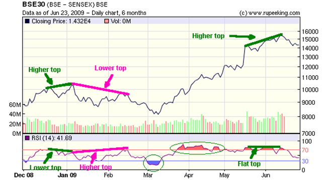
Enough theory. Now on to some practical examples by looking at the 6 months closing price of the BSE Sensex chart pattern along with a 14 day RSI:-

Sensex vs RSI_Jun2309

First, a look at the oversold and overbought regions. In early Mar '09, the RSI entered the oversold region (below 30) as the Sensex was making a low. A reversal of the previous down move followed. In late Mar '09, the RSI entered the overbought region (above 70) but remained at or near this region till the middle of Jun '09 while the Sensex rallied.

This is an indication of the imperfect nature of technical analysis. The reversal from oversold region was swift. But a reversal from overbought region took much longer. This is the reason for using several different technical indicators before coming to a conclusion about buying or selling.

Now let us look at three different divergences between the BSE Sensex chart pattern and the Relative Strength Index. During mid-Dec '08 and early Jan '09, the Sensex made a slightly higher top. The RSI made a slightly lower one. This negative divergence caused a short reaction.

From early Jan '09 to the middle of Feb '09, the Sensex made a lower top but the RSI made a higher one. The positive divergence. along with the RSI entering the oversold region led to the huge rally.

The rally continued, and from mid-may '09 to mid-June '09, the Sensex made higher tops, but the RSI failed to make higher tops. The inevitable correction is the result of this negative divergence.

It is a lot easier to sit back and analyse after the event. A lot tougher to place buy/sell bets as these patterns occur in live markets. No wonder it is so difficult to make money by day trading!

It also reinforces my view that for ordinary small investors, neither technical analysis alone, nor fundamental analysis alone can work well over long periods of time.

A combination helps you to identify good stocks through fundamental analysis, and then use technical indicators like the Relative Strength Index (RSI) and slow stochastic to time your entry and exit.

I have deliberately not marked another instance of divergence on the above chart. Observant readers should be able to find it! The reward for correct identification will be a special mention in my blog.

Related Posts

About Volume and On-Balance Volume (OBV)
Why you need to learn about the Stochastic Oscillator

Monday, June 22, 2009

Dow Jones (DJIA) Index Chart Pattern - Jun 19, '09

Last week's discussion about the Dow Jones (DJIA) index chart pattern noted that the technical indicators were not looking too bad but the failure of the DJIA to penetrate its 200 day EMA meant that the Dow had failed to enter a bull market. I had also commented:-

'The short-term average has been a pillar of support ever since the rally began in early Mar '09. Watch this average, as a downward penetration may signal a strong correction.'

The 3 months bar chart pattern of the Dow Jones (DJIA) index shows that for the first time since the rally began in Mar '09, the 20 day EMA failed to lend support to the index:-

Dow_Jun1909

The index fell below the 20 day EMA on Monday but managed to close above it. For the next four trading sessions, despite strong efforts to reclaim its place above the short-term average, it closed below it on all four days.

The volumes have become paltry. The RSI and MFI have moved down to the 50% levels. The slow stochastic fell from the overbought zone to just below the 50% level. The MACD is still positive but well below its signal line. All the technical indicators are signalling a deeper correction.

What a difference a week makes! After ignoring all the bad economic news, increasing unemployment figures and poor housing starts and continuing to rally for more than 3 months, the DJIA index started to fall just when the 'green shoots of recovery' were actually beginning to look like healthy foliage!

So are we now going to see a 'W' shaped recovery after all, or will it be a slow drift sideways to nowhere? Difficult to say at this point, but the rally never managed to turn the bear market into a bull market - like it seems to have done in Brazil, China and India.

Today's (Jun 22, '09) trade so far indicates that the correction is well on its way and the next support from the 50 day EMA may be under threat. If the already flattened 20 day EMA slips below the 50 day EMA, the bears will start to dominate the market again.

Bottomline? Time to take profits off the table. Wait for the correction to run its course. Avoid fresh investments.

Sunday, June 21, 2009

Hang Seng Index Chart Pattern - Jun 19, '09

When I first looked at the Hang Seng index chart pattern for the week ending June 19, '09, I thought it was a hallucination. The week's trading and the technical indicators were almost identical to that of the BSE Sensex chart pattern.

In the discussion of the BSE Sensex in the previous week, everything looked very bullish but I had sounded a note of caution because of the 14 weeks long rally without a correction. Likewise, in the previous week's discussion of the Hang Seng index chart pattern, the rally looked like it will continue some more, but I observed the negative divergence of the RSI lower tops.

I was reminded of the comment made by my investment banker friend from Singapore, that the Hang Seng index doesn't have a mind of its own, but follows China and India. And so it did, as we will be able to see from the 6 months bar chart pattern below:-

Hang Seng_Jun1909

The Hang Seng index slipped below the support of its 20 day EMA on Thursday. Ever since the rally began in Mar '09, the index had sprung back upwards every time it came near the short-term average.

It tried to pull back towards the 20 day EMA on Friday, but again closed below the short-term moving average. The bigger concern is that the week's trading pierced through the up trend line that was also supporting the rally for the past three months.

Volumes should have fallen with the correction, but it remained high. The RSI has gone below the 50% mark. The slow stochastic fell from the overbought zone to below the 50% level. The last two occasions it did so - in Jan '09 and Mar '09 - it went all the way down to the oversold zone. The MFI is resting on the 50% level. The MACD is still in positive territory but has moved well below the signal line.

Barring a sudden spurt in liquidity from overseas investors, the Hang Seng index looks like it will correct some more next week. Till it stays above the 200 day EMA, the bull market will remain in force.

Bottomline? If you missed booking profits last week, you can do so early next week. Then wait for the correction to exhaust itself before re-entering.

Saturday, June 20, 2009

BSE Sensex Index Chart Pattern - Jun 19, '09

Last week's BSE Sensex index chart pattern showed 14 straight weeks of gains on increasing volumes. All the technical indicators were positive and supporting the up move. The economic fundamentals were hinting at signs of improvement. Everything pointed to a continuation of the rally.

However, I did strike the following note of caution:

'But I remain cautious simply because of the continued 14 positive weeks of rally without any meaningful correction. That increases the possibility of a steep fall.'

Prescient? Hardly. Just several years of experience in the stock market and watching chart patterns. In spite of the late pullback on Friday, Jun 19, '09 the Sensex closed lower than the previous week. The incredible bull spell seems to be broken.

This week, we will take a look at the 6 months bar chart pattern of the BSE Sensex index to catch some very interesting formations:-

Sensex_Jun1909

The long-awaited correction during the week was quite steep and the Sensex pierced through two supports - (i) the 20 day EMA from above, some thing it hasn't done since Feb '09; and, (ii) the up trend line connecting the bottoms made on Mar 9, '09 and May 14, '09.

Friday's pullback took it back to the up trend line and very marginally above the short-term moving average - which means the bulls aren't ready to give up without a fight. The text books on technical analysis say that if you missed selling at the top, sell on the pullback.

Now look at the formation over the last four weeks (the previous 19 trading sessions, to be precise). Do you see a nice semi-circular 'rounding top' formation? Not quite? Then have a look at the signal line of the MACD.

A 'rounding top' is bearish. Since the time spent in the formation has been only 4 weeks, its effect may be weaker. That means, the BSE Sensex index should get support in the region between the previous low of 13480 (made on May 18, '09 when the huge gap-up happened) and the 50 day EMA at 13200.

I've also introduced the Money Flow Index (MFI), a momentum oscillator that is interpreted much like the RSI, but with a difference. The RSI is based on the price alone. The MFI uses price data weighted with the volume of transactions in Rupees.

See how the MFI made a lower top when the Sensex was hitting a new high? This negative divergence is not that clear in the RSI or the slow stochastic indicators. One more reason why you need to look at several indicators for coming to any conclusion.

The best (or worst, depending on your market stance at the moment) has been saved for the last. My favourite indicator, the slow stochastic. After remaining at or in the overbought region for the better part of the past 3 months, it has dived down steeply, and gone below the 50% mark.

The last two times it did that - in Jan '09 and Feb '09 - it went all the way down to the oversold zones, followed by up moves. So watch it closely over the next two weeks.

The big gap (between 11950 and 13480) in the Sensex still remains unfilled, and the very bearish possibility of an 'island reversal' still remains open.

Bottomline? Remain very cautious over the next two weeks, and refrain from making wild bets on unknown stocks. The BSE Sensex index chart pattern is dancing to global money flows. Keep track of the world indices. Fresh investments should be made after the budget.

Friday, June 19, 2009

About assets, liabilities and the curious case of HUL

Dissecting balance sheets and getting to the root of financial statements are not really the stuff that gets me all energised. Assets, liabilities, inventories, cash and bank balances are insipid compared to the engineers' arsenal of double derivatives (no pun intended) and triple integrals.

But as uninteresting as brushing one's teeth, or eating 'karela' (bitter gourd) may be, they are a necessity for good hygiene and health. Likewise, being able to read between the lines of balance sheets, Profit & Loss and Cash Flow statements is a necessity for better health of one's stock portfolio.

Today's discussion was triggered off by reader Rishi's query last week. Why is it that a stalwart company like HUL is showing negative Net Current Assets on its balance sheet year in and year out? I was taken aback. How could that be possible? A market bellwether and leading FMCG multinational has more liabilities than its assets? After generating huge cash flows and paying continuous dividends?

Unfortunately, I could not locate last year's Annual Report. It came more than a year back and after a quick review to check every thing was in order, I didn't need to refer back to it any more. So I checked up at the Rediff money site, and guess what? Five straight years of negative Net Current Assets.

Now, any semi-intelligent high school graduate will be able to tell you that Net Current Assets (i.e. Current Assets - Current Liabilities) should be zero at worst, never negative. In other words, any company should own enough readily accessible assets to cover what it owes to others in the near term (within the financial year).

Ideally, the ratio of Current Assets to Current Liabilities should be 2 or more. But 1.5 is an acceptable number. That would indicate that a company has more than enough money to pay off the loans due and its creditors.

Unable to locate the HUL Annual Report to check the details, I checked up ITC's report instead. Sure enough, the Current Assets to Current Liabilities ratio was a respectable 1.58. Cummins India's? 1.67. Glaxo Pharma's? 1.91.

Now I was getting a bit jittery. Without the Annual Report, how will I respond to Rishi? Suddenly, I remembered my friend Nasir, who is an experienced Chartered Accountant in a multinational company. He had kindly offered to help me out with accounting intricacies if I faced problems.

Nasir's response was prompt and detailed. HUL's modus operandi is unique in corporate India. At the beginning of the year, they collect advance payments from their distributors. No distributor has the temerity to say 'No'.

These substantial advance payments are reflected in their books as a "Current Liability", though the company has no intention of paying back the money. What they do instead, is to supply their various products to the distributors throughout the year against the advance payments.

Consequently, the 'Debtors' figure under the head of "Current Assets" is negligible or nil. And the company is always flush with cash. Funny thing is, I knew about all this because an acquaintance used to be a HUL distributor.

Why do the HUL distributors effectively fund the company's operations? This is what happens when a company becomes so large and so popular, that it almost becomes a monopoly and can negotiate advantageous business terms with its suppliers and distributors.

Does all this smack of sharp business practices? Not at all. The company has worked hard over the years to create good products and establish strong brands. They spend hundreds of Crores in advertising to maintain their leadership position in the FMCG segment.

Why shouldn't they cut the best deal possible for themselves, and their shareholders? Microsoft does it. I would do it if I was able to garner that kind of market domination.

After all, a company exists to make profits. Not to win popularity contests. If it can do so without violating the law of the land, more power to them. Whether its Current Assets are more or less than its Current Liabilities.

Related Posts

How to pick Stocks for Investment - Part III
Stock Chart Pattern - Hindustan Unilever
About portfolio suggestions and a stock not to be picked
How to Select Stocks within Infrastructure Sector

Thursday, June 18, 2009

Stock Chart Pattern - Sanghvi Movers

The stock chart pattern of Sanghvi Movers has a couple of interesting formations - one is very positive, and the other - which is still forming - is quite negative.

Before delving in to the details, a small confession. I have very little information about the management quality. But they seem to be on to a good thing. What is Sanghvi Movers' business? They hire out cranes for construction projects.

What is the big deal about that? It is just the kind of business the big boys will not get into. That has allowed this small-cap company (equity less than Rs 10 Crores) to become the largest crane hiring company in India, and the 3rd largest in Asia.

Sanghvi Movers' client list reads like a 'who's who' of the engineering and construction industry. They have close relationships with Reliance, BHEL and Suzlon. Robust cash flows from operations, growing earnings and dividends, more than 300 medium and large size cranes amongst its assets - all add up to a company whose future is tied to India's growth story.

The 1 year bar chart pattern of Sanghvi Movers shows that savvy investors have already caught on to the stock:-

Sanghvi Movers_June1809

After making an almost perfect bullish 'rounding bottom' formation with a low of Rs 60 made on Mar 4, '09, the stock moved up quickly and hit a high of Rs 199 yesterday.

Take a look at the pattern forming since the middle of May '09. If you draw a line connecting the tops, you will see a semi-circle being formed. Such a 'rounding top', if formed, is a bearish pattern that could lead to a sharp decline.

The RSI has been moving down as the stock has moved sideways for most of this month. The slow stochastic has moved down from the overbought zone and the %K line is below the %D line. The MACD is in positive territory but has gone below its signal line. All three indicators are showing negative divergences.

The OBV is the only indicator that looks bullish. But look a little closer. A sharp volume spike on Jun 2, '09 (a bulk deal?) moved the OBV into positive territory. Otherwise it was meandering below the '0' line, with a marginal rise during April and May '09. In fact, the pick up in volumes happened only during the past month.

Please note that Sanghvi Movers is a Rs 2 face-value stock, so the current price of Rs 177 is equivalent to Rs 885 for a Rs 10 face-value stock. Are there any other negatives? Yes, the huge debt. Obviously, the nature of the business is such that to keep up with the growth, the company needs to invest continuously in capital equipment.

Bottomline? On a correction, the stock chart pattern of Sanghvi Movers can move down to the Rs 120-130 levels and seek support from its 50 day EMA. Entry can be considered on the dip by intrepid investors for a 100% gain within a year or so.

Wednesday, June 17, 2009

Stock Chart Pattern - Voltas Ltd

The stock chart pattern of Voltas Ltd is based on strong fundamental foundations. Like many companies of the Tata group, Voltas has market leadership in its chosen area of manufacturing.

It produces solid, long-lasting goods and manages its finances conservatively. Steady growth in earnings, regular dividends, substantial order-book and a comfortable cushion of cash - just the kind of company I like.

Let us have a look at the 1 year bar chart pattern of Voltas Ltd:-

Voltas_Jun1709

Voltas made a 'V' shaped bottom after hitting a low of Rs 31 on Mar 5, '09. On a rapid pick-up in volume, the stock surged to Rs 146 on Jun 10, '09. It encountered strong resistance at the 145-150 zone and has corrected down to seek support at its 20 day EMA.

A quick look at the technicals. The OBV is tracking the correction by moving down. The MACD is in positive territory but has moved below its signal line. The RSI has slipped below the overbought zone. The slow stochastic has done likewise, with the %K below the %D line. All the indicators point to a further drop in price.

The massive rise of 370% in 3 months was unsustainable and the correction should help the stock shed some weight for its next up move. Wait for the correction to play out. Meanwhile, you can do your research and read a detailed fundamental study of Voltas Ltd in this article.

Bottomline? A 38.2% or 50% Fibonacci retracement of the entire rise means a possible drop to the 90-100 zone. That would take the Voltas chart pattern near its 50 day EMA - a good entry opportunity for new investors. Existing investors should continue to hold.

Tuesday, June 16, 2009

A break from the stock market and chart patterns

Some times, it is good to take a break from discussing stock market indices and chart patterns and step back a little from the scene of action. It gives a more macro perspective.

The eternal fights between the bulls and the bears is exciting to follow and they provide just the opportunities to lay the foundations of long-term wealth creation. Once in a while it is also good to do a reality check.

I was discussing the pros and cons of long-term investing and waxing eloquent about the positive aspects of the buy-and-hold strategy with a friend. He came back at me with Keynes' famous quote: 'In the long-term, we are all dead!'

My thought process hit the pause button and quickly shifted to the Puja we had at our home a couple of weeks back. Early in the morning, the door-bell rang and a young man, clad in tee-shirt and jeans, announced that he was the priest who would be conducting the day's affairs. After changing into more traditional attire, the young priest proceeded to carefully and lovingly decorate the Puja area.

What followed surprised me even more. The 'shlokas' and chants from the Vedas and the Bhagavad Gita emerged fluently in chaste and mellifluous Sanskrit from his heart. He did not refer once to any of the scriptures he was carrying with him. He stopped from time to time to explain the significance of his chants in simple English.

One of the things he said was (and this might be the essence of the Hindu religion): Human beings go through an eternal cycle of birth and death. During our brief lives, we ceaselessly pursue happiness, not realising that sadness is the other side of the coin. Sadness will follow happiness, just as death follows birth (and in stock market analogy, bear markets follow bull markets).

The only way out from this eternal cycle of 'Maya' (or illusion) is to try and attain 'Ananda' (or bliss) - which is a state beyond happiness and sadness when one's mind attains greater heights and unifies with the Supreme Consciousness (or God or Allah or whichever terminology that followers of different religious beliefs may employ).

The sooner we realise the true purpose of our lives, the better. The pursuit of worldly attainments - whether power, or fame, or long-term wealth from the stock market - have no real significance other than in the very short-term in the universe's time cycle. In the long-term, we will all be dead.

Does that mean we will stop all our activities and become hermits? Obviously not, because that path is not for every one to follow. We need to keep doing our regular assignments and duties as per responsibilities acquired or thrust upon us. But in this journey of life, we have to occasionally stop and smell the roses.

Once in a while, take a few days off. While I paid attention to the religious ceremony, my mind focussed away from the stock market and its chart patterns. You may want to go white-water rafting or spend a weekend at a tiger reserve.

A bird's eye view from time to time helps to retain objectivity. Too much day-to-day involvement in anything causes our minds to saturate and may lead to hasty and unwise decisions. Clear out the clutter, refresh your minds and come back with renewed vigour to this addictive roller-coaster ride in the stock market.

Monday, June 15, 2009

Dow Jones (DJIA) Index Chart Pattern - Jun 12, '09

In last week's discussion about the Dow Jones (DJIA) index chart pattern, the following comment was made:-

'While the Dow has been making higher tops, the ROC and RSI have been making lower tops. This negative divergence, coupled with disappearing volumes, do not augur well for the index to continue its rally much longer.'

A look at the 3 months bar chart pattern of the Dow Jones (DJIA) index will reveal that the rally has definitely stalled:-

Dow_Jun1209

In 5 days of trading last week, the 200 day EMA was penetrated 4 days in a row. Except on Friday, Jun 12, '09 when the Dow closed bang on the long-term average, all the daily closes were below the 200 day EMA.

This strong resistance from the long-term average means the DJIA index is yet to enter a bull market. Both the 20 day and 50 day EMAs are still rising but are below the 200 day EMA. The volumes are low, which does not instill confidence about continuation of the rally.

The technical indicators are not looking bad. The slow stochastic is marginally overbought. The MACD is positive and above its signal line. The ROC and RSI are moving up but haven't yet made a higher top.

Today (Jun 15, '09), the Dow has opened with a gap down and is seeking support from the 20 day EMA. The short-term average has been a pillar of support ever since the rally began in early Mar '09. Watch this average, as a downward penetration may signal a strong correction.

Unemployment is still rising, albeit at a slower rate. The extra liquidity injection into the financial system has temporarily arrested the steep fall in the economy. The stock markets have celebrated the reprieve from the edge of a precipice and started an unprecedented rally. Looks like it is time to revert back to reality.

Bottomline? The failure of the Dow Jones (DJIA) index to close above its 200 day EMA, despite several attempts, is significant. Be very cautious and keep booking partial profits.

Sunday, June 14, 2009

Hang Seng Index Chart Pattern - Jun 12, '09

During the previous week's discussion of the Hang Seng index chart pattern, I had observed a sideways consolidation on diminishing volumes but had commented that the trend was bullish and the rally was likely to continue.

The Hang Seng index seemed to have liked what I had written. After dipping down and seeking support from the 20 day EMA on lower volumes, it once again jumped up on higher volumes and breached the 19000 level before closing a bit lower.

The 6 months bar chart pattern of the Hang Seng index shows that the bullish fervour is not showing any signs of abating:-

Hang Seng_Jun1209

The 20 day EMA has become an important trend supporter. For 3 months now, the Hang Seng index has not closed below its short term average (except one day in April '09). Watch it closely as a breach of the support from the 20 day EMA can lead to a bigger correction.

The 50 day EMA has moved above the 200 day EMA. The last hope of the bears have been snuffed out. All the three moving averages are now moving up with the Sensex - the bull market is well and truly on its way.

The slow stochastic, after a brief dip, has moved back into the overbought zone. The MACD, after a slip below its signal line, has gone up to touch it. The ROC has reversed direction from last week. The RSI followed more of a zig-zag path but is in the positive zone.

The Hang Seng index chart pattern is looking very bullish on every count - save one. Look at the last four RSI tops. They are gradually going lower. Compare it with the corresponding index levels, which are progressively higher by 1000 points or more. This negative divergence is the only fly in the ointment.

Bottomline? Stay invested and enjoy the ride. But keep trailing stop-losses and book partial profits.

Saturday, June 13, 2009

BSE Sensex Index Chart Pattern - Jun 12, '09

Last week's BSE Sensex index chart pattern discussion had started off with a line from an old Dylan song. This week's BSE Sensex chart pattern resembles the previous week's chart so much that you can't help but remember another 1960's corny pop song by the Herman's Hermits called "I'm Henry the Eighth I am" - where all the verses were the same. (Whoopy Goldberg did a great take of that song in the Patrick Swayze-Demi Moore movie 'Ghost'.)

Let us have a look at the two years weekly chart pattern of the BSE Sensex index:-

Sensex_Jun1209

Every thing on the chart pattern looks pretty much the same as the previous week's. This also exemplifies that on longer term charts, so much of the tensions of day-to-day index gyrations get smoothened out. One more advantage of being a long-term investor!

The RSI and slow stochastic continue to remain snugly in overbought zones. The divergence between the MACD and its signal line has increased. The possibility of an 'island reversal' remains open because the big gap in the Sensex caused on May 18, '09 is still unfilled.

The new indicator added is the OBV, which I discussed in an earlier post this week. Look how it continues to move up because of the high volumes. Since an 'upwardly mobile' OBV indicates accumulation, the Sensex may continue its sideways drift with an upward bias for a while longer.

The improved positive industrial production figures for April '09, after 4 months of negatives should nudge the BSE Sensex chart a little further up, towards the 16000-16500 zone. Most industry watchers feel that the worst of the economic downturn is behind us.

But I remain cautious simply because of the continued 14 positive weeks of rally without any meaningful correction. That increases the possibility of a steep fall.

Bottomline? No need to get out all at once. Keep your stop-losses tighter on individual stocks, and keep taking some profits off the table.

Friday, June 12, 2009

What is the value of stock tips?

When I first started writing this blog about a year ago, one of the first things I considered was whether to give stock tips or not. Quite a few readers have also asked me to give stock tips.

Many of the popular Indian stock sites thrive on providing several stock tips throughout the day - with detailed levels of support, resistance, stop-loss. A few of these sites have paid subscription services. Some even openly ask for money that they will invest with 'guaranteed high returns'.

The question that immediately popped up in my mind was: What is the value of these stock tips? Do they teach readers to become more adept at picking their own stocks? Or, do they urge people to jump onto a momentum stock's bandwagon?

I remembered the old story about catching fish:- Give a man a fish, and you feed him for a day; teach a man to fish, and you feed him for life.

As a long-term investor, I had no desire to keep coming up with a handful of stock tips every day, without any accountability about what those tips may do to my readers' finances. Is anything that is churned out a dime a dozen of any real value?

Another factor that influenced my decision was that very few sites take the trouble of explaining in simple language about what is going on in the economy and the environment around us, and what could be their effect on the stock markets and individual stocks.

As an engineer who has been investing in the stock markets for nearly 25 years, I had to learn about the basics of economics and accounting - just to level the playing field against the smart Chartered Accountants who can dissect an annual report before I can say 'Jack Robinson'.

But the most important factor was the observation that most stock related sites have either a 'fundamental' stance or a 'technical' stance. As if, to quote Kipling: 'Oh, East is east, and West is west, and never the twain shall meet'.

This unnecessary divide created between fundamental analysis and technical analysis was brought forth piquantly by a member of an investment group, who asked me after reading one of my 'Stock Chart Pattern' discussions: "Are you a fundamental analyst, or a technical analyst?"

My mind was made up. This will be a blog site that will discuss both fundamental and technical concepts, in easy-to-understand English with a good dose of my investment experiences thrown in, to make a mix that will motivate young people of all ages to learn more about long-term investments in the stock market and mutual funds.

So I write about a couple of stocks every week - not because I want you to blindly go out and buy or sell them, but to learn how to take your own decisions about different stocks based on the fundamental and technical parameters discussed.

My friend Pankaj sent me a congratulatory email after noticing that my Sitemeter is now into 5 digits. A better criteria of success will be if you, dear readers, improve the quality of your lives and become better investors as well.

Thursday, June 11, 2009

Stock Chart Pattern - Bartronics India

There is a specific reason for analysing the stock chart pattern of Bartronics India, but I will not divulge it right away. This is one of those much-talked-about-by-analysts-on-Business-TV-channels kind of stock. That means it is well-known among retail investors - particularly those who can't get by without their daily dose of stock tips.

It is funny how these TV stock tips work. By the time an analyst finishes discussing the stock, it spurts in value and some times even hits an upper circuit or two. Retail investors try not to miss the bus. A few fund managers get caught up in the chase. Pretty soon, every one and his brother-in-law owns the stock.

Specially when the company is in so-called 'high-tech' fields - like barcode readers, RFID tags and smart cards - then the exuberance and excitement progresses geometrically. No one doubts the potentially huge market for these 'untapped' technological marvels. More so because they have seen it all in action in one of their '11 days, 10 nights' conducted trips to the USA or Europe.

The positive sentiment is quite apparent from the 1 year bar chart pattern of Bartronics India:-

Bartronics_Jun1109

The stock made a low of Rs 55 on Nov 20 '08, followed by a test of the low on Dec 3, '08. It made another low of Rs 61, three months later on Mar 9, '09 - thereby creating a typical double-bottom chart pattern.

The rally that followed was on expected higher volumes, albeit after the stock cleared the Rs 80 level. Both the RSI and slow stochastic indicators quickly hit overbought zones and then started to decline.

The stock reacted from Rs 115 to Rs 85, where it received support from its 50 day EMA while it consolidated sideways. Note that the on-balance volume (OBV) remained flat when the stock reacted in late April '09. This positive divergence gave an indication that the next move would be a continuation of the up move.

The sharp up-move from May 18, '09 onwards after the election results again took the RSI and slow stochastic to overbought zones. Both indicators have since moved down as the stock reacted from a long-term resistance level of Rs 180.

But observe the MACD, which is flat and the OBV, which has made a new high. These indicate a possible continuation of the rally. Looks like the chart pattern of Bartronics India is suggesting a 'buy-on-dips' strategy.

That's not why I'm writing about this stock. If some thing looks like it is too good to be true, it usually is. So I took a quick peek at the cash flow from operations and the Profit and Loss statement. And guess what? The 'excellent' profits are a big bag of wind!

In the year ending Mar '07, adjusted PAT was Rs 13.4 Crores; cash flow from operations was (-) Rs 75.7 Crores. It got worse in Mar '08. Adjusted PAT was Rs 33.1 Crores, a 'creditable' increase of 147%! But the cash flow from operations? (-) Rs 219 Crores - a fall of 189%. The company actually paid a tax of Rs 8.3 Crores with money it did not have!

How is this company surviving? A look at the balance sheet will reveal all. Almost a doubling of equity capital from Mar '06 to Mar '08; plus a whopping unsecured loan of Rs 253 Crores - at much higher interest rates than that prevailing now. No wonder the Mar '09 Q4 results were awful.

Bottomline? The Bartronics India stock chart pattern looks very encouraging, thanks to the positive sentiment in the markets, but the fundamentals are apalling. Get out before this house-of-cards comes tumbling down.

Wednesday, June 10, 2009

About Volume and On-Balance Volume (OBV)

I have been writing about the importance of transaction volume for confirmation of stock or index chart pattern moves. Price rise should be accompanied by higher volumes. Price falls should be on lower volumes.

Rising price on static or lower volumes produces a 'negative divergence' - which indicates the rise may end soon. But what if the stock price or index is moving sideways and the volume is going up, or down? Does that have any technical significance for market movements?

Enter the concept of 'On-Balance Volume', a momentum indicator developed by Joseph Granville in 1963. It is calculated on the basis of a rather simplistic assumption about the closing price of a stock, or the closing level of an index:

If the closing price or index level of a particular day is higher than the immediately preceding trading day's, then the entire volume of transactions is added to a cumulative volume total (named On-Balance Volume, or OBV).

If the closing price or index level is lower than the immediately preceding trading day's, then the entire volume of transactions is subtracted from the OBV.

If the closing price or index level of a particular day remains unchanged from that of the immediately preceding trading day's, the OBV also remains unchanged.

What is the significance of this momentum indicator? A rising OBV means accumulation (i.e. the entry of smart-money); a falling OBV means distribution (i.e. stronger hands transferring their holdings to weaker ones).

Why is the calculation of OBV simplistic? A stock or index usually has several up and down movements throughout the trading day. On a higher closing day, the volume of all buy and sell transactions are added to the OBV. Logically, the total volume of all sell transactions should be subtracted from the total volume of all buy transactions before adding to the OBV.

Likewise, for a lower closing day, the difference between the total sell volume and the total buy volume should be subtracted from OBV. When the indicator was developed by Joe Granville, computers were not as readily available or accessible. So to keep matters simple, logic was given short-shrift.

Let us look at an example. What better choice than the BSE Sensex index chart pattern?

Sensex_OBV1009

During Sept '08 and Oct '08, the OBV followed the Sensex downwards. In Nov '08 and Dec '08 also, the OBV danced together with the Sensex in lock-step.

Now comes the interesting part. See what happened during Jan '09 and Feb '09. While the Sensex fell, the OBV remained flat. A positive divergence, indicating a possible trend change.

Also interesting to observe is what happened when the rally took off during Mar and Apr '09. The OBV made a higher top in Apr '09 when the BSE Sensex index was at around 11000, than when the index was at 16000 in Aug '08. This was a true sign of accumulation.

Unfortunately, this particular charting software doesn't have volume information updated from May '09 onwards.

I would like to thank reader Rajeev for asking a question about accumulation and distribution in the 'comments' thread of this post. It motivated me to write this article.

Related posts

A rectangular Sensex chart pattern
Three phases of a Bear Market
Sensex in a narrow band

Tuesday, June 9, 2009

Stock Chart Pattern - Sintex Industries

The stock chart pattern of Sintex Industries gives clear indication that this fundamentally strong company is coming out of the down turn well. No wonder it has caught the recent attention of the pink papers.

The claim to fame of Sintex was the almost ubiquitous black plastic water storage tanks atop recently constructed houses. The company has moved on to bigger and better products which they sell to the global market place. Their pre-fabricated low-cost housing products order book exceeds their 2008-09 revenues by three times, as per this article.

What I like about the company is the growth in earnings, regular dividends, and positive cash flows from operations. But all is not peaches and cream. The growth in earnings has not been matched by a growth in cash flows from operations. Increasing interest payments is another concern.

Let us take a look at the one year bar chart pattern of Sintex Industries to see what the technicals are indicating:-

Sintex_Jun0909

After making a low of Rs 70 on Mar 12, '09 the stock reversed trend and made a high of Rs 250 last Friday (Jun 5, '09) - rising more than 2.5 times on higher volumes in less than 3 months. The 'V' shaped bottom formation has been marked on the chart pattern.

After the sharp rise, the stock is consolidating sideways and has taken support from its 20 day EMA. In the process, the technical indicators have dropped from overbought zones.

The %K line of the slow stochastic has slipped below the %D line. The MACD has gone below its signal line. The RSI has moved down to its 50% level. Note how the RSI had reached heavily oversold levels in early March '09 - just before the stock chart pattern reversed direction. The ROC is marginally in the positive zone.

Bottomline? Long-term investors can consider putting Sintex Industries on their watch-list. It is a Rs 2 face-value stock and one should plan to add only on a correction to the Rs 140-150 level. Existing holders can book some partial profits.

Monday, June 8, 2009

Dow Jones (DJIA) Index Chart Pattern - Jun 5, '09

Last Monday (June 1), the Dow Jones (DJIA) index chart pattern made a final dash towards its 200 day EMA on higher volumes. After reaching its goal, the last remaining energy seemed to get drained out of the index. For the rest of the week, it drifted sideways on reducing volumes.

On Friday (June 5), a brave effort made the Dow pierce through its long-term average, only to fall back and close below it. The week's trading stopped the 200 day EMA from falling, though the DJIA was unable to close above it.

The 3 months closing bar chart pattern of the Dow Jones (DJIA) index shows that it is still technically in a bear market:-

Dow_Jun0509

The technical indicators are looking stronger than the previous week. The slow stochastic has moved up and is just below the overbought zone. The MACD has also moved up and above its signal line. The RSI has moved above the 50% level. Only the ROC has slipped down a bit.

But all doesn't seem well for the DJIA. After it hit the 8000 level on Mar 26, '09 - it has consumed all of 10 weeks to rise 10%. While the Dow has been making higher tops, the ROC and RSI have been making lower tops. This negative divergence, coupled with disappearing volumes, do not augur well for the index to continue its rally much longer.

The fundamental picture is becoming 'less bad'. It's still a long way from becoming good. The banks-that-can-not-fail should raise some money quickly before the window of opportunity shuts.

Bottomline? The Dow Jones (DJIA) index chart pattern has not been able to conquer the overhead resistance from its 200 day EMA yet. Keep taking profits off the table and continue to keep trailing stop losses on your remaining stock holdings.

Sunday, June 7, 2009

Hang Seng Index Chart Pattern - Jun 5, '09

Last week's analysis of the Hang Seng index chart pattern was concluded with some cautionary statements - maintain trailing stop losses and book partial profits.

The sudden up-tick in volumes in the previous week had made me a little wary. The Hang Seng index did close higher than the previous week - but consolidated sideways with three up days and two down days, on progressively diminishing volumes.

The 3 months bar chart pattern of the Hang Seng index clearly shows this consolidation:-

Hang Seng_Jun0509 

The 200 day EMA has started moving up and the 50 day EMA has just touched it. The medium-term average is poised to move above the longer-term one to provide the final confirmation of a bull market.

Some experts have been calling this a 'cyclical bull market' within a longer term bear market. Others opine that this is the beginning of a secular bull market. Whatever be the prognosis, the fact remains that the trend is bullish. We should always make friends with the trend.

The slow stochastic has remained in the overbought zone and is showing no inclination of moving down. The MACD is positive and above its signal line. The RSI has moved up while the Hang Seng moved sideways. But this positive divergence is counteracted by the ROC, which has moved down.

A friend who is a big shot in an investment bank in Singapore made an interesting comment. He said the Hang Seng index doesn't have a mind of its own. It watches what happens in China and India, and tries to follow suit. Point to ponder!

Bottomline? The rally looks like it wants to continue next week as well. Avoid fresh buying and keep taking profits, or, maintain strict stop-losses and enjoy the ride.

Saturday, June 6, 2009

BSE Sensex Index Chart Pattern - Jun 05, '09

This week's BSE Sensex index chart pattern reminded me of an old Bob Dylan song that was popularised by The Byrds in the 1960s. A line from the song says: "Pack up your money, pick up your tent, you ain't going nowhere."

The Sensex had made a high of 14931 on May 19, '09 on strong volumes (the day after history was created by the Sensex chart when it hit two upper circuits and the stock market closed for the day after a few minutes of trading). On Jun 5, '09 the Sensex chart made a new high of 15257 - barely 2% higher after 3 weeks of trading on volumes that were quite a bit lower.

May be it is time to pick up your money and pack up your tent (Dylan had a tendency to deliberately mix his metaphors) because the Sensex "ain't going nowhere."

We will take a look at the 2 years weekly bar chart pattern of the BSE Sensex index to highlight a couple of possible bearish pattern formations:-

Sensex_Jun0509

The big gap created on Monday, May 18, '09 still remains unfilled. For three weeks in a row, the Sensex hasn't even come close to even partially filling the gap. The island-like formation on the weekly chart pattern has been circled.

Any trading below the gap will indicate an 'island reversal'. Such a formation is not very common, but if it happens, it is very bearish and signals a trend change.

Now take a look at the 3 months period from Oct '07 to Jan '08 - when the previous bull market had peaked. The slow stochastic had remained overbought all through those 3 months before suddenly breaking downwards.

Compare it with the past 2 months. The slow stochastic has been overbought right through, even though the Sensex index is 6000 points below the Jan '08 high. The slow stochastic can remain overbought for a while longer, but it is better to take some profits early than make a loss later.

There are other concerns as well. The RSI is highly overbought and is much higher than what it was during the 3 months bull market period from Oct '07 to Jan '08. The ROC is also much higher and looking overbought.

The MACD is lower than what it was during the bull market. But have a look at the divergence between the MACD and its signal line. It is much higher now than what it was earlier.

Bull markets are known to climb a 'wall of worry'. The question is - how high is the wall? The strong bullish sentiment in the stock market would indicate that the wall isn't very high.

The upward movements in mid-caps and small-caps are making me a trifle suspicious that a nice bull-trap has been set. Just a hunch.

Bottomline? The technical indicators on the long-term chart pattern of the BSE Sensex index are suggesting caution. This is not the time to jump in with both feet. The risk-averse can start booking partial-profits. Others can maintain strict trailing stop-losses and continue the bull ride.

Friday, June 5, 2009

How to pick Stocks for Investment - Part III

In this mini series on how one should pick stocks for investment, I had previously provided some general guidelines in the first part, followed by a discussion of the top-down method of stock selection in the second part.

The bottom-up method of selecting stocks for investment is by far the most time consuming and difficult, particularly for people who don't like to play around with numbers.

Why is the bottom-up method of stock picking difficult? Because you have to sift through thousands of listed stocks to narrow down to the hundred odd companies that meet the basic criteria of being truly investment worthy.

After doing that, you will need to check the fundamentals of each and every one of those short-listed companies to separate the wheat from the chaff. Now you know why brokerages and financial institutions maintain expensive research departments!

One way to cut short the time and effort is to combine the top-down method with the bottom-up method. In other words, first select the handful of sectors that you have some knowledge about. Then limit your stock picking to only those few sectors. That would be by far the safest option for picking stocks for your core portfolio.

There can be no better guide for selecting good stocks than the biggest 'guru' of them all - Benjamin Graham. I learned all about stock picking from his book, 'The Intelligent Investor'. Till date, I use the guidelines suggested by him - with suitable modifications for the Indian environment.

'No risk - no gain' is an old saying. The bottom-up method is the only one for choosing the smaller and somewhat riskier bets for your 'mad money' portfolio. Here are Graham's guidelines for stock picking for the conservative investor, suitably modified:-

1. Adequate size. Market capitalisation, i.e. current share price multiplied by the total number of shares issued and subscribed, should be at least Rs 100 Crores.

2. Strong Financial condition. Current assets should be twice current liabilities, and long-term debt should not exceed working capital.

3. Earnings Stability. Positive earnings per share (EPS) for each of the past 5 (preferably 10) years.

4. Earnings Growth. At least 50% cumulative growth in EPS for the past 10 (preferably 5) years.

5. Dividend record. Consistent dividend payment for the past 5 (preferably 10) years.

6. Moderate P/E ratio. Current share price divided by the average EPS for the past 3 years should not exceed 15.

7. Moderate P/BV ratio. Current share price divided by the book value per share should not exceed 1.5.

Graham also suggested that the result of multiplying the P/E ratio by the P/BV ratio should not exceed 22.5 - for cases where either the P/E ratio is higher than 15 and the P/BV ratio is lower than 1.5, or, the P/E ratio is lower than 15 and the P/BV ratio is higher than 1.5.

So there you have it. This is no secret recipe for untold riches. Stocks picked using these guidelines may not perform as expected. Stocks which do not meet many of the above criteria can fly through the roof. That is the nature of the beast.

During bear markets, you may find most of the listed stocks meeting the above criteria. In bull markets, only tiny caps may meet the guidelines. The in-between stage - like now - is a great time to start your research work for identifying strong stocks for the next up move of the bull run. It will happen after the inevitable correction to the 3 months long rally.

A good starting point is to buy a copy of Capital Market magazine, or visit www.moneycontrol.com for checking out the database of companies, and apply criteria numbered 1, 6 and 7 above to prepare a preliminary short-list. Check whether the short-listed companies have positive cash-flows from operations for at least 4 of the last 5 years.

The ones that make the grade can then be run through the guidelines mentioned in 2, 3, 4 and 5 above. You will finally have a 'buy list' that you can start tracking.

Oh! I almost forgot to mention the corollary to the earlier saying. It is 'no pain - no gain'. For readers who do choose to suffer the pain, there will be a guaranteed gain. I will technically analyse your choice of the 5 top picks from your list and give you approximate buy and sell targets. Absolutely FoC (free of charge).

Now, that can be a ticket to decent money-making, if not untold riches!

Related posts:

Market cycles and Sectors
Which sectors should you invest in?

Thursday, June 4, 2009

FTSE 100 Index Chart Pattern - Jun 4, 2009

The tussle between the bulls and bears continued with the FTSE 100 index chart pattern in a sideways consolidation. The overhead resistance is being provided by the 4500 level. The FTSE managed a couple of closes above its 200 day EMA and then moved down to seek support from the 20 day EMA.

The UK economy is not showing any great signs of revival. Gordon Brown appears to be losing his grip over his party and the government. These signs are not conducive for the trend change to a bull market.

In a recent interview, Stephen Roach, Head of Morgan Stanley Asia said that the current global stock market rally is not based on fundamentals. The huge stimulus and domestic consumption in the economies of China and India may not be sufficient to pull global economies out of the rut.

The stock markets of both China and India have entered bull phases. But the 3 months bar chart patten of the FTSE 100 index shows that the UK markets are yet to follow suit, with both the short-term and medium term EMAs still below the 200 day EMA:-

FTSE_Jun0309 

The slow stochastic bounced up from the 50% level and tried to move up to the overbought zone. It failed in its efforts and is dropping down towards the 50% level again.

Both the ROC and RSI are at their mid-points. The MACD is in positive zone but below its signal line. The only difference from the previous week's chart pattern is the uptick in volumes over the last couple of trading sessions.

Bottomline? The FTSE 100 index chart pattern is yet to make a decisive move above its 200 day EMA. It needs to stay above the long-term moving average for 10-12 sessions continuously for the trend to change from bear to bull. Till then, the strategy for investors should be to book some profits on every rise in the market.

Wednesday, June 3, 2009

Stock Chart Pattern - Cummins India

Yesterday I had analysed the stock chart pattern of IRB Infrastructure purely from a technical point of view because of the interesting double-bottom formation. I had very little idea of the fundamentals of the company and would not contemplate purchasing the stock because it belongs to a sector that I'm sceptical about.

No such doubts about Cummins India. It is just the kind of stock I like to hold for long term. A market leader in the manufacture of diesel engines of different sizes and used in different industries. A strong overseas collaborator which is also a client. Regular dividends. Good operating cash flows. Steady growth. Low debt. Low risk.

Stalwart stocks like Cummins India won't bring you overnight riches. Neither should you lock it up in a vault and forget about it. The way to benefit from such stocks is to be on the alert for the occasional longer term trading opportunities.

The 1 year bar chart pattern of Cummins India has a couple of notable formations:-

Cummins_Jun0309

The chart pattern above shows a single bottom in a 'V' shape. Note that the bottom was formed on Mar 9, '09 - the day most world indices formed their bottoms. Both the fall to the bottom, and the subsequent rise, have been gradual and not as sharp as most other stocks.

From the bottom of Rs 148 the stock moved up to Rs 231 in 2 months for a decent gain of 56%. After a short consolidation came a volatile spurt on May 19, '09 - the day after the markets were shut due to extreme volatility after the election results.

The stock chart pattern of Cummins India then entered an interesting consolidation pattern called a 'symmetrical triangle'. The main criteria for such a formation - lower tops and higher bottoms with at least two tops and two bottoms touching the sides of the triangle - have been met.

Triangles can be quite fickle - with three possible options. The most likely one is an upward breakout that will be a continuation of the previous up move. The breakout must be on significantly higher volumes. If the breakout happens on low volumes, then it could be a 'false breakout' - termed an 'end run', with the stock eventually moving downwards.

There can be a downward breakout on low volumes - though a triangle is generally not a reversal pattern. Sometimes such downward breakouts can be 'false' on higher volumes, with the stock subsequently moving up. It is then termed a 'shakeout', i.e. a ploy by strong players to get rid of weaker hands (viz. retail investors) so that they can get back into the stock at lower rates.

The third option is the chart pattern meandering sideways on low volumes and eventually moving out of the triangle near its apex. This option, though possible, seems unlikely because of the increased volume during the triangle formation. This is rather unusual, and indicates possible accumulation.

The breakout - either upward or downward - should happen while the chart pattern is anywhere between half and three-quarters of the distance between the base of the triangle and its apex. The stock chart pattern of Cummins India is in that region now, so we can expect a breakout over the next few days.

The technical indicators are beginning to weaken - not unusual during a triangle formation. The slow stochastic and RSI have slipped down from overbought zones. The MACD is positive but has moved below its signal line. The ROC has dropped close to the mid-point.

Bottomline? Cummins India is a solid long-term portfolio stock, but it has moved up quite a bit from its recent bottom. In any case, one should wait for the breakout from the triangle to initiate action. Should the stock chart pattern break upwards, the next resistance is likely at Rs 350. On a downward breakout, support will be at Rs 230.

Tuesday, June 2, 2009

Stock Chart Pattern - IRB Infrastructure

Before discussing the stock chart pattern of IRB Infrastructure, I have to make a confession. Normally, I would not analyse a stock about which I have no idea whatsoever. More so, because it is in the engineering and construction sector which is notoriously opaque in its accounting practices.

Yesterday, I read this article in the Business Standard about IRB Infrastructure and was intrigued enough to take a peek at the stock chart pattern. What I saw was so fascinating, that I could not pass up the opportunity of sharing it with my readers.

Without further ado, let us take a look at the 1 year bar chart pattern of IRB Infrastructure:-

IRB Infra_Jun0109

What you see above is a classic double-bottom formation. The first bottom was formed at Rs 65 on Dec 2, '08. The second - slightly higher - bottom was formed at Rs 77 on Mar 27, '09. Almost a 4 months gap between the two bottoms. This long gap ensures the solidity of the bottom formation.

In between, the stock price rose all the way to Rs 147 on Dec 30, '08 and then gradually drifted down on low volumes. Note how the volume rose significantly as the stock price moved up from the second bottom - in absolute copybook fashion.

The stock is currently facing resistance near the previous top of Rs 147. A correction down to its 20 day EMA - which has just crept above the 200 day EMA - can be expected before the next rise.

The slow stochastic and RSI are in overbought zones. The MACD is positive but made a lower top. Likewise for the ROC. The technical indicators are also hinting about a correction.

Double-bottoms provide price target indications. The distance from the lower bottom of 65 to the top of 147 gives a Rs 82 difference. The minimum upside can be (147+82=) 229. That would take it close to the high of 222 made on Apr 29, '08 and gives a potential 60% upside from the current market price of Rs 143.

Bottomline? Price target mentioned is based purely on the stock chart pattern of IRB Infrastructure. I haven't checked the fundamentals at all. Any one planning to invest should cross-check the Business Standard article with company annual report and SEBI EDIFAR site for veracity of the figures mentioned.

Monday, June 1, 2009

Dow Jones (DJIA) Index Chart Pattern - May 29, '09

Like a person who has downed a few too many at the local watering hole, the Dow Jones (DJIA) index chart pattern has been stumbling along in no particular direction, seeking frequent support from nearby lamp posts (read, the 20 day EMA).

A look at the 3 months closing chart pattern of the DJIA shows how the index has been desperately clinging on to its short-term moving average. As if it is afraid that if it falls down, it may not be able to get up again.

Dow_May2909 

(Please right-click on the image; open it in a new tab or window for a better view.)

Compare the Dow Jones index chart pattern above with the Hang Seng chart pattern analysed on Sun. May 31, '09. Notice how the Hang Seng has been using its 20 day EMA like a trampoline to jump higher and higher, way above its flattened 200 day EMA.

The long-term average of the Dow Jones index is still moving down. In today's trade so far, the DJIA is trying to make a dash towards its 'home' (viz. the 200 day EMA). Let us see if it finally makes it or falls flat on its face.

The slow stochastic fell below the 50% level and is attempting to get back above it. The MACD is in positive zone but below its signal line. The ROC is at its mid-point '0' line. The RSI is also at its 50% level.

The volume had dropped last week, but Friday's up move was on slightly higher volume. All the technical indicators are also showing a slight upward bias. Things may change if the extent of damage to the economy by the impending GM bankruptcy dawns on market participants.

Bottomline? Enjoy the ride while it lasts. A lot of fundamentally weak stocks have moved up. Book profits in them. Keep strict trailing stop losses for your core holdings.