Wednesday, May 30, 2012

Notes from the USA (May 2012) - a guest post

The UK and several Eurozone countries are in recession (defined as two straight quarters of negative GDP growth). The US economy has averted a recession but growth remains sluggish. The strong performance of the stock market may have lulled some people into believing that all was going to be well soon, and prosperity of the good old days was around the corner.

Not quite yet, suggests KKP in this month’s guest post. In a report from ‘ground zero’, he explains that a lot of work needs to be done by the government before the US can return to its earlier level of prosperity.

-------------------------------------------------------------------------------------------------------------

Looking Forward to Prosperity?

Everyone knows that America means an entrepreneurial, positive-thinking, and future-oriented society. E-governance models have been developed, schools/universities are cranking out real creative talents and geniuses, and enterprises are thinking outside the box to develop solutions that were unthinkable only a few years ago. iPad3 is a perfect ‘poster child’ of this, coming completely from left-field and destroying the best-laid plans of Microsoft, Sony, Blackberry and IBM.

But, it is a sad fact that politics/politicians have not come to grips with the question of on-going national decline. Governing elites have long debated America’s power in the world (still intact today), and whether it’s eroding at the edges or from inside-out is definitely debatable. But most important politicians and pundits have much less to say other than keeping on printing money and expect that the solution lies therein. Despite the bitter public arguments over tax and budget policies, Americans who have their pulse to the ground, share the implicit assumption that even harder times are ahead for the majority of Americans, whether that means 99% or at least 75% is yet to unfold. Even with these facts out in the open, politicians are presenting this as a temporary set-back or inconvenience, with steps being taken to rebalance government’s books and a return to pre-crash prosperity in the near term. Well, near term has now become over four years, with very erratic signs of improvements, and definitely not commonly heard or talked about in the professional community (i.e. educated circles).

The evidence in front of our eyes is that on our current economic trajectory, the American middle class is staring at a further fall in its living standards. This will not bode well for the economy, since these are the people that control/affect the majority of the GDP.

The conventional chatter from the nation’s pundits declares Washington as “dysfunctional” and the bloggers continue to have a field day on the moves that are being made by these buffoons. Yet, the point of view of politicians and some economists (on the side of the government) is that Washington is actually functioning quite well as seen in the unemployment numbers, and also the latest GDP performance. Clearly, it is torn between reality and perception of reality (through complex charts). As I have said before in this blog, if you are working, it is clearly a recession, and if you cannot find a job (as a professional), then this is a long and deep recession (aka depression). The only change I will make to the above in this May 2012 article is “if you are working, it is clearly a recession with an unbelievable amount of inflation affecting take home pay, and if you cannot find a job (as a professional), then this is a long and deep recession (aka depression) that is depleting retirement savings really fast.

We had three decades of policies that undermined the country’s global competitiveness and the bargaining position of its workers, as portrayed by the simultaneous growth in the BRIC and Latin American economies. US economy can no longer provide the means to support its three most politically important American dreams:

  1. Wall Street’s dream of subsidized limitless profits;
  2. the military-industrial complex’s dream of global supremacy; and
  3. middle class dream of rising incomes

One out of three? Certainly plausible. Two out of three? Perhaps likely. All three? Absolutely NO WAY.

The middle class is bearing, and will continue to bear, the brunt with lower paying jobs, sending people back to India/China/Mexico (happening in a big way for Mexico), or just forcing retirement on many who are not even ready to retire (reality), or just riding the wave of government support through ‘welfare and unemployment’ (government programs are at the highest levels in its history of 50+ years). A lot of two income earning families are now one income earners, and surviving. But if these parents have to pay for the college education (rising at 12% per year - non-stop for 20+ years) of their children, then they will be depleting their retirement savings (or taking on debt), and live a poorer life than planned during retirement. Bottom line is that there is pain written all over the middle-income group, which unfortunately includes a very large percentage of the baby boom generation (people born between 1946 and 1964). This pain will also be inflicted on the emerging economies, with many more tidal waves to hit those shores over the coming decade or two, until the developed nations (including Europe) come to grips with GDP, Debt, Jobs, Inflation and Net-Organic-Growth.

Rebuilding economic foundations is no easy task. Neither is it beyond our technical capability. At a recent party at our American neighbours, their views along with those of many of my Indian friends, were that the future is a bit more complex but, in the end, hopeful. People are worried about their jobs and income, and majority think that the next generation will be worse off than ours. Yet these people (as do the polls) show that they have faith that they, personally, and their kids will be OK, which reinforces the optimism that this government will wake up and do the right things for the future (an example is the program of re-shoring jobs). Personally, I am hopeful, but not so sure, and stick out like a sore-thumb at a lot of these gatherings. Hence taking many steps to do the right things for my portfolio, my family/kids and also analyzing/re-analyzing the heck out of macro-trends, and trying to capitalize on the curve-balls that will be thrown in the way of this ‘seemingly prosperous times’. We are definitely in for many surprises, and even more than the past, coming up in the next 1-2-3 years. Let’s plan to cope with those as best as we can….

-------------------------------------------------------------------------------------------------------------

KKP (Kiran Patel) is a long time investor in the US, investing in US, Indian and Chinese markets for the last 25 years. Investing is a passion, and most recently he has ventured into real estate in the US and also a bit in India. Running user groups, teaching kids at local high school, moderating a group in the US and running Investment Clubs are his current hobbies. He also works full time for a Fortune 100 corporation.

Tuesday, May 29, 2012

Gold and Silver chart pattern: an update

Gold Chart Pattern

Gold_May2512

Two week’s back, the following comments were made about gold’s chart pattern: “Gold’s price is trading well below its falling 20 day EMA, which could lead to a technical bounce at any time. Such a bounce will be an exit opportunity for those who may still be holding on. A test of the Dec ‘11 low of 1520 is on the cards.”

Gold’s price dropped down to test the Dec ‘11 low and bounced up to the 1600 level, but faced strong resistance from the falling 20 day EMA. The price dropped again to touch a slightly higher bottom. Bulls need not feel too encouraged – the volumes continue to be higher on down days, which is a sign of distribution.

Technical indicators have corrected oversold conditions, but remain bearish. Any up moves will face resistance from the falling 20 day and 50 day EMAs. The ‘death cross’ of the 50 day EMA below the 200 day EMA has technically confirmed a bear market. If gold’s price falls below 1520, the next stop down the trail of broken dreams will be 1475.

Silver Chart Pattern

Silver_May2512

Oversold conditions in the technical indicators caused an upward bounce before silver’s price could test the Dec ‘11 low of 26. The up move halted at 29. Silver’s price appears to be consolidating within a symmetrical triangle, which is usually a continuation pattern. That means a drop below the triangle after the consolidation is over.

The technical indicators have corrected oversold conditions, but remain bearish. In case silver’s price climbs above the falling 20 day EMA, it will face resistance from the 50 day EMA. Lower volumes on up days does not augur well for the bulls.

All three EMAs are falling and silver is trading below them. A bear market is in progress. If 25 gets breached, silver can fall to 20.

Monday, May 28, 2012

Stock Index Chart Patterns – S&P 500 and FTSE 100 – May 25, ‘12

S&P 500 Index Chart

S&P 500_May2512

In last week’s analysis of the S&P 500 index chart pattern, the oversold conditions in the technical indicators had signalled an upward bounce. But the bounce wasn’t expected to be a strong one because of prevailing bearish sentiment due to the Facebook IPO flop.

The index managed to close above its 200 day EMA on all five days in a desperate bid to remain in a bull market, but failed to make much upward progress. The S&P 500 appears to be consolidating within a symmetrical triangle pattern, which can eventually turn out to be a rectangular ‘flag’ pattern or a ‘rising wedge’ pattern. Either way, such consolidation patterns tend to be continuation patterns – so the likely break out from the pattern should be downwards.

The technical indicators have corrected oversold conditions. The MACD is negative and below its signal line, but has stopped falling. Both the RSI and the slow stochastic have emerged from their oversold zones. But the upward momentum is weak. A repetition of the strong rally from the Dec ‘11 low is unlikely.

No need to sell in a panic. The 50 day EMA is well above the 200 day EMA, and as mentioned in an earlier post, 1250 – 1300 is a strong support zone.

FTSE 100 Index Chart

FTSE_May2512

Selling exhaustion and oversold technical indicators of the FTSE 100 chart led to a week-long consolidation within a symmetrical triangle pattern. Once the pattern gets completed, the down move should resume. The ‘death cross’ of the 50 day EMA below the 200 day EMA has technically confirmed a return to a bear market.

The technical indicators are bearish, but correcting oversold conditions. The MACD is negative and below its signal line, but is not falling. The RSI has emerged from its oversold zone. The slow stochastic is still inside its oversold zone, but attempting to climb out.

All eyes should be on the outcome of the elections in Greece next month. If Greece decides to leave the Eurozone, Spain and Portugal may follow them. Monetary union without political union was an interesting experiment that may be reaching a failure point.

Bottomline? The S&P 500 chart shows that bulls are still fighting it out with the bears. Book part profits or hold with a suitable stop-loss. There is little doubt about which side is winning on the FTSE 100 battlefront. Every rise will be a selling opportunity.

Sunday, May 27, 2012

BSE Sensex and NSE Nifty 50 index chart patterns – May 25 ‘12

BSE Sensex index chart

After four straight lower weekly closes, the BSE Sensex chart was in pause mode last week. The bulk of Q4 results have been declared. Bottom line pressure has been clearly visible, and may continue for a couple more quarters. BPCL sprang a surprise with a bonus offer. ITC’s results were good, except for its hotel business. The hotel industry is suffering from a double whammy – increase in supply of available rooms with decrease in overseas visitors due to the economic downturn in USA and Europe.

The sharp hike in the price of petrol was met with the usual noises of ‘rollback’ from UPA allies and the opposition. The section of the population that will be most affected is the middle class – who own two-wheelers and small cars that run on petrol. Petrol car makers, particularly Maruti, have started offering discounts to shore up the likely drop in sales. The high and the mighty, who own diesel-guzzling SUVs and luxury cars, will be unaffected.

SENSEX_May2512

The blue down trend line continues to dominate the Sensex chart. The index is trading below its falling 20 week and 50 week EMAs and the down trend line. All three are potential barriers to any up move.

Why have the FIIs been in selling mode of late? The depreciation of the Rupee against the Dollar and failure of the government to curtail deficit and introduce policy reforms have shaken their confidence. They have the option of investing anywhere they like, and India is not on the top of their list.

The technical indicators are bearish. The MACD is falling below its signal line in negative territory. The ROC has stopped falling, but remains negative and below its 10 week MA. Both the RSI and the slow stochastic are in their oversold zones, and touched lower bottoms as the Sensex touched a higher bottom. The negative divergences may drag the Sensex down .

NSE Nifty 50 index chart

The NSE Nifty consolidated sideways and closed about 30 points higher on a weekly basis. But volumes were low, so it was more of short-covering than investment buying. Interestingly, FIIs were net sellers on the last two days. The index rose partly due to DII buying and partly due to RBI’s efforts to stem the fall of the Rupee.

Nifty_May2512

The technical indicators have corrected from oversold conditions. The MACD has turned up to touch its signal line in negative territory. The ROC has climbed above its 10 day MA to reach the ‘0’ line. Both the RSI and the slow stochastic have emerged from their oversold zones.

Any attempt at an up move will need to overcome the combined resistances (at 4980) from the falling 20 day EMA and the blue down trend line. The down move is likely to resume after the current consolidation is over.

Bottomline? Chart patterns of the BSE Sensex and NSE Nifty 50 indices are in bear markets and may seek lower levels. Policy paralysis is keeping the FIIs away. There has been talk of issuing US Dollar bonds for NRIs. But that may not prevent a net Dollar outflow. Conserve cash till the tide turns.

Friday, May 25, 2012

Stock Index Chart Patterns – Jakarta Composite, Singapore Straits Times, Malaysia KLCI – May 25, ‘12

Three weeks back, chart patterns of the Jakarta Composite, Singapore Straits Times and Malaysia KLCI indices were hesitating near important resistance levels but looked poised to reach new highs.

There has been quite a turnaround in sentiments since then. Bear selling has pushed the STI back into a bear market. The Jakarta Composite and the KLCI indices are desperately seeking support from their 200 day EMAs.

Jakarta Composite Index Chart

Jakarta_May2512

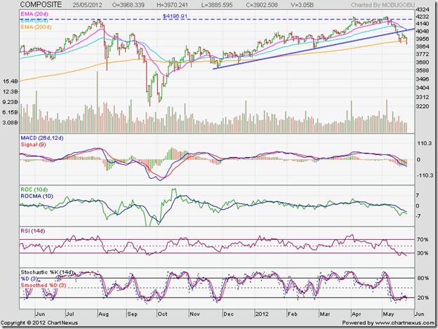
The Jakarta Composite failed to breach its Aug ‘11 top of 4196 convincingly, formed a double-top reversal pattern and started correcting. After dropping below its 20 day EMA, it halted a while near its 50 day EMA before crashing through the blue up trend line to its rising 200 day EMA.

The index pulled back towards the up trend line, found resistance, resumed its down move and closed below the 200 day EMA for the first time since Dec ‘11. Such pullbacks provide selling opportunities. Note that the index had touched a 52 week high of 4235 on May 4 ‘12, but all four technical indicators touched lower tops. The combined negative divergences had warned of a correction or consolidation (as mentioned in the previous post) – but it is looking more like a trend reversal.

The 20 day EMA has crossed below the 50 day EMA, which is bearish. But the 50 day EMA is still well above the 200 day EMA. Technically, the bull market is intact and will remain so till the 50 day EMA crosses below the 200 day EMA. The correction from the May peak is less than 10% so far.

The technical indicators are looking bearish and oversold. The MACD is negative and falling below its signal line. The ROC is also negative, and falling below its 10 day MA. The RSI and the slow stochastic are both in their oversold zones. Any upward bounce is likely to face combined resistances from the up trend line and the falling 20 day and 50 day EMAs.

Book part profits and/or hold with a stop-loss at 3720.

Singapore Straits Times Index Chart

Straits Times_May2512

The resistance at the 3030 level, which coincides with the lower edge of the big gap formed in Aug ‘11 on the STI chart, proved to be too strong for the bulls. What had looked like a bullish ‘ascending triangle’ pattern failed as the index dropped below the triangle with a gap and went into a free fall.

The 20 day EMA has crossed below the 200 day EMA, and the 50 day EMA is about to follow suit. The ‘death cross’ will confirm a return to a bear market after a brief foray into bull territory.

The technical indicators are bearish and looking oversold. The MACD is falling below its signal line in negative territory. The ROC has managed to cross above its 10 day MA, but remains negative. The slow stochastic and the RSI are both inside their oversold zones.

Any upward bounce should be used to sell. The STI is likely to test its Dec ‘11 low.

Malaysia KLCI Index Chart

KLCI Malaysia_May2512

Malaysia’s KLCI index had briefly breached its Jul ‘11 top of 1597 to touch a 52 week high of 1609 in Apr ‘12, but it wasn’t a convincing breach of its previous top. Note that the four technical indicators touched lower or flat tops as the index rose higher (marked by blue arrows).

The combined negative divergences led to a sideways consolidation for a few days, followed by a drop to the 50 day EMA and some more sideways consolidation, and finally a sharp drop to the 200 day EMA. The index is trying to rally by using the long-term moving average as a support.

The low volumes may not be able to sustain the rally. The technical indicators are bearish but showing signs of turning around. The RSI and the slow stochastic touched slightly higher bottoms as the index touched a lower bottom. If the rally continues, it may not be able to get far beyond the falling 20 day and 50 day EMAs.

Book part profits and/or hold with a stop-loss at 1510.

Bottomline? The Asian index chart patterns are in bear grips and may slip into bear markets. The STI seems to have done so already. Time to preserve cash. Corrections are ongoing in global stock markets, and Asia can’t be immune from its ripple effects.

Thursday, May 24, 2012

Stock Chart Pattern - Marico Ltd (An Update)

The previous update to the technical chart pattern of Marico Ltd was posted on Mar 23 ‘11 when the stock had closed at 129.45 (marked by grey vertical line on chart below). Earlier, after touching an intra-day top of 153 in Oct ‘10, the stock had started correcting a little ahead of the broader market. On Feb 9 ‘11, the intermediate correction had ended with a high volume ‘reversal day’ pattern as the stock touched an intra-day low of 112.10 – well below its 200 day EMA.

The 20 day EMA had briefly fallen below the 200 day EMA, but the 50 day EMA did not do so. That was an indication that the bull market was intact and the dip was a buying opportunity. The concluding comments in the previous post are worth repeating: “Small investors should add such stocks to their portfolios for steady gains and downside protection, instead of running after mythical multibaggers. Existing holders can top up their holdings. New entrants should wait for a convincing break above 136 to buy.”

The daily bar chart pattern of Marico Ltd clearly shows that investors would have benefitted by following the recommendation to buy:

Marico_May2412

Shortly after the previous post, the stock price rose to test the support-resistance level of 136 and crossed above. A few days of sideways consolidation in Apr ‘11 was followed by a sharp rise to 150 – an unsuccessful test of the Oct ‘10 peak of 153. The stock price dropped down below its 20 day and 50 day EMAs in May ‘11, but found good support from the rising 200 day EMA.

Another test of its previous top stopped short at 151.80 on May 31 ‘11. This time, the correction received combined support from the 50 day EMA and the 136 level. The subsequent up move comfortably crossed the previous top of 153 and touched a new high of 172.70 on Jul 27 ‘11 – a respectable 33% gain in 4 months.

For the next 6 months, the stock was in a period of consolidation during which the 200 day EMA provided good support – except for a few days in Dec ‘11, when it dropped below its long-term moving average and the 136 level. Dec ‘11 had marked the 52 week low on the Nifty and Sensex charts, while Marico’s stock touched a higher bottom.

The entire 6 months long consolidation formed the ‘cup’ of a ‘cup and handle’ bullish continuation pattern. The ‘handle’ formation took about a month – from early Feb to early Mar ‘12 – with the stock price getting support from the rising 50 day EMA. The next leg of the up move reached a new high of 184.40 on Apr 25 ‘12.

Before touching the new high, the stock started consolidating within a rectangular pattern between 176 and 184 and broke down from the pattern on May 14 ‘12. A drop to the rising 200 day EMA (at about 160) is a possibility, which may provide an opportunity to add/enter.

The technical indicators are quite bearish and pointing to a deeper correction. The MACD is below its signal line and has dropped inside negative territory. The ROC is negative and below its falling 10 day MA. The RSI has bounced up from the edge of its oversold zone. The slow stochastic is inside the oversold zone.

Bottomline? The stock chart pattern of Marico Ltd is undergoing a bull market correction and providing an entry opportunity. At the risk of sounding like a broken record (or a scratched CD), investors should seriously consider adding FMCG stocks like Marico to their portfolios. The high P/E ratios of FMCG stocks should not be a deterrent. Good things are never cheap!

Wednesday, May 23, 2012

A mid-week Nifty chart update

The ‘reversal day’ pattern (lower low, higher close) on the Nifty chart last Friday (May 18 ‘12) was not accompanied by a volume surge. That was an indication that the ‘reversal day’ was unlikely to mark the end of the current down move, and any upward bounce due to the oversold technical indicators was going to be a short and weak one.

Some times charts play out as per expectation. There was a brief bounce up towards the blue down trend line, but bullish energy petered out after the Nifty crossed the 4950 level on intra-day basis yesterday. The down move has resumed.

Nifty_May2312

The technical indicators have corrected oversold conditions a bit. Any upward move is going to face resistance from the falling 20 day EMA and the down trend line. Can the Nifty fall lower to test the Dec ‘11 low? The probability is high, and the main culprit will be the weakening Rupee. The chart below will explain why.

S&P CNX Defty_May2312

The S&P CNX Defty chart is the Nifty measured in US Dollars. Why should we look at it? Because the Nifty dances to the tune of FII cash flows, and FIIs look at this chart to decide their buying and selling.

The Defty chart shows two important points of difference from the Nifty chart:

  1. The rally from the low of Dec ‘11 to the intermediate top of Feb ‘12 crossed above all three EMAs, but failed to even test the blue down trend line – let alone cross above it; the 50 day EMA came close to the 200 day EMA, but the ‘golden cross’ above the 200 day EMA failed to occur - so it was just a bear market rally.
  2. The Defty is already testing its Dec ‘11 low and may break down lower to test its Jul ‘09 low (the corresponding Nifty level is about 4000); the bearish technical indicators are suggesting the possibility.

This is not the right time for bottom fishing. It won’t be, as long as the Rupee keeps weakening against the Dollar. Regular investments from monthly savings should not be stopped however.

Tuesday, May 22, 2012

Brent Crude oil chart pattern: an update

The 6 months bar chart pattern of Brent Crude oil is playing out almost exactly as per expectations. In the previous update, the support level at 113-114 had stalled the sharp fall below the 200 day EMA but the bearish technical indicators had pointed to a deeper correction.

After a brief pause around the 113 level on a closing basis, crude oil’s price started falling in earnest on rising volumes – which is a bearish sign. The 110 level was tested a few times on an intra-day basis before the price dropped close to the 106 level.

The 20 day EMA has dived below the 200 day EMA. The 50 day EMA is hurtling down towards the long-term moving average. The ‘death cross’ will technically confirm a bear market. Oil’s price has fallen too far below its 20 day EMA – indicating an oversold condition. Yesterday’s bounce above the 109 level was probably due to short covering because of the much lower volume. Any follow-up buying will help to correct the oversold condition and allow bears to resume their selling.

BrentCrude_May2112_daily 

The technical indicators are quite bearish, and correcting from oversold conditions. The RSI is showing negative divergence by falling deep inside its oversold zone even as oil’s price touched a higher bottom than its Dec ‘11 low. Also note the head-and-shoulders reversal pattern in the RSI back in Feb ‘12 as crude’s price was rising to a new high. That was an early warning about a correction.

The MACD is below its signal line in negative territory and also showing negative divergence by falling to a lower bottom than the one touched in Dec ‘11. The slow stochastic bounced up a bit after testing its previous bottom of Dec ‘11. The combined negative divergences are hinting at a steeper fall in oil’s price after the current bounce.

Is the longer-term 2 years weekly  bar chart pattern of Brent Crude oil looking just as bearish?

BrentCrude_May2112_weekly

Not yet, if you notice that oil’s price is trading well above its rising 200 week EMA. Yes, if you note that all three technical indicators touched lower tops as oil’s price touched a slightly higher top in Feb ‘12. The combined negative divergences warned of a correction, if not a change of trend.

The slow stochastic has dropped inside its oversold zone, but the RSI has not done so yet. The MACD is below its signal line and just about slipped into negative territory. The price correction isn’t quite complete. However, a pullback towards the 50 week EMA may precede the next leg of the down move.

All eyes should be glued to the 98 level – the previous low touched in Aug ‘11 and Oct ‘11. If crude oil’s price falls below 98, it will technically confirm a double-top reversal pattern, which is very bearish and a trend changer. The downward target of the double-top is 68 – the low touched back in May ‘10.

Such a calamity may not happen for oil bulls, but the possibility can’t be ruled out. The good news for the bulls is that the rising 200 week EMA may prevent such a disaster. The current bounce in oil’s price can be used to exit. Alternatively, one can hold with a strict stop-loss at 96. The rising volumes during the past few weeks’ correction shows that the time is not opportune for bottom-fishing.

Monday, May 21, 2012

Stock Index Chart Patterns – S&P 500 and FTSE 100 – May 18, ‘12

S&P 500 Index Chart

SnP500_May2112

The S&P 500 index breached the support level of 1340 and dropped sharply below the 200 day EMA. Such a possibility had been hinted at by the bearish technical indicators. It may be worth repeating the observations made in last week’s analysis: “Even if the index falls below the 200 day EMA – like it did back in Dec ‘11 - there is a good possibility that the bulls may fight back. 1250 – 1300 is a long-term support zone.” At the time of writing this post, the index is seeking support from the 1300 level.

Bulls should be concerned about the rising volumes as the index fell. The good news is that the technical indicators are looking oversold, which may lead to an upward bounce. The MACD is falling below its signal line in negative territory. Both the RSI and the slow stochastic are well inside their oversold zones. Note what happened when the RSI last entered its oversold zone back in Aug ‘11. The index has dropped too far below its falling 20 day EMA, which is usually a precursor to a bounce up.

How strongly can the bulls fight back? The disappointing listing of the much-hyped Facebook IPO suggests bearishness. Expect resistance to any up moves from the 200 day EMA (at 1314) and the falling 20 day EMA (at 1348). Bears will try to retain their upper hand by selling on the rise. Technically, a bear market won’t be confirmed unless the 50 day EMA crosses below the 200 day EMA.

FTSE 100 Index Chart

FTSE_May1812

The previous week’s ‘dead cat bounce’ on the FTSE 100 index chart was followed by renewed selling by the bears last week. The drop below the 5300 level on Friday, May 18 ‘12 was supported by a sharp volume spike not seen in nearly 2 months (not shown in chart above), which may indicate a temporary selling exhaustion.

The index has dropped too far below its falling 20 day EMA and all three technical indicators are looking oversold. The MACD is below its signal line and falling deeper into negative territory. Both the RSI and the slow stochastic are in their oversold zones. There is a good possibility of an upward bounce due to short-covering and investment buying. But the bounce is likely to be short-lived. It is only a matter of time before the ‘death cross’ of the 50 day EMA below the 200 day EMA technically confirms a return to a bear market.

The (UK) economy has deep structural weaknesses and has been through a colossal banking crisis that has caused the deepest recession since the 1930s. With the Greek debt crisis casting a pall of gloom over the Eurozone, things are unlikely to get better any time soon. The FTSE 100 chart is reflecting that.

Bottomline? The bears are beginning to take complete control over the chart patterns of the S&P 500 and FTSE 100 indices. Hold on to your cash and wait for the tide to turn.

Sunday, May 20, 2012

BSE Sensex and NSE Nifty 50 index chart patterns – May 18 ‘12

BSE Sensex index chart

There was good news and bad news last week. First, the good news. State Bank of India came out with results that exceeded market expectations. That led to short covering and some investment buying on Friday (May 18 ‘12), which caused a ‘reversal day’ pattern (lower bottom, higher close) on the Sensex bar chart.

Now the bad news. Inflation reared its ugly head again – the culprit being food inflation. That may prevent RBI from cutting rates any further in June. The Finance Minister eloquently described the current economic problems and promised some belt tightening in the form of curtailing foreign travel of ministers and a restriction on buying new cars. Sounds more like tokenism than serious intent of curtailing wasteful subsidy expenditure.

SENSEX_May1812

The daily bar chart pattern of BSE Sensex is looking oversold – so Friday’s ‘reversal day’ pattern may lead to a brief bounce. Why not an end to the down move?

‘Reversal day’ patterns can occur a few times in the midst of a down (or up) move. But to mark the end of an intermediate move, the ‘reversal day’ should be accompanied by a volume surge that indicates selling (or buying) exhaustion. Such volume support (not shown in chart) was missing on Friday. Overhead resistance from the falling 20 day EMA and the blue down trend line – which are converging around the 16500 level – is likely to restrict any up move.

Note that in Jul ‘11, all three EMAs had merged with each other and gave advance warning of a sharp move. Since the Sensex was in a down trend, the sharp move in Aug ‘11 was downwards. A similar pattern emerged when all three EMAs merged in Apr ‘12. The sharp downward move in May ‘12 may go down to test and even break the Dec ‘11 low. All three EMAs are falling and the Sensex is trading below them. That means the Sensex is back in a bear market.

The technical indicators are bearish and looking oversold. The MACD is negative and falling below its signal line. The ROC is also negative, but has crossed above its 10 day MA. The RSI and the slow stochastic are inside their oversold zones. Any upward bounce towards the blue down trend line is likely to be used by the bears to sell.

NSE Nifty 50 index chart

The hallmarks of a bear market are clearly visible on the weekly bar chart of the NSE Nifty 50 index. The 20 week EMA failed to cross above the 50 week EMA and has started to fall. The index is trading below both its weekly EMAs and has dropped below the blue down trend line.

Can’t the bulls fight back from here?

Nifty_May1812

The bearish technical indicators are suggesting that bulls are currently out of ammunition. SBI’s result announcement, followed by the CMD’s statement that the stock should trade at 2500, smacks of financial engineering and an effort to talk the market up. Even if SBI has performed a magic trick, it is unlikely that the other PSU banks will suddenly turn out to be magicians as well.

The MACD is below its signal line and has slipped into negative territory. The ROC is negative and below its falling 10 week MA. The RSI has entered its oversold zone, where it doesn’t stay for long. The slow stochastic is inside its oversold zone. Any upward bounce is likely to face resistance from the down trend line (currently at 5000).

Note that last week’s volumes were less than the previous week’s. Nothing unusual in that. Volumes are supposed to move in the direction of the trend.

Bottomline? Chart patterns of the BSE Sensex and NSE Nifty 50 indices are back in bear markets. Investors should stay away for now. Lower levels may provide better entry points. Risk takers can sell on every rise and buy back at lower levels. Always remember to use a stop-loss in case the market goes against you.

Friday, May 18, 2012

Some markets that FIIs prefer over India

Ever since India started undertaking economic reforms from 1991, the FIIs have shown a great interest in investing in India. Their combined buying/selling power now decides the trend in the Indian stock market.

In a post last month, the Nifty 50 index was compared over a 2 years time frame with stock indices of the other three BRIC nations. Russia’s RTSI outperformed the Nifty by a small margin, but was much more volatile with higher peaks and troughs. But the Nifty outperformed Brazil’s IBOVESPA by a small margin and China’s Shanghai Composite by 25%. Economic growth, of which China is the undisputed leader among the BRIC nations, did not necessarily translate into stock market performance.

So, why are the FIIs selling in India? Because they can invest anywhere they want, and a few stock markets are outperforming India by a fair amount. Here is a comparison of four global indices with the Sensex (in green) over the past 2 years:

S&P 500 vs. Sensex

SnP vs Sensex_May1812

After underperforming the Sensex for the first 7 months till Dec ‘11, the US S&P 500 index has outperformed the Sensex by a good 20% till yesterday’s closing. The recent correction has dropped the index below its rising 200 day EMA, but the S&P 500 has still gained 15% over the 2 year period while the Sensex is down 5%.

The RSI is deep in oversold territory, which could lead to an upward bounce.

IPC (Mexico) vs. Sensex

IPC Mexico vs Sensex_May1812

Mexico’s IPC index has outperformed the Sensex by almost 23%. Despite the correction in May ‘12, which has dropped the index to its rising 200 day EMA, the IPC has gained 18% over the past 2 years – slightly outperforming the S&P 500.

The RSI is almost at the edge of its oversold zone – from where it has bounced up every time during the past 2 years.

KLCI (Malaysia) vs. Sensex

KLCI vs Sensex_May1812

Malaysia’s KLCI index has outperformed the Sensex by 20%. It has bounced up after dropping to its 200 day EMA, and has gained 15% in the past 2 years.

The RSI is showing positive divergence by touching a higher bottom while the KLCI dropped to a lower bottom.

Jakarta Composite vs. Sensex

Jakarta vs Sensex_May1812

Indonesia’s Jakarta Composite index has been a stellar performer, attracting a lot of FII inflows. It has outperformed the Sensex by a whopping 45%. The recent correction has dropped the index close to its rising 200 day EMA, leaving a 40% gain over the past 2 years.

The RSI is just above its oversold zone from where it has bounced up on all three previous occasions.

There are two interesting points to note from the above charts. The Sensex has been in a bear market since touching its Nov ‘10 peak, forming a pattern of lower tops and lower bottoms. It is also trading below its falling 200 day EMA (not shown in charts above). However, the other four indices are all in bull markets, forming patterns of higher tops and higher bottoms.

There is an old stock market adage: “Sell in May and go away.” Investors and traders often take a break from the markets during the summer months and go off on vacations. Though there is no scientific basis to the adage, global markets appear to have taken the adage seriously in May ‘12. (In May ‘11, US and Mexico markets had corrected, but Malaysia and Jakarta had remained flat.)

Thursday, May 17, 2012

Stock Chart Pattern – Voltas Ltd (an update)

In the previous technical update (in Feb ‘11) of the chart pattern of Voltas Ltd., the ‘death cross’ of the 50 day EMA below the 200 day EMA had confirmed a bear market. The technical indicators were looking bearish, and the following observations were made:

“The stock may fall to its support zone of 145-150. If the support doesn’t hold, a drop to 100 is possible. Voltas remains a good stock fundamentally, and lower levels mentioned could be good entry points.”

The daily closing chart pattern of Voltas Ltd. shows how long-term support-resistance levels come into play:

Voltas_May1712

The stock dropped to the support level of 150 in Mar ‘11 about a month after the previous update was posted. Note that the stock touched a lower bottom than the one in Feb ‘11, but all four technical indicators touched higher bottoms. The effect of the combined divergences led to an upward bounce that crossed above the falling 20 day and 50 day EMAs to 186 (in Apr ‘11), but failed to reach the falling 200 day EMA.

That was another warning to exit the stock, because the bears were too strong to allow a trend reversal despite the positive divergences. The stock price twice sought support from the 150 level in May ‘11 and Jun ‘11 and bounced up, only to break downwards in Jul ‘11.

The stock hesitated at the next support level of 100 in Oct ‘11, but again broke downwards in Nov ‘11. A small inverse head-and shoulders reversal pattern formed during Dec ‘11 and Jan ‘12, with the stock price touching a closing low of 72.65 on Dec 29 ‘11 – correcting almost 72% from the double-top reversal of the bull rally in Nov-Dec ‘10.

The rally from the bottom of 72.65 coincided with the rally in the broader market, but instead of peaking out in Feb ‘12 after crossing above the 100 level, the stock price rose briefly above its 200 day EMA to 129.80 on Mar 13 ‘12. A consolidation within a ‘descending triangle’ pattern followed. The expected downward break occurred today as the stock price fell below the triangle and the 100 level to close at 98.85. Can the stock price fall much lower?

The bearish technical indicators seem to suggest a likely test of its Dec ‘11 low. The MACD is falling below its signal line in negative territory. The ROC is negative and falling below its 10 day MA. It has touched a higher bottom, which may cause a brief upward bounce. The RSI and the slow stochastic are both sliding below their 50% levels. There is a small support zone between 92 and 95, which may try to halt the fall.

What ails the company? Like most other stocks that are involved with infrastructure projects, Voltas has lost favour with the investing community. Severe competition in India and West Asia has squeezed margins. Debt has tripled, though the debt/equity ratio remains low. The company took a huge Rs 280 Crores hit in Q3 due to delayed execution of a hospital project in Qatar. The good news is that it was a one-time hit, and the order book has been increasing of late.

Bottomline? The stock chart pattern of Voltas Ltd. is back in a strong bear grip technically, but the fundamentals appear to be improving. Patient and long-term investors may keep a close watch on this company from the Tata group. The adventurous may enter on the current dip, but with a strict stop-loss at 71. Alternatively, wait for the audited full year results and a convincing break out above 130 to enter.

Wednesday, May 16, 2012

Bank the dividends from PSU banks

There is bad news all around. High inflation, negative IIP number, sliding GDP, increasing fiscal deficit, scams and corruption. Anything that can go wrong seems to be going wrong in India.

Add to that the uncertainty caused by debt problems in the Eurozone, which is not helping exports. No wonder the stock market is in a tailspin with no bottom in sight.

Where can one invest without losing sleep? In this month’s guest post, Nishit suggests that tax-free dividend yields of PSU banks is a good place to park your investible surplus.

-----------------------------------------------------------------------------------------------------

The stock market is on a downward spiral. What should investors do? Where does one park one’s cash? The classic dilemma is between safety and preservation of capital and increasing wealth. There is an unexciting part of the stock market which is often unexplored since it is not very glamorous.

These are the PSU banks. They provide steady dividend yields in excess of 5%. Dividends are not taxable in the hands of investors. So, a dividend yield of 5% is equivalent to a return of 7.2% per annum on a bank Fixed Deposit (provided one falls in the highest tax bracket).

To prove this theory I have taken two case studies of Andhra Bank and Corporation Bank. Andhra Bank has declared a dividend of Rs 5.50 per share and it is currently trading at Rs 106. This gives a dividend yield of about 5.2%.

Now, people may argue whether such a dividend will continue in the future? The answer is ‘Yes’ because Andhra Bank has been a steady dividend payer. The dividend for last year also was Rs 5.50. Before that, it was Rs 5 and before that Rs 4.50.

If the stock price goes up and one finds that one has made enough profit, the stock could be sold. The stock had hit highs of Rs 189 and Rs 159 in the previous years.

The second stock is Corporation Bank. It has declared a dividend of Rs 20.50 per share (last year it declared a dividend of Rs 20). The stock trades around Rs 400, giving a dividend yield of 5.1%.

Now, if the stock price declines due to adverse market conditions, one can always add more. Andhra Bank had hit a low of Rs 77 last December giving a dividend yield of 7.14%. Almost similar was the case with Corporation Bank.

The Government is in need of money and keeps pushing the PSUs to pay liberal dividends. The downside to this strategy is if the bank does not declare dividends at all. For this one needs to keep a cursory glance at the Quarterly results and go in for mid-sized PSU banks. The dividend may decline at the most but it is unlikely to get stopped completely.

In times of uncertainty and with questions of where to park the money, this is a low risk strategy. One could always trade in and trade out of these stocks to reduce the cost of acquisition. In 2001, I had bought Andhra Bank shares for Rs 12 in the IPO. If I had held on to them all these years, the dividend yield would have been almost 50% every year for me now.

-----------------------------------------------------------------------------------------------------

(Nishit Vadhavkar is a Quality Manager working at an IT MNC. Deciphering economics, equity markets and piercing the jargon to make it understandable to all is his passion. "We work hard for our money, our money should work even harder for us" is his motto.

Nishit blogs at Money Manthan.)

Tuesday, May 15, 2012

Gold and Silver chart patterns: the glitter is gone

Gold Chart Pattern

Gold_May1412

In the previous post three weeks back about gold’s chart pattern, readers were warned that a bear market was looming. Now only a final technical confirmation is awaited – the ‘death cross’ of the 50 day EMA below the 200 day EMA - and that should come soon enough.

Gold’s price is trading well below its falling 20 day EMA, which could lead to a technical bounce at any time. Such a bounce will be an exit opportunity for those who may still be holding on. A test of the Dec ‘11 low of 1520 is on the cards. If gold’s price falls below 1520, it can drop to 1475. Strong volumes on down days since this leg of the correction started in end-Feb ‘12 is a clear sign of distribution.

The technical indicators are bearish and looking oversold. The RSI is inside its oversold zone. Note that on the previous occasion in Dec ‘11, a drop into the oversold zone was followed by an upward bounce. The MACD is below its signal line, and sliding deeper into negative territory. The slow stochastic is well inside its oversold zone.

Silver Chart Pattern

Silver_May1412

Just after the previous post on Apr 24 ‘12, silver’s price bounced up from 30 but could not surmount resistance from the falling 20 day EMA. Silver has been in a one-way downward move since then and sinking deeper into a bear market. A test of the Dec ‘11 low looks imminent. The zone between 25-26 should provide good support. Will the support hold?

The technical indicators are not providing much hope for the bulls. Both the RSI and the slow stochastic are inside their oversold zones. The MACD is falling below its signal line in the negative zone. Any upward bounce is likely to be feeble and provide a selling opportunity to the bears.

The precious metals are losing their glitter. Better to stay away.

Monday, May 14, 2012

Stock Index Chart Patterns – S&P 500 and FTSE 100 – May 11, ‘12

S&P 500 Index Chart

SnP500-001-001

Last week, the following comments were made about the chart pattern of the S&P 500 index: “A fall below the 1358 level – the intra-day low touched three times in Apr ‘12 – will form a bearish pattern of lower tops and lower bottoms. That may lead to a deeper correction.”

Investors were recommended to book some profits, or hold with a stop-loss at 1340. It was the state of the technical indicators that led to the short-term bearish view. Note that the S&P 500 chart is playing out as per expectations. The index dropped below the 1358 level on intra-day basis – forming a bearish pattern of lower tops and lower bottoms. The bulls put up a decent fight but could not prevent a weekly close below the 1358 level. At the time of writing this post, the index was testing support from the suggested stop-loss level of 1340.

The technical indicators are looking bearish. The RSI is falling below its 50% level, and seems ready to drop into its oversold zone. The MACD is below its signal line, and both are falling inside negative territory. The slow stochastic has slipped into its oversold zone. A fall below 1340 can lead to a test of support from the 200 day EMA.

Are the bulls in tactical retreat or have they been vanquished? Note that the 20 day EMA is touching the 50 day EMA and both have started falling. While that may mean that the near term outlook is bearish, both EMAs are still well above the 200 day EMA. Even if the index falls below the 200 day EMA – like it did back in Dec ‘11 - there is a good possibility that the bulls may fight back. 1250 – 1300 is a long-term support zone.

FTSE 100 Index Chart

FTSE100-001-001

The 6 months bar chart pattern of the FTSE 100 index shows that the bulls have taken a solid battering from the bears. The fall from the bearish ‘rising wedge’ pattern was sharp and backed by strong volumes (not shown in chart). The 5500 level was easily breached, followed by a ‘dead cat bounce’. Bears have used the brief bounce to renew their attack. At the time of writing this post, the FTSE 100 is trading close to the 5450 level.

The technical indicators are bearish. Note that all three indicators touched slightly higher bottoms as the index touched last week’s low of 5464 (on May 9 ‘12). The positive divergences caused only a brief bounce – which indicates the strength of bear selling.

The RSI is below its 50% level, but trying to turn up. The MACD is falling below its signal line in negative territory. The slow stochastic has emerged from its oversold zone, but may drop back. The 20 day EMA has dropped to the 200 day EMA. The 50 day EMA is falling towards the 200 day EMA. Things aren’t looking good for the bulls.

Bottomline? The chart patterns of the S&P 500 and FTSE 100 indices show that the bears are tightening the screws. The bulls are at a distinct disadvantage in the US market, and totally on the run in the UK market. This isn’t a good time to play contrarian. Preserve cash.

Sunday, May 13, 2012

Which sectors are dragging the Sensex down?

The previous update to the technical analysis of BSE Sectoral index charts was posted shortly after the intermediate rally in the Sensex topped out in Feb ‘12. A few sectors were beginning to look bullish, while the others were still struggling to get out of bear markets.

The Sensex has reverted to a bear market since then. Most of the sectors are looking bearish, but there are a few exceptions.

BSE Auto Index

BSE Auto Index

BSE Auto index is technically in a bull market, as it is trading above its rising 200 day EMA. The index almost reached its Nov ‘10 top, but combined negative divergences from all four technical indicators has pulled it down to the support-resistance level of 9630. The index is looking oversold, so an upward bounce from the current level or the 200 day EMA can be expected. The bounce may provide an exit opportunity.

BSE Bankex

BSE BANKEX

The chart pattern of BSE Bankex is almost identical to that of the Sensex – so it can’t be blamed for dragging the Sensex down. Private sector banks have performed better than PSU banks – which is no great surprise.

BSE Capital Goods Index

BSE Capital Goods Index

BSE Capital Goods index is one of the Sensex-draggers. It failed to move above the blue down trend line since touching its Nov ‘10 top. A test, and possible breach, of the Dec ‘11 low is likely. The sector performed the worst in the Mar ‘12 IIP index.

BSE Consumer Durables Index

BSE Consumer Durables Index

BSE Consumer Durables index is technically in a bull market, as it is trading above its rising 200 day EMA. However, it is struggling to climb above the blue down trend line. A brief breach in Feb ‘12 found resistance from the 7000 level – its previous top in Sep ‘11. The technical indicators are neutral. A couple of stocks from the sector have been star performers.

BSE FMCG Index

BSE FMCG Index

Hola! What do we have here?! A sectoral index in a raging bull market! After a brief drop below the 200 day EMA (in Feb ‘11) following a triple-top reversal pattern, the index has been on a steady one-way ride. The chart pattern of the BSE FMCG index is the best example of why every small investor should own a couple of FMCG stocks.

BSE Healthcare Index

BSE Healthcare Index

Close behind the FMCG index is BSE Healthcare index, which is trading well above its rising 200 day EMA in a bull market. The index is correcting after touching its previous top of Jan ‘11. The dip can be used to enter/accumulate.

BSE IT Index

BSE IT Index

The ‘Infy effect’ caused BSE IT index to gap down below the blue down trend line in Apr ‘12. The recovery could not fill the gap entirely as the down trend line provided strong resistance. Some more down side can be expected.

BSE Metal Index

BSE Metal Index

BSE Metal index has been a major drag on the Sensex, as it continues to touch lower tops and lower bottoms in a bear market. A test of the Dec ‘11 low is likely.

BSE Oil & Gas Index

BSE Oil & Gas Index

Despite a breach of the down trend line in Feb ‘12, BSE Oil & Gas index is sliding relentlessly and is testing its Dec ‘11 low. Technical indicators are suggesting that a new low is in the offing.

BSE Power Index

BSE Power Index

BSE Power index is demonstrating a lot of downward power. Poor government policies and slow execution of projects is turning the sector sick – just like BSE Oil & Gas index. A test and breach of the Dec ‘11 low looks a certainty.

BSE Realty Index

BSE Realty Index

The less said about BSE Realty index the better. Everything that is wrong with the econo-political situation in India can be found in this sector – corruption, politician-underworld nexus, defrauding the public and the exchequer, money laundering, flouting of all laws with impunity, total lack of transparency.

Saturday, May 12, 2012

BSE Sensex and NSE Nifty 50 index chart patterns – May 11 ‘12

BSE Sensex index chart

During bull markets, bad news gets overlooked as buying frenzy sweeps away any negative impact from the news. Good news seem to come out of the woodwork. The opposite happens in bear markets. There is no dearth of bad news. Not the least of which was the negative IIP numbers for Mar ‘12. The capital goods sector contributed the most to the drop in the index.

There has been a clamour from all quarters for further easing of interest rates. The surprising 50 bps rate cut by the RBI barely left a ripple on the financial markets. The next RBI meet is a month away. Unless there is a noticeable fall in inflation rate, another rate cut may be impractical.

SENSEX_May1112

The FIIs were net buyers on the last two trading days of the week gone by. That couldn’t prevent the weekly closing chart of the Sensex from plunging below the blue down trend line, and back into a bear market. Note that the 20 week EMA failed to cross above the 50 week EMA. The technical confirmation of a bull market failed to materialise.

The sharp rally during Dec ‘11 and Jan ‘12 took the Sensex above its two weekly EMAs and the down trend line. But what had looked like the first leg of a new bull market turned out to be nothing but a bear market rally.

The technical indicators are looking bearish – so a deeper fall in the Sensex is likely. The MACD has crossed below its signal line and entered the negative zone. The ROC is also negative and below its falling 10 week EMA. The RSI has dropped to the edge of its oversold zone. The slow stochastic has entered negative territory. Any pullback towards the down trend line is likely to be used as an opportunity to sell by the bears.

NSE Nifty 50 index chart

In a mid-week Nifty update, three possible moves by the Nifty index was discussed. The Nifty chose the most bearish of the three options by dropping below the blue down trend line, after raising bullish hopes by staying above the trend line for more than three months.

Nifty_May1112

The 20 day EMA has crossed below the 200 day EMA. The 50 day EMA is on the verge of doing likewise – the ‘death cross’ will confirm a return to a bear market. The technical indicators are looking bearish to the point of being oversold. The MACD is falling below its signal line in negative territory. The ROC is negative, and below its falling 10 day MA. The RSI is inside its oversold zone, but trying to turn around. The slow stochastic is inside its oversold zone.

An attempt at a pullback towards the blue down trend line is a possibility. But it would be a selling – not a buying – opportunity. Looks like the Nifty is determined to go down further, and test its Dec ‘11 low.

Bottomline? The chart patterns of the BSE Sensex and NSE Nifty 50 indices are now under the influence of persistent bears. The global and domestic economic outlooks continue to be gloomy. RBI’s efforts at controlling inflation has ended up in curbing growth. The government has backed itself into a wall of corruption, indecisiveness and strident allies who behave more like opposition parties. Looks like it will be a long, hot summer till the advent of monsoons bring some relief. Preserving cash should be the priority.

Friday, May 11, 2012

Stock Index Chart Patterns – Hang Seng, Taiwan TSEC, Korea KOSPI – May 11, ‘12

In the previous update 2 months back, the chart patterns of Hang Seng, TSEC and KOSPI indices had rallied above their 200 day EMAs and looked all set to re-enter bull markets. The only hurdles were the gaps that formed on the respective charts back in Aug ‘11. Bears were expected to put up a last-ditch battle to defend the gaps but the bulls appeared to be too strong.

The bears have done a remarkable job in the intervening period – not only in stalling the bull rallies, but in pushing the indices down towards bear markets.

Hang Seng index chart

HangSeng_May1012

The Hang Seng index has been in a sideways consolidation pattern with 20000 acting as a good support level. That has changed with a sharp fall and a close below the 20000 level today (May 11 ‘12 – not shown in chart). The 20 day EMA is about to slip below the 50 day EMA. If they fall below the 200 day EMA, a return to a bear market will be technically confirmed.

The technical indicators are bearish. The slow stochastic is about to drop to its oversold zone. Likewise for the RSI. The MACD is negative and below its signal line. The ROC is also negative, but trying to turn around.

The bulls were unable to close the small gap above the 22000 level formed in Aug ‘11, though the larger gap above the 21000 level has been closed. Some more correction can be expected before the bulls fight back.

Taiwan TSEC index chart

TSEC_May1012

The larger of the two gaps on the Taiwan TSEC chart (above 8000 – formed in Aug ‘11) was not completely filled two months back. Bears took full advantage to push the index below the 200 day EMA in Apr ‘12. Despite a couple of attempts by the bulls to cross above the long-term moving average, the bears stood their ground. Now the 20 day and 50 day EMAs have fallen below the 200 day EMA and the TSEC is trading below all three – technically confirming a return to a bear market.

The technical indicators are bearish. The slow stochastic and the RSI are below their 50% levels. The MACD is touching the signal line in negative territory. The ROC is trying to show some positive divergence by gradually climbing up to its ‘0’ line from negative territory. Any rallies will be selling opportunities.

Korea KOSPI index chart

Kospi_May1012

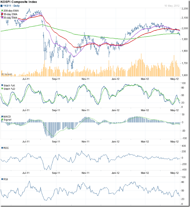
The larger of the two gaps on the Korea KOSPI index chart was completely filled but the smaller gap at the 2100 level remains unfilled. Note the bearish ‘rounding top’ pattern formed by the index (more clearly visible on the 20 day EMA), following which the support from the 200 day EMA was breached.

The 20 day and 50 day EMAs are falling, though they are still above the 200 day EMA. The technical indicators are bearish, which means the correction isn’t over. The slow stochastic is about to enter its oversold zone. The RSI may follow suit. The MACD is touching its signal line in the negative zone. The ROC found resistance at the ‘0’ line and has dropped back into negative territory.

Bottomline? Chart patterns of three Asian indices had brief forays into bull territory, but have been pushed down by the bears. The TSEC index is already in a bear market. Hang Seng and KOSPI are likely to join their neighbouring index into bear country. Economic slowdown in the Eurozone and in USA has cast a pall of gloom over Asian indices. Preserve cash and wait for the situation to improve.

Thursday, May 10, 2012

Why the current state of the stock market makes me happy and sad

The state of the stock market make talking heads in business TV channels happy or sad – depending on whether the indices are trending up or falling down. Their business depends on bull markets, which attracts more viewers and more advertising revenues. But investors are supposed to be dispassionate about the state of the market, right?

Not quite. Most small investors tend to be bulls; i.e. they try to buy low and sell high. They feel happy when stock prices move up during bull markets and their paper profits increase by leaps and bounds. Then they fail to sell at the appropriate time, only to see their paper profits start to disappear. They hang on with the hope that prices will start rising again, and end up feeling sad when profits turn into loss.

Why is the current state of the stock market making me happy and sad at the same time? It is because of recent reader queries and emails I have been receiving. Mostly they ask variations of the same question: “I want to buy XYZ stock; is this a good time/level to enter?” The first part of the query has made me happy for two reasons:

1) The selected stocks have been some of the better known and fundamentally strong stocks. No longer are readers asking my opinion about Bartronics or Suzlon or Geodesic or Punj Lloyd. That shows investor maturity.

2) Most small investors want to buy when the bull market is already at an advanced stage. They buy at a high price with the hope of selling at even higher prices, and become victims of the ‘Greater Fool’ theory. But the current state of the market seems like the tail-end of a bear market or the early stage of a bull market. Wishing to enter now is again a sign of investor maturity.

It is the second part of the query that has made me feel sad, because it made me realise that investor psychology hasn’t changed in 100 years despite the advent of nuclear energy, rocket science and computers. How so? Here is what Larry Livingston (a.k.a Jesse Livermore) mentioned in his reminiscences: “The average man doesn’t wish to be told that it is a bull or a bear market. What he desires is to be told specifically which particular stock to buy or sell. He wants to get something for nothing. He does not wish to work. He doesn’t even wish to have to think.”

It also makes me sad that after four years of effort in maintaining a blog, I have not quite been able to simplify technical analysis for lay investors so that they can take their own decisions about when to buy and at what level. Here is another quote from Livingston/Livermore: “Nobody can make big money on what some one else tells him to do.”

Remember and internalise that last quote. You have to depend on your own judgement for long-term investment success. The sooner you make the effort to learn the rudiments of technical analysis – I’ve written a free eBook on the subject – the easier it will be to decide when to buy or sell and at what level.

Related Post

Why investors fall prey to the Greater Fool Theory
When should you 'hold' and When should you 'fold' a stock?

Wednesday, May 9, 2012

A mid-week Nifty update

In last Sunday’s post on the Sensex and Nifty chart patterns, both bullish and bearish possibilities were discussed. Based on the technical indicators, the correction was likely to continue, but the bulls were expected to put up a fight near the blue down trend line.

On Monday, May 7 ‘12, the Nifty dropped below the ‘falling wedge’ pattern to an intra-day low of 4988, but the postponement of GAAR provisions to the next financial year by the Finance Minister caused a sharp pullback inside the wedge. The index managed a higher daily close above the 5100 level.

It seemed that the GAAR clarification had provided a positive trigger for the bulls to emerge from hiding. But FIIs were not too impressed. Two issues seemed to bother them. First, the results of the elections in France and Greece – where leftist leaders managed to translate their anti-austerity rhetoric into votes, pushing the Eurozone debt problems back on the centre table. Second, the determination of the Finance Minister about amending existing laws that will circumvent the Supreme Court’s judgement against taxing Vodaphone.

If France and Greece go back on the austerity commitments made by the previous regimes, the Eurozone will be thrown back into turmoil – which will affect Indian exports. More troublesome is the amendment of laws to give retrospective effect to tax demands. FIIs will think twice before investing any long-term funds in India under such uncertainty. Since FII buying was responsible for the rally from the Dec ‘11 low to the Feb ‘12 high, it is feared by market players that a reversal of the flow can push the Nifty back into a bear market.

Nifty_May0912

For the past couple of days, the Nifty closed below the ‘falling wedge’ but received support from the blue down trend line that had ruled the Nifty from Nov ‘10 to Jan ‘12. There are three possibilities of what the Nifty can do next:

  1. The index will drop below the down trend line and seek much lower levels. The 20 day EMA has already dropped below the 200 day EMA. The 50 day EMA is likely to do the same, and technically confirm a return back to a bear market after a brief foray into bull territory. All four technical indicators are bearish. The MACD and the ROC are negative. The RSI and the slow stochastic are in their oversold zones.
  2. The Nifty may bounce up from the support of the down trend line. Why? Note that the ROC and the slow stochastic, though bearish, have touched slightly higher bottoms as the Nifty touched lower bottoms. The positive divergences may lead to an upward bounce. Also, look at what happened after the RSI entered its oversold zone back in Jun ‘11, Aug ‘11 and Nov ‘11. On all three occasions, the Nifty bounced up – only to face more selling pressure.
  3. The Nifty may continue to slide above the down trend line with periodic upward bounces without falling below the trend line. After a month or two of such sliding it may move above the ‘falling wedge’.

Whatever option the Nifty chooses, the bulls won’t have too much to cheer in the near future. Q4 results declared so far continue to be a mixed bag. Keep an eye out for those few companies that are declaring better than expected results under these trying circumstances. They could be the winners in the next bull market.