Wednesday, September 30, 2009

Stock Chart Pattern - 3i Infotech Ltd

The stock chart pattern of 3i Infotech Ltd looks a little different from other stocks that have been analysed recently. It made a high of 165 back in May '07 (actually 330, but adjusted for the subsequent 1:1 bonus). The bears attacked almost immediately, and the stock gradually slid down to 115 in Sep '08, before it fell off a cliff.

It finally bottomed at 25 in Mar '09 - dropping 85% from its peak. A swift 3 months rally took the stock to 95 in Jun '09 - an exact 50% Fibonacci retracement of the entire Rs 140 fall over 2 years. Thereafter, the stock has been in a consolidation phase within an 'ascending triangle'.

Let us have a look at the 1 year bar chart pattern of 3i Infotech Ltd:-

3i Infotech_Sep3009 

The RSI has moved above the 50% level. The MACD is positive, but marginally below the signal line. The slow stochastic is below the 50% level but the %K line has just crossed above the %D. All three are indicating mild bullishness. The OBV is providing the real clue to the underlying strength - the gradual rise indicates 'accumulation'.

3i Infotech is part-owned (39.5%) by ICICI Bank, and its revenues are a 50-50 split between software products and services. Its product portfolio - mainly targeted at banks and financial institutions - helps to generate a high net margin of close to 30%.

A low P/E of 6.25 means an earnings yield (E/P) of 16% - which is double the current fixed deposit rates in banks, leaving a good 'margin of safety'. Solid top and bottom line growth and strong cash flows from operations make this an ideal portfolio candidate.

Then why is the stock under-performing the Sensex (which has already retraced 70% of its bear market fall)? The company has been aggressively pursuing growth through the inorganic route. That means, it has been acquiring a number of software companies and businesses in India and overseas.

The danger of such a strategy - when leveraged through debt - is that the interest payments become due sooner than later, whether there is a global economic downturn or not.

3i Infotech is less reliant on clients in US and Europe (where the financial services outsourcing business has been hit the hardest) than most Indian software services companies. But the bears have mauled it just the same. And there lies an opportunity for smart investors.

Bottomline? The stock chart pattern of 3i Infotech is indicating that the smart money has been accumulating the stock, and an upward break from the ascending triangle may be imminent. Enter, or add more, on a close above 95. Keep a stop-loss at 70.

(Some questions: Why is the stop-loss set at 70? If you enter now, should you set a tighter stop-loss? At what price?)

Tuesday, September 29, 2009

Some times you have got to stop and smell the roses

To use a metaphor from the game of golf: We get to play only one round. As we walk through the fairways of life, there are plenty of challenges and tests. But some times, you have got to stop and smell the roses. Because you may not get another chance.

Today, I would seek your indulgence, dear reader, to share with you a particularly fragrant rose that I had a chance to stop and smell some time back, when I had the privilege of attending a memorable classical music concert.

It was an august audience. Corporate bigwigs rubbed shoulders with top Government officials, doctors and lawyers. Pandit Ulhas Kashalkar, a noted vocalist, was also present.

It was a vocal performance by Ashwani Bhide Deshpande, a PhD in Biochemistry from the University of Bombay and a top vocalist of the Jaipur-Atrauli Gharana. I had heard her on CDs but this was the first time I was hearing her live.

A classical music concert tends to reflect not only the personality of the performer but the performer's mood at that particular time. Ashwani created sheer magic that evening.

She opened with an extended 'khayal' in Raga Maruvihar, followed by a composition in Raga Bageshree. She then sang a semi-classical 'Jhoola'. But Ashwani had saved the best for the last. A melodious 'bhajan' in Bhairavi had the audience enthralled.

One has heard stories about how Mian Tansen could produce raindrops from a clear sky with his singing. The best exponents of Indian classical music have this ability of entering a state of bliss, where the voice is no longer human, but attains unity with a universal sound that emanates from a greater being.

When Ashwani was singing the full-throated refrain of the 'bhajan', I do believe she attained that exquisite union:

"Jab praan tan se nikley, 'Shiva, Shiva' man smaran ho"

("When life begins to ebb away from our body, remember to take the name of the Lord").

Fortunately, the stock market gives us plenty of chances - provided we have learned the basics and practised hard at acquiring the skills required to succeed. And the harder we practice, the greater the chances of winning.

Monday, September 28, 2009

Season's Greetings to my blog's readers and followers

Thanks for your support, encouragement and feedback.

Please enjoy the festive season safely and responsibly.

Dow Jones (DJIA) Index Chart Pattern - Sep 25, '09

The previous week's Dow Jones (DJIA) index chart pattern was looking quite bullish. But the technical indicators showed negative divergences, and the fundamentals were not very encouraging either. It led me to conclude with the following comments:-

'The European indices are correcting ... and its effect may be felt across the Atlantic. On two recent occasions, the Dow had sought support from its 20 day EMA, and may do so again.'

The 3 months bar chart pattern of the Dow Jones (DJIA) index seems to have got wind of my post, and decided to humour me by doing exactly what I had surmised:-

Dow_Sep2509

The Dow took its cue from the European indices. Another 'reversal day' on Wed, Sep 23 '09 led to a correction that sought support at the 20 day EMA. Down days on 23rd and 24th had higher volumes than the up day on 22nd. The volume action has not been supporting the bull rally for quite some time.

All three EMAs are still moving up, which means the rally may make an attempt at conquering the psychological 10000 mark soon. But there is a piece of bad news for the bulls. The trend line joining the bottoms made on Jul 10 '09 (8058) and Sep 2 '09 (9223) was broken on Thu 24th and Fri 25th. Since this trend line forms the lower line of the 'rising wedge' pattern, a larger correction may be in the offing.

The RSI briefly entered the overbought region before dropping down. The MFI continues its sideways movement above the 50% level. The slow stochastic has slipped down from the overbought zone. The MACD has fallen a bit below the signal line. (Note the lower bottoms in the RSI and slow stochastic as the Dow made higher bottoms in mid-Aug and early-Sep '09.)

Bottomline? The Dow Jones (DJIA) index chart pattern looks like it is in the last stage of the bull rally. If you haven't booked profits yet, try to sell when the index attempts a pullback to the trend line.

Sunday, September 27, 2009

Stock Index Chart Patterns - FTSE 100, CAC 40, DAX - Sep 25, '09

Last week's analysis of the stock chart patterns of the European indices concluded with the following observations:-

'The stock index chart patterns of the European markets are showing buying exhaustion, which could lead to a correction. Part profit booking is advised. Better entry points may become available.'

All the three indices went through a mild correction during the week.

FTSE 100 index chart

FTSE_Sep2509

The FTSE was looking the most bullish, and corrected only 1.75% on a closing basis, remaining just above the 20 day EMA. All three EMAs are still moving up, so the bull rally is intact.

The technical indicators are reflecting the correction. The slow stochastic is still in the overbought zone, but the %K line has gone below the %D. The RSI has dipped below the overbought zone. The MFI is moving sideways below the overbought zone. The MACD has moved a bit below the signal line.

DAX index chart

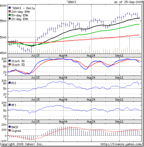
DAX_Sep2509

The German index corrected 2.2% on a closing basis, and got support from the flattening 20 day EMA. The 50 day EMA stopped rising, but the 200 day EMA is still moving up. There is no immediate threat to the bull market.

The technical indicators appear a little weaker than the FTSE's. The slow stochastic has dropped out of the overbought zone. So has the RSI. The MFI is resting on the 50% level. The MACD is positive, but below its signal line.

CAC 40 index chart

CAC_Sep2509

The French index corrected 2.3% on a closing basis, and sought support at its short-term moving average. The 20 day EMA has stopped rising, but the 50 day and 200 day EMAs are moving up.

The technical indicators are almost identical to those of the DAX. The French economy has followed its neighbouring country and come out of the recession.

The 20 day EMA has provided good support to the FTSE and CAC since the middle of Jul '09. The DAX went below its 20 day EMA twice, but stopped short of falling to the 50 day EMA.

Bottomline? The stock index chart patterns of the European indices had mild corrections and have reached short-term support levels. The economies are clawing back towards recovery. Chances of a resumption of the bull rally are good. In case of a further correction, the 50 day EMA should provide support.

Saturday, September 26, 2009

BSE Sensex Index Chart Pattern - Sep 25, '09

Last week's analysis of the BSE Sensex index chart pattern included several concerns about the continuation of the bull rally - lower volumes on up days, negative divergences in the technical indicators, the widening distance between the 50 day and 200 day EMAs, and the possibility of an 'end run' after the upward breakout from the 'rising wedge' pattern.

The cumulative effect of all the bearish signals led to a halt in the bull rally, but the bears could not wrest the initiative. The 6 months bar chart pattern of the BSE Sensex index shows that the truncated F&O settlement week passed off without any significant change:-

Sensex_Sep2509

After Monday's holiday, the index made a new high of 16943 and a higher close of 16886 on Tue, Sep 22 '09 - once again on lower volume. The next day was a lower top and lower close day on much higher volume. Thu, Sep 24 '09 was a higher close day, but again on lower volume. The week ended with another down day as the index closed marginally lower for the week.

The positive signal is that the index managed to stay above the upper trend line of the 'rising wedge' pattern. But the negative signals from the previous week - mentioned in the opening paragraph - have not been overcome.

Next week will be another holiday-shortened one, and it is unlikely that there will be significant trading activity. That will tend to tip the scales towards the bears. Keep an eye on the 15600 level for support. That is where the 50 day EMA has reached. It is also the level of the top made in Aug '08.

The business news in the western world have been dominated by the '1-year-since-the-Lehman-Brothers-collapse' stories. So I thought of including some charts, comparing how the BSE Sensex index has performed with respect to a few world indices. Here they are:-

BSE_Dow_Sep2509

BSE_FTSE_Sep2509

BSE_Shanghai1yr_Sep2509

The top two charts show that the Dow (USA) is down 10% and the FTSE (UK) is absolutely flat, while the Sensex is up 20% over the past 1 year. The bottom chart shows a marginal out-performance by the Shanghai (China) index. Note the 40% out-performance by the Shanghai Composite index through most of Jul '09 till a big ongoing correction started from Aug '09 - bringing the two indices closer in performance.

Now, a longer period chart throws up a tantalising possibility:-

BSE_Shanghai2yr_Sep2509

The 2 years chart comparison shows the BSE Sensex completely flat, while the Shanghai Composite has dropped by 50% since Sep '07! What happened here? Well, the Shanghai Composite entered the bear market in Oct '07, when the Sensex was in the final stages of a bull market.

Fast forward to the current time. The Shanghai Composite completed its bear market rally and has been in a corrective mode since Aug '09. Will the pattern repeat? Will the Sensex follow behind and correct as much as the Shanghai Composite? The possibility does exist.

Bottomline? The BSE Sensex index chart pattern is technically in a new bull market, but the possibility of a big correction makes me circumspect. Avoid new investments and book some profits if you haven't done so already.

Friday, September 25, 2009

Stock Index Chart Patterns - Shanghai Composite, Hang Seng, Singapore Straits Times - Sep 25, '09

Shanghai Composite index chart

The 'reversal day' pattern on the chart of the Shanghai Composite index last Friday (Sep 18 '09) led to another bout of correction that took the index below both its 20 day and 50 day EMAs, and formed a lower top.

The 3 months bar chart pattern of the Shanghai Composite index shows that the bears are regaining control:-

Shanghai_Sept2509

The 20 day EMA is turning down below the 50 day EMA, confirming the bearishness. All eyes should be on the 200 day EMA, which provided support at the beginning of the month. If the index goes below the long-term average, the bull market may come to an end.

The technical indicators have deteriorated. The MACD is now touching the signal line in the negative zone. The ROC has entered negative region. The slow stochastic is moving down quickly from the overbought zone. The RSI has also started moving down.

The Chinese index seems ready to slip into a bear market.

Hang Seng index chart

The negative divergences in the technical indicators last week, plus the bearish mood in the Shanghai Composite dampened the bull fervour and dragged the Hong Kong index down.

The 3 months bar chart pattern of the Hang Seng index is looking a lot less bullish:-

HangSeng_Sept2509

Technically, one look at the three EMAs marching upwards will indicate that the index is in a bull market. But the underpinnings are beginning to weaken.

The 500 points lower close on Thu, Sep 24 '09 was accompanied by higher volume. At the time of writing this post, the index is down 195 points - which means it has dipped below the 20 day EMA and heading down towards the 50 day EMA. The medium-term average has not been penetrated since July '09, and should be an important support to watch.

The MACD has moved down, and is about to fall below the signal line. The ROC has swung back into the negative zone. The slow stochastic is still in the overbought zone, but the %K line has gone below the %D. The RSI touched the overbought zone before slipping down.

There is no immediate threat to the bull market, but the Hang Seng is being dragged down by its big brother.

Straits Times (Singapore) index

The Singapore index was looking stronger than its Chinese counterparts when I last looked at it 4 weeks back. The 3 months bar chart pattern of the Straits Times index shows that the bulls are still very much in control:-

Straits Times_Sep2509

The 20 day EMA has provided solid support to the index so far. The bulls however, have been kept in check by the bears. The 2700 level has been a strong resistance level. The widening gap between the 50 day and 200 day EMA is also a concern.

The technical indicators are giving mixed signals. The MACD is falling, but hanging on to the signal line. The ROC has dropped to the '0' line. The slow stochastic is meandering sideways below the overbought zone. Only the RSI is looking bullish by smartly moving up from the 50% level. But all the indicators are showing negative divergences, having made lower tops while the index is near its previous high.

Bottomline? The movements of the Shanghai Composite index is casting a shadow on its Asian brethren. The Hang Seng and Straits Times indices are still bullish, but showing signs of strain. Profit booking should be on the cards.

Thursday, September 24, 2009

About Cost averaging and Value averaging strategies

Following a strategy involving either Cost averaging or Value averaging can lead to significant wealth creation for most investors - specially if followed for a reasonable period of time. These are simple strategies, but require investing discipline.

Cost averaging

Let us say, you are able to save Rs 3000 per month from your income. If you are a novice investor, or, have not yet learned how to pick fundamentally strong stocks, choose an index fund or an index ETF (like Nifty BeES). More experienced investors can choose any of their favourite stocks.

Every month, without fail, buy Rs 3000 worth of index fund/ETF units (or any stock that you have chosen). When the market moves up (bull market), the number of units/shares you get to buy every month will get reduced. If the market moves down, the number of units/shares will be more.

So, if you buy 300 units of Rs 10 in the first month, and the next month the net asset value (NAV) of the unit is Rs 12 - you will buy 250 units. In the third month, if the NAV is Rs 15, you will buy 200 units.

This strategy is identical to the Systematic Investment Plan (SIP) touted as very effective for small investors by most fund houses. Though this is a no-brainer system that any one can follow, it has a drawback. It doesn't work so well in up or down trending markets.

Value averaging

This is a variation to the cost averaging concept, that requires more monitoring. Instead of investing a fixed amount every month, you buy according to a pre-determined value of your portfolio. Let us say, it is Rs 3000 per month.

As in the above example, you buy 300 units @ Rs 10. At the beginning of the second month, if the NAV has increased to Rs 12, then the value of your portfolio has become Rs 3600. Instead of investing Rs 3000, you will invest Rs 2400 - getting 200 units in return. Your total portfolio value becomes Rs 6000.

If at the beginning of the third month, the NAV is Rs 15, then your portfolio value is Rs 7500. So you'll invest only 100 units to reach your goal of Rs 9000 after 3 months. (The actual numbers - and the math - will not be so simple. An Excel spreadsheet should take care of the calculations.)

See the difference? In the Cost averaging (SIP) method, you buy 750 units in 3 months for Rs 9000. In the Value averaging method, you invest Rs 6900 to buy only 600 units. In other words, you invest less when the market is going up. The balance savings of Rs 2100 can be used when the market turns down (bear market).

What happens when the market goes down? Which method will be the better of the two? Why? Are there any drawbacks to the Value averaging strategy?

Ponder about these questions. And get back to me with your opinions and comments.

Wednesday, September 23, 2009

Stock Chart Pattern - Suzlon Energy Ltd (An update)

The previous analysis of the stock chart pattern of Suzlon Energy was done more than 6 months ago when the stock market was near its nadir. It is time for an update - more so because the stock is back in the news, thanks to a 5% sale of the promoter's stake.

My bias against Tulsi Tanti and his faulty wind mills was laid bare, including a nonsense rhyme from 'Abol Tabol' by Sukumar Ray, in the earlier post. So I will try to refrain from adding insult to injury. But I can't stop myself from asking this question:

'Why and when does a person sell his wife's jewellery?'

If I was a scriptwriter of Hindi movies, I would perhaps come up with a lofty answer - like 'for building low-cost housing for the down-trodden', or, 'for setting up a well-appointed old folks home'. But the logical answer would be:

'When he exhausts all other options to raise money for survival.'

Let us take a look at the 1 year bar chart pattern of Suzlon Energy and find out how the stock has fared in the bull rally:-

Suzlon_Sep2309

The stock was decimated by the bears, falling all the way from a peak of 460 in Jan '08 (adjusted for a 5:1 stock split that changed the face value from Rs 10 to Rs 2) to a low of 33 in Mar '09. A massive 93% fall, that few stocks can survive.

The subsequent sharp rally took the stock up above the 200 day EMA to 146 in Jun '09 - retracing about 26% of the entire bear market fall. A reader had questioned my recommendation to not go anywhere near the stock (though I had suggested that adventurous traders could make a punt, because the 50 day EMA had gone far below the 200 day EMA, indicating oversold conditions).

Smart investors were not fooled by the whopping 340% gain in 3 months from the Mar '09 low, and started booking profits. After managing to keep its head above the long-term average for most of Jun '09, the stock slipped below it in Jul '09. The 200 day EMA has since provided strong resistance to further up moves.

What is more remarkable? Despite the sharp rally, the 50 day EMA - which had moved below the 200 day EMA way back in Mar '08 - has not been able to move above the long-term average. That means, technically, the stock failed to enter a bull market.

Today's (Wed, Sep 23 '09) news about the 5% stake sale has not been well-received by investors. The stock slipped by more than 6%, and closed below both the 20 day and 50 day EMAs. The bears are in control. Every rise can be used to sell.

The technical indicator's are reflecting the weakness in the stock. The RSI is below the 50% level and moving down. The MACD is barely positive, and below its signal line. The OBV is slipping, indicating 'distribution'. The slow stochastic is getting ready to enter the oversold region.

Bottomline? The stock is at a level nearly 3 times higher than where it was 6 months back. But the chart pattern of Suzlon Energy is uninspiring - particularly the volume spikes on down days. A drop to the 75-80 level could be in the offing. A stock every one should avoid.

Tuesday, September 22, 2009

Learn the Art of Partial Profit Booking

Before we delve into a discussion about partial profit booking, readers may want to do some ground work. In an earlier article, I had given three reasons why you should sell a stock from your portfolio completely. Prior to that, I had written an article about asset reallocation.

Selling a stock totally from your portfolio may or may not generate profits - because the reasons for selling are to avoid a loss because of faulty stock selection or worsening company fundamentals; or, to generate cash for emergencies.

Your timing of selling may not coincide with a bull period, which means you may need to sell at a loss. It is important to note this point, because as human beings we are 'loss averse'. That means, taking a loss causes a bigger emotional upheaval than making a big profit. But prudence demands that some times you do have to sell at a loss - to avoid a bigger one.

Partial profit booking is a different skill altogether. Here, the reason and timing of selling is totally in the investor's control. When and how much quantity you sell depends on your skill and risk tolerance. The profits you make will depend on it.

Here are a couple of reader comments, that are good examples of why you need to learn the art of partial profit booking:-

1. 'I bought a stock at 37 and saw it go all the way up to 180, but did not sell. It came down, and I finally sold at 120.'

2. 'I bought a stock at 18. When it went up to 44 within 3 months, I sold it all. To my horror, the stock kept going up and hit 150. I have learned that to make big profits, one has to hold the stock for a long time.'

Both situations happened during a bull phase. Both investors made decent profits, but missed out on a much larger profit potential. Let us learn how partial profit booking can help.

Firstly, you need to buy a decent quantity of shares - at least 300 or 500 - of each company. Buying 50 shares or 100 shares won't work very well. Secondly, you need to decide whether a particular stock is going to be part of your core portfolio (80-90% of your total portfolio value) or your satellite or 'mad money' portfolio (10-20% of your total portfolio value).

The core portfolio should comprise fundamentally strong large-cap shares which should be held 'forever'. You should add to this portfolio near bear market bottoms, and book partial profits only near a market top. Otherwise, just sit back and enjoy the dividends and bonus issues, and subscribe to the rights issues. Good large-caps find various ways to reward their stakeholders.

The satellite or 'mad money' portfolio usually contains more risky and relatively unproven mid-caps and small-caps. These shares may shoot up like a rocket in the short-term, and collapse in a heap some time later. This portfolio requires closer monitoring, and partial profit booking is a must during bull phases.

Let us assume you had bought 500 shares at 18. You may have set a target - based on technical analysis or fundamental analysis (or both) - at 40 in 3 years. More than 100% returns in 3 years isn't bad at all. Expecting more than that would be bordering on greed.

To your pleasant surprise, you find the stock shooting up and crossing your target within 6 months. What should you do? Sell 200 @ 50, which recovers your original investment plus the 10% short-term capital gains tax (of 640). The balance 300 shares have become 'free', i.e. there is no holding cost for you.

So, enjoy the bull ride by keeping a 'trailing stop-loss' of say, 10%. That means, at 100 the stop-loss will be 90. If the stock moves to 150, the stop-loss should be 135. Sell the shares as soon as your stop-loss is hit.

If you are lucky enough to hold the entire 500 shares through the bull phase and sell it at the very top, then you will obviously make more money. In reality, picking exact tops and bottoms are next to impossible.

Partial profit booking reduces the risk considerably - first by pulling out your original investment; then, by letting profits ride on the balance quantity to the maximum extent possible. It also ensures that you will not make a loss.

(Note: Partial profit booking works in a bear market also. You 'short sell' when the market is falling, and at each drop you buy back a portion of the amount short sold. This strategy is not recommended for inexperienced investors.)

Monday, September 21, 2009

Dow Jones (DJIA) Index Chart Pattern - Sep 18, '09

In last week's discussion of the Dow Jones (DJIA) index chart pattern, a 'reversal day' bar was observed on Fri, Sep 11 '09. It had bearish implications, and some correction was expected.

On Mon, Sep 14 '09, the Dow did make a lower top and a lower bottom but closed higher. The rest of the week, the bull charge continued with higher tops and higher bottoms - supported by higher volumes. There seems to be no hurdle high enough to trip the bulls.

Let us have a look at the 3 months bar chart pattern of the Dow Jones (DJIA) index:-

Dow_Sep1809

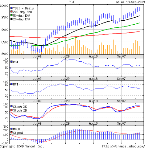
Once again, a 'reversal day' pattern formed on Thu, Sep 17 '09 - but it was ignored by the Dow as it made a higher top and a higher close. All three EMAs are also moving up, leaving no doubt that the bulls are in charge.

Note the negative divergences in the RSI and MFI, which are moving lower - though they remain above their 50% levels. The slow stochastic has moved into the overbought zone. The MACD has inched above its signal line, but is also showing negative divergence. The technical indicators are not as bullish as the index.

The economy appears to be improving and the worst seems to be over. Just don't mention that to your friend or neighbour who may have lost his job recently. For him, the worst is beginning.

Consumers are saving more and spending less. As per this article, stock funds are showing net outflows and bond funds are showing net inflows. Corporate insiders are merrily selling. Corporate share buy-backs are down more than 70% year-on-year. That leaves short-covering and programmed trading as the buying support for the market. How long can the bull rally sustain on such weak underpinnings? (Not to forget about the bearish 'rising wedge'!)

Bottomline? The Dow Jones (DJIA) index chart pattern seems determined to enter a new bull market by climbing a wall of worry. The European indices are correcting today (Mon, Sep 21 '09) and its effect may be felt across the Atlantic. On two recent occasions, the Dow had sought support from its 20 day EMA, and may do so again. Time is ripe for some profit booking.

Sunday, September 20, 2009

Stock Index Chart Patterns - FTSE 100, CAC 40, DAX - Sep 18, '09

During last week's discussion of the stock chart patterns of European markets, it was observed that the liquidity driven rally was likely to continue a while longer. The technical indicators were pointing to the bulls regaining control after a brief correction.

FTSE 100 index chart

FTSE_Sep1809

The bull party continued with gusto - the week ending on a new high of 5173 on significantly higher volume. All three EMAs are moving merrily upwards with the FTSE. (The marginal increase of 9 points over the closing level of Thu, Sep 17 '09 on 50% higher volume could be an indication of buying exhaustion.)

The slow stochastic is well within the overbought zone. The RSI and MFI are swinging up wards and about to enter their overbought zones. The MACD has made a new high as well. The bulls are firmly in control.

The rally seems to me like the tail is wagging the dog. A surfeit of liquidity - created in a coordinated manner by the G20 countries to bolster their faltering economies - is trying to create the optimism that may lead to consumer confidence and the good old days of borrowing money to spend.

It is not working.  The banks are boosting their bottom lines through their trading desks. Traditional lending activities continue to lag. The economy remains far away from a recovery.

DAX index chart

DAX_Sep1809

The DAX joined the FTSE bull party - but look what happened on Fri, Sep 18 '09. The volume more than doubled from Thu, Sep 17 '09, and the index made a higher high but a lower close. A 'reversal day', indicating buying exhaustion.

The three EMAs continue their up move with the index, indicating bullishness. The slow stochastic is in the overbought zone, but the %K line has moved down to touch the %D. Both the RSI and MFI are above their 50% levels, but are dropping. The MACD is positive and above its signal line, but is showing negative divergence.

The DAX technical indicators are nowhere near as bullish as those of the FTSE.

CAC 40 index chart

CAC_Sep1809

The CAC also joined the FTSE bull party, but failed to keep up - ending the week with a 'reversal day' (higher high, lower close on significantly higher volume).

The flood of liquidity has been negating almost all bearish technical signals. Normally, a reversal day should lead to a correction. But note the bar of last Thu, Sep 10 '09. That was also a reversal day, but the index ignored it. This time around, the higher volume may do the trick.

The technical indicators are looking like carbon copies of the DAX indicators. Except the MACD, where the negative divergence is not as pronounced.

Bottomline? The stock index chart patterns of the European markets are showing buying exhaustion, which could lead to a correction. Part profit booking is advised. Better entry points may become available.

Saturday, September 19, 2009

BSE Sensex Index Chart Pattern - Sep 18, '09

During last week's analysis of the BSE Sensex index chart pattern, I had made a couple of observations that require repeating. One was about the 61.8% Fibonacci retracement level of the entire bear market fall. This was indicated at 16524 (including the 3% 'whipsaw' lee way) and was the last resistance that the bulls needed to cross.

The other was about a 'rising wedge' bearish pattern that the Sensex had formed, and a downward break from the pattern below 15700 would have sent the index into the long-expected correction. Both points need more elaboration.

Let us first look at the 3 months bar chart pattern of the BSE Sensex index:-

Sensex_Sep1809

A deluge of FII investments took the Sensex past the final hurdle of the 61.8% Fibonacci retracement level. Technically, there remains no further doubt that we are now in a bull market, and this rally can't be termed a bear market rally any more. Any corrections should now be used for buying.

Note the volume bars. Tue, Sep 15 '09 was an up day on lower volume. But volumes picked up noticeably on Wed and Thu (Sep 16 & 17 '09) as the index cleared the 16524 mark. The higher close of 16741 on Fri, Sep 18 '09 was a level not seen since May '08. But the new 52 week closing high was on reduced volume - indicating that this leg of the rally may be drawing to a close (finally!).

Also note that the distance between the 50 day and 200 day EMA is approaching 2000 points, and the index has moved about 1300 points above the 50 day EMA. There are negative divergences in the RSI, MFI and MACD. All these indications are bearish.

What about the bearish 'rising wedge' pattern? The 2 years weekly bar chart pattern may have some answers, and possible index targets:-

Sensex_Sep1809_2

Last week's price action took the index above the 'rising wedge'. Does that mean a pattern failure? Not yet. The possibility of an 'end run' remains. That means, the upward break from the pattern can get reversed and the index can move down. The comparatively lower volume on the break out suggests this possibility.

Note how the previous top of 15600 in Aug '08 provided resistance to the Sensex up move for quite some time. The next resistance on the up side could come at 17600, the previous top in May '08. The 17600 level conforms with the 17800 level suggested earlier from the analysis of the gap in May '09. So, watch out for the 17600-17800 zone to provide good resistance to the first leg of this bull rally.

The maximum downside target on correction - when it eventually happens - would be the May '09 gap area. The 200 day EMA is at 13500, and the long-term average should provide support to a falling index. The Sensex may not go down that far. But it gives us an idea about the sell and buy levels.

Bottomline? The BSE Sensex index chart pattern is playing out the final stages of the bull market's first leg. This is not the time to enter - unless one finds compelling value in an individual stock. Book partial profits and conserve cash. Better buying opportunities may become available in the near future.

Friday, September 18, 2009

Stock Index Chart Patterns - Shanghai Composite, Hang Seng, Taiwan TSEC - Sep 18, '09

Shanghai Composite index chart

Four days of adventure above the 3000 level and the 50 day EMA proved to be too much for the Shanghai Composite index to handle. Today (Fri, Sep 18 '09), the index made a new high of 3068 but closed lower at 2963 - forming a 'reversal day' pattern.

The 3 months bar chart pattern of the Shanghai Composite index shows more of a sideways consolidation:-

Shanghai_Sept1709

Today's close has taken the index below the 20 day EMA, which rose up to touch the 50 day EMA. The 200 day EMA is still moving up, but the upward momentum is slowing. As long as the index remains well above the long-term average, the bull market remains in place.

The RSI is resting at the 50% level. The slow stochastic has swung up into the overbought zone. The MACD has moved up, but is still in negative territory though above the signal line. The ROC has nicely moved up.

Some more consolidation may be on the cards before the bulls can regain control.

Hang Seng index chart

While big brother is struggling to shrug off the bear attack, the bulls of the Hang Seng index deftly side-stepped the bears. Two days of minor correction was followed by a renewed upward surge, with a new high of 21930 clocked on Thu, Sep 17 '09.

The 3 months bar chart pattern of the Hang Seng index is up and running again on higher volumes, with all three EMAs moving up together:-

HangSeng_Sept1709

The RSI has moved above the 50% level. The slow stochastic is in the overbought zone. The ROC has moved up well. So has the MACD. The technical indicators are supporting the continuation of the bull run.

The negative divergences in the RSI, MACD and ROC - which failed to make new highs - continue to remain a concern.

Taiwan (TSEC) index chart

When I last looked at the Taiwan (TSEC) index 4 weeks back, it was undergoing a correction, and the technical indicators were looking weak.

Let's look at the 3 months bar chart pattern of the Taiwan (TSEC) index:-

TSEC_Sept1709 

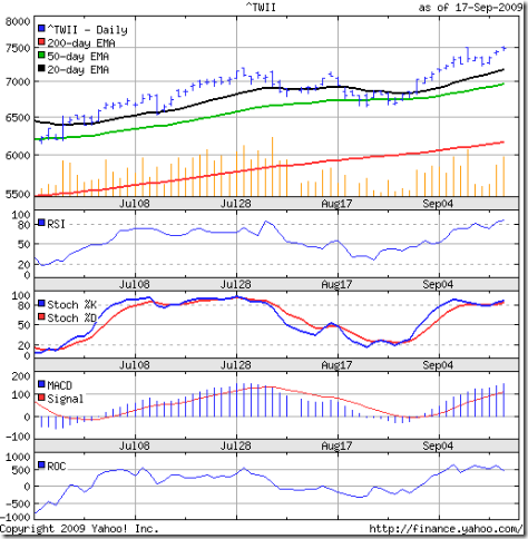
The TSEC seems to be tracking the Hang Seng as it continues to move up with higher volumes. But unlike its mainland cousins, the Taiwan index closed at a new 52 week high today.

All three EMAs are moving up. Both the RSI and slow stochastic are in overbought zones. The MACD is moving up strongly. Only the ROC is moving sideways, but in the positive zone.

The index is less than 40 points below 7560 (the 61.8% Fibonacci retracement level of the entire bear market fall from 9786 in Nov '07 to 3955 in Nov '08). Some resistance to the up move can be expected next week.

Bottomline? The movement of the Shanghai Composite index may determine which way the other two indices move. Both the Hang Seng and TSEC are looking quite bullish. But the Chinese index can drag them down. Hang on to existing investments with trailing stop losses. If you've missed the rally so far, miss it a little longer.

Thursday, September 17, 2009

Why small investors should avoid small cap stocks

There are several reasons why small cap stocks should not be considered for investment by any investor - new or old, small or large. Before I start to argue my case, let me define what is a small cap stock.

The market capitalisation (or market 'cap') of a stock is the product of a stock's current market price and the total number of equity shares outstanding. In other words, a stock having total outstanding equity shares of 10 Million (1 Crore) and a price of Rs 100 has a market cap of Rs 1 Billion (100 Crore).

The question is: What market cap makes a company a small cap, or a mid cap or a large cap? The short answer is: It depends on whom you ask. There are no precise definitions. The industry norm for a small cap company seems to be a market cap of upto Rs 2500 Crore!

A mid cap company has market cap ranging from Rs 1000 Crore to Rs 13000 Crore. Large caps are those forming part of the Sensex 30 and Nifty 50 stocks. As you can see, the whole thing is pretty confusing.

Small investors get attracted to small caps because of two main reasons - 'affordability' and greed. Most small companies are also small cap companies that trade typically at few tens of Rupees. This price is attractive to small investors with small capital. (Many don't realise that a Rs 30 stock may have a Re 1 face value and may be trading at a P/E of 30.)

Many of today's large caps were small caps 10 or 12 years back. The general assumption is that all small caps have the potential to become large caps and give multibagger returns. But only a small minority out of the thousands traded in the stock market actually make the transition. Most will remain small caps, or disappear into the sunset.

Why are small cap stocks so risky that they are best avoided by small investors?

  • lack of transparency of management
  • lack of adequate research by fund houses and brokers
  • lack of financial muscle
  • low liquidity
  • high volatility

Management is too busy trying to survive (or siphon off money) to look after investor relations and proper communication of plans. Fund houses shun such stocks, so analysts don't cover them or visit their factories to ask tough questions.

One or two bad quarters can wipe out a small company, who may not have access to big money. Low volume of trading leads to difficulty in getting in or out, and wild price swings if small quantities are traded.

Only those investors with adequate experience and knowledge of fundamental and technical analysis should attempt investing in small cap stocks. That too, with the awareness that the entire investment can go down the drain. Preferably, the investment in small cap stocks should be limited to 10% of total portfolio value, to mitigate the risks involved.

The vast majority of investors should look for more expensive but less risky large cap stocks, or stick to index funds or index ETFs. Always remember Warren Buffet's investment rule: Don't lose money.

Related Post

The futile quest for the mythical 'multibagger'

Wednesday, September 16, 2009

Stock Chart Pattern - Tata Chemicals Ltd

The stock chart pattern of Tata Chemicals Ltd, another stalwart from the Tata stable, shows a nice breakout from a bullish consolidation pattern called an 'ascending triangle'.

The company manufacturers a wide array of products including chemicals like soda ash (used in detergents, water and effluent treatment, paper and glass making), sodium bicarbonate (used in pharma industry for making antacids, analgesics, toothpaste), fertilisers (like Urea, DAP, SSP), portland cement (manufactured using the solid wastes generated at its soda ash plant), and packaged salt.

Tata Chemicals has recently acquired a 36% stake in crop protection and pesticides company Rallis India from other Tata group companies, thereby taking its total stake in Rallis to 45%.

Steady growth, low debt/equity ratio, strong cash flows from operations, regular dividend payments make this an ideal 'boring' stock that can find a place in any long-term investor's portfolio.

Time for a look at the one year bar chart pattern of Tata Chemicals:-

Tata Chem_Sep1609

The stock made a double top at 430 in Jan '08 and 440 in May '08, following which the bears really mauled the scrip. It bottomed at 100 in Mar '09. The bull rally took the stock to 266 in Jun '09 - retracing nearly 49% of the bear market fall.

A 3 months period of consolidation in an 'ascending triangle' was followed by an expected upward breakout - thanks to the deluge of FII money into the Indian stock markets this week. But bulls should not start a dance of joy yet.

The stock made a high of 275 and closed at 274 today. There is long-term resistance at the 270-280 zone. Also the 50% Fibonacci retracement level of the entire bear market fall is at 270. The stock has not cleared it strongly enough on higher volumes.

Also note the negative divergences from all four technical indicators. The RSI stopped short of entering the overbought zone. So did the slow stochastic. The MFI is barely above the 50% level. The MACD is marginally positive.

The next few days could be crucial for the stock, and for the market as a whole. If the FII inflows continue, new highs may be the order of each day's trade.

Bottomline? The stock chart of Tata Chemicals has given a mild breakout from a consolidation pattern. Existing investors should wait for the stock to clear 280 before adding more. Patient investors may wait for the next correction to enter.

(Thanks to reader Sujoy for suggesting this stock.)

Tuesday, September 15, 2009

Is Organised Retail a Great Business or a Mediocre Business?

Organised retail business is a comparatively new phenomenon in India, and is still in the process of finding its feet in terms of location, size, format, product ranges, and segment targetting.

Before figuring out whether organised retail is a great business or a mediocre one, let me digress a bit and relate an interesting bit of news that appeared in the local newspapers.

South City Mall is one of the flashy new edifices in Calcutta's retail industry, with flagship large-format stores like Pantaloon and Shopper's Stop. With the city's four-day annual celebration of Durga Puja round the corner, the Mall has been teeming with shoppers of all ages.

Many shopper's were confounded recently by a closed Pantaloon store. Several smaller stores were also closed. Even the food court had most shutters down. This, at a time of peak shopping in the city.

The next day's papers were all agog with the inside scoop. Reportedly, the mall authorities had turned off the power supply to the Pantaloon store for non-payment of a large electric bill. The smaller stores and the food court - which apparently were part-owned by Pantaloon - had shut down in 'sympathy'.

Turns out that the mall authorities had agreed to lower the 'astronomical' store rents for a few months because of the economic down turn, after representation by a group of retailers allegedly led by Pantaloon. Raising of the rents back to the earlier levels caused the non-payment of bills. Wonder what they were thinking, when they agreed to the high rents before moving in!

That Pantaloon is badly in need of money, and they are not finding anyone who will give them a loan, is not news any more. (All their 'profits' are accounting fiction - negative cash flows from operations on each of the last 4 years paint the true picture.)

Neither is the story of losses incurred by the likes of Shopper's Stop, Subhiksha, Spencer's, Vishal Retail. Even a big company like ITC is incurring losses on its retail garment stores.

What went wrong? Organised retail was supposed to be the ideal service industry for the future of India, with a huge potential of employment of an unskilled but literate work force.

Several things. The most basic being the business fundamentals. You need to spend several Rupees to earn one. Real estate has to be purchased or leased at exhorbitant rates in large cities - where small format stores are not viable. In smaller towns with cheaper real estate, large format stores may not draw adequate footfalls.

Stores need to be air-conditioned, well lit, frequently remodelled. New products and fashions have to be constantly introduced and the older models and shop-soiled garments sold off at highly discounted prices.

Margins are wafer thin. The constant requirement of cash sooner or later overwhelms the business because of the large interest burden. Add to that, the competition from mom-and-pop outfits that have lower infrastructure costs and have long established customer relationships.

Highly streamlined bulk procurement processes, tight inventory control, live assessment of customer preferences are some of the ways by which some actual profits can be generated. Such activities require expensive computer hardware and software, further adding to the cost.

The banning of overseas retail businesses - except in single product stores - has ensured that Indian retail companies will not benefit from established processes at Walmart, Krogers, Asda, Costco, Target.

Is there any hope for organised retail businesses in India? Will they ever make any real profits?

What do readers think?

Monday, September 14, 2009

Stock Index Chart Patterns - Dow Jones (DJIA) and Bovespa (Brazil), Sep 11, '09

Dow Jones (DJIA) index chart

During the previous week's analysis of the Dow Jones (DJIA) index chart pattern, I had expressed my reservations about the continuation of the bull rally because of two things - the lack of volumes and the 'rising wedge' bearish pattern.

The bulls emerged rejuvenated after the long weekend and the index made higher tops and bottoms every single day of the truncated week of trading. But look what happened on Fri, Sep 11 '09 - a higher high but a lower close. A bearish 'reversal day'.

The 3 months bar chart pattern of the Dow Jones (DJIA) index shows the effort by the bulls to shake off the poor fundamentals and technicals of the market:-

Dow_Sep1109

All three EMAs are moving up with the index, which means that the bulls are still in control. The bears appear to be in need of a confidence booster to launch a proper attack. The short squeeze in Jul '09 is still fresh in their minds.

The low volumes remain a concern. The technical indicators are not supporting the gung-ho bullishness in the Dow. The RSI turned flat after rising above the 50% level. The MFI remains above the 50% level but is heading down. The slow stochastic stopped short of entering the overbought zone. The MACD rose a bit but failed to move above its falling signal line.

Note the negative divergences in all the indicators, which failed to make new highs with the index. That doesn't mean you should short this market. Not yet. Wait for it to go below the low of 9223 made on Sep 2, '09.

Bovespa (Brazil) index chart

I had looked at the Bovespa (Brazil) index chart pattern nearly two months ago, when it was trying to shrug off a correction. The subsequent up move was strong, as the bears were trapped badly.

The 3 months bar chart pattern of the Bovespa (Brazil) index is now following the moves of the Dow closely:-

Bovespa_Sep1109

Almost a lock-step move with the Dow last week - moving above the 20 day EMA and making higher tops and bottoms through the week, ending with a bearish 'reversal day'.

There are two significant differences between the Dow and Bovespa. A much wider gap between the 50 day and 200 day EMAs in the Bovespa chart, indicating a much stronger bull rally. Volumes are also much lower but less volatile.

The RSI is just above the 50% level. The MFI has slipped below the 50% level. The slow stochastic has also stopped short of entering the overbought zone. The MACD has moved a bit above its flattening signal line.

Bottomline? Both the Dow Jones (DJIA) and Bovespa (Brazil) index chart patterns are showing a bit of fatigue after the hectic climb last week. A correction this week would help the bull rally to get stronger. (At the time of writing this post, both indices seem to be in correction mode.)

Sunday, September 13, 2009

Stock Index Chart Patterns - FTSE 100, CAC 40, DAX - Sep 11, '09

The stock index chart patterns of the European markets were looking a bit tired when I had looked at them last week, thanks to the negative divergences in the technical indicators following a bout of minor correction.

It was a brief pause, as the bulls had regained control and began another charge with renewed vigour. The indices ended last week at new highs.

FTSE 100 index chart

FTSE_Sep1109

The FTSE led the charge, and pulled the three EMAs upwards. But the volumes continue to be a worry. Much lower volume on Mon, Sep 7 '09 which was an up day; highest volume of the week on Thu, Sep 10 '09 - a down day.

On the longer term (2 years weekly) chart pattern of the FTSE, a bearish 'rising wedge' is clearly visible, which indicates that an intermediate top may be close at hand.

The RSI went up close to the overbought zone before dipping a little. The MFI didn't make it that far, but remains above the 50% level. The slow stochastic has re-entered the overbought zone. The MACD has moved up  and is just above the signal line.

The technical indicators have improved over the previous week, which means that the bulls may continue their party a while longer.

CAC 40 index chart

CAC_Sep1109 

The CAC 40 is following in the footsteps of the FTSE 100 Index, the notable difference being higher volume on Fri, Sep 11 '09. A 'rising wedge' has formed in the French index as well, ever since the Jul 13 '09 low of 2958.

The technical indicators look a little weaker than FTSE's. The RSI is just above the 50% level. The MFI is resting on its 50% level. The slow stochastic has entered the overbought zone. The MACD has moved up and is touching the signal line. An improvement over the previous week, but nowhere near the joyous bullishness being shown by the index.

DAX index chart

DAX_Sep1109

The German index had a much sharper up move - just look at the higher slant of the week's trading pattern. But the higher high and higher close on Fri, Sep 11 '09 was on lower volume. All three EMAs are continuing their upward journey.

Both the RSI and MFI are above the 50% level but did not move up with the index. Negative divergences like these will put a rein on the rampaging bulls. The slow stochastic has entered the overbought zone. The MACD has moved up and above its signal line, but it is making lower tops as the index is making higher ones. Clear signs of a bull rally driven more by liquidity and less by fundamental and technical underpinnings.

Bottomline? The stock index chart patterns of the European markets are confirming an old saying: markets can remain irrational longer than investors can remain solvent. Caution and profit booking advised.

Saturday, September 12, 2009

BSE Sensex Index Chart Pattern - Sep 11, '09

During the previous week's discussion about the BSE Sensex index chart pattern, the bulls seemed to be still in control, and I had advised investors not to sell in a panic.

Hectic buying by the FIIs took the index to a new high of 16435 on Thur, Sep 10 '09. I had indicated that the 61.8% Fibonacci retracement of the entire bear market fall from 21200 to 7700 was at 16043. That hurdle has been almost crossed.

Why almost? Because technical analysis is imperfect, a 'whipsaw' lee way of 3% should always be added to any technical level. Adding 3% to 16043 gives us the final resistance to the bulls at 16524. That is the high water mark that the BSE Sensex index needs to cross to remove any further doubts about the bull market.

The DIIs initially joined the FIIs for the bull party last week. Interestingly, they turned net sellers on the last two days. Wonder why. Is it because the Oil India IPO went through smoothly by Thur Sep 10 '09, so they no longer needed to provide buying support?

Let us take a look at effect of last week's bull charge on the 3 months bar chart pattern of the BSE Sensex index:-

Sensex_Sep1109

All three EMAs are up and running with the index. The volumes perked up a bit after the dismal show in Aug '09, but is still lagging the Jun and Jul '09 volumes. Unless the volumes pick up, the bull run may stall.

The technical indicators have improved quite a bit. The RSI touched the overbought zone before drifting down. The MFI is just below its overbought zone. No such problems with the slow stochastic, which stayed above the 80% level. The MACD has moved above the signal line.

Bullish readers must be thinking that I've finally exhausted all bearish signals. I've thrown up low volumes, increasing distance between the 50 day and 200 day EMAs, negative divergences, a possible 'broadening top', and even a rare 'island reversal'. The bull market has climbed every wall of worry.

Wait just a minute. There is one more bearish indicator up my sleeve. And this one - as the Yanks would say - is a real 'doozy'. I had pointed out this pattern in a recent post on the Dow Jones index. Last week's trading has formed one in the Sensex chart. The one year bar chart pattern of the BSE Sensex has formed a 'rising wedge':-

Sensex_Sep1109_2

The 'rising wedge' is like a 'triangle' or a 'pennant' consolidation pattern, except the two trend lines connecting the tops and bottoms slant upwards. It typically takes 3 to 8 weeks to form, and reverses an intermediate top in a bear market. All the conditions seem to have been met (since the pattern started forming after the low of 13220 on Jul 13 '09), and a 'denouement' can be expected in the coming week.

The Sensex closed higher on Fri, Sep 11 '09 but had a lower top and a lower bottom than Thur, Sep 10 '09. Was it preparing for a fall? Look closely at the 15700 level next week. That level is at the lower trend line of the 'rising wedge'. If that breaks (don't forget the 3% lee way), the much awaited correction could follow.

Bottomline? The BSE Sensex index chart pattern continues to move up against considerable odds. Extreme caution is advised. Intrepid investors can keep trailing stop losses and wait for the index to make up its mind. The faint-of-heart can book profits.

Friday, September 11, 2009

Stock Index Chart Patterns - Shanghai Composite, Hang Seng, Malaysia KLCI - Sep 11, '09

Shanghai Composite index chart

The previous week's big fall followed by a recovery took the Shanghai Composite index chart pattern close to its descending 20 day EMA. Let's look at the 3 months bar chart pattern of the Shanghai Composite index to see how far the recovery progressed:-

ShanghaiComp_Sep1109

After initial resistance from the 20 day EMA during the early part of last week, the index managed to move and close above the short-term moving average, only to face resistance from the 50 day EMA. It closed the week below the psychological 3000 mark.

The medium-term average has started to slip down, but the 20 day EMA has flattened and the 200 day EMA is still rising. The EMAs are giving conflicting signals - short-term neutral, medium-term negative and long-term positive.

The technical indicators have improved some what. The RSI is at the 50% level. The slow stochastic has moved sharply moved above the 50% level. THe MACD is still negative but has risen above the signal line. The ROC is at the '0' mark.

Hang Seng index chart

Looks like happy days are here again for the Hang Seng index, which has taken off with a renewed surge upwards. On Thur, Sep 10 '09, it made a new intra-day high of 21322 and today (Fri, Sep 11 '09) it made a new higher close at 21161. Volumes have also picked up over the previous week.

Let us see how much stronger than its big brother the 3 months bar chart pattern of the Hang Seng index is looking:-

HangSeng_Sep1109 

The Shanghai index is facing resistance from its 50 day EMA, but the Hang Seng got support from it before moving up. All three EMAs are moving up together confirming the bull market.

The slow stochastic is nudging the overbought zone - quite a jump in a week. The MACD has not only turned positive, but has moved above its signal line. The ROC is in the positive zone, and the RSI is above the 50% level.

The fly in the ointment is the negative divergences in the technical indicators, that have failed to make new highs with the index.

Malaysia KLCI index chart

A first look at the Malaysia index shows that it is looking even stronger than the Hang Seng index.

The 3 months bar chart pattern of the Malaysia KLCI index was well supported by the 20 day EMA during the recent correction before making a new high above the 1200 level:-

KLCI_Sep1109

The onward march of the KLCI seems unstoppable now, with the index at a 52 week high - a level last seen in Jun '08. Both the RSI and slow stochastic are about to enter overbought zones. The MACD is positive and above the signal line. The ROC is in positive territory.

There are a couple of concerns though. Like in the Hang Seng technical indicators, the KLCI indicators are showing negative divergences. The 50 day EMA has moved a 100 points away from the 200 day EMA. A bigger correction may be round the corner.

Bottomline? The Shanghai Composite index chart pattern holds the key to the future of the Asia-Pac regional bourses. If it resumes its upward journey, it may light a fire under the Hang Seng and KLCI indices. But if it drops back down, then the bull rally in the regional markets could end.

Thursday, September 10, 2009

Analysis of gaps in stock chart patterns

Analysis of gaps require an understanding of different types of gaps that occur in the bar chart pattern of a stock or index. An area of no trade, or a 'gap', occurs when the low of a particular period, be it a day or week or month or year, is higher than either the previous or the next period's high.

Gaps in daily charts is quite common. Weekly gaps are less frequent. Monthly and yearly gaps are the least frequent.

There are four types of gaps:-

  • Common gaps occur in a rectangular or triangular consolidation area
  • Breakaway gaps occur at the beginning of an up or down move
  • Runaway or measuring gaps develop at the middle of a move
  • Exhaustion gaps happen at the end of a move.

Most gaps, particularly common gaps, get 'filled' quite quickly. But some gaps can remain unfilled for prolonged periods - weeks and months. Even years. On rare occasions, they may not get filled at all. As a general rule, gaps do get completely or partially filled and the previous trend resumes.

An interesting chart pattern called an 'island reversal' occurs when an area of trading is separated by an upward gap at one end and a downward gap at the other. Such a trend reversal pattern happens at the top or bottom of a trend.

Let us look at the 1 year daily bar chart pattern of the BSE Sensex index to try and identify and analyse the gaps:-

Sensex gap1_Sep1009

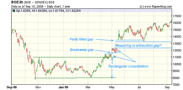
Notice several 'common' gaps during the rectangular consolidation of the Sensex during Oct '08 to April '09 - all of which got filled. After the breakout from the larger rectangular consolidation in Apr '09, the chart pattern entered a smaller rectangular consolidation, called a 'flag'. (A 'flag' is a continuation pattern.)

A 'breakaway' gap occurred at the end of Apr '09 followed by another 'flag' pattern. The huge 1200 point gap then developed, post election results in May '09. This was partially filled during the correction in Jul '09.

Ever since, the Sensex chart pattern has been in an up trend, defying all concerns like deficient monsoon, rampant rise in prices of common staples, poor exports and low volumes of trade. Observe several common gaps during the sideways consolidation move post-election from May '09 till date.

An important question: Is the 1200 point post-election gap a runaway (or measuring) gap, or is it an exhaustion gap?

If it is a measuring gap, then it is supposed to occur at the midway point of the bull rally. Since the gap is between 12300 and 13500, half of the gap, i.e. 600 points should be added to the lower edge of the gap, to give a level of 12900 as the midpoint of the rise from the low of 8000. The rise to the midpoint is (12900 - 8000 =) 4900 points.

This gives an approximate target of (12900 + 4900 =) 17800 for the Sensex. Why approximate? Because technical analysis is not a science but an art. It deals with indications and possibilities, and is imperfect.

Why did I raise the question about the type of gap? The part filling of the gap indicates that it should be a measuring gap. The resumption of the up move confirms it.

A look at the 2 years weekly bar chart pattern of the BSE Sensex throws some interesting contra-indications that I have discussed in earlier posts:-

Sensex gap2_Sep1009

In the longer term weekly chart, no common gaps are appearing during the rectangular consolidation period from Oct '08 to Apr '09. But the breakaway gap at the end of Apr '09 and the huge post-election gap in May '09 are clearly visible.

Observe that after the gap, a bearish 'broadening top' is being formed in the BSE Sensex chart pattern. Higher tops and lower bottoms indicate that neither the bulls nor the bears are in complete control. An eventual break downwards from this pattern is a possibility.

Also note that the entire trading above the gap could turn into a bearish 'island reversal', should the Sensex chart move down with a gap below the 13200 level. This hasn't happened, or may never happen, but the possibility remains open. In which case, the gap will be an 'exhaustion gap'.

Technical analysis is never a 'sure shot', so trade gaps with caution. An upward or downward break out with a gap is likely to be more valid than a break out without a gap. Upward breakouts should be accompanied by higher volumes. Downward break outs do not require volume support.

Wednesday, September 9, 2009

Stock Chart Pattern - ICI India Ltd (An Update)

The stock chart pattern of ICI India was analysed 6 months back, when the BSE Sensex was near its nadir. A cash rich company with generous dividend payments and steady growth, it has enhanced share holder value by divesting unrelated businesses and using some of the cash to buy back its own shares.

Let us have a look at the 1 year bar chart pattern of ICI India and check out how the stock has fared in the past 6 months:-

ICI_Sep909

In early Mar '09, the stock was at 416 and below its 200 day EMA. The bull rally had already started from the Oct '08 low - as confirmed by the progressively higher tops and bottoms. Note the gradual up move, well supported by the 50 day EMA.

The stock is neither a trader's favourite, nor one that FIIs lap up - hence the low volume of transactions. The low OBV reading indicated that right up to Jun '09, when the stock entered a bullish consolidation pattern called an 'ascending triangle' (i.e. flat top and a rising bottom).

The consolidation continued with a small up-tick in volume till the end of Aug '09. The slowly rising OBV indicates 'accumulation'. Volumes peaked at the  end of Aug '09, and the stock broke out above the resistance at the 550 level. There has been some selling after the break out, and now the resistance level has turned into a support level.

Both the RSI and MACD are showing negative divergence, making lower tops as the stock made a new high. The slow stochastic has dropped from the overbought zone and is now at the 50% level with the %K line below the %D. The stock may consolidate, or correct some more.

The rise of the ICI India stock from 416 to 557 means a return of 34% in 6 months. Add the Rs 16 dividend, and the return becomes a little more than 37.5%. That means an annualised return of 75%. Not bad for a boring, stalwart stock that manufactured paints 10 years ago and will continue to do so 10 years from now. It won't cause you sleepless nights and can be held 'forever'.

Tuesday, September 8, 2009

How to buy a Great Business at a fair price

Before learning how to buy a great business at a fair price, we must be able to distinguish a great business from a mediocre one. But I'm getting a little ahead of myself, so let's start with some preliminaries.

When we buy a company's stock, we are not buying a piece of paper called a 'share certificate'. Nor are we buying an 'entry' in a dematerialised (a.k.a. demat) account statement.

What we buy is a minority share in a business. That is why they are called 'shares'. This is not a course in semantics. It is important to understand the difference.

A piece of paper, or a card, or a plastic chip can be used for gambling. But you will probably not gamble with part ownership of a factory, or a brand, or an export-import business. You are making an investment for future growth.

Before you buy a car, you go for a test drive, find out the fuel economy, maintenance costs, seating comfort, and then put your money down. Even for buying a less expensive item like a fridge or a TV, you probably check the products at a couple of showrooms and read reviews on the Internet before buying.

The same research and diligence, if not more, should be followed before you buy a share in a business - not after.

What are some of the traits of a great business?

  • high net margin
  • low debt
  • positive cash flows from operation
  • proven management with integrity
  • high return on equity
  • products or services with predictable earnings

What are the signs of a mediocre business?

  • low net margins - which may be the result of creative accounting
  • high debt
  • negative or negligible cash flows from operations
  • questionable management pedigree
  • low return on equity
  • products or services that keep changing, making earnings projections difficult

Buying a great business at a fair price is not easy, because great businesses usually sell at great prices. Occasionally, the market goes a bit crazy and great businesses and mediocre businesses sell at low or fair prices.

Once you have identified some great businesses, don't jump in to buy immediately. Wait patiently for an opportunity to buy at a fair price. If that means waiting for 2 or 3 years, so be it. Till then, keep your money in a bank fixed deposit and earn interest on it.

The worst mistake that an investor can make is to buy on a hunch or an impulse. That usually means buying a mediocre business at a great price - a ticket to financial ruin. A mediocre business bought at a fair price may also cause losses.

It is your money. Make it grow by buying great businesses at fair prices. It means, growing rich slowly. Isn't that better than getting poor quickly?

Related post

What exactly is the Margin of Safety?

Monday, September 7, 2009

Dow Jones (DJIA) Index Chart Pattern - Sep 4, '09

Last week's analysis of the Dow Jones (DJIA) index chart pattern had a few concerns, in spite of the overall bullish undertone of the stock market. The biggest concern remains the bearish 'rising wedge' pattern in the weekly chart of the Dow.

The economy continues to get 'less bad' and that is being considered as good. The Q2 earnings beat the revised and much lower estimates, but it did beat them. The doom and gloom surrounding a repeat of the 1929-like recession is dissipating slowly. While government spending is increasing, tax collections are decreasing.

High speed algorithmic trading has generated the 'feel-good' higher volumes and the large banks have traded their way into profits. Consumer spending hasn't quite picked up to the level where every one can breathe a sigh of relief. There is still talk of a double-dip recession.

Such a conflicting fundamental backdrop led to a mild correction in the Dow, but by the end of the week, the index had picked itself up by its bootlaces and finished only 1% lower week-on-week. Let us have a look at the 3 months bar chart pattern of the Dow Jones (DJIA) index:-

Dow_Sep409

Despite three consecutive closes below the 20 day EMA, the first time that had happened since the middle of Jul '09, the bull rally remained intact with all the three EMAs moving up.

A look at the volume bars paints a completely different picture. Big volume on a down Tuesday and almost 50% lower volume on an up Friday. Without volume support, how long will the bull rally last? For the bulls' sake, let us hope that the index is not forming the right shoulder of a bearish 'head-and-shoulder' formation.

The technical indicators have turned weaker - not entirely unexpected on a down week of trading. The RSI is at its 50% level after slipping below. The MFI is back where it was the week before. The slow stochastic dropped to the 50% level and is attempting to move up. The MACD is still positive, but is falling and has gone below the signal line.

Bottomline? The chart pattern of the Dow Jones (DJIA) index may be getting ready for a bigger correction. Strong up moves in the stock markets of Asia and Europe may not have the desired bullish effect because of the Labor Day holiday. Remain invested, but be prepared. A 'rising wedge' is a bad omen for bulls.

Sunday, September 6, 2009

Stock Index Chart Patterns - FTSE 100, CAC 40, DAX - Sep 4, '09

During last week's discussion of the stock index chart patterns of the European markets, I had mentioned that the bull rally was likely to continue a little longer. The FTSE 100, CAC 40 and DAX - all faced minor corrections. By the end of the week, the bulls seemed to regain control.

FTSE 100 index chart

FTSE_Sep409

The short-lived correction was well supported by the 20 day EMA. Though the index finished lower week-on-week, the bull rally continues with all three EMAs moving up together.

The technical indicators are showing signs of weakness. The higher volumes on down days and low volume on an up day signifies a rally that may soon run out of steam.

The RSI and MFI are both resting at their 50% levels, but are moving down. The slow stochastic has dipped below the overbought zone. The MACD has slipped below its signal line and is falling. It is time to exercise caution.

CAC 40 index chart

CAC_Sep409

The CAC 40 seems happy to play 'follow the leader' to the FTSE. But the French index corrected 2.5% whereas the FTSE was down by a little over 1%. The 20 day EMA provided support and the bull rally remains in tact for now.

The technical indicators have weakened since last week, with the volume pattern providing the same discordant note - higher volumes on down days and lower volume on the up day. That doesn't augur well for the bulls to retain control.

The RSI is just above the 50% level, but the MFI has fallen below. The slow stochastic has dropped from the overbought zone. The MACD is falling and has gone below the signal line.

DAX index chart

DAX_Sep409

The German index looks the weakest of the three indices, with the correction taking the DAX below the 20 day EMA three days in a row, before it closed just above the short-term average for the week. The week-on-week drop was 2.4%.

The same concern about the volume divergence means the bull rally may be nearing an end, even though all the three EMAs are still moving up.

The RSI and MFI are just below the 50% levels. The slow stochastic is resting on the 50% level. The MACD is falling and remains below the signal line.

Bottomline? The stock index chart patterns of the European markets are beginning to look a bit tired. Investors should maintain strict stop losses and start taking some profit off the table.