Tuesday, January 29, 2013

WTI and Brent Crude Oil charts: an update

WTI Crude chart

WTI Crude_Jan2913

The bullish signs visible two weeks back on the 1 year daily bar chart pattern of WTI Crude oil are beginning to fade a bit. The rally from the higher bottom formed in Nov ‘12 appears to be stalling, as oil’s price is consolidating sideways for the past few days.

Note that the tallest volume bar occurred on a down-day last week, and volumes have been sliding since then. The 50 day EMA is all set to cross above the 200 day EMA, which will technically confirm a return to a bull market.

However, all three daily technical indicators are starting to correct from overbought conditions, and may be the harbinger of a correction.

Brent Crude chart

Brent Crude_Jan2913

The 1 year daily bar chart pattern of Brent Crude oil has formed a bullish pattern of higher tops and higher bottoms since touching an intra-day low of 105 in Nov ‘12. All three EMAs are moving up and oil’s price is trading above them in an attempt to stay in bull territory.

Volumes have not been great, and may not be able to sustain the rally. Daily technical indicators are bullish, but showing signs of slowing upward momentum.

The previous up move from the Jun ‘12 bottom had faced resistance from the 117.50 level in Sep ‘12. Note that 117.50 was the bottom touched in Apr ‘12 (an example of how previous bottoms act as a resistance level to future up moves). Unless oil’s price can cross above 117.50, bears will continue to lurk around the corner.

Monday, January 28, 2013

Stock Index Chart Patterns: S&P 500 and FTSE 100 – Jan 25, ‘13

S&P 500 Index Chart

S&P 500_Jan2513

The 1 year daily bar chart pattern of S&P 500 has crossed above the 1500 level to a new 3 years high on a flood of liquidity released by three rounds of Quantitative Easing. The index is less than 5% below its all-time high touched in Oct ‘07.

Volumes have picked up, but continues to slide as the index moves higher. A bull rally needs volume support to sustain. All three EMAs are rising, which is a bullish sign, but the index is trading more than 100 points above its rising 200 day EMA. The last time it did so was back in Sep ‘12 – a 120 points correction followed.

All three daily technical indicators are in overbought territory – as they were in Sep ‘12. The same pattern may or may not repeat, but it is better to err on the side of caution. The slow stochastic can remain inside its overbought (or oversold) zone for extended periods. Not so for the RSI.

The odds of a correction/consolidation is increasing by the day.

FTSE 100 Index Chart

FTSE_Jan2513

The 1 year daily bar chart pattern of FTSE 100 has shot up to a 3 years high, just below the 6300 level. Like the S&P 500 index, it is trading way above its rising 200 day EMA. Unlike the S&P 500 index, it is trading more than 10% below its all-time high touched back in Jan 2000.

All three daily technical indicators have reached new highs along with the index, however all three are also looking quite overbought. A correction or consolidation may be around the corner – though an index (or stock) can stay overbought for long periods.

The more adventurous can ride the bull surge with a trailing stop-loss. Conservative investors can book partial profits.

Bottomline? Daily bar chart patterns of S&P 500 and FTSE 100 indices have reached 3 year highs. This is not an occasion to celebrate by jumping in with both feet. Stay invested with suitable stop-losses, and await dips to add.

Saturday, January 26, 2013

BSE Sensex and NSE Nifty 50 index chart patterns – Jan 25, 2013

BSE Sensex index chart

The weekly bar chart of Sensex has closed above the 20000 level for two consecutive weeks. That should be cause for celebration, right? But talking heads on business channels as well as retail investors seem to be suffering from a strange ennui. Forget about celebrating – there is almost an underlying feeling of ‘Oh God! Not again’ about what is likely to happen next.

Anecdotal evidence from brokers and investment group chat zones indicate that retail investors may have been influenced by the title of a hilarious Woody Allen movie called “Take the Money and Run”. Jot it down as another example of recency bias. Every one seems to remember what happened in Jan 2008 and Nov 2010 – the previous two occasions when Sensex crossed the 20000 mark.

But this time it is different. In Jan 2008, the index had gained 6 times after a 5 years long bull period and in Nov 2010, the index had gained almost 2 times after a 2 years long bull period. This time the gain is just 33% after 1 year of bullishness. The earnings of Sensex stocks have increased, so Sensex valuation has not yet reached stratospheric levels – though valuation is no longer mouthwatering.

SENSEX_Jan2513

Note that the Sensex has crossed the resistance zone between 19000 and 19800 and has closed just above the parallel channel within which it has traded for the past 13 months. Some hesitation is to be expected near a previous high, but it doesn’t call for a sell-out from existing holdings.

Both weekly EMAs are rising and the index is above them – the sign of a bull market. Weekly technical indicators are bullish but looking overbought. Some consolidation or correction is likely. Book some partial profits if you are feeling jittery. Otherwise, hang on to existing holdings, and add more on dips.

NSE Nifty 50 index chart

It is amusing how the Congress Party is trying to project Rahul Gandhi as its saviour for the 2014 elections. The guy has displayed good intentions, but seems to lack political acumen. The main opposition party is in disarray with too many leaders jockeying for position. Looks like coalition politics will be the only realistic outcome.

That means a back seat for tough decisions – like labour reform and reduction of subsidies and populist measures. The parallel economy will continue with the politician-business-underworld nexus ruling the roost. The ordinary citizens of the country will suffer the effects of inflation and poor governance. Kudos to Indian entrepreneurs for succeeding despite such overwhelming odds.

Nifty_Jan2513

The daily bar chart pattern of Nifty spent Dec ‘12 inside the resistance zone between 5750 and 5950. All of Jan ‘13 has been spent above the resistance zone with the 20 day EMA providing downside support. All three EMAs are rising, with Nifty trading above them. Bulls are clearly in charge.

Daily technical indicators are bullish, but showing negative divergences by failing to touch new highs with the index. Some consolidation or correction is likely. FIIs are still net buyers. DIIs have been selling – with one noteworthy exception. LIC’s Chairman mentioned in a TV interview that the company has been a net buyer of equity shares.

Bottomline? Chart patterns of BSE Sensex and NSE Nifty 50 indices are at 2 year highs. Weekly technical indicators are looking overbought and daily indicators are showing negative divergences. Watch out for some consolidation or correction. It will help improve the technical health of the charts and enable both indices to move to new highs. Concentrate on fundamentally strong stocks with low debt and growth prospects.

Friday, January 25, 2013

Stock Chart Pattern – Cairn India (an update)

Shortly after the previous update on the stock chart pattern of Cairn India was posted (on Sep 29 ‘11 – marked by grey vertical line on the extreme left of chart below), the stock price formed a small double-bottom and rallied above all three EMAs to touch an intra-day high of 325 on Nov 9 ‘11.

But it turned out to be a ‘reversal day’ (higher high, lower close), and the stock corrected below all three EMAs – only to touch a higher bottom before continuing upwards in a zig-zag move over the next 3 months that culminated with a new intra-day top at 401 on Feb 22 ‘12.

Again, it turned out to be a ‘reversal day’ (higher high, lower close), and the stock price has since been consolidating within a ‘pennant’ (narrow triangle) pattern. Will the stock price of Cairn India be able to break out of the ‘pennant’ pattern any time soon? In which direction?

Cairn_Jan2513

My recommendation to readers in the previous update had been: “If you are holding the stock, use any rise to exit.” If you had heeded my advice and sold out on the first rally to 325 in Nov ‘11, you would have missed out on the rally to 401. So, it wasn’t such great advice – specially from the short-term point of view. But for long-term investors, the recommendation wasn’t so bad. The stock closed today’s trading at 323.45 – a bit lower than the level touched on Nov 9 ‘11.

Triangle patterns tend to be unreliable, because the direction of the eventual break out can be up or down. However, there is one ‘rule’ about triangles (rules generally don’t work in technical analysis) that seem to work most of the time. A break out usually occurs after the stock price touches each of the upper and lower boundaries twice.

On the Cairn India chart, note that the upper boundary was touched in Feb ‘12 and Sep ‘12, while the lower boundary was touched in Jun ‘12 and Dec ‘12. That means the stock price should be ready for a break out at any time. But in which direction?

Throughout the month of Jan ‘13, the stock price has been attempting to break out upwards. In fact, on Jan 22 ‘13, the stock price broke out upwards when it touched an intra-day high of 350. But it turned out to be another ‘reversal day’ (higher high, lower close), followed by a drop below all three EMAs.

What happened? Apparently, the market wasn’t particularly excited by Cairn India’s Q3 results though on a QoQ basis they have turned a loss to profit. It is a capital intensive company that needs to ramp up its production substantially. This is a stock meant for investors with high risk tolerance and a really long-term outlook.

Daily technical indicators are bearish and looking a little oversold. The stock price may try to bounce up, but may not be able to break out upwards. It may continue to consolidate within the ‘pennant’ and eventually pass through the apex of the ‘pennant’ and negate the triangle pattern.

Bottomline? The stock chart pattern of Cairn India has been consolidating within a narrow triangle (‘pennant’) for the past 11 months. Business has started improving, but there is still a long way to go. Small investors interested in the oil and gas space may be better off investing in the stocks of established players like RIL, ONGC or Oil India.

Wednesday, January 23, 2013

Nifty and Defty charts: mid-week technical update

Nifty chart

Nifty_Jan2313

The daily bar chart of Nifty touched a 2 year intra-day high of 6101 on Jan 22, ‘13 but it turned out to be a ‘reversal day’ (higher high, lower close). Not all ‘reversal days’ lead to corrections or trend reversals. A sharp rise in volumes on a ‘reversal day’ is usually an indication that a correction or trend reversal may follow.

For the past 2 months, after crossing above the 5750 level into the ‘resistance zone’ with a volume spurt, the Nifty has traded above all three rising EMAs, and received support from its 20 day EMA. After some hesitation near the top of the resistance zone (5950 level), the index has been gradually moving up towards the upper edge of the blue parallel channel (at about 6200).

The bull market is progressing well. However, all four daily technical indicators are showing negative divergences by failing to touch new highs. That is probably hinting at some consolidation or correction. The correction is not expected to be steep – at worst the index can drop inside the resistance zone.

Q3 results of Infosys, ITC, RIL were positive surprises. HUL results disappointed the market – and has provided an opportunity for entering at lower levels.

Defty chart

S&P CNX Defty_Jan2313

The daily bar chart pattern of CNX Defty (Nifty measured in US Dollars) has formed a bullish pattern of higher tops and higher bottoms by crossing its Oct ‘12 intra-day high. It is getting ready to cross its Feb ‘12 top of 3967. The blue uptrend line has not been tested since the ‘flash crash’ on Oct 5 ‘12.

All three EMAs are rising and the Defty is trading above them. The bulls are clearly regaining control. However, daily technical indicators are showing negative divergences by failing to move above their Oct ‘12 levels. Some consolidation or correction can be expected.

As long as FIIs remain net buyers, there is little chance of a big correction despite heavy selling by DIIs. RBI’s interest rate policy announcement later in the month and the Union Budget next month may act as triggers for the next moves in the index.

Tuesday, January 22, 2013

Gold and Silver charts: an update

Gold Chart Pattern

Gold_Jan2213

Gold’s one year daily bar chart pattern has been in a falling trend within a downward channel for nearly 4 months – after testing but failing to cross the level of 1800 in Oct ‘12.

Ever since gold’s price corrected from a double-top reversal pattern formed above the 1900 level back in Sep ‘11, it has been consolidating within a rectangular band between 1525 and 1800. Such a long period of consolidation has tested the patience of investors, but has provided good trading opportunities.

Daily technical indicators are looking bullish. MACD is negative, but is rising above its signal line. RSI has moved above its 50% level. Slow stochastic has entered its overbought zone. Gold’s price can move up some more, till it encounters likely resistance at about 1710 (from the downtrend line connecting the Oct ‘12 and Nov ‘12 tops).

On longer-term weekly chart (not shown), gold’s price continues to trade well above its rising 200 week EMA – keeping the bull market intact.

Silver Chart Pattern

Silver_Jan2213

Silver’s one year bar chart pattern has been in a corrective mode since touching an intra-day high of about 35.50 in Oct ‘12. It has formed a bearish pattern of lower tops and lower bottoms.

Daily technical indicators are looking bullish – thanks to the rally during the last 2 weeks. MACD is rising above its signal line, and ready to enter positive territory. RSI has climbed from its oversold zone to the 60% level. Slow stochastic has entered its overbought zone.

Falling volumes indicate that the rally may be on its last legs. On longer-term weekly chart (not shown), silver is trading above its 200 week EMA. Bulls have no immediate cause of worry.

Saturday, January 19, 2013

BSE Sensex and NSE Nifty 50 index chart patterns – Jan 18, 2013

BSE Sensex index chart

The inevitable happened. The daily bar chart pattern of the BSE Sensex index finally breached the resistance level of 19800, and is now testing the resistance of the upper edge of the blue upward-sloping channel.

Resistance (and support) levels act as thin rubber membranes or bands. By getting tested a few times in quick succession, they tend to break. That is what happened during the first two weeks in Jan ‘13. After testing the 19800 level a few times, the index broke out above it.

The index closed the week above the psychological 20000 level for the first time in 2 years. All three EMAs are rising, and the index is trading above them. The bulls are clearly in control. So, is this a good time to buy?

Sensex_Jan1813

A general answer is: Any time is a good time to buy if you have the money. A more specific answer is: No. Why? Look at recent history, and the state of the technical indicators (all four showed negative divergences by touching lower tops while the index rose higher).

In Feb ‘12, Sensex had touched the upper edge of the blue channel, but formed a ‘reversal day’ pattern and started a 3 months long correction that reached the lower edge of the channel. This time, no such ‘reversal day’ pattern is visible, but last Friday’s (Jan 18 ‘13) opening and closing levels were the same – which indicates indecision (‘doji’ for candlestick fans), and a possible turning point.

Q3 results declared so far have been quite good – particularly those from market favourites TCS, ITC and RIL. FIIs remain net buyers. The chances of a correction down to the lower edge of the channel may be low. However, a correction that takes the index down within the resistance zone is a possibility.

NSE Nifty 50 index chart

Will the RBI governor finally cut interest rates this month? WPI inflation reduced a bit, but stayed above 7%. CPI inflation rose back to double-digits. With most Q3 results coming in at or above expectations, the economic slowdown seems to have bottomed out.

The government has started taking baby steps towards reducing its huge deficit – through share divestment by PSUs and de-regulation of diesel prices. At best, a 25 bps cut in the repo and reverse repo rates can be expected. A 50 bps cut will cheer the market. Maintaining status quo on interest rates will be a dampener.

Nifty_Jan1813

Weekly technical indicators are bullish, but looking overbought. MACD is positive and rising above its signal line inside overbought territory. ROC is also positive and rising above its 10 week MA. RSI is about to enter its overbought zone. Slow stochastic has remained inside its overbought zone for almost 6 months.

Three of the four technical indicators – ROC, RSI, slow stochastic – are showing negative divergences by failing to reach new highs. Last week’s up-week volume bar is lower than the previous week’s down-week volume bar. Caution should be exercised at a 2 years high, though both the 20 week and 50 week EMAs are rising with Nifty trading above them.

Bottomline? Chart patterns of BSE Sensex and NSE Nifty 50 indices have reached 2 year highs. Daily and weekly technical indicators are showing negative divergences. Analysts have started issuing significantly higher targets. This is a good time to book some partial profits.

(Note: Regardless of index movements, there are some fundamentally strong stocks with growth prospects that are available at reasonable valuations. My paid Monthly Investment Newsletter recommends such stocks. Subsequent monthly technical updates identify entry/exit points. A limited number of new subscriptions are being offered till Jan 21, 2013. Contact me at mobugobu@yahoo.com for details.)

Friday, January 18, 2013

Stock Chart Pattern - Navneet Publications (An Update)

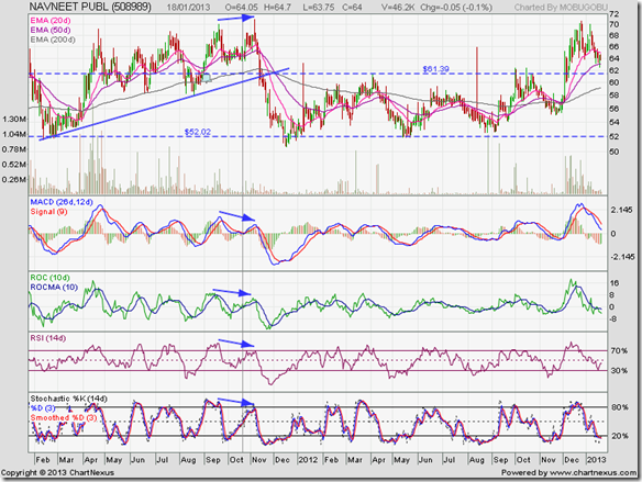
In the previous update to the stock chart pattern of Navneet Publications (posted back in Oct 20, 2011 – marked by grey vertical line in chart below), the recommendation was to ‘use dips to buy’, because the stock was in an uptrend in a bull market.

However, the caveat was: “Bears will remain in the picture as long as the stock fails to move above its previous top of 74.” Two weeks after my post (on Nov 4 ‘11), the stock rose to touch an intra-day high of 71 – but it turned out to be a ‘reversal day’ (higher high, lower close).

Also, all four technical indicators showed negative divergences by touching lower tops while the stock price rose higher (marked by blue arrows). The combined negative divergences and the ‘reversal day’ pattern warned of a possible correction, which came swiftly as it coincided with the correction in the broader market.

Navneet_Jan1813

The stock price dropped past the support level of 61, the 200 day EMA and the blue uptrend line in rapid succession. The 50 day EMA crossed below the 200 day EMA – the ‘death cross’ confirming a bear market. The stock price continued to drop and breached the long-term support level of 52 in Dec ‘11.

Observant readers may note that while the stock touched a new low of 50.60 on Dec 20 ‘11, all four oversold technical indicators had already started moving higher – the combined positive divergences hinting that the sharp correction was over.

For almost 12 months after touching its low, the stock price consolidated sideways within a rectangular band between 52 and 61 – testing the patience of investors, but providing traders with some decent trading opportunities.

In late Nov ‘12, all three EMAs almost merged with each other. As often happens, a sharp move followed, which turned out to be upwards. Rectangular consolidations are unpredictable because the eventual break out can happen in either direction. In this case, the up move breached the 61 level on a volume spurt – which gave technical validity to the upward break out.

The stock price rose to touch an intra-day high of 70.20 on Dec 24 ‘12, testing but failing to cross its Nov ‘11 top. A correction/pullback ensued. The stock price has almost dropped to the top of the rectangular consolidation range. Such a pullback after an upward break out on strong volumes provide an opportunity to enter.

The daily technical indicators are bearish, which means the correction may not be over just yet. MACD is still positive, but is falling rapidly below its signal line. ROC is negative, and falling below its 10 day MA. RSI has bounced up from the edge of its oversold zone, but is below its 50% level. Slow stochastic has entered its oversold zone.

Fundamentals remain reasonably good, though cash flows from operations dipped into the negative in FY12. Steady growth in top and bottom lines is a positive. Q3 results should be checked before entering. Alternatively, enter with a stop-loss at the rising 200 day EMA.

Bottomline? The stock chart pattern of Navneet Publications has entered a bull market after a long sideways consolidation. Bears have not been vanquished yet, so slow accumulation rather than buying a large lot is advised. The company is investor-friendly and pays decent dividends.

Wednesday, January 16, 2013

An update on the Auto Sector – a guest post

The continuing slow down in the Indian economy, coupled with high interest rates, has finally started telling on monthly auto sales numbers. The recent hike in diesel price has taken away some of the advantage of diesel models over petrol models of vehicles.

In a guest post back in Nov ‘12, Nishit had analysed the 4-wheeler auto segment and its three principal listed players. In an update this month, he examines the likely changes in fortune of Maruti, M&M and Tata Motors.

-----------------------------------------------------------------------------------------------------------------------------------------

We had explored the auto sector in India in last November’s post. We are in the New Year and let us see if things have changed. The month of December was pretty poor with Sales down about 3% year on year. The auto industry is under duress. Earlier, when Petrol price was deregulated in June 2010, it galloped from about Rs 55/litre to Rs 78/litre at the peak.

The rising petrol prices put a break on the sale of Petrol models and this led to a ‘dieselification’ of the Indian auto segment. The market leader Maruti didn’t have too much Diesel engine capacity and hence took a back seat which led to Mahindra and Tata coming to the fore.

While Petrol prices galloped, Diesel prices were not changed for a long time. Typically, Diesel used to be priced Rs 10 cheaper than Petrol. In September 2012, the government went ahead with a hike in Diesel price and the price has gone up to Rs 52/litre. At the same time petrol prices came down to Rs 73/litre. Thus, the price differential between the two fuels, which used to be Rs 10 but had increased to almost Rs 32, was brought down to Rs 21.

Another development which took place was that manufacturers took advantage of the fuel price differential and increased prices of Diesel car models - so their price differential with petrol models of the same vehicle rose to about Rs 1.5 lakhs from the earlier Rs 1 lakh.

Typically, a petrol car, if it gives a mileage of 10 km/litre will cost the owner about Rs 7.30 per km as fuel cost. The diesel version of the same model will cost about Rs 4.30. The breakeven for buyers, which was about 33,000 kilometers has now gone up to above 50,000 kilometers. Typically, most car buyers do not drive more than 10,000 kilometers a year and after 5 years, they replace the vehicle.

The demand and the wait-list for Diesel cars have vanished and they are pretty much available off the shelf. Maintenance expenses of Diesel vehicles also tend to be on the higher side.

The Government is coming up with a plan to hike Diesel prices by up to Rs 10 more this year, with a hike of Re 1 per month. If this happens then price differential between Petrol and Diesel will be back to Rs 10. The breakeven for buyers will go even higher to 75,000 kilometer running.

Petrol cars will make a comeback and the biggest beneficiary of this will be Maruti, which has a strong portfolio of Petrol cars. Mahindra will be the biggest loser as it has a line-up mainly focused on Diesel variants. Tata Motors has a mix of both, but tilted towards Diesel.

As and when the government starts hiking Diesel’s price, it would be time to switch to Maruti from Mahindra. Another key point to watch out for would be any additional excise duties on Diesel vehicles - if they are imposed in the budget. This seems like a remote possibility but anything is possible for a cash-strapped government.

-----------------------------------------------------------------------------------------------------------------------------------------

(Nishit Vadhavkar is a Quality Manager working at an IT MNC. Deciphering economics, equity markets and piercing the jargon to make it understandable to all is his passion. "We work hard for our money, our money should work even harder for us" is his motto.

Nishit blogs at Money Manthan).

Tuesday, January 15, 2013

WTI and Brent Crude Oil charts: looking for direction

WTI Crude chart

WTI Crude_Jan1413

The 1 year daily bar chart pattern of WTI Crude oil is showing a mix of good and bad news from the perspective of bulls. First the good news: After recovering from a higher bottom (touched in Nov ‘12), oil’s price has rallied nicely to cross all three EMAs into bull territory. The 20 day EMA has managed to cross above the 200 day EMA. The 50 day EMA is rising, but is below the 200 day EMA. These are all bullish signs.

Now the bad news: The cross above the 200 day EMA in end-Dec ‘12 was not accompanied by a significant increase in volumes. That could lead to a pullback towards, and even a drop below, the 200 day EMA. Note what happened back in Sep ‘12, when a move above the 200 day EMA was not followed by the ‘golden cross’ of the 50 day EMA above the 200 day EMA.

The up move in Jan ‘13 appears to be losing momentum. MACD is positive and rising above its signal line, but the histogram is falling. RSI has entered its overbought zone, where it doesn’t stay for long. Slow stochastic is inside its overbought zone, but showing negative divergence by sliding down while oil’s price is moving higher.

Though oil’s price is currently trading above its 200 day EMA, the long-term moving average has been gradually falling since touching a peak back in May ‘12. The bearish view will change only if oil’s price can rally past the 100 mark.

On longer-term weekly chart (not shown), WTI Crude oil price is trading above its 200 week EMA, after falling below for two weeks in early Dec ‘12.

Brent Crude chart

BrentCrude_Jan1413

The 1 year daily bar chart pattern of Brent Crude oil has been alternately moving above and falling below its 200 day EMA since Sep ‘12. The 200 day EMA has become flat at the 110 level.

During such sideways consolidation moves, technical analysis becomes a challenge. Note that a higher bottom was touched in Dec ‘12, but slow stochastic showed negative divergence by touching a lower bottom.

No clear direction is visible from RSI and slow stochastic, which are at their 50% levels. MACD is barely positive and dropped to touch its signal line. On longer-term weekly chart (not shown), Brent Crude oil price is trading above its rising 200 week EMA. The long-term bull market is intact.

Monday, January 14, 2013

Stock Index Chart Patterns: S&P 500 and FTSE 100 – Jan 11, ‘13

S&P 500 Index Chart

S&P 500_Jan1113

The 6 months daily bar chart pattern of the S&P 500 index has recovered all its losses from the Nov ‘12 low following the triple-top reversal pattern. The index is poised near its Sep ‘12 top, and should move up to touch a new 52 week high.

All three EMAs are rising and the index is trading above them. The bulls are back in control. But volumes are drifting down as the index is moving up. That is a concern. Also, the gaps between the EMAs are widening – which is a sign that the index is becoming overbought.

Daily technical indicators are bullish. MACD is positive and rising above its signal line. RSI is moving sideways below its overbought zone. Slow stochastic is inside its overbought zone.

A bit of correction or consolidation will improve the technical health of the chart, and enable bulls to make an attempt at testing the all-time high touched back in Oct ‘07.

FTSE 100 Index Chart

FTSE_Jan1113

The 6 months bar chart pattern of the FTSE 100 index consolidated for a couple of days before moving up to cross the 6100 level. In doing so, it crossed above the triple-top reversal pattern formed during Feb-Jul ‘11 (not shown in chart) and touched a 3 year high.

All three EMAs are rising and the index is trading above them. However, this isn’t a time of euphoria, but of caution. The index is trading more than 300 points above its 200 day EMA, which is a sign of an overbought condition.

Daily technical indicators are bullish, but looking overbought. MACD is positive and rising above its signal line, but has entered overbought territory. RSI has re-entered its overbought zone, where it doesn’t like to stay for long. Slow stochastic is well inside its overbought zone.

Some correction/consolidation is likely, which will help the index to attempt a test of its 2007 high.

Bottomline? Daily bar chart patterns of S&P 500 and FTSE 100 indices have overcome resistance zones, and look all set to move up to test their 2007 highs. However, the up moves may be preceded by some correction/consolidation. Hold, with suitable trailing stop-losses.

Saturday, January 12, 2013

BSE Sensex and NSE Nifty 50 index chart patterns – Jan 11, 2013

BSE Sensex index chart

From an intra-day low of 15136 touched on Dec 20 ‘11, the daily bar chart pattern of Sensex touched an intra-day high of 19856 on Jan 7 ‘13 – a gain of 4720 points (31%) in just over a year. It has traded within an upward-sloping channel during the entire period of 13 months, and gradually transitioned from a bear market to a bull market.

For the past 4 months, the long-term resistance zone between 19000 and 19800 has prevented the index from moving up too fast – despite continuous buying by the FIIs. After briefly entering the resistance zone in early Oct ‘12, the index retreated. It made another abortive attempt to enter the resistance zone in early Nov ‘12.

Finally, Sensex entered the resistance zone on Nov 29 ‘12, only to spend Dec ‘12 in a sideways consolidation in the middle of the resistance zone – receiving good support from its 20 day EMA. In Jan ‘13, the index attempted to break out above the resistance zone but failed. It is trading sideways at the upper edge of the resistance zone.

SENSEX_Jan1113

This is an interesting example of how a long-term resistance (or support) level can impact progress in a bull (or bear) market. Drawing long-term support/resistance levels on charts is an art that improves with practice and experience. But it is a good skill to acquire because such support/resistance levels tend to have stronger implications than calculated levels (like Fibonacci retracement levels).

Daily technical indicators are giving mixed signals – which often happens during periods of consolidation. MACD is positive, but about to slip below its signal line. ROC is barely positive, and has become entangled with its 10 day MA. RSI has moved up to the edge of its overbought zone. Slow stochastic has dropped down from its overbought zone.

All three EMAs are rising and the index is trading above them. The bull market is under no immediate threat. The weak IIP number and falling exports will add downward pressure on the index. Infosys came out with pleasantly positive Q3 results. A few more such positive surprises may push the index above the resistance zone.

NSE Nifty 50 index chart

The weekly bar chart pattern of the Nifty 50 index looks similar to the Sensex – trading within an upward sloping channel for more than a year. But there is an important difference. The long-term resistance zone between 5750 and 5950 is narrower, and the index managed to cross it in the previous week.

Last week’s correction caused the index to pullback to the top of the resistance zone, after briefly entering it intra-week. The volume spurt on the pullback is a concern, and may be an indication that the break out above the resistance zone was a ‘false’ one. However, both the weekly EMAs are rising and the Nifty is trading above them, which is bullish.

Nifty_Jan1113

Weekly technical indicators are bullish, but showing signs of weakness. MACD is positive and above its signal line, but moving sideways. ROC is also positive, but has dropped down to touch its 10 week MA. After moving in and out of its overbought zone since Aug ‘12, RSI has started moving down towards its 50% level. Slow stochastic has remained inside its overbought zone since Aug ‘12, but may be slipping down.

Any further correction should find twin support from the lower edge of the resistance zone and the rising 20 week EMA. Unless there are several negative surprises in Q3 results, the 5750 level is unlikely to be breached.

Bottomline? Chart patterns of BSE Sensex and NSE Nifty 50 indices are continuing with their upward moves within parallel channels. Long-term resistance zones are impeding the upward momentum. The indices are likely to make steady progress with periodic corrections/consolidations. Q3 results are likely to trigger the next move.

(Note: Regardless of index movements, there are some fundamentally strong stocks with growth prospects that are available at reasonable valuations. My paid Monthly Investment Newsletter recommends such stocks. Subsequent monthly technical updates identify entry/exit points. A limited number of new subscriptions are being offered till Jan 21, 2013. Contact me at mobugobu@yahoo.com for details.)

Friday, January 11, 2013

About weak IIP and strong Infy

The IIP number for November 2012 came in at a disappointing –0.1% compared to the 6% growth in November 2011. That means factory output shrank marginally from the year-ago month. The economy is still down, and only strong reform measures and a decent budget may shake it up from its somnolence.

For the Apr to Nov ‘12 period, IIP grew by a puny 1%, compared to a 3.8% growth during the same period in 2011. Mr Montek Singh Ahluwalia of the Planning Commission tried to put an interesting spin on the negative number – by saying that it was a statistical aberration because Diwali was celebrated in November in 2012.

That wasn’t the only bad news. Exports fell for the 8th straight month. However, the trade deficit reduced to $17.7 Billion in December from $19.3 Billion in November. Thanks to shrinking exports and the poor IIP figure, Rupee lost value despite strong FII inflows.

The poor IIP figure raised hopes of an interest rate cut by RBI later in the month. However, the inflation figure expected on Monday (Jan 14) will determine whether the RBI will cut rates. Even if it does, it is unlikely to be more than 25 bps – which may have very little effect on the market.

Surprisingly positive noises from Infosys management helped to prop up the stock market. Q3 revenues rose by 12% from the year-ago quarter, but net profit was down 0.1%. However, the full year and Q4 guidance were raised, which cheered the market no end.

After several quarters of disappointing results, which led to excessive selling of the Infosys stock, today’s euphoria was also a bit overdone. The stock opened up with a huge gap above its 200 day EMA, backed by a sharp increase in volumes, and rose nearly 17%.

Interestingly, the large gap in the Infosys chart formed on Apr 13 ‘12 – which was partly filled during Sep ‘12 – has not yet been fully filled. But that may be a moot point. The 2 years long down trend in the stock may be getting over.

Does that mean it is a good time to buy the Infy stock? If you missed buying on the break out today, you may get another chance if there is a pullback towards the 200 day EMA. Such pullbacks often follow sharp break outs. 

Thursday, January 10, 2013

Stock Chart Pattern - Hindustan Unilever (An Update)

These were the concluding comments in the previous update to the stock chart pattern of Hindustan Unilever back on Sep 21, ‘11 (marked by grey vertical line in chart below): “Valuations are not cheap, but the stock is worth its weight in gold. Regular dividends are an added attraction. Use dips to accumulate.”

The stock price had closed at 339.30 on Sep 21 ‘11. A few days later (on Oct 5 ‘11), the stock price closed at 322. That was the lowest closing price the stock touched in the last 15 months. At today’s (Jan 10 ‘13) closing price of 516.65, the stock has gained an annualised 42% since the previous post – not counting the substantial dividends paid.

Not bad for a stock whose valuations appear expensive to most small investors. Gold appears expensive too, but many investors would rather by gold than HUL stock – despite the fact that gold pays zero dividends.

What does the 2 years closing chart pattern of Hindustan Lever show us? It is still in a bull market, but undergoing a period of consolidation. Is this a good time to enter?

HUL_2yr_Jan1013

Note that over the past 2 years, the stock had undergone three prolonged periods of consolidation (marked by light blue ellipses) which lasted between 3 to 4 months each. The current consolidation has been going on for more than 2 months.

The stock price had broken out upwards from the three previous consolidations, and each time negative divergences in the daily technical indicators (which failed to touch new highs – marked by blue arrows) led to the next period of consolidation.

Will the pattern get repeated this time as well? All four daily technical indicators are showing positive divergences by touching higher bottoms while the stock price has been moving sideways. However, the technical indicators are bearish, which means the consolidation may not be over.

The company continues to deliver on both sales and profit fronts and generates a ton of cash. The best way for small investors to accumulate the stock is to start a monthly SIP by buying 5 or 10 stocks each month (about the cost of a night out with friends at a pub or restaurant).

Bottomline? The stock chart pattern of Hindustan Unilever is in a bull market, making steady rather than spectacular progress. Growth and margins are back on the upswing. Valuations are not cheap, but the stock is worth its weight in gold. Regular dividends are an added attraction. Use dips to accumulate. (This is a repeat of the concluding paragraph of the previous update – did not see any reason to change it.)

Wednesday, January 9, 2013

Nifty and Defty charts: a mid-week update

Nifty chart

Nifty_Jan0913

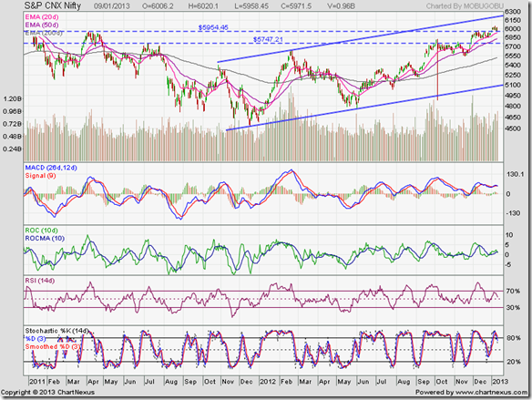
Last Wednesday, the Nifty had managed to cross the resistance zone between 5750 and 5950. Since then, the index hasn’t made much progress, but has stayed above the resistance zone. The break out above 5950 was not accompanied by a significant increase in volumes – so the possibility that the break out was a ‘false’ one remains.

All three EMAs are moving up and the index is trading above them – which is the sign of a bull market in progress. All four technical indicators had showed negative divergences by failing to touch new highs. The sideways consolidation above the resistance zone was expected – more so because Q3 results are around the corner.

Daily technical indicators are still bullish, but showing signs of weakness. MACD is touching its signal line in positive territory. ROC is barely positive, and has crossed below its 10 day MA. RSI is moving down towards its 50% level. Slow stochastic has dropped down from its overbought zone.

Nifty may slip down inside the resistance zone – specially if Infosys declares below par results.

Defty chart

S&P CNX Defty_Jan0913

The uptrend (marked by the blue uptrend line) and the bull market on the Defty chart (Nifty measured in US Dollars) continues. The 20 day EMA provided good support to the index – just as the 200 day EMA and 50 day EMA had done during Nov ‘12 and Dec ‘12.

Daily technical indicators are showing some bearish signs. MACD has become entangled with its signal line, and moving sideways in positive territory. ROC has dropped to its 10 day MA, and about to cross into negative zone. RSI is resting on its 50% level, and may slip below. Slow stochastic is falling towards its 50% level.

Some more correction or consolidation is likely.

(Note: Paid subscriptions to my Monthly Investment Newsletter will be open till Jan 21, 2013. The newsletter mainly covers below-the-radar small-cap stocks that are fundamentally strong with growth prospects. Majority of stocks recommended during the past 12 months have provided good returns. Send me an email at mobugobu@yahoo.com for details.)

Tuesday, January 8, 2013

Gold and Silver charts: cup-and-handle patterns fail

Gold Chart Pattern

Gold_Jan0813

One of the challenges in technical analysis is that patterns don’t always play out as expected. The weekly bar chart pattern of gold is a clear example of that. The bullish cup-and-handle pattern - whose ‘handle’ part was in the process of forming – failed to break out upwards above the ‘rim’ of the cup at 1800.

In the previous post four weeks back, investors were advised to hold with a stop-loss at the level of the 20 week EMA. Bearish weekly technical indicators led to the warning that a price drop below 1660 would negate the cup-and-handle pattern.

Note that gold’s price fell sharply below both the 20 week and the 50 week EMAs – thus triggering the stop-loss. However, on a weekly closing basis, gold’s price has managed to cling on to the 1660 level for the past three weeks.

Is there a chance that gold’s price will recover from here and make a renewed attempt at crossing the resistance level of 1800? Weekly technical indicators are not providing any such hopes. MACD is falling below its signal line and entered negative territory. RSI is trading sideways below its 50% level. Slow stochastic is inside its oversold zone.

What had looked like the ‘handle’ of the cup has turned into a downward move within a channel. Lower price levels are likely. However, gold is trading well above its rising 200 week EMA (not visible in chart), which means the long-term bull market is still intact.

Silver Chart Pattern

Silver_Jan0813

In the previous post on silver’s 1 year weekly bar chart pattern, the following comments were made: “The ‘handle’ portion is being formed. A move above 36 will be quite bullish. A drop below 31 will negate the cup-and-handle pattern.”

Three weeks back, silver’s price dropped below its 20 week and 50 week EMAs as well as the 31 level – negating the bullish cup-and-handle pattern that had taken more than 9 months to form. What had looked like the ‘handle’ of the cup has turned into a bearish pattern of lower tops and lower bottoms.

The 20 week EMA is resting on the 50 week EMA, and is likely to cross below soon. MACD has entered negative territory below its signal line. RSI is treading water below its 50% level. Slow stochastic is inside its oversold zone. Any price rise will probably be used by bears to sell.

Note that the 200 week EMA is still rising and silver’s price is trading above it. The long-term bull market is in force.

Monday, January 7, 2013

Stock Index Chart Patterns: S&P 500 and FTSE 100 – Jan 04, ‘13

S&P 500 Index Chart

S&P 500_Jan0413

The last-minute resolution of the ‘fiscal cliff’ provided renewed energy to the bulls. The one year bar chart pattern of the S&P 500 index jumped above the resistance zone between 1420 and 1440, backed by good volumes. That provided technical validity to the upward break out.

The index is hesitating near the ‘triple top’ reversal pattern formed during Sep-Oct ‘12. This is quite expected, as traders tend to remember levels from which a stock or index had reacted earlier. That is why support and resistance levels are important in technical analysis.

Since the index is in a bull market – note that it is trading above all three EMAs, which are rising – the previous top touched in Sep ‘12 should not halt the upward march. The all-time high touched in Oct ‘07 is likely to be tested and breached.

Daily technical indicators are looking quite bullish. MACD is rising above its signal line in positive territory. RSI is consolidating half-way between its 50% level and the edge of its overbought zone. Slow stochastic has entered its overbought zone.

Hold, with a trailing stop-loss. It is not a good idea to buy when the index is less than 10% below its all-time high.

FTSE 100 Index Chart

FTSE_Jan0413

The resolution of the ‘fiscal cliff’ in the US helped the one year bar chart pattern of FTSE 100 index to reverse its corrective move and cross above the resistance zone between 5950 and 6000. The index moved up to touch a 52 week high close to the 6100 level, which also happens to be near the level of the ‘triple-top’ reversal pattern formed during Feb-Jul ‘11.

It is likely that the index may consolidate or even correct a bit here before it can move above the 6100 level. Daily technical indicators are looking bullish but overbought. MACD has crossed above its signal line in positive territory, and about to enter its overbought zone. RSI has entered its overbought zone. Slow stochastic has risen sharply and is well inside its overbought zone.

The index is in a bull market, but close to a previous reversal level. Hold, with a trailing stop-loss.

Bottomline? One year daily bar chart patterns of S&P 500 and FTSE 100 indices have overcome resistance zones – thanks to the resolution of the US ‘fiscal cliff’. Both indices are near the levels of previous ‘triple top’ reversal patterns. Some consolidation or correction may precede the next up moves.

Saturday, January 5, 2013

BSE Sensex and NSE Nifty 50 index chart patterns – Jan 04, 2013

BSE Sensex index chart

The first trading week of the year showed renewed buying interest from FIIs, and net selling by DIIs – a trading pattern that has continued since the low touched by the Sensex in Jun ‘12. The expected end of the year selling by FIIs didn’t happen or, their buying exceeded their selling.

Thanks to continuous net selling by DIIs, there has been no runaway rally by the Sensex. The weekly bar chart pattern of the Sensex shows that the rally within the upward-sloping channel from the Dec ‘11 low has been regularly interspersed with periods of consolidation and correction. That has maintained the technical health of the rally.

However, the index is likely to face twin resistance from the top of the resistance zone at 19800 and the upper edge of the upward-sloping channel at around 19900. Some consolidation or correction is quite likely – prior to Q3 results that will start hitting the market within the next 2-3 weeks.

SENSEX_Jan0413

Weekly technical indicators are bullish. MACD is above its signal line, and both are rising in positive territory. ROC has crossed above its 10 week MA in positive zone. RSI is moving in and out of its overbought zone since Aug ‘12. Slow stochastic is back inside its overbought zone after dropping below in Nov ‘12.

Note that three of the four technical indicators – ROC, RSI, slow stochastic – touched lower tops while Sensex touched its highest level since Apr ‘11. The negative divergences is a warning of an impending consolidation/correction.

Is there a possibility of a steep correction down to the lower edge of the upward sloping channel? Yes, if Q3 results fall short of expectations, and RBI keeps interest rates intact. No point in worrying about such an event. Maintain a suitable stop-loss if you decide to buy or hold on to your existing portfolio.

NSE Nifty 50 index chart

Unlike the Sensex, which has reached the top of its resistance zone, Nifty 50 has broken out above its resistance zone and the psychological 6000 level. However, volumes during the break out were not significantly higher – though volumes are not low by any means.

Note that the top edge of the upward-sloping channel, within which Nifty has been trading for more than a year, is still 200 points away. That opens up the possibility of a further rise in the index before a meaningful correction can happen.

Nifty_Jan0413

Observant readers may notice that the upward-sloping channels on the Sensex and Nifty charts are similar but not identical (in terms of where the index is trading with respect to the upper end of the channel). Why the difference? Remember that the two indices are structurally different – Sensex comprising 30 stocks whereas Nifty has 50 stocks.

All four daily technical indicators are looking bullish, but have touched lower tops while Nifty has reached a 2 years high. The combined negative divergences may be hinting at a consolidation or correction. All three EMAs are rising and the index is trading above them – which means the bulls are on top.

Bottomline? Chart patterns of BSE Sensex and NSE Nifty 50 indices have enjoyed bull rallies from their Jun ‘12 lows, and appear ready for some consolidation or correction. Upcoming Q3 results should be checked before jumping in to buy. However, one can keep accumulating fundamentally strong stocks trading at reasonable valuations regardless of index levels.

(Note: My paid Monthly Investment Newsletter recommends fundamentally strong stocks with growth prospects. Subsequent monthly technical updates identify entry/exit points. A limited number of new subscriptions are being offered till Jan 21, 2013. Contact me at mobugobu@yahoo.com for details.)

Friday, January 4, 2013

How is the Sensex performing against Asian indices?

You may find it hard to believe, but it is true. The Sensex has been the best performing stock index over the past 12 months when compared with its Asian peers.

Through all the chaos, scams, policy inaction, allies of the government turning foes, opposition parties stalling parliament proceedings, high interest rates, high inflation, fiscal and current account deficits, sliding exports, falling Rupee and a slipping GDP – FIIs kept faith in the Indian stock market.

DIIs on the other hand, played contrarian by selling off. Perhaps many were forced to do so as retail investors pulled money out of the market. Did anyone other than FIIs gain from the Sensex rise? May be a few fortunate or prudent investors, who locked on to FMCG and Pharma stocks.

Shown below are one year closing chart patterns of Asian stock indices (in blue), compared with Sensex chart (in green):

Shanghai Composite vs. SENSEX (in green)

Shanghai

Except for a brief spell in early Jan ‘12 and most of May ‘12, the Shanghai Composite index was outperformed by Sensex – particularly from Jul ‘12 onwards.

Hang Seng vs. SENSEX (in green)

HangSeng

Hang Seng moved in lock-step with Sensex for the first 5 months of the year, before losing some ground during the rest of the year. But it came close to matching the Sensex performance with a 20% gain for the year.

Taiwan TSEC vs. SENSEX (in green)

TSEC

Taiwan’s TSEC index managed to hold its own till May ‘12 before getting left behind by the Sensex for the rest of the year.

Jakarta Composite vs. SENSEX (in green)

Jakarta

Except for the first half of Jan ‘12 and during Apr-May ‘12, Jakarta Composite index was no match for the Sensex.

Malaysia KLCI vs. SENSEX (in green)

Malaysia KLCI

For the first four months and the last four months of the year, Sensex clearly outperformed Malaysia’s KLCI index. During May-Aug ‘12, the race was a bit closer.

Singapore STI vs. SENSEX (in green)

STI

Singapore’s Straits Times index matched or beat the Sensex performance during the first 8 months of the year, and notched up a creditable 20% gain. But Sensex outperformed STI during the last 4 months.

Korea KOSPI vs. SENSEX (in green)

KOSPI

For a few days in Mar ‘12 and May ‘12, Korea’s KOSPI index tried to hang on to Sensex coattails, only to be left far behind.

Thursday, January 3, 2013

Stock Chart Pattern - Cummins India (An Update)

Within two weeks of posting the previous update on the stock chart pattern of Cummins India (marked by grey vertical line on chart below) on Dec 28 ‘11, the stock price completed a rare ‘diamond’ bottom reversal pattern and broke out upwards on a volume surge.

Patient investors had been advised to accumulate the stock, or await the formation of a bottom reversal pattern to enter. Those who were fortunate enough to heed my advice are sitting on a Rs 200 (58%) gain in just over a year – outperforming the Sensex by almost 100%.

What if you missed the rally and wish to enter now? Let us take a look at the daily bar chart pattern of Cummins India to identify possible entry opportunities:

Cummins_Jan0313

The bull rally following the break out from the ‘diamond’ pattern coincided with the rally in the broader market. The stock price rose sharply to touch an intra-day high of 485 on Feb 10 ‘12. Note that all four technical indicators looked highly overbought, and warned of a correction or consolidation.

While the Sensex went into a corrective mode, Cummins’ stock consolidated sideways with an upward bias. The ‘golden cross’ of the 50 day EMA above the 200 day EMA (marked by light green oval) technically confirmed a return to a bull market.

The stock price rose to touch a new intra-day high of 505 on Apr 2 ‘12. But it turned out to be a ‘reversal day’ (higher high, lower close). All four technical indicators touched lower tops (marked by blue arrows). The combined negative divergences and the ‘reversal day’ pattern warned of a correction.

After consolidating sideways with a downward bias during Apr ‘12, the stock price fell sharply below all three EMAs and touched an intra-day low of 396 on May 23 ‘12. But it turned out to be a ‘reversal day’ (lower low, higher close), which coincided with all four technical indicators in oversold zones.

The subsequent rally within an upward-sloping channel has entered its eighth month and touched a new 52 week intra-day high of 542 in today’s trading. But there are some dark clouds on the horizon. Three of the four technical indicators touched lower tops while the stock rose higher.

The stock price is also at the upper edge of the channel, where it is likely to face resistance. The all-time high of 574 touched in Nov ‘10 (adjusted for 2:5 bonus) is less than 40 points away. There is usually some hesitation near all-time high levels.

Cummins is a debt-free, investor-friendly company with strong positive cash flows. It continues to perform well despite declining exports and a slow down in the capital goods sector. Valuations are looking a bit stretched. It may be prudent to wait for a dip to enter.

Bottomline? The stock chart pattern of Cummins India is in a bull market. Earnings are likely to improve due to expanded capacity and expected lower interest rates in the next few quarters. It is the kind of stock that will help small investors build wealth. If you don’t wish to time your entry, start a monthly SIP.

Wednesday, January 2, 2013

Nifty and Defty charts: a mid-week technical update

Nifty chart

Nifty_Jan0213

First, the good news. After struggling for a month to cross above the long-term resistance zone between 5750 and 5950, the Nifty finally managed to climb above 5950. The index touched an intra-day high of 6006 – a level last seen two years back – before closing just below the 6000 level.

Now, the bad news. The break out above 5950 was not accompanied by a significant increase in volumes. Contrast it with the spike in volumes in late Nov ‘12 when Nifty crossed the 5750 level. That means the break out may be a ‘false’ one.

Also, the new high in the Nifty was not matched by any of the four technical indicators – which touched lower highs. The combined negative divergences can lead to some correction or consolidation.

However, daily technical indicators are looking bullish and the next upside resistance is expected from the top edge of the upward-sloping channel at around 6200. It is possible that Nifty may move towards 6200 before correcting/consolidating.

All three EMAs are rising, and the index is trading above them. The bull market in Nifty is intact.

Defty chart

S&P CNX Defty_Jan0213

The CNX Defty chart (Nifty calculated in US Dollars) made a gap-up move in today’s trading. FIIs were probably celebrating the last-minute resolution of the ‘fiscal cliff’ issues by the House of Representatives.

The uptrend from May ‘12 lows – marked by the blue uptrend line - has not been tested since the ‘flash crash’ in Oct ‘12. All three EMAs are rising and the Defty is trading above them – which is the sign of a bull market.

Daily technical indicators are looking bullish. MACD has crossed above its signal line in positive territory. ROC has crossed above its 10 day MA into positive zone. RSI has crept above its 50% level. Slow stochastic has climbed sharply towards its overbought zone.

However, all four technical indicators are showing negative divergences by touching lower highs. A correction/consolidation may be around the corner.

(Note: Paid subscriptions to my Monthly Investment Newsletter have been re-opened for the period Jan 1-21, 2013. If you are looking to add fundamentally strong stocks with growth prospects to your portfolio, look no further. Majority of stocks recommended during the past 12 months have provided good returns. Send me an email at mobugobu@yahoo.com for details.)

Tuesday, January 1, 2013

Stock Index Chart Patterns: S&P 500 and FTSE 100 – Dec 31, ‘12

S&P 500 Index Chart

S&P 500_Dec3112

2012 turned out to be a good year for the S&P 500 index, despite the painfully slow growth of the US economy. The index touched a 3 years intra-day high of 1475 in Sep ‘12 before forming a triple-top reversal pattern and going into a corrective mode.

In the previous post on the daily bar chart pattern of S&P 500 index, the resistance zone between 1420 and 1440 had proved a tough hurdle for bulls. The index dropped below the 1400 level before bouncing back inside the resistance zone on hopes of a resolution of the ‘fiscal cliff’ issues.

Daily technical indicators are giving mixed signals. MACD is positive, but has crossed below its signal line. RSI slipped below its 50% level, but has crept back up. Slow stochastic has fallen sharply below its 50% level.

The index may continue to consolidate near the resistance zone between 1420 and 1440 till the issues related to the ‘fiscal cliff’ are satisfactorily resolved.

FTSE 100 Index Chart

FTSE_Dec3112

2012 was a volatile year for the FTSE 100 index, thanks to a double-dip recession in the UK economy followed by an almost imperceptible recovery. The index dropped sharply below its 200 day EMA in May ‘12, before gradually recovering all its losses during the rest of the year.

For the past couple of weeks, the 1 year daily bar chart pattern of the FTSE 100 index has been struggling to cross the resistance zone between 5950 and 6000 – but without much luck. The index had corrected sharply after forming a triple-top reversal pattern during the first half of 2011 and haven’t yet recouped all its losses.

Daily technical indicators are looking bearish, which means the correction from the 6000 level is not quite over. MACD is positive, but has crossed below its signal line. RSI has dropped to its 50% level. Slow stochastic formed a head-and-shoulders like reversal pattern inside its overbought zone before plummeting below its 50% level.

A drop below the 50 day EMA and a test of support from the rising 200 day EMA is a possibility.

Bottomline? One year daily bar chart patterns of S&P 500 and FTSE 100 indices are struggling to overcome resistance zones. Some consolidation/correction can be expected before resistance zones are crossed. Both indices are in bull markets. Hold, or use dips to add.