Saturday, December 31, 2011

eBook: Technical Analysis – an Introduction

As regular readers already know, I have been writing a blog for more than 3 years to educate new investors about investing in the stock market. The experience so far has been quite enriching for me, and hopefully, beneficial for some of the readers.

The stock market can be a fascinating place or a fearsome place – sort of like bathing in the sea. The first few attempts are usually quite humbling – specially if the sea has large waves that keep constantly crashing on to the shore.

The uneducated can get thrown and dashed around by the waves – hurting pride and self-confidence. In extreme cases, the sea waves can drag out the hapless to a watery grave.

To the experienced sea bather, there can be nothing more exhilarating, invigorating and even relaxing. Jumping up to let the smaller waves flow through, diving under the really big breakers, then swimming out and letting the waves gently carry you back to shore is great fun and builds up a healthy appetite.

Likewise for the stock market. The inexperienced buy to find their stock going down, sell to find the stock going up, spend sleepless nights thinking how to salvage their losses – and in extreme cases, commit suicide.

Of those who have been through the experience, some leave the market permanently blaming brokers, operators, market manipulators, friends who gave wrong tips – in fact any one except themselves. Those who stick around to fight another day, try to learn the ropes by reading, or following the advice of experienced market players.

My earlier eBook: How to become a better investor, was published exactly two years ago on New Year Eve. It contained general advice about sector and portfolio selection, and strategies about how and when to invest without losing a lot of money. Several hundred eBooks were emailed – and may have helped a few readers to become better investors. That eBook is now being ‘retired’ – it will no longer be emailed, but will be available for reading on a different blog.

Many of the posts on this blog are about technical analysis of chart patterns. Several readers had requested me to write an eBook on technical analysis, so that the important information can be available easily in one place. After remaining on the anvil for nearly a year, it is finally ready.

Like the previous eBook, this one is also being provided to my blog readers for free - but on two conditions:

First, you need to specifically ask for the free eBook by sending me an email at mobugobu@yahoo.com with your full name. Hiding behind a pseudonym won't help! I would like to avoid spammers to the extent possible.

Second, you can ask your friends, relatives, colleagues to send me an email for the eBook (or send them a link to this blog post) - but please do not forward the eBook to others without my permission. I don't want the eBook to be freely circulated over the Internet.

The eBook has been compiled from selected blog posts and some new material. It is meant to be an introduction to the subject of technical analysis, with a handful of important concepts that are more than enough to arouse the curiosity of those who want to learn more.

2011 has been a disappointing bearish year for most small investors. Please consider this eBook as a small gift towards making 2012 a happier and more prosperous year. Needless to say, your comments and feedback will be most welcome.

Friday, December 30, 2011

BSE Sensex and NSE Nifty 50 index chart patterns – Dec 30 ‘11

The BSE Sensex and NSE Nifty 50 index chart patterns spent an entire year trading within downward-sloping channels, alternatively raising and dashing the hopes of small investors. A series of scams and government inaction on the policy reforms front spooked the FIIs, and they voted with their feet.

RBI’s attempts to stem the rising inflation rate through 13 interest rate hikes failed to tame inflation, but slowed down the growth engine of India Inc. to crawl speed. The government continued with its spending profligacy – subsidy payments and the NREGA scheme drained the coffers without increasing productivity – and aggravated inflation. Depreciation of the Rupee added to the woes.

All in all, a forgettable year. The good news is that neither of the two indices collapsed like they did three years ago. That doesn’t mean that sharp falls have been ruled out. 2012 is likely to be quite challenging – at least the first half of the year is unlikely to show any significant improvement in the economy or the stock indices.

BSE Sensex index chart

Sensex_Dec2911_LT

Last week, it was mentioned that any bounce from the lower edge of the downward channel would be a weak one. How was the conclusion drawn? The technical indicators on the daily and weekly charts had looked bearish, though positive divergences were visible on the daily chart. Note that the weekly bar of the Sensex moved above the support level of 15700 but stopped well short of the falling 20 week EMA. The index closed the week, month and year below the 15700 level – losing more than 25% for the year.

There is no respite for the bulls visible on the weekly Sensex chart. The index is trading below its falling 20 week and 50 week EMAs. All four technical indicators are bearish. The MACD has crossed below it signal line deep inside negative territory. The ROC is also negative and below its 10 week MA. The RSI is below the 50% level, but trying to rise. The slow stochastic has fallen inside the oversold zone. Expect a test and possible breach of the lower edge of the trading channel.

NSE Nifty 50 index chart

Nifty_Dec3011

The weak bounce up from the lower edge of the downward channel took the Nifty above the support level of 4700 – only to face resistance from the falling 20 day EMA and sip down below 4700 at today’s close.

Note that during Apr ‘11 and Jul ‘11, the index made several unsuccessful attempts to break out above the downward channel. During that period, the lower edge of the channel wasn’t tested even once. The tables have turned in the past 5 months. Only one serious attempt was made to test the upper edge of the channel in Oct ‘11. But multiple attempts were made by the index to breach the lower edge of the channel.

It seems as if the weight is shifting downwards, and the next couple of attempts to breach the lower edge of the channel may lead to a sharp fall - which the bulls have been able to prevent so far. The technical indicators have corrected oversold conditions, but are looking bearish.

The MACD is about to cross below its signal line in negative territory. The ROC is above its 10 day MA and trying to enter the positive zone. Both the RSI and slow stochastic are below their 50% levels. For the past two months, the Nifty is also facing resistance from a small blue down trend line drawn within the downward channel.

Bottomline? The BSE Sensex and the Nifty 50 index chart patterns are falling gradually within downward-sloping channels. The balance of power is shifting to the bears, and sharp falls below the channels may happen sooner than later. Remain patient, but stay prepared. Some investable funds may be locked away in long-term bonds offering tax-free interest.

Thursday, December 29, 2011

Notes from the USA (Dec 2011) - a guest post

Of late, the US economy has been showing small but positive signs of stability. A double-dip recession seems to be off the table. Doom-sayers have been less prolific in their doom-sayings. No one is talking about a collapse of the dollar and revival of the gold standard any more. Gold bulls have stopped predicting levels of $6000 and $10000.

Even the noise about impending calamity emanating from Europe have been on very muted volumes. Every one seems reasonably satisfied that Europe may be heading into another recession, but the Eurozone is not going to disintegrate and the euro won’t collapse. This is what we are getting to read and hear from CNBC and Bloomberg.

But what is the reality? In this month’s guest post, KKP provides his measured opinion from Ground Zero, and advises investors to be cautious.

---------------------------------------------------------------------------------------------------------

All Green Light with the EU Crisis Over?

With all the moves being made in the last few weeks, and the latest punch by the ECB, is the crisis in Europe done with? The bailout of various governments by the ECB allowing them to borrow money super cheap might make it seem like that. These economies need the money to buy their sovereign debt at much higher yields and save a bundle. Sure, it is a big breakthrough in policy and a correct step towards savings these economies, but in my opinion it is far from convincing that this is a one step cure. Markets seem to believe some of it caused the yields to plunge.

The US dollar has reacted accordingly by going into a slight corrective mode, with gold, A$, C$ and Euro bouncing up a bit. Again, in my opinion, this is just a resting place for these currencies before they continue down against US$, since there is too much faith in the ‘least ugly’ (of the moment) i.e. US$.

The US economy seems to be showing typical seasonal strength. People are getting temporary jobs (seasonal jobs in retail, logistics and transportation industry) and hence the unemployment claims are lower. But, this is not going to last because come January, we will have many of those people back on the streets looking for jobs.

Again, 2012 is an election year, and hence we will see artificial moves made by the politicians to show improvement in the US economy so that they can ensure a win. It will again be temporary and not last long. The economy does seem to show some stabilization, but revenue and profits are ratcheting down for corporations, although the quarter to quarter comparison (from previous year) is looking positive, and hence giving a false sense of relief to investors. Net effect is that companies are cutting employees, cutting costs, and delaying investments to show those profits. Ultimately, the reduction in employment affects the supply chain of business that is inter-related, and inter-dependent on ‘jobs and employed folks’.

Housing is showing some stability although there is enough inventory out there (hidden) that keeps coming out slowly but surely. Banks are more lenient and allowing non-mortgage payers to stay in their homes for free based on government regulations. Until prices climb up, most of the purchases made between 2004-05 and 2008-09 are homes that potentially will come back out on the market as a foreclosure sale.

So, no, I do not believe EU is out of the red-light-zone, and neither is the US. Hence, times are still turbulent (with signs of positive turn in mobile computing marketplace) and keeping money safely on the sidelines or trading quickly (in and out) is the only thing we should be doing. This applies to India as well as US.

What are you doing with your money in India or in US?

---------------------------------------------------------------------------------------------------------

KKP (Kiran Patel) is a long time investor in the US, investing in US, Indian and Chinese markets for the last 25 years. Investing is a passion, and most recently he has ventured into real estate in the US and also a bit in India. Running user groups, teaching kids at local high school, moderating a group in the US and running Investment Clubs are his current hobbies. He also works full time for a Fortune 100 corporation.

Wednesday, December 28, 2011

Stock Chart Pattern - Cummins India (An Update)

In the previous analysis of the stock chart pattern of Cummins India in Dec ‘10, it was mentioned that the stock was in a bull market but facing some technical headwinds after touching an all-time high. Existing holders were advised to hold or book partial profits. New entrants were advised to await a bigger correction.

Despite being a well-managed, fundamentally strong and investor-friendly company, the Cummins India stock hasn’t fared well in 2011. It happens to be in the capital goods sector, which is completely out of favour with investors. Just goes to show that even the best of stocks can get badly mauled by bears.

Instead of chasing after ‘theme’ stocks with questionable management, small investors can benefit by periodic profit booking at or near all-time highs and buying the same stocks back at much lower prices. Let us see if the Cummins India stock is providing such an opportunity:

Cummins_Dec2811

Note that after closing at an all-time high of 574 (adjusted for 2:5 bonus in Sep ‘11) on Nov 1 ‘10, the stock made a rare triple-top reversal pattern – marked T1, T2 and T3 on the chart. T1 itself formed a small double-top. After a long bull rally, a reversal pattern formation is the norm.

The stock price dropped sharply below the 200 day EMA to 440 in Feb ‘11, only to bounce up and start a counter-trend rally that formed a bearish ‘rising wedge’ pattern over the next three months. Those who failed to heed the warning from the triple-top were given another chance to exit the stock. The break below the ‘rising wedge’ in May ‘11 was followed by two unsuccessful pullback attempts.

Instead of falling, the stock price consolidated sideways during the first part of Jun ‘11. It then formed a small inverse head-and-shoulders pattern, followed by a brief rally above all three EMAs in Jul ‘11. In the process, all three EMAs got entangled together (marked by light blue oval) – which usually precedes a sharp move.

The RSI made a head-and-shoulders pattern in Jul ‘11. So, it was no surprise that the sharp move was downwards. The ‘death cross’ of the 50 day EMA below the 200 day EMA confirmed the bear market. The 440 support level was breached on a volume spike in Aug ‘11. Several subsequent attempts by the stock to break above the 440 level got thwarted – an example of how a support level turns into a resistance level.

The bonus issue (marked by light blue bell) in Sep ‘11 could not stem the rot. The stock continued its fall with the 20 day EMA acting as resistance to all up moves. The stock dropped to a lower bottom in Dec ‘11 but the MACD and ROC made higher bottoms (marked by blue arrows). The positive divergences – not supported by the RSI and the slow stochastic -led to a brief bounce.

The technical indicators are looking mildly bullish. The MACD is negative, but rising above its signal line. The ROC is above its 10 day MA and trying to stay positive. Both the RSI and the slow stochastic have just about managed to move above their 50% levels. The widening gap between the falling 50 day and 200 day EMAs can be a prelude to a period of consolidation.

At its Dec ‘11 closing low of 326, the stock price has corrected 43% from its Nov ‘10 closing high. Another 10-15% correction from current levels can’t be ruled out. But if you have the patience to wait 2-3 years, you can start accumulating the stock slowly. (Prudence dictates that you wait for a bottom reversal pattern to form and then start your buying – provided of course that you can identify a bottom reversal pattern if you see one.)

Bottomline? The stock chart pattern of Cummins India is in a strong bear grip, with no sign of a turnaround yet. The company has sensibly expanded manufacturing facilities during a period of slow down – and will be in a good position to benefit from the eventual return to growth. This is the kind of stock that small investors should hold in their long-term portfolios.

Tuesday, December 27, 2011

10 Reasons why small investors should love a bear market

Most small investors detest a bear market. The helpless feeling of watching stocks bought with hard-earned money falling into oblivion can be quite traumatic, and cause sleepless nights.

In a desperate and misguided effort to salvage a losing position, investors start ‘averaging’ – buying more shares at progressively lower prices. The stock doesn’t know that some one is ‘averaging’ it – and keeps going down further! The ‘average’ price of the stock decreases, but the losses increase.

Is there any remedy for this fairly common ailment? Turn a disastrous situation into a learning experience. Find out the reasons why small investors should love a bear market. Here are 10 of them.

1. Every one loves bargains. The best bargains in stocks are found during a bear market. Good stocks are available at 40%-50%-60% discounts to their recent peak values.

2. Experts and analysts appearing on TV or writing in business papers stop recommending third rate stocks. They may actually discuss about some decent companies. No longer will you hear that Suzlon is a great buy or Bartronics is the next Infosys.

3. Email or cell phone inboxes will not get overloaded with SMS stock tips about unknown companies from unknown brokerage houses. Most of those brokerages go belly-up during a bear market.

4. No one wants to discuss about stocks at weddings or college reunions. One can actually have intellectually stimulating conversations with relatives and friends – instead of saying “I’ve bought this” or asking “Why did you sell that?”

5. Working hours will not be wasted by staring at stock tickers scrolling on computer terminals. Up to the minute stock updates on cell phones will get disabled. Productivity at work places will improve.

6. One can get a haircut or a shoeshine in peace without getting stock tips from the barber or the shoeshine boy.

7. A bear market separates the short-term, one-hit rock-star companies from the true long-term wealth creating companies. The stocks that don’t fall much in a bear market are the ones that provide dividend income and stability to your portfolio.

8. If one is unfortunate enough to come face to face with a bear in a forest, the best thing to do is not to run or try to fight but to play dead. In the stock market, one can play dead by investing in fixed income avenues. Interest rates are usually higher at such times.

9. The importance of proper asset allocation becomes clear. Spreading investments among equity, fixed income, gold and cash not only saves a portfolio from annihilation but the asset allocation gives clear signals about when to buy and when to sell.

10. A bear market tests an investor’s mettle. Those who turn tail and run are just not meant to be successful investors. Those who can stick it out and learn from their mistakes are the ones who may be able to build wealth over the long term. 

Monday, December 26, 2011

Stock Index Chart Patterns – S&P 500 and FTSE 100 – Dec 23, ‘11

S&P 500 Index Chart

SnP500_Dec2311

In last week’s analysis, contradictory signals from the technical indicators of the S&P 500 index chart had signalled a week of consolidation before Christmas. Instead, the index took investors for a roller-coaster ride – closing at its lowest level for the month on Mon. Dec 19 ‘11 and then rallying above all three EMAs to its highest closing of the month on Fri. Dec 23 ‘11. A bullish pattern of higher tops and higher bottoms will get formed if the index manages to move above its Oct ‘11 top of 1293. Will it be able to do so?

The technical indicators are looking bullish, but there are signs of fatigue. The slow stochastic, which was falling towards its 50% level last week, turned around smartly and is about to enter its overbought zone. The MACD has climbed up above its signal line in positive territory. The RSI, which was rising above its 50% level last week, dropped below its mid-point before inching back above it. The ROC had dropped into the negative zone last week, but turned around to just about enter its positive zone.

Note that all four technical indicators are showing negative divergences. The S&P 500 closed at its highest level for the month and was just 2 points short of its intra-day high for the month, but the technical indicators reached much lower tops. Another concern for the bulls is the progressively lower volumes as the index rose higher – with Friday’s volume being the lowest of the month. It is difficult to sustain a rally with low volume support.

US economic news and indicators are still providing mixed signals. Q3 GDP growth estimate was revised down to 1.8%. There is hope that Q4 GDP growth will show improvement. Weekly rail traffic grew by 11.7% over the same week in 2010. Reuters/Univ. of Michigan survey showed an increase in consumer sentiment to 69.9 against 64.4 in Nov ‘11, but was 18% lower than its average level since 1978. Initial unemployment claims fell to 364,000. New orders for manufactured durable goods increased by 3.8%. New home sales increased by 1.6%, but the median price dropped. Not great figures, but not doom and gloom either.

FTSE 100 Index Chart

FTSE_Dec2311

The FTSE 100 index chart tried to follow the lead from the S&P 500, but was less successful in its efforts to reverse the bearish trend. The index dropped to its lowest level for the month on Tue. Dec 20 ‘11. The subsequent rally climbed above the 20 day and 50 day EMAs but stopped short of the 200 day EMA. A weekly close above the 5500 level was accompanied by very low volumes.

The technical indicators are looking weak. The slow stochastic dropped below its 50% level, and failed to get back into the bullish zone. The MACD slipped into negative territory before managing to scramble back into the positive zone. The RSI fell below its 50% level and remained there. The ROC tried valiantly to clamber back into positive territory but failed. Looks like the Santa Claus rally may be skating on thin ice.

The UK economic outlook continues to be bleak. Q3 GDP growth was revised upwards to 0.6%; but services sector output contracted by 0.7% in Oct ‘11. Q4 GDP may be poor, and a threat of recession is looming large. The current account deficit in Q3 ballooned to 15 Billion sterling - its widest since 1955.

Bottomline? Chart patterns of the S&P 500 and FTSE 100 indices embarked on Santa Claus rallies, but on low volumes. The possibility of the rallies continuing during the last week of the year can’t be ruled out. Bears may use the opportunity to sell. Buying can be considered only on clear breaks above Oct ‘11 tops.

Saturday, December 24, 2011

BSE Sensex and NSE Nifty 50 index chart patterns – Dec 23 ‘11

Technical analysis of the BSE Sensex and NSE Nifty 50 index chart patterns last week posed a challenge as both indices dropped towards the lower edge of their downward channels. Would the indices bounce up or not? The technical indicators on weekly charts looked bearish except for a positive divergence in the ROC.

All four technical indicators in the daily charts showed positive divergences. Plus the Nifty TRIN had spiked up above the 1.2 level, which is usually followed by a bounce. The conclusion was that the likely bounce will be a weak one.

BSE Sensex index chart

SENSEX_Dec2311

The Sensex fell during the first two days of trade last week, and even closed below the downward channel for a day. Two days of upward bounce took the index above the support level of 15700. On Fri. Dec 23 ‘11, the index moved up to face resistance from the falling 20 week EMA and just about managed to close above 15700. A higher weekly close hasn’t changed the technical situation a great deal.

The technical indicators are bearish, but showing faint signs of turning around. The MACD is negative and below its signal line, but trying to move up. The ROC is also negative, but has just crossed above its 10 day MA. The RSI is at the edge of its oversold zone. The slow stochastic has climbed out of its oversold zone.

The odds are still stacked in favour of the bears. The periodic counter-trend rallies have provided them with selling opportunities. A small down trend line within the downward channel has been drawn by connecting the Nov ‘11 and Dec ‘11 tops. The 50 day EMA and the small down trend line are likely resistances for any up move in the last week of a forgettable 2011.

NSE Nifty 50 index chart

Nifty_Dec2311

The weekly bar chart of the Nifty 50 index shows that the 4700 level, which provided support during Aug and Sep ‘11 is now turning into a resistance level. The weekly volume bar shows the same volume as the previous week’s – which doesn’t augur well for sustaining a rally.

The technical indicators are bearish. The MACD is negative and below its signal line. The ROC is negative and below its 10 week MA. The RSI is below its 50% level. The slow stochastic has dipped into its oversold zone. Things aren’t looking very good for the bulls at this stage.

Inflation is showing moderation, but repeated interest rate hikes have put the brakes on economic growth. It will take a while before the growth engine starts chugging along at full steam. Substantial interest rate cuts are required before that. Less than commendable Q3 results next month may trigger off more selling.

Bottomline? The BSE Sensex and the Nifty 50 index chart patterns are still sliding within downward-sloping channels. Breaks below the channels can’t be ruled out. It is disheartening to spread gloom on Christmas Eve – so here is an attempt to spread some good cheer: Next year around this time, the stock market should be in much better shape. (Regular readers of this blog may please stay tuned for a surprise gift on New Year Eve.)

Wishing all readers, followers and subscribers a merry Christmas and a happy 2012.

Friday, December 23, 2011

Stock Index Chart Patterns – Jakarta Composite, Korea KOSPI, Taiwan TSEC – Dec 23 ‘11

In my previous analysis of the chart patterns of the Jakarta Composite, Korea KOSPI and Taiwan TSEC index charts, I had made certain observations about the likely moves of the three indices. As it so happened, all three of my ‘guesstimates’ turned out to be correct.

I may pat myself on the back about my ‘predictive’ capabilities – but the fact is that chart patterns can’t really be predicted in advance. At best, one can make educated guesses about likely occurrences based on the way similar chart patterns played out earlier. Some times, patterns turn out exactly as you expect them to; at other times they make a complete fool of you.

Many put the blame on technical analysis as a decision making tool for investing. The fault usually lies with the analyst who boldly ‘predicts’ outcomes which don’t occur. It is necessary to look at several different technical indicators to arrive at a logical conclusion. Still, charts can ‘behave’ in radically different ways because ultimately an index chart pattern represents the collective greed and fear of market participants.

Jakarta Composite Index Chart

Jakarta_Dec2311

My observation about the Jakarta Composite index chart two weeks ago was: “Expect some more sideways consolidation.” The index consolidated between 3700 and 3800 for two weeks, dropping below the 3700 level and the 200 day EMA once on an intra-day basis. The 3800 level was crossed four times on intra-day basis, including the last three days of the current week. But the index failed to close above the 3800 level even once – indicating that the bears are defending it strongly.

Technically, the index is in a bull market and showing signs of wanting to move higher. All three EMAs have started moving up. Today’s intraday high of 3822 is the highest level the index has touched in more than a month. Crossing above the Oct ‘11 top of 3875 will form a bullish pattern of higher tops and higher bottoms.

The technical indicators are suggesting mildly bullish conditions. The slow stochastic is about to enter its overbought zone. The MACD is above its signal line and barely positive. The ROC has just climbed into positive territory. The RSI is above the 50% level, but falling towards it. An interesting tussle is expected between the bulls and bears over the next couple of weeks, with the bulls having a slight edge.

Korea KOSPI Index Chart

Kospi_Dec2311

The Korea KOSPI index chart was expected to fall below its 20 day and 50 day EMAs. It fell a little further to touch an intra-day low of 1750 on Mon. Dec 19 ‘11 – slightly lower than the Nov ‘11 low of 1767, forming a bearish lower tops and lower bottoms pattern. The index is trading below its falling 200 day EMA and is in a bear market.

The bulls are not quite out of the game yet. Note the positive divergences in the slow stochastic and the RSI, which touched higher bottoms as the index dropped lower. That could lead to another attempt by the index to cross above its 200 day EMA – and probably another failure.

Despite the positive divergences, the technical indicators are looking weak. The slow stochastic is below the 50% level. The MACD is negative and below its signal line. The ROC is also negative, but trying to climb up. The RSI is below its 50% level.

Taiwan TSEC Index Chart

TSEC_Dec2311

The Taiwan TSEC index was expected to test and fall below its Nov ‘11 low, and it showed no hesitation in doing so as it dropped to a low of 6609 on Mon. Nov 19 ‘11. Note that all four technical indicators touched higher bottoms as the index dropped lower. The combined positive divergences led to a sharp upward bounce and the index had a weekly close above the 7000 level.

In spite of the sharp bounce, the technical indicators remain bearish. That means the falling 50 day EMA may stall the upward move. The slow stochastic and the RSI are below their 50% levels, but rising. The ROC is about to cross into positive territory. The MACD is above the signal line, but negative.

The index is trading well below its 200 day EMA, and is in a bear market.

Bottomline? The Jakarta Composite index is technically in a bull market, but still struggling to keep the bears away. The Korea KOSPI and the Taiwan TSEC indices dropped below their Nov ‘11 lows and are trying to rally. Investors can very selectively look for value in beaten down stocks. It may be more prudent to wait till the indices cross above their respective Oct ‘11 tops.

Thursday, December 22, 2011

Are you ready to splurge at the discount sale in the stock market?

Discount sales in retail stores happen several times during the year. They advertise ‘buy-one-get-one–free’ sales and ‘upto 50% discount sales’ that bring in buyers by the hordes. If you have ever visited a retail store on the last day of such a sale, you will find a scene of utter devastation – stuff strewn all over the place and buyers practically yanking things off other buyers in a last desperate bid to find a bargain buy.

What is interesting is that the same buyers (or their friends or cousins) become completely reticent when a discount sale is going on in the stock market – keeping their wallets glued to their pockets. No one rings a bell or takes out full-page advertisements in newspapers to announce a sale in the stock market. One fine day, when everything seemed to be full of sunshine and happiness, people realise their stock or mutual fund portfolio is decreasing in value. Stocks and funds that were flying into orbit suddenly start to nose-dive.

The initial reaction is usually denial. This must be a temporary phase. The correction will soon be over. Experts suggest: “Buy the dip”. Those who entered a bull market late (they are mostly new investors attracted like flies to a pot of honey) start ‘averaging’. When the stock market continues to fall, denial is replaced by shock. All the ‘averaging’ does not prevent a stock’s price from crashing. In sheer panic, investors sell off their holdings to recover whatever little they can.

That is when the real sale starts in the stock market. Experts opine that the index can’t fall any more; 4700 or 15700 or some such number should be the bottom; this is a good time to buy into blue chips. And then the stock market decides to offer even better discounts! But where are the buyers? Why aren’t they falling over each other in trying to lock-in the best bargains?

Many years ago, in a training class on the art of selling, I learned two important lessons. The first lesson: When some one leaves you a message stating that the ‘matter is very urgent’, the urgency is the person’s who left the message. He has probably not yet met his quarterly or yearly sales target – which means no bonus payment and may be even a ‘pink slip’. Don’t call the person back. Let him call again.

The second lesson: When some one offers you a very good deal – so good that you are tempted to whip out your cheque book – smile politely and refuse. The deal will usually get even better! Those who have negotiated a car purchase – particularly a second hand one – will know what is being discussed.

The same goes for Mr Market. He announces discount sales only once in two or three years – not several times a year like retail stores. But if you have the patience and skill to ‘negotiate’, keep smiling and refusing to accept his offers. Even if strong performers are trading at 52 week lows. You will find that his offers get even more mouth watering.

At some stage, Mr Market will get fed up with you (and others like you) and start increasing prices – not in one shot, but gradually. Much like the way he kept offering better discounts with each passing week. That is the best time to start buying. You may not get the absolute lowest bargain price. But you can sleep peacefully at night knowing that henceforth, prices will start rising. 

Wednesday, December 21, 2011

Nifty 50 chart pattern: a midweek update

The following comments were made in last Sunday’s post:

“The NSE Nifty 50 daily chart pattern is clearly showing positive divergences from all four technical indicators, which made higher bottoms while the index fell lower. That should lead to an upward bounce. Perhaps a weak bounce because the indicators are looking bearish.”

“TRIN has spiked up sharply to 1.4, which indicates oversold conditions and a very likely upward bounce. A TRIN level of 1.2 and higher indicates oversold conditions, which is usually followed by an up move.”

Instead of bouncing up, the Nifty continued its fall during the first two days of the week, closing at 4544 on Tue. Dec 20 ‘11 - below the downward channel. The TRIN rose to 1.5 – its highest level in the past year. Positive divergences disappeared from the MACD and slow stochastic indicators, but both the ROC and RSI continued to show positive divergences (marked with blue arrows in the Nifty 50 chart below).

Nifty_Dec2111

The strong 150 points bounce in today’s trading has not changed the technical picture greatly. The index has moved back within its trading channel and prevented a steep fall for now, but its upward bounce stalled near the 4700 level that had earlier provided support during Aug to Oct ‘11.

Today’s up-day volumes were about the same as yesterday’s down-day volumes, and lower than Monday’s down-day volumes. That probably means more short covering than buying. All four technical indicators are bearish – though showing some signs of turning around. The MACD and ROC are negative. The RSI is below its 50% level. The slow stochastic is in its oversold zone.

As mentioned in last Sunday’s post, don’t try to chase this bounce because it may not go very far. Even if the Nifty crosses the 4700 barrier, resistance can be expected from falling 20 day and 50 day EMAs.

Tuesday, December 20, 2011

Gold and Silver Chart Patterns: an update

Gold Chart Pattern

Microsoft Word - Document1

In a post two weeks back, the possibility of a break below the symmetrical triangle pattern on gold’s price chart had been mentioned, even though gold was trading way above its rising 200 day SMA. A downward target of 1450 was also mentioned. Such huge drops – from 1750 to 1450 - don’t happen in one shot. But the drop of 150 within two weeks must have shaken the confidence of die-hard gold bulls.

A swift and steep drop below the 200 day SMA stopped just short of the support level of 1550 (where multiple tops were formed in May and Jun ‘11). A pullback to the long-term moving average was only to be expected, and has been in progress for the past three trading sessions.

The 14 day SMA is falling towards, and may soon drop below, the 200 day SMA. That will be the first warning of a likely change of the bull trend. The 30 day and the 60 day SMAs – not shown in chart above – are also falling. Note that the ‘panic bottom’ of 1600 – formed in Sep ‘11 – has been broken. Panic bottoms seldom hold.

The break down below the triangle was a selling opportunity. So is the current pullback. Long-term holders who may have entered at lower levels can stay invested with a stop-loss at 1550.

Silver Chart Pattern

Microsoft Word - Document1

The 200 day SMA has just about started to fall as silver’s price is moving down towards the lower edge of its downward channel. All the three moving averages – 14 day (in chart above), 30 day and 60 day SMAs – have crossed below the 200 day SMA, with silver’s price trading below all four.

Silver is in a bear market, and can fall to much lower levels. Looks like ‘game over’ for the bulls.

Monday, December 19, 2011

Stock Index Chart Patterns – S&P 500 and FTSE 100 – Dec 16, ‘11

S&P 500 Index Chart

SnP500_Dec1611

The small rounding-top bearish pattern observed on the S&P 500 index chart pattern last week led to a small correction-cum-consolidation. The outcome was along expected lines because of the contradictory technical signals. The technical indicators were looking bullish but were also showing negative divergences.

The technical picture has turned weaker. The index closed below all three EMAs on Fri Dec 16 ‘11 – a bearish weekly close due to the high volumes. The 20 day EMA failed to cross above the 200 day EMA and has turned down. A breach of the Nov ‘11 low of 1159 would form a bearish pattern of lower tops and lower bottoms. As long as the Nov ‘11 low holds, the bears won’t regain control.

The technical indicators are showing bearish signs. The slow stochastic has dropped from its overbought zone, but is above the 50% level. The MACD is barely positive and touching its signal line. The RSI is looking bullish as it rises above its 50% level. But the ROC has dipped into negative territory. The contrary signals means some more consolidation in the offing.

The US economy is starting to get back into the growth path, but too slowly. Initial unemployment claims decreased by 19000 to 366,000 – comfortably below the 400,000 mark. New loans and leases to small businesses have been increasing for the past 15 months – considered as a leading indicator of economic growth. But industrial production in Nov.’11 was down 0.2% on a month to month basis, following a 0.7% increase in Oct. ‘11.

FTSE 100 Index Chart

FTSE_Dec1611

The small bearish rounding-top pattern on the FTSE 100 index chart had pushed the index below the 200 day EMA last week. Negative divergences in otherwise bullish technical indicators encouraged the bears to sell. The index closed the week below all three EMAs.

The technical indicators have turned weaker. The slow stochastic is falling towards its 50% level. The MACD is barely positive and clinging to its signal line. The RSI is above its 50% level, but its up move has stalled. The ROC is looking bearish by falling sharply into negative territory. Watch the Nov ‘11 low of 5075 closely. If the FTSE falls below it, the bears will regain control. Till then, expect some more consolidation.

The global economic outlook for 2012 seems bleak. Europe may already be in recession. The UK may be slipping into a double-dip recession. Order books of UK factories are shrinking due to poor domestic demand and the slow down in exports to Europe. Top retailers are facing losses.

Bottomline? Chart patterns of the S&P 500 and FTSE 100 indices are struggling to keep the bears at bay. So far, the Nov ‘11 lows have held. A fall below could lead to sharp declines. This isn’t a good time to be adventurous. Hold on to your cash and await a clear trend.

Sunday, December 18, 2011

BSE Sensex and NSE Nifty 50 index chart patterns – Dec 16 ‘11

In last week’s analysis of the BSE Sensex and NSE Nifty index chart patterns, I had mentioned the likelihood of both indices falling below their support levels (marked by blue dotted lines). So, the break and close below the support levels on Fri. Dec 16 ‘11 should not have come as a surprise to this blog’s followers. The good news is that neither index fell below its downward channel. We will expect both indices to continue trading within their downward channels – unless something drastic happens in the global or local economies.

BSE Sensex index chart

SENSEX_Dec1611

The sharp fall last Friday dropped the weekly bar of the Sensex to a closing level below 15500 – its lowest weekly close in more than 2 years. While that may sound ominous, it isn’t the end of the world – yet. Note that the Sensex fall stopped just short of the lower edge of the downward-sloping channel.

Will the Sensex bounce up – like it did on the past few occasions when it dropped to the lower edge of the channel? Three of the technical indicators are suggesting: ‘No’. The MACD has slipped below its signal line in negative territory. The RSI is falling below its 50% level. The slow stochastic is moving sideways below its 50% level, but has started sliding.

Only the ROC is showing positive divergence by touching a higher bottom while the index dropped lower. However, the ROC is negative and below its 10 week MA. So, any bounce up may be a weak one and induce more selling. There is a possibility of some FII buying in the next week – due to year-end considerations.

NSE Nifty 50 index chart

Nifty_Dec1611

The NSE Nifty 50 daily chart pattern is clearly showing positive divergences from all four technical indicators, which made higher bottoms while the index fell lower. That should lead to an upward bounce. Perhaps a weak bounce because the indicators are looking bearish. The MACD is negative and below its signal line. The ROC is also negative – but has dropped too far below its 10 day MA. The RSI failed to cross above its 50% level. The slow stochastic has just entered its oversold zone.

A look at the NSE TRIN indicator gives a slightly different picture:

Nifty TRIN_Dec1611

Note that the TRIN has spiked up sharply to 1.4, which indicates oversold conditions and a very likely upward bounce. A TRIN level of 1.2 and higher indicates oversold conditions, which is usually followed by an up move. (Please don’t go crazy about chasing the bounce!)

The pause in interest rate hike by the RBI should have encouraged the market – but didn’t. Ignoring ‘good news’ is the sign of a bear market. Inflation still remains high, even though food inflation has come down. The de-growth in IIP is a huge concern.

Many corporate honchos are fed-up with policy inaction and flip-flops by the UPA government and want to shift their businesses overseas. Some have started spending a lot of time overseas to manage their global businesses. The BJP-led opposition along with the Leftists are trying to corner the government on the issue of corruption, but stalling the passage of the Lokpal Bill which is meant to curtail corruption!

In short, the economic and political climate is just not conducive enough for the stock market to stop its steady slide.

Bottomline? The BSE Sensex and the Nifty 50 index chart patterns continue their slide within downward-sloping channels. Bravehearts can trade the range. Sensible investors may be better off parking their money in bank fixed deposits or gilt funds. Those who are accumulating good stocks trading at reasonable values should keep a two-three years time frame in mind.

Saturday, December 17, 2011

Stock Index Chart Patterns – Hang Seng, Singapore Straits Times, Malaysia KLCI – Dec 16 ‘11

The Asian stock indices were in the middle of rallies two weeks ago, and had moved above their respective resistance levels. But the rallies didn’t look convincing, and investors were warned that bears may use the rallies to sell. That is exactly what they did.

Hang Seng Index Chart

HangSeng_Dec1611

The Hang Seng index chart closed 6 straight sessions above its 50 day EMA, but failed to move much higher. Eventually, it dropped and closed below both the 50 day and 20 day EMAs. The only saving grace for the bulls is that the Nov ‘11 low of 17613 has held so far. But may not be for long. Once the index drops below its Nov ‘11 low, a bearish pattern of lower tops and lower bottoms will get formed. The Oct ‘11 low of 16170 will then be under threat of being tested and broken.

The technical indicators are looking bearish. The MACD has crossed below its signal line in negative territory. The ROC is also negative, and below its 10 day MA. The RSI is just above its 50% level, but has started sliding down. The slow stochastic has fallen sharply below its 50% level and is about to enter its oversold zone.

The Hang Seng index is in a bear market. All rallies are providing selling opportunities to bears. There are no signs of a bottom formation as yet.

Singapore Straits Times Index Chart

Straits Times_Dec1611

The Singapore Straits Times index is looking rather weak. It managed to close above its falling 50 day EMA on four occasions before falling well below its 50 day and 20 day EMAs. The index dropped below its Nov ‘11 intra-day low of 2644 – thereby forming a bearish pattern of lower tops and lower bottoms.

The technical indicators are all bearish. The MACD is negative and falling below its signal line. The ROC is negative and below its 10 day MA. The RSI failed to move above its 50% level and has started to fall. The slow stochastic has dropped into its oversold zone.

The Oct ‘11 low of 2522 may be tested and broken soon.

Malaysia KLCI Index Chart

KLCI Malaysia_Dec1611

The Malaysis KLCI index has been in a bull rally since it touched an intra-day low of 1311 in Sep ‘11. Note the higher tops and higher bottoms touched during the rally. But the volume peaks are moving lower – indicating that the rally is losing strength. All four technical indicators are showing negative divergences – touching lower tops in Dec ‘11 as the index touched a higher top. The index has dropped below its slowly sliding 200 day EMA, and is technically in a bear market.

The technical indicators are weakening but haven’t turned bearish yet. The MACD has slipped below its signal line but is still positive. The ROC has dropped below its 10 day MA into negative territory. The RSI is rising above its 50% level. The slow stochastic has fallen just below its 50% level.

The bulls appear to be fighting hard, but the bears are slowly regaining control.

Bottomline? Counter-trend rallies in the Asian index charts appear to have ended. The Hang Seng and the Straits Times indices are in bear markets. The Malaysia KLCI index is desperately struggling to extricate itself from a bear grip. There is unlikely to be a quick end to the bear markets. Stay in cash.

Friday, December 16, 2011

RBI pauses interest rate hikes – why did the stock market dive?

Stock markets and interest rates have a love-hate relationship. Markets love low interest rates, but detest high interest rates. ‘Low’ and ‘high’ are relative terms. As a very rough thumb rule, a Repo rate of 5% or lower can be taken as a ‘low’ rate; 7% or higher can be considered a ‘high’ rate.

In Jul ‘08, the Repo rate (the interest rate payable by commercial banks when they borrow money from the RBI) had peaked at 9% – more than 6 months into the previous bear market that lasted from Jan ‘08 to Mar ‘09. Thereafter, Repo rates and Reverse Repo rates (interest rates payable by RBI when they borrow money from commercial banks) were gradually reduced till the Repo rate hit a low of 4.75% in Apr ‘09.

By Mar ‘09, when the Repo rate was at 5%, the stock market reversed direction and started rising. The ‘lag’ effect of interest rate changes are evident from the above data. Bear markets start well before interest rates hit their peak; bull markets start before interest rates drop to the bottom.

The next increase in the Repo rate came only in Mar ‘10, when it was raised from 4.75% to 5%. The bull market was already a year old by then. Thereafter, 12 more rate increases – the last of them in Oct ‘11 – took the Repo rate to a high of 8.5%. By then, the bear market from the top of Nov ‘10 was almost a year old.

Why do stock markets hate high interest rates? Because the cost of doing business increases for every one, and profits take a hit. Capital expenditure is postponed, which hurts growth and in turn, hurts profits. When earnings decrease, EPS reduces. P/E ratios become higher, which induces selling of stocks and shifting of investments to bank fixed deposits at high rates.

Two months back, RBI last increased the Repo and the Reverse Repo rates by 25 basis points (0.25%). The stock market had expected the hike, but appeared to celebrate the news by moving up. That seemed to go against logic. Stock markets are supposed to hate high interest rates. What may have caused the celebration was a hint by the RBI that they may not raise rates further if inflation rate started to moderate.

Inflation rate has started to drop, though it continues to remain high. Food inflation has fallen quite remarkably – whether due to seasonal reasons or high ‘base effect’ or both. The high interest rates caused GDP growth to slow down and de-growth in IIP (Index of Industrial Production). So, it was no surprise that RBI left the interest rates unchanged, and hinted that rates may be lowered henceforth to spur growth. Instead of celebrating, the stock market dived – again appearing to defy logic.

What happened? Many market players had expected a cut in the CRR (Cash Reserve ratio – the percentage of total deposits that commercial banks have to maintain in cash) to inject more liquidity into the financial system. But a combination of an inflation rate that is still high and a fast depreciating Rupee against the US dollar may have forced RBI’s hand in keeping the CRR in tact. That perhaps caused disappointment that led to the sell-off today.

During a bear market, the slightest bit of ‘bad’ news causes a disproportionate amount of negative sentiment. Even if the news isn’t bad for the long-term but appears to be bad in the short-term gives a good enough reason to sell. The opposite happens in bull markets, when the slightest bit of ‘good’ news sends the stock indices soaring. That is an unlikely occurrence at least for another 6 months. Till interest rates are reduced significantly, the bulls will not return.

Related Post

Market celebrates RBI interest rate hike – why?

Thursday, December 15, 2011

Stock Chart Pattern - Tata Motors (An Update)

The previous analysis of the stock chart pattern of Tata Motors was posted a year back. The stock price had touched an all-time high of 1350 (270 in the chart below after adjusting for a 5:1 split) on Nov 10 ‘10, and after a brief correction down to its rising 50 day EMA, had bounced up sharply. But there were strong technical headwinds – in the form of negative divergences on all four technical indicators, and likely topping out of the Sensex and Nifty. That led to the following concluding remarks:

“Existing holders should stay invested, or book partial profits at any sign of hesitation near 1350. This is not a time for fresh entry.”

The bar chart pattern of Tata Motors is an example of how a bull market in a fundamentally strong, large-cap stock, which is part of the Sensex and Nifty indices, can get affected by a change of trend in the indices:

TataMotors_Dec1511

(Please note that the price levels in the above chart have been adjusted for the 5:1 stock split – marked by the light blue bell in Sep ‘11. So, all price levels mentioned in the year-ago post should be divided by 5 for comparison.)

Shortly after my previous post, the stock rose to a new all-time high of 276.30 (equivalent to 1381 before the split) on Dec 6 ‘10, supported by high volumes - marked by the upper blue arrow. The price dropped quickly to the rising 50 day EMA, only to bounce up to a slightly lower high of 274.40 (equivalent to 1372 before the split) on Dec 22 ‘10. Note the much lower trading volume marked by the lower blue arrow. This satisfied the first criterion of a bearish double-top pattern.

The confirmation of the double-top came when the stock price dropped below the ‘valley’ low of 242.60 (equivalent to 1213 before the split) between the two tops on Jan 7 ‘11. That gave a minimum downward target of 210.80. (Why? The price difference between the second top of 274.40 and the ‘valley’ low of 242.60 is 31.80; the downward target is 242.60 – 31.80 = 210.80.)

The stock fell to the support level of 215 and the 200 day EMA in Feb ‘11, bounced up and then dropped to a low of 208.60 on Feb 24 ‘11 – meeting the minimum downward target. The bulls took the opportunity to start a new rally that reached a top of 260.40 in Apr ‘11. Note that there wasn’t much volume support for the rally, indicating it would not sustain for long. Simultaneously, the technical indicators – particularly the slow stochastic and the RSI – signalled overbought conditions.

This time, the bears were in no mood to relent. The stock price dropped below all three EMAs to the support level of 215 in end-May ‘11. On Jun 2 ‘11, the price fell below the support level of 215, indicating the beginning of a bear market. The ‘death cross’ of the 50 day EMA below the 200 day EMA (marked by light blue circle) three weeks later confirmed a bear market.

A pullback to the support-turned-resistance level of 215 in Jul ‘11 provided the bears with another opportunity to sell. A waterfall-like drop to a low of 139 on Aug 26 ‘11 was followed by a ‘dead-cat bounce’ and then a new low of 137.60 on Sep 13 ‘11 (a day after the 5:1 stock split). A spirited rally saw the stock climbing above all three EMAs to a high of 207.90 on Oct 28 ‘10.

The failure to test the resistance level of 215 was a sign of weakness, and the Tata Motors stock price has drifted below all three EMAs once more. The technical indicators are looking bearish, which means the correction is not over yet. The MACD has crossed below the signal line and is about to enter the negative zone. The ROC has dropped below its 10 day MA and is trying to cling to the ‘0’ line. The RSI is on the verge of slipping below the 50% level. The slow stochastic has fallen sharply below its 50% level.

Gross global sales in Nov ‘11 were higher than that in Nov ‘10. Whether profits have increased proportionately or not will be known only when Q3 results are announced. At its recent low of 137.60, the stock has fallen a huge 50% from its Dec ‘10 peak of 276.30 – underperforming the Sensex by two times.

Is this a good time to start accumulating the stock? Technically, no. There is a good possibility that the Sep ‘11 low may be tested and broken. Even if it doesn’t break the previous low, such a large-cap index stock is likely to consolidate for a while and enter some sort of a bottoming pattern. That would be a better time to start accumulation.

Bottomline? The stock chart pattern of Tata Motors is in a bear market and is expected to test its recent low. Fundamentally strong but beaten down large-cap stocks should find a place in small investor portfolios. If you don’t have the chart reading ability to time your entry, start buying small quantities on dips below 160. But such stocks are meant for long-term wealth building. Don’t expect miracles in the short-term.

Wednesday, December 14, 2011

Investment options in a bear market – a guest post

Both Sensex and Nifty indices have been sliding down in bear markets for the past 13 months. There doesn’t seem to be any signs of a recovery. In fact, the economic situation – both in India and abroad – seem to be heading from bad to worse. This is not the best time for investing in the stock market, because the market can fall much further.

What should investors do? Where can they park their savings and hope to get reasonable returns without undue risk? In this month’s guest post, Nishit discusses a few investment options that can provide decent returns without taking on too much risk.

---------------------------------------------------------------------------------------------------------

With the markets falling continuously, the question uppermost in people’s minds is where to invest their hard earned money? Let us explore a few options.

PPF investment limits have been increased from Rs 70,000 to Rs 1 lakh, and the interest rate has been increased to 8.6%. This is one of the safest options for investors and should be used first before looking at anything else. Next it is tax saving time and IDFC has come with Infrastructure bonds which provide tax saving on an additional Rs 20,000 over and above the 1 lakh cap under Section 80C. These bonds have an interest yield of 9%. If you are in the highest tax bracket you will save additional tax of Rs 6,000. Thus, in the month of December itself, additional avenues to invest Rs 50,000 are possible.

Gilt funds are a good place to be in. In the past 1 month, bond yields have fallen from 8.97% to 8.4%. Bond funds have given a return of 4.5%. Now, this performance will not be repeated every month but one may get an annualized return of about 15% in the next 2 years in gilt funds.

A slightly more sophisticated way of generating money in a falling market is writing call options of the Nifty against your portfolio. For example, Jan 5200 Nifty call is trading at Rs 32. The margin for writing 1 lot is around Rs 20,000. So, for 5 lots one would get an inflow of Rs 7,500 and the margin of 1 lakh would be blocked till Jan 25th 2012. This is another safe way of generating steady returns in a bear market.

HDFC Top 200 is a very good equity fund where one can continue to do a SIP every month. This fund has yielded a return of 22% over the last 15 years. During this time, several bear and bull markets have come and gone.

The above mentioned are just a few avenues for putting in one’s money as per his or her risk appetite. Also, there is the safe bank fixed deposit giving very good returns for risk-averse investors. My advice for those not needing that cash in a hurry is to lock in the money for next 5 years for returns between 9-10%, depending on the bank.

Also, there is the L&T NCD trading on the NSE which has an expiry of about 7.5 years still and yield is about 10%. The benefit is one gets the interest credited twice to the bank account.

---------------------------------------------------------------------------------------------------------

(Nishit Vadhavkar is a Quality Manager working at an IT MNC. Deciphering economics, equity markets and piercing the jargon to make it understandable to all is his passion. "We work hard for our money, our money should work even harder for us" is his motto.

Nishit blogs at Money Manthan.)

Tuesday, December 13, 2011

Is the Nifty stuck in the Buttered Cat paradox?

Today’s (Dec 13 ‘11) intraday movements of the Nifty index was a classic example of volatility caused by uncertainty, with alternate bouts of buying and selling making the index gyrate about its previous day’s closing level.

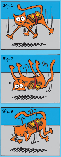
Neither bulls nor bears were able to make up their minds about what to do, after yesterday’s big sell-off following the announcement of the negative IIP numbers for Oct ‘11.  It reminded me of the ‘Buttered Cat paradox’ – which is a thought experiment based on two adages:

  • If you drop a cat from a height, it always falls on its feet
  • If you drop a slice of buttered toast, it always lands with the buttered side down

What will happen if some one straps a piece of buttered toast (with the buttered side on top) on the back of a cat and then drops the cat from a height? The toast will try to make the cat land on its back. But the cat will try to land on its feet. The end result will be a gravity-defying equilibrium where the cat will hover just above the ground level and keep whirling round and round!

Rest assured that I didn’t make this up after imbibing a few too many. It is all over the Internet. I’m even providing the wiki link from which the cartoon below was copied:

Those of you who are enamoured by the unrealised potential of alternative energy stocks like Praj (ethanol) and Suzlon (wind) can imagine the potential of harnessing emission-free green energy from hundreds and thousands of whirling buttered cats.

If you enjoy thought experiments, here is one more. Imagine a fisherman living on a small island in the middle of the Pacific Ocean very near the international date line. Every morning, he sets out on his boat and crosses the international date line (thereby gaining 24 hours). After fishing the whole day, he returns to his island by crossing the international date line once more (this time losing 24 hours). Will he ever get old?

Monday, December 12, 2011

Stock Index Chart Patterns – S&P 500 and FTSE 100 – Dec 9, ‘11

S&P 500 Index Chart

image

In last week’s technical analysis of the S&P 500 chart pattern, I had commented: “Expect a bit of consolidation before the index makes up its mind about the next move.” That was exactly what the index did during the past week - closing above the 1250 level on four out of the five trading sessions – but making very little upward progress.

The good news for the bulls is that index is trading above all three EMAs, with the 20 day EMA about to cross above the 200 day EMA. The bad news is that the index has made a small rounding-top pattern, which may be signalling an end to the brief rally. Also, the slow stochastic and the RSI are showing negative divergences by touching lower bottoms in Nov ‘11 while the S&P 500 touched a higher bottom.

The technical indicators are looking bullish. The slow stochastic has re-entered its overbought zone. The MACD is positive, and above its rising signal line. The RSI is above its 50% level, but appears reluctant to move higher. No such hesitation with the ROC, which is rising in positive territory. Some more consolidation or even a minor correction can be expected this week.

The US economic indicators are improving ever so slowly. Initial jobless claims at 381,000 were at the lowest level since Feb ‘11. The Reuters/Univ of Michigan Consumer sentiment index at 67.7 was at a 6 month high, but remains below its long-term average. Even the ECRI’s Weekly Leading index rose, though the institute is standing by its earlier prediction of a recession.

FTSE 100 Index Chart

image

The technical indicators of the FTSE 100 chart were looking bullish last week, which pointed to a continuation of the rally. But after a brief foray above the 200 day EMA, the index formed a small rounding-top pattern and slipped below long-term moving average by the end of the week.

The slow stochastic is at the edge of its overbought zone. The MACD is above its signal line in positive territory. The RSI is above its 50% level. The ROC is rising in the positive zone. These are all bullish signs. But the negative divergences in the slow stochastic and the RSI may put an end to bullish hopes. Note that both touched lower bottoms in Nov ‘11 while the index touched a higher bottom.

UK’s opting out of the European Union agreement to protect its financial interests may have far-reaching negative consequences. There is a good possibility that its manufacturing exports to the Eurozone will suffer. Already, there is a slow down with manufacturing output declining by 0.7%. The good news is that the Eurozone isn’t going to break-up and the euro may not disintegrate.

Bottomline? Chart patterns of the S&P 500 and FTSE 100 indices are showing some signs of weakness, but as long as the Nov ‘11 lows hold there should be no cause of worry. The Oct ‘11 highs are barriers on the upside that need to be crossed for bulls to regain control. Expect some more consolidation or correction. Wait for a clear trend to emerge.

Sunday, December 11, 2011

BSE Sensex and NSE Nifty 50 index chart patterns – Dec 9 ‘11

The BSE Sensex and NSE Nifty 50 indices continue their slide inside downward sloping channels. Probabilities of dropping below support levels (marked by blue dotted lines) are high. Any drops below the trading channels can induce panic selling.

BSE Sensex index chart

SENSEX_Dec0911

The sharp rally from the lower edge of the downward channel took the BSE Sensex chart above the 50 day EMA, but stalled well short of the falling 200 day EMA. Bear selling has pushed the index below all its three EMAs. The support level of 15700 is likely to be breached again. The bigger threat for die-hard bulls is a possible break below the channel.

The technical indicators are looking bearish. The MACD is above the signal line, but is changing direction in negative territory. The ROC has started falling, and may cross below its 10 day MA into the negative zone. The RSI failed to climb above its 50% level, and has started to move down. The slow stochastic has dropped from its overbought zone.

FDI inflows during the first half of this financial year has been more than double the amount received during the same period last year. But there was huge FII inflows last year. This year’s net FII outflows have neutralised any positive impact. Time to be cautious.

NSE Nifty 50 index chart

Nifty_Dec0911

The weekly bar of the Nifty 50 index faced resistance from the falling 20 week EMA and is getting ready to drop below the support level of 4700. If the index fails to find support from the lower edge of the downward channel, there can be a sharp drop.

The weekly volume bar appears lower because of the holiday on Dec 6 ‘11. Otherwise, volumes may have been equal to or even more than the previous week’s volumes. Higher volumes on down weeks is usually a sign that smart money is exiting. The policy flip-flop on allowing 51% FDI in retail has shaken the confidence of FIIs – at least in the near term.

All four technical indicators are bearish. The MACD is entangled with its signal line in the negative zone. The ROC has dropped below its 10 week MA into negative territory. The RSI has slipped below its 50% level. The slow stochastic is barely above its oversold zone.

Food inflation has started to moderate. The core inflation and IIP numbers will be announced in the coming week. They are not expected to provide any positive triggers to the market. The depreciated Rupee is making an already widening trade deficit even worse. Exports are slowing – thanks to the debt problems of the Eurozone. Decisions on domestic infrastructure projects have practically stalled because government mandarins are sitting on their hands. As William Shakespeare wrote in Richard III: “Now is the winter of our discontent.”

Bottomline? The BSE Sensex and the Nifty 50 index chart patterns are slowly grinding down within their channels. Neither index has fallen dramatically – but that doesn’t mean that they won’t. A pause in RBI’s interest rate hikes could be the first signal that the tide is turning. Cash preservation should be the guiding principle. If you wish to accumulate beaten down stocks, choose only the best ones.

Saturday, December 10, 2011

Can telecom sector stocks be contrarian bets?

Not much has changed in my bearish views about the telecom sector stocks since I wrote the previous post a little over a year back. The Sensex and Nifty are in bear markets – so are most of the telecom stocks. But there are always a couple of stocks in every sector that flow against the tide. The telecom sector is no exception. But the answer to the question is: No.

The 2G scam has not yet reached a denouement, except that the former telecom minister and his cohorts are still enjoying free lunches, but behind bars. Those who bid too high in the 3G auctions tried to cut their losses by circumventing auction conditions by sharing resources. The headwinds in the sector remain strong.

Horizontal dotted lines on the two year bar charts below represent price levels at the time I wrote a bearish post back in Oct ‘09.

MTNL

MTNL_Dec0911

The MTNL stock chart shows why the government should concentrate on making policies that enable businesses to prosper, but not be in business. A monopoly in the lucrative Delhi and Bombay markets couldn’t help the company to gain any competitive advantage. The stock is falling further in a bear market. Avoid.  

Bharti Airtel

Bharti_Dec0911

Bharti Airtel is the leader in the telecom pack. After dropping to a low of 254 in Jun ‘10, the stock had been in an up trend that reached a peak of 445 in Aug ‘11. The bears decided enough was enough. The stock has fallen below its 200 day EMA, the blue up-trend line and is just about hanging on to the two years old price level of 359. A drop to 325 is possible. Hold.

Reliance Communications

RelCommi_Dec0911

The Reliance Communications stock has lost 75% from the two years old level of 282 to its recent low of 69 – and may drop lower. The only hope for shareholders (those poor souls who are still hanging on) is if ‘big brother’ bails out ‘little brother’. Do not touch with a 10 ft pole.

Idea Cellular

Idea_Dec0911

In my previous post, Idea Cellular was recommended as a contrarian play, and is the only stock to make some gains in the past two years. Though technically in a bull market, the good times seem over for now. Book profits, or hold with a strict stop-loss at 80.

Tata Teleservices (Mah.)

TataTele_Dec0911

Tata TeleServices is at a critical support level of 14. All efforts at rallies have been met with selling by bears. If 14 is broken – and the probability is high, it may become a penny stock. Avoid.

Subex

Subex_Dec0911

The stock of Subex had made a good recovery and was forming the handle of a possible cup-and-handle bullish pattern. Only, the handle turned into the first leg of a down trend that has pushed the stock price deep into a bear market. The stock has lost 70% from its Nov ‘10 high of 95 to the recent low of 28. THe market has punished companies with high debt. Avoid.

OnMobile Global

OnMobile_Dec0911

The OnMobile stock has been pummeled out of shape – an example of how sentiments can play havoc with a fundamentally strong stock. For the past few months, the stock has been consolidating within a rectangular band between 54 and 73. There is a good possibility of the stock trying to form a bottom here. This can be a contrarian bet, but with a strict stop-loss at 52.

Geodesic

Geodesic_Dec0911

The Geodesic stock was a favourite of small investors in the previous bull market – thanks to the presence of the ‘RARE’ bull. But I could never figure out how they were making money (in spite of working in the IT industry for almost 30 years). The company has spun a web of subsidiary companies – many of which are located in tax havens. “Daal may zuroor kuchh kaala hai”! THe stock is falling deeper into a bear market. Stay far away.

Tanla Solutions

Tanla_Dec0911

Tanla was falling deep inside a bear market when I looked at it a year back. The chart is an example of how a stock which has already fallen a lot can fall much further. It has become a penny stock. Avoid.

MRO-Tek

MROTek_Dec0911

MRO Tek has also turned into a penny stock in spite of being around for more than two decades and being in the growing telecom and networking hardware business. Those who trade in this stock are either very brave or very foolish. Volumes indicate that their numbers are quite small. Don’t touch it.

Related Post

Should Indian investors switch out of Telecom Sector stocks?

Friday, December 9, 2011

Stock Index Chart Patterns – Jakarta Composite, Korea KOSPI, Taiwan TSEC – Dec 9 ‘11

Jakarta Composite Index Chart

image

Two weeks back, the Jakarta Composite index was under a bear attack and had slipped below the 200 day EMA. The technical indicators were looking weak and the index was expected to fall some more. But a ‘reversal day’ pattern (lower low, higher close) on Nov 25 ‘11 led to a quick rally above all three EMAs.

The rally seems to have stalled at the 3800 level. The index is technically still in a bull market, but the bulls and bears appear to be equally matched. The immediate hurdle on the upside is the Oct ‘11 top of 3875.

The slow stochastic is climbing towards its overbought zone. The MACD is above its signal line and slowly rising in positive territory. The ROC has entered the positive zone. The RSI is struggling to cross its 50% level. Expect some more sideways consolidation.

Korea KOSPI Index Chart

image

The Korea KOSPI index broke the bear shackles with a sharp recovery and a gap up jump above the 1900 level to the 200 day EMA, where the bears put up a stiff resistance. The index tried valiantly for a few days to climb above the long-term moving average. It finally appeared to give up the fight today, and closed below the 1900 level.

The technical indicators are showing weakening signs. The slow stochastic is inside the overbought zone. The MACD is positive and above the signal line. The ROC is also positive, but turning down. The RSI is above the 50% level, and also turning down.

The stock has failed to get out of the bear market but is trading above its 20 day and 50 day EMAs. May not be for long.

Taiwan TSEC Index Chart

image

The Taiwan TSEC chart looks the weakest of the three Asian indices. Though it recovered nicely from its two year low of 6751 and had a gap up jump above its falling 20 day EMA, it started correcting almost immediately and closed below the 6900 level today.

All three EMAs are falling and the TSEC is trading below them. It is likely to fall deeper into a bear market. The technical indicators are bearish. Both the slow stochastic and the RSI are below their 50% levels. The MACD is touching its signal line in negative zone. The ROC has failed to enter positive territory.

The Nov ‘11 low may be tested and broken.

Bottomline? All three Asian indices staged rallies, but with different consequences. The Jakarta Composite chart looks the strongest, as it is trading just above all three EMAs. The Korea KOSPI chart is above its 20 day and 50 day EMAs, but below the 200 day EMA. The Taiwan TSEC chart is the weakest, trading below all three EMAs in the depths of a bear market. Conserve cash and wait for lower levels to enter.