S&P 500 Index Chart
The downward break from a symmetrical triangle pattern (in yellow) observed on the chart of the S&P 500 index last week, met its downward target of 1160. Instead of falling deeper into a bear market, the index made a surprising turn around to climb above all three EMAs in another attempt to return to a bull market.
Note that the S&P 500 is facing resistance from a horizontal dotted line drawn from the apex of the symmetrical triangle. The index did cross above the dotted line on an intra-day basis but has failed to close above it convincingly. Except for a volume spike on Wed. Nov 30 ‘11, when the index climbed above all three EMAs, the volumes during the latest rally hasn’t been great. Rallies need volume support to sustain.
The technical indicators are looking mildly bullish. The slow stochastic has climbed above its 50% level. But the RSI dropped back on to the 50% level after briefly crossing it. The MACD has moved above its signal line, but is still negative. The ROC reached its ‘0’ line, but has slipped back into negative territory. Expect a bit of consolidation before the index makes up its mind about the next move.
The trigger for the sharp rally was the joint decision by six central banks - including the US, Canada, Japan, UK, Swiss and ECB - to make dollar liquidity swaps cheaper by 50 bps to provide more liquidity to global money markets. China simultaneously lowered its liquidity reserve requirements. The steps won’t solve the sovereign debt problems by any means, but will provide some breathing room. The positive US employment data (drop in unemployment rate and increase in non-farm payrolls) and increase in consumer confidence helped the bullish cause.
The economic growth in the US remains painfully slow, and it will take a long time for a full recovery. A good time to be cautiously optimistic – not wildly bullish.
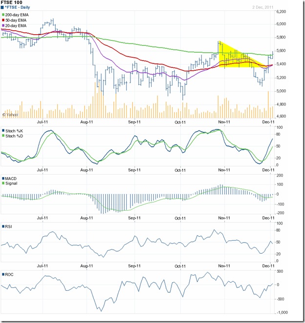
FTSE 100 Index Chart
The FTSE 100 chart had broken down below the descending triangle pattern (in yellow) last week, but the break turned out to be a ‘false’ one. Some times, break outs turn out to be ‘false’ if the volumes accompanying the break out on the downside are unusually large. That wasn’t the case here. Triangles tend to be unreliable in giving hints about the direction of the eventual break. These are challenges faced in technical analysis.
The FTSE 100 closed the week just above its 200 day EMA, and the technical indicators are pointing to a continuation of the rally. The slow stochastic has risen above its 50% level. The ROC has entered positive territory. The MACD is above its signal line, and about to enter the positive zone. But the RSI has dropped below its 50% level.
Despite the bullishness in the index, the ground realities remain grim. The UK unemployment rate rose to its highest level in 15 years. British factories are facing sharp slowdowns. Consumer confidence is falling. Inflation is up to 5%. The UK economy is showing all signs of dipping into another recession.
Bottomline? The chart patterns of the S&P 500 and FTSE 100 indices have turned around after ‘false’ break downs from triangle patterns. Both indices may be preparing for a year-end rally – thanks to the action by central banks to flood the money markets with more liquidity. Enjoy the ride while it lasts – eventually some one will have to pay the piper.


No comments:
Post a Comment