Sunday, February 28, 2010

Stock Index Chart Patterns - FTSE 100, CAC 40, DAX - Feb 26, '10

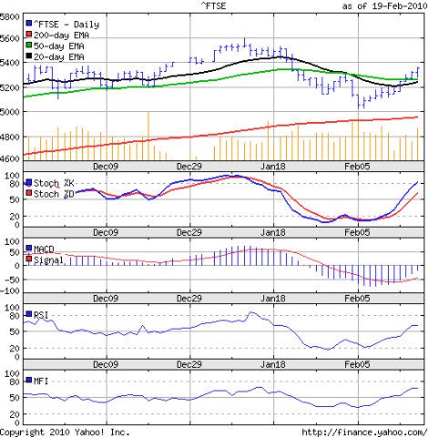
FTSE 100 index chart

FTSE_Feb2610

In last week's analysis of the FTSE 100 index chart pattern, I had made the following observation about the pull back rally:-

'There is likely resistance around the 5370 level, where several tops were made in late Nov and early Dec '09.

Friday's high of 5366 was the highest for the month, but one can expect the bears to put up a fight next week to stall the bull recovery.'

On Monday and Tuesday, the index reached intra-day highs of 5387 and 5395, only to close below the 5370 level. During the rest of the week, the 5370 level could not be crossed at all.

The 61.8% Fibonacci retracement level of the recent fall from the top of 5600 in Jan 11 '10 to the low of 5033 on Feb 8 '10 is at 5383. No wonder the bears are putting up a fight. Before 5600 can be attacked, the bulls will need to cross the 5400 hurdle.

The index stayed on or above the 50 day EMA throughout the week. The 20 day EMA has moved up to merge with the 50 day EMA. The technical indicators are signalling a move higher next week.

The slow stochastic is in the overbought zone. The MACD is above the signal line and has turned positive after almost a month. The RSI and MFI are both above their 50% levels and heading towards the overbought zones.

But have a look at the volume bars. Thursday's down day had the highest volumes of the week. That isn't a good sign. All in all, the bulls scored a few more points, but the fight is far from over.

DAX index chart

DAX_Feb2610

The pull back rally in the German DAX index chart seems to have fizzled out before it could gather strength. A brief sojourn of the index above the 50 day EMA was quickly resisted by the bears. The index closed just below the 5600 level, and more importantly, below both the 20 day and 50 day EMAs that have resumed their down ward moves.

The MACD is above the signal line but remains in negative territory. The RSI and MFI are both above their 50% levels but their upward momentum is slowing. The slow stochastic retraced sharply after venturing up to the overbought zone and is resting at the 50% level.

CAC 40 index chart

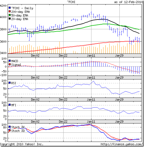
CAC_Feb2610

Expectedly, the CAC 40 index chart pattern continues to be the weakest. The French index barely crossed the 50 day EMA on an intra-day basis but failed to close above it even once. In fact, it has closed below the medium-term moving average 5 weeks in a row.

The technical indicators are reflecting the weakness in the index - which is just 100 points above the 200 day EMA.

Bottomline? The chart patterns of the European indices are still showing the effects of a bear mauling. The bulls in the German and French indices have fared much worse than those in the British index. As long as the indices remain above their 200 day EMAs, the bears would not gain total control. Investors should buy only if they can identify under-valued stocks.

Saturday, February 27, 2010

BSE Sensex Index Chart Pattern - Feb 26, '10

The index chart pattern of the BSE Sensex meandered between the 16000 level and the 20 day EMA for the first four days of the week as the DIIs and FIIs worked at cross purposes. When one group was a net seller, the other became a net buyer.

Even as the Finance Minister was reading the budget speech on Friday, the index moved in a range with an upward bias. As soon as the increase in the personal income tax slab rates were announced, there was buying euphoria. As if, all the tax savings of individuals were likely to get channeled into stock investments.

No such thing is likely to happen. The bulls were just looking for an opportunity to trap the bears after taking it on the chin for almost two months. Short covering caused a sharp jump all the way to 16669 - the first time in over a month that the index ventured above the 50 day EMA.

Bears started to play strong defense as profit booking pushed the index down towards the 20 day EMA. Finally, the index closed the week and the month just above the 20 day EMA on strong volumes. The 72 points higher close month-on-month should encourage the bulls.

Let us look at the 3 months bar chart pattern of the BSE Sensex index:-

Sensex_Feb2610_3m

The 200 day EMA continues to rise and the Sensex is about 1000 points above it. There is no immediate threat to the long term bull market. On the way up, the levels of 16721 and 16973 could provide resistance. Those levels correspond to the 50% and 61.8% Fibonacci retracement levels of the fall from the Jan '10 high of 17790 to the Feb '10 low of 15652.

On the way down, 15652, the Nov '09 low of 15331 and the 200 day EMA should provide support. Since technical analysis is not a science, it is better not to deal with exact numbers. Investors should watch the 16700 - 17500 zone for resistance and the 14900 - 15600 zone for support. It is possible that the index may consolidate within the two zones till all the budget provisions are digested.

The technical indicators have improved marginally. The slow stochastic has moved above the 50% level and looks to be heading for the overbought zone. The MFI is just above the 50% level. The RSI is exactly at the mid-point. The MACD is moving up above the signal line, but remains in the negative zone.

At the first reading, the budget seems as good as was possible under the circumstances of high deficit, increasing inflation and the UPA government's professed socialistic tilt towards the common man. A closer reading may reveal some of the negatives. The roll back of excise duties and custom duty on petrol and diesel will stoke inflation.

Bottomline? The BSE Sensex index chart pattern shows that the bulls haven't yet extricated themselves from the bear hug. Remember that the bull rally is now almost a year old and we haven't yet had a strong correction. A double-dip recession in the western world remains a possibility that will have negative implications for our markets. Be very selective in buying, and use up moves to get rid of junk.

Friday, February 26, 2010

Stock Index Chart Patterns - Shanghai Composite, Hang Seng, Taiwan TSEC - Feb 26, '10

Shanghai Composite index chart

ShanghaiComp_Feb2510

The Shanghai Composite index chart seems to have recharged its batteries during a week-long holiday to celebrate the new year. After a brief dip below the 3000 level on Tuesday, Feb 23 '10 where it got good support from the 200 day EMA, the index moved up quickly above the falling 20day EMA.

The bears were not quite ready to let go, as the 50 day EMA provided resistance to the brief up move. As long as the index remains above the 200 day EMA the bulls will continue to fight.

The technical indicators are improving. The slow stochastic has moved above the 50% level rapidly. The RSI has edged above the 50% level, but more slowly. The ROC has entered the positive zone. The MACD is negative but has gone above the signal line.

The Chinese export juggernaut is rolling back into action but is facing an interesting problem - lack of skilled workers! Those who were laid off and sent back to their villages are probably wary of returning to their factory jobs.

Hang Seng index chart

HangSeng_Feb2510

The bulls are desperately trying to extricate themselves from the bear hug as the Hang Seng index swung back and forth between the 20400 and 20600 levels after a dip below the 200 day EMA the week before.

The slow stochastic is moving up towards the overbought zone. The ROC is positive. The MACD is negative, but above the signal line and moving up. The RSI is oscillating around the 50% level. So far, the bulls have managed to stymie a deeper correction, but the bears are in no mood to give up control.

Taiwan (TSEC) index chart

TSEC_Feb2510

My previous look at the Taiwan (TSEC) index was 4 weeks ago. The index was under a strong bear attack but had managed to stay above the 7500 level. The bears seemed to overwhelm the bulls as the index dropped to the 7200 level on Feb 5 '10 where the 200 day EMA provided good support.

After the long new year holiday break, the bulls tried to engineer a pull back above the 7500 level that was thwarted by the 20 day EMA. By the end of the week, the TSEC ended at the same level before the holidays.

The technical indicators are looking weaker than its mainland counterparts. The slow stochastic is below the 50% level. The MACD is negative and touching the signal line. The ROC has dipped into the negative zone. The RSI has moved up to the 50% level.

Bottomline? The chart patterns of the Asian indices are still bearish and the corrective moves are not yet over. There may be a period of consolidation before a clearer trend can emerge. This is a time to be stock specific and buy very selectively.

Thursday, February 25, 2010

Why investors board the wrong train and then refuse to get off

Why is it that many investors seem to specialise in boarding the wrong trains (read: stocks) and then simply refuse to get off, even though logic and common sense dictates otherwise?

After watching part of the presentation of the Railway budget, where the honourable minister thoroughly entertained the treasury benches as she took on the opposition by throwing taunts at them, I was reminded of a movie I had watched several years ago.

In the British film 'Clockwise', a very uptight and ridiculously punctual headmaster, played by John Cleese, is invited to speak at the headmaster's conference at a distant town.

He diligently prepares for the visit, goes to the railway station well on time, boards the train and starts memorising his typed speech - only to realise too late that he had boarded the wrong train.

He quickly gets off, but misses his own train and then faces one hilarious misfortune after another as he desperately tries to ensure that he is not late for the headmaster's conference. To cut a long story short, he eventually reaches the conference on time - in a dishevelled and chastened condition.

The moral of the story? Trying to be too punctual can create unnecessary situations, including boarding the wrong train. But getting off quickly may ensure that you reach your destination on time.

Many investors would rather follow the stock ideas of others than learn to do the hard work of stock selection themselves. That can create serious financial problems.

Either one buys into a momentum stock with questionable fundamentals. Or, even worse, one buys a fundamentally strong stock after it has already run up a lot and the smart money is getting out.

End result is the same. One is stuck with a stock bought at higher prices. Then begins a prolonged period of 'loss aversion' - asking questions at different investment groups about the future of the company and when one can get back one's 'buy price'.

Not selling a losing position in the hope of breaking even may be the biggest cause of losses faced by small investors. There is only one solution. Get off the train! If you learn how to set stop-losses, you will incur smaller losses.

(Haven't learned how to set stop-losses yet? Read Chapter 2 of my FREE eBook.)

Wednesday, February 24, 2010

Stock Chart Pattern - Cummins India (An Update)

The stock chart pattern of Cummins India was in a consolidation phase after a sharp up move post election results when I had taken a look at it in early June '09. At that time, the consolidation pattern had met the criteria of a 'symmetrical triangle'.

Three possibilities about the direction of the subsequent move were discussed, and I seek the readers' indulgence in repeating them here:

'Triangles can be quite fickle - with three possible options. The most likely one is an upward breakout that will be a continuation of the previous up move. The breakout must be on significantly higher volumes. If the breakout happens on low volumes, then it could be a 'false breakout' - termed an 'end run', with the stock eventually moving downwards.

There can be a downward breakout on low volumes - though a triangle is generally not a reversal pattern. Sometimes such downward breakouts can be 'false' on higher volumes, with the stock subsequently moving up. It is then termed a 'shakeout', i.e. a ploy by strong players to get rid of weaker hands (viz. retail investors) so that they can get back into the stock at lower rates.

The third option is the chart pattern meandering sideways on low volumes and eventually moving out of the triangle near its apex. This option, though possible, seems unlikely because of the increased volume during the triangle formation. This is rather unusual, and indicates possible accumulation.'

Let us now take a look at the one year bar chart pattern of Cummins India:-

Cummins_Feb2410

The consolidation pattern (near the lower left of the chart) extended up to the first week of July '09, forming a rectangular 'flag' pattern between 250 and 300 levels. A 'flag' is a more reliable continuation pattern than a 'triangle'. It was no surprise that the stock moved upwards subsequently.

Before that, there was a neat little 'shakeout' pattern as the stock broke below the 250 level to 235 on Jul 13 '09 and then formed a 'rounding bottom' pattern for the rest of July '09 on increased volumes before breaking out upwards.

The 'flag' pattern after the low of around 150 in Mar '09 and the top of the flag at 300 in June '09 gave a minimum target of 450 - which was achieved in Jan '10.

Price targets often overshoot on the higher side in bull phases, and the stock went further up to make a high of 487 on Feb 4 '10. A fortnight later, it tested the previous high but fell short as it reached 484 on Feb 19 '10.

That formed a bearish 'double top' from which the stock price corrected down to the 50 day EMA before closing at 451. The 200 day EMA is moving up smoothly as the stock price remains almost 100 points above the long-term average. The bulls are still in control.

In the longer term 3 year chart, the stock had made a similar 'double top' bearish pattern - 463 on Sep 27 '07 and 462 on Oct 17 '07 - before entering a 17 month long bear phase well ahead of the Sensex:

Cummins_Feb2410_2

So, is this the beginning of another long bear phase? Who knows? Technical analysis is not a science, and there are no guarantees that chart patterns will repeat. But this is an excellent opportunity to book partial profits in the stock.

Bottomline? The stock chart pattern of Cummins India (a fundamentally strong stock) shows why investors should bother less about the daily Sensex movements and concentrate on individual stocks. Every 2 or 3 years, the stock seems to provide opportunities to buy below 200 and sell above 400. Wealth-building can't get easier than this!

(A question for keen observers: is there a technical reason why the stock may be starting on another long bear phase? I'm not saying it will - but there is a good probability.)

Tuesday, February 23, 2010

Does economic growth lead to higher returns for stock market investors?

A recent article in Business India magazine warned that investors 'should be wary of relying on a link between overall growth of the economy and returns on specific company stocks'.

The article written by Hugh Sandeman, MD of Langham Capital, concludes with the following statement:

"...the macro-economic growth story is a cue for caution, not just celebration."

That sounds counter-intuitive, doesn't it? If the economy is growing, then more goods are being manufactured, roads and bridges are being built, every one has more disposable income, so more shares will be bought and their prices will go up. Right?

Not quite. In his book 'Stocks for the Long Run', Jeremy Siegel presents some interesting research data to show that 'economic growth has nowhere near as big an impact on stock returns as most investors believe'.

In one chart, percentage returns (in dollars) for 16 developed countries was plotted against each country's percentage real GDP growth from 1900 to 2006. Real GDP growth had a negative correlation with returns from the stock market. Higher the economic growth in individual countries, lower was the returns to equity investors.

A similar chart for 25 developing countries (including India and China) shows a similar negative correlation, in spite of the massive returns provided by the stock market indices of these countries in recent years. Are we missing some thing?

Turns out that the growth in aggregate earnings and dividends do increase along with GDP growth. But for investors the returns are based on earnings and dividends per share.

Economic growth is dependent on expenditure on R&D, technology upgradation, increase in manufacturing capacities, building new factories and offices. Such expenditure needs to be funded - either through loans, or through issuing new (or additional) equity shares, or both.

The interest burden and equity dilution leads to lower rate of growth in EPS and dividends per share. While internal accruals (read: positive cash flows from operations) can fund expenditure in the shorter time frame, Siegel's research shows that in the longer term a 10% increase in GDP requires a 10% increase in the equity capital.

The cautionary note in the article was directed particularly at asset heavy sectors like infrastructure, energy and shipbuilding. Investors in IVRCL Infrastructure may have noted the recent downgrade in its credit ratings due to a large debt burden.

Pantaloon and Cranes Software are other examples of how rapid growth funded through loans and equity can quickly lead to poor share holder returns.

Monday, February 22, 2010

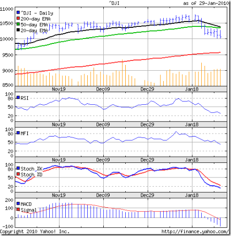
Dow Jones (DJIA) Index Chart Pattern - Feb 19, '10

In last week's analysis of the Dow Jones (DJIA) index chart pattern, I had made the following concluding remarks:

'Bulls don't need to panic yet. Technically, the 10000 level has not been broken on the downside.'

In a holiday-shortened week, the bulls engineered a spirited rally that saw higher tops, higher bottoms and higher closes on all four days of the week. The last three closes were above the 50 day EMA.

So, is it time to yell "tally-ho" because the bull market can be clearly seen? Not quite, as the 3 months bar chart pattern of the Dow Jones (DJIA) index will suggest:-

Dow_Feb1910 

The sharp rally happened on receding volumes, which raises concerns about the sustainability of the up move. The Dow needs to clear its previous top of 10767 (made on Jan 14 '10) before the bulls regain complete control.

The technical indicators have improved over the previous week. The slow stochastic is about to enter the overbought zone. Both the RSI and MFI are above their 50% levels. The MACD is still negative, but has moved up above the signal line.

Expect the bears to put up some resistance around the 10500-10550 area (several tops in late Nov and early Dec '09). Though the 25 basis points discount rate hike by the Fed was taken in its stride by the Dow, things aren't getting better in the economy.

As this article states, the insider selling to buying ratio has 'improved' to 5-to-2 (week ending Feb 12 '10) from 5-to-1 (week ending Jan 15 '10). That means insiders were selling a lot when the Dow peaked, and were still selling more than they were buying during the recent correction.

Bottomline? The Dow Jones (DJIA) index chart pattern is trying to escape from a bear hug. But the bulls aren't out of the woods yet. 'Caution' should be the key word this week. Another leg down in this corrective move is a possibility.

Sunday, February 21, 2010

Stock Index Chart Patterns - FTSE 100, CAC 40, DAX - Feb 19, '10

FTSE 100 index chart

FTSE_Feb1910

Just when all seemed lost for the bulls, they managed a spirited fight back pushing the bears on to the back foot. The index sailed above the 20 day and 50 day EMAs on decent volumes as the fears of sovereign debt default by the PIIGS receded to the background.

The slow stochastic has entered the overbought zone. The RSI and MFI are both above their 50% levels. The MACD is negative but is above the signal line and moving upwards.

The previous high of 5600 is the hurdle that the bulls need to clear to restore the FTSE 100 index chart back to the bull phase. There is likely resistance around the 5370 level, where several tops were made in late Nov and early Dec '09.

Friday's high of 5366 was the highest for the month, but one can expect the bears to put up a fight next week to stall the bull recovery.

DAX index chart

DAX_Feb1910

The bull recovery in DAX index chart was a little less spirited. The index managed to move above the 50 day EMA only on the last day of the week, but failed to go past the Feb 3 '10 high of 5734.

The RSI and MFI have moved above their 50% levels. The slow stochastic is rapidly rising towards the overbought zone. The MACD is also rising in the negative zone and is above the signal line.

On the way up, the index may face resistance at the previous tops around the 5850 level.

CAC 40 index chart

CAC_Feb1910

The CAC 40 index chart pattern still appears the weakest, with the 50 day EMA providing resistance to the up move. Unlike the FTSE 100 and DAX, the volumes have receded instead of increasing during the week's rally.

The slow stochastic and MFI have moved above their 50% levels. The RSI is resting at the mid-point. The MACD is negative, but rising and is above the signal line.

Bottomline? Despite the strong fight back by the bulls, the worst may not be over for the European indices. The bears are expected to make an effort to regain control. Only a move above the previous tops made on Jan 11 '10 will restore the bull market to its earlier glory.

Saturday, February 20, 2010

BSE Sensex Index Chart Pattern - Feb 19, '10

The fight between the bulls and bears for ascendancy is clear from the BSE Sensex index chart pattern. Bulls managed to score some points in last week's round. But the bears managed to score a few points as well.

The index closed above the critical 16000 level all five days of the week. On Wednesday, Feb 17 '10, the Sensex moved above the 20 day EMA for the first time in more than 3 weeks and closed exactly on the short-term moving average.

Just when it looked like the bears were going to get knocked out, they came roaring back and once again pushed the index below the 20 day EMA. The 39 points higher close week-on-week may give the bulls some impetus to fight harder next week.

The monthly settlement on Thursday, followed by the budget on Friday may not generate too much buying support. Let us take a look at the 3 months bar chart pattern of the BSE Sensex index:-

Sensex_Feb1910

The technical indicators have improved a bit but are still favouring the bears in the near term. Both the 20 day and 50 day EMAs are falling with the short-term moving average below the medium-term one and the index below both. Volumes have been on the lower side.

The 200 day EMA is inching up with the index above it - so the longer-term bull market continues. The slow stochastic, RSI and MFI are all at their 50% levels. The MACD is negative but above the signal line.

Inflation numbers are worrisome and the expected oil and gas price hike have been kept in abeyance. At some point, the RBI and the Finance Ministry will need to bite the bullet and raise interest rates and duties. That could be a trigger for the market to fall some more.

Bottomline? The chart pattern of the BSE Sensex index is showing some indecision by bulls and bears prior to the budget. What should investors do post budget? Any sharp up (or down) moves can be utilised to book profits (or buy value). Otherwise, wait for the dust to settle. 

Friday, February 19, 2010

Stock Index Chart Patterns - Hang Seng, Jakarta Composite - Feb 19, '10

Hang Seng index chart

HangSeng_Feb1910

Last week's analysis was concluded with the following remarks:

'Any signs of a pull back can be selling opportunities. Wait for lower levels to enter.'

A holiday shortened week saw a great effort by the bulls to pull back the Hang Seng index chart above the 20000 mark, giving good opportunity to sell. Once again, the 20 day EMA proved to be a tough resistance to overcome and today's 500 point drop pushed the index down below the 200 day EMA and the 20000 mark.

The attempted recovery on falling volumes could not be sustained. The technical indicators improved somewhat. The slow stochastic and the RSI both managed to move above the 50% level. The MACD is still negative but above the signal line. The MFI moved up towards the 50% level.

Today's big drop seems to have negated the fledgling recovery and the bears have wrested control once again - at least in the near term.

Jakarta Composite index chart

Jakarta_Feb1910

With the Shanghai Composite and Taiwan TSEC indices enjoying a new year holiday, let us have a look at the Jakarta Composite index chart pattern - which is looking a bit stronger than the Hang Seng index chart.

The index is resting on the 20 day EMA, which is just above the 50 day EMA. The 200 day EMA is still rising, but the low volumes are a concern.

The slow stochastic is above the 50% level, but the RSI and MFI have both moved down after touching their 50% levels. The MACD is negative and touching the signal line.

The index made a lower top before moving down, indicating that the correction may resume next week.

Bottomline? The brief recovery in the Asian indices seem to be over as the bears have regained control. A deeper correction is likely. Stay on the sidelines till a clearer trend emerges.

Thursday, February 18, 2010

Why stock market technical analysis chart patterns act like airport windsocks

One of the interesting aspects of writing a blog is that I get almost instant feedback from readers. It is a real joy when my posts on technical analysis of stock index chart patterns motivate some of you to get interested in the subject.

Carl Swenlin, a self-taught technical analyst, has been involved in market analysis since 1981. A pioneer in the creation of online technical resources, he is president and founder of DecisionPoint.com, a premier technical analysis website specializing in stock market indicators, charting, and focused research reports.

Below his weekly technical analysis posts is the following comment:

'Technical analysis is a windsock, not a crystal ball. Be prepared to adjust your tactics and strategy if conditions change.'

(If you have never seen a windsock or don't know its purpose, here is a link that will enlighten you.)

One of the reasons that technical analysis of stock market chart patterns doesn't find favour among many well-known stock market gurus (like Warren Buffett, Peter Lynch and others) is probably because they don't need to use it.

They are like the 'jumbo jets' of the investment world that can take off and land in fair weather and foul, regardless of wind conditions. They have ready access to the upper echelons of the corporate world.

But what about us - the single-engine turboprops trying to fly with limited resources? Wind and weather conditions play an important role in our longevity. We have to use as many tools as are available to make our path to investment success a little less thorny.

Fundamental analysis alone may not help us to reach our goal of financial independence. Why? The Satyam scam has shown how managements out to commit fraud can hoodwink the best known auditors. Even if we are convinced about the management, we rarely have information about the actual operations inside any company.

The collective wisdom (or lack of it) of the market players tend to get reflected in the price charts. If we learn to identify similarities in price patterns from stock charts, it gives us an idea about which way the wind is blowing.

What these chart patterns can not reveal with a high degree of accuracy is which way the wind will be blowing three months or a year later. But, like a windsock, they can be very useful when we decide to land ('sell') or take off ('buy').

Wednesday, February 17, 2010

Stock Chart Pattern - IRB Infrastructure (An Update)

The stock chart pattern of IRB Infrastructure had made a classic bullish double-bottom pattern when I had taken a look at it in the beginning of June last year. Based on the double-bottom pattern, I had indicated a minimum target of 229.

It is time for an update. Let us have a look at the 9 months bar chart pattern of IRB Infrastructure:-

IRB Infra_Feb1710

The stock hit 161 on Jun 5 '09 and immediately dropped to 125. That level provided good support and the stock resumed its upward climb on growing volumes, as indicated by the OBV.

The stock made a high of 227 on Aug 27 '09 - almost meeting the minimum target mentioned within a short span of 3 months - before going into a 5 weeks long sideways consolidation between 200 and 220.

It broke upwards on decent volumes on Oct 6 '09 and eventually went on to make a high of 280 on Nov 19 '09. A corrective move saw the stock make a low of 233 on Dec 18 '09. A high volume breakout on Jan 8 '10 saw the IRB stock make another high at 280 on Jan 14 '10.

The chart pattern thus formed a bearish 'double-top' and it is no wonder that the stock once again entered a corrective phase. If you had entered at lower levels, this would be a good time to book partial profits. The minimum downside target from the double-top is 186.

The bulls are still in control as the stock price is just above the 20 day and 50 day EMAs and well above the 200 day EMA. The MACD is barely positive. The RSI is slightly above the 50% level.

The company is apparently doing quite well and year-end Mar '10 should see a sharp increase in profits as road toll revenues from completed BOT projects start to kick in. High promoter holding and negligible public float could lead to wide price fluctuations.

Bottomline? The stock chart pattern of IRB Infrastructure is showing some tiredness after an excellent rally. Taking some profits home is never a bad idea, particularly when the stock appears to have run ahead of its valuations.

Tuesday, February 16, 2010

Why investors fall prey to the Greater Fool Theory

To explain the reasons, we must first understand the concept behind the Greater Fool Theory.

During periods of fast economic growth, there is usually a feeling of optimism and excitement all around. New jobs get created, more people have disposable cash, factories produce more and as they find more buyers, they raise prices.

As this process accelerates over a few years, asset bubbles get created - particularly in real estate and the stock market. Every one gets involved in a buying frenzy, and as values escalate, more buyers join the fray with the hope of making a quick profit.

Sooner than later, what was under-valued becomes fair-valued and fair-valuations become over-valued. As long as there are buyers, valuations don't really matter. There is always a bigger or 'greater fool' on whom one can unload a flat in a not-so-great locality (or a stock with questionable management and poor financials) at a higher price.

Many investors have made a ton of money by 'flipping' stocks - selling one at a profit to buy another at a higher price regardless of its fundamentals with the expectation that there will always be some one willing to pay an even higher price.

Such 'momentum' investing seems to work when the bulls are rampaging. It is precisely at such times that new investors start flocking to the stock market - having heard stories about how their friends or neighbours or colleagues are becoming rich overnight.

When a correction takes place, momentum investors find out that they have been the greater fool, as they get stuck with good as well as not-so-good stocks at sky-high prices. Their aim becomes to somehow recover their 'buy price' to break even.

There are only two ways to avoid falling prey to the Greater Fool Theory. The first is to avoid the share market (which many investors do after losing their shirt). The second is to spend the time to learn and understand the concepts of value investing and contrarian investing.

If you buy stocks without any regard to its fundamentals or technicals because you think it is a waste of time, there is a genuine risk that at some stage you will become the 'greater fool'. Over time, the market recognises the better companies because of their good management and sound balance sheets.

Value investing and contrarian investing concepts have been explained in my FREE eBook: 'How to become a better investor'. (Get your copy today, if you haven't done so already.)

Monday, February 15, 2010

Dow Jones (DJIA) Index Chart Pattern - Feb 12, '10

Last week, I had made a couple of observations about the Dow Jones (DJIA) index chart pattern.

1. 'It is interesting how this round figure has become the battleground for the bulls and bears. The lows on Thursday and Friday pierced the 10000 level, but on both days the Dow managed to close marginally above.'

2. 'Should the bulls throw in the towel? Not yet. Friday's price action on high volume looks like a 'reversal day' (lower low but a higher close). That could lead to another attempt at a pull back.'

The 10000 level continued to remain the battle line for the bulls and bears. On Monday, Feb 8 '10, the index closed at 9908 - its first closing below the 10000 mark in over 3 months.

The bulls immediately fought back and the Dow closed above the 10000 level on the next four days - touching a high of 10185 on Thursday, where it met resistance from the falling 20 day EMA.

The 3 months bar chart pattern of the Dow Jones (DJIA) index shows the valiant effort by the bulls to extricate themselves from the tight bear hug:-

Dow_Feb1210

The 200 day EMA is rising - albeit much more slowly than earlier - and the index remains above it. That means the bulls are well entrenched to fight another day. But declining volumes during an upward rally isn't encouraging.

The technical indicators have improved a little. The slow stochastic has moved out of the oversold zone but remains below the 50% level. The MACD is still negative but touching the signal line. The RSI bounced off smartly from the oversold zone and is at the 50% level. The MFI is just below the 50% level.

The Dow has closed below the 50 day EMA three weeks in a row. That hadn't happened since the rally began in Mar '09. The odds will be in favour of the bears till the Dow moves convincingly above the medium-term moving average.

Bottomline? The Dow Jones (DJIA) index chart pattern is in the midst of a decent correction. Bulls don't need to panic yet. Technically, the 10000 level has not been broken on the downside. Investors should stay on the sidelines till a clearer trend emerges - a move above the 50 day EMA or below the 9700 level.

Sunday, February 14, 2010

Stock Index Chart Patterns - FTSE 100, CAC 40, DAX - Feb 12, '10

FTSE 100 index chart

FTSE_Feb1210

In last week's analysis of the FTSE 100 index chart pattern, I had mentioned about the positive divergence in the RSI (which made a higher low as the index made a lower low). Whether because of it, or otherwise, the bulls managed to mount a small rally.

Once again, the resistance from the falling 20 day EMA proved to be a tough barrier. The index made a 'higher high lower close' reversal day pattern on Friday. The battle lines between the bulls and bears are now clearly drawn between the 5000 level and the falling 20 day EMA.

The slow stochastic has just managed to emerge out of the oversold zone. The MACD is still negative and below the signal line. The RSI is moving up but remains below the 50% level. The MFI is touching the 50% mark.

The index is grinding down slowly instead of falling in a heap.

DAX index chart

DAX_Feb1210

Not unexpectedly, the DAX index bounced off the 200 day EMA giving the bulls some temporary relief. But the subsequent rally was weak. The index failed to get close to the falling 20 day EMA and oscillated between the 200 day EMA and the 5600 level.

The slow stochastic is inside the oversold zone. The MACD is negative and below the signal line. Both the RSI and MFI are below the 50% levels. The distance between the falling 20 day and 50 day EMAs is increasing.

CAC 40 index chart

CAC_Feb1210

The CAC 40 index chart continues to be the weakest. The pull back effort by the bulls barely managed to push the index above the 200 day EMA before closing exactly on the long-term moving average on Friday. The index remains well below the falling 20 day EMA, and is a whisker away from dropping into a bear market.

The technical indicators of the CAC 40 index are in much the same bearish state as those of the DAX index.

Bottomline? The chart patterns of the European indices show that the bulls are gradually but reluctantly giving away ground to the bears. Some more correction is likely. Enter only if you see value in individual stocks.

Saturday, February 13, 2010

BSE Sensex Index Chart Pattern - Feb 12, '10

A holiday shortened week emboldened the bulls to arrange a small rally that took the BSE Sensex index chart above the crucial 16000 level. But the diminishing volumes during a rally is not very encouraging.

A look at the three months bar chart pattern of the BSE Sensex index will show some interesting technical behaviour:-

Sensex_Feb1210

In last week's analysis, I made the following observation:

'For a valid penetration of a long-term support or resistance, we need to maintain a 3% 'whipsaw' lee way. That gives a level of 15500. A fall below will confirm the break. Till then, the bulls have some hope.'

On Monday, Feb 8 '10, the Sensex dropped to a lower low of 15652, which was just a 100 points above the 15500 mark. The break of the 16000 level was not confirmed. The bulls managed to push the index to a higher close of 15936, forming a 'reversal day' - confirmed by the highest volumes seen in a month. The next three days saw the Sensex make higher tops and higher bottoms, further encouraging the bulls.

The technical indicators continue to reflect the dominance of the bears. The 20 day EMA is below the 50 day EMA and both are falling. The 200 day EMA is still rising but the upward momentum is slowing.

The slow stochastic is languishing in the oversold zone. The MACD is negative and below the signal line. The RSI is barely above the oversold zone. The MFI is below the 50% level.

The FIIs have been selling, while the DIIs have been buying. Global markets have entered intermediate down trends, and the Sensex is no exception. Till the index remains above the 200 day EMA, bulls will not give up hope.

Have a look at the 6 months closing chart pattern of the BSE Sensex compared with the Dow Jones (DJIA) chart:

Sensex_Dow_Feb1210

From Nov '09 onwards, the two indices have been tracking each other rather closely. The Sensex chart has been trying to hang on to the 16000 level. The Dow chart is doing likewise with the 10000 level.

Bottomline? The BSE Sensex index chart pattern shows the fierce struggle between the bulls and bears. Intraday volatility has increased. Investors may want to keep an eye on global markets in general and the Dow in particular for the near term trend. A good time to stay on the sidelines.

Friday, February 12, 2010

Stock Index Chart Patterns - Shanghai Composite, Hang Seng, Korea KOSPI - Feb 12, '10

Shanghai Composite index chart

ShanghaiComp_Feb1210

Almost a sense of deja vu when one looks at the chart pattern of the Shanghai Composite index. The index dipped below the 200 day EMA once again, only to move back up. The week-on-week difference being the close above the long-term moving average today.

The bulls may enjoy a more relaxed weekend with the technical indicators showing marginal improvements. The slow stochastic is trying to keep its nose above the oversold zone. The RSI has bounced off its oversold zone. The MACD has moved up just a bit and is touching the signal line, but remains in negative territory. The ROC is also in negative territory but has moved up smartly towards the '0' line.

The 20 day EMA has dropped well below the falling 50 day EMA, and is threatening to go below the 200 day EMA. A minor fight back by the bulls have prevented a complete rout. The bears still have the upper hand.

Hang Seng index chart

HangSeng_Feb1210

Another attempt at a recovery after a deeper drop below the 200 day EMA by the Hang Seng index chart was again resisted by the falling 20 day EMA. Note the falling volumes during the pull back attempt, indicating little follow-through buying.

The technical indicators look similar to those of the Shanghai Composite index. The slow stochastic has edged above the oversold zone. The RSI has bounced off the oversold zone. The ROC has moved up to touch the '0' line. The MACD is in negative territory and touching the signal line.

The bearish pattern of lower tops and lower bottoms continue. Bulls will need to make a stronger effort to get the index out of the rut.

KOSPI (Korea) index chart

Kospi_Feb1210

During the previous look at the Korea KOSPI index chart three weeks back, the following comments were made:

'Bears need not lose hope. The MACD has remained pretty flat for three weeks while the index rose to make a high of 1723 on Jan 19 and 20, '10. That is the exact same level hit on Sep 23, '09. That makes a very good case for a bearish 'double-top' pattern.'

The 'double top' bearish pattern in Sep '09 and Jan '10 was followed by a swift correction down to the 200 day EMA on high volumes. A nice bounce up from the long-term moving average got resisted by the long-term support-resistance level of 1600. A copy-book technical analysis example.

The technical analysis indicators are looking weak, even as the index remains above the 200 day EMA. The slow stochastic is inside the oversold zone. The MACD is below the signal line in negative territory. The ROC is still negative, but trying to move up quickly. The RSI is just above its oversold zone.

Bottomline? The chart patterns of the Asian indices show only a minor respite from a strong bear attack. Any signs of a pull back can be selling opportunities. Wait for lower levels to enter.

Thursday, February 11, 2010

Why small investors should avoid IPOs, FPOs (and NFOs)

Before I delve into the details, I think it may be prudent to clarify what the TLAs (Three Letter Acronyms) mean.

IPO stands for 'initial public offering'. That means a company is issuing shares to the general public for the first time. (It may have issued shares to promoters and private investors, but such shares were not traded in a stock exchange.) IPOs are issued at 'face value' plus a premium.

FPO means a 'follow-on public offer'. Companies may have sold a small percentage of shares, say 10% or 20% of their authorised equity capital, earlier. Now they need more money for expansion and/or to retire debt. An FPO is different from a rights issue - where shares are offered only to existing shareholders. FPOs are also issued at face value plus a premium.

NFO is a 'new fund offering' from a mutual fund house. Fund houses earlier called these IPOs, but were compelled by the authorities to change the name. Why?

Because a new fund has no prior track record whatsoever, unlike most companies that have to be in business for a while and attain a particular balance sheet size before they can issue shares. NFOs are issued at face value.

The short answer to the question (and I'm not sure that the authorities will be terribly pleased with it): Because investors get taken for a ride.

Aren't IPOs and FPOs tickets to quick riches? It used to be so in the 1970s and 1980s when the pricing was pre-approved by the stock exchanges, and there was enough left on the table for investors.

The current practice of pricing shares through a book-building process(and a French auction for the recent NTPC FPO) is supposed to 'discover' the best price, but actually causes uncertainty and confusion among small investors.

The 'red-herring prospectus' that is supposed to be part of the offer document including the application form, is either not available, or printed in tiny nano fonts that require a powerful microscope to read, or too voluminous to comprehend.

The end result? Most investors fill up the application forms without going through the company details - particularly the risk factors, including pending litigation, unpaid tax demands, potential forex losses and myriad other issues that are conveniently hidden in the fine print.

Even if investors have the patience to go through all the details, it is unlikely that they will be enlightened because of forward-looking statements (read 'pure fiction') about the future growth and profitability prospects of the company.

On top of it, the price-band given for the book-building process is mostly way higher than reasonable, aimed at squeezing out the last Rupee from the pockets of gullible investors.

Compound that with the fact that most IPOs, FPOs (and NFOs) appear when the stock market is at or near a peak - and you have got a perfect recipe for making losses.

Get-rich-quick schemes - in the stock market or otherwise - never benefit the investors. It is meant for the benefit of those who sell such schemes. So stay away from IPOs, FPOs (and NFOs). Stick to the tried, tested and trusted companies and funds. You will get rich - slowly.

(A hypothetical question for investors. Some one holds a gun to your head and forces you to invest in any one of three IPOs. The first company is raising money to retire its bloated debt. The second company is raising money for some planned acquisitions. The third company is planning to buy new plant and machinery for an expansion project. Which of the three IPOs will you subscribe to, and why?)

Wednesday, February 10, 2010

Stock Chart Pattern - IFCI Ltd (An Update)

My previous look at the stock chart pattern of IFCI Ltd was in the last week of May '09. This trader's favourite stock had risen sharply to 50, where I had expected some resistance. After a brief consolidation in a triangle pattern, the stock spurted to 60, where it ran into longer term resistance from the May-Jun '08 highs.

The one year bar chart of IFCI Ltd has since formed a very interesting bullish pattern:-

IFCI_Feb1010

The stock corrected to 46 on Jun 9 '09. A 4 weeks sideways consolidation between 48 and 56 followed, after which there was a rapid fall to 37. A 'V' shaped recovery and a gradual rise afterwards took the stock back to test its earlier high in Sep '09.

Several attempts to break the resistance at 60 was met with profit booking and the stock corrected down and made a higher low of 41 in Nov '09, where it received good support from the 200 day EMA.

Another upward rally took the stock back to 60 on Jan 8 '10. More profit booking caused a drop towards the long-term moving average. Once again, the stock received good support at the 200 day EMA and made a higher low of 46.

At today's close, the IFCI stock has given precisely zero returns in more than 8 months since my previous post. So why am I discussing about this stock?

It is because of the bullish 'ascending triangle' pattern being formed (with a flat top at 60 and an upward sloping trend line connecting the higher lows). A break out can take the stock to 70, and even higher.

That is not the only reason for being bullish. Notice the higher volumes on up days that has caused the OBV to keep moving higher even as the stock has hardly gained anything. That is a sign of 'accumulation'.

The MACD is marginally negative and below the signal line. The RSI is below the 50% level. The 20 day EMA is below the 50 day EMA. All these indicate short-term bearishness, which could lead to another drop to the 200 day EMA.

Bottomline? The stock chart pattern of IFCI Ltd is showing some weakness. This counter is not for the faint of heart and is strictly for speculation. If you want to take a punt on some sort of a restructuring of its business in the near future, use any falls to enter. Serious investors should stay miles away.

Tuesday, February 9, 2010

Is this a good time to buy gold?

To be absolutely honest, I haven't the foggiest idea. That is because of my aversion to buying any commodity, including gold. Why?

I remember the good old days of trading at the Calcutta Stock Exchange. During trading hours, the main floor inside the building used to be a scene of complete mayhem. A sea of people shoving and jostling each other while shouting at the top of their voices.

Frequent references and scribbles were made in small chits of paper or notebooks while one or more fingers were frantically waved in the air. How any one could understand what was going on was beyond me.

If that was scary, the scene outside the stock exchange building was almost out of a horror film! Small wooden cubbyholes stacked one on top of the other across the street. Each tiny cubicle inhabited by one human body in a contorted position.

All of them were shouting and gesticulating at a group of people who were assembled on the street. They were also shouting and gesticulating with frenzied abandon. That was the commodities exchange - trading in jute, steel, agri-products and who knows what else!

A couple of days exposure was enough to give any sane person nightmares. To cut a long story short, I have invested in commodity stocks but never directly in a commodity. (Buying jewellery for lady family members does not count!)

So why am I writing about gold? Because it seems to be the latest fad to talk about investing in gold as a hedge against (a) inflation or (b) the falling US Dollar or (c) being overweight in stocks. And when every one is unanimous about buying some thing, I become cautious.

Allocating a small portion of your assets in gold ETFs may not be a bad idea. But huge returns from buying gold at current prices is unlikely to happen. For an explanation, we will need to look at a 2 year gold chart pattern:-
Gold_Feb2010

From a low of USD 712.50 per ounce in Nov '08, gold price moved up a huge 70% to a high of USD 1212.50 per ounce a year later. The gold chart could not sustain at the high altitude and has subsequently made a bearish 'lower top lower bottom' pattern.

Recent upward movement has been resisted by the falling 30 day SMA. The 200 day SMA is still rising, giving the gold bulls some hope. But a drop to the USD 900-1000 per ounce zone seems likely. That may provide a better entry point.

Monday, February 8, 2010

Dow Jones (DJIA) Index Chart Pattern - Feb 05, '10

Last week's analysis of the Dow Jones (DJIA) index chart pattern was concluded with this comment:

'The bulls managed to avert a bigger sell-off, and may make another attempt to regain control.'

A nice little pull back during the first three days of the week went as far as the intertwined 20 day and 50 day EMAs. The resistance from both the short and medium term moving averages proved too strong.

The Dow fell rapidly on strong volumes on the last two days of the week, before a bout of short covering combined with bargain hunting saw the index manage a weekly close just above the 10000 level.

Let us have a look at the interesting tussle between the bulls and bears in the 3 months bar chart pattern of the Dow Jones (DJIA) index:-

Dow_Feb0510

There is no technical significance - merely a psychological one - about the 10000 level. A nice round number that every market player can easily understand.

It is interesting how this round figure has become the battleground for the bulls and bears. The lows on Thursday and Friday pierced the 10000 level, but on both days the Dow managed to close marginally above.

A bearish pattern of lower tops and bottoms have formed. The technical indicators are supporting the weakness in the chart pattern. The 20 day EMA has slipped below the 50 day EMA and the 200 day EMA has stopped rising.

The slow stochastic is in the oversold zone. The MACD is below the signal line and falling in negative territory. The RSI and MFI are both below their 50% levels.

Should the bulls throw in the towel? Not yet. Friday's price action on high volume looks like a 'reversal day' (lower low but a higher close). That could lead to another attempt at a pull back.

Bottomline? The Dow Jones (DJIA) index chart pattern remains in a strong bear grip. The up trend line connecting the July, Nov and Dec '09 lows have been decisively penetrated downwards. Any break of the 200 day EMA can lead to a deeper correction.

Sunday, February 7, 2010

Stock Index Chart Patterns - FTSE 100, CAC 40, DAX - Feb 05, '10

FTSE 100 index chart

FTSE_Feb0510

The concluding remarks after last week's analysis of the European indices were:

'The bulls may attempt a pull back, but bears are unlikely to release their firm grip. Wait for lower levels to enter.'

As if on cue, the FTSE 100 index chart moved up during the first three days of the week before encountering stiff resistance from the falling 20 day EMA.

A 'reversal day' pattern (higher high, lower close) on Wednesday led to a sharp fall on high volumes on the last two days of the week. The 20 day EMA dipped below the falling 50 day EMA. The index is still above the rising 200 day EMA.

The bulls can find some solace from the positive divergence in the RSI, which made a higher low as the FTSE 100 sank to a new low. The other technical indicators continue to look weak.

The slow stochastic is inside the oversold zone. The MACD is below the signal line, and falling in negative territory. The MFI is below the 50% level and just above the oversold zone.

Bears remain in control, as they quickly squashed the feeble pull back attempt of the bulls.

DAX index chart

DAX_Feb0510

The pull back attempt by the bulls in the DAX index chart faced a slightly worse fate than in the FTSE 100 index. Strong resistance from a falling 20 day EMA pushed the index down to the 200 day EMA on higher volumes.

The slow stochastic is in the oversold zone. The MACD is below the signal line and falling in negative territory. The MFI is below the 50% level. So is the RSI, which is showing a positive divergence - giving some hope to the bulls.

CAC 40 index chart

CAC_Feb0510

The CAC 40 chart is looking the most bearish. The pull back attempt of the bulls was thwarted by the falling 20 day EMA, which has dropped below the 50 day EMA. The index has moved below the 200 day EMA.

The technical indicators are looking just as weak as those of the FTSE 100 and DAX. The fall on high volumes is not good news for the bulls.

Bottomline? The European indices are bearing the brunt of the bad news of the likely sovereign debt default of the PIIGS (Portugal, Ireland, Italy, Greece, Spain). The situation has changed to 'sell on every rise'. Bide your time for lower entry points.

Saturday, February 6, 2010

BSE Sensex Index Chart Pattern - Feb 05, '10

Last week, I had mentioned the importance of the 16000 level in the BSE Sensex index chart pattern. For the first four days of the week, the bulls managed to stave off the marauding bears and stoutly defended the 16000 level.

Friday's strong selling by the FIIs, despite equally strong buying by the DIIs, finally broke the support of the 16000 level. The fight between the bears and bulls will be quite evident from the 3 months bar chart pattern of the BSE Sensex index:-

Sensex_Feb0510

The special trading session today (for testing a new software update at the NSE) was used by market players to cover their shorts. The Sensex moved up by 125 points, but could not move above the 16000 level.

For a valid penetration of a long-term support or resistance, we need to maintain a 3% 'whipsaw' lee way. That gives a level of 15500. A fall below will confirm the break. Till then, the bulls have some hope.

The bears will have their sights set on the 200 day EMA and the 15331 level (the low made in early Nov '09). Will the Sensex go even lower? The technical indicators seem to suggest a resounding 'YES'.

The 20 day EMA has crossed below the drooping 50 day EMA. The slow stochastic remains inside the oversold zone. The MACD is negative and continues to fall, dragging the signal line with it. The RSI and MFI seem ready to enter the oversold regions.

To set down side targets - should the 15331 and 200 day EMA supports break - one needs to revert to the Fibonacci retracement levels again. The intermediate rally covered 10100 points - from 7700 to 17800.

A 38.2% retracement gives a level of approximately 14000. Which will bring down the index almost to the top of the post election result 'gap' in the chart pattern. A more likely 50% retracement means 12750, and a filling of the 'gap'.

'Gaps' in chart patterns eventually get filled, so however unlikely the level of 12750 may seem now, investors need to stay prepared for the possibility.

Q3 results season is almost over. There are no positive triggers left. The next big event is the budget on the 26th. The bulls may attempt a pull back before then. It can be used to book profits.

Bottomline? The BSE Sensex index chart pattern is in the midst of the much awaited correction. Don't jump in to buy every time the Sensex drops a few hundred points. Much lower levels are likely. If you do see value, pick up a token quantity.

Friday, February 5, 2010

Stock Index Chart Patterns - Shanghai Composite, Hang Seng, Singapore Straits Times - Feb 05, '10

Shanghai Composite index chart

ShanghaiComp_Feb0510

Last week, the Shanghai Composite index chart was trying to hang on to the 200 day EMA for dear life, as the bears took charge of the situation. The index slipped below the long-term moving average on the first two days of the week before swinging back up on the next two days.

Just when bulls started hoping that they would be able to do a repeat performance of the end Aug '09 and end Sep '09 recoveries, a renewed bear attack dashed their hopes and caused the index to slip below the 200 day EMA once again.

The technical indicators are hinting at a further fall. The 20 day EMA is well below the 50 day EMA with both moving down. The 200 day EMA has stopped rising.

The slow stochastic is in oversold zone. The RSI made a feeble attempt to recover from the oversold zone. The ROC is in negative territory and moving down. The MACD is also negative and below the signal line.

Hang Seng index chart

HangSeng_Feb0510

The attempt at a recovery by the Hang Seng index chart was a little stronger than that of the Shanghai Composite chart. But the end result was no different.

The index managed to move above the 200 day EMA, only to face resistance from the falling 20 day EMA. Today's heavy selling pressure took the index below the psychological 20000 level where it closed at its lowest point in 5 months.

The slow stochastic is in oversold zone. The MACD is negative and below the signal line. The ROC is also negative. The RSI is trying to emerge from the oversold zone.

Straits Times (Singapore) index

Straits Times_Feb0510

Four weeks back, the Straits Times (Singapore) index was soaring up and making new highs. But I had warned about bearish possibilities:

'The bears need not lose heart. There are negative divergences in the technical indicators. A correction could be in the offing.'

A sharp 8% correction from 2947 to 2706 followed before the index started a sideways consolidation. The Singapore index remains well above the rising 200 day EMA, though it has fallen below the 20 day and 50 day EMAs.

The bulls are in slightly better shape than their Chinese counterparts, but the technical indicators are all looking weak.

Bottomline? A coordinated bear attack is decimating the Asian indices. Keep your 'buy list' ready and await the correction to play out.

Thursday, February 4, 2010

What should investors do when stock markets turn volatile?

The Sensex is undergoing some volatile movements this week - flat on Monday, down 200 points on Tuesday, up 300 the next, down nearly 300 today - going nowhere in particular.

This is a trying time for investors, who are bewildered about what Mr Market is up to. Is this a good time to buy, or sell, or sit on the sidelines?

Patient, long-term investors are probably waiting for a clear trend to emerge. Die-hard traders may be using this opportunity to make some quick trading profits.

To decide what to do, one must understand the cause of stock market volatility. It is usually caused by uncertainty in the minds of market participants. Uncertainty about what? About the near-term market trend.

We had a long bull rally, which made an intermediate top at 17790 on Jan 6 '10. The index had a sharp 10% (1800 points) fall. Since then it is neither going up, nor falling down. Is this the correction before a new rally, or a pause before a bigger fall? Or, is this the beginning of a sideways consolidation movement?

No one really knows. That is the main reason of anxiety among investors, which is causing the volatility. Jeremy Siegel (author of 'Stocks for the Long Run') has observed in his research that stock markets show a tendency to 'revert to mean'.

The current P/E of the Sensex is above 20, and the mean value is closer to 15. Reversion to mean means a bigger fall should be the logical outcome.

High volatility is usually indicative of a change in trend. That again points to a fall, because the previous trend was up. Most analysts and experts have started suggesting different lower levels for the Sensex.

That can be a contrarian play. When every one agrees that the index will fall, Mr Market tends to do just the opposite.

There are no easy answers to the question - except my favourite one. Forget about the index and remain stock specific. Watch your portfolio like a hawk. If you own some less than stellar scrips which are moving up, book profits.

If you own fundamentally strong stocks that are moving down, don't sell in a hurry. If the fundamentals have not changed for the worse, use the dips to add. If you are in doubt, stay out. Wait for a clearer trend to emerge.

Wednesday, February 3, 2010

Stock Chart Pattern - Maharashtra Seamless (An Update)

The stock chart pattern of Maharashtra Seamless was looking overbought when I had looked at it in May '09, just after the election results were declared. I had advised medium-term investors to await a possible correction to the 200-220 level before entering this cash rich, low debt, fundamentally strong company.

Let us have a look at the 9 months bar chart pattern of Maharashtra Seamless to see how investors who entered the stock may have fared:-

Mah Seamless_Feb0310

Instead of correcting in May '09, the stock consolidated in a flag-like pattern between 230-260 before another sharp up move took it to 325 on Jun 4 '09. A 5 weeks long correction brought the stock down to the 230 level - below the 50 day EMA.

A steady up move followed as the stock received good support from the 50 day EMA as it moved all the way to a high of 393 on Jan 18 '10. The stock faced strong headwinds and dipped more than 15% to 332 - below the 50 day EMA again - on Jan 29 '10. It is currently attempting a pull back.

Mah Seamless_Feb0310_2

In the longer-term chart (above), the stock had made a very bearish triple-top pattern - 675 in Jul '07, 672 in Sep '07 and 660 in Jan '08 - before collapsing in a heap to a low of 112 in Mar '09. The fall of 563 points from 675 to 112 was a huge 83% drop.

Is there any reason why the stock faced corrective moves when it reached 325 and 393? Regular readers of my technical analysis of chart patterns should not have any difficulty in answering that question.

If you are new to technical analysis, 325 and 393 are almost exactly the 38.2% and 50% Fibonacci retracement levels of the 563 points fall from the top. Here is why: (112 + 563 x 0.382 = 327); and (112 + 563 x 0.5 = 393.5). Those levels tend to act as resistance levels.

So, what should investors do now? The prudent ones may like to wait till the stock convincingly clears 393 before entering. They can also wait for a correction down to the 200 day EMA (at 300).

Note the interesting pattern of the OBV indicator. It has not fallen during the recent (and earlier) corrections and continues to move up - a sign of accumulation by knowledgeable investors. The MACD is in negative territory and below the signal line, but is attempting to move up. The RSI fell below the 50% level but has turned back upwards.

Bottomline? The stock chart pattern of Maharashtra Seamless is looking bullish. On crossing 393, it can move up to 460. On the down side, expect support in the 260-300 zone. This is a good mid-cap stock for long-term portfolios.

Tuesday, February 2, 2010

Should you invest in lump sum or gradually?

Some frequent investor questions I face go like this:

'I have some spare cash. Should I invest it gradually in SIP (Systematic Investment Plan) or in a lump sum?'

'I have recently booked some profits from my portfolio. What should I do with the cash?'

'The market has moved up so much. Should I keep my savings in a fixed deposit or in a liquid fund?'

The answer will be different for different investors. Why? Because no two investors have the same financial situation. Some have aged parents to take care of. Some have EMIs on their residential accommodation. Some are planning to get married. Others have young school-going children.

But if I had to give a single answer, it would be: 'Follow your asset allocation plan.' (If you don't know how to go about making an asset allocation plan, read Chapter 12: How to Reallocate your Assets in my FREE eBook.)

Once you have an asset allocation plan in place, it will be a lot easier to decide what to do with your spare cash. If your equity allocation is too high already, don't buy any more shares. Invest in fixed income, or a gold ETF or in a liquid fund.

If the market is tanking and your equity allocation has dropped below your benchmark level, then only venture into equities. If you are unable to decide which stock to buy, then buy some Nifty BeES or an index fund.

The thumb rule about investing a lump sum amount - which you may have received as a gift, or as a bonus, or due to the maturity of a long-term investment - is to invest all of it, but without deviating from your asset allocation plan.

The best avenues to invest systematically and gradually are additional amounts in your company provident fund (or, Public Provident Fund for the self-employed), a bank recurring deposit, or a SIP in an index fund.

May be all three together. You may be surprised by the tidy sum that will accumulate after 5 years.

Monday, February 1, 2010

Dow Jones (DJIA) Index Chart Pattern - Jan 29, '10

Last week, I had mentioned that the bulls may find it difficult to extricate themselves from the bear grip, but may attempt a pull back. The mild attempt to move up during the first three days of the week didn't succeed. By the end of the week, the Dow lost more than 100 points.

The GDP number at 5.7% was quite a bit above expectations. Consumer spending is picking up. Bernanke got re-appointed. Q4 '09 results of companies have been better.

So, why did the index drop? A closer look at the GDP figure revealed that the rise was caused mainly by inventory re-stocking. The trauma of unemployment is permeating into the psyche of investors. The economy will need to get a lot better before it can be considered to be in good health.

Let us take a look at the 3 months bar chart pattern of the Dow Jones (DJIA) index:-

Dow_Jan2910

The bear onslaught has caused the 20 day EMA to drop down to the falling 50 day EMA. The index struggled through the week to move higher, but the medium-term moving average provided strong resistance. The 200 day EMA is still moving up - the long-term up trend remains in tact.

The effort by the bears to push the index below the Nov '09 low of 9647 was well supported at the 10000 level. The higher volumes on the last two down days of the week indicate that the bears may mount a renewed attack.

Both the RSI and MFI are below the 50% level and moving down. The slow stochastic has entered the oversold zone. The MACD is falling in negative territory and is below the signal line.

Bottomline? The Dow Jones (DJIA) index chart pattern is still in a bear grip. The bulls managed to avert a bigger sell-off, and may make another attempt to regain control. Investors can sit on the side lines till a clearer trend emerges.