Wednesday, July 31, 2013

Nifty chart: a mid-week update (Jul 31 ‘13)

Nifty_Jul3113

Today’s trading action on the daily bar chart pattern of Nifty has produced some interesting technical patterns that have bearish implications. These are:

  • The index has dropped below all its three EMAs into bear territory
  • the blue up trend line connecting the Jun ‘12 and Apr ‘13 lows has been breached
  • The small ‘gap’ between 5700 and 5750 formed in Jun ‘13 has been filled
  • Trading volumes have been rising for the past 3 days as the index fell
  • All four daily technical indicators are looking bearish

There are a few bullish counter-arguments as well:

  • The index had fallen below all three EMAs and the blue up trend line in Jun ‘13 also – but the index had bounced back up into bullish zone; ‘death cross’ of the 50 day EMA below the 200 day EMA that technically signals a bear market was averted
  • Filling a ‘gap’ during a bull phase need not be bearish; see what happened back in Apr ‘13, when the larger ‘gap’ (between 5450 and 5525) formed back in Sep ‘12 got partly filled (the Oct 5 ‘error trade’ will be ignored since it didn’t occur on Sensex or Nifty Futures charts)
  • Usually, trading volumes rise during up moves and shrink during down moves; rising volumes during a down move may be indicating a selling exhaustion (the index recovered substantially by the end of the day)
  • Daily technical indicators ROC and Slow stochastic are in their oversold zones, and RSI is about to enter its oversold zone; though an index can stay oversold for long periods, a bounce-back may be around the corner

Bulls will hope that the older ‘gap’ of Sep ‘12 (marked by blue dotted lines) will once again support the index fall. Even if that ‘gap’ gets filled, the up move is likely to resume thereafter. Many stocks – even large-caps – are trading at attractive, if not mouth-watering, valuations.

A big crash typically follows a euphoric rise when individual stock P/E ratios stretch towards three figures. The gloom and doom all around is hardly conducive to a big crash. It won’t be surprising if smart money starts entering now (if they haven’t done so already – some one is buying the sold shares!).

Tuesday, July 30, 2013

WTI and Brent Crude Oil charts: an update

WTI Crude chart

WTI Crude_Jul2913

Two weeks back, the daily bar chart pattern of WTI Crude oil was consolidating within a small ‘flag’ pattern between 104 and 106 after a sharp, vertical rise. Since a ‘flag’ tends to be a continuation pattern, an upward break out was expected with a target of 120. However, the price rise was too sharp and oil’s price had looked overbought.

The following remarks were made: “Oil’s price may pullback towards the 100 level before resuming its up move…Keep a stop-loss at 100 and stay invested.” Note that oil’s price did break out upwards and rose to about 109, before facing selling pressure. The 20 day EMA seems to be providing good downside support.

Daily technical indicators have corrected from overbought conditions. MACD made a bearish ‘rounding top’ pattern inside its overbought zone and has crossed below its signal line – but remains positive. RSI has dropped from its overbought zone and is drifting down towards its 50% level. Slow stochastic is looking bearish by falling sharply below its 50% level.

Stay invested with a stop-loss at 100. Add on an upward bounce from the 20 day or 50 day EMAs.

Brent Crude chart

BrentCrude_Jul2913

Despite spending several consecutive trading sessions above its 200 day EMA, the 6 months daily bar chart pattern of Brent Crude oil has failed to extricate itself from a strong bear grip. After touching an intra-day high around the 109 level on Jul 19 ‘13, oil’s price formed a ‘reversal day’ pattern (higher high, lower close) and started drifting down lower.

Daily technical indicators are showing signs of weakness. MACD is positive, but has formed a bearish ‘rounding top’ pattern and crossed below its signal line. RSI has made a formed a bearish pattern of lower tops and lower bottoms, but has managed to stay above its 50% level. Slow stochastic formed a bearish ‘double-top’ pattern inside its overbought zone, and dropped sharply below its 50% level.

Some more consolidation is likely before oil’s price can make a more decisive attempt to get back into bull territory.

Saturday, July 27, 2013

BSE Sensex and NSE Nifty 50 index chart patterns – Jul 26, 2013

Q1 results season is on in full swing. This is the time when the wheat gets separated from the chaff. Better results usually get declared early. Market leaders HUL and ITC declared decent sets of numbers. But slow volume growth for HUL and negative FMCG result for ITC led to some serious selling.

RBI’s efforts at shoring up the value of the Rupee through short-term liquidity squeeze seems to be working. However, growth may take a further hit if the liquidity squeeze is sustained through an increase in CRR. Bank stocks tanked in fear. Prices of oil and gold have stopped rallying, which should help reduce the CAD (Current Account Deficit).

Short-term focus of fund managers and market analysts are evident from the recent spate of ‘sell on rise’ calls. The good news is that the long-term bull market is intact, as can be seen from the weekly bar chart pattern of Sensex below. The bad news is that the index has traded in a sideways rectangular range year-to-date.

BSE Sensex index chart

SENSEX_Jul2613

The weekly bar on the Sensex chart shows a ‘reversal week’ (higher high, lower close) pattern that could lead to some correction or consolidation. Note that the index is trading above the blue up trend line and its two weekly EMAs, but it failed to get past its May ‘13 top by less than 100 points. Attaining a new high may take a little longer.

Weekly technical indicators are showing signs of weakness. MACD is just above its signal line in positive territory, but moving sideways. ROC is below its 10 week MA and has dropped into negative territory. RSI has bounced down from the edge of its overbought zone. Slow stochastic has reached the edge of its overbought zone, but its upward momentum has slowed down.

Downside support is expected from the 50 week EMA and the blue up trend line (both at around 19000). The Jun ‘13 low of 18467 can be maintained as a shorter-term stop-loss. A drop below 18467 will form a bearish pattern of lower tops and lower bottoms. 

NSE Nifty 50 index chart

Nifty_Jul2613

The following warning was given in last week’s analysis of the daily bar chart pattern of Nifty 50: “The blue uptrend line from the Jun ‘13 low is a bit too steep. Such steep up trends don’t sustain for long.” Note that after moving higher during the first two days of the week, the index comprehensively breached the steep trend line.

This is another example of how technical analysis can provide advance warning of likely changes in direction. A test of, and possible drop below, the 200 day EMA appears likely. Just below the 200 day EMA is the ‘gap’ between 5700 and 5750 that formed on Jun 28 ‘13. There is a good chance the ‘gap’ will support the fall. Even if the ‘gap’ gets filled, the up move should resume thereafter.

Daily technical indicators are beginning to look bearish. MACD is positive, but has just crossed below its signal line. ROC has dropped very sharply below its 10 day MA into negative territory. Such sharp falls in ROC are seldom sustained. RSI bounced up a bit from its 50% level. Slow stochastic has slipped below its 50% level.

Bottomline? Chart patterns of BSE Sensex and NSE Nifty 50 indices faced temporary technical headwinds, and are undergoing corrections. There are no signs of a huge fall - being predicted by some experts. The dips can be used to add fundamentally strong stocks, but with appropriate stop-losses.

Wednesday, July 24, 2013

RBI’s liquidity squeezing – a guest post

Vote-bank politics with schemes like NREGA, food securities bill, and hugely hiking the pay of government employees – not to speak of fertiliser subsidy, oil subsidy – has led to a bloated fiscal deficit in India.

Slowdown in global economies – including in India – and rising oil prices have added to the Current Account deficit. Instead of taking pro-active steps to curtail the twin deficits and put GDP growth back on track, the government tried to coerce RBI into reducing monetary controls to re-energise growth.

Instead of succumbing to pressure, the RBI Governor stuck to his hawkish stance against inflation. He is paying the price by not getting an extension of his term in office. His latest step to stem the fall in value of the Rupee by tightening liquidity has not been well-received by the stock market.

In this month’s guest post, Nishit discusses the likely effect of RBI’s action on Gilt Fund yields.

----------------------------------------------------------------------------------------------------------------------------------

Recently, the RBI indirectly raised Interest Rates by squeezing liquidity to curb the pressure on the Rupee. This led to a spike in bond yields from 7.5% to 8.1%. Many of the debt funds lost 3-4% of their NAVs. Many must have panicked, as this had never happened before and can almost be called a ‘Black Swan’ event.

So what does it mean for Gilt funds going ahead? The basic objective of Gilt funds is that they are meant for long term investors when the interest rates are coming down, to capitalize on the increase in Bond Prices when yields come down. One is supposed to exit when the trend has changed and the bond yields are going up.

Was RBI’s intervention a signal that Interest Rates may be going up? I do not think so. The economy is in shambles and to simulate the economy, rates have to come down. RBI’s action was just a one-off blip as a desperate government tried to stop the Rupee from devaluing further.

Bond Yields, which had spiked to 8.1% towards the end of the week, came down to 7.9%. If there are no more unpleasant surprises, then the yields could touch the record low of 7.1% by December. The spike in yield was a buying opportunity for the long term investor.

clip_image002

The very fact that the yield rose from 7.56% to 8.10% and back to 7.94% means that the market had over-reacted and yields are coming down.

The RBI policy on the 30th of July ‘13 will give further guidance on what the RBI intends to do. As I see it, they will maintain a status quo and will neither raise nor cut Interest Rates.

In real terms, home loan rates will not come down. The Auto or the Realty sectors’ hopes of a stimulus will have to keep waiting.

Long-term investors do not need to worry. Only short-term traders, and Banks who conduct treasury operations, will take a hit. Till the economy turns around, I do not see Interest rates rising.

----------------------------------------------------------------------------------------------------------------------------------

(Nishit Vadhavkar is a Quality Manager working at an IT MNC. Deciphering economics, equity markets and piercing the jargon to make it understandable to all is his passion. "We work hard for our money, our money should work even harder for us" is his motto.

Nishit blogs at Money Manthan.)

Tuesday, July 23, 2013

Gold and Silver charts: an update

Gold Chart Pattern

Gold_Jul2213

Two weeks back on the 6 months daily bar chart pattern of gold, MACD and RSI were showing negative divergences by touching slightly higher bottoms in Jun ‘13 than in Apr ‘13 while gold’s price dropped lower. However, Slow stochastic didn’t confirm the negative divergence, so a rally was ruled out.

Bulls obviously didn’t care much for my analysis. Gold’s price rallied up to its 20 day EMA on increasing volumes. After a few days of sideways consolidation, gold has surged up to its 50 day EMA on good volumes, gaining 100 points in the past two weeks.

Daily technical indicators have turned bullish. MACD is still negative, but is rising above its signal line. RSI has climbed above its 50% level. Slow stochastic is inside its overbought zone. Can gold’s price move up some more? Sure it can. Is the bear market over? The falling 200 day EMA is suggesting otherwise.

Note that down-day volume on Wed. Jul 17 was the highest in the past two weeks. That means bears are likely to use every opportunity to sell. On the longer-term weekly bar chart (not shown), the 200 week EMA is still falling and gold’s price has spent 10 straight weeks below it. A long-term bear market is looming.

Silver Chart Pattern

Silver_Jul2213

Two weeks back, a couple of bullish signals were visible on the 6 months daily bar chart pattern of silver. However, the following cautionary remark was made: “..bullish signs deep inside a bear market should be traded cautiously. What appears to be a rally can turn into a sideways consolidation, followed by another drop.”

Though silver’s price has rallied above its 20 day EMA on good volumes, the past two weeks trading has formed a bearish ‘rising wedge’ pattern from which the price is likely to fall downwards.

Daily technical indicators are looking bullish. MACD is rising above its signal line in negative territory. RSI has moved above its 50% level. Slow stochastic dropped from its overbought zone, but has bounced up from its 50% level. Silver’s price may move up towards its falling 50 day EMA, but not much further.

On the long-term weekly bar chart (not shown), things are looking rather ominous for bulls. Silver’s price has spent 15 straight weeks below its falling 200 week EMA. The 50 week EMA is about to cross below the 200 week EMA. That will technically confirm a long-term bear market.

Monday, July 22, 2013

Stock Index Chart Patterns: S&P 500 and FTSE 100 – Jul 19, ‘13

S&P 500 Index Chart

S&P 500_Jul1913

The 1 year daily bar chart pattern of S&P 500 index shows the unfolding of a strong bull market despite the tepid growth of the US economy. Three rounds of Quantitative Easing helped the cause of the bulls. A strengthening Dollar added fuel to the bullish fire.

Periodic corrections on the way up has kept the technical health of the chart intact, and helped the index to touch a new life-time high. However, the index is looking overbought. A correction may be around the corner.

Daily technical indicators are looking bullish. MACD is rising above its signal line, and looks ready to enter its overbought zone. RSI is just below the edge of its overbought zone. Slow stochastic is well inside its overbought zone.

The index can remain in overbought conditions for long periods. But negative divergences in all three technical indicators – which failed to touch new highs with the index – may be indicating a period of correction or consolidation.

If the economy continues to grow – albeit slowly – a tapering of QE3 is likely. That is when the resilience of the bull market will be tested. Till then, stay invested, and use dips to add.

FTSE 100 Index Chart

FTSE_Jul1913

The 1 year daily bar chart pattern of FTSE 100 index is back in a bull market after surviving a sharp bear attack that dropped the index below its 200 day EMA. The 20 day EMA has crossed above the 50 day EMA and the index is trading above all three EMAs.

Daily technical indicators are looking bullish. MACD is rising above its signal line in positive territory. RSI is just below its overbought zone. Slow stochastic is inside its overbought zone. Volumes have started picking up, which augurs well for the continuation of the rally.

The UK economy continues to suffer the pangs of a miserably slow GDP growth. The housing market is starting to recover and retail spending is on the rise, but business investment in the first quarter of 2013 was more than 16% lower than a year earlier.

Bottomline? One year daily bar chart patterns of S&P 500 and FTSE 100 indices overcame sharp bear attacks and are back in long-term bull markets. Stay invested; use dips to add.

Saturday, July 20, 2013

BSE Sensex and NSE Nifty 50 index chart patterns – Jul 19, 2013

The start of results season brought with it the usual share of ups and downs. Infosys, TCS, Bajaj Auto declared better than expected results. RIL results were so-so – its net profit boosted by ‘other income’. HDFC results were a bit below expectations.

Following the share buyback by parent Unilever, HUL’s weightage was increased in a couple of global indices. HUL’s share price spurted a whopping 10% in a single day. Other FMCG stocks joined the bull party. Removal of Raymond and Indian Hotels from F&O list had a negative effect on their respective share prices.

RBI raised short-term rates in a bid to squeeze liquidity to prop up the falling Rupee. Bank stocks took a hit. India’s forex reserves rose marginally after a big drop in the previous week. Despite the economic gloom and doom, the bull market keeps chugging along nicely, as can be seen from the weekly chart of BSE Sensex below.

BSE Sensex index chart

SENSEX_Jul1913

The weekly bar chart of Sensex closed higher for the fourth straight week, and seems ready to climb past its May ‘13 top. Both weekly EMAs are rising and the index is trading above them. The blue uptrend line joining the Jun ‘12 and Apr ‘13 lows, which was briefly breached the trend line intra-week in Jun ‘13, continues to rule the chart.

Three of the four weekly indicators are looking bullish. MACD has crossed above its signal line in positive zone. RSI and Slow stochastic have moved up to the edge of their respective overbought zones. But ROC is showing negative divergence by falling below its 10 week MA. Since the negative divergence has not been supported by the other three indicators, any correction is likely to be of short duration.

NSE Nifty 50 index chart

Nifty_Jul1913

Daily bar chart pattern of Nifty is back in bull territory. The 20 day EMA has crossed above the 50 day EMA and all three EMAs are moving up. The sharp rally from the Jun ‘13 low has completed 4 weeks. But there are a few dark clouds on the horizon.

The blue uptrend line from the Jun ‘13 low is a bit too steep. Such steep up trends don’t sustain for long. Volumes tapered down on the last 2 days of the week. Nifty formed a ‘reversal day’ pattern (higher high, lower close) on Friday. All these point to a temporary halt to the rally.

Daily technical indicators are bullish, but showing some signs of weakness. MACD is rising above its signal line in positive territory. ROC is also positive, but has crossed below its 10 day MA. RSI is sliding down from its overbought zone. Slow stochastic is inside its overbought zone. Three of the four indicators – ROC, RSI, Slow stochastic – are showing negative divergences by failing to touch new highs with the index (marked by blue arrows).

Remember that Nifty is in a bull market, so any dip can be used to add to existing portfolios.

Bottomline? Chart patterns of BSE Sensex and NSE Nifty 50 indices are on their way to touch new highs, but are facing temporary technical headwinds. Any correction/consolidation can be used as an adding opportunity – needless to say, with appropriate stop-loss. Both indices are near their all-time highs; some caution should be exercised.

(PS: If you are planning to add growth-oriented and fundamentally strong mid-cap/small-cap stocks to your portfolio, but are not sure which stocks to choose, book your paid subscription to my Monthly Investment Newsletter now. New subscriptions will be offered till July 21, ‘13.)

Thursday, July 18, 2013

Is the Sensex valuation signalling a ‘buy’?

Given below is a chart that appeared in the Economic Times a couple of days ago. For those who are not familiar with, or feel shy about, graphs and charts – a brief explanation may be necessary.

What is PE (Price to Earnings ratio)? It is a common valuation metric that is calculated by dividing a stock’s current market price by its TTM (trailing 12 months) EPS:

In other words, PE of a company = CMP (Current market price) / TTM EPS

EPS (or, earnings per share) is calculated by dividing the net profit by the total number of shares outstanding (i.e. shares authorised, issued and owned by investors, including company promoters).

Net profit is declared along with quarterly results of a company. Quarterly EPS can be calculated by dividing the quarterly net profit by the number of shares outstanding. To calculate the full year’s EPS, the quarterly EPS of three previous quarters is added to the EPS of the current quarter (i.e. TTM EPS).

sensex-pe

The Sensex is an index of 30 stocks. The ‘price behaviour’ of the index is supposed to represent the ‘price behaviour’ of the entire stock market. Does the Sensex have a PE, and can it be calculated. The answer is ‘Yes’. How?

By performing a simple arithmetic trick to make the calculation easier. For each of the Sensex constituent companies, CMP and TTM EPS are respectively multiplied by number of shares outstanding:

  • CMP x number of shares outstanding = Market Capitalisation;
  • TTM EPS x number of shares outstanding = TTM Net profit.

So,  PE of a company = Market Capitalisation / TTM Net Profit.

Now, calculate the market capitalisation of the 30 Sensex stocks; then add the 30 market capitalisation numbers (in Crores) to get the total Sensex market capitalisation. Next, add the TTM net profits of the 30 Sensex stocks (in Crores) to get the total Sensex TTM net profit. Dividing the total Sensex market capitalisation by the total Sensex TTM net profit gives us the Sensex PE. Voila!

Why is the PE ratio important? Because it is a commonly used valuation ratio. A PE of 15 means the market is ready to pay Rs 15 for each Re 1 in earnings of a company. A lower PE means the stock is a more attractive purchase. A higher PE means the stock is on the expensive side. Note that PE ratio should not be the only criteria to value a stock. Other metrics like Price to Book Value, Return on Capital Employed, cash flows from operations, etc. should also be looked at.

The chart above plots the Sensex PE from end 1998 to Jul 12 ‘13 (in red), with the average PE during the entire period of 18.34 (in blue). How to use the chart? Below the blue line is the ‘buy’ zone and above the blue line is the ‘sell’ zone. On Jul 12 ‘13, Sensex PE was at 17.65 – below the average level of 18.34. In fact, Sensex PE has been below the average level for the past several months. Now you know why investors were being implored to buy in various posts on this blog over the past few months.

Don’t worry too much about the gloomy economic scenario. The government is taking belated steps to allay the situation. The stock market cycle is usually a few steps ahead of the economic cycle. By the time the economy improves, it will be time to sell.

Related Post

Using Earnings Yield to time your Investments

Wednesday, July 17, 2013

Nifty chart: a mid-week update (Jul 17 ‘13)

Nifty_Jul1713

The daily bar chart pattern of Nifty is showing some typical bull market patterns that should allay the fears of those who are confused about the market’s direction – which is clearly up. Individual portfolios may be telling different stories – particularly if such portfolios are packed with unknown mid-cap and small-cap stocks.

First, note the 200 day EMA. It is rising gradually. The 50 day EMA has remained above the 200 day EMA. The 20 day EMA briefly crossed below the 200 day EMA when Nifty formed its Apr ‘13 low of 5477. It bounced off the 200 day EMA when Nifty touched a slightly higher bottom of 5566 in Jun ‘13. In between, the index touched a 2 years high of 6229 in May ‘13 – continuing a bullish pattern of higher tops and higher bottoms.

Next, look at what happened during the past 4 weeks’ trading. The index corrected below its 200 day EMA for 6 trading sessions; then jumped up with a ‘gap’ (between 5700 and 5750) above its 200 day EMA. A sideways rectangular consolidation for 9 trading sessions was followed by an expected upward break out – since rectangular consolidations tend to be continuation patterns. The break out was with a small ‘gap’ but not accompanied by an increase in volume. The index pulled back to the top of the rectangle – only to bounce up today on a volume spurt. Such pullbacks offer adding opportunities.

The 20 day EMA has crossed above the 50 day EMA, and Nifty is trading above all three EMAs. The stage is set for the next leg up of the bull market. Daily technical indicators are looking bullish. MACD is rising above its signal line in positive territory. ROC is about to cross above its rising 10 day MA. RSI has just slipped down from its overbought zone. Slow stochastic is moving down inside its overbought zone. Note that MACD’s signal line (red) and ROC’s 10 day MA (blue) are forming bullish ‘rounding bottom’ patterns – just like they did back in Apr ‘13.

All technical signals mentioned above point to a bull market that is undergoing some consolidation. It isn’t a raging bull market where you can buy cats and dogs and they start moving up immediately. Stock selection will be the key. Stick to quality – even if they appear ‘expensive’. Good things – like Rolex watches, BMW cars, ITC shares - usually are. Can’t afford good quality stocks? Better buy a good balanced fund, instead of throwing your money away on wild long-shot bets.

(PS: If you are planning to add growth-oriented and fundamentally strong mid-cap/small-cap stocks to your portfolio, but are not sure which stocks to choose, book your paid subscription to my Monthly Investment Newsletter now. New subscriptions will be offered till July 21, ‘13.)

Tuesday, July 16, 2013

WTI and Brent Crude Oil charts: bulls to the fore

WTI Crude chart

WTI Crude_Jul1513

The following comments were made three weeks back in a technical analysis of the 1 yr daily bar chart pattern of WTI Crude oil: “For the last 3 months, oil’s price has made a bullish pattern of higher tops and higher bottoms. The 200 day EMA is gently rising. These are bullish signs. However, strong volumes on down days means bears are using every opportunity to sell…A convincing move above 100 can bring bulls to the fore.”

After briefly dropping below all three EMAs towards the end of Jun ‘13, oil’s price rose almost vertically and was accompanied by strong volumes. The 100 level was overcome easily and the rally seems to have stalled after touching the 107 level. A sideways consolidation has ensued between 104 and 106.

Such a sideways consolidation in a ‘flag’ pattern is usually a continuation pattern, and the eventual upward break out can take oil’s price much higher – towards 120. However, the rise has been too sharp and has taken all three daily technical indicators well inside their overbought zones.

Observant readers may notice a small head-and shoulders reversal pattern on the RSI indicator. Slow stochastic has also turned down. Oil’s price may pullback towards the 100 level before resuming its up move.

What caused the sudden rally? Was it due to the turmoil in Egypt and the likely disruption of oil supplies through the Suez? But wasn’t there an uprising two years back, when Mubarak’s government fell? Oil’s price had a big correction then!

Keep a stop-loss at 100 and stay invested. Remember that US shale oil findings are likely to add downward pressure on oil’s price.

Brent Crude chart

BrentCrude_Jul1513

The 1 year daily bar chart pattern of Brent Crude oil made a sharp up move above all three EMAs, backed by good volumes, in a spirited attempt to extricate itself from a strong bear grip. However, the rally seems to have stalled at the upper end of the resistance zone between 106 and 108.

Daily technical indicators have turned bullish. MACD is rising above its signal line in positive territory. RSI is consolidating above its 50% level. Slow stochastic has turned down inside its overbought zone. Oil’s price may try to move a little higher after the current sideways consolidation is over, but overhead resistance is expected from the zone between 110 and 112.

The gap in price between WTI Crude and Brent Crude has narrowed considerably since Feb ‘13 – thanks mainly to the strengthening of the US Dollar against the Euro.

Saturday, July 13, 2013

BSE Sensex and NSE Nifty 50 index chart patterns – Jul 12, 2013

Infosys declared better then expected Q1 numbers with Narayanamurthy back at the helm. Bulls celebrated with a buying spree that propelled Sensex and Nifty to their third straight higher weekly closes. However, every silver lining is accompanied by a dark cloud.

IIP number surprisingly turned out to be negative 1.6%. CPI inflation rose almost to double digits - not so surprisingly - thanks to rising food prices due to higher cost of diesel. Oil’s price has gone past the $100 mark, putting pressure on the current account deficit. Gold imports have dropped a bit – mitigating the deficit somewhat.

Ministers of Finance and Commerce have gone west with begging bowls – a bit late in the day. Only time will tell whether they will be able to convince overseas investors to increase the flow of FDI into the country. Wish both these ministers made greater efforts to stop the flow of black money that continues to bleed the Indian economy.

BSE Sensex index chart

SENSEX_Jul1213

Despite the decelerating growth in the Indian economy, Sensex is showing a lot of bullish signals. This is a clear example of the stock market cycle ‘leading’ the economic cycle – as it generally tends to do. Bears may argue that the bullishness is due to the flood of liquidity in global markets – thanks to various ‘Quantitative Easing’ programmes. But haven’t the FIIs been selling of late?

As the old market saying goes: ‘The trend is your friend’. And the trend is definitely up, for more than 18 months. Let us look at the bullish signs in the Sensex chart above:

  1. After touching a higher top in May ‘13, the index correction touched a higher bottom in Jun ‘13
  2. On Jun 28 ‘13, Sensex jumped above its 200 day EMA with a ‘gap’ (marked ‘GAP 1’)– after spending 6 consecutive trading sessions below its long-term moving average
  3. Sensex spent 9 consecutive trading sessions consolidating within a rectangular band just above its 200 day EMA; such consolidations usually turn out to be continuation patterns – so, no surprises when the index broke out and closed above the rectangular band on Jul 11 ‘13
  4. On the last day of the week (Jul 12 ‘13), the index rose further with a ‘gap’ (marked ‘GAP 2’), and almost touched the psychological 20,000 level; break outs with gaps are considered to be ‘stronger’ than break outs without gaps
  5. The 20 day EMA has bounced off the top of ‘GAP 1’ and is about to cross above the 50 day EMA; the Sensex is trading above all three EMAs
  6. MACD signal line and ROC 10 day MA are forming bullish ‘rounding bottom’ patterns – just like they did in Apr ‘13.

Daily technical indicators are bullish. MACD has climbed into positive territory above its signal line. ROC is also positive, but has dropped to its rising 10 day MA. RSI and Slow stochastic are in their overbought zones. There is a possibility of a pullback that can take the index down inside the rectangular consolidation zone.

Why? Because volumes during past 3 weeks’ rally have been receding (not shown in chart above, but clearly shown in Nifty chart below). Also, the market didn’t get a chance to react to the poor IIP and CPI numbers. The likely dip can be used to add fundamentally strong stocks.

NSE Nifty 50 index chart

Nifty_Jul1213

Small investors are often confused by daily volatility in stock indices and stay away – only to enter when the market rises to new highs. That is precisely the time not to enter. Unfortunately, their confusion is compounded by experts on TV who turn bullish or bearish depending on how the Nifty performs in a particular day.

The broader market comprising mid-cap and small-cap stocks – typically preferred by small investors because they tend to be ‘cheap’ – have not performed well. However, there are always exceptions. A few mid-cap and small-cap stocks have continued to perform against all odds. This is why stock selection and a long-term view should take precedence over daily index movements.

A look at the weekly bar chart of Nifty above should allay all doubts as to the direction of the stock market. The longer-term up trend (‘1’) from the Dec ‘11 low is intact. The shorter-term up trend (‘2’) from the Jun ‘12 low was breached intra-week, but remains intact also. (The ‘error trade’ of Oct 5 ‘12  is ignored for technical analysis, since it doesn’t appear on Sensex or Nifty Futures charts.)

The weekly technical indicators are turning bullish. MACD is about to cross above its signal line in positive territory. ROC is below its 10 week MA, but has bounced up from the ‘0’ line. RSI is moving up towards its overbought zone. Slow stochastic has crossed above its 50% level. However, falling volumes during the past 3 weeks may bring the rally to a halt soon.

Do not get swayed by doomsayers who have been predicting Nifty levels of 4500 and even 3000. While a ‘black swan’ event can change things overnight, there is no point in keeping your money ‘safe’ out of unwanted fear. It is better to stay invested and follow regular investment plans by maintaining suitable stop-losses.

Bottomline? Chart patterns of BSE Sensex and NSE Nifty 50 indices are getting ready to rise to new highs on the back of bullish technical signals. However, fundamentals seem to be worsening, so some caution should be exercised. In other words, accumulate fundamentally strong stocks for the long-term but stay away from high-beta and ‘theme’ stocks.

(PS: If you are planning to add growth-oriented and fundamentally strong mid-cap/small-cap stocks to your portfolio, but are not sure which stocks to choose, book your paid subscription to my Monthly Investment Newsletter now. New subscriptions will be offered till July 21, ‘13.)

Wednesday, July 10, 2013

Nifty chart: a mid-week update (Jul 10 ‘13)

Nifty_Jul1013

After spending 6 consecutive trading sessions below its 200 day EMA, Nifty moved up with a ‘gap’ (between 5700 and 5750) above its 200 day EMA and closed above all three EMAs after touching a high of 5904 on Jul 1 ‘13. In the process, the index retraced about 51% of its fall from its May ‘13 intra-day top of 6229 and its Jun ‘13 intra-day low of 5566.

A retracement of 50% or more is usually a signal of a change of trend – in this case, from bearish to bullish. The bullishness is confirmed by the facts that the 50 day EMA has remained above the 200 day EMA and the 20 day EMA has bounced up after coming close to touching the 200 day EMA.

The index has been consolidating within a rectangular band between 5750 and 5904 for the past 9 trading sessions, during which it has closed above the 200 day EMA every single day. Rectangular consolidation zones are usually continuation patterns. Since Nifty entered the consolidation zone from below, it is expected that the break out will be upwards, with a target of about 6050.

Daily technical indicators are looking bullish. MACD is moving above its signal line, and is about to enter its positive zone. ROC is at the edge of its overbought zone and above its rising 10 day MA. (Note that the 10 day MA is in the process of forming a bullish rounding-bottom pattern.) RSI is rising above its 50% level. Slow stochastic is at the edge of its overbought zone.

Bears are not completely out of the game yet. Nifty’s failure to break out above the 5904 level is probably an indication that bulls are hesitant about the upcoming Q1 results. If results turn out to be worse than expectations, a downward break out may occur.

However, the 200 day EMA and the ‘gap’ are likely to provide downside support to the index. Other stronger downside supports were explained in this previous post.

(PS: If you are planning to add growth-oriented and fundamentally strong mid-cap/small-cap stocks to your portfolio, but are not sure which stocks to choose, book your paid subscription to my Monthly Investment Newsletter now. New subscriptions will be offered till July 21, ‘13.)

Tuesday, July 9, 2013

Gold and Silver charts: sliding lower in bear markets

Gold Chart Pattern

Gold_Jul0813

Three weeks back, gold’s 6 months daily bar chart was consolidating sideways in a bear market and had closed a little below the 1400 level. The following warning was given to investors of the yellow metal: “A similar sideways consolidation in a price range between 1550 and 1625 during Feb-Mar ‘13 had ended with a high volume ‘panic bottom’ pattern. Since a ‘panic bottom’ seldom holds, gold’s price is likely to seek levels lower than its Apr ‘13 low.”

Not only did gold’s price fall below its Apr ‘13 low, it dropped below the first lower target of 1250, and briefly below the psychological 1200 level before weakly bouncing up. All three daily EMAs are falling, and gold’s price is trading below them – a classic bear market in progress. Is it game over for bulls? Looks that way.

Both MACD and RSI are just above their oversold zones, but are showing positive divergences by touching slightly higher bottoms in Jun ‘13 than the ones touched in Apr ‘13 while gold’s price dropped lower. Slow stochastic is not confirming the positive divergence. So, a rally can be ruled out. Some consolidation is possible before the next down move.

In the longer-term 3 years weekly bar chart (not shown), the 200 week EMA has started to fall and the 20 week EMA has just crossed below it. If the 50 week EMA also falls below the 200 week EMA – it is showing every sign of doing so – the gold bull market may be well and truly over.

Silver Chart Pattern

Silver_Jul0813

The 6 months daily bar chart pattern of silver dropped below the target level of 20 last month, and has stayed below since then. After briefly dropping to 18, there was a brief bounce up towards 20 on decent volumes. But the bears used the opportunity to sell.

The gap between silver’s price and its falling 200 day EMA is widening by the day. Such a technical set-up usually precedes a rally. Positive divergences visible on the MACD and RSI indicators, which touched higher bottoms in Jun ‘13 while silver’s price fell lower, is another bullish sign.

However, bullish signs deep inside a bear market should be traded cautiously. What appears to be a rally can turn into a sideways consolidation, followed by another drop.

In the longer-term 3 years weekly bar chart (not shown), the 200 week EMA is falling and the 50 week EMA is about to cross below the 200 week EMA. That will technically confirm the beginning a long-term bear market. However, deeply oversold weekly technical indicators may lead to a sharp counter-trend rally.

Monday, July 8, 2013

Stock Index Chart Patterns: S&P 500 and FTSE 100 – Jul 05, ‘13

S&P 500 Index Chart

S&P 500_Jul0513

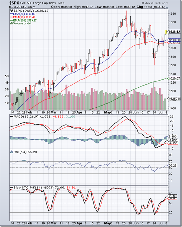
The daily bar chart pattern of S&P 500 index went through a smart correction that dropped from an intra-day high of 1687 to an intra-day low of 1560 – a 7.5% correction from the top that dropped the index below its 20 day and 50 day EMAs. An expected test of the rising 200 day EMA didn’t happen.

The rally from the Jun ‘13 low of 1560 touched a high of 1632 on Fri. Jul 5 – easily moving above the support/resistance level of 1600 and retracing more than 50% of the recent fall that pushed the index back into bull territory. However, down-day volumes continue to be strong – which is an indication that bears may be lurking around the corner.

Daily technical indicators are looking bullish. MACD is rising above its signal line, and seems ready to enter positive territory. RSI has moved above its 50% level. Slow stochastic has risen sharply above its 50% level, and is heading towards its overbought zone.

The long-term bull market is intact, though there may be some short-term volatility. The US economy continues its slow recovery – as can be ascertained from improving employment numbers and growth in light vehicle sales.

FTSE 100 Index Chart

FTSE_Jul0513

The 6 months daily bar chart pattern of FTSE 100 index dropped below all three EMAs into bear country, but the support level of 6000 (mentioned two weeks back) held. The index rallied smartly above all three EMAs and almost reached the 6500 level before dropping down to close exactly on the 20 day EMA.

The index has retraced more than 50% of its corrective fall from the May ‘13 top of 6876 to the Jun ‘13 bottom of 6023, and is back in a bull market. Strong volumes on down-days remains a concern though.

Daily technical indicators are turning bullish. MACD is negative, but rising above its signal line. RSI has moved above its 50% level. Slow stochastic is also above its 50% level and climbing towards its overbought zone.

The UK economy avoided a double-dip recession (as per revised figures) and is expected to grow strongly in 2 years.

Bottomline? The 6 months daily bar chart patterns of S&P 500 and FTSE 100 indices have recovered smartly from sharp corrections and are back in long-term bull markets. Stay invested, and use dips to add.

Saturday, July 6, 2013

BSE Sensex and NSE Nifty 50 index chart patterns – Jul 05, 2013

The big news of the week was the ordinance passing the Food Security bill. Though aimed at helping the rural poor, it will have a huge impact on the already ballooning fiscal deficit, and open the doors to more corruption in food procurement.

Like the earlier NREGA scheme of providing 100 days work to the rural poor, the real benefit will accrue to the Congress Party in the next elections. That such schemes lead to inflation is explained away as necessary for the ‘greater good’.

Further increase in inflation – already proving quite stubborn, thanks to hike in diesel and petrol prices – means RBI may not further decrease interest rates. That can’t be beneficial to India Inc. and therefore, for the stock market.

BSE Sensex index chart

Sensex_Jul0513

The weekly bar chart pattern of BSE Sensex index shows two up trend lines in blue – a longer-term up trend connecting the Dec ‘11 and Jan ‘12 lows (marked ‘1’) and a shorter-term up trend connecting the Jun ‘12 and Apr ‘13 lows (marked ‘2’).

Note that up trend line ‘1’ is in tact. Up trend line ‘2’ was breached twice intra-week, but the breaches were within the 3% ‘whipsaw’ limit. That means, technically, up trend line ‘2’ is also in tact.

Both the 18 months long up trend from Dec ‘11 and the 12 months long up trend from Jun ‘12 remain in force. To make money in the stock market, one should follow the trend – which is clearly up, despite all the negative sentiment all around.

After forming a ‘reversal week’ pattern (lower low, higher close) in the previous week that marked the end of the correction from the May ‘13 top, Sensex has moved up to close above both its two weekly EMAs. This has been a gradual up trend rather than a runaway one – as can be seen from the proximity of the index and its weekly EMAs.

Weekly technical indicators haven’t quite turned bullish yet. MACD is moving sideways in positive territory, but is below its signal line. ROC has crossed below its 10 week MA and is barely positive. RSI is moving sideways above its 50% level. Slow stochastic is gently rising towards its 50% level.

Expect the rally to continue with periodic corrections.

NSE Nifty 50 index chart

Nifty_Jul0513

The daily bar chart pattern of NSE Nifty 50 index consolidated between 5750 and 5900 during the week, and managed to remain above its 200 day EMA. The consolidation should help the index to gather technical strength for the next up move – though Friday’s low volumes is a concern.

Daily technical indicators are looking bullish. MACD is still negative, but continues to rise above its signal line. ROC has jumped back into positive territory. RSI is resting on its 50% level after a brief foray above it. Slow stochastic has dropped from its overbought zone, but is attempting to move back up again.

The 20 day EMA has bounced off the 200 day EMA, and looks ready to cross above the 50 day EMA. That should restore the bullish set up for the next up move.

Some technical experts have mentioned 5500 as the floor level for Nifty. That level is right in the middle of the ‘gap’ zone between 5450 and 5525 formed back in Sep ‘12 that has acted as a strong support for Nifty.

Bottomline? Chart patterns of BSE Sensex and NSE Nifty 50 indices received good support from their up trend lines after correcting from 2 year highs. Both indices are getting ready to rise to new highs on the back of renewed FII buying. This is as good a time as any to accumulate fundamentally strong stocks for the long-term.

(PS: If you are planning to add growth-oriented and fundamentally strong mid-cap/small-cap stocks to your portfolio, but are not sure which stocks to choose, book your paid subscription to my Monthly Investment Newsletter now. New subscriptions will be offered till July 21, ‘13.)

Wednesday, July 3, 2013

Nifty chart: a mid-week update

The 1 year daily bar chart pattern of Nifty is technically still in a bull market – despite strong selling by FIIs during June ‘13. The selling occurred across emerging markets and had more to do with strengthening of the US Dollar against most currencies.

The correction that started after Nifty touched a 2 year high in May ‘13, dropped below the 200 day EMA and briefly breached the blue up trend line connecting the Jun ‘12 and Apr ‘13 lows. However, the breach wasn’t a convincing one – i.e. the index didn’t drop below the trend line by more than the 3% ‘whipsaw’ level.

Note that the ‘gap’ zone created back in Sep ‘12 (marked by blue dotted lines) provided support to the index in Nov ‘12 and Apr ‘13 (when the ‘gap’ was partly filled) – and again during Jun ‘13. (The ‘error trade’ on Oct 5 ‘13 will be ignored because it didn’t occur in Nifty Futures or Sensex charts).

Nifty_Jul0313

The upward bounce from the Jun ‘13 low was backed by good volume support, that took the index above all its three EMAs. Two days of correction has brought the index down to its 200 day EMA once more. The battle between the bulls and bears has not yet determined a clear winner. However, in the past 10 trading sessions volumes on 5 up-days have exceeded volumes on 5 down-days. That is a bullish sign.

Daily technical indicators are turning bearish. MACD has moved above its signal line in negative territory, but its upward momentum is slowing down. ROC is falling towards its 10 day MA and has slipped into negative zone. RSI is about to drop below its 50% level. Slow stochastic is ready to drop down from its overbought zone.

If the support from the 200 day EMA is breached, expect support from the up trend line and the ‘gap’ zone. What if the ‘gap’ gets filled completely? The index will be expected to resume its up move thereafter.

In spite of all the doom and gloom stories – about the economy, the currency, the fiscal and current account deficits – Nifty has remained in a long-term up trend since touching its Dec ‘11 low, thanks mainly to FII buying. India Inc. is tightening its belt and not going for frivolous acquisitions or overseas borrowings.

Though capital expenditure has slowed down, government is belatedly taking steps to improve the investment climate. 2013 is expected to be better than 2012 for the economy and the stock market.

(Note: A limited number of new subscriptions to my Monthly Investment Newsletter is being offered till July 21 ‘13. If you are interested in adding good mid-cap/small-cap stocks to your portfolio, but are not sure which stocks to pick, book your subscriptions now to my Monthly Investment Newsletter.)

Monday, July 1, 2013

Announcing re-opening of paid subscriptions to my Monthly Investment Newsletter

I am pleased to announce the re-opening of paid subscriptions to my Monthly Investment Newsletter for a 3 weeks period from July 1-21, 2013. Only a limited number of subscriptions will be on offer – strictly on a first-come first-served basis – to enable me to provide personalised attention and guidance to each subscriber.

If you are interested in subscribing, please send an email to: mobugobu@yahoo.com at the earliest for details.

The past 6 months have been a challenging and humbling experience for me. Challenging because even fundamentally strong mid-cap and small-cap stocks have faced the wrath of bears. The Nifty touched two successive 52 week highs in Jan ‘13 and May ‘13, but the subsequent sharp bear phases decimated most mid-cap and small-cap stocks.

Humbling because a few stocks have not performed up to expectations yet, still subscribers have kept faith in my stock picking abilities. Those who have been following my blog posts already know what kind of stocks I like, and what type of stocks I avoid. The guiding principle is to choose well-managed, financially sound companies that give steady (rather than spectacular) returns and have growth prospects.

Subscribers receive monthly technical updates to identify entry/exit points and stop-loss levels. That helps to ensure that profits are maximised and losses are minimised. In a 2-3 years time frame for which stocks are recommended in the newsletter, most stocks have provided significant returns to subscribers through capital appreciation and dividends.

What is important to understand is that none of the recommended stocks were ‘cheap’ – fundamentally strong stocks rarely are - and some had already run up quite a lot when they were recommended.

Why wait if you need help in selecting fundamentally strong stocks with growth potential? Just subscribe to my Monthly Investment newsletter. Send me an email (at mobugobu@yahoo.com) soon – subscriptions will close on Jul 21, 2013.