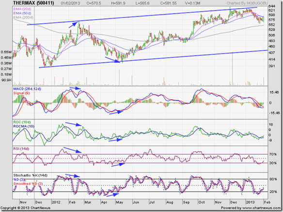
The concluding remarks in the previous technical update to the stock chart pattern of Thermax Ltd., posted on Nov 30 ‘11 (marked by grey vertical line on chart below) were: “The bear market isn’t over. No need to buy in a hurry. But slowly accumulating the stock may be a good idea.”
Turns out that the recommendation was quite appropriate. About a month after that post, the stock price of Thermax Ltd. touched an intra-day 52 week low below the 400 level (along with the broader market), formed a small double-bottom reversal pattern, and started on an up trend that is ongoing.
The stock price rose to touch an intra-day high of 568.65 on Feb 21 ‘12, but all four technical indictors touched lower tops (marked by blue arrows). The combined negative divergences warned of the correction that followed.
The opposite happened when the stock dropped to an intra-day low of 401.60 on May 15 ‘12. All four technical indicators touched higher bottoms (marked by blue arrows). The positive divergences signalled that the correction was over.
Note that the stock price touched progressively higher tops during Oct ‘12 and Dec ‘12, but all four technical indicators touched progressively lower tops that hinted at a possible correction that is going on now.
Such divergences are not always visible on charts, and the extent of the subsequent down or up move can not be ascertained, but when all four indicators are showing divergences then one should heed the signal and take appropriate buy/sell decisions.
The stock has been trading within an upward-sloping channel for more than a year now. Resistance from the upper boundary of the channel has been fairly strong for two reasons: Traders who follow technical analysis have obviously used the proximity to the top of the channel to sell.
The other reason is a long-term support/resistance zone between 650 and 700 (mentioned in the previous update). Observant readers may note that the price breakdown below 650 during Apr-May ‘11 (shown on chart in previous update) was accompanied by a spurt in volumes.
Upward break outs above resistance levels require stronger volumes for technical validity, but downward breaks of support levels need not be accompanied by strong volumes.
However, when a downward break of a support level is accompanied by a volume spurt, it usually means that the support level (of 650 in this case) will turn into a strong resistance to future up moves. The stock price of Thermax Ltd. touched a peak of 639.90 on Dec 3 ‘12 – above the upper edge of the parallel channel – before retreating.
Daily technical indicators appear to be recovering from oversold conditions, though MACD and ROC are still negative, and both RSI and slow stochastic are below their 50% levels. This may be a good time to start accumulating the stock from the technical point of view.
Fundamentally, headwinds are still strong – as for most companies in the capital goods sector. Q3 (Dec ‘12) results showed slippage in top and bottom lines, though order intake is improving.
Bottomline? The stock chart pattern of Thermax Ltd has returned to a bull market, but is nowhere near its glory days. Patient long-term investors would do well to start accumulating the stock. Short-term players looking for quick profits should look elsewhere.

No comments:
Post a Comment