Sunday, January 31, 2010

Stock Index Chart Patterns - FTSE 100, CAC 40, DAX - Jan 29, '10

FTSE 100 index chart

FTSE_Jan2910

In last week's analysis of the FTSE 100 index chart pattern, I had concluded with the following comment:

'Friday's low of 5303 was higher than the Dec '09 low of 5176. The bulls can use that as a rallying point to fight back quickly, otherwise the bears may regain complete control.' 

It was one of those fortuitous occasions that has created such a worldwide following for technical analysis. The index fell further, as expected, and closed at a low of 5146 on Thursday, Jan 28 '10. Technically, that can't be treated as a breach of the Dec '09 low since it was within the 3% 'whipsaw' leeway.

Sure enough, the bulls managed a small pullback and the week's and month's close was at 5189. Does that mean that the bear grip has been loosened? The technical indicators shows otherwise.

The 200 day EMA is still moving up, but the 20 day EMA has dropped to the falling 50 day EMA. The corrective move has been on good volumes, which should be a worrying sign for the bulls.

Both the RSI and slow stochastic are in the oversold zone. The MFI is below the 50% level but managed to stay above the oversold zone. The MACD is falling in the negative zone and is below the signal line.

DAX index chart

DAX_Jan2910

The DAX index chart behaved similarly to the FTSE 100 chart. Thursday's low of 5540 was below the Dec '09 low of 5605 but within the 3% leeway. Friday's close was at 5609.

Could this be a 'double bottom' leading to a new up move? That seems unlikely as the bears are not going to give up in a hurry. The technical indicators are supporting the bear cause.

The 20 day EMA has fallen and merged with the falling 50 day EMA. The slow stochastic is well inside the oversold zone. The RSI is just above the oversold zone. The MACD is falling in the negative zone and is below the signal line. The MFI is below the 50% level.

CAC 40 index chart

CAC_Jan2910

The CAC 40 chart is looking quite similar to its European counter parts, with a low on Thursday and a pull back on Friday. The recent corrective move has been on good volumes.

The 200 day EMA is rising, but the 20 day EMA has dropped to the falling 50 day EMA. The slow stochastic is in the oversold zone. The RSI has entered its oversold zone. The MFI is below the 50% level. The MACD is falling in the negative zone and is below the signal line.

Bottomline? The European indices are still in bear grip and are poised at tantalising support levels. The bulls may attempt a pull back, but bears are unlikely to release their firm grip. Wait for lower levels to enter.

Saturday, January 30, 2010

BSE Sensex Index Chart Pattern - Jan 29, '10

During last week's analysis of the BSE Sensex index chart pattern, I had mentioned that the index was facing a bear attack and may fall further. I had also made the following comment:

'There are previous tops at the 16000 level made in early and late Aug '09. Previous tops usually act as supports. In other words, the 16000-16600 zone should help the bulls to stage a comeback.'

It was almost as if the Sensex wanted to humour me and did exactly what I had surmised! Some times technical analysis works quite well, and this time it did, but it fails just as often.

Let us look at the 3 months bar chart pattern of the BSE Sensex index to see how the holiday-shortened F&O expiry week fared:-

Sensex_Jan2910_blog

Heavy FII selling continued to take its toll on the world indices, and the Sensex was no exception - despite efforts by the DIIs to stem the rot. A fall on rising volumes doesn't augur well.

With PSU divestments around the corner, the Government can't 'allow' the index to fall too much. End of week and end of month considerations led to some short covering that aided the Sensex to recover somewhat.

The bearish lower tops and lower bottoms pattern during the current correction remains in place. A further fall to test the Nov '09 low of 15331 (at the extreme left of the Sensex chart) can be expected.

The CRR tightening by 75 basis points by the RBI to stem inflation seemed to be taken in its stride by the market. A 50-100 basis point hike was discounted. The system is flush with liquidity. Interest rates may not rise in the near term.

Both exports and imports are down and corporate borrowing from the Indian banking system hasn't picked up much. The economy is still recovering.

The technical indicators are looking pretty weak and hint at a further fall. The RSI and slow stochastic have both entered the oversold zone. The MFI just managed to stay above its oversold zone. The MACD is falling in negative territory and is below the signal line.

Bulls may try a pullback - taking heart from the fact that they managed to defend the 16000 level. The falling 20 day EMA is resting on the 50 day EMA. The 200 day EMA is still moving up and may support a further Sensex fall.

The importance of the 16000 level needs to be emphasised. It is the 61.8% Fibonacci retracement level of the entire bear market fall from 21200 to 7700. Once the bull rally breached that resistance level, it has become a support level.

Bottomline? The BSE Sensex index chart pattern is showing the effects of a bear carnage. Longs don't need to panic as long as 15331 and the 200 day EMA remains unbreached. Investors can start to accumulate fundamentally strong stocks on any break of the two supports.

Friday, January 29, 2010

Stock Index Chart Patterns - Shanghai Composite, Hang Seng, Taiwan TSEC - Jan 29, '10

Shanghai Composite index chart

ShanghaiComp_Jan2810

During my last look at the Shanghai Composite chart pattern 3 weeks back, the bulls were struggling to extricate themselves from the bear's clutches. Things have gone from bad to worse since then - perhaps due to the talk of credit tightening.

The index has once again dropped down to the 200 day EMA where it is hanging on for dear life. The 20 day EMA has given a bearish cross below the falling 50 day EMA.

The slow stochastic has entered the oversold zone. The MACD is negative and below the signal line. The ROC is in negative territory and sliding further. The RSI is trying to keep its head above the oversold zone.

The lower tops and bottoms on the chart pattern show that the bears have a firm grip on the situation.

Hang Seng index chart

HangSeng_Jan2810

In the previous week, the Hang Seng chart was under a severe bear attack. The bears have further consolidated their position. The index has fallen below the crucial support of the 200 day EMA and went below the 20000 level during the last day of the month.

The slow stochastic is well inside the oversold zone. The MACD is negative and below the signal line. The ROC is deep in the negative zone. The RSI has also entered the oversold zone.

Looks like the bull rally has ended for now.

Taiwan (TSEC) index chart

TSEC_Jan 2810

The last look at the Taiwan (TSEC) chart pattern 5 weeks back showed the bulls in irrepressible form, but there were some concerns of the index being overbought. The concerns were not misplaced.

The index continued to make newer and higher highs right through the middle of Jan '10 before the global selling onslaught brought the index crashing down.

The TSEC has fallen through the supports of both the 20 day and 50 day EMAs and fell below the 7500 level on an intra-day basis on the last day of the month.

The slow stochastic has entered the oversold zone. The RSI is about to do the same. The ROC is in negative territory. The MACD has also entered the negative zone and is below the falling signal line.

Bottomline? The Asian indices have succumbed to a strong bear onslaught. Stay on the sidelines for the correction to play out. Better and cheaper entry points should be available in the near future.

Thursday, January 28, 2010

Investors may find something fishy about this post

I was pondering about the current uncertain state of the stock market, when I remembered the story of the three fishes that was part of my school curriculum many many moons ago.

There were several ponds within a large tract of land owned by a wealthy land-owner. In one of the ponds lived three large fishes. One was called 'Anagatavidhata'. The second was called 'Pratyutpanyamatitwa' and the third was called 'Jadvabishya'.

Not being literate in the Sanskrit language at that early age, the names sounded rather complicated and unnecessarily long for fishes. The purpose of such strange-sounding names may become clear from the story.

One day, some fishermen were standing near the pond where the three fishes lived and were chit-chatting about the impending wedding of the landowner's daughter. One said: The wedding will surely include a huge feast. Another said: If we can catch some big fishes alive, the landowner will surely give us a nice tip.

Over-hearing such talk, the three fishes went into a huddle to decide the next course of action. Anagatavidhata didn't want to take any chances and decided to escape into the neighbouring pond, which was much larger and deeper and would be easier to hide in. He immediately started to burrow in the mud to dig a hole into the next pond.

Pratyutpanyamatitwa would have none of it. He knew that the wedding was still a couple of months away, so there was no immediate danger of getting caught. Jadvabishya believed that it was the destiny of all fishes to get caught and slaughtered, so why get all worked up about it?

Two months later, the fishermen came with a huge net and cast it into the pond and caught all the fishes in it. Anagatavidhata had already escaped into the neighbouring pond and was saved.

Pratyutpanyamatitwa decided to play dead and did not struggle at all when the net was pulled in. The fishermen took all the fishes that had died struggling to get out of the net, and threw them back into the pond.

Pratyutpanyamatitwa also got thrown back in with the dead fishes and lived happily ever after. Jadvabishya kept desperately struggling to get out of the net, and became a part of the wedding feast.

Moral of the story? When the market starts to tank after making an intermediate top, it is better for conservative investors to book their profits and stay out, so that they can live to invest again at lower prices.

The smarter investors can remain in the thick of it and use their market timing and asset allocation strategies to reap maximum benefit.

Those investors who believe that being able to profit from the stock markets is pre-ordained and depends more on luck than strategy, are destined to lose money.

Wednesday, January 27, 2010

Stock Chart Pattern - Hindustan Unilever (An Update)

When I analysed the stock chart pattern of Hindustan Unilever more than 8 months ago, this was one of my comments:-

'If you want to preserve your capital during vicious bear attacks and like steady returns from tax-free dividends, there are very few stocks that can match HUL. This is not a stock for day traders. But there are plenty of opportunities for longer term trading.'

Now that the world indices are facing a co-ordinated bear attack by the FIIs, it may be a good time for a re-look at one of the favourite defensive stocks of all time.

Let us peruse the 9 months bar chart pattern of Hindustan Unilever (HUL) to check how the stock chart has played out since May '09:-

HUL_9m_Jan2710

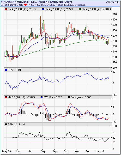
The stock peaked at 306 in Jul '09 on high volumes, but a 'reversal day' formation ended with a 3 weeks long sharp correction to 248 in Aug '09, where it got good support from the 200 day EMA. The stock subsequently made lower tops of 295 in Oct '09 and 288 in Nov '09 before sliding down below the 200 day EMA, which is very bearish.

But technical analysis requires verification from several other indicators for a confirmation. Look at the On-balance Volume (OBV). While the stock was making lower tops in Oct and Nov '09, the OBV was making higher ones - a positive divergence.

Even though the stock dropped below the 200 day EMA, it made a higher bottom of 252 last Friday, Jan 22 '10 and is trying to move up above the long-term moving average.  Note that after falling below the 50 day EMA, the 20 day EMA is resting on the 200 day EMA.

The RSI bounced off the oversold zone and reached the 50% level before dipping down. The OBV has been moving sideways with an upward bias as the stock corrected for the past two months. The MACD is in negative territory, but has given a bullish cross above its signal line.

Are you all confused with the conflicting bullish and bearish signals? Time to take a look at a longer term chart - a 3 years closing chart pattern of HUL which gives a completely different picture:-

HUL_3yr_Jan2710

Now you know why I keep harping about long-term investing! The bull rally in the HUL stock that started in 2007, and progressed upwards right through the bear market in 2008, remains in tact.

The last 2 months' corrective move has merely brought the stock down towards the lower end of the upward trending channel (which can be drawn by connecting the tops and bottoms of the 3 years chart pattern) - giving an opportunity to enter.

Bottomline? With the Sensex undergoing a much needed correction, the HUL stock chart pattern looks poised for another rise within its bullish up-trend channel. Existing investors should hold on. New entrants can expect a 25% gain in the near term - but remember to maintain a tight stop-loss.

Tuesday, January 26, 2010

What can small investors learn from the Put-Call Ratio (PCR)?

Before launching into a discussion about the Put-Call ratio, I need to make a disclosure. I strongly feel that small investors should stay far away from Futures and Options (F&O) trading. Most options contracts expire worthless and investors lose the premium amount that they had paid.

(I had made this point very clear in 'Chapter 3: What are your Future Options?' of my eBook. Haven't got your copy yet? Get your FREE eBook today!)

A put option owner has the option, but not an obligation, to sell the underlying security (a stock or an index) at a pre-determined price within a specified time. Likewise, a call option owner has the option, but not an obligation, to buy the underlying security at a pre-determined price within a specified time.

The Put-Call ratio (PCR) is calculated by dividing the total number of put options traded by the total number of all options traded. A ratio of more than 1 means more put options were traded than call options (i.e. more investors were feeling bearish). A ratio 1 or less means more call options were traded than put options (i.e. more investors were feeling bullish).

If small investors are supposed to stay away from F&O trading, why should they be interested to learn about the Put-Call ratio? The short answer is: the PCR is a short-term contrarian sentiment indicator.

As stock market indices drop near a bottom during a bear market, investors turn extremely pessimistic in panic and fear and expect to see further downsides. Many more put option contracts are traded than call options, and the PCR ratio keeps going higher.

How high is high? There are no fixed benchmarks. But a ratio of 1.5 or more means that bearishness is becoming excessive. As option traders are generally incorrect in their market sentiment assessment, a high PCR is taken as a contrarian 'buy' signal.

When stock market indices rise to a top during a bull market, investors become excessively greedy and euphoric and expect to see newer highs. More call options are traded than put options, and the Put-Call ratio drops below 1. This is used as a contrarian 'sell' signal.

Most business channels and pink papers make a big noise about the PCR. Just keep your eyes and ears open. Whenever the PCR gets to 1 or less, a correction may be close at hand. When the PCR gets near 1.5 or higher, it may be a good time to enter.

Like all technical analysis indicators, the usefulness of the Put-Call ratio (PCR) should be taken with a pinch of salt. It is not infallible. So never take buy/sell decisions based only on the PCR indicator. It should be used in conjunction with other indicators.

Monday, January 25, 2010

Dow Jones (DJIA) Index Chart Pattern - Jan 22, '10

It was almost like a bolt from the blue. The Dow Jones (DJIA) index chart pattern was moving up merrily, ignoring all concerns about weak fundamentals and low volumes.

The index not only tested the previous high of 10767 on the first day of a holiday-shortened week, but closed at 10725 - the highest close in 15 months (since Oct 1, '08).

The complacency of the bulls may have brought about the sudden and vicious bear attack. In three days, the index lost more than 600 points on strong volumes.

The much-awaited correction seems to be unfolding at last. The Dow has dropped below the 50 day EMA for the first time in more than 6 months. Friday's low of 10133 is below the Dec '09 low of 10207.

Let us look at the 6 months bar chart pattern of the Dow Jones (DJIA) index to check the likely supports to a further fall:-

Dow_Jan2210 

The low made on Nov 2, '09 was 9647. That is a bit below where the rising 200 EMA has reached currently. We can expect support in the 9600-9700 zone, should the correction continue. There are good supports in the 9000-9500 zone as well.

The technical indicators are hinting that the bulls may find it difficult to get out of the bear grip that easily. The ROC has plunged into the negative zone. The RSI is below the 50% level and falling. Likewise for the slow stochastic. The MFI is just above the 50% level, but is ready to drop below.

Note the negative divergences in the ROC, RSI and slow stochastic - all of which failed to make new highs with the index. Will the bulls quickly engineer a pull back, as they have done several times during this rally? It won't be surprising if they do.

Bottomline? The Dow Jones (DJIA) index chart pattern is facing a determined bear attack. Wait and watch for the correction to play out. It may not be prudent to start buying right away.

Sunday, January 24, 2010

Stock Index Chart Patterns - FTSE 100, CAC 40, DAX - Jan 22, '10

FTSE 100 index chart

FTSE_Jan2210

Last week I had mentioned that the correction in the FTSE 100 index chart pattern may continue. After clinging on to the 5500 level on a closing basis for the first two day's of the week, the index succumbed to a renewed global bear assault and fell below the 50 day EMA on rising volumes.

That doesn't augur too well for the bulls, even as the long-term moving average continues to rise. The index had not closed below the 50 day EMA in the last 6 months.

The technical indicators have weakened further. Both the RSI and MFI have dropped below the 50% levels. The slow stochastic is ready to enter the oversold zone. The MACD is still positive, but falling fast  below the signal line.

Friday's low of 5303 was higher than the Dec '09 low of 5176. The bulls can use that as a rallying point to fight back quickly, otherwise the bears may regain complete control.

DAX index chart

DAX_Jan2210

Despite a valiant effort on Tuesday, Jan 19 '10 the bulls could not regain the 6000 level, and the DAX index chart fell below the 50 day EMA after the bear onslaught on increased volumes.

The 'Quantum of Solace' for the bulls is that Friday's low of 5639 stopped short of falling below the Dec '09 low of 5605. The 200 day EMA is also rising.

The technical indicators have weakened some more. Both the RSI and MFI are below their 50% levels. The slow stochastic has just entered the oversold zone. The MACD has turned negative and is below the signal line.

The bulls will hope for a quick recovery, just like in early Nov '09. Wonder if they haven't already exhausted their fire-power.

CAC 40 index chart

CAC_Jan2210

The CAC 40 index chart didn't fare much better than its European neighbours, closing below the 50 day EMA on higher volumes. It briefly moved above the 4000 level on Tuesday, Jan 19 '10 but reacted downwards almost immediately.

The 200 day EMA is still rising, but the technical indicators are weakening. Both the RSI and MFI have fallen below the 50% levels. The slow stochastic has just entered the oversold zone. The MACD is barely positive and below the signal line.

Bottomline? The European index chart patterns seem to be succumbing to a concerted bear attack. Book profits, but stay ready with your buy list. A deeper cut will present buying opportunities.

Saturday, January 23, 2010

BSE Sensex Index Chart Pattern - Jan 22, '10

Last week's analysis of the BSE Sensex index chart pattern was concluded with the following remarks:-

'The BSE Sensex index chart pattern wants to move higher but is unable to do so. A likely outcome could be a break down wards. Maintain tight stop-losses and try to subdue your buying impulse.'

The FIIs sold heavily, and nearly overwhelmed the equally strong buying from the DIIs. A bout of short-covering before the weekend helped the Sensex recover from the low of the week hit on Friday.

The Q3 results declared so far haven't been bad at all, but were below market expectations. As often happens in such cases, the index took a dive. (In a post ten days ago, investors had been cautioned about such a possibility. In fact, it was suggested that investors book some profits in this post in the last week of Dec '09.)

The 3 months bar chart pattern shows that the BSE Sensex index is facing a strong bear attack and may be getting ready for a further fall:-

Sensex_Jan2210

The selling pressure on increased volumes caused the Sensex to drop below both the short-term and medium-term moving averages, with two consecutive closes below the 50 day EMA.

The technical indicators have all turned weak. The RSI is below the 50% level and dropping fast towards the oversold zone. Likewise for the slow stochastic. The MFI has dipped below the 50% level. The MACD is barely positive and below the signal line.

All is not lost for the bulls. The 50 day EMA has stopped moving up but the 200 day EMA is still rising with the Sensex well above it. The index dropped to a low of 16608 on Friday, Jan 22 '10, but it stayed above the Dec 21 '09 low of 16578 and the Nov 27 '09 low of 16210.

There are previous tops at the 16000 level made in early and late Aug '09. Previous tops usually act as supports. In other words, the 16000-16600 zone should help the bulls to stage a comeback.

In case the bears are able to breach the resistance zone of 16000-16600, watch out for the low of 15331 made on Nov 3 '09. The 200 day EMA is quite close to that level, and should be a good support.

If that support gets broken - and I am not saying that it will - then the index can drop to the top of the gap at 13220 made on July 13 '09.

Bottomline? The BSE Sensex index chart pattern is in the midst of a sharp correction, along with most global indices. Investors should wait for it to play out before jumping in. But keep your buy-list ready and track it on a daily basis.

Friday, January 22, 2010

Stock Index Chart Patterns - Hang Seng, Korea KOSPI - Jan 22, '09

Hang Seng index chart

HangSeng_Jan2210

The Hang Seng index chart pattern was trying to recover from a bear attack when I looked at it two weeks back. I had made the following comment about the continuation of the bull rally:-

'The high of 23100 made in Nov '09 remains the big barrier that the bulls need to cross before they can shake off the bears.'

The bulls managed to push the index up to a high of 22672 on Jan 11 '10 - which was higher than the Dec '09 high of 22594. But their buying power ran out of steam. The bears took control.

Both the 20 day and 50 day EMAs have turned down and the 20 day EMA has slipped below the medium-term moving average. At today's low of 20250, the stock came perilously close to the 200 day EMA.

Though the Hang Seng index ended the day nearly 500 points higher at 20726, a bearish pattern of lower tops and lower bottoms have formed. The lower volume on the up day on Jan 19 '10 and increasing volumes as the index headed further down are major concerns for the bulls.

The technical indicators are all looking bearish, which means that the correction can continue some more. The slow stochastic has just entered the oversold zone. In each of the past four months, the indicator had moved back up immediately without spending much time below the 20% level. The bulls will hope for a repeat performance.

The MACD is in negative territory and below the signal line. The ROC is well inside the negative zone. The RSI is just below the 50% level and headed down.

The bulls will hope that the 200 day EMA will provide support to the falling index. Should the index fall below the long-term moving average, expect support around 19100 and 17700 (previous tops).

KOSPI (Korea) index chart

Kospi_Jan2210

My previous look at the KOSPI (Korea) index chart was five weeks back. The index had made a spirited recovery from a strong bear attack that took the index down close to its 200 day EMA.

The bulls didn't let go of the reins, as the KOSPI made a series of bullish higher tops and bottoms. Except for a brief dip in the middle of last week, the index has managed to stay on or above the 20 day EMA since Dec 2 '09. (Today's close of 1684 has made the index dip below the short-term moving average once again.)

Note how the slow stochastic has spent almost 7 weeks inside the overbought zone, except for the dip last week. The volumes have started to pick up and all three EMAs are moving up.

Bears need not lose hope. The MACD has remained pretty flat for three weeks while the index rose to make a high of 1723 on Jan 19 and 20, '10. That is the exact same level hit on Sep 23, '09. That makes a very good case for a bearish 'double-top' pattern.

Negative divergences are clearly visible in the ROC and RSI indicators - both of which are above their mid-points and moving sideways.

Bottomline? The Hang Seng index chart pattern shows that the bull rally is over for the time being. The KOSPI (Korea) index chart pattern shows the bulls are still in control, but things can change quickly if the FIIs continue with their selling spree. Book profits.

Thursday, January 21, 2010

Why did the Sensex fall so much today?

One of the favourite pastimes (or is it bread-and-butter?) of market analysts is to assign reasons for gyrations in the Sensex after it has gone through a big up or down move.

Some times the reasons are genuine and accurate. Mostly it is an exercise in trying to explain the unexplainable. The Finance Minister said that inflation in food prices will slow down, so the Sensex moved up. Several Indians are on a ship hijacked by Somali pirates, so the Sensex moved down. You get the drift.

I have no intention of doing a post-mortem. I'd rather quote from this recent article:

'... stock markets generally 'discount' good or bad news months in advance. If you own stocks that make up the Sensex (or Nifty) index, and if such stocks have risen a lot already and are now showing signs of hesitation - then they may fall if the results are perceived to be less than great. Only positive earnings surprises can cause them to rise more.'

Larsen and Toubro's Q3 Profit After Tax (PAT) grew 15% on a Year-on year (YoY) basis; the stock fell more than 6.6%. BHEL's Q3 PAT rose more than 35% on a YoY basis; the stock dropped 4.25%. Wipro's Q3 PAT increased more than 21% on a YoY basis; the stock dipped by 2.2%. ONGC's Q3 PAT was higher by 23%; the stock shaved off 2%.

Is the market behaving irrationally? Not at all. The results were below the market 'expectations'. It was the expectations that were irrational.

Will the Sensex fall some more? The probability is high, because the expectations of growth of the Indian economy has been on the irrational side as well. The actual growth is likely to be lower.

For the April to December '09 period, indirect tax collections have suffered. A 13% dip in excise duty, a 6% drop in service tax and a hefty 28% cut in customs duty has led to an overall 18% lower collection over the previous year's same period. These figures will not enthuse market players.

World indices are facing headwinds, with the Dow dropping like a stone at the time of writing this post. FIIs have been selling for some time, and buying by DIIs may not stem the rot.

What should small investors do? If you have been reading my blog posts regularly, you already know my answer. Wait and watch, but stay nimble. Curb the urge to dive in. This could be a quick, sharp cut before the Sensex recovers. The India growth story is far from over.

Wednesday, January 20, 2010

Stock Chart Pattern - Balrampur Chini (An Update)

During my previous look at the stock chart pattern of Balrampur Chini, the stock had jumped up from the Mar '09 low of 42 and had nearly doubled in value by early May '09. I had expected the stock to face some profit booking after the rapid rise.

The stock consolidated in a triangle pattern instead of correcting, and after the election results embarked on a steady northward journey with occasional dips. The bull rally finally terminated with a key reversal day on Oct 30 '09, as the stock hit a higher high of 167 and a lower close of 149.

The spectacular 450% rise from the low of 30 made in Dec '08 still fell short of the high of 205 made on Apr '06. Let us take a look at the 9 months bar chart pattern of Balrampur Chini to see what transpired next:-

Balrampur_Jan2010 

The reversal day pattern stopped the bull rally on its tracks and the stock has been drifting sideways with a downward bias since then. The 20 day EMA is resting on the 50 day EMA and the stock has moved below both the short and medium term moving averages.

The stock had recovered well in Dec '09 when the 20 day EMA had moved down to touch the 50 day EMA, but made a lower top. If it moves below 120, a bearish pattern of lower tops and lower bottoms will get formed.

There is a possibility that the 200 day EMA will provide support to the stock. Even if it does, and the stock manages to move up again, a bearish descending triangle pattern will start forming.

The OBV seems to be tracking the stock's movements, as it is supposed to do. But the MACD has moved into the negative zone and has gone below the signal line. The RSI is below the 50% level and rapidly moving towards the oversold zone. Looks like the wind has gone out of the stock's sails.

What has caused the bearishness? Technical analysis alone can't explain it. This is another instance of why both technical and fundamental analysis need to be considered for buy-sell decisions.

The Saraogi family of Calcutta that owns 36.5% of the equity and runs the show at Balrampur Chini seem to have had enough and have been trying to sell the company. In Nov '09, Bajaj Hindustan balked at the Rs 180 per share (of face value Re 1) price. In Dec '09, an attempt by Shree Renuka Sugar to take over the company came to nought.

The other reason for lack of investor interest could be the likely bulk import of sugar by the Government to ease the shortage situation. That would help curtail the runaway sugar prices and dent the profits of sugar manufacturers.

Bottomline? The stock chart pattern of Balrampur Chini shows a distinct dampening of bullish fervour. Existing holders may stay invested with a strict stop-loss at 115, with the hope that a white knight will appear on the scene soon. The risk-averse can book profits. Fresh entry is not recommended.

Tuesday, January 19, 2010

Try to avoid the simultaneous switch

What is a simultaneous switch? It is when you sell a stock to immediately buy another. The simultaneous switch is quite a common practice amongst small investors - usually followed by the less experienced ones. But it is a mistake, and needs to be avoided if you want to succeed as an investor.

Why is an investment mistake to be avoided? Because you end up losing money. And avoiding losses is the only rule of investing. Remember that the stock market is not a zero-sum game.

Each buy order needs a sell order for the transaction to be completed. But if you buy 1000 shares, it doesn't mean a single seller sells the entire 1000. There could be several sellers of 100-200 shares each. If the stock shoots up after your purchase, you 'win' and 5 or 6 investors 'lose' (or, 'win' a much smaller amount).

A smaller percentage of investors make money. The majority lose. To make money from stocks, there has to be lots of losers. You don't want to be one of them!

Why is the simultaneous switch a mistake? It is a form of 'timing' the transaction which is fraught with risks. One is trying to make a sale and trying to make a buy at the same time. It is a rare occasion when a good time for selling one stock is also a good time for buying another.

The 'need' for a simultaneous switch occurs during bull markets. Small investors often enter late. In an effort not to miss the bus, they end up spending all their spare cash in buying some of the 'hot stocks' that have already run up a lot.

These 'hot stocks' may not provide great returns over the short-to-medium term. As sector rotation occurs and a different set of 'hot stocks' shoot up, investors get rid of a few of the non-performers (or the ones in which they have made small profits) and simultaneously re-deploy the money into another set of stocks.

This may provide a lot of excitement, but doesn't greatly enhance wealth building. When the next correction comes, there is hardly anything left in the kitty to pick up the bargains.

In a previous article, I had mentioned three reasons why one should sell a stock. Those reasons can not be reasons for buying. Learn the mental discipline of separating the reason for selling from the reason for buying, and avoid the temptation of the simultaneous switch.

(Note: If you are not sure how to time your selling, you need to learn about and implement an asset allocation plan. Read Chapter 12: How to Reallocate your Assets from my eBook. Haven't got your copy yet? Get your FREE eBook before it is too late.)

Monday, January 18, 2010

Dow Jones (DJIA) Index Chart Pattern - Jan 15, '10

The Dow Jones (DJIA) index chart pattern shows that the relentless bull surge continues unabated with decent volume support. The index made another new high of 10767 on Thursday, Jan 14 '10. The only solace for the bears was the 100 point drop on Friday, Jan 15 '10 with volumes touching a high for the week.

Though the Dow closed marginally lower on a weekly basis, the technical indicators haven't weakened too much. The 20 day EMA continues to provide strong support to the Dow and all three EMAs are moving up.

We are now into Q4 earnings season and the future trend may depend a lot on how the corporate results shape up. Let us now have a look at the 6 months bar chart pattern of the Dow Jones (DJIA) index:-

Dow_Jan1510

The pattern of higher highs and higher lows indicate that the bull rally may last a while longer. Negative divergences in the technical indicators and rise on lower volumes remain concerns. But the index has continued its 10 month long climb regardless.

The RSI fell after touching the overbought zone, but remains well above the 50% level. The MFI has dropped from the overbought zone and also stayed above the 50% level. The slow stochastic has just dipped from the overbought zone. The MACD is in positive territory and touching the signal line. Negative divergence is quite clearly visible in the MACD.

Bottomline? The Dow Jones (DJIA) index chart faced some selling pressure on options expiry day, ahead of a holiday-shortened week. For abundant caution, set tighter stop-losses and stay invested. This is neither a good time to enter, nor to go short.

Sunday, January 17, 2010

Stock Index Chart Patterns - FTSE 100, CAC 40, DAX - Jan 15, '10

FTSE 100 index chart

FTSE_Jan1510

In last week's analysis, I had mentioned that the FTSE 100 index chart pattern hadn't quite cleared the hurdle of the 61.8% Fibonacci retracement level of 5500, despite closing above it for four straight days.

On Monday, Jan 11 '10, the index made a new high of 5600 and closed above the 5500 level for the fifth straight day, but on lower volumes. Just when it seemed that the bulls were unstoppable, the bears mounted a swift counter-attack.

The FTSE 100 closed below the 5500 level four days in a row. The spike in volumes on Friday, Jan 15 '10 pushed the index down to the 20 day EMA, but the support from the short-term moving average held firm.

The technical indicators have weakened, and continues to show negative divergence. The RSI has dropped from the overbought zone. So has the slow stochastic - but both remain above the 50% levels. The MFI is also above the 50% level but is moving down. The MACD is falling and has gone below the signal line.

All three EMAs are still moving up and the index remains above them. So the bull rally is still under no threat. But some more correction could be in the offing.

DAX index chart

DAX_Jan1510

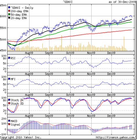
The DAX index chart came under a bear attack as well, and almost tracked the FTSE 100 in its movements. The German index made a new high of 6094 on Monday, Jan 11 '10, and closed above the 6000 level for the sixth day in a row.

The bears spoiled the party somewhat, and the index closed below the 6000 level on four consecutive days. The large volume on Friday, Jan 15 '10 pushed the index down below the flattening 20 day EMA.

The technical indicators have weakened quite a bit. The RSI has moved down towards the 50% level. The MFI is following suit. The slow stochastic has slipped below the 50% level. The last time it did that was during the sharp correction in Oct '08. The MACD is dropping and is below the signal line. Looks like the bears aren't quite done yet.

CAC 40 index chart

CAC_Jan1510

The CAC 40 index chart managed to fend off the bears a little better. The index clung on to the 4000 level throughout the week, before falling below it on Friday on higher volumes. The French index made a new high of 4088 on Monday, Jan 11 '10.
The technical indicators look similar to those of the FTSE 100. The RSI has dropped from the overbought zone but remains above the 50% level. The MFI and slow stochastic are falling towards their 50% levels. The MACD is positive but below the signal line.

The 20 day EMA has supported the index fall and all three EMAs are moving up with the index above them. The bull rally is still going strong.

Bottomline? The European index chart patterns are facing some correction. Such phases are good for the continuation of the bull rally. Things could change fast if the bears can continue their selling spree. Keep tight stop-losses, but stay invested.

Saturday, January 16, 2010

BSE Sensex Index Chart Pattern - Jan 15, '10

The BSE Sensex index chart pattern went through some more sideways consolidation and ended practically flat for the week. An effort at a new high on Monday, Jan 11 '10 fell short, and the index again failed to muster up any volume support.

The FIIs were net sellers and the DIIs were net buyers during most of the week. The HDFC stock, which is an FII favourite has been drifting down of late. The impending PSU divestments could be a reason why the DIIs are propping up the index with buying support.

The 6 months bar chart pattern of the BSE Sensex index shows the listlessness of the bulls:-

Sensex_Jan1510

The three EMAs are continuing their upward journey with the Sensex above them. The bull rally remains intact.

The RSI has moved up to the overbought zone. The MFI made a similar attempt but failed. The slow stochastic is trying hard to remain in the overbought zone. The MACD has stopped moving up and is clinging on to the signal line. The technical indicators are looking a little less bullish than the previous week.

Action has shifted to the mid-cap and small-cap stocks as the large-cap stocks are looking fair-valued with little further upside left in them. This is a good opportunity to churn your portfolio. Get rid of some of the less than stellar performers.

Bottomline? The BSE Sensex index chart pattern wants to move higher but is unable to do so. A likely outcome could be a break down wards. Maintain tight stop-losses and try to subdue your buying impulse.

Thursday, January 14, 2010

Does it make any sense to invest in tax saving (ELSS) mutual funds?

If you are like most investors, then you probably haven't yet planned your tax saving investments for the Accounting Year 2009-10. Barely 10 weeks remain for you to decide and make your investments.

The more conservative investors will probably choose the 5 years fixed deposit at a bank, or the NSC VIII savings certificates at the Post Office to avail of tax benefits of up to Rs 1 Lakh under Section 80C of the Income Tax act. (I'm not including LIC insurance policies - because insurance should not be confused with investments.)

Both pay a risk-free interest of around 8%, with the NSC VIII certificates requiring a holding period of 6 years. (For those who are in the early stages of your career, it makes a lot of sense to make monthly or quarterly investments by buying these certificates. After 6 years, you get back about 1.6 times your original investment every month or every quarter. So, after systematically investing for 6 years, you won't need to make fresh investments, as you can keep reinvesting the amounts that mature.)

But I'm digressing. Let me get back to the original topic about ELSS funds. Since these have a lock-in period of only 3 years, many investors - particularly the younger ones - prefer them over the more 'old-fashioned' bank fixed deposit or NSC VIII certificates. But does it make any sense to do so?

I made a quick visit to the valueresearchonline.com site and used their Point-to-point return calculator for ELSS funds, giving a start date of Jan 15, 2007 and an end date of Jan 14, 2010. That gives the return for all ELSS funds for a 3 year minimum holding period.

The results are interesting, to say the very least. Out of the 27 ELSS funds listed at the site, only 50% managed a return of 8% or more. Now, remember that ELSS funds invest mostly in equity shares - with its associated risks.

The 3 years holding period gives the fund managers some flexibility in buying shares with a longer-term perspective as there won't be an immediate threat of pull-out by investors should the markets turn for the worse in the near term.

That doesn't mean that the risks are reduced too much. On top of it, there is no guarantee that you will even get back your principal amount. If you had bought the units of either ING Tax Savings or Fortis Tax Advantage Plan on Jan 15 '07, your returns till date would be negative.

If we add a minimum 'Margin of Safety' of 5% above the risk-free interest of 8% in bank fixed deposits or NSC VIII certificates (to adequately cover the risk of equity investing), then only the top 6 funds out of the 27 make the grade of giving returns of 13% or more.

These are Taurus Tax Shield (21.35%), Canara Robeco Equity Tax Saver (18.09%), Sahara Tax Gain (16.08%), Religare Tax Plan (15.02%), Sundaram BNP Paribas Tax Saver (14.56%) and Fidelity Tax Advantage (13.27%).

So, should you just invest Rs 1 Lakh in any one of these 6 ELSS funds and be done with it for this year? Not quite, and I'll show you why. By pushing back the start date to Jan 15 '06 and end date to Jan 14 '09, the returns decline quite dramatically.

That isn't surprising considering the bear market during Jan '08 to Mar '09. Still, only the top 2 funds managed positive returns - Sundaram BNP Paribas Tax Saver (2.94%), Canara Robeco Equity Tax Saver (2.78%). The rest were all in the red.

Obviously, a lot depends on the state of the market - both at the time of investing, and nearer the time of maturity. Considering that the BSE Sensex is close to an intermediate top, the risk-return equation seems to be favouring the risk side more.

That was the long answer. The short answer is: avoid ELSS funds for your tax saving investments.

Wednesday, January 13, 2010

Stock Chart Pattern - Bharti Airtel (An Update)

My previous look at the stock chart pattern of Bharti Airtel was back in Apr 29, '09 when the 2:1 stock split was announced. The stock had bounced off from an intra-day low of 272 (split-adjusted) on Mar 12 '09 and had sailed above the 200 day EMA.

The rise seemed too steep, and was devoid of volume support - which is essential for a bull rally to sustain. The post-election result euphoria took the Bharti Airtel stock to a high of 495 (split-adjusted) on May 19, '09 - but well short of its Oct '07 high of 575.

Let us take a look at the 1 year closing chart pattern of Bharti Airtel and see what transpired since then:-

Bharti_Jan1210

The bears attacked almost immediately as the stock dropped on much higher volumes. A sideways consolidation followed for the next 4 months. After making an intra-day low of 360 on Aug 11 '09 that took it below the 200 day EMA, the stock rose steadily to make a high of 467 on Oct 1 '09. The consolidation was marked by low volumes, which isn't unexpected. But the higher volumes on down days was a big negative.

Then the bottom fell out as the stock tanked on very high volumes. It finally dawned on investors that the heady growth of yesteryears had come to an end. Severe price competition from newer and bigger players had started to take a toll on the company's profit margins.

After making an intra-day low of 230 on Nov 27, '09 the stock made a valiant effort to move above the 200 day EMA. It managed to cross above the 50 day EMA and made an intra-day high of 349 on Dec 11 '09 - hitting exactly the 50% Fibonacci retracement level of the fall from 467 to 230.

Another period of sideways consolidation followed, that brought the 20 day EMA close to making a bullish cross above the 50 day EMA. Today's close of 319 has dropped the stock below the 50 day and 20 day EMAs. Technical indicators like the slow stochastic, RSI and MFI are showing negative divergences as they moved lower while the stock moved sideways.

What next? The impending 3G spectrum auction is going to cause a huge outflow of cash, at a time when continued price competition is clouding the future. The Bharti management, which has shown its mettle through thick and thin, may not be relishing the idea.

Which telecom service provider is going to make it through the next two years with its reputation and financial situation reasonably in tact? My guess will be Bharti. But that doesn't mean I'll bet my money on them. Fundamentally and technically, the stock is looking bearish.

Bottomline? The stock chart pattern of Bharti Airtel is showing an interesting double bottom on a closing basis (279 on May 13 '09 and 281 on Nov 25 '09). A drop below 280 can take the stock to 220. Bulls have nothing to celebrate till the recent high of 349 is taken out. New entrants should avoid the stock. This is not the time to play contrarian.

Related Post

Should Indian investors switch out of Telecom Sector stocks?

Tuesday, January 12, 2010

Have you taken some profits home?

Two weeks back I had suggested that investors should take some profits off the table in this post. The BSE Sensex moved up to make a new high of 17790 on Jan 6 '10 - very close to the target of 17800 mentioned in a post on gap-analysis back in Sept '09.

The expected long-term resistance from the 17500-18000 zone kicked in, and the Sensex started to drift down and closed today at 17422 - almost the same level at which it had closed two weeks back. If you haven't booked some partial profits already, this may be a good opportunity to do so.

The Q3 results season is upon us, shouldn't one wait to check out the results before booking profits? Yes, if you are stock specific - and you should be. Volatility in the Sensex doesn't affect all stocks equally. One should concentrate on the stocks in one's own portfolio.

But don't forget that stock markets generally 'discount' good or bad news months in advance. If you own stocks that make up the Sensex (or Nifty) index, and if such stocks have risen a lot already and are now showing signs of hesitation - then they may fall if the results are perceived to be less than great. Only positive earnings surprises can cause them to rise more.

What if you have booked some profits already? Don't get anxious because the Sensex isn't correcting. Also, curtail your impulse to jump in if the market starts to move up. That is the challenge in the stock markets. To keep your cool, and be patient - like the South African python mentioned in Chapter 4 of my FREE eBook. (If you haven't got a copy of the FREE eBook yet, get it now by sending me an email request.)

If you would rather not time the market (it is a difficult task for most investors), park your profits in a liquid fund and make monthly withdrawals from it to invest in an index fund or Nifty BeES.

What you should definitely avoid is to sell out completely and sit on cash. That is investing suicide in the midst of a bull market.

Monday, January 11, 2010

Stock Index Chart Patterns - Dow Jones (DJIA) and Bovespa (Brazil), Jan 8, '10

Dow Jones (DJIA) index chart

Dow_Jan0810

Last week's analysis of the Dow Jones (DJIA) index chart was concluded with the following comments:-

'...this bull rally on low volumes has surprised on the upside every time the bears have tried to dominate. So look for another thrust towards a new high.'

True to form, the Dow made a new high of 10666 on Jan 7 '10 - this time accompanied by decent volumes. But the daily lows dipped below the 10500 level on each of the first four days of the week and the index sought daily support from the rising 20 day EMA. The 50 day EMA and the 200 day EMA are rising nicely, as the bulls resumed their efforts to dominate the bears in the new year.

The technical indicators are reflecting the bull surge. The RSI bounced off the 50% level, but note that it failed to make a new high. The MFI has moved up sharply above the 50% level. The slow stochastic has entered the overbought zone. The MACD has remained positive and just above the signal line, but is showing negative divergence like the RSI.

This rally can end dismally if the employment figures do not start to improve soon. "Until we focus on creating middle class jobs that are not dependent on the government, we will only be putting band-aids on the open, festering wound that is our unemployment rate", mentions this article.

Bovespa (Brazil) index chart

Bovespa_Jan0810

It has been a while since I looked at the Bovespa (Brazil) index chart. But that hasn't deterred the bulls from their upward march. A renewed effort by the bears to fight back during the last two weeks of Dec '09 was effectively repulsed.

The new year's trading began strongly and the index made a new high of 70937 on Jan 6 '10 with good volume support. All three EMAs are moving up with the index above them.

The technical indicators are not as supportive. The RSI is above the 50% level, but actually drifted lower as the Bovespa made a new high. The MFI has dropped to the 50% level. The slow stochastic has entered the overbought zone. The MACD is above the signal line and rising in the positive zone. But it is showing negative divergence - like the RSI and MFI.

Bottomline? Both the Dow Jones (DJIA) and Bovespa (Brazil) index chart patterns are looking bullish. The sporadic efforts by the bears to stall the bull rally have come to nought every time. Maintain trailing stop-losses and stay invested.

Sunday, January 10, 2010

Stock Index Chart Patterns - FTSE 100, CAC 40, DAX - Jan 8, '10

FTSE 100 index chart

FTSE_Jan0810

Last week, I had mentioned that the FTSE 100 index chart may face resistance at the 61.8% Fibonacci retracement level of 5500. On the first day of the week (Jan 4 '10) the index closed exactly at the 5500 level. It proceeded to close marginally above 5500 for the next four days on good volumes. A new high of 5552 was made on Jan 7 '10.

The break above the 5500 level isn't convincing as yet, in spite of 4 straight closes above it. Why? Because of the 3% 'whipsaw' lee-way followed in technical analysis. That means 5665 needs to be crossed before the bulls can take complete control.

It should be a question of when, not if. All three EMAs are moving up and the index is above them. For a change, the up move is receiving volume support. The technical indicators are also bullish.

The RSI is headed up towards the overbought zone. The MFI bounced off nicely from the 50% level. The slow stochastic is well-entrenched in the overbought zone. The MACD is moving up in positive zone and is above the signal line.

Bears can only hope that the negative divergences in the technical indicators can play spoilsport to the bull rally.

DAX index chart

DAX_Jan0810

The DAX index chart pattern made a new high of 6058 on Jan 5 '10 and closed all 5 days of the week above the 6000 level on decent volumes. The index is above the three EMAs, which are moving up. The bulls are looking to extend their dominance in the new year.

The technical indicators are not quite as bullish as those of the FTSE 100. The slow stochastic is well inside the overbought zone. The MFI has bounced off the 50% level. But the RSI has dipped after touching the overbought zone. The MACD is in positive territory and above the signal line, but has stopped moving up.

CAC 40 index chart

CAC_Jan0810 

The CAC 40 index chart also looks bullish, with all three EMAs moving up and away. The index made a new high of 4051 on Jan 8 '10 and closed above the 4000 level an all 5 days of the week. Volumes have picked up in the new year.

The technical indicators are looking reasonably bullish. The RSI has dipped a little after coming close to the overbought zone. The MFI is moving sideways above the 50% level. The slow stochastic is comfortably inside the overbought zone. The MACD is moving up in positive territory and is above the signal line.

Bottomline? The bulls continue to hold sway in the European index charts. This rally has continued for 10 months now, so maintain trailing stop-losses and stay invested.

Saturday, January 9, 2010

BSE Sensex Index Chart Pattern - Jan 8, '10

The BSE Sensex index chart made a new high of 17790 on Jan 6 '10 during the first full trading week of the new year. The new high wasn't accompanied by an increase in volumes, indicating lack of follow-up buying. The Sensex chart drifted down and closed marginally higher over the previous week.

There are a couple of interesting points to note about last week's trading. Both the FIIs and DIIs were net buyers on Friday, Jan 8 '10 - yet the Sensex dropped. That means Sensex stocks were sold and stocks outside the index were bought.

The new high of 17790 almost touched the target of 17800 that I had mentioned in this post on gap analysis four months back. The target has been met. That doesn't mean that the Sensex can't move higher. But this is a time for caution, not elation.

Why? The low volumes indicate that this rally is being sustained less by investor participation and more due to the excess liquidity in the global financial system. With PSU disinvestments in the pipeline, the Sensex bull rally is likely to continue a while longer. Note that the Sensex has barely gained 300 points since its high of 17493 made on Oct 17 '09. That is less than a 2% gain in 3 months.

Let us have a look at the 6 months bar chart pattern of the BSE Sensex index:-

Sensex_Jan0810

All three EMAs are moving up and the Sensex is above them. The bulls have things under control, though the low volumes is a concern.

The RSI is moving up nicely. The MFI is above the 50% level. The slow stochastic is in the overbought zone, though the %K line has dipped a bit to touch the %D. The MACD is moving up in the positive zone and remains above the signal line. The technical indicators are looking more bullish this week.

Bottomline? The BSE Sensex index chart shows that the bears have slowed down the momentum of the bull rally, but are nowhere near getting the upper hand. Maintain trailing stop-losses and stay invested.

Friday, January 8, 2010

Stock Index Chart Patterns - Shanghai Composite, Hang Seng, Singapore Straits Times - Jan 08, '10

Shanghai Composite index chart

ShanghaiComp_Jan0810

The Shanghai Composite chart shows that the bulls continued to struggle as the bears wrested back the initiative during the first week of 2010. The index dropped below the 20 day EMA and got support from the 50 day EMA - showing short-term weakness.

More importantly, the bearish pattern of lower tops and bottoms continued as the high of 3296 on Jan 6 '10 was lower than the Dec 7 '09 high of 3334.

The slow stochastic has turned down and the %K line is about to cross below the %D. The MACD is barely positive and above the signal line. The ROC has moved into the positive zone, but the RSI has slipped below the 50% level.

Hang Seng index chart

HangSeng_Jan0810

The bulls were not as much on the back foot, as the Hang Seng  chart seems to suggest. The index moved above the converging 20 day and 50 day EMAs on decent volumes till the bears halted the rise  short of the Dec '09 high of 22594.

The slow stochastic has moved up to the overbought zone. The MACD is marginally inside the positive zone and above the signal line. The ROC is well inside positive territory. The RSI has moved above the 50% level.

The high of 23100 made in Nov '09 remains the big barrier that the bulls need to cross before they can shake off the bears.

Straits Times (Singapore) index

Straits Times_Jan0810

The bullishness in the Straits Times chart continues unabated with the Singapore index making a new high of 2945 on Jan 7 '10. All three EMAs are moving up smartly and the index is well above them.

The slow stochastic has remained inside the overbought zone for a month, except for a brief dip. The MACD is positive and above the signal line. The ROC is in positive territory. The RSI is in the overbought zone.

The bears need not lose heart. There are negative divergences in the technical indicators. A correction could be in the offing.

Bottomline? The index chart patterns of the Shanghai Composite and the Hang Seng are in the midst of a tussle for supremacy between the bulls and bears. The Straits Times index is showing a clear bullish trend. Stay invested, but keep tight stop-losses.

Thursday, January 7, 2010

eBook: A big 'THANK YOU' to all readers

When I finally launched the FREE eBook on the last day of 2009 as a New Year gift, little did I expect such a wonderful response. I have been totally overwhelmed by the love, affection and respect that has flooded into my mail box.

I had decided to respond to each request for the eBook personally and promptly - instead of through an impersonal automated system. Due to the huge number of requests, I may not have been able to respond to all readers fast enough. Thanks for bearing with me.

Many of you have already completed reading the eBook and sent me suggestions for improvement and inclusion of various topics. This level of reader involvement and commitment has really impressed me.

For reasons of brevity, I had limited the eBook to a few of my earlier blog articles that gave an overview of how the stock market psychology works, what kind of portfolio to build, what mistakes to avoid and economic indicators to watch out for.

The excellent response and reader involvement has motivated me to plan two more eBooks - one on Fundamental analysis, and one on Technical analysis. These would require more effort and careful planning. I expect to announce the launch of one of them in the second half of 2010.

Some readers have requested me to hold training programmes on Technical analysis. I have been pondering over this for a while, and need to work out the logistics of delivering such a programme over the Internet.

To start with, the training programme will be restricted only to readers residing in and around Calcutta. The details will be announced later - I'm targetting an April 2010 launch.

Regarding the paid monthly newsletter - 'commercials' were liberally sprinkled in the eBook ('There is no such thing as a free lunch' - Milton Friedman), the brief outline is given below:-

1. There will be an annual subscription and a half-yearly subscription. (You can send me an email at mobugobu@yahoo.com for the rates.)

2. A detailed analysis of a carefully selected, under-the-radar stock will be featured each month. It need not be a 'hidden gem', and can be a large-cap, mid-cap or small-cap stock that is fundamentally strong and holds growth promise.

3. Links to some interesting articles on global markets will be provided.

4. A brief monthly review of the Sensex will be presented.

5. Each subscriber will be able to chat on-line with me exclusively once a month for 15 minutes.

6. To enable individualised attention, only 12 subscriptions are being offered initially, on a first-come first-served basis. Subscriptions will remain open till Jan 28, 2010 - but may close earlier if 12 subscribers sign up before then. So book your spot early.

7. Individualised portfolio creation, analysis, and discussion will be provided on request at additional charge. The charges will be discussed and mutually agreed upon. (I will offer portfolio help to non-subscribers as well - as I've been receiving several requests from readers over the past few months. But subscribers will get priority, and a discounted rate.)

8. The first newsletter should be ready for distribution by Jan 31, 2010.

If you haven't sent a request for the FREE eBook yet, do so now. Check the link below for details. The FREE eBook offer will remain open till Jan 31, 2010.

Related Post

eBook: How to become a better investor

Wednesday, January 6, 2010

Stock Chart Pattern - Thermax Ltd.

The one year bar chart pattern of Thermax Ltd. shows a sharp rise between Mar '09 and May '09, followed by a steady rise that took the stock from a low of 151 in Mar '09 to the recent high of 650 in Nov '09 - a spectacular 330% rise for this mid-cap energy and environment company.

Thermax_Jan0610

The stock had made a high of 968 back in Oct '07 from where it fell steeply by 84% to the low of 151 in Dec '08. The impressive rise during the year has retraced 61.1% of the entire bear market fall.

It is quite interesting how the Fibonacci retracement level of 61.8% (656 in this case) has proved to be a strong resistance level for the Thermax Ltd. stock. There has been four attempts in the last 2 months to cross the level, and each time the bears managed to stop the bull rampage.

That is not the only point of concern. In the 2 year charts, there is a resistance zone between 650-700 that the stock needs to cross decisively. The negative divergences in the MACD and RSI are also evident. The stock has been correcting soon after the RSI entered the overbought zone (which it is about to do again).

The stock has received good support from the 50 day EMA during recent corrections, and there is no reason to believe that any correction will be deeper. In case the stock corrects more, the zone between the 450 level and the 200 day EMA should provide stronger support.

All three EMAs are rising and the stock is above them. The OBV is also rising, indicating buying support. There is also a bullish 'ascending triangle' pattern forming. So the bull rally in the Thermax Ltd. stock is under no great threat.

A fundamentally strong, debt-free, regular dividend payer with positive cash flows from operations that has funded its expansion activities mostly from internal accruals - just the kind of well-managed company that should adorn the portfolio of long-term investors.

The company offers products and services in the field of power generation, environment protection and water management - all areas currently fancied by investors. No wonder this Rs 2 face-value stock is trading at a high P/E of 26.5 at today's closing price of 640.

Bottomline? The stock chart pattern of Thermax Ltd. shows that the bulls are in control. The time to add this stock was during Mar-Apr '09. New entrants should wait for a decent correction, as valuations are looking a bit stretched. Existing holders can book partial profits, but should stay invested.

(Thanks to readers 'VJ' and 'The Visitor' for suggesting this stock.)

Tuesday, January 5, 2010

About Active vs. Passive investment strategies

There are basically two kinds of investors - those who follow active investment strategies and those who follow passive investment strategies. (I am excluding those who trade on a daily basis, whether in the cash market or the F&O market.)

Some Active investment strategies

1. Looking for new stock ideas: constantly looking to buy stocks that are being overlooked by the market, or selling stocks that have started to drop off after a brief rise

2. Identifying sector rotation: try to outguess the market about which sector will be the next 'hot' one (in bull phases), or 'dumped' one (in bear phases) and try to buy or sell ahead of the market

3. Frequently booking small profits: every time a stock moves up or down by 10% or 20%, lock the profits and hunt for the next stock to repeat the process

4. Using a 'ladder' or 'pyramid' approach: keep buying more in stages as a stock moves up or selling more when a stock starts to fall; contrarian investors may do just the opposite

Some Passive investment strategies

1. Identifying fundamentally strong stocks: spending a lot of time in initial research to choose only those stocks that have performed well in the past through bull and bear markets, and are likely to continue to do well in future

2. Choosing sectors within 'Circle of Competence': selecting stocks from only those sectors about which the investor has in-depth knowledge about operations, competition and growth prospects

3. Booking partial profits: when markets reach near an intermediate top (or bottom), booking partial profits (or partially covering shorts)

4. Lump-sum buying or selling: buying large quantities in a few stocks near market bottoms, waiting patiently for the stocks to rise several-fold, then selling large quantities when valuations suggest a market top

Both strategies carry a certain amount of risk. An active investment strategy tries to exploit short-term market movements on a regular basis. This carries an extra risk of the stock or sector calls going wrong. There might be a tendency to become a long-term investor by default, to avoid immediate cash losses.

Passive investment strategies also carry the risk of investments not performing up to expectations even after holding for a longer period, and may have to be sold off at a meager profit or even a loss.

The kind of investing strategy you want to follow should depend on why you are investing in stocks. Saying 'to make money' is a cop-out. Every one has to make money to survive - whether he is a big-shot, or a clerk or a peon.

Stock market investing should be for long-term wealth building that complements regular income from a job or business. It is for individual investors to decide whether active investment strategies or passive investment strategies are more conducive to long-term wealth creation.

As in life, so in investing - it may be better to strike a balance between the two. As a conservative long-term investor, I prefer to follow passive investment strategies for my 'core portfolio' and active investment strategies for my 'mad money portfolio.

What do readers think? Is it better to be an active investor or a passive one?

Related Posts

How to build wealth using a buy and hold strategy
What is your Circle of Competence?
Are you an irrational investor?

Monday, January 4, 2010

Dow Jones (DJIA) index chart pattern - Dec 31, '09

Last week, the Dow Jones (DJIA) index chart pattern was consolidating sideways, but the RSI, MACD and slow stochastics were showing negative divergences. The Santa Claus rally didn't materialise, though the index did make a new high of 10606 on Dec 29 '09.

But severe lack of oxygen (read: volumes) at the higher altitude forced the Dow to close below the 10500 mark by the year end. Year-on-year, the Dow gained just under 19%. Not bad - but a pale shadow of the impressive 81% gain of the BSE Sensex index.

The rise in the existing home sales figures and house prices didn't have too much effect as the figures probably hide more than they reveal, as this article seems to suggest.

The 6 months bar chart pattern of the Dow Jones (DJIA) index shows that the bulls haven't quite shaken off the bear shackles:-

Dow_Dec3109

The upward momentum of the 20 day EMA is slowing down as a result of the sideways consolidation of the index. But the 50 day and 200 day EMAs are still rising. The bulls are struggling but still in command. How much longer can they dominate without volume support? As long as the money tap (economic stimulus) remains open.

The RSI and MFI are both above their 50% levels but have dipped a little. The slow stochastic has dropped from the overbought zone and the %K line has crossed below the %D. The MACD is still in positive territory but has slipped below the signal line. The technical indicators are pointing to an effort by the bears to seize the initiative.

Bottomline? The Dow Jones (DJIA) index chart is showing some difficulty in staying above the 10500 level. But this bull rally on low volumes has surprised on the upside every time the bears have tried to dominate. So look for another thrust towards a new high.

Sunday, January 3, 2010

Stock Index Chart Patterns - FTSE 100, CAC 40, DAX - Dec 31, '09

FTSE 100 index chart

FTSE_Dec3109

In last week's analysis of the FTSE 100 index chart pattern, I had made the following observations:-

'Looks like the bulls managed to trap the bears into covering their shorts. All three EMAs are moving up, so this rally on weak fundamentals and weaker volumes looks set to continue for a while longer.'

As if on cue, the bulls managed to push the index up to a new high of 5445 on Dec 29 '09. But with low volumes indicating lack of follow-up buying, the index drifted down a bit to close the year at 5413 - a gain of 22% over the close of 4434 on Dec 31 '08.

On the longer term charts, the FTSE 100 had made a 'double top' bearish pattern - 6754 on Jul 13 '07 and 6724 on Nov 1 '07 before crashing to a low of 3461 on Mar 9 '09. The recent high of 5445 has retraced 60% of the entire bear market fall. Resistance can be expected at the 61.8% Fibonacci retracement level of 5500.

All three EMAs continue to move up with the index above them. The technical indicators are looking stronger. The RSI and MFI are both above their 50% levels. The slow stochastic is in the overbought zone. The MACD is above the signal line and rising in the positive zone.

Bears may use the negative divergences - the technical indicators failed to make new tops - to put up a fight.

DAX index chart

DAX_Dec3109

Like the FTSE 100, the DAX index made a new high of 6027 on Dec 29 '09 on very low volumes before dropping down below the 6000 level. It closed the year at 5957 - a gain of almost 24% over the close of 4810 on Dec 30 '08. The German index has retraced 53% of its entire bear market fall from a high of 8152 in Jul 13 '07 to a low of 3589 on Mar 9 '09.

All three EMAs are moving up with the index above them. That means the bulls continue to rule. The technical indicators are similar to those of the FTSE 100 index. The DAX index can move up to the 6400-6500 zone, which is also around the 61.8% Fibonacci retracement level of the bear market fall.

CAC 40 index chart

CAC_Dec3109

The CAC 40 index chart also made a new high of 3977 on Dec 29 '09 on low volumes. The year end saw the index close at 3936, a year-on-year gain of 22%. The French index has retraced only about 40% of the entire bear market fall from a high of 6156 on Jul 13 '07 to a low of 2553 on Mar 9 '09.

The three EMAs are moving up, the index is above them and the technical indicators are all looking bullish. The index may move up further before facing resistance in the 4300-4500 zone, which is around the 61.8% Fibonacci retracement level of the bear market fall.

Bottomline? The bulls are holding sway at the European indices. Keep trailing stop-losses and enjoy the bull rally in spite of the weak fundamentals. At some point in the near future, the economic stimuli may need to be curtailed. 2010 could be a year of consolidation, as the economies recover gradually.