Thursday, April 30, 2009

FTSE 100 Index Chart Pattern - Apr 29, 2009

It has been more than a month since I looked at the FTSE 100 index chart pattern. The index was looking weak compared to global indices and looked like forming a bearish 'rounding top' pattern that led me to infer that the up trend may be ending soon.

The global up-trend through Mar and Apr '09 has confounded a lot of experts, and just as the majority seemed to agree that it was a bear market rally that would end sooner than later, Mr Market thumbed its nose and proved everyone wrong by continuing to trundle up.

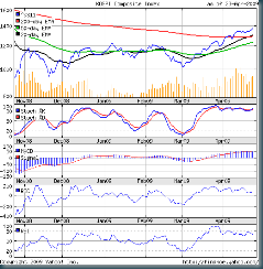
Let us look at the 6 months bar chart pattern of the FTSE 100 to see if it is trotting or cantering:-

FTSE_Apr2909

(Please right-click on the image above and open it in a new tab or window for a better view.)

After a spurt in early April '09 followed by a reaction, the FTSE 100 index has been moving in a sideways fashion with a slight upward bias. The 20 day and 50 day EMAs have become entangled, with the short term average ever so slightly above the medium term one.

The index is unable to move up fast - much like the Dow, and quite unlike the KOSPI or even the Hang Seng. Like the Dow, volumes are lower in Apr '09 than in Mar '09. The FTSE 100 is below its Jan '09 and Feb '09 tops, and well below the 200 day EMA. The bears are not giving up without a fight.

The slow stochastics has just moved into the overbought zone, indicating that the rally may have some more upside. The MACD is confirming that, with a gradual upward movement. However, the ROC and RSI are both making lower tops and moving sideways.

Bottomline? This rally should be utilised to lighten holdings - particularly in non-performing shares. Not a great time to enter. There will be better opportunities in the near future.

Wednesday, April 29, 2009

Stock Chart Pattern - Bharti Airtel

The stock chart pattern of Bharti Airtel will reveal why it is one of the favourite stocks of institutional and retail investors. Not only has the company provided innovative products and services, its rapid growth has provided huge capital appreciation to investors.

Today it has announced a maiden dividend and a 2:1 stock split. That should further consolidate its leadership position as the stock-to-own in the telecom services sector.

The 6 months closing chart pattern of Bharti Airtel shows that it has been outperforming the Sensex during the recent rally:-

Bharti_Apr2809

(Please right-click on the image above and open it in a new tab or window for a better view.)

Bharti had six straight closes above its 200 day EMA, while the Sensex continued to play hide-and-seek with its long-term average. The rise from the Mar '09 low has also been much sharper than that of the Sensex.

The 20 day EMA has moved well above the 50 day EMA and is likely to pierce the 200 day EMA from below. That will be the first confirmation that Bharti Airtel has entered a bull phase.

The slow stochastics is comfortably ensconced in the overbought zone and not showing any signs of moving out. The MACD and its signal line are both rising.  The RSI is about to enter the overbought zone. All good signs for the up move to continue.

But there are a few contra-indications. The ROC has turned down. Bharti's rise during the rally has been a bit too steep. Steep rallies tend to correct sharply as well. The biggest concern is the volume - or the lack of it. Such a rally should have been supported by a rapid rise in volumes. That hasn't happened - and is a negative sign.

Bottomline? An existing holder can keep riding the rally or book partial profits. Potential investors in Bharti Airtel should keep observing the chart pattern for a decent correction and then enter.

Tuesday, April 28, 2009

Will the H1/L1 US visa restrictions 'news' affect the IT sector?

A couple of months back, I had written a post about how to use financial news. Four categories of 'news' were discussed - good, great, bad and worse. Some suggestions about how to deal with such news were given.

What if there is a fifth category? Some item that appears in the pink papers or business channels as 'news' and causes some turmoil in the stock markets - but later turns out to be a misinterpretation? It wasn't really 'news'?

It is difficult to take any action till you receive further clarifications. Or, you may have an 'insider' in the industry or sector who can separate the wheat form the chaff and go to the core issue to advise you.

The recent 'news' about the H1/L1 visa restrictions for temporary non-immigrant workers in the USA is a case in point. The business channels went to town about it, asking leading members of the IT industry how these restrictions will affect their top lines and bottom lines.

Some retail investors dumped Infosys, TCS and other IT stocks. Some even stated that the leading IT sector stocks had become 'fundamentally weak'. The 'smart money' lapped up the stocks.

Any one who has spent a few years in the IT industry and has worked in the USA would take such 'news' in their stride. Because (s)he would know that similar 'news' keeps popping up every so often only to dissolve without a trace.

Why? Because the visa restriction 'news' was only a proposal by a couple of senators - pandering to the popular misconception that most of USA's unemployment problems have been caused by jobs being outsourced to India.

It takes a very long while - some times, forever - for such restrictive proposals to become a law. The proposal needs to be tabled and passed in the US Congress and the Senate. There will be a strong Indian-American lobby that will be working against it.

Even if the proposal gets through both houses, it is likely that there will be several amendments made to the original draft proposal. Each amendment will take its own sweet time to go through.

The US President has to sign the revised proposal to turn it into a 'law'. He has the authority to turn it down, or - you guessed it - seek more amendments. Many such proposals never get to become a law. Even if it does, most of the severe restrictions are likely to get diluted.

At the end of it all, should the visa restrictions become a law, it will not take effect retrospectively. Meaning, existing H1/L1 visa holders will not be affected. Only new visa applications made after the law comes into effect will face the restrictions.

Who might get affected the most in the IT sector? It will be the small body-shoppers whose business model is to hire out programmers to different US companies.

Also affected will be large US IT companies like Microsoft, Oracle, Cisco who employ significant numbers of H1/L1 software personnel from India. They will face difficulty in finding new employees from the US job market. So they will probably be lobbying the US government to veto such a restrictive proposal.

Infosys, TCS, Wipro have globally dispersed businesses, with a large portion of the work done 'offshore' in India. They will be inconvenienced, but the effect on their top line and bottom line will be very little.

Monday, April 27, 2009

Dow Jones (DJIA) Index Chart Pattern - Apr 24, '09

There has not been any significant change in the Dow Jones index chart pattern from the previous week. But a closer look at the technical indicators will confirm a sea change in investor perceptions.

The DJIA 6 months closing chart pattern will reveal the differences:-

Dow_Apr2409

(Please right-click on the image above and open it in a new tab or window for a better view.)

Two weeks back, I had commented that the DJIA seemed to be treading water around the 8000 level. It has continued to do that throughout the month of Apr '09. If you look at the closing tops since the global rally began in Mar '09, you may be able to perceive that the index is beginning to form a bearish 'rounding top' pattern.

The volumes in Apr '09 are lower than that in Mar '09, when the rally was in its initial stages. The 20 day EMA has crossed above the 50 day EMA but has not been able to pull away from it. The slowing of the upward momentum is quite visible.

Both the short and medium term averages as well as the Dow are well below the 200 day EMA. So we are still in a bear market.

But take a look at the slow stochastics. It has dived down from the over-bought region, confirming that the rally is coming to an end soon. The MACD has started falling and is about to go below its signal line. The ROC and RSI are moving in opposite directions near their midpoints. The 'smart money' seems to be moving out.

As Haresh Soneji of CNBC-TV18 wrote in his weekly article, the fund managers (like Bolton of Fidelity and Mobias of Templeton) are calling a new bull market; the economists, like Stiglitz, Krugman, Roubini are calling it a bear market rally. I'm on the side of the economists because they have no vested interests in a bear or a bull market.

Bottomline? Time to book profits - or hold on to your cash a while longer. Better opportunities to buy will be round the corner.

Sunday, April 26, 2009

Hang Seng Index Chart Pattern - Apr 24, '09

During the previous discussion about the Hang Seng index chart pattern on Apr 17, '09, this is what I had asserted:-

See where the Hang Seng has halted - even if temporarily? Around the 15600 level - which defines the top of the rectangular sideways consolidation pattern of the past 6 months. This level was earlier touched by the index in Oct '08, Dec '08 and Jan '09.

It is also the level where the 200 day EMA is currently poised. This combination of resistance at previous tops plus resistance at the long-term 200 day EMA may prove a tough hurdle to cross.

It was a tough hurdle indeed. One look at the 6 months bar chart pattern of the Hang Seng index will make it amply clear why I keep harping that successful stock market investing requires the ability to analyse the market both fundamentally and technically:-

Hang Seng_Apr2409

(Please right-click on the image above and open it in a new tab or window for a better view.)

Fundamental analysis would have correctly indicated that the 7 weeks long global market rally was not based on the underlying strength of the economies, but on the perception that things were bad but not getting worse. Some even saw the first signs of an economic turnaround.

The chart patterns that reflect the collective behaviour of different stock market participants indicated otherwise, and was able to guide that the rally may be fizzling out sooner than later.

The expected resistance at the 200 day EMA forced the index down to seek support at the 20 day EMA (which has stopped rising). The volumes have also dropped off.

The slow stochastics has turned down from the overbought zone. The MACD has flattened and is about to slip below its signal line. The ROC has turned down and reached the neutral level. The RSI is about to do the same.

Bottomline? The Hang Seng index chart pattern is indicating that the rally may be over. Investors should use the opportunity to book some profits or get rid of non-performing stocks. The index is back in the sideways consolidation range where it is likely to meander for a while.

Saturday, April 25, 2009

Sensex Chart Pattern - Week ending Apr 24, '09

In last week's discussion about the Sensex chart pattern, I had mentioned about the hesitation of the index near its 200 day EMA - as if it was finding it tough to make up its mind whether it wanted to remain below or move above the long-term moving average.

After two holiday shortened weeks, we had a full week of trading. The Sensex crept lower on the first three days, only for the bulls to resume control and move the Sensex up on Thursday and Friday.

Let us have a look at the 6 months bar chart pattern of the Sensex to find out if there is any indication of reversal of trend:-

Sensex_Apr2409

(Please right-click on the image above and open it in a new tab or window for a better view.)

Friday's (Apr 24, '09) near 200 point rise caused the index to close above its 200 day EMA for the second time this month. But can you see what were significant differences from the previous close above the long-term average on Apr 15, '09? No? That's because you haven't looked at the right places!

The close on Apr 24, '09 was 0.4% higher than on Apr 15, '09 - 45 points to be precise. Not clearly visible on the charts? Not that significant? You're excused for not noticing on both counts.

But what about the volumes? It was 35% lower on Apr 24, '09 compared to the volume on Apr 15, '09. A higher close on a significantly lower volume is a red flag. Are there other negatives as well? Yes.

Both the ROC and RSI continue to make lower tops as the Sensex moves higher - a 'divergence'. The MACD has flattened and is refusing to move up. (Only the slow stochastics is giving a positive spin with the %K moving above the %D in the overbought zone.)

Now compare the Sensex action with that of the KOSPI chart pattern discussed yesterday. Notice how the KOSPI had not only charged well above the 200 day EMA on significantly higher volumes, but its 20 day EMA had also nosed above the 200 day EMA - the first confirmation of a bull market.

No such luck for the Sensex - yet. The volumes are reducing, the indicators are giving negative divergences, and though the 20 day EMA and 50 day EMA are moving up, both are still below the 200 day EMA. Technically, we are in a bear market.

Bottomline? The Sensex rally is beginning to look like it is on its last legs. I won't be surprised if selling pressure sets in before settlement day on Thursday, Apr 30, '09. Extreme caution is the watchword. Fresh investments to be avoided.

Friday, April 24, 2009

KOSPI (Korea) Chart Pattern - Apr 23, 2009

In last week's discussion about the Sensex chart pattern, I had made the following assertion:

A quick look at indices around the globe reveals that Bovespa (Brazil), Venezuela and Chile in South America and Shanghai, TSEC (Taiwan) and Kospi (Korea) in Asia are the only six that have closed above their 200 day EMA, but the upward rally is slowing. All the other world indices are below their 200 day EMAs.

It is logical to have a look at the KOSPI (Korea) 6 months closing chart pattern to ascertain the status of the rally:-

Kospi_Apr2309

(Please right-click on the image above and open it in a new tab or window for a better view.)

Far from slowing down, the upward rally has resumed with new vigour. Before we look at the technical indicators, let us note the interesting index chart pattern.

The global stock indices, including the Sensex, made a new 52 week closing low on May 9, '09 before the rally started. But look at the KOSPI. It made a low on Mar 2, '09 - but this wasn't a 52 week closing low. That had happened all the way back on Oct 27, '08.

After testing the 52 week closing low in Nov '08, the KOSPI's rally started as the index made gradually higher tops and bottoms while still in a long term bear market. The sharp upward rally from Mar '09 also preceded the global rally by a week.

The index has now spent most of Apr '09 above its 200 day EMA, while global indices (barring the few mentioned) are struggling to reach - let alone cross - their respective 200 day EMAs. Now, have a look at the short and medium term EMAs.

The 20 day EMA moved above the 50 day EMA from below around the middle of Mar '09, and both averages moved steadily up along with the index. But see what happened after the past two days' trade? The 20 day EMA nudged above the flattening 200 day EMA from below - the first confirmation of a bull market.

The stronger confirmation will come if the 50 day EMA also crosses above the 200 day EMA. That seems like a question of 'when?' rather than 'will it'? The volumes in Apr '09 have been considerably higher than in Mar '09.

There is no long term resistance below 1500. So another 10% upside is quite likely before any serious correction can happen. (Coincidentally, the long term resistance for the Sensex is also 10% above its current level of 11300.)

Are there any negatives at all? A few. The MACD has stopped moving up for the past few trading sessions. Both the ROC and RSI have made lower highs while the KOSPI continues to make higher tops. This is a 'divergence' that can stop the rally and bring the index down below its 200 day EMA. May be not right away - but the possibility exists.

Bottomline? It appears that the smart money (read FIIs) have realised that the economies of the USA and Europe are in far worse shape and are betting their stakes on the relatively stronger economies of Brazil, China, India, Taiwan, Korea. The KOSPI chart pattern is reflecting that.

Thursday, April 23, 2009

DAX (Germany) Chart Pattern - Apr 22, 2009

Why did I choose to look at the DAX chart pattern? Two reasons. It has been nearly three weeks since I discussed the CAC (France) chart pattern and the FTSE (UK) chart pattern.  It is time to take another look at a European market.

More importantly, I was motivated to look at the DAX chart pattern by this article in the Wall Street Journal that paints a grim picture of the European economy, and Germany happens to be the largest economy of Europe.

Technical analysis experts say that all fundamentals are reflected in the chart patterns. Let us take a look at the 6 months bar chart of the DAX to find out the veracity of that assertion:-

DAX_Apr2209

(Please right-click on the image above and open it in a new tab or window for a better view.)

Readers who have been following my earlier posts on technical analysis of global indices may notice that the DAX chart looks more like the Dow chart than either the Hang Seng or the Sensex charts - both of which reached their respective 200 day EMAs during the recent rally.

The more striking thing to note is the near complete absence of volume confirmation. The up trend during Mar and Apr '09 have been on marginally higher volumes. This is a contra indication - so the rally is likely to terminate sooner rather than later.

The slow stochastics is still in the overbought zone but the %K has gone below the %D line. The MACD, ROC and RSI have all started to turn down. The technical indicators are all showing negative signs.

Is there nothing positive in the DAX chart pattern? Yes, a couple of them. The index is getting some support from the 20 day EMA. Plus the 20 day EMA has got its nose above the 50 day EMA, and both averages have turned up.

Bottomline? The DAX and its short and medium term averages are still below the 200 day EMA. The long term bear market is not over by a long shot. Caution advised to investors. The rally can be used to get rid of non-performing stocks in your portfolio.

Wednesday, April 22, 2009

Stock Chart Pattern - DLF Ltd

The stock chart of DLF has formed an interesting bottoming pattern. There are several reasons I don't much care about the real estate sector. Lack of transparency from managements, proliferation of 'black' money in most deals, lack of standards in revenue recognition and accounting, treating consumers like uneducated sheep, are some of them.

My intention is not to sit on judgement, but to interpret chart patterns. I don't like the sector so I don't invest in it. But a lot of individual investors got caught up in the real estate hype, and no stock was hyped up more than DLF in recent memory. (Fortunately there were no 'sub-prime' lending in the Indian markets - otherwise our economy would be in worse trouble!)

Let us have a look at the 6 months bar chart pattern of DLF:-

DLF_Apr2109

(Please right-click on the image above and open it in a new tab or window for a better view.)

Can you see the bottoming pattern? No? Take another look at the price chart. Two bottoms were made - one in early Feb '09, the other in Mar '09. These two bottoms helped in forming a nice 'rounding bottom' pattern. The 20 day EMA, which is the short-term smoothened version of the price chart shows a clear saucer-shaped pattern.

The volume confirmation is there as well - an increase in average volumes throughout the upward rally from Mar '09. But there is no need to get excited. It looks like a case of pattern failure. The rounding bottom and subsequent rally should have taken the stock past the strong resistance (from previous tops) at 300 level - where the 200 day EMA has also reached on its downward path.

In spite of the 20 day EMA crossing over the 50 day EMA from below - a bullish sign - the upward momentum wasn't strong enough to carry the stock to the immediate resistance zone. The 'reversal day' last Thursday (Apr 16 '09) and the retreating slow stochastics signalled the end of the up move.

The MACD has flattened (but remember that it is a trend following indicator). Both the ROC and RSI are heading down. I have been cautioning investors for a while that the sharp up move of the past 6 weeks  was a bear market rally which should be used to get rid of non-performing stocks.

Bottomline? If you haven't got rid of your DLF holding yet, you may get one more chance to do so. There is a possibility that this rally is taking a pause before trying to move higher again. But please do not harbour hopes about DLF reaching 1000 levels - not any time soon.

Tuesday, April 21, 2009

A Correction and some Observations about Mutual Funds and ETFs

About index funds and ETFs

This discussion is not about the correction that has been seen in global stock markets this week. In an article about two index funds, I had discussed about ICICI Pru Index Fund Retail and UTI Sunder. My broker pointed out that UTI Sunder is not an index fund but an index ETF. That means you require a demat account to purchase or sell units of the fund. The oversight is regretted.

Index ETFs are supposed to track the index closely. But due to the very low volume of transactions in the UTI Sunder ETF, unit prices move abnormally higher or lower even on small transactions. Investors may be better off with Nifty BeES, which tracks the Nifty more closely and has decent volume of transactions as well.

About SIPs

I often receive queries about SIP (Systematic Investment Plans) in mutual funds. My bias against SIP has been documented in this post. However, SIP works if used during sideways consolidation patterns - like the one we had in the Sensex for the past 6 months.

If you have the self-discipline, then keep the investment date flexible. Signing up for a SIP plan with a mutual fund every month or every quarter locks you into specific dates. You won't be able to take advantage if there are sharp market turns in between.

About Debt MFs

Some times investors ask me if they should put money into a debt mutual fund instead of a fixed deposit. I am old fashioned and have never invested in debt MFs. I like the assured return in a FD, even though the return is taxable. A quarterly interest payout from FDs provide a regular cash inflow - which a debt MF may not be able to match.

About Sector Funds

These are more risky and volatile than diversified equity funds. Unless you have a very good reason, avoid sector funds. There were a plethora of infrastructure fund offerings during the bull market. Many performed spectacularly. But their fall has been equally dramatic.

The only exception would be if you really know every thing about a sector, let's say the banking sector, that needs to be known but do not have sufficient cash to deploy in more than one stock. In that case, an investment in a banking sector fund may work for you.

About Gold ETFs

Buying and storing of gold - whether bars or coins or jewellery - has been a tradition with many Indian families. With the advent of gold ETFs, the hassle and risks in storing physical gold can be avoided.

According to some gold analysts, the bull period in gold has not ended. It is about to get even bigger and stronger. I've never bought gold or gold ETFs. But with the current uncertainty in the global economy, a small investment - not more than 5% of total investment portfolio - may not be such a bad idea. I'm looking at UTI's gold ETF for possible purchase.

If any reader has a better idea, I'd be more than happy to hear from you.

Monday, April 20, 2009

Dow Jones Chart Pattern - Apr 17, 2009

Last week, my comment about the Dow Jones chart pattern was: The upward momentum has definitely slowed and the index seems to be treading water around the 8000 level.

The DJIA closed higher for the 6th week in a row but was reluctant to go much beyond the 8000 level. Let us have a look at the 3 months bar chart pattern of the Dow:-

Dow_Apr1709

(Please right-click on the image above and open it in a new tab or window for a better view.)

The only difference from the previous week is that the 20 day EMA has crept up above the 50 day EMA. But the index has flattened out, and so have the slow stochastics (which is in the overbought region) and the MACD.

The ROC rose during the week but made a lower high. The RSI has turned down and is headed towards the midpoint. The Dow seems happy to be above the 50 day EMA and is in no hurry to get anywhere close to the 200 day EMA. As long as the index remains below the long-term average, this isn't a bull market.

Contrast this with the Taiwan (TSEC) and Brazil (Bovespa) indices - both of which have crossed their respective 200 day EMAs, though the upward momentum has slowed.

Despite some experts opining about 'green shoots' and 'light at the end of the tunnel', the economic slowdown is far from getting over. Home foreclosures are back with a bang and joblessness is not showing any signs of abating. The positive results declared by a few companies should be carefully checked with a fine-tooth comb for fictional content.

Bottomline? Investors should use this rally to get rid of their non-performing or dud stocks. Buying should be postponed till the next dip.

Sunday, April 19, 2009

Bovespa (Brazil) Chart Pattern - Apr 17, 2009

I had a look at the Bovespa chart pattern on Apr 7, '09 - when it had paused just below its 200 day EMA, much like what the Sensex chart pattern is doing now.

Let us have a look at the 3 months bar chart pattern of the Bovespa index to see what is different:-

Bovespa_Apr1709

(Please right-click on the image above and open it in a new tab or window for a better view.)

Last week, the Sensex crossed the 200 day EMA hurdle three days in a row, but only managed a close above it for a day. The Bovespa showed no such hesitation and after piercing the long-term average, closed 6 straight trading days above it.

Is that a clear indication of a reversal in trend from bear to bull market? Not yet. In spite of the 6 days spent above the 200 day EMA, the upward thrust seems to have lost momentum as the Bovespa pauses for breath.

Why do I say that? The answer lies in the technical indicators. While the slow stochastics has remained in the over bought zone for quite sometime - as it often does during bullish periods, the MACD and RSI has flattened out and the ROC is showing signs of moving down from an over bought region. Volume has also tapered off a bit, and that doesn't support an upward move.

Does it mean that the rally is over? May be not. Both the 20 day EMA and 50 day EMA are moving up sharply and may cross the 200 day EMA. That will confirm the change of trend.

Bottomline? Next week's trading needs to be watched closely. Like the index, investors should also pause a bit before deciding on the next course of action.

Saturday, April 18, 2009

Sensex Chart Pattern - Week ending Apr 17, '09

While discussing last week's chart pattern, I had mentioned that the Sensex had come to an interesting fork on the road. Unlike a more decisive Yogi Berra, the Sensex took three steps forward and a long step back on another holiday-curtailed week.

Let us take a look at the 6 months bar chart pattern to find out what happened on the 4 days of trading:-

Sensex_Apr1709

(Please right-click on the image above and open it in a new tab or window for a better view.)

On Apr 13, '09, the Sensex moved up to pierce through the upper level of 10945 of the rectangular consolidation pattern of the past 6 months and closed 22 points above it - but failed to touch the 200 day EMA. After the holiday on Apr 14, the Sensex charged up with renewed vigour above the long-term average on Apr 15, '09 and managed to close above it.

On Apr 16, '09 the Sensex opened higher than the previous day's high but profit booking on heavy volumes caused a drop below the 200 day EMA, with the close below the previous day's close and almost at the upper level of the rectangular consolidation pattern. This higher-high-lower-close on high volumes is a typical 'reversal day' pattern often seen at the end of a longish upmove.

On Fri. April 17, '09, the index opened below the 200 day EMA, soon crossed it without any problems but then faced heavy headwinds and closed below it, 75 points above the previous day's close.

So three days in a row, the Sensex crossed the 200 day EMA, but closed above it only on one day. That still leaves us at the fork on the road, with the Sensex unable to decide whether to take the high road or the low.

What do the technical indicators say? The slow stochastics continues in the overbought zone, though the %K has just dipped below the %D line. The MACD has stopped rising. But both the ROC and the RSI have turned down from overbought zones. Friday's higher close was on lower volumes. The Sensex seems to be hesitating, much like the Hang Seng, after reaching the 200 day EMA .

What do the experts say? Anthony Bolton, the respected fund manager at Fidelity, recently gave a call that this is not a bear market rally but the start of a new multi-year bull market. Nouriel Roubini, Professor of Economics at NYU who had correctly predicted the economic downturn way back in 2006, has mentioned in an article that this is nothing but a bear market rally and the light at the end of the tunnel that many optimists are able to see is actually very faint.

A quick look at indices around the globe reveals that Bovespa (Brazil), Venezuela and Chile in South America and Shanghai, TSEC (Taiwan) and Kospi (Korea) in Asia are the only six that have closed above their 200 day EMA, but the upward rally is slowing. All the other world indices are below their 200 day EMAs.

Bottomline? Wait and watch till the Sensex makes up its mind. My hunch is that we are still in a bear market rally, which the 'reversal day' on Apr 16, '09 may bring to a halt. But the possibility of a trend change remains. When the 20 day EMA and the 50 day EMA both rise above the 200 day EMA a new bull market will be confirmed.

Friday, April 17, 2009

Hang Seng Chart Pattern - Apr 17, 2009

It has been three weeks since I looked at the Hang Seng chart pattern on Mar 27, '09. What had I concluded then?

The index has penetrated both the 20 day EMA and the 50 day EMA from below, indicating bullishness. But it is still way below the 200 day EMA, which means it is still in a long term bear market. The double top above the 15000 level is likely to provide strong resistance.

Let us have a look at the current 6 months bar chart pattern of the Hang Seng to see what transpired:-

Hang Seng_Apr1709

(Please right-click on the image above and open it in a new tab or window for a better view.)

The index continued its upward rally along with the global markets, with the 20 day EMA crossing the 50 day EMA and both averages moving up with the Hang Seng - showing continued bullishness.

The slow stochastics, which had entered the overbought zone in the middle of Mar '09, happily stayed there while the MACD and ROC moved up. The RSI remained flat as the index went higher - a 'divergence' - but has turned up of late. Looks like it is 'all systems go' for the rally to continue.

But wait a minute. Please look at the chart pattern again. Find some thing interesting? See where the Hang Seng has halted - even if temporarily? Around the 15600 level - which defines the top of the rectangular sideways consolidation pattern of the past 6 months. This level was earlier touched by the index in Oct '08, Dec '08 and Jan '09.

It is also the level where the 200 day EMA is currently poised. This combination of resistance at previous tops plus resistance at the long-term 200 day EMA may prove a tough hurdle to cross.  The other thing to note is the volume. It increased in the second half of Mar '09 but has flattened off in Apr '09.

Bottomline? Investors should closely watch the chart pattern of Hang Seng next week. Crossing the 200 day EMA and staying above it for a few days may confirm a change of trend from bear market to bull market. But a reversal from the longer-term average would mean reverting to the sideways consolidation pattern for some more time.

Thursday, April 16, 2009

How to pick Stocks for Investment - Part II

In the first part of this short series of articles on stock picking, I had given some general guidelines about stock selection for investment. Today's discussion will center around the top-down method of stock selection.

Imagine a timber merchant who wants to lease several hundred acres of forested land. A land broker takes him to a nearby hill, from where he looks down at a forest in the valley below. What would he look for?

Is there a large enough density of trees that will take several years to get depleted? Is the soil conducive to adequate growth of saplings? Is there plentiful source of water nearby? Is the forest reasonably close to a highway system that will aid quick movement of logs? Is there a sufficient variety of trees to enable him to cater to a wider market?

If answers to such questions are in the affirmative, the timber merchant may decide to lease the forest tract. He looked at the 'big picture' from the top of the hill before deciding to invest his money. He will look at the nitty-gritty of exploiting the forest resources later.

Like the timber merchant, you are also a potential investor - but in the stock market. What is the 'big picture' you should see?

What is the state of the economy? Which stage of its up or down cycle is it in now? How is the domestic industry faring? Is the export industry meeting its targets? What is the balance of payments situation? Inflation? Liquidity? Is the Sensex in a bull or a bear phase?

I can almost anticipate your objections: "I'm a software engineer/lawyer/sales executive; this is all about macro-economics. How do you expect me to understand it? There must be an easier way!"

Well, if you wish to make the stock market a long-term source of additional income, you definitely need to learn the rudiments of economics.

At the very least, the concepts of supply and demand, cost and pricing, inflation and its relation to the interest rate scenario, basic accounting principles have to be grasped to have any chance of long-term success in the stock market.

You may have a friend who did nothing but happily follow tips from other friends and now owns a flat in Bandra (or Banjara Hills) and drives a BMW. Don't fall for that trap. He may have just got lucky. Check with your other friends. Most are not rich. Not from the stock market anyway.

So you look at the current 'big picture' and think that the economic and stock market cycles are in sufficiently conducive stages for you to invest some money. How will you decide? You can always take the help of a couple of my earlier blog posts: 'Market cycles and Sectors' and 'Which sectors should you invest in?'

In the first article, I've identified the sectors that come into prominence at different stages of the economic and stock market cycles. You don't have to invest in all those sectors. Choose three or four sectors about which you already have some knowledge (or you may know someone from those sectors who can help you with information). It is of utmost importance that you only invest in sectors about which you can gather adequate knowledge.

If you are still unable to decide on your sector choices, please read the second article mentioned above. I have outlined four sectors and the reasons why I like them for investment purposes.

Are we done yet? Not quite. After identifying three or four sectors (you need solid reasons to like them - not something vague like 'alternative energy is the next high growth area in India'), select three or four of the best known stocks in each sector.

You now have a list of 12-16 stocks from some of your favourite sectors. These need to be analysed in detail to arrive at the final list of 8-10 stocks for your core investment portfolio. (In Part III, I will discuss about the bottom-up method of stock selection.)

Wednesday, April 15, 2009

Stock Chart Pattern - Infosys Ltd.

For this week's stock chart pattern discussion, I could not think of a more appropriate stock than Infosys. A bellwether of the Indian stock market and a perennial favourite of foreign and domestic investors for the longest time, Infosys seemed to have lost its pride of place of late.

A quick look at the 6 months closing chart may allay some investor doubts:-

Infosys_Apr1309

(Please right-click on the image above and open it in a new tab or window for a better view.)

Well before the global rally started in Mar '09, Infosys moved up above its 20 day and 50 day EMA in Jan '09 - though it remained well below the 200 day EMA. After a small dip, it again moved up and remained above its short and mid-term EMAs till the middle of Feb '09.

After a 3 weeks period of sideways consolidation during which the stock made a higher bottom than the one made in late Dec '09, it started to move up again along with the global rally.

After initial resistance in late Mar '09, Infosys pierced through the 200 day EMA in the beginning of April '09, but then lost its upward momentum and consolidated sideways just above the 200 day EMA - probably due to uncertainty about the forthcoming results.

The above chart is updated up to Apr 13, '09 (the previous day of trading). The Q4 '09 result, declared earlier today (Apr 15, '09) was disappointing but not really disastrous. The  challenging outlook for the near future spooked the market and the stock crashed more than 5% from its previous close.

There are a couple of interesting indications on the chart. Both the ROC and the slow stochastics had started turning down from the beginning of April '09, while the MACD was making new highs and the RSI had flattened just below the overbought zone.

This 'divergence' was partly responsible for the profit booking that happened today, due to which the stock has dipped below its 200 day EMA. However, the 20 day EMA and 50 day EMA are both rising and the 200 day EMA is flattening out.

From early Nov '08, Infosys has made a 'saucer-like' chart pattern which is quite clearly identifiable from the 50 day EMA. This 'rounding bottom' pattern is considered bullish. A strong breakout upwards should be on higher volumes. Volumes have not been significantly higher during Apr '09.

Bottomline? Wait for the selling pressure to subside before entering the stock on the dip. Be prepared for a longish wait for  profits in front-line information technology stocks. There may be other stocks that can provide better returns. Please remember that, like HDFC, Infosys has impeccable management and is a FII favourite. This one is for patient, long term investors.

Monday, April 13, 2009

Dow Jones Chart Pattern - Apr 10, 2009

Compared to the week before, the Dow Jones chart pattern for the holiday-shortened week ending on Apr 10, '09 is showing signs of tiredness, in spite of Thursday's 250 point spurt on higher volumes.

A look at the 6 months bar chart of the Dow will reveal why:-

Dow_Apr1009

(Please right-click on the image above and open it in a new tab or window for a better view.)

The upward momentum has definitely slowed and the index seems to be treading water around the 8000 level. The 20 day EMA has turned up and merged with the 50 day EMA, which has been almost flat for the past several trading sessions.

The Dow is still well below the 200 day EMA, and is not behaving like it wants to cross it any time soon. The MACD is positive and the signal line is rising. But have a look at the other indicators.

The slow stochastics, ROC and RSI are all making lower highs as the Dow is trying to reach higher. This 'divergence' - noticeable in other world indices as well - is indicating a correction in the offing.

Compare the Dow chart pattern with the Taiwan (TSEC) and Sensex chart patterns discussed over the weekend. While the TSEC has pierced through the 200 day EMA and the Sensex is just short of doing so, the Dow is mirroring the weakness of the US economy by remaining well below the 200 day EMA.

Bottomline? Investors who are not risk averse (don't know if they exist any more!) can move some money out of US funds and start to deploy in Asia funds.

Sunday, April 12, 2009

Taiwan (TSEC) Chart Pattern - Apr 10, 2009

When I  discussed about the Taiwan (TSEC) chart pattern on Friday, Apr 3, '09 I had made the following observation:-

In the Mar '09 rally - in tandem with global markets - it has not only pulled out of the consolidation phase, but has made a clear 'rounding bottom' chart pattern on significantly higher volumes.

The TSEC has moved above the 20 day EMA and the 50 day EMA - both of which are moving up. This is a clear bullish sign. It is tantalisingly poised below the trend deciding 200 day EMA. My guess is that the 200 day EMA won't be able to stop the up move.

Let us take a look at the 6 months closing chart pattern of the TSEC to see what happened last week:-

Taiwan_Apr 1009

(Please right-click on the image above and open it in a new tab or window for a better view.)

Guess what? After getting resisted initially, the index pierced through the 200 day EMA - just as I had expected. What was my expectation based on? Firstly, the higher volumes. More importantly, the 'rounding bottom' pattern of the TSEC - which may not be discernible to the untrained eye, but is clear as daylight when you look at both the 20 day EMA and 50 day EMAs.

See how the shorter and mid-term EMAs have made saucer-like patterns on their climb upwards, along with the index on higher volumes? Classic technical stuff!

What next? Is a new bull market confirmed? Almost, but not quite yet.  The 200 day EMA is beginning to flatten out but the 20 day and 50 day EMAs are still below it. That may change soon.

There are a few other hurdles visible as well. Both the ROC and RSI have made lower tops while the index is making higher ones. This is a 'divergence'. The MACD is above its signal line and both are in the positive zone, but have stopped rising. The slow stochastics has been in the overbought zone for a month now, and may be due for a correction. Finally, the TSEC is only 200 points below the 6000 level where it is likely to face resistance.

Bottomline? The Taiwan (TSEC) chart pattern is looking the most promising among all the indices discussed so far and may well be signalling a new bull market. But there could be a correction to the up move in the near term.

Saturday, April 11, 2009

Sensex Chart Pattern - Week ending Apr 10, 2009

Before discussing the Sensex chart pattern for this week, I seek the indulgence of this blog's readers in a little trumpet-blowing. A leading Indian pink-sheet quoted some of the comments I made in last week's Sensex chart pattern discussion in a recent article. Interested readers may want to click on the link below:-

http://economictimes.indiatimes.com/Markets/Analysis/Market-bull-run-Technicals-indicate-otherwise/articleshow/4380215.cms

I emailed my friends, assuring them that now that I'm 'famous', I promise never to forget them. While most of them sent congratulatory messages, one had a question: "You may have fame, but do you have fortune?"

Not realising that this was an outswinger pitched outside the off-stump and should be left well alone, I poked at it and asked him what he meant. Pat came a pithy comment: "There are two kinds of people in this world - those who think fortune follows fame, and those who know fame can be bought with fortune."

Ouch!! I was out - caught first ball. Guess my two minutes of 'fame' wasn't even worth the paper it was printed on! Since fortune is supposed to favour the brave, I will bravely move on to discuss the 6 months bar chart pattern of the Sensex.

Sensex_Apr1009

(Please right-click on the image above and open it in a new tab or window for a better view.)

In a truncated week with only 3 days of trading, the Sensex continued its relentless upward rally that began a month ago, and hit 10929 in intraday trade on Apr 9, '09. A whopping 36% rise from the Mar 6, '09 intraday low of 8047.

The slow stochastics is firmly in the overbought zone. MACD and ROC are both positive. The RSI is also positive and just about entering the overbought zone. The Jan '09 high was crossed in style. As per a few US market analysts, a 20% plus rise from a recent bottom is supposed to indicate a bull market.

Some how, in spite of all the positives, I'm still not convinced that this rally is the first leg of a new bull market. I may be in a minority of one, but a few technical and fundamental hurdles remain on the way.

1. The volumes are nothing worth writing home about. Barely higher in Mar '09 over Feb '09, and marginally higher in April '09 so far. A new bull market should have significantly higher volumes.

2. The 20 day EMA is above the 50 day EMA and both have started to rise. This is a bullish sign. The Sensex is above both these EMAs. Also bullish. But so far, all three have remained below the 200 day EMA, so technically we remain in a long term bear market.

3. The past one month's rally has not seen any significant correction, except the big fall on Monday, Mar 30, '09. This is an anomaly. An index can't go on rising without proper correction from time to time - unless some one is manipulating it. Who? The insurance companies, more particularly, LIC. Why? Probably under the dictats of the wily Finance Minister, to give voters a feel good factor before the impending general elections.

4. The corporate results for the financial year Apr '08 to Mar '09 will start hitting the markets from next week. They are not expected to be good. Anecdotal evidence suggests that the results for the next two quarters aren't going to be great either. Weak fundamentals can't prop up the market for long.

Now we come to an interesting fork on the road. (As the New York Yankees baseball coach Yogi Berra had famously said: "When you come to a fork on the road, take it!") This is what makes technical analysis so much fun.

The intraday high of 10929 is nearly the same as the intraday high of 10945 made on Nov 5, '08. After touching it, the Sensex dropped down more than 125 points on Apr 9, '09.

Please remember that the level of 10945 has defined the upper limit of the sideways rectangular Sensex chart pattern formed over more than 5 months. Since the Sensex is also tantalisingly below the 200 day EMA, bears may try to take control. That means the Sensex will remain within the rectangular chart pattern and the long term bear market will continue.

However, if the buying momentum continues for a few more days, and the possible resistances at 10945 and the 200 day EMA at 11200 are overcome, the Sensex may go all the way up to the 12000-12500 long term resistance zone. That may be a tough resistance to cross.

Bottomline? Keep your eyes glued to the Sensex chart over the next couple of weeks. If the bears take control and there is a sharp sell-off, one can start buying in small quantities again. If the Sensex goes up above 11500, start getting rid of some of the second and third rung stocks remaining in your portfolio.

Friday, April 10, 2009

Stock Chart Pattern - Reliance Capital Ltd.

For this week's stock chart pattern discussion, I've chosen Reliance Capital. Readers of this blog may be a bit surprised, since I've been quite outspoken about my abhorrence for the word 'Reliance'.

The reason will become apparent when we take a look at the 6 months bar chart pattern of Reliance Capital:-

RelCap_Apr0909

(Please right-click on the image above and open it in a new tab or window for a better view.)

The stock chart pattern of Reliance Capital seems to be lagging the Sensex chart pattern. It made a 52 week low in Nov '08, which was tested again in Dec '08. A 2 months sideways consolidation followed, after which the stock broke downwards and made a new 52 week low in Mar '09 along with most global markets.

The rally that followed first pierced the 20 day EMA from below; took support on it for a few sessions, then moved sharply up to pierce the 50 day EMA and is now taking support from it. The 50 day EMA has flattened and the 20 day EMA is moving upwards, but is still below the 50 day EMA.

Right through Mar '09 and in Apr '09 volumes have been expanding.  From the recent bottom at 274, the stock has jumped nearly 75% to touch 479.

The ROC and MACD are in the positive zones. The RSI is just below the overbought zone, and hesitating to go further up. The slow stochastics has entered the overbought zone. So, it looks like the  rally may continue for a bit more.

The down sides? The stock is well below the 200 day EMA, which means it is still in a long term bear phase. Though it has gone above the most recent top made in Feb '09, it is still below its Jan '09 high of around 625. Before it can reach there, the stock is likely to face resistance in the 490-500 zone.

Bottomline? Short term investors can enter the stock on the next dip, which can provide profits of about 50% (or 200 points). Why would a long term investor be interested in the Reliance Capital stock chart pattern? The reason is its 'hidden' assets. The mutual funds business alone has assets under management (AUM) of Rs 80,000 Crores - the largest mutual fund business in India. At a conservative valuation of 5-7% of AUM, the mutual funds business alone is worth Rs 5000 Crores. And I've not even talked about its rapidly growing insurance business, plus its stock broking, private equity, consumer finance and distribution of financial products businesses!

Tuesday, April 7, 2009

Bovespa (Brazil) Chart Pattern - Apr 6, 2009

Brazil's Bovespa chart pattern looks quite different from all the index chart patterns discussed so far. The only similarities are the Mar '09 rally, and the stock index being below the 200 day EMA, indicating a long term bear market.

The striking differences in the Bovespa 6 months closing chart pattern can be seen below:-

Bovespa_Apr0609

(Please right-click on the image above and open it in a new tab or window for a better view.)

Most global indices made a 52 week low in Mar '09. Bovespa's Mar '09 low is almost 30% above its 52 week low made in Oct '08.

In Jan '09, the 20 day EMA moved up from below to touch the 50 day EMA. Thereafter, the 20 day EMA and 50 day EMA have been in a tight embrace while the Bovespa consolidated in a rectangular sideways pattern between the 38000 and 42000 levels - well above the Oct '08 52 week low and the higher Nov '08 low.

The global rally that started in Mar '09 culminated with the Bovespa moving above the rectangular sideways pattern on April 2, '09. But the 200 day EMA provided strong resistance. The volume has also fallen off the past couple of days.

The technical indicators - slow stochastics in the over bought zone, MACD, ROC, RSI in positve zones - are confirming the recent bullishness.

Bottomline? The overall chart pattern of the Bovespa is looking a lot stronger than the Dow and the Sensex.  But the resistance by the 200 day EMA and the volume drop off may be the first signs of the global bear market rally coming to an end soon.

Monday, April 6, 2009

Dow Jones Chart Pattern - Apr 3, 2009

In last week's discussion of the Dow Jones chart pattern, I had pointed out the similarities and differences with the Sensex chart pattern. This week's chart patterns of the Dow and Sensex have more similarities than differences. In fact, they almost look like carbon copies (remember those?) of each other.

A look at the Dow Jones 6 months closing chart pattern will make it clear:-

Dow_Apr0309

(Please right-click on the image above and open it in a new tab or window for a better view.)

The similarities first. The slow stochastics is in the over bought zone, but looks like it wants to stay there awhile. MACD is positive. ROC and RSI indicators have reacted from over bought areas and have made lower highs, indicating 'divergence'. But overall, the indicators are confirming the bullish behaviour of the index.

But there are a few significant differences with the Sensex chart pattern. The recent Apr '09 high is still way below the Jan '09 high. Volume during the later part of the rally (that began in early Mar '09) is lower than that in the earlier part of the rally.

The 20 day EMA is turning upwards but is still below the 50 day EMA. (In the Sensex chart pattern discussed on Saturday, the 20 day EMA had crossed above the 50 day EMA.)  So the Dow rally appears to be weaker than - and lagging - the Sensex rally.

Bottomline? For investors interested in the near term outlook of the Sensex, looking at the TSEC (Taiwan) and Hang Seng indices may give a better picture. The stock market technicals are beginning to reflect the fact that Asian economies are in a better shape than those of the USA and Europe.

Sunday, April 5, 2009

CAC 40 (France) Chart Pattern - Apr 3, 2009

Last week I had discussed the FTSE chart pattern and how it was looking weaker than the Hang Seng and the Sensex. This week we will take a look at another Europen stock index, the CAC 40.

The 6 months closing chart pattern of the CAC 40 is also looking rather weak:-

CAC_Apr0309

(Please right-click on the image above and open it in a new tab or window for a better view.)

Unlike many other global indices, the CAC 40 never quite entered a consolidation pattern, except for the month of Dec '08. It has been continuously making lower tops and bottoms, and made a 52 week low in early Mar '09 before joining the global market rally.

But the rally looks a lot weaker with the volume spurt missing.  The CAC 40 has pierced through the 20 day EMA and 50 day EMA from below and is trading above both EMAs. The 50 day EMA is beginning to flatten and the 20 day EMA is trying to move above it.

All the technical indicators - the slow stochastics, MACD, ROC and RSI - are looking positive. But like in the Sensex discussion yesterday, both the ROC and the RSI have made lower highs while the CAC 40 was making a new high. This 'divergence' is likely to check the upward rally in the near term.

Note that the closing level made on Apr 2, '09 is almost 400 points lower than the highest close made in Jan '09. Contrast this with the Sensex close of Apr 2, '09 which touched the Jan '09 closing level.

Bottomline? In a globalised economy, action in stock markets in one geographic zone invariably has a reaction in a different zone. But after looking at the weaker FTSE and CAC chart patterns, it is becoming apparent that the Sensex outlook will be clearer by looking at the chart patterns of Hang Seng and TSEC (Taiwan).

Saturday, April 4, 2009

Sensex Chart Pattern - Week ending Apr 3, 2009

The Sensex chart pattern is beginning to look more bullish this week in tandem with most of the the global index chart patterns. After a sharp pullback on Monday, Mar 30, '09 the Sensex resumed its upward journey with renewed vigour.

The 6 months closing chart pattern of the Sensex is still lagging the chart pattern of the Taiwan index discussed yesterday:-

Sensex_Apr0309

(Please right-click on the image above and open it in a new tab or window for a better view.)

The 20 day EMA has now crossed above the 50 day EMA from below. and the Sensex is above both these EMAs and is rising. Volumes are supporting this rise, as are the number of advancing shares each day.

The ROC and RSI have moved down from over bought regions but are trying to go back up again. The MACD is in the positive zone. The slow stochastics is in the overbought zone and looks like it is quite comfortable in its surroundings.

So, with all technical indicators showing bullishness, is it all systems go for a further rise? May be, or may be not. There are three contra indications that need to be watched closely.

Firstly, the Sensex is still below its 200 day EMA and also below the upper level of 10950 of the rectangular consolidation chart pattern of the past 5 months. Technically, we are still in a long term bear market.

The more interesting thing to note are the ROC and RSI behaviours. While the Sensex had made a higher high at the end of the week, both the ROC and RSI have made lower highs. This is a 'divergence' in technical parlance, and indicates a possible correction in the offing.

Last, but not the least, the high made by the Sensex last week is almost the same as the high made in early Jan '09, when the Satyam scam hit the market. This could be a good enough reason for some profit booking in the coming week.

Though the fundamentals of the Indian economy have not improved much, the euphoria caused by the G20 announcement of creating a trillion dollar fund for the IMF to bestow on weak economies has had a sea change in sentiments.

When people feel that things are getting better, they start to spend and things do get better. So it is kind of self-fulfilling. Sentiment has a big role in the stock markets in the short run. No wonder global markets are charging up.

Eventually, the reality is going to bite. Regardless of how much money different governments print to charge up their economies, changes at the ground level will take time. A lot of cash swishing around will then boost inflation, which markets do not like.

Bottomline? My last week's concerns are still valid. But buying momentum can take the Sensex past the two resistance levels of 10950 and 11300. If you haven't bought during the sideways consolidation phase, do not buy now. You won't miss the bus. More buying opportunities will come.

Friday, April 3, 2009

TSEC (Taiwan) Chart Pattern - Apr 3, 2009

Last week, we had taken a look at the Hang Seng chart pattern, and it looked quite similar to the Sensex chart pattern. The Taiwan index chart pattern gives quite a different view.

Let us have a look at the TSEC 6 months closing chart pattern:-

Taiwan_Apr 0309

(Please right-click on the image above and open it in a new tab or window for a better view.)

After a sharp fall like most global indices, the TSEC jumped off its 52 week low in late Oct '08, but went down to a new 52 week low in Nov '08. It moved into a sideways consolidation for the next three months.

In the Mar '09 rally - in tandem with global markets - it has not only pulled out of the consolidation phase, but has made a clear 'rounding bottom' chart pattern on significantly higher volumes.

The TSEC has moved above the 20 day EMA and the 50 day EMA - both of which are moving up. This is a clear bullish sign. It is tantalisingly poised below the trend deciding 200 day EMA. My guess is that the 200 day EMA won't be able to stop the up move.

Why? Other than the EMAs and volume confirmation, the MACD, ROC and RSI are also showing bullish patterns. The slow stochastics is in the over bought zone, but a market can stay over bought for quite some time during a bull phase.

Bottomline? The TSEC chart pattern is clearly showing a trend change from bear market to bull market. A harbinger of what is to follow in the global markets?

Thursday, April 2, 2009

Stock Chart Pattern - Hero Honda Ltd

While discussing the chart pattern of ICI India Ltd on Mar 4, '09, I had mentioned how the stock was proving resilient after hitting a low in Oct '08 by slowly making higher tops and bottoms. But it still remained in a bear phase - below the 200 day EMA.

If you look at the 1 year closing chart pattern of Hero Honda Ltd, it will warm the cockles of your heart:-

HeroHonda_Mar3109

(Please right-click on the image above and open it in a new tab or window for a better view.)

After going below the still-rising 200 day EMA in June '08, Hero Honda made a 52 week low at around 630 in July '08. The Sensex and almost all the known stocks were in a steep fall at this stage and most made their 52 week lows around Oct 27, '08.

But Hero Honda entered a new bull phase! After sharply moving above the 20 day EMA, the 50 day EMA and the 200 day EMA, it fell back below the 200 day EMA in late Oct '08 - along with the rest of the market. But it made a higher low on the stock chart.

It stayed in a sideways consolidation pattern for most of Nov '08 before embarking on an unbridled bull run, which is getting stronger as time passes. There were two short corrective phases in between. One in Jan '09 was supported by the 200 day EMA. The one in Mar '09 was supported by the shorter term 20 day EMA.

From the Jan '09 corrective phase onwards, Hero Honda has remained above all the three EMAs - the 20 day, 50 day and 200 day - with the shorter term averages above the longer term ones. This is the clearest sign of a bull phase.

The only note of caution is that the Mar '09 rally in the rest of the stock market has propelled Hero Honda far above the 200 day EMA and all three EMAs are pointing sharply upwards. This is usually the sign of an imminent correction.

The slow stochastics, and ROC are trying to move down from over bought regions. The MACD is still going strong. But have a look at the RSI. It has made a lower top while the stock is making higher ones. This is a 'divergence' in technical terms and indicates the possibility of a correction soon.

In Hero Honda's case, the technicals seem to reflect the fundamentals. Two-wheeler sales are strong and growing, in spite of the fact that the parent Honda Motors of Japan is becoming an active competitor.

Bottomline? Hero Honda is one of the few index stocks that is in a bull phase. New investors may buy on dips. Existing investors should hang on tight and enjoy the ride.