Saturday, January 31, 2015

Did Coal India’s share divestment trigger the stock market fall on Friday?

Before an answer to the question can be attempted, let us look at some facts and figures.

The government had offerred to divest 5% of its equity holding at a ‘floor price’ of Rs 358, with a 5% ‘greenshoe’ option. What that means in plain English is that in case of an oversubscription, the government would part with a total of 10% of its equity holding.

As per reports, there was an oversubscription. That also means the offer price may be a little higher than the floor price.

The total amount likely to be realised from the share divestment is a huge Rs 24000 Crores – which is more than 50% higher than the amount realised from Coal India’s IPO back in Oct ‘10.

FIIs put in bids worth a reported Rs 5400 Crores. That is about the size of their net investment in equities in an average month. Since FIIs were net sellers of equity yesterday, it is fair to conclude that some of them booked profits in the secondary market to invest in Coal India’s offer.

That leaves a balance of more than Rs 18000 Crores, which must have been invested by DIIs and individual investors. DIIs were also net sellers of equity on Friday. Some of them must also have booked profits in the secondary market to finance their investment in Coal India’s offer.

So, the obvious answer to the question is a qualified ‘Yes’. Why qualified?

Because stock markets don’t fall on facts alone. They also fall on expectations of future events. As per a recent article in Business Standard, in the pipeline are divestments from ONGC worth Rs 15000 Crores, and HDFC Bank worth Rs 10000 Crores. Both offers are going to receive enthusiastic support from investors of all hues. There are smaller offers from PFC (Rs 1900 Crores) and REC (Rs 1600 Crores) that are awaiting government’s nod.

To top it all, a few PSU banks came out with disappointing Q3 results. Since the stock market was at a lifetime high after a 10 day rally that pushed technical indicators into their overbought zones, the stage was ideally set for a correction.

Putting matters into perspective, Sensex and Nifty corrected by about 2% from their lifetime highs touched yesterday, and closed marginally lower for the week. Some more correction may be on the cards till the overhang of share divestments is dissipated. The dip can be used to add to fundamentally strong stocks in your portfolios.

That was the long answer. The short answer is: Yes.

Wednesday, January 28, 2015

Are consumers benefitting from falling oil prices? – a guest post

Oil prices have fallen off a cliff - from above $110 a barrel to less than $50 a barrel in the space of 6-7 months. Part of it was due to speculation. Discovery of huge quantities of shale oil in USA, and development of technology for extracting it at reasonable cost has reduced the dependence on Middle-East oil.

Since most of India’s oil requirements are met by imports, falling oil price has been a boon for our economy – reducing our current account deficit considerably. Reduced prices of petrol and diesel have benefitted consumers – but not to the extent it should have. The government has taken the opportunity to increase excise duty.

In this months’ guest post, Nishit analyses the effect of falling oil prices and increased excise duty to show that consumers are paying at least Rs 8-10 per litre more than what they should. It is probably the government’s way of compensating the oil marketing companies for the past several years of under-recoveries. Does that provide an opportunity to invest in OMCs like BPCL and HPCL?

--------------------------------------------------------------------------------------------------------------------------------------------

The unprecedented fall in oil prices in the international market have reduced pump prices of Diesel and Petrol by large margins. However, consumers are not getting the full benefit of lower oil prices. Let us try and see the reason why.

Brent crude has come down from $115 per barrel in June ’14 to about $50 a barrel, a reduction of 56%. Petrol prices, which were deregulated, have reduced by about Rs 15. (I am taking Mumbai prices as a benchmark just to get average percentage reduction). This reduction constitutes about 19%. The prices have gone down from about Rs 81 a litre to Rs 66.

The Government has increased excise duty on Petrol by about Rs 9 per litre. This constitutes about 11% price drop being absorbed by the Government. If we add up the price reduction and the excise duty hike, the total comes to about 30% reduction from peak prices.

The question which begs to be answered is where is almost 25% of balance reduction going to? Pump prices should be Rs 36 if we take straight linear co-relation. But looking at a complex tax structure, let us add another Rs 10 to the equation. The pump price should be between Rs 45-48. This Rs 10 is being factored in as there is a fixed cost of refining, dealer commission, etc.

Considering everything, consumers are paying at least Rs 8-10 more than they should. Oil marketing companies are hiding behind the fact that they are having to bear inventory losses since they buy at least 6-8 weeks in advance.

This argument can hold for only a short time. If oil prices sustain below $50 a barrel for even a month more, the inventory losses argument will not work.

Also, when prices went up, did consumers get the benefit of inventory profits? Now they are bearing the brunt of the so-called inventory losses!

Another factor is the Rs 9 excise duty. If oil prices go up, will the Government roll back these duty gains so as to cushion the consumer?

The calculations of taxes have been made so complex that it is beyond the understanding of most people.

The real test of the Government would come when oil prices begin to go up again. Right now, in this fiscal, the Government stands to mop up about Rs 20000 Crores from these hikes.

--------------------------------------------------------------------------------------------------------------------------------------------

(Nishit Vadhavkar is a Quality Manager working at an IT MNC. Deciphering economics, equity markets and piercing the jargon to make it understandable to all is his passion. "We work hard for our money, our money should work even harder for us" is his motto.

Nishit blogs at Money Manthan. You can reach him at nish.stockid@gmail.com)

Tuesday, January 27, 2015

WTI and Brent Crude Oil charts: an update

WTI Crude chart

WTI Crude_Jan2615

The daily bar chart pattern of WTI Crude oil attempted a weak rally that briefly crossed the 50 level, but faced strong resistance from the falling 20 day EMA. Oil’s price has consolidated sideways in a range between 45-50 for most of this month, but looks ready to fall further.

Daily technical indicators have corrected oversold conditions, but their upward momentum is already coming to an end. MACD is rising above its signal line but remains well inside its oversold zone. RSI emerged from its oversold zone, but is sliding down. Slow stochastic has re-entered its oversold zone.

Oil’s price is trying to find a bottom at 45, but bears appear to be tightening their grip.

On longer term weekly chart (not shown), oil’s price is trading far below its three weekly EMAs in a long-term bear market. Weekly technical indicators are deep inside their respective oversold zones. There is no sign of a reversal of the bear market as yet.

Brent Crude chart

BrentCrude_Jan2615 

The daily bar chart pattern of Brent Crude oil has been consolidating sideways in a range between 47-52 since the beginning of this month. However, the entire trading has occurred below the three falling daily EMAs in a bear market.

Daily technical indicators have corrected oversold conditions. In fact, MACD and RSI have formed ‘double bottom’ reversal patterns inside their respective oversold zones. But that has not inspired bullish possibilities.

MACD is rising above its signal line, but remains inside its oversold zone. RSI failed in its attempt to climb out of its oversold zone. Slow stochastic has just managed to emerge from its oversold zone.

On longer term weekly chart (not shown), all three weekly EMAs are falling, and oil’s price is trading well below them in a long-term bear market. Technical indicators are deep inside their respective oversold zones. Bears may resume their selling soon.

Monday, January 26, 2015

Stock Index Chart Patterns: S&P 500 and FTSE 100 – Jan 23, 2015

S&P 500 Index Chart

SPX_Jan2315

The daily bar chart pattern of S&P 500 shows a ding-dong battle between bulls and bears. A couple of downward breaches of the lower support line of the bearish ‘rising wedge’ pattern have been followed by upward bounces back inside the wedge – one at the beginning of the month and one last week. On both occasions, the index faced strong resistance from the 2064 level and dropped lower.

Both downward breaches were within the 3% ‘whipsaw’ limit – which may explain why the index successfully pulled back within the wedge. Observant readers may note that the index has closed below the wedge once again, but remains above its three EMAs in a long-term bull market. Despite a long bull phase followed by a clearly visible bearish pattern, the index has not reversed trend yet. The wedge may need to be slightly redrawn based on the next few days trading.

The index has been consolidating sideways in a range between 1988 and 2064 during this month. The possibility of such a consolidation was mentioned in last week’s post.

Daily technical indicators are looking bullish – but not overly so. MACD has crossed above its signal line, but is in negative zone. RSI crossed above its 50% level, but has turned down. Slow stochastic is looking the most bullish by rising sharply towards its overbought zone.

On longer term weekly chart (not shown), the index dropped below its 20 week EMA for the third week in a row but closed above it – and is trading above its three weekly EMAs in a long-term bull market. All three weekly technical indicators are in bullish zones but MACD and Slow stochastic are showing downward momentum. Let a clearer picture emerge before taking any buy/sell decision.

FTSE 100 Index Chart

FTSE_Jan2315

In a surprising bullish move, the daily bar chart pattern of FTSE 100 rallied for 7 straight days to move comfortably move above its three daily EMAs, and broke out above the large ‘symmetrical triangle’ pattern within which it was consolidating since early Sep ‘14.

Daily technical indicators were showing some bullish signs last week. They are now turning overbought. MACD has climbed to the edge of its overbought zone. RSI is just below its overbought zone. Slow stochastic is well inside its overbought zone. The index may pullback towards the triangle – giving a buying opportunity.

The 20 day and 50 day EMAs have started rising up towards the 200 day EMA. Both will need to cross above the long-term moving average for bulls to regain control.

On longer term weekly chart (not shown), the index is trading well above its three weekly EMAs in a long-term bull market. The 20 week EMA is about to cross above the 50 week EMA. Weekly technical indicators are looking bullish. Time to initiate long positions.

Friday, January 23, 2015

BSE Sensex and NSE Nifty 50 index chart patterns – Jan 23, 2015

Previous week’s 25 bps interest rate cut by RBI had come as a surprise for the stock market – not because it was unexpected but because the timing of the cut was a month ahead of schedule. Bulls reacted with ‘gap up’ moves out of ‘symmetrical triangle’ consolidation patterns formed on Sensex and Nifty charts.

Another surprise was in store this week. The ECB announced an expected quantitative easing programme, but the quantum was larger and duration longer than what the market had discounted. ‘Gap up’ moves saw both Sensex and Nifty indices touch new lifetime highs.

FIIs have turned strong net buyers of equity. DIIs have turned net sellers. Some of the extra liquidity from Europe is likely to flow to India. A number of PSU divestments planned till Mar ‘15 may act as a brake to the bull charge.

BSE Sensex index chart

Sensex_Jan2315

The daily bar chart pattern of Sensex hesitated briefly near its Dec ‘14 ‘double top’ at 28809 before climbing and closing above the 29000 level. Since the previous top was crossed with rising volume support (not shown on chart), it may turn into a support level. Technically, the index is within the 3% ‘whipsaw’ limit of the 28809 level. A close above 29675 will validate the break out above 28809.

Daily technical indicators are looking bullish, but a bit overbought. MACD is rising above its signal line towards its overbought zone. ROC is well inside its overbought zone, but its upward momentum has stalled. RSI is hovering near the edge of its overbought zone. Slow stochastic is well inside its overbought zone, but is moving sideways.

In a strong bull market, Sensex can remain overbought for long periods. However, after 7 straight days of rallying, some consolidation or correction may be on the cards. Next week is a holiday-shortened trading week, which also happens to be F&O settlement week. That may slow down bullish activity.

NSE Nifty 50 index chart

Nifty_Jan2315 

The weekly bar chart pattern of Nifty crossed easily above its previous top of 8627, backed by good volume support. A close above 8890 will give back total control to bulls.

Weekly technical indicators are bullish and looking a bit overbought. MACD has moved up to touch its sliding signal line just below its overbought zone. ROC has crossed above its 10 week MA, and is poised to enter overbought territory. RSI and Slow stochastic have entered their respective overbought zones.

Nifty is trading well above its two weekly EMAs in a long-term bull market.

Bottomline? Chart patterns of BSE Sensex and NSE Nifty indices have rallied to touch new lifetime highs. Hold on to your portfolios and enjoy the ride. If you are planning to enter now, choose a diversified equity fund or a balanced fund instead of trying your luck with individual stocks. Avoid stocks that appear ‘cheap’.

Wednesday, January 21, 2015

Nifty chart: a mid-week update (Jan 21 ‘15)

The unscheduled interest rate cut by RBI seems to have recharged the batteries of FIIs. Their buying spree over the last four trading sessions have turned them into net buyers of equity in Jan ‘15 from being net sellers. Not surprisingly, DIIs have turned net sellers. That could not prevent Nifty from soaring to a new lifetime high.

IMF has forecast that by 2016-17, India will be growing the fastest among major economies. The expected GDP growth of 6.5% is likely to outpace China’s expected GDP growth of 6.3%. A possible quantitative easing programme announcement by ECB will boost bullish sentiments further.

Q3 results declared so far have been uninspiring. Top and bottom line pressure is visible across sectors. There has been a noticeable shift by investors towards large-cap companies of late.

Nifty_Jan2115

Nifty broke out upwards from the ‘symmetrical triangle’ pattern within which it was consolidating for the previous 6 weeks. The break out occurred with an upward ‘gap’ and an increase in volumes that provided technical validity to the break out.

Subsequent buying on good volumes propelled the index above its Dec 4 top of 8627 to new lifetime intra-day and closing highs. Nifty has again entered ‘blue sky’ territory with no known resistances.

All three EMAs are rising, and Nifty is trading well above them in a long-term bull market. The consolidation within the triangle provided a good opportunity to investors to reallocate and streamline their portfolios.

Daily technical indicators are looking bullish, but a bit overbought. MACD is rising above its signal line in positive territory. ROC has climbed sharply above its 10 day MA to enter overbought territory. RSI has moved up to the edge of its overbought zone. Slow stochastic is well inside its overbought zone.

Nifty may consolidate or correct a bit before continuing its up move. This is not the time to feel excited or to buy unknown ‘cheap’ stocks. That is a sure recipe for disaster.

With interest rates likely to come down further during this calendar year, investing a portion of your savings in long-term debt funds makes a lot of sense.

Tuesday, January 20, 2015

Gold and Silver charts: an update

Gold Chart Pattern

GOLD_Jan1615

There has been a significant change on the daily chart pattern of gold since the previous post. The 40 months long bear market that started after gold touched its lifetime high in Sep ‘11 appears to be over. Why?

Note that gold’s price formed a slightly complicated ‘inverse head-and-shoulders’ reversal pattern that took more than 4 months to complete. The left and right shoulders have been labelled as S1 and S2 respectively. The ‘head’ itself is a ‘double bottom’ reversal pattern. The 20 day EMA has formed a more easily discernible ‘inverse head-and-shoulders’ pattern.

The reversal pattern has formed over several months after a long bear period – giving it technical ‘strength’. The eventual break out above the falling neckline was followed by a strong volume break out above the falling 200 day EMA into bull territory. It can be concluded that the bear market is all but over technically.

All three daily technical indicators are inside their respective overbought zones. A pullback towards the 200 day EMA is a possibility. The pullback can be used to enter – in case one has missed buying on the break out.

Those who are more inclined to assess fundamental signals may say that removal of the cap on Swiss Franc’s exchange rate against the Euro provided the bullish trigger. Those who are more technically inclined will appreciate the formation of a large reversal pattern prior to the break out.

On longer term weekly chart (not shown), gold’s price has crossed above its 20 week and 50 week EMAs, but is trading below its falling 200 week EMA in a long-term bear market. Technical indicators are looking bullish, though MACD is still inside negative territory. Bears may put up a strong fight near 1340.

Silver Chart Pattern

SILVER_Jan1615

The daily bar chart pattern of silver has broken out above the falling neckline of an ‘Inverse head-and-shoulders’ reversal pattern. Good volume support has provided technical validity to the break out. Is the 46 months long bear market finally coming to an end?

Possibly, yes. However, the falling 200 day EMA needs to be crossed with strong volume support for the bear market to get reversed. So, bulls have their work cut out.

Daily technical indicators are bullish, but looking a bit overbought. MACD and RSI are on the verge of entering their respective overbought zones. Slow stochastic is already inside its overbought zone.

The zone between 18-19 is a long-term support-resistance zone. Bulls may regain control only if the 19 level is crossed convincingly.

On longer term weekly chart (not shown), silver’s price has crossed above its 20 week EMA, but is trading below its 50 week and 200 week EMAs in a long-term bear market. MACD is still in negative zone. RSI and Slow stochastic have crossed above their respective 50% levels.

Monday, January 19, 2015

Stock Index Chart Patterns: S&P 500 and FTSE 100 – Jan 16, 2015

S&P 500 Index Chart

SPX_Jan1615

The daily bar chart pattern of S&P 500 breached the lower support line of the ‘rising wedge’ pattern for the second time in two weeks. This time, it remained below the wedge – though it did attempt a pullback on the last day of the week.

A break down from a bearish pattern is often followed by a pullback towards the pattern. It provides a selling opportunity to those who may have missed selling on the break below the wedge pattern.

Can the index make another recovery and re-enter the wedge from below? The 3% ‘whipsaw’ rule says it can. But the falling 20 day and 50 day EMAs may prevent that from happening.

Technically, the index is trading above its rising 200 day EMA. So, the bull market is still intact. It is possible that the index may consolidate sideways for a while without dropping below its long-term moving average.

Daily technical indicators are in bearish zones. MACD is falling below its signal line in negative territory, and showing negative divergence by touching a lower bottom. RSI is trying to move up towards its 50% level. Slow stochastic has entered its oversold zone.

On longer term weekly chart (not shown), the index dropped below its 20 week EMA for the second week in a row but just managed to close above it – and is trading above its three weekly EMAs in a long-term bull market. All three weekly technical indicators are in bullish zones but showing increasing downward momentum. Remain on the sidelines till a clearer picture emerges.

FTSE 100 Index Chart

FTSE_Jan1615

The daily bar chart pattern of FTSE 100 slipped briefly below the 6300 level, but recovered to close above its 20 day and 50 day EMAs. However, it failed to test its sliding 200 day EMA and spent another week in bear territory.

Daily technical indicators are showing some bullish signs. MACD has crossed above its signal line in negative territory. RSI has moved above its 50% level. Slow stochastic is trying to cross above its 50% level. The index may attempt to test resistance from its 200 day EMA.

The index continues to trade within a large ‘symmetrical triangle’ pattern since touching a high of 6905 on Sep 4 ‘14. A convincing move above 6700 will cause an upward break out from the ‘symmetrical triangle’.

On longer term weekly chart (not shown), the index is trading well above its 200 week EMA in a long-term bull market, but has remained below its falling 20 week and 50 week EMAs. The 50 week EMA is forming a bearish ‘rounding top’ pattern. Weekly technical indicators are giving mixed signals. MACD and RSI are in bearish zones, but Slow stochastic is in bullish zone.

Sunday, January 18, 2015

BSE Sensex and NSE Nifty 50 index chart patterns – Jan 16, 2015

There were two surprises for investors last week. The first was an unscheduled 25 bps cut in interest rates by RBI. The second was Swiss central bank’s decision to remove the cap on the value of Swiss Franc against the Euro.

RBI’s rate cut was welcomed by the market. It provided a trigger for FIIs to increase their buying in equity, and caused upward break outs from ‘symmetrical triangle’ consolidations on Sensex and Nifty charts. The Swiss announcement – a prelude to a possible dose of economic stimulus by ECB – led to selling in Europe and US markets.

Q3 results season has started. Private banks have declared a decent set of numbers. TCS results were in line with expectations. But RIL showed a drop in both top and bottom lines. PSU divestments in the pipeline may prevent the market from soaring away.

BSE Sensex index chart

Sensex_Jan1615

In a bull market, upward break outs are to be expected from consolidation zones. RBI’s rate cut announcement on Thursday (Jan 15) led to a break out with an upward ‘gap’ from the ‘symmetrical triangle formed on the daily bar chart pattern of Sensex.

Volumes (not shown) improved during the break out – though not significantly. But when combined with the upward ‘gap’, the break out received technical validity. However, lack of follow-up buying on Friday (Jan 16) is a concern for bulls.

Daily technical indicators are in bullish zones, but not displaying strong upward momentum. MACD has entered positive territory after more than a month. ROC crossed above its 10 day MA to enter positive zone, but has turned down. RSI bounced up after receiving support from its 50% level, but has started to reverse direction. Slow stochastic has climbed to the edge of its overbought zone.

The upward break out from the triangle may turn out to be a ‘false’ one if buying support does not emerge next week. The index needs to convincingly move above its Dec ‘14 twin top at 28800 for bulls to regain full control.

NSE Nifty 50 index chart

Nifty_Jan1615

The weekly bar chart pattern of Nifty received good support from its 20 week EMA and the support-resistance zone between 7840 and 8180 to close almost 3% higher for the week.

The index had received support from Up trend line 2 in the previous week – thereby increasing the longevity of the up trend. (Remember that a trend becomes stronger the more times a trend line is successfully tested.)

Weekly technical indicators are overcoming their weaknesses. MACD is still below its signal line, but has stopped falling. ROC has bounced up from its ‘0’ line, but is yet to cross above its 10 week MA. RSI and Slow stochastic have moved up to the edges of their respective overbought zones.

Expect the up move to continue. However, the Dec ‘14 top of 8627 is a hurdle that bulls will need to cross convincingly before bears throw in the towel.

Bottomline? Chart patterns of BSE Sensex and NSE Nifty indices have broken out upwards from consolidations within ‘symmetrical triangle’ patterns. Both indices are poised to resume the next legs of their bull rallies. No need to jump in with both feet. For most small investors, a diversified equity fund or a balanced fund may be better options now than trying to pick individual stocks.

(Note: Thinking of adding quality mid-cap and small-cap stocks to your portfolio? Subscribe to my Monthly Investment Newsletter. Paid subscriptions are being offered to blog visitors, followers and subscribers for 3 more days only - till Jan 21, 2015. Contact me at mobugobu@yahoo.com for details.)

Thursday, January 15, 2015

Did the stock market over-react to the 25 bps interest rate cut by RBI?

The short answer to the question is: Yes. Why?

Low inflation during the past few months had increased the likelihood of an interest rate cut sooner than later. It was widely expected that RBI will start slashing interest rates from Feb ‘15 onwards.

While some experts were touting a 50 bps (i.e. 0.5%) cut, the consensus estimate was a 25 bps (i.e. 0.25%) cut in the repo and reverse repo rates to start with, followed by two or three more cuts - totalling 1% for the calendar year 2015.

In other words, a 25 bps rate cut in Feb ‘15 was already ‘discounted’ in the stock indices. But the surprise announcement by RBI of a rate cut before the stock market opened for trading today was a positive trigger for the market to get out of its consolidation mode.

It was definitely good news. But was it great news? I don’t think so. A 25 bps cut in the repo rate means that the rate will drop to 7.75% from 8%. That means the corresponding lending rate to companies by banks will drop from say 12.5% to 12.25%, and home loan rates may go down from 10.75% to 10.5%.

Will that cause a stampede towards banks by companies, or towards housing finance companies by home buyers, from tomorrow? Highly unlikely. Companies or home buyers don’t take decisions about large investments merely because interest rates go up or down by 0.25%.

Why then did Sensex gain more than 700 points, and Nifty move up by 200 points? Those holding shorts had to rush to cover. That gave the initial impetus to the market. Technically also, Sensex and Nifty were poised to break out from consolidations within ‘symmetrical triangle’ patterns. The surprising rate cut news provided a positive trigger to bulls.

So, did you miss buying today? Not to worry. Many others did too. And remember that one day doesn’t make or break your ability to make money.

When realisation dawns on market players that today’s buying was a bit overdone, profit taking will emerge. The likely dip can provide an entry point.

Things are getting in place for stronger economic growth. Today’s rate cut was a small step in the right direction. This bull market will be ascending new heights again.

Related Post 

How to use Financial News

Wednesday, January 14, 2015

Nifty chart: a mid-week update (Jan 14 ‘15)

CPI and WPI inflation have started inching up again, as the effect of a higher base starts to wear off. Higher food prices played a part as well. The positive IIP number raised bullish hopes.

FIIs have been net sellers of equity worth Rs 2200 Crores this month. DII net buying of about Rs 1400 Crores has prevented a bigger fall in Nifty. Both FIIs and DIIs were net sellers today.

Global economic growth is likely to be lower than an earlier forecast of 3.4% by the World Bank. Sharply falling oil prices is an indication of lack of demand. Slower growth and a rising Dollar index have motivated many FIIs to book profits.

Nifty_Jan1415

After forming a small ‘double top’ reversal pattern in early Dec ‘14 (by touching levels of 8623 on Dec 1 and 8627 on Dec 4), Nifty corrected sharply below its 20 day and 50 day EMAs but found good support in the support-resistance zone between 7840 and 8180.

The index has since been consolidating sideways within a ‘symmetrical triangle’ pattern. Since triangle patterns tend to be unreliable, the eventual break out can occur in either direction.

The index has already touched the upper (downward-sloping) resistance line and the lower (upward-sloping) support line of the triangle twice. That means a break out from the triangle can occur at any time.

Remember that for technical validity any upward break out should be accompanied by a surge in volumes. Otherwise, the break out may turn out to be ‘false’. A downward break does not require strong volume support.

There is also a third possibility that can negate the triangle pattern.

The index may continue to move sideways through the apex of the triangle, which is approximately at the 8250 level. In such an event, the 8250 level can become a support-resistance level for future Nifty movements.

Daily technical indicators are giving mixed signals, which often happens during periods of consolidation. MACD is mildly bullish, as it has crossed above its signal line in negative zone. ROC is a little bearish. It has crossed below its 10 day MA, and looks ready to enter negative zone.

RSI is looking bullish. It has bounced up after receiving support from its 50% level. Slow stochastic is in bullish zone (i.e. above its 50% level), but its upward momentum has stalled.

On balance, the scale is tipped in favour of bulls. The gradually rising 200 day EMA - with the index trading above the long-term moving average - should dispel any doubts about the continuation of the bull market.

The consolidation can be used as an opportunity to reallocate your portfolio. If you are a patient long-term investor, let the consolidation play out. If you are interested in making quick profits – you are at the wrong place.

(Note: If you are interested in adding quality mid-cap and small-cap stocks to your portfolio, subscribe to my Monthly Investment Newsletter. A limited number of paid subscriptions are being offered to blog visitors, followers and subscribers till Jan 21, 2015. Contact me at mobugobu@yahoo.com for details.)

Tuesday, January 13, 2015

WTI and Brent Crude Oil charts: fall to 6 yr lows

WTI Crude chart

WTI Crude_Jan1215

The daily bar chart pattern of WTI Crude oil halted for a few days around the 55 level in Dec ‘14. But it was just a temporary pause. The down move resumed in earnest. The psychological level of 50 was breached easily as oil’s price plunged to 6 yr lows.

All three technical indicators are well inside their respective oversold zones, but showing positive divergences by touching slightly higher bottoms. Bulls need not hope for any reversal of trend. The bear grip is too strong.

How much lower can oil’s price fall? Already experts are discussing targets below 30. Adequate supply and weak global demand have been compounded by OPEC’s failure to agree on a production cut.

On longer term weekly chart (not shown), oil’s price is falling like a stone below its three weekly EMAs in a long-term bear market. Weekly technical indicators are sliding deeper inside their respective oversold zones. There is no sign of a bottom formation.

Brent Crude chart

BrentCrude_Jan1215

The daily bar chart pattern of Brent Crude oil tried to find a bottom at 60, but gave up after a few days. A slight pause at the psychological level of 50 was followed by a drop to a 6 yr low.

Technical indicators are well inside their respective oversold zones, but showing positive divergences by not touching new lows with oil’s price. That doesn’t mean that the slide in oil’s price will stop any time soon.

On longer term weekly chart (not shown), all three weekly EMAs are falling, and oil’s price is falling well below them in a long-term bear market. Technical indicators are sliding deeper inside their respective oversold zones.

Monday, January 12, 2015

Stock Index Chart Patterns: S&P 500 and FTSE 100 – Jan 09, 2015

S&P 500 Index Chart

SPX_Jan0915

Volumes increased on the first two days of the week, as the daily bar chart pattern of S&P 500 breached the lower support line of the ‘rising wedge’ pattern and dropped below the 2000 level. The possibility was mentioned in last week’s analysis.

Though the index closed below the wedge pattern for a day, it wasn’t a technically valid downward breach because the index remained within the 3% ‘whipsaw’ limit. The efficacy of the ‘whipsaw’ rule was demonstrated when the index bounced up to re-enter the wedge pattern.

The rally was short-lived. After crossing the 2060 level, the index reversed direction. At the time of writing this post, the index is testing support from the lower edge of the ‘rising wedge’ pattern. The support may not hold.

Daily technical indicators are turning bearish. MACD is below its signal line, and has entered its negative zone. RSI has slipped below the 50% level. Slow stochastic is just above its 50% level, but turning down.

On longer term weekly chart (not shown), the index dropped below its 20 week EMA but managed to close above it and is trading above its three weekly EMAs in a long-term bull market. All three weekly technical indicators are in bullish zones but showing increasing downward momentum. Caution is advised.

FTSE 100 Index Chart

FTSE_Jan0915

The daily bar chart pattern of FTSE 100 spent the entire week in bear territory. Good news for bulls were the higher bottom of 6329 touched by the index on Jan 6 and a close above the 20 day and 50 day EMAs on Jan 8. But these were small mercies.

Daily technical indicators are showing signs of bearishness. MACD is touching its signal line in negative zone. RSI and Slow stochastic are above their respective 50% levels, but are turning down. At the time of writing this post, the index has dropped below the 6500 level.

Since touching a high of 6905 on Sep 4 ‘14, the index has been consolidating sideways within a large symmetrical triangle pattern. A break down below the triangle will be very bearish. Maintain a strict stop-loss at 6200, if you are holding.

On longer term weekly chart (not shown), the index is trading well above its 200 week EMA in a long-term bull market, but has remained below its 20 week and 50 week EMAs. The 50 week EMA is forming a bearish ‘rounding top’ pattern. Weekly technical indicators are giving mixed signals. MACD and RSI are in bearish zones, but Slow stochastic is in bullish zone.

Sunday, January 11, 2015

BSE Sensex and NSE Nifty 50 index chart patterns – Jan 09, 2015

Falling price of crude oil and uncertainty about Greece’s possible exit from the Euro zone were the triggers that caused a wave of selling in global stock markets by FIIs last week. They were net sellers of equity worth Rs 2900 Crores in the Indian market.

DII net buying of Rs 1800 Crores prevented bigger falls in Sensex and Nifty. Both indices ended the week with minor losses. Better than expected Q3 results announced by Infosys on Friday helped to revive bullish sentiments.

Consensus estimate of experts foresee weak Q3 results from most companies. That may prevent a pre-budget rally. The government is planning to step up disinvestments in PSU companies during Q4 - which will divert liquidity from the secondary market.

BSE Sensex index chart

Sensex_Jan0915

The daily bar chart pattern of Sensex dropped inside the support-resistance zone between 26300 and 27350 for the second time in a month. The subsequent upward bounce faced strong resistance from the entangled 20 day and 50 day EMAs.

Since forming a small ‘double top’ reversal pattern at 28800 in early Dec ‘14, the index has been consolidating sideways within a ‘symmetrical triangle’ pattern. A break out from the triangle appears imminent – but in which direction?

Triangles tend to be unreliable patterns. Since the index is in a long-term bull market, the expected break out is upwards. A downward break can test support from the rising 200 day EMA – but that seems unlikely at this stage.

Technical indicators are giving mixed signals, which is often the case during sideways consolidations. MACD is trying to cross above its signal line in negative territory. ROC has entered positive territory but is yet to cross above its 10 day MA. RSI is getting support from its 50% level. Slow stochastic has dropped below its 50% level, but is trying to turn around.

Wait for the break out from the triangle before taking any fresh buy/sell decision.

NSE Nifty 50 index chart

Nifty_Jan0915

The weekly bar chart pattern of Nifty dropped below its 20 week EMA into the support-resistance zone between 7840 and 8180. The index received good support from Up trend line 2 and bounced up above the support-resistance zone.

Weekly technical indicators are in bullish zones, but showing some weakness. MACD is falling below its signal line in positive zone. ROC has dropped to its ‘0’ line. RSI is above its 50% level, but sliding down. Slow stochastic bounced up after receiving support from its 50% level.

The overall chart set-up remains bullish – with Nifty trading above its two weekly EMAs and Up trend line 2. The up move should resume after a bit of consolidation.

Bottomline? Chart patterns of BSE Sensex and NSE Nifty indices are consolidating after sharp bull market corrections. Long-term up trends are still intact. Both indices should resume the next legs of their bull rallies soon. Continue with SIPs and add to existing holdings.

(Note: Looking to add quality mid-cap and small-cap stocks to your portfolio? A limited number of paid subscriptions to my Monthly Investment Newsletter are being offered to blog visitors, followers and subscribers. Offer ends on Jan 21, 2015. Contact me at mobugobu@yahoo.com for details.)

Thursday, January 8, 2015

3 Unbreakable Trading Rules

Regular readers of my posts already know that I have a strong bias towards long-term investing. It is important for young investors to understand that short-term trading in stocks may seem fun and exciting – but those are precisely the feelings that lead to losses.

Those who enter the market for the first time often have very little capital to spare. Short-term trading seems like a quick way to make some money. Or, as a short-cut to acquire the latest object of desire – may be an iPad, or an iPhone. They soon find out that the stock market is not a place for making easy money.

Short-term trading is serious business. Most successful traders have spent many years in the stock market. They have gained experience by making mistakes – and have learned the hard way (by losing money) that trading is not fun and games. It requires a particular mindset and strict discipline.

In a recent article, Greg Guenthner (The Rude Awakening) wrote:

The stock market doesn't care about you. It doesn't care what kind of fancy degree you have. It doesn't care how many years of trading experience you have -- or how many complex techniques you use to pick your investments.

Got it? Ok, good. Because if you want to succeed in the market, you need to adopt that same spirit of indifference. You need to forget about your beliefs, emotions and hunches. In other words, you need a "trader's mindset"...

Greg also wrote about his ‘3 Unbreakable Trading Rules’:

1) Price is King – price action shows all you need to know about the market; don’t be guided by emotions, hunches or astrology. If the price action seems illogical and goes against your analysis – obey it anyway. Not losing money is more important than being ‘right’.

2) Don’t chase overheated stocks – particularly if you have been following a stock for some time, hoping to buy it on a correction and it suddenly flies away. Have the discipline to control your urge to buy. Wait for the next correction, or look for another stock.

3) Don’t let a trade turn into an investment – despite your best efforts, some trades will go against you. If you hold on, hoping to get back your cost – your short-term trade may turn into a long-term losing investment. Be ruthless about getting out as soon as your stop-loss is hit. That will prevent a small, short-term loss from turning into a large long-term disaster.

(Note: If you are interested in building wealth over the long-term, subscribe to my Monthly Investment Newsletter. A limited number of paid subscriptions are being offered to blog visitors, followers and subscribers till Jan 21, 2015. Contact me at mobugobu@yahoo.com for details.)

Tuesday, January 6, 2015

Gold and Silver charts: consolidating sideways in bear markets

Gold Chart Pattern

Gold_Jan0515

Not much has happened on the daily bar chart pattern of gold since the previous post three weeks back. Gold’s price consolidated sideways in a range between 1170 and 1210, with a slight downward bias.

Despite a surge and close above the 1200 level on a volume up tick on Jan 5, gold’s price has  formed a bearish pattern of slightly lower tops and bottoms. The steadily falling 200 day EMA is an indication that bears are in control.

Daily technical indicators are showing some bullish signs. MACD is negative, but has just crossed above its signal line. RSI has managed to climb above its 50% level. Slow stochastic is rising towards its 50% level. However, any attempt at a rally is likely to be short-lived.

On longer term weekly chart (not shown), all three weekly EMAs are falling, and gold’s price is trading below them in a long-term bear market. Technical indicators are looking mildly bullish. Any rally is likely to face bear selling.

Silver Chart Pattern

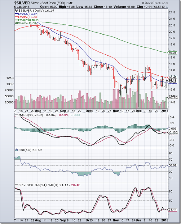
Silver_Jan0515

The daily bar chart pattern of silver has been consolidating sideways in a range between 15.50 and 16.50 during the past three weeks. The falling 50 day EMA provided overhead resistance.

Silver’s price has formed a bearish ‘descending triangle’ pattern during the past month, from which the likely break out is downwards. The previous low of 14 is likely to be tested, and broken.

Two of the technical indicators – MACD and Slow stochastic – are in bearish zones. RSI is attempting to cross above its 50% level and enter its bullish zone. Any rally will present a selling opportunity to bears.

On longer term weekly chart (not shown), silver’s price is trading below its three weekly EMAs in a long-term bear market. MACD and RSI remain in bearish zones. Slow stochastic is at its 50% level. Silver’s price may drop below 14.

Monday, January 5, 2015

Stock Index Chart Patterns: S&P 500 and FTSE 100 – Jan 02, 2015

S&P 500 Index Chart

SPX_Jan0215

Volumes were low on another truncated trading week due to the New Year holiday. The daily bar chart pattern of S&P 500 rose to touch new intra-day and closing highs on Mon. Dec 29, ‘14 – but failed to test the upper resistance line.

Negative divergences on all three technical indicators – which failed to touch new highs with the index – encouraged bears. A sharp correction dropped the index below its 20 day EMA. The possibility was mentioned in last week’s analysis.

The bearish ‘broadening top’ pattern in last week’s chart has been discarded. It has been replaced with another bearish ‘rising wedge’ pattern. Why? Because the trading pattern since the Oct ‘14 low is suggesting a ‘wedge’ rather than a ‘broadening top’.

Failure of the index to test the upper resistance line of the ‘wedge’, followed by the correction below the 20 day EMA may lead to a downward breach of the lower support line of the ‘wedge’ (which is currently at 2010).

Daily technical indicators are looking bearish. MACD has dropped to touch its signal line in positive zone. RSI is seeking support from its 50% level. Slow stochastic has dropped from its overbought zone. The index is trading above its 50 day and 200 day EMAs in a long-term bull market, but a large reversal pattern formed at a market top is an alarm bell for bulls.

On longer term weekly chart (not shown), the index is trading above its three weekly EMAs in a long-term bull market, but has formed a ‘reversal week’ pattern (higher high, lower close). All three weekly technical indicators are showing negative divergences by failing to touch new highs with the index. It may be a good idea to book part profits, and hold the rest with a stop-loss at 2010.

FTSE 100 Index Chart

FTSE_Jan0215

The daily bar chart pattern of FTSE 100 crossed above its 200 day EMA and the 6650 level in bull territory on Mon. Dec 29 ‘14. But the rally was unconvincing. Bears pounced almost immediately, and dropped the index down below its three EMAs.

Daily technical indicators are showing some bullish signs. MACD is above its rising signal line in negative zone. RSI is moving sideways along its 50% level. Slow stochastic is above its 50% level, and rising gradually.

Failure of the index to sustain above its 200 day EMA will encourage bears. At the time of writing this post, the index is trying to hang on to the 6500 level.

On longer term weekly chart (not shown), the index is trading well above its 200 week EMA in a long-term bull market, but has dropped below its 20 week and 50 week EMAs. Weekly technical indicators are giving mixed signals. MACD and RSI are looking bearish, but Slow stochastic is in bullish zone. Since touching a high of 6905 on Sep 4 ‘14, the index has been consolidating sideways within a large symmetrical triangle pattern.

Sunday, January 4, 2015

BSE Sensex and NSE Nifty 50 index chart patterns – Jan 02, 2015

Trading activity was at a low ebb during the first four days of the week, as most FIIs were on vacation due to Christmas and New Year holidays. There was a renewed spurt in activity on Friday as both FIIs and DIIs were net buyers of equity.

Good news came from HSBC’s Purchase Manager’s Index (PMI), which rose to a 2 years high of 54.4 in Dec ‘14 from 53.3 in Nov ‘14. A number higher than 50 indicates growth in industrial activity. Bad news was government’s fiscal deficit touching 99% of full year budget estimates during the first 8 months of the fiscal year.

An increase in excise duty on petrol and diesel to fund infrastructure development programmes should come as welcome news for construction, cement and steel sectors. Withdrawal of excise sops was not-so-welcome news for the automobile sector.

BSE Sensex index chart

SENSEX_Jan0214

The daily bar chart pattern of Sensex traded sideways within a narrow range till Thu. Jan 1 – facing strong resistance from its entangled 20 day and 50 day EMAs. An upward break out occurred on Friday on renewed buying by FIIs.

Daily technical indicators have turned bullish. MACD is still negative, but has crossed above its signal line (which is forming a ‘rounding bottom’ pattern). ROC is positive, and above its 10 day MA (which has formed a bullish ‘rounding bottom’ pattern). RSI has risen above its 50% level. Slow stochastic has just entered its overbought zone.

The support/resistance zone between 26300 and 27350 provided good support to the index during the recent correction. Expect the up move from the Dec ‘14 low of 26469 to continue.

NSE Nifty 50 index chart

Nifty_Jan0214

The weekly bar chart pattern of Nifty received strong support from its 20 week EMA and the support/resistance zone between 7840 and 8180, and closed at 8395 – its highest level in 4 weeks. The index is trading above its two weekly EMAs and the dark blue up trend line 2 in a long-term bull market.

Weekly technical indicators are turning bullish. MACD is below its signal line in positive zone, but has stopped falling. ROC is also positive, and has received support from its gradually rising 10 week MA. RSI and Slow stochastic have bounced up after receiving support from their respective 50% levels.

Look for an increase in volumes as Nifty continues with its up move next week. Otherwise, the rally may not sustain.

Bottomline? Chart patterns of BSE Sensex and NSE Nifty indices have recovered from sharp bull market corrections. Long-term up trends are intact. Both indices should resume the next legs of their bull rallies with buying support from FIIs. If you have booked profits, think about redeployment in long-term debt funds – which should do well with likely reduction in interest rates.

(Note: A limited number of paid subscriptions to my Monthly Investment Newsletter are being offered to blog visitors, followers and subscribers. Offer ends on Jan 21, 2015. Contact me at mobugobu@yahoo.com for details.)

Saturday, January 3, 2015

Technical updates – Container Corp and Indraprastha Gas

Stocks of PSU companies have never been my favourite because too often, management decisions have been dictated by government prerogatives and their bulging cash balances have been used to fix problems arising from faulty fiscal policies.

But if some one pointed a gun at my head and forced me to pick two PSU stocks – these two would be at the very top of my list. Why? Their near-monopoly status, and consequent strong fundamentals.

Container Corp is debt free, with RoE of 14%, and net profit margin of 18.4%. Indraprastha Gas has a debt/equity ratio of 0.18, RoE of 20.4%, and net profit margin of 9.1%. Therefore, it is no great surprise that the former has a P/E of 26.6, while the latter has a P/E of 17.6.

The charts below show that both stocks are trading in strong bull markets. But the general public holds just 1.3% of Container Corp’s equity and 6.5% of Indraprastha Gas’ equity. Two excellent investment-worthy stocks – and the public doesn’t seem to care about them!

Container Corp

ContainerCorp_Jan0215

The stock price of Container Corp. consolidated sideways within a ‘rectangle’ pattern for a year before finally breaking out upwards on a volume surge. As often happens, a pullback towards the breakout point gave investors an opportunity to enter.

The stock closed at a new high of 1483 in Nov ‘14, but negative divergences in all four technical indicators - which failed to touch new highs with the stock (marked by blue arrows) - led to a correction. The stock dropped below its 20 day and 50 day EMAs, but has recovered since then.

Technical indicators are looking bullish. Some consolidation can be expected before the up move resumes. 

Indraprastha Gas

Indraprastha Gas_Jan0215

The stock price of Indraprastha Gas consolidated sideways within a bullish ‘falling wedge’ pattern before breaking out upwards with a volume surge. It has been a strong up move since then, with intermittent corrections that ensured that the stock didn’t become too overbought.

The stock touched a new closing high of 465.40 in Dec ‘14, but negative divergences in all four technical indicators, which failed to touch new highs with the stock (marked by blue arrows), have led to a correction that is continuing.

Any drop below its 50 day EMA will be an adding opportunity.

Thursday, January 1, 2015

Announcing re-opening of paid subscriptions to my Monthly Investment Newsletter

I am pleased to announce the re-opening of paid subscriptions to my monthly investment newsletter for a 3 weeks period from Jan 1-21, 2015. Only a limited number of subscriptions will be offered to blog visitors, followers and subscribers – on a first-come first-served basis – to enable me to provide personalised attention and guidance to each subscriber.

If you are interested in subscribing, please send an email to: mobugobu@yahoo.com at the earliest for details.

The newsletter has completed 60 issues, with its share of hits and misses. 2014 was a good year for the stock market with the Sensex hitting a new lifetime high. Many good mid-cap and small-cap stocks rose 3 or 4 times from their lows. That made stock selection difficult because finding value was a challenge. The sharp correction during Dec ‘14 has brought down several selected stocks from their peaks – affecting year-end performance. It is gratifying that subscribers have kept faith in my stock picking abilities.

Those who have been following my blog posts regularly already know what kind of stocks to select, and what type of stocks to avoid. The guiding principle is to choose well-managed, financially prudent companies that generate cash from operations, have low debt, give steady (rather than spectacular) returns and have growth prospects.

Non-subscribers may be interested to know how recommended stocks have fared during the past 18 months. Without revealing the names of the stocks (it won’t be fair to my subscribers to do so), here is a brief results table with recommended dates and prices, subsequent high and low prices, closing price and gains as on Dec 31, ‘14:

Stock

Date

Price

High

Low

Close

Gain

A

Jul 26 ‘13

93.10

687.40

72.50

675.65

625.7%

B

Aug 27 ‘13

216.55

335.00

206.25

251.50

16.1%

C

Sep 27 ‘13

130.55

211.45

130.30

203.35

55.8%

D

Oct 29 ‘13

98.75

109.00

62.00

67.35

-31.8%

E

Nov 27 ‘13

39.00

146.50

37.40

138.05

254.0%

F

Dec 27 ‘13

128.10

257.45

115.10

201.45

57.2%

G

Jan 28 ‘14

67.00

122.00

66.00

78.95

17.8%

H

Feb 26 ‘14

154.60

159.40

75.30

86.95

-43.7%

I

Mar 28 ‘14

89.00

293.50

84.60

279.40

213.9%

J

Apr 25 ‘14

277.20

458.45

266.00

393.00

41.8%

K

May 27 ‘14

94.10

471.70

93.25

344.75

266.4%

L

Jun 27 ‘14

62.60

88.00

59.00

68.45

9.3%

M

Jul 28 ‘14

206.50

267.90

191.90

242.10

17.2%

N

Aug 28 ‘14

115.50

182.45

113.25

153.65

33.0%

O

Sep 26 ‘14

46.00

52.80

37.50

43.95

-4.4%

P

Oct 27 ‘14

250.10

299.85

248.10

267.90

7.1%

Q

Nov 27 ‘14

231.85

340.00

221.00

319.90

38.0%

R

Dec 26 ‘14

66.60

71.90

66.25

70.00

5.1%

All recommended stocks were small-cap or mid-cap, picked for long-term investment of 2 to 3 years. Several of them (in bold) are already showing excellent gains, including 4 multi-baggers – even after falling from their recent highs – which is a testimony to their underlying strength. Note that three stocks are showing losses (in italics), but the Sep ‘14 stock is undergoing consolidation and is expected to perform better.

A different perspective on the above performance: By blindly investing (not recommended) Rs 10,000 in each stock and holding on till Dec 31 ‘14, a subscriber would be sitting on gains of close to Rs 158,000 (62% annualised) – outperforming the Sensex (31%) and BSE Mid-cap index (50%), and slightly underperforming the BSE Small-cap index (66%).

Note that all 18 stocks touched higher levels after my recommendations. It helped that the Sensex has been in an uptrend since Aug 2013. In a 2-3 years time frame, I expect the laggards to improve their performances.

What is important to understand is that none of these stocks were ‘cheap’ – fundamentally strong stocks rarely are - and some had already run up quite a lot when they were recommended.

Why wait if you wish to add fundamentally strong mid-cap and small-cap stocks with growth potential to your portfolio? Just subscribe to my Monthly Investment newsletter. Send me an email (at mobugobu@yahoo.com) soon – subscriptions will close on Jan 21, 2015.