Monday, October 28, 2013

Stock Index Chart Patterns: S&P 500 and FTSE 100 – Oct 25, ‘13

S&P 500 Index Chart

S&P 500_Oct2513

In last week’s analysis of the daily bar chart pattern of S&P 500 index, it was observed that technical indicators were bullish but showing negative divergences. Accordingly, the recommendation was to stay invested but be prepared for a correction.

Correction? What correction? Rampaging bulls took the index to another life-time high of 1760 – despite a single-day’s profit booking. However, the daily technical indicators are looking overbought and showing negative divergences by failing to touch new highs.

Also, the index is trading more than 140 points above its rising 200 day EMA – a condition that has led to sharp corrections. Many global stock indices are at or near 52 week or life-time highs – which is a sign of a global bull market.

Not a great time to buy, but good to stay invested and enjoy the ride.

FTSE 100 Index Chart

FTSE_Oct2513

The following were the concluding comments in last week’s analysis of the daily bar chart pattern of FTSE 100 index: “Trading volumes have picked up. The rally is likely to continue.” And so it did – right past the Sep ‘13 and Aug ‘13 tops to cross the 6700 level for the first time in 5 months.

All three EMAs are rising and the index is trading above them. Bulls are back in control. The May ‘13 top is barely 150 points away. However, sliding volumes are a concern.

Daily technical indicators are bullish. MACD is positive, and rising above its signal line. RSI is at the edge of its overbought zone. Slow stochastic is well inside its overbought zone. Any corrective dip can be used to add to existing positions.

Bottomline? 6 months daily bar chart patterns of S&P 500 and FTSE 100 indices indicate that bulls have regained control. Stay invested. Any corrective dips can be used to add.

Saturday, October 26, 2013

BSE Sensex and NSE Nifty 50 index chart patterns – Oct 25, 2013

Q2 results are coming in thick and fast, and one point that is clearly emerging is size matters – specially when the economy is not performing well. The big boys of India Inc. continue to outperform. HDFC, ICICI, Hero Motocorp, ITC, HUL results were better than expectations.

Among smaller players, Idea Cellular, TVS Motors, ING Vysya Bank results surprised positively but cement companies have disappointed. Wipro and Exide results were also below par. All eyes will be on RBI’s policy announcement next week. With inflation refusing to go down, a 25 bps repo rate hike is expected.

BSE and NSE indices touched new 52 week highs on intra-day and intra-week basis before taking a breather. In last week’s analysis, technical indicators had pointed to a period of correction or consolidation – after which new life-time highs are likely.

BSE Sensex index chart

SENSEX_Oct2513

The daily bar chart pattern of Sensex crossed the psychological 21000 level on intra-day basis for the first time in 3 years, but could not sustain above it. All three EMAs are rising and the index is trading above them. The bulls are back on top.

Three of the four daily technical indicators – MACD, RSI, Slow stochastic – are correcting overbought conditions. ROC has crossed below its 10 day MA, and is showing negative divergence by failing to touch a new high with the index.

A few more days of correction/consolidation is likely. The opportunity can be used to add to existing positions.

NSE Nifty 50 index chart

Nifty_Oct2513

The weekly bar chart pattern of Nifty touched a new intra-week high but formed a ‘reversal week’ pattern (higher high, lower close) accompanied by strong volumes. That has set the stage for a period of correction or consolidation.

Weekly technical indicators are bullish, but ROC and Slow stochastic are overbought. MACD and RSI are both showing negative divergences by failing to touch new highs with the index.

The 20 week and 50 week EMAs are rising and the index is trading above them, so there is no immediate threat to the long-term bull market. FIIs have remained net buyers, but appear to be shifting focus to the mid-cap segment where better valuations are available.

Bottomline? Chart patterns of BSE Sensex and NSE Nifty indices again touched new 52 week (and 2 yr) highs, but are facing expected technical headwinds. Stay invested, or add to existing positions.

Thursday, October 24, 2013

Comparative charts of world stock indices at 52 week highs

In yesterday’s post on the Nifty chart, the concluding comments were: “Expect some more correction, but remember that many global stock indices are at or near life-time or 52 week highs. That is a sign of a global bull market.”

Given below are the 1 yr closing charts of 10 global stock indices (in blue) that are at or near their 52 week highs. The 1 yr closing chart of Nifty (in green) has been superimposed for comparison purposes.

Notable exceptions are the three BRIC countries – Brazil, Russia, China – whose stock indices are well below their 52 week highs. But wait a minute. Isn’t China’s economy showing the strongest growth? Much stronger than India’s? And isn’t the economic growth in USA one of the weakest?

So, how come Nifty is performing better than the Shanghai Composite, and S&P 500 is outperforming Nifty? Just goes to show that economic growth and stock market performance don’t go hand-in-hand.

Australia All Ordinaries vs. NIFTY (in green)

AORD_Oct13

The Australian index has outperformed Nifty after falling behind till Feb ‘13.

Austria ATX vs. NIFTY (in green)

Austria ATX_Oct13 

The Austrian index has outperformed Nifty throughout the past 12 months.

France CAC40 vs. NIFTY (in green)

CAC40_Oct13

France’s economy is still struggling to grow, but its stock index has beaten Nifty hands down.

DAX Germany vs. NIFTY (in green)

DAX_Oct13

Germany’s stock index has outperformed Nifty since Dec ‘12.

MERVAL Argentina vs. NIFTY (in green)

Merval_Oct13

Argentina’s stock index is one of the best performers over the past 12 months – rising almost 150%.

Canada TSX vs. NIFTY (in green)

Canada TSX_Oct13

Canada’s stock index has matched Nifty’s performance but with a lot less volatility.

S&P 500 vs. NIFTY (in green)

S&P500_Oct13

The stock index of USA has trounced Nifty handsomely despite sluggish economic growth.

Taiwan TSEC vs. NIFTY (in green)

Taiwan TSEC_Oct13

Taiwan’s TSEC has outperformed Nifty from Feb ‘13 onwards.

Korea KOSPI vs. NIFTY (in green)

KOSPI_Oct13

KOSPI is the only index among the 10 that Nifty has managed to leave behind.

Malaysia KLCI vs. NIFTY (in green)

KLCI Malaysia_Oct13

Malaysia’s KLCI index lagged behind Nifty till Mar ‘13, but has managed to make up the deficit.

Wednesday, October 23, 2013

Nifty chart: a mid-week update (Oct 23, ‘13)

What a difference FII buying makes! Less than two months back, market sentiment was at rock bottom. FIIs were selling and all analysts and experts were predicting significantly lower levels for Nifty. Bulls seemed to have turned tail and were running away in sheer panic.

As soon as FIIs started buying again, shorts got trapped and market jumped up sharply. Now all bearish analysts and experts have not only turned bullish, but are predicting life-time highs for Nifty before the end of the year.

After touching a new 52 week high, the index is expectedly letting off some steam. Periodic corrections in a bull market improve the technical ‘health’ of price charts by eliminating froth and gathering strength to rise higher. So, should you buy, sell or hold?

Nifty_Oct2313

The answer to the question is: It depends. On what? On your state of investment maturity. If you are new to the stock market, stifle your impulse to jump in. Markets tend to get jittery near new highs – simply because those who entered at a previous high are staring at a big loss and want to escape in a hurry. Use your savings to invest regularly in a good balanced fund and build up your capital over the next 3-5 years.

If you have invested in the market for some time, but have a penchant for accumulating unknown mid-cap and small-cap stocks – use the current sector rotation to get out and invest in a few good large-caps that are still reasonably priced. Like? Hindalco and TISCO come to mind.

If you are a seasoned investor and have a proper asset allocation plan in place, your plan should tell you what to do. What are the technical indicators saying? Three of them – MACD, RSI, Slow stochastic – are inside their overbought zones and showing signs of reversing. ROC is not in overbought zone, but displaying negative divergence by failing to touch a new high with the index.

Expect some more correction, but remember that many global stock indices are at or near life-time or 52 week highs. That is a sign of a global bull market.

Tuesday, October 22, 2013

WTI and Brent Crude Oil charts: an update

WTI Crude chart

WTI Crude_Oct2113

The following remarks were made in a technical analysis of the daily bar chart pattern of WTI Crude oil two weeks ago: “A test of support from the 200 day EMA is likely. In case the 200 day EMA is breached, expect support from the zone between 97 and 99.”

Thanks to adequate US supplies, oil’s price breached the 100 mark for the first time in three months and closed just below its 200 day EMA. Volumes on down-days were strong, indicating that the bears aren’t done with their selling yet.

Daily technical indicators are bearish. MACD is falling below its signal line in negative territory. RSI is falling towards its oversold zone. Slow stochastic has re-entered its oversold zone. Note that RSI and Slow stochastic are showing positive divergences by failing to drop to a new low with oil’s price.

Any bounce up in price from the current level will be a selling opportunity, as oil’s price continues in a 2 months long down-trend.

Brent Crude chart

BrentCrude_Oct2113

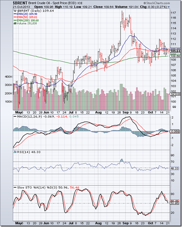
The daily bar chart pattern of Brent Crude oil broke out upwards from the consolidation range between 107 and 110, and rose to touch a high of 112. But lack of volume support failed to sustain the price break out.

Oil’s price has slipped down into the consolidation zone between 107 and 110. Brent Crude prices have remained high due to supply disruptions in Libya, Syria and North Sea and a European embargo on purchase of Iranian crude. 

Daily technical indicators are turning bearish. MACD failed to enter positive territory, and is touching its signal line. RSI has slipped below its 50% level. Slow stochastic is about to drop below its 50% level.

With growth slowing in BRICS countries and growth in Europe remaining sluggish, speculators may be forced to liquidate their bullish positions leading to a fall in oil’s price below its 200 day EMA.

Monday, October 21, 2013

Stock Index Chart Patterns: S&P 500 and FTSE 100 – Oct 18, ‘13

S&P 500 Index Chart

S&P 500_Oct1813

Thanks mainly to the initiative of a few enlightened lady senators who helped thrash out a temporary resolution, the debt-ceiling imbroglio has been postponed to the beginning of 2014. The daily bar chart pattern of S&P 500 celebrated in relief and rose to touch a new life-time high.

Despite being supported by rising trading volumes, the rally has been a bit too sharp and the index is trading more than 130 points above its rising 200 day EMA. Such a large difference between the index level and its 200 day EMA has often led to sharp corrections.

Daily technical indicators are bullish. MACD is rising above its signal line in positive territory. RSI has moved up close to the lower edge of its overbought zone. Slow stochastic has entered its overbought zone. However, all three indicators are showing negative divergences by failing to reach new highs with the index.

Stay invested but be prepared for a correction.

FTSE 100 Index Chart

FTSE_Oct1813

The 6 months daily bar chart pattern of FTSE 100 index shows a relief rally due to the resolution of the US government shutdown and debt-ceiling impasse. The index regained the 6600 level. The 20 day EMA is about to cross above the 50 day EMA. The sharp bull market correction is over.

Daily technical indicators are looking bullish. MACD has crossed above its signal line into positive territory. RSI is rising towards its overbought zone. Slow stochastic has entered its overbought zone.

Trading volumes have picked up. The rally is likely to continue.

Bottomline? 6 months daily bar chart patterns of S&P 500 and FTSE 100 indices have recovered from bull market corrections. The US index has touched a life-time high. The UK index is back in bull territory. Stay invested.

Saturday, October 19, 2013

BSE Sensex and NSE Nifty 50 index chart patterns – Oct 18, 2013

An 11th hour temporary resolution of the US fiscal impasse caused global markets to rise towards new highs. Tapering of bond buying by the US Fed may be kept in abeyance till the end of the year. Bulls would like to use the window of opportunity before the whole debt-ceiling drama gets re-enacted at the beginning of 2014.

Both WPI and CPI inflation is on the rise again. A protracted monsoon followed by cyclone devastation in a few states have sent food prices soaring upwards. RBI may be left with no option but to keep interest rates high. Signs of revival in exports and manufacturing may get nipped in the bud. All the negative news got swept aside by good Q2 results from L&T and large-cap IT stocks.

Sensex and Nifty indices touched new highs, supported by FII buying. However, the Sensex chart below is showing a short-term technical barrier. The longer-term Nifty chart below is poised to rise significantly higher. Bulls appear ready to take complete control.

BSE Sensex index chart

SENSEX_Oct1913

The 1 yr daily bar chart pattern of BSE Sensex touched a new 52 week (and 2 yrs) high on Fri. Oct 18 ‘13. All three EMAs are rising and the index is trading above them. The bulls are clearly regaining control, but haven’t quite done it yet. Why?

All four daily technical indicators touched lower tops while the index touched a higher top. The combined negative divergences (marked by blue arrows) is likely to halt the bull rally temporarily. Also, all four indicators are looking overbought – ROC and RSI are at the edge of their overbought zones while MACD and Slow stochastic are inside their overbought zones.

The combination of overbought indicators displaying negative divergences should lead to some correction or consolidation. For those who are still waiting to enter at much lower levels, the likely dip may be the last chance to pick up fundamentally strong stocks at reasonable valuations.

NSE Nifty 50 index chart

Nifty_Oct1913

The 3 yrs weekly closing chart pattern of NSE Nifty has formed a large ‘cup-and-handle’ pattern, which is a bullish continuation pattern with measuring implications. Since Nifty was in a bull market when it touched its Nov ‘10 high, the eventual break out from the ‘cup-and-handle’ pattern should occur above the ‘rim’ of the ‘cup’ (marked by dotted horizontal line at about 6175).

The depth of the ‘cup’ – from the ‘rim’ to its closing low of 4625 touched on Dec 30 ‘11 – is 1550 points. That provides an upward target of 7725 (= 6175+1550). Note that technical analysis is not a science, and targets are approximate based on empirical observations. Also, the break out above the ‘rim’ should be accompanied by a significant increase in volumes – otherwise the break out may turn out to be a ‘false’ one.

The rally since the completion of the ‘handle’ in Aug ‘13 has been on falling volumes – partly due to several intervening trading holidays in the past 6 weeks. However, the ‘rule’ of stronger volumes on an upward break out holds regardless.

All four weekly technical indicators are looking bullish, with ROC and Slow stochastic entering their overbought zones. Expect some correction or consolidation before the eventual upward break out occurs.

Bottomline? Chart patterns of BSE Sensex and NSE Nifty indices touched new 52 week (and 2 yr) highs as expected. Technical headwinds may stall the bull rallies temporarily – providing adding opportunities. Both indices should move up to touch life-time highs in the near future.

Wednesday, October 16, 2013

US Shutdown, looming debt-ceiling and their effects on the Indian market – a guest post

Since the beginning of this month, the US government has been in partial shutdown. That means all government services and activities barring a few emergency and security services have come to a halt and government employees have been asked to proceed on unpaid leave. Why?

Because the government has run out of funds. Oct 1 being the first day of a new fiscal year, budget appropriations for different departments and activities need to be finalised before that date. But the Congress with a Republican majority is playing a game of ‘dare’ with the Democrat US President – withholding appropriations till the President bows down to their demands for budget cuts.

With both sides refusing to budge from their respective positions, there was no alternative to a partial shutdown. The debt-ceiling will be reached on Oct 17. Unless a deal is worked out before that date, the US government may default on its debt. In this months guest post, Nishit explains the current fiscal impasse, and how it may affect global stock markets.

---------------------------------------------------------------------------------------------------------------------------------------

The current hot topic of discussion is the expiry of US Debt ceiling. What is this all about and how does it affect Indian markets? Let us try and simplify things.

Right now, the Government shutdown, in American politics, refers to a temporary halt in government services when lawmakers cannot pass the necessary funding measures in time.

Reference: http://en.wikipedia.org/wiki/Government_shutdown

In 1939, the US government was authorized to borrow money up to a particular limit. This was to make sure that the debt did not go completely out of control. The various arms of the US democracy have to work together to keep raising the limit as time passes by - coming to an agreement over the amount by which it has to be raised.

Thanks to petty politicking between the Democrats and Republicans, things are at a stand-off. The debt ceiling will be reached by Oct 17th and the government will be unable to borrow more money. If that happens, then US may default on its debt. US government issues Treasury bills of various maturities ranging from 30 day to 30 years. Some of these will come up for payment and due to technical reasons, the payment will be missed.

USA is no ordinary country. It is the leading superpower. Its debt is considered to be safest in the world. Many governments including ours have invested in US Treasury bills. We hold about US $59 Billion worth of debt in US Government Securities.

The fall-out of US debt default will be that gold’s price will rise and world economy may get a shock. The world economy is already in a fragile state and can do without such needless technical defaults over petty politics.

The sentiments of the US people are pretty strong against this standoff and about 70% don’t approve of it. Already due to shutdown, many National parks and monuments have been closed to visitors and people sent home on leave without pay. This is already hurting US consumer sentiment.

Important US economic data are not being released and this will lead to tapering of US bond buying being postponed. For this reason, our markets have gone up.

After Oct 17th, if there is no resolution, then there may be crisis in global equity markets. In my opinion, things will not come to such a pass. The politicians will find some way out at the last possible minute. Even if a resolution is not reached by Oct 17th, the US government will have enough funds to meet its debt obligations for another 30 days.

This was a good chance for speculators to make some money by betting on a non-event. Expect a big gap up in markets when this fiscal impasse is resolved. The game right now is all about kicking the ball further down the road. With a month wasted here and a dovish new Fed Chairman, quantitative easing will continue for some more time. New highs here we come.

After highs, a correction has to take place which is the law of markets. If you have equities in place, slowly book profits at higher levels. Markets always give a chance to buy back at lower levels. Remember 5118 almost 45 days back?

---------------------------------------------------------------------------------------------------------------------------------------

(Nishit Vadhavkar is a Quality Manager working at an IT MNC. Deciphering economics, equity markets and piercing the jargon to make it understandable to all is his passion. "We work hard for our money, our money should work even harder for us" is his motto.

Nishit blogs at Money Manthan.)

Tuesday, October 15, 2013

Gold and Silver charts: an update

Gold Chart Pattern

Gold_Oct1413 

Two weeks back, the long-term weekly bar chart pattern of gold had clearly shown a bear market in progress. Weekly technical indicators were bearish, and more downside in gold’s price was expected. The 6 months daily bar chart pattern of gold (above) confirms the expectation.

All three daily EMAs have resumed their down moves after a strong bear market rally that provided a good exit opportunity. Gold’s price is again moving down. Down day volumes have been strong, which means bears have the upper hand.

Daily technical indicators are bearish. MACD is falling below its signal line in negative territory. RSI is below its 50% level. Slow stochastic has entered its oversold zone. A test of the Jun ‘13 low is a possibility.

The only silver lining for bulls is that gold’s price appears to be trading within a ‘falling wedge’ pattern, from which an upward break out is likely. But one needs to wait for the pattern to form fully. On longer-term weekly chart (not shown), the 50 week EMA is on the verge of crossing below the 200 week EMA. The ‘death cross’ will technically confirm a long-term bear market.

Silver Chart Pattern

Silver_Oct1413

The 6 months daily bar chart pattern of silver has not fallen much in the past two weeks, but that may be a brief respite. Another attempt at a rally took silver’s price above its 20 day and 50 day EMAs but found strong resistance at the 22.50 level.

All three daily EMAs have resumed their down moves. Volumes have been strong on down-days. Bears are using every opportunity to sell. Lower levels and a test of the Jun ‘13 low are likely.

Daily technical indicators are looking bearish, but not oversold. MACD has slipped below its signal line in negative territory. RSI and Slow stochastic are both falling below their 50% levels.

Monday, October 14, 2013

Stock Index Chart Patterns: S&P 500 and FTSE 100 – Oct 11, ‘13

S&P 500 Index Chart

S&P 500_Oct1113

The following remarks were made in last week’s analysis of the 6 months daily bar chart pattern of S&P 500 index: “The bad news is that volumes on three down days were stronger, which is a sign of distribution. Bears are lurking, and may mount another attack at anytime.”

The bear attack was sharp and swift. The index dropped below its 20 day and 50 day EMAs, and the 1650 level intra-day. But the recovery was even sharper. The index climbed back into bull territory above all its three EMAs and closed above the 1700 level for the week.

Note that volumes dropped off as the index rose higher. Without volume support, the rally is unlikely to sustain. Daily technical indicators have turned bullish. MACD has moved up to touch its falling signal in positive territory. RSI is above its 50% level. Slow stochastic has risen to the edge of its overbought zone.

Initial claims of unemployment surged to 374,000 - its highest level in more than 6 months. Bulls were encouraged by the possibility of a resolution of the US fiscal impasse, as both parties made conciliatory noises. But if a deal isn’t worked out before Oct 17, bears will have a field day. Remain cautious.

FTSE 100 Index Chart

FTSE_Oct1113

Short-term bearishness visible on the 6 months daily chart pattern of FTSE 100 index last week led to a drop into bear territory and a day’s close below the 200 day EMA. By the end of the week, the index recovered sufficiently to move up to the 6500 level where the 50 day EMA offered some resistance.

Daily technical indicators are showing signs of emerging from bearish zones. MACD has moved up a bit to touch its signal line in negative zone. RSI has risen sharply from its oversold zone, but hasn’t reached its 50% level yet. Slow stochastic has climbed out of its oversold zone.

An unexpected 1.1% fall in UK’s industrial output in Aug ‘13 and slowdown in factory output in Sep ‘13 may put the brakes on GDP growth estimates.

Bottomline? 6 months daily bar chart patterns of S&P 500 and FTSE 100 indices are recovering from month-long corrections. But the recoveries could be fleeting if the US fiscal impasse isn’t resolved over the next couple of days. Stay invested, but tighten stop-losses.

Saturday, October 12, 2013

BSE Sensex and NSE Nifty 50 index chart patterns – Oct 11, 2013

First, the good news. Infosys declared better-than-expected Q2 results, with quarterly revenue crossing US $2 Billion for the first time. Net profit missed analyst estimates, but that was due to a one-time provision. Revenue outlook is promising. IT stocks and both indices celebrated the results.

Possibility of a resolution to the US fiscal impasse is also good news. Now, the bad news. The August IIP number dropped to 0.6% from 2.75% recorded in July – mainly due to contraction in mining and manufacturing sectors. This is far lower than the consensus estimate of 2.0%. Devastation caused by cyclone ‘Phailin’ is another concern.

Sensex and Nifty are back in bull markets after brief forays into bear territories. Both indices are trading above their long-term moving averages, and look poised to touch new 52 week highs. Curb your impulse to jump in feet first. Biding your time to buy during dips will yield better results.

BSE Sensex index chart

Sensex_Oct1113

The daily closing chart pattern of BSE Sensex closed above the 20500 level for the week, and is just 120 points short of touching a new 52 week high. All three EMAs are rising, and the index is trading above them. Bulls are back on top.

Daily technical indicators are looking bullish. MACD has crossed above its signal line, and looks ready to re-enter its overbought zone. ROC has crossed above its 10 day MA into positive territory. RSI has moved above its 50% level. Slow stochastic has reached the edge of its overbought zone.

Caution near a previous top is advised.

NSE Nifty 50 index chart

Nifty_Oct1113

After closing below the long-term up-trend line two weeks in a row during Aug ‘13, the weekly closing chart of NSE Nifty is once again back in bull territory. It is trading above its two weekly EMAs and the blue up-trend line. A new 52 week high is barely 90 points away.

Weekly technical indicators are looking bullish. MACD has crossed above its signal line into positive territory. ROC has bounced up sharply off its 10 week MA into positive territory. RSI is rising above its 50% level. Slow stochastic is at the edge of its overbought zone.

Note that volume peaks have been moving down while the index has been moving up from its Aug ‘13 low. A bull market needs volume support to sustain. Proximity to a previous top calls for some caution.

Bottomline? Chart patterns of BSE Sensex and NSE Nifty indices are bullish and ready to touch new 52 week highs. The Rupee continues to strengthen against the US Dollar. The trade deficit has reduced. FIIs have turned net buyers. Looks like ‘game over’ for the bears. However, caution is advised since both indices are close to their previous tops.

Wednesday, October 9, 2013

Nifty chart: a mid-week update (Oct 09, ‘13)

The down trend in Nifty, which started after the index hit its May ‘13 top, lasted till the end of Aug ‘13 – dropping the index into bear territory. Most market experts started predicting much lower levels of 4500 and 3700. Sentiments were quite negative. Economic news was getting worse by the day.

As often happens when consensus is bearish, the index jumped up sharply during Sep ‘13. Even seasoned investors and experienced analysts were surprised by the high volume of buying. Such sharp rallies seldom sustain. Daily technical indicators showed overbought conditions, and a couple of them displayed reversal patterns.

A correction ensued and the index dropped quickly to its 200 day EMA by the end of Sep ‘13. The subsequent ‘V’ shaped recovery has taken the index above the psychological 6000 level at the end of trading today. Can the index sustain above the 6000 level and move up to touch a new 52 week high?

Nifty_Oct0913

Technical indicators are turning bullish, so a new high is definitely within the realm of possibilities. MACD has crossed above its signal line in positive zone. ROC has crossed above its falling 10 day MA into positive territory. Both RSI and Slow stochastic have moved above their respective 50% levels. All three EMAs are rising, and Nifty is trading above them – which is the sign of a bull market.

The current account deficit reduced considerably, thanks to lower imports and higher exports. The reduction in deficit should allay a major concern of overseas investors. But the parting of ways between Bharti and Walmart may queer the pitch for FDI in multi-brand retail. Uncertainty due to the US debt ceiling problem is another bearish overhang.

Be cautiously optimistic. That means accumulating fundamentally strong stocks, but with proper stop-losses.

Tuesday, October 8, 2013

WTI and Brent Crude Oil charts: consolidating sideways

WTI Crude chart

WTI Crude_Oct0713 

The 6 months daily bar chart pattern of WTI Crude oil consolidated sideways between 101 and 104 levels for the past two weeks. It bounced up strongly after dropping to 101, but faced resistance from its falling 20 day EMA.

A tropical storm in the Gulf of Mexico caused a production shutdown and a brief spike in oil’s price. But the storm blew over without causing much damage, and production is returning to normal.

Daily technical indicators are in bearish zones. MACD is moving up towards its falling signal line in negative territory. RSI moved up towards its 50% level but could not cross above it. Slow stochastic emerged from its oversold zone, but remains well below its 50% level. All three indicators have been in down trends since Jul ‘13, touching lower tops and lower bottoms.

Oil’s price is trading above its rising 200 day EMA, and remains in a bull market. Strong volumes on down days is an indication that bears are active. A test of support from the 200 day EMA is likely. In case the 200 day EMA is breached, expect support from the zone between 97 and 99.

Brent Crude chart

BrentCrude_Oct0713

The 6 months daily bar chart pattern of Brent Crude oil is trying very hard to stay above its 200 day EMA. For the past two weeks, oil’s price has been consolidating sideways between 107 and 110.

Such consolidations within a rectangular band tend to be continuation patterns. Since the pattern has been forming after oil’s price dropped from a recent peak of 117, the likely break out from the pattern is downwards. However, rectangles are unreliable. It is better to wait for the eventual break out before taking a sell/buy decision.

Daily technical indicators are showing some bullish signs. MACD has formed a rounding-bottom pattern and moved up to touch its falling signal line in negative territory. RSI is gradually moving up towards its 50% level. Slow stochastic has risen past its 50% level.

All three indicators are showing negative divergences by touching lower lows than the ones touched in Aug ‘13, while oil’s price touched a higher low. Trading volumes have been mostly stronger on down days. The balance is somewhat tilted towards the bears.

Monday, October 7, 2013

Stock Index Chart Patterns: S&P 500 and FTSE 100 – Oct 04, ‘13

S&P 500 Index Chart

S&P 500_Oct0413

The 6 months daily bar chart pattern of S&P 500 showed a small loss for the week as it consolidated sideways – getting good support from its rising 50 day EMA. The good news for bulls is that the index managed to close the week above all three EMAs in bull territory.

The bad news is that volumes on three down days were stronger, which is a sign of distribution. Bears are lurking, and may mount another attack at anytime. Daily technical indicators are giving mixed signals with a bearish bias.

MACD is positive, but falling below its signal line. RSI is crisscrossing its 50% level. Slow stochastic is moving sideways below its 50% level. The correction isn’t over yet. However, the index is trading well above its rising 200 day EMA, so the long-term bull market is under no threat.

There are signs that the painfully slow growth of the US economy is about to hit a road block. Initial jobless claims rose marginally, but less than expected. Private job growth was slightly higher. Intermodal rail traffic also rose a bit. But the US Dollar is slipping against global currencies, thanks to the shutdown of the US government and the looming debt ceiling. Only a last-minute resolution of the impasse can save the stock market from tanking.

FTSE 100 Index Chart

FTSE_Oct0413

The 6 months daily bar chart pattern of FTSE 100 index traded sideways between 6400 and 6500 during the week, and managed to close just above the 6450 level. The 20 day EMA is about to cross below the 50 day EMA, showing short-term bearishness. The 200 day EMA is still rising with the index trading above it. The long-term bullishness persists.

Daily technical indicators are looking bearish. MACD has dropped below its signal line into negative territory. RSI and Slow stochastic have fallen below their respective 50% levels, and look ready to enter oversold zones. Some more correction or consolidation is likely.

Bottomline? 6 months daily bar chart patterns of S&P 500 and FTSE 100 indices are still in bear grips, but remain in long-term bull markets. Bull market corrections provide adding opportunities – but be selective and maintain adequate stop-losses.

Saturday, October 5, 2013

BSE Sensex and NSE Nifty 50 index chart patterns – Oct 04, 2013

The Rupee gained nearly 2%, rising to a level of 61.25 against the US Dollar, which is its highest level since Aug 13. Weakness of the US Dollar against global currencies was caused by the continued shut-down of the US government and the looming debt ceiling.

The new RBI Governor made soothing noises by reiterating the GDP growth prediction of between 5-5.5%. He also also revealed that the Central Bank and the ruling government were in talks to ease interest rates. The market may receive a Diwali gift.

Despite HSBC’s Services PMI index falling to its lowest level since Apr 2009, indicating that the slowdown in the Indian economy isn’t over yet, FIIs continued to be net buyers. That helped both Sensex and Nifty indices to bounce up in a holiday-shortened week.

BSE Sensex index chart

SENSEX_Oct0413

The daily bar chart pattern of Sensex dropped below its 50 day EMA and tested support from its 200 day EMA before bouncing up above all three EMAs and back into bull territory. The correction from a new 52 week high after a sharp rally appears to be over.

Daily technical indicators have not quite turned bullish yet, but there are some signs of a turn around. MACD is below its falling signal line in positive zone, but has stopped falling. ROC has dropped into negative territory below its 10 day MA. RSI has bounced up above its 50% level. Slow stochastic has also bounced up after a brief dip into its oversold zone, but remains below its 50% level.

Expect the bears to put up some fight before the bulls can push the index up to new highs.

NSE Nifty 50 index chart

Nifty_13 

The weekly bar chart pattern of Nifty dropped into bear territory intra-week by falling below both weekly EMAs. By the end of the week, the index closed inside bull territory. (The shorter volume bar for the week is due to Gandhi Jayanti holiday on Oct 2.)

Weekly technical indicators are beginning to turn bullish. MACD has crossed above its signal line, and just entered positive zone. ROC has bounced up off its 10 week MA to enter positive zone. RSI is resting on its 50% level. Slow stochastic is at the edge of its overbought zone.

Bottomline? Chart patterns of BSE Sensex and NSE Nifty indices successfully warded off bear attacks and remain in bull markets. The strengthening of the Rupee against the US Dollar has improved sentiments and brought FIIs back into ‘buy’ mode. Both indices have been in broad sideways consolidations during the past year – frustrating investors but providing trading opportunities. At times like these, sticking to investment plans and fundamentally strong stocks are the smart things to do.

Tuesday, October 1, 2013

Gold and Silver charts: in long-term bear grips

Gold Chart Pattern

Gold_Sep3013

The long-term weekly bar chart pattern of gold clearly shows a bear market in progress. After correcting from its life-time high of 1900 odd in Sep ‘11, gold’s price entered a sideways rectangular consolidation zone between 1525 and 1800 for the next 18 months.

Rectangular consolidations tend to be continuation patterns. The high volume downward break below 1525, followed by a drop below the 200 week EMA in Apr ‘13 indicated that the long bull market in gold was over. Gold’s price dropped all the way below 1200 before bouncing up strongly to test its 200 week EMA.

Bears used the bounce to sell. Gold’s price has resumed its down move, and is trading below all three weekly EMA. The 50 week EMA is falling towards the 200 week EMA. A cross below will technically confirm a long-term bear market. The confirmation may be just a matter of time.

Weekly technical indicators are looking bearish. Some more downside is likely. MACD bounced up from the edge of its oversold zone, but remains negative. RSI moved up from its oversold zone, but failed to climb above its 50% level. Slow stochastic has dropped from its overbought zone, and falling towards its 50% level.

How much lower can gold’s price fall? Apparently, the current cost of producing an ounce of gold is about 1000. So, it is unlikely that gold’s price will fall below 1000. Buying should emerge in the zone between 1000 and 1200. That doesn’t mean another bull market will start immediately. Bear markets take a long time to play out.

Silver Chart Pattern

Silver_Sep3013

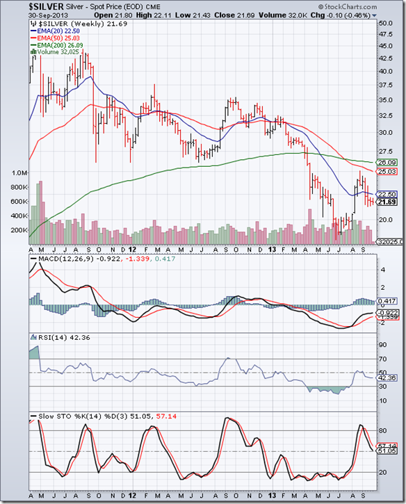
The long-term weekly bar chart pattern of silver is in a long-term bear market that was technically confirmed by the ‘death cross’ of the 50 week EMA below the 200 week EMA in Jul ‘13.

After falling below the 22.50 level, weekly technical indicators became oversold, and remained so for almost 3 months as silver’s price continued its fall down to touch the 18 level in Jun ‘13. This is an example of how markets can remain oversold (or overbought) for long periods.

A technical bounce, supported by good volumes took silver’s price above its falling 20 week EMA to 25, but couldn’t quite test its 50 week EMA. Bears used the bounce to sell. Silver’s price has dropped below 22.50 once again, and is trading below all three EMAs.

Weekly technical indicators are looking bearish, but not oversold. That means lower levels are likely. Global economic and industrial revival should help to stabilise silver’s price, because silver has industrial use (unlike gold). But that seems some distance away.