Tuesday, May 28, 2013

WTI and Brent Crude Oil charts: an update

WTI Crude chart

WTI Crude_May2713

The 6 months daily bar chart pattern of WTI Crude oil shows another aborted attempt by the bulls to push oil’s price past the resistance level of 98. Bears used the rally to sell. Down-day volumes continue to remain strong, which is a bearish sign.

Daily technical indicators are turning bearish. MACD is still positive, but is falling below its signal line. RSI has slipped below its 50% level. Slow stochastic has fallen sharply below its 50% level. Note that MACD and Slow stochastic touched lower tops while oil’s price touched a slightly higher top.

The negative divergences could lead to a drop below the 200 day EMA. For the past 6 months, oil’s price has been consolidating in a broad range between 86 and 98. Since the 200 day EMA is rising, the scales are slightly tilted towards the bulls for now. 

Brent Crude chart

BrentCrude_May2713

The 6 months daily bar chart pattern of Brent Crude oil is clearly in a bear market. Another attempted rally faced strong resistance from the falling 50 day EMA, and dropped below the 20 day EMA on rising volumes.

Daily technical indicators are looking bearish. MACD has dropped down to touch its signal line in negative territory.Both RSI and Slow stochastic have slipped below their 50% levels. Slow stochastic has formed a head-and-shoulders reversal pattern.

Some more consolidation/correction is likely.

Monday, May 27, 2013

Stock Index Chart Patterns: S&P 500 and FTSE 100 – May 24, ‘13

S&P 500 Index Chart

S&P 500_May2413

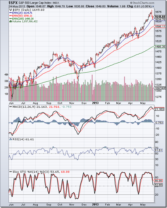
The S&P 500 index has been in a tear-away rally since the intra-day low of 1343 in Nov ‘12 – touching a new life-time high of 1687 on Wed. May 22 ‘13. But it turned out to be a high-volume ‘reversal day’ (higher high, lower close) that often marks the end of a rally.

The index corrected during the last 2 days before the Memorial Day long weekend, but received good support from the 20 day EMA. Blog readers received advance warning about the possibility of a correction in last week’s post, and were advised to book part profits.

Daily technical indicators have corrected from overbought conditions. MACD has crossed below its signal line inside its overbought zone. RSI and Slow stochastic have dropped from their overbought zones, but remain above their 50% levels.

Can the index correct some more? The possibility can’t be ruled out. High volumes on down days is bearish and indicates distribution. The index is trading 150 points above its 200 day EMA – such a wide gap is unsustainable. But this is a bull market correction – so the dip should be used to add to existing holdings.

The US economy seems to be improving. Initial claims of unemployment dropped. Durable goods orders rose 3.3% in April after slipping 5.9% in March. The housing market is recovering. Inflation remains low. These are bullish signs.

FTSE 100 Index Chart

FTSE_May2413

The FTSE 100 index charged up to a new 4 yr high of 6876 on Wed May 22 ‘13, backed by strong volumes. However, profit booking ensued on the next 2 days, and the index closed 1% lower on a weekly basis. The 20 day EMA provided good support to the index.

Daily technical indicators have corrected from overbought conditions, but remain bullish. MACD has dropped down to touch its signal line below the edge of its overbought zone. RSI and Slow stochastic have fallen sharply from their respective overbought zones, but remain above their 50% levels.

Some more correction is possible. The dip can be used to add to existing holdings. There is no immediate threat to the bull market.

Bottomline? The 1 yr daily bar chart patterns of S&P 500 and FTSE 100 indices are showing the effects of profit booking – possibly triggered by the likely tapering down of QE3 in the next few months. Bull markets remain intact. The corrections can be used to add.

Saturday, May 25, 2013

BSE Sensex and NSE Nifty 50 index chart patterns – May 24, 2013

BSE Sensex index chart

Sensex reversed direction last week – the sharp fall coming as a surprise to many analysts and investors, who are once again fearing a big crash. Readers of this blog received ample warning about a correction/consolidation in last week’s post, where negative divergences in all four weekly technical indicators were pointed out.

Several reasons were put forth for the ‘sudden’ fall: Bernanke’s statement that unlimited bond buying in the US (a.k.a QE3) may be tapered down if the US economy shows continued improvement; slowdown in China’s GDP growth rate; recession in Europe. Technically, stock markets in US, UK and India were overbought, and some profit booking was inevitable.

So, is it just a correction or a change of trend? FIIs are still buying – though they were net sellers on Friday (May 24 – the only day the Sensex closed higher last week!). The blue uptrend line remains intact. the 200 day EMA is still rising. The index received support from its 50 day EMA, and formed a ‘reversal day’ pattern (lower low, higher close). All these point to a correction of the rally from the April bottom.

SENSEX_May2413

The daily technical indicators are showing a more bearish picture. MACD has crossed below its signal line after forming a double-top reversal pattern inside its overbought zone. ROC formed a head-and-shoulders reversal pattern in its overbought zone and has dropped below its 10 day MA into negative territory. RSI has fallen below its 50% level. Slow stochastic has dropped to the edge of its oversold zone.

The correction may continue next week. While the possibility of a trend reversal can’t be entirely ruled out – it can come into consideration only if the blue uptrend line (currently at about 18500) is breached. (Remember that this is a new uptrend line – the earlier one connecting the Dec ‘11 and Jun ‘12 lows and marking the long-term bull market is at 17200).

NSE Nifty 50 index chart

There were some negative surprises from large-cap companies at the tail-end of Q4 results season. SBI, L&T, Tata Steel disappointed. L&T announced a 1:2 bonus in an effort to stall the slide in its stock price. Tata Steel’s result was affected by a one-time charge, so the stock price reacted positively.

The IPL spot-fixing scandal is turning out to be like a script of a B-rated film – with players, umpires, team managements, movie stars, politicians, bookies, underworld dons, police – all playing important roles. The rot of corruption and ‘hawala’ money has entered every pore and cell of India’s moneyed classes. The stock market is not immune to this rot.

Nifty_May2413

The weekly bar chart of Nifty touched a new 2 years high but closed lower – forming a ‘reversal week’ pattern. All four weekly technical indicators are showing negative divergences by touching lower tops (marked by blue arrows). Though the indicators are still in bullish zones, they are beginning to turn bearish.

A drift down towards the 50 week EMA or the blue uptrend line are possibilities. The bull market is intact and under no immediate threat. The dip is an opportunity for adding to existing holdings.

Bottomline? Chart patterns of BSE Sensex and NSE Nifty 50 indices are undergoing corrections after touching 2 year highs. Such corrections improve technical health of indices and provide opportunities for adding. Remember to use stop-loss limits in case the market turns against you.

Thursday, May 23, 2013

Are small investors influenced by the ‘IPL Syndrome’?

There is little doubt that the IPL matches have become one of the most successful entertainment shows over the past few years. It has captured the imagination of young and old, men and women, rich and poor, those who have played and understand the game of cricket and those who have never put bat to ball and couldn’t care less.

It provides three hours of action, music, thrills, dancing girls – in fact all the ingredients of a typical Indian movie, with the added attraction of audience participation. The paying public can cheer, jeer, shout, sing, dance, wear fancy costumes and generally have a good time regardless of what is happening out on the field.

Tickets for the matches are not cheap by any means. They can’t be – considering the astronomical sums of money paid to the players for just a couple of months of ‘work’. Yet, most matches have packed stadiums even though the matches are covered live on television. So, what is the great attraction for watching these matches in the searing heat of summer?

May be I’m just too old-fashioned and conservative to understand or appreciate the ‘tamasha’ that goes on in the name of cricket. The first live cricket match I had the privilege of attending was in Jan-Feb 1964 at the Eden Gardens, Calcutta. It was a 5-day test match between Mike Smith’s MCC and India. It ended in a boring draw, but remains memorable because of the century scored by Colin Cowdrey.

Scoring runs in test cricket is all about patience, discipline and technique. Only an experienced test batsman knows which balls to leave, which balls to play defensively, which balls to turn around the corner for a single or two, and which balls to hit for a boundary. Cowdrey’s innings – unexciting and sometimes boring - was a lesson for cricket enthusiasts about how to go about accumulating runs.

One can learn a lot about accumulating wealth through investments by watching and observing a technically sound test batsman (like Cowdrey or Gavaskar or Dravid). The knowledge of which stocks to avoid, which to buy and hold for the long-term, and which stocks to acquire for some quick gains comes from experience gained by spending long, boring hours at the ‘crease’.

In contrast, the IPL batsmen show little patience, less discipline and almost a complete absence of technique. The entire emphasis is on scoring runs as fast as possible by hitting many balls in the air (the ‘IPL Syndrome’) – an exciting but sure strategy for getting out quickly. Entertaining? Perhaps. But is it the best way to play cricket?

Most small investors enter the stock market with zero experience, little knowledge, but with great enthusiasm to make a lot of money quickly.  So, they run after stock tips and cheap stocks - failing to distinguish between ‘dud’ stocks, stocks that are only good for short-term gain and the real wealth-builders.

The ‘cheap’ stocks are cheap for a reason. The blue-chip wealth-builder stocks are always ‘expensive’. It is up to investors to decide if they want to be influenced by the ‘IPL Syndrome’  and lose money quickly, or make the effort to learn and be patient and disciplined to acquire wealth over the long-term.

Tuesday, May 21, 2013

Gold and Silver charts: an update

Gold Chart Pattern

Gold_May2013

In a post two weeks back, the 6 months daily bar chart pattern of gold was analysed with the help of certain technical patterns to explain the descent of gold’s price into a bear market. For a longer-term perspective, let us look at the 2 years weekly bar chart pattern of gold.

Note that the zone between 1500 and 1550 had been providing strong support to gold’s price. Last month, the 1500 level was breached decisively, followed by a high-volume drop (‘panic bottom’) below the 200 week EMA. The subsequent pullback moved above the 200 week EMA, but failed to regain the 1500 level.

Gold’s price dropped below the 200 week EMA last week, and looks ready to fall much lower. The 20 week EMA is falling like a stone below the 50 week EMA. Weekly technical indicators are looking bearish and oversold. MACD is falling deeper into negative territory below its signal line. RSI is trying to emerge from its oversold zone. Slow stochastic is sliding down towards its oversold zone.

Bears are using every rise to sell. The time for bottom-fishing hasn’t arrived yet.

Silver Chart Pattern

Silver_May2013

The 2 years weekly bar chart pattern of silver shows a support zone between 26 and 28 that was decisively breached in Apr ‘13. A high-volume ‘panic bottom’ formed at 22, and after a brief upward bounce, the ‘panic bottom’ was breached as silver’s price dropped to the target of 20 (mentioned in the previous post).

Silver’s price has spent 6 straight weeks below the 200 week EMA. The 20 week EMA has crossed below the 200 week EMA, and the 50 week EMA may follow soon. A long-term bear market is looming.

Weekly technical indicators are looking bearish and oversold. MACD is falling below its signal line in negative territory, and has entered its oversold zone. Both RSI and Slow stochastic have remained inside their oversold zones for a few weeks.

Looks like ‘game over’ for the bulls. Any attempt at a rally will probably be an opportunity to sell.

Monday, May 20, 2013

Stock Index Chart Patterns: S&P 500 and FTSE 100 – May 17, ‘13

S&P 500 Index Chart

S&P 500_May1713

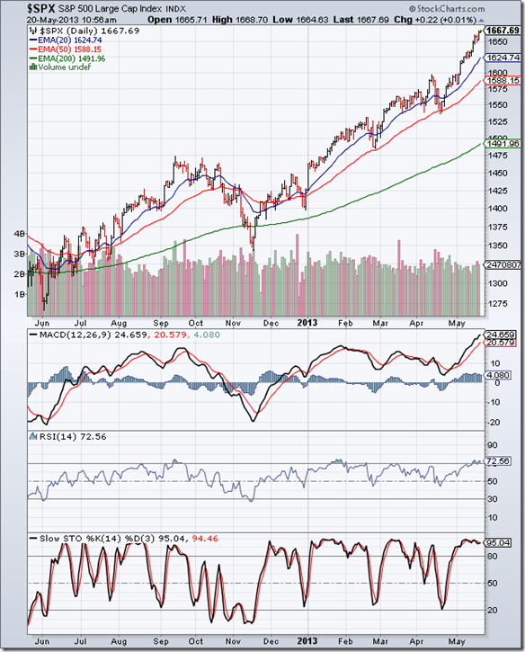
The 1 yr daily bar chart pattern of S&P 500 index keeps rising higher to touch new life-time intra-day and closing highs on a weekly basis. All three EMAs are rising and the index is trading above them. The bulls are in complete control, and are sweeping aside all efforts by bears to stall the runaway rally.

Daily technical indicators are looking quite overbought. MACD is climbing higher into overbought territory. RSI and Slow stochastic are inside their respective overbought zones, and seem happy to stay there. Remember that the index can stay overbought for long periods.

However, during the rally from the Nov ‘12 low, short and sharp corrections have occurred every 6-8 weeks. If the pattern is maintained, a correction may be around the corner. It may be prudent to book partial profits, and redeploy during the next dip.

The US economy continues its painfully slow growth. Initial jobless claims rose higher than expectations. But inflation was lower than the forecast. Univ. of Michigan Consumer Sentiment index rose. Housing starts declined but residential building permits showed growth. Retail sales were strong, but household debt came down.

FTSE 100 Index Chart

FTSE_May1713

The 1 yr daily bar chart pattern of FTSE 100 index sailed past the 6700 level, and closed almost 100 points higher for the week. Volumes picked up as the index rose higher. The bulls seem determined to take the index to a life-time high soon.

Daily technical indicators are bullish, but clearly overbought. MACD is rising above its signal line and entering overbought territory. RSI and Slow stochastic are well inside their overbought zones, and showing no signs of coming down. Stay invested with a trailing stop-loss.

The outlook for UK’s economy during the rest of the year is better. Inflation was lower than expected. GDP growth may touch 1%. However, the economy is far from getting back on track for sustained growth.

Bottomline? The 1 yr daily bar chart patterns of S&P 500 and FTSE 100 indices show that bears have been vanquished, and the bulls are charging ahead. Enjoy the ride, but maintain a trailing stop-loss.

Sunday, May 19, 2013

BSE Sensex and NSE Nifty 50 index chart patterns – May 17, 2013

BSE Sensex index chart

FII buying caused the 5th straight week of higher closes – despite continuous selling by DIIs and an overhang of equity dilutions by companies with more than 75% promoter holdings. There are several interesting technical chart patterns visible in the weekly bar chart of Sensex below, and they will be discussed one by one – starting from the extreme left of the chart.

First, the ‘diamond’ reversal pattern (which can be looked upon as a head-and-shoulders pattern with a bent neckline) that formed during Oct – Dec ‘10. It ended the previous bull phase that started from Mar ‘09. Note that a horizontal dotted line drawn from the right apex of the ‘diamond’ has acted as a resistance level for more than 2 years – in one of those ‘coincidences’ that frequently appear in technical charts!

The bear phase that started after the break down below the ‘diamond’ and ended with an intra-week low of 15136 in Dec ‘11 actually turned out to be the first half of a bullish consolidation pattern known as a ‘cup and handle’. This is an example of why one needs to look at short-term, medium-term and long-term charts before arriving at a conclusion.

SENSEX_May1713

The ‘handle’ formation appears to have completed, and the rally during the last 5 weeks is about to convincingly breach the resistance level of the dotted line (at about 20200). Upward target of the ‘cup and handle’ pattern is 25000, as explained in this post. The index is trading above its rising 20 week and 50 week EMAs. The next leg of the bull market that started in Mar ‘09 is ready to unfold.

Weekly technical indicators have turned bullish, but all four are exhibiting negative divergences by failing to touch new highs with the index. Does that indicate a possible reversal of trend, or a more probable correction/consolidation near a previous top? What do readers think – and why?

NSE Nifty 50 index chart

The drop in WPI inflation below RBI’s threshold level of 5% seems to have given a boost to the bulls – though the ‘base effect’ probably had more to do with it than a real fall in prices. In any case, the ‘drop’ is not really a drop, but an increase at a slower rate. Investors need to understand this concept about the rate of inflation.

Q4 results declared so far have been better than expectations and not as bad as Q3 results. That has also added to improved sentiments. Mid-cap and small-cap stocks have started to move up again – probably an indication that retail investors are returning to the market (not surprising near a new high!).

Nifty_May1713

All three EMAs are rising and Nifty is trading above them. A new up trend line has been drawn connecting the Jun ‘12 and Apr ‘13 bottoms. All four daily technical indicators are bullish and looking overbought. That doesn’t mean Nifty can’t move up higher. Rising volumes last week – after the break out above 5970 and a pullback - is a bullish sign.

However, the need for caution at a new high can’t be over-emphasised – particularly when three of the four technical indicators are showing negative divergences by touching lower tops (marked by blue arrows). Don’t sell off in a panic at the first hint of a correction. Don’t try to short a bull market. Stay invested with a trailing stop-loss, or add stocks where you see compelling value.

Bottomline? Chart patterns of BSE Sensex and NSE Nifty 50 indices are about to embark on new bull phases after touching 2 year highs. Don’t expect a one-way up move. Use corrections/consolidations as adding opportunities. Select only the best quality stocks, and maintain a stop-loss.

Friday, May 17, 2013

What is fuelling the stock market rally?

Many analysts – specially those who have been caught on the wrong foot – are finding it difficult to explain the reasons behind the current rally in the stock markets. The easiest way out is to say: “It is a liquidity driven rally.” But aren’t all rallies liquidity driven? If buyers didn’t overwhelm sellers, the market would remain stagnant.

If the Sensex falls 1000 points in a week, investors want to know what caused the fall, and whether a bear market has started. Analysts are more than happy to satisfy the curiosity with their considered opinions based on fundamental analysis, or technical studies, or astrological alignments.

If the Sensex rises 1000 points in a week, investors want to know if it is a good time to buy. Analysts jump in to list out their favourite small/mid/large cap ideas that are just the kind of stocks that would provide multibagger returns.

Whatever be the trend of the stock market, investors always have this insatiable need to know why the market is doing what it is doing. As if analysts really know! At best, they may have a reasonably good idea.

French author, critic and journalist Jean-Baptiste Alphonse Karr had made the statement: "Plus ça change, plus c'est la même chose" – which is usually translated as “the more things change, the more they stay the same”. He may just as well have said it about the unnecessary curiosity of stock market investors about the direction of a market index.

In a recent post, a bullish technical chart pattern that has been forming on the Sensex for more than 2 years was explained to justify why the Sensex should touch 25,000. Some readers scoffed at the conclusion. A few wanted to know how soon might the target be achieved.

What was the purpose of writing the post? To partly dispel the overwhelming mood of negativity among many small investors. The high inflation and slow down in economic growth seemed to dampen any enthusiasm to invest money into a ‘risky asset’ like stocks. Gold or bank fixed deposits appeared safer bets.

Inflation-beating returns require judicious and timely investment in stocks – regardless of the level or direction of a stock index. Then, discipline and patience are required to hold on to the stocks for the long-term, without worrying too much about why the stock market is rising or falling.

That was the long answer. The short answer is: “Who cares?”

Wednesday, May 15, 2013

Stock market behaviour prior to a general election – a guest post

The next general elections for Lok Sabha seats are less than a year away. Political parties have already started pre-election activities like choosing likely candidates for the PM’s post and discussing possible alternative alignments for government formation.

The period prior to a general election is usually one of uncertainty for investors. Uncertainty leads to selling, or at best, staying on the sidelines – neither being particularly conducive for a bull phase. In this month’s guest post, Nishit presents a different viewpoint

--------------------------------------------------------------------------------------------------------------------------

The next General Elections are round the corner. Let us see the implications for the stock market. Most believe that the uncertainty of elections leads to markets falling. A friend of mine had done an analysis where he compared the 1 year period leading to general elections, and found out that in 5 out of 6 occasions the markets had rallied at least 20% prior to elections.

In the year the market did not rally before the elections, it rallied after the elections (in 2009). Next is the timing of the elections. There are 3 likely slots for elections: In September 2013, November-December 2013 and the original slot of April 2014.

For elections to happen in September 2013, the elections should be announced now. It takes the Election Commission about 4 months to organize an election and also the monsoons have to withdraw. The Parliament is not in session till July and the Government would like to see how the Monsoon progresses before jumping the gun and calling for early elections.

That means September is more or less ruled out. That leaves us with the November-December slot along with the State elections, or the normal elections next April. I strongly feel it will be next April because out of the States going for elections in December, Madhya Pradesh and Chhattisgarh are BJP strongholds and in Rajasthan and Delhi, the Congress is on very weak wickets. If the elections are held simultaneously it can very well happen that the Congress loses out on Lok Sabha seats also in these States.

Also, the Congress as a rule never calls for elections before its term is up. If we go by that yardstick, then also the elections should be held next April.

If we take the Nifty bottom in April ‘13 (of 5477), then a gain of minimum of 20% till the elections in April ‘14 can take us to 6572.

The situation post the election results may completely change. The stock market will depend on the stability of the next Government and we will explore that as we come closer to elections.

If we go by the above hypothesis, then every dip becomes a buying opportunity. Profits need to be booked at higher levels so that one has investible funds in hand when the market falls. The previous elections in 2009 created a big gap at 3700-4000 in Nifty. After the next general elections, Nifty may very well go and fill that gap.

--------------------------------------------------------------------------------------------------------------------------

(Nishit Vadhavkar is a Quality Manager working at an IT MNC. Deciphering economics, equity markets and piercing the jargon to make it understandable to all is his passion. "We work hard for our money, our money should work even harder for us" is his motto.

Nishit blogs at Money Manthan.)

Tuesday, May 14, 2013

WTI and Brent Crude Oil charts: counter-trend rallies?

WTI Crude chart

WTI Crude_May1313

The 1 yr daily bar chart pattern of WTI Crude oil shows a spirited rally by the bulls that propelled oil’s price above all three EMAs and into bullish territory. After bouncing up from the 86 level, oil’s price has formed a bullish pattern of higher tops and higher bottoms.

However, the volumes on down days continue to be very strong, which is an indication that bears are selling at every rise. Oil’s price touched a slightly lower top at 97, and needs to move past 98 for the rally to sustain.

Daily technical indicators are bullish, but showing signs of weakness. MACD is above its signal line in positive zone, but its upward momentum is slowing down. RSI is falling towards its 50% level. Slow stochastic is about to drop down from its overbought zone.

New sources of oil across North America are going to keep oil prices subdued for the next few years, as per this article.

Brent Crude chart

BrentCrude_May1313

The 1 yr daily bar chart pattern of Brent Crude oil rallied up to its falling 50 day EMA, faced resistance and has dropped back below all three EMAs. The bears are missing no opportunities to sell on rallies. Strong volumes on down days is a sign of ‘distribution’.

Daily technical indicators are turning bearish. MACD rose above its signal line in negative territory, but has started to turn down. RSI has slipped below its 50% level. Slow stochastic has dropped down from its overbought zone.

The down move is likely to resume.

Monday, May 13, 2013

Stock Index Chart Patterns: S&P 500 and FTSE 100 – May 10, ‘13

S&P 500 Index Chart

S&P 500_May1013

The 6 months daily bar chart pattern of S&P 500 continues to rise relentlessly. It touched a new life-time intra-day high of 1635 on May 9 ‘13, and a new life-time closing daily and weekly high of 1633.70 on May 10 ‘13.

The index is trading above all three EMAs, but appears to be taking a pause. All three EMAs are rising, and there are no immediate threats to the bull market. But some of the concerns raised in last week’s analysis remain. Volumes are not great and the widening gap between the 50 day and 200 day EMAs is unsustainable.

Daily technical indicators are bullish, but beginning to correct from overbought conditions. MACD is above its signal line, but has stopped rising in its overbought zone. RSI has started to drift down after touching the edge of its overbought zone. Slow stochastic has started to slide down inside its overbought zone.

The index appears ripe for another correction. The Fed is planning to wind down the QE3 program – as per an article in the Wall Street Journal. The real mettle of the bulls may get tested soon.

FTSE 100 Index Chart

FTSE_May1013

The 6 months daily bar chart pattern of FTSE 100 index ignored all the warning signs mentioned last week, as it climbed past the 6600 level and closed at a 5 yr high of 6625. The index is now within a stone’s throw of touching a life-time high.

Volumes have picked up. All three daily technical indicators are bullish, but looking overbought. MACD has risen above its signal line into overbought territory. RSI and Slow stochastic are both inside their overbought zones.

The index can stay overbought for extended periods. It is not a good idea to buy when the index is at a new high. So, one can stay invested with a trailing stop-loss.

Bottomline? Bulls continue to rule the daily bar chart patterns of S&P 500 and FTSE 100 indices – touching new highs on a weekly basis. Hold on, with trailing stop-losses to protect profits.

Saturday, May 11, 2013

BSE Sensex and NSE Nifty 50 index chart patterns – May 10, 2013

BSE Sensex index chart

FIIs continue to pour in money into the Indian stock and debt markets. Their inflows year-to-date are much higher than the amount they brought in during the same period last year when the bull rally started. DIIs are selling, but a look at the daily bar chart pattern of Sensex shows which side is winning.

The index is on the verge of touching a new 52 week high, and is just 5% below its life-time high touched in Jan ‘08. Retail participation is still low, and there is a lot of uncertainty about the political and economic environment. But a bull market is supposed to climb a wall of worries – and it seems to be doing just that.

Once the beaten-down mid-cap and small-cap stocks join the party, and some of them are already showing signs of doing so, retail investors will jump in. That will be a good time to book part profits.

SENSEX_May1013

Daily technical indicators are looking bullish, but overbought. MACD is rising above its signal line, and has entered its overbought zone. ROC formed a small head-and-shoulders reversal pattern inside its overbought zone, and has crossed below its 10 day MA – perhaps giving an early warning of a correction, or consolidation. RSI and Slow stochastic are inside their respective overbought zones.

However, all four indicators are showing positive divergences by touching higher tops than the ones they touched in Jan ‘13. Remember that a market can remain overbought for some time, so stay invested with a trailing stop-loss. The index has crossed above its Mar ‘13 top of 19760, so a new uptrend line connecting the Jun ‘12 and Apr ‘13 lows have been drawn.

NSE Nifty 50 index chart

Loss in the Karnataka state election and replacement of Law and Railways ministers have taken some of the wind out of the opposition’s sails. However, the clamour for the PM’s head hasn’t quite subsided.

The IIP number wasn’t great, but it was better than expectations. Hike in diesel’s price will reduce the subsidy burden. Annual results from the non-performing sectors – like metals, capital goods, realty – are awaited and may decide the rate of progress of the bull market.

Nifty_May1013

The weekly bar chart pattern of Nifty had four straight weeks of higher closes – last seen in Sep ‘12. But volumes have not been great (even though the previous three weeks had only 4 trading days each). The 20 and 50 week EMAs are rising and the index is trading above them. A new 52 week high is imminent.

Weekly technical indicators are turning bullish. MACD has crossed above its signal line after three months. ROC is rising above its 10 week MA in positive territory. RSI has crept above its 50% level. Slow stochastic is about to enter its overbought zone. Looks like bulls won’t stop till a life-time high is reached.

Bottomline? Chart patterns of BSE Sensex and NSE Nifty 50 indices are on the verge of touching new 52 week highs, and may move up to touch life-time highs. This is not the time for across-the-board buying. Be selective. Pick fundamentally strong mid-cap and small-cap stocks, and do maintain a stop-loss.

Thursday, May 9, 2013

Global indices vs. Sensex

Many investors, including fund houses, have been taken by surprise by the strong surge in the Indian stock market during the past year. FIIs have shown their faith by remaining net buyers throughout. The Sensex is trading very close to its 52 week high touched in Jan ‘13, and is a short distance away from its all-time high.

The bullishness is not limited to the Sensex alone. Many global indices are looking just as bullish as the Sensex. Some are at life-time highs. Here is a look at the one year charts of four global indices (in blue) compared with the Sensex (in green).

Jakarta Composite vs. Sensex

Jakarta_May13

Jakarta Composite and Sensex have gained an almost identical amount during the past 12 months. Note that Jakarta faced the last major correction back in May ‘12, while Sensex had a good correction during Feb-Mar ‘13. Sensex should resume its outperformance.

Germany DAX vs. Sensex

DAX_May13

After moving neck-and-neck till Feb ‘13, Germany’s DAX index has strongly outperformed Sensex during the past 2 months. DAX is currently at a life-time high, but RSI is looking extremely overbought.

Dow Jones vs. Sensex

Dow_May13

Though Dow Jones index is near a life-time high, it has underperformed the Sensex during the past year. RSI is overbought, and showing negative divergence by failing to touch a new high.

Argentina MERVAL vs. Sensex

Merval_May13

Argentina’s MERVAL index underperformed the Sensex till Nov ‘12, but has surged ahead since then. The Sensex is near a life-time high, but RSI is looking overbought, and a correction may be on the way.

Wednesday, May 8, 2013

A mid-week Nifty update

Nifty_May0813

The Nifty has almost retraced its entire fall from Jan 29 to Apr 10 ‘13 (10 weeks) in less than a month, which is very bullish. All three EMAs are rising and Nifty is trading above them – a clear sign that the bulls are back in control.

However, the index looks ripe for a correction. Volume peaks have been sliding as the index kept rising past the blue downtrend line. Without volume support, the up move may stall.

Daily technical indicators are looking bullish, but overbought. MACD, RSI and Slow stochastic are well inside their overbought zones. ROC formed a ‘double-top’ reversal pattern inside its overbought zone and has dropped below its 10 day MA – perhaps giving an advance warning of a correction.

The index is close to its Jan ‘13 top. It is better to be cautious near a previous top. If and when the correction comes, use the dip to add to existing positions. Some fundamentally strong mid-cap and small-cap stocks that had faced the brunt of bear selling may be looked at for accumulation.

Tuesday, May 7, 2013

Gold and Silver charts: bounce after panic bottoms

Gold Chart Pattern

Gold_May0613

The 6 months daily bar chart pattern of gold clearly shows three distinct phases that characterise a descent into a bear market:

  1. an initial drop below the 200 day EMA (in Dec ‘12);
  2. a sideways consolidation that brought all three EMAs together, followed by a sharp drop below all three EMAs that led to the ‘death cross’ of the 50 day EMA below the 200 day EMA (in Feb ‘13);
  3. another sideways consolidation followed by a sharp fall below the support level of 1525, and then a high-volume ‘panic bottom’ formation (on Apr 15 ‘13)

The subsequent bounce is facing resistance from the 20 day EMA. Note that volumes on the previous three down-days (Apr 23, 26, May 1) were higher than up-day volumes, which is a bearish sign. Since a ‘panic bottom’ seldom holds, gold’s price chart is likely to resume its downward move soon.

Daily technical indicators are giving mixed signals, which is to be expected during a sideways consolidation. MACD is rising above its signal line, but both are in negative territory. RSI is moving sideways below its 50% level. Slow stochastic has entered its overbought zone.

If you are holding on with the hope that gold will regain its lost glory, you will be disappointed. If you were lucky/brave to buy during the ‘panic bottom’, stop being greedy and book your profits. If you think this is a good time to enter – forget it.

There will be strong upside resistance from the falling 50 day EMA and the 1525 level. Downward target is 1250.

Silver Chart Pattern

Silver_May0613

The 6 months daily bar chart pattern of silver is showing a similar three step descent into a bear market explained in the analysis of gold’s chart (above): a fall below the 200 day EMA followed by a desperate effort to return to bull territory; a confluence of all three EMAs that usually precede a sharp fall (downwards in this case) and the ‘death cross’ technically confirming a bear market.

Finally, a breakdown below a rectangular consolidation zone between 28 and 29.50, followed by a pullback to the 28 level, and then a sharp fall below the support level of 26 and a ‘panic bottom’ on high volumes.

The subsequent bounce has been a weak one that has failed to cross above the falling 20 day EMA. Daily technical indicators are giving mixed signals. MACD is rising above its signal line, but inside negative territory. RSI is moving sideways below its 50% level. Slow stochastic has risen above its 50% level.

‘Panic bottoms’ seldom hold. Downward slide of silver’s price is likely to resume. The 20 day EMA should continue to provide upside resistance. Next downward target is 20.

Monday, May 6, 2013

Stock Index Chart Patterns: S&P 500 and FTSE 100 – May 03, ‘13

S&P 500 Index Chart

S&P 500_May0313

The 6 months daily bar chart pattern of S&P 500 index tested its Apr ‘11 intra-day top of 1597 three days in a row, before climbing to an all-time high of 1618 on Fri. May 3 ‘13. The weekly close at 1614 was also an all-time closing high.

All three EMAs are rising and the index is trading well above them. The last of the bears have been vanquished. The index is in ‘blue sky’ territory with no resistances. The bulls are in complete control, and ready to crack open the bubbly.

But there are a few technical signals that warrant caution, and not celebration. The volume bars on up-days have not been great, and there was no strong volume support during Friday’s all-time high. All three daily technical indicators failed to touch new highs with the index.

The index and its 50 day EMA are moving far away from the 200 day EMA – a situation that is not sustainable for long. Enjoy the ride, use dips to add, and maintain a trailing stop-loss to protect profits.

ISM manufacturing report was a bit better than expected. Unemployment claims fell. Non-farm payrolls grew. No wonder bulls were charging ahead.

FTSE 100 Index Chart

FTSE_May0313

The following comments were made in last week’s analysis of the 6 months daily bar chart pattern of the FTSE 100 index: “The down trend that started after the Mar ‘13 double-top at 6534 is still in progress. But it looks like a mild bull market correction.”

After consolidating sideways within a range during the first four days of the week, the index rose above its Mar ‘13 double-top to touch a new 52 week (and 4 yr) intra-day high of 6542. All three EMAs are rising and the index is trading above them. The bulls are back on top.

But there are some warning signs. Last Tuesday’s (Apr 30 ‘13) volumes were highest during the week – on a down-day. All three daily technical indicators are bullish, but showing negative divergences by failing to touch new highs with the index.

Stay invested, but maintain a trailing stop-loss.

Bottomline? Bulls are ruling the daily bar chart patterns of S&P 500 and FTSE 100 indices. Hold on to current positions, and use dips to add.

Sunday, May 5, 2013

Why Sensex should touch 25000 – a long-term view

When you stand very close to a large tree and look straight at it – all you will see is wood (i.e. the trunk). Step back a few yards, and you will see branches, leaves and flowers. Step back some more, and you may see several trees of different shapes and sizes. Only when you get to the top of a cliff can you see an entire forest full of trees.

Look at Sensex from the beginning of 2013, and you see an index trying to reverse a down trend that shaved off 2000 points (10%). The view from the beginning of 2012 till date shows a bull phase that gained 5000 points (33%). From the beginning of 2011 till date, the Sensex had a bear phase followed by a bull phase, and made zero gains.

Now let us go all the way back to the beginning of 2008. What we get is the ‘cliff view’ of the chart. While the Sensex has made no gains since touching the bull market top, there are three distinct phases visible in the long-term chart of Sensex below:

Sensex_May0313_LT

Phase I: A sharp bear market of about 14 months (from Jan ‘08 to Mar ‘09). The index dropped from 21200 to 7700 within 10 months, followed by 4 months of sideways consolidation.

Phase II: A bull market that began in Mar ‘09 with a quick jump above the 200 day EMA, followed by a large ‘gap’ that opened up after election results in May ‘09. The ‘gap’ was partly filled in Jul ‘09. The next leg of the bull phase was more gradual, and culminated with a slightly lower top of 21100 in Nov ‘10. A ‘diamond’ reversal pattern marked the end of the 20 months long bull phase that retraced the entire fall from Jan ‘08 to Oct ‘08.

Phase III: From the beginning of 2011 till date, Sensex has formed a bullish consolidation pattern known as a ‘cup-and-handle’. The formation of the ‘cup’ took 2 years with the Sensex touching 20200 in Jan ‘13. Note the ‘rounding bottom’ shape of the 200 day EMA that has smoothened out the fluctuations of the ‘cup’. The subsequent correction formed the ‘handle’.

A rise above the ‘rim’ of the ‘cup’ (right edge at 20200) on strong volume support will confirm the successful completion of the ‘cup-and-handle’ pattern, which is usually a continuation pattern in a bull market. The pattern has target measuring implications: the rise above the right edge should equal the depth to the bottom of the ‘cup’.

In this case: 20200 – 15100 (bottom in Dec ‘11) = 5100 (depth of cup from right edge). So, upward target of Sensex: 20200 + 5100 = 25300. 

Caveat: Technical analysis is not a science and the stock market doesn’t understand arithmetic and formulae. However, the ‘gurus’ of technical analysis have suggested the above formula after observing thousands of price charts over many years.

Saturday, May 4, 2013

BSE Sensex and NSE Nifty 50 index chart patterns – May 03, 2013

BSE Sensex index chart

Bulls (i.e. FIIs) emerged winners on another holiday-shortened week of trading, keeping Sensex above the blue downtrend line throughout the week. DIIs continued with their selling, and managed to stall the bull charge at the resistance level of 19760 (explained in last week’s analysis). 

The 3 months long bull market correction seems to be over. The 20 week and 50 week EMAs are both rising and the index is trading above them. In case the index pulls back towards the downtrend line next week, it will be an adding opportunity.

RBI’s announcement of a 25 bps cut in repo and reverse repo rates couldn’t excite the market because of the Governor’s hawkish stance on future rate cuts. A convincing  move above the resistance level of 19760 should improve market sentiments.

SENSEX_May0313

Weekly technical indicators are turning bullish. MACD is moving up towards its falling signal line in positive territory. ROC has crossed above its 10 week MA into positive zone. RSI is below its 50% level, but moving up gradually. Slow stochastic has risen to its 50% level.

Note that the uptrend line connecting the bottoms touched in Dec ‘11 and Jun ‘12 did not get tested during the recent correction. Once the Sensex crosses above the 19760 level, a new uptrend line connecting the Jun ‘12 and Apr ‘13 lows will be drawn. The new trend line will act as a support for the next leg of the bull market.

NSE Nifty 50 index chart

Just when the Law Minister’s interference in the CBI investigation into the coal block allocation scam had taken centre stage in Parliament, a bribery incident related to the posting of a member of the Railway Board has got the Railway Minister embroiled in controversy. Citizens of India should have no doubts that the UPA alliance is a den of thieves.

Q4 results showed good performances by two more private banks – Kotak Mahindra and ING Vysya. Bharti Airtel’s results were disappointing, thanks to their African adventure. Titan posted a decent set of numbers. But the star of the week was undoubtedly HUL – management declared better than expected numbers, and then announced a huge buyback at a premium.

Nifty_May0313

The daily bar chart of Nifty rose above the blue downtrend line and even closed above the resistance level of 5970 for a day before slipping a bit on profit taking. The 20 day EMA had bounced up after a slight dip below the 20 day EMA, and has now crossed above the 50 day EMA – signalling the end of the correction.

Daily technical indicators are looking bullish but overbought. MACD is rising above its signal line towards its overbought zone. ROC has dropped from its overbought zone and slipped below its rising 10 day MA. RSI and Slow stochastic are inside their respective overbought zones, and have started sliding down.

Any pullback towards the blue downtrend line can be used to add to existing holdings.

Bottomline? Chart patterns of BSE Sensex and NSE Nifty 50 indices have halted near their Mar ‘13 tops. The halts should be temporary. Both indices should resume their upward moves and touch new 52 week highs. Hold. Add more on convincing moves past Mar ‘13 tops.

Thursday, May 2, 2013

Stock Chart Pattern – SpiceJet (An Update)

The previous update to the analysis of the stock chart pattern of SpiceJet was posted back in Sep ‘11 (date marked by grey vertical line at extreme left of chart below). Takeover of the company from financier Wilbur Ross by Kalanithi Maran of Sun TV was followed by the departure of senior management – some of whom were experienced airline industry hands.

Worse was to follow because DMK’s loss in the state assembly elections somewhat negated the political clout of the Maran family. High fuel prices and stiff competition from several private carriers hindered the prosperity of airline companies – despite growth in airline passengers.

Technically, the stock price dropped below the support level of 49 on a volume spurt, and the ‘death cross’ of the 50 day EMA below the 200 day EMA confirmed a bear market. Fall below a support level on strong volumes usually turns the support level into a resistance level for future up moves.

The bar chart pattern of SpiceJet below shows how price charts tend to have ‘memory’ of previous levels:

SpiceJet_May0213

The stock price dropped to an intra-day low of 15.35 on Dec 22 ‘11 – managing to spare itself the blushes of turning into a ‘penny’ stock. A rally, which started along with the broader market and continued for 12 months – culminated with an intra-day high of 50.90 touched on Dec 7 ‘12.

Though the stock breached the 49 level on intra-day basis for a few days, it failed to close above 49. The stock gained more than 35 points (230%) from its Dec ‘11 low – excellent returns within one year. But its failure to convincingly breach the 49 level allowed the bears to return with a vengeance.

After several failed attempts to cross above the 49 level during Dec ‘12 and Jan ‘13, the stock price dropped sharply below all three EMAs and the blue uptrend line – pushing the stock down into bear territory. As often happens when a trend line gets breached, there was a pullback towards the trend line that provided another opportunity to sell.

The stock price dropped to a low of 25.90 on Mar 28 ‘13 – a 50% drop from its Dec ‘12 high, and a 70% retracement of its entire rally from the Dec ‘11 low. A double-bottom reversal pattern and a rally along with the broader market has taken the stock above all three EMAs. However, daily technical indicators are looking quite overbought. Another bout of correction is likely.

Does the price pattern reflect some fundamental change in the company? May be it is just on a hope of better times following the deal between Jet Airways and Etihad of Abu Dhabi that has brought some life back into the struggling airlines sector. A fall in fuel prices has also been positive.

Bottomline? The stock chart pattern of SpiceJet is trying to disentangle itself from a strong bear grip. Upside resistance is expected from the blue trend line and the 49 level. Demise of Kingfisher Airlines has partly reduced competition. But profitability in the airline sector is fleeting. The stock is not investment-worthy, but can be a trading bet due to high-volume price swings.