Wednesday, February 27, 2013

Notes from the USA – a guest post

For some one who has Indian origins but has spent a reasonable amount of time in the Western world, a trip to India can simultaneously be a pleasant and an aggravating experience.

Pleasant because one meets old friends and family, as well as appreciates the economic growth that is quite visible – particularly in cities and towns. Aggravating because the same old bureaucratic ways of daily business and commerce leave a lot to be desired.

In this month’s guest post, KKP points out the areas of improvement that can propel India to faster economic growth. 

------------------------------------------------------------------------------------------------------------------------------------------

Pros and Cons of Westernizing the East

The Westernized world (viz. North America and Western Europe) has developed over many decades into a refined economy with many pillars to the structure. Each of these pillars form the foundation on which the western economies have grown, multiplied and provided the prosperity that people deserve.

Today, those same pillars are being built in the East. However, many of the pillars of the western economies are now becoming  wobbly due to the size and flaws in their structure - like too much enthusiasm with debt (personal and corporate). One of the historians (Niall) explains these shifts in what he calls “killer apps”. There are six to be precise: Competition, Science/Technology, Rule of Property Rights, Medicine, Consumer Society and Work Ethics.

In a recent trip to India, I have analyzed the Indian marketplace from many angles and spoke with several HNIs. Each of them called the West ‘a world waiting to blow up’, and name the East as the place to be. I do not disagree with this ‘macro-call’. What I fail to see very clearly is the dominance in India of all of the “killer apps”, without which the economy will either wobble, or even begin to fall. We all know that some of the pillars are still being built, but what I clearly found amiss was the older generation continuing to run the country (in Nationalized Banks, Government Offices and other places).

  • Competition is all around, but there is still nepotism and corruption that leaves the door wide open
  • Science/Technology is being adopted, but there is too much automation of old bureaucratic processes
  • Property Rights rules are being modified, but old rental rules still dominate in large cities
  • Medicine is advancing, but it is riding on old rules, processes and a bit of ‘short cut approaches’
  • Consumers are getting smarter, using technologies, but it is limited to the new young middle class
  • Work Ethics are outright missing among the masses, and this is the shortest pillar of the economy

Without all the pillars of the structure strong and growing, we will see a deteriorating environment that runs on black money, inefficient processes costing manpower, high error rates in each task, paper-based society that will not change for another 10-20 years, and finally, an uncontrolled inflationary environment due to lack of resources.

None of the above means that we will falter, because people know how to work ‘around’ the system, but yet, it will take another 10-20-30 years for the dominance of India to show up at the Global Level, with a level of confidence that was shown by some of the Western Nations in the mid-1990’s or mid-2000’s, and by China now.

All in all, let’s give a lot of credit to India (and Indians) for working away amongst this turning tide of sustaining the energy of going after each task 2-5 times before it is completed to its required intent, being patient or pushy depending on the day to get the job done, and finally, for improving at the rate that it has since 1990. Long working hours within the new institutions is a norm that people face today to sustain growth, but everyone works happily in this environment, moving themselves from one step of the financial ladder to the next higher one. With people like Modi forcing change upon change at the government level, we might be able to shorten the 10-20-30 years that I predict into something less, but that has to be proven between now and 2020.

Bottom line is to stay invested come thick or thin in the Indian economy, but simultaneously believe in China and Commodities to diversify and distribute wealth, since East is the place to be, and West is fading away in my lifetime.

------------------------------------------------------------------------------------------------------------------------------------------

KKP (Kiran Patel) is a long time investor in the US, investing in US, Indian and Chinese markets for the last 25 years. Investing is a passion, and most recently he has ventured into real estate in the US and also a bit in India. Running user groups, teaching kids at local high school, moderating a group in the US and running Investment Clubs are his current hobbies. He also works full time for a Fortune 100 corporation.

Tuesday, February 26, 2013

WTI and Brent Crude Oil charts: an update

WTI Crude chart

WTI Crude_Feb2613

Two weeks back, the 6 months daily bar chart pattern of WTI Crude oil had touched the 98 level but corrected after double-top reversal patterns were visible on the technical indicators. The correction received good support from the 20 day EMA, and the up move resumed.

Oil’s price touched the 98 level for a second time on Feb 13, forming a small double-top pattern, and also formed a ‘reversal day’ pattern (higher high, lower close). All three technical indicators showed negative divergences by reaching lower tops. The combination of all these bearish signals led to a swift drop below the 200 day EMA.

Is the brief foray into bull territory over? The strong volumes on 2 down-days last week seem to indicate that. Daily technical indicators are looking bearish, which means the correction may not be over yet.

Brent Crude chart

Brent Crude_Feb2613

The following comments were made two weeks ago about the 6 months daily bar chart pattern of Brent Crude oil: “The break out above the support-resistance level of 117.50 was not accompanied by a substantial increase in volumes. That opens up the possibility of the current pullback continuing a bit longer before the up move can resume.”

Oil’s price dropped to its 50 day EMA, where it received good support and bounced up. Is the correction over? May be not yet. Last week’s down-day volumes were stronger than the volumes on the upward bounce.

Also, RSI and slow stochastic are showing negative divergences by touching lower bottoms (than the ones in Jan ‘13), while oil’s price touched a higher bottom. A test of support from the 200 day EMA is a possibility.

Monday, February 25, 2013

Stock Index Chart Patterns: S&P 500 and FTSE 100 – Feb 22, ‘13

S&P 500 Index Chart

S&P 500_Feb2213

For a different and longer-term perspective, let us take a look at the 2 years weekly bar chart pattern of S&P 500 index. It is apparent that a long-term bull market is playing out. All three weekly EMAs are rising and the index is trading above them.

Last week, the index touched another new high of 1530, before closing a bit lower on a weekly basis. By doing so, it formed a ‘reversal week’ bar pattern (higher high, lower close). Such a pattern may end the current leg of the up move. Falling weekly volumes point to such a likelihood.

Weekly technical indicators are bullish, but showing some signs of weakness. MACD is above its signal line in positive territory, but its upward momentum is slowing. RSI is just below its overbought zone, and slipping down. Slow stochastic is well inside its overbought zone, but turning down.

Note that MACD and RSI are showing negative divergences by failing to touch new highs with the index. Some consolidation or correction may be on the cards.

FTSE 100 Index Chart

FTSE_Feb2213

The 2 years weekly bar chart pattern of the FTSE 100 index is a clear example of the disconnect between the economy and the stock market. The UK economy’s growth is taking two steps forward and then one step back. No such hesitation with the FTSE index, which touched another new high of 6400 during the week.

Weekly technical indicators are bullish, but exhibiting some hint of weakness. MACD is above its signal line in positive territory, but its upward momentum is slowing. RSI is just below its overbought zone. Slow stochastic is inside its overbought zone, but falling.

Note that RSI and slow stochastic failed to touch new highs with the index. The negative divergences may be heralding some correction or consolidation.
Bottomline? The weekly bar chart patterns of S&P 500 and FTSE 100 are touching new highs every week on a flood of liquidity. However, there are signs of a possible correction or consolidation. Stay invested with trailing stop-losses.
Saturday, February 23, 2013

BSE Sensex and NSE Nifty 50 index chart patterns – Feb 22, 2013

BSE Sensex index chart

For the past 10 trading sessions, the daily bar chart pattern of BSE Sensex has behaved more like a yo-yo – moving up and down without going anywhere. There has been a lot of volatility intra-day as well – opening higher and closing lower, or opening lower and closing higher.

With unimpressive Q3 results season almost over and the union budget around the corner, such uncertainty is understandable. The underlying theme since Jun ‘12 remains the same. FIIs are bulls and DIIs are bears. With more PSU disinvestments in the pipeline, emphasis has shifted slightly from the secondary to the primary market.

The Sensex remains in a corrective mood, as it drifts down within the long-term resistance zone between 19000 and 19800. As long as the support level of 19000 is not breached, and the 200 day EMA continues to rise, the bull market won’t be under any threat.

Sensex_Feb2213

What if the budget disappoints the market? Can the Sensex drop below its 200 day EMA and enter bear territory? Anything is possible in the market. Sensex had dropped below its 200 day EMA in May ‘12, and provided a good buying opportunity for those who missed the initial rally during Dec ‘11 - Feb ‘12. A drop towards the lower edge of the upward sloping channel may provide a similar buying opportunity for those who missed the rally from the Jun ‘12 low.

Daily technical indicators have corrected from oversold conditions but remain bearish. MACD is falling below its signal line in negative territory. ROC is also negative, though it has bounced up after receiving support from its rising 10 day MA. RSI and slow stochastic have moved up from their respective oversold zones, but have failed to move higher.

Observant readers may note that three of the four indicators – ROC, RSI, slow stochastic – have touched higher bottoms during the month while the index has touched a slightly lower bottom. The positive divergences may lead to some consolidation within the resistance zone – at least till the budget on Feb 28.

NSE Nifty 50 index chart

The UPA government has been cornered by the Opposition for another scandal – caused by the procurement of expensive helicopters for VIP travel. It is an open secret – highlighted by the Bofors gun scandal – that large procurement deals by the government involve kickbacks. So, it is difficult to understand the song-and-dance about it in the media.

Of much greater importance to a common citizen is the trickery performed by the government in ‘tom-tom’ing the reduction in WPI inflation, when every housewife knows that CPI inflation (particularly food inflation) is going through the roof. Reduction in interest rate by the RBI only compounds the housewife’s problems, as her savings get depleted. Inflation caused by the government’s reckless expenditure in unproductive areas is the real problem.

Nifty_Feb2213

The weekly bar chart pattern of NSE Nifty 50 index shows four straight weeks of correction. The good news for the bulls is that the 20 week EMA has provided good support so far. A further fall is likely to receive strong support from the 5750 level (lower edge of the resistance zone), and below it, from the rising 50 week EMA.

Weekly technical indicators are suggesting that the correction is still not over. MACD has crossed below its signal line and has slipped from its overbought zone. ROC has dropped below its 10 week MA into negative territory. RSI is above its 50% level, and the odd man out by moving up slightly. Slow stochastic is falling towards its 50% level.

Bottomline? Chart patterns of BSE Sensex and NSE Nifty 50 indices are still undergoing corrections, and are trading inside their long-term resistance zones. The forthcoming budget may provide the trigger for the next index moves, though for the past couple of years the budget had very little effect on the market. Stay invested.

Wednesday, February 20, 2013

Nifty and Defty charts: a mid-week update

Nifty chart

Nifty_Feb2013

Negative divergences visible in all four daily technical indicators two weeks back had led to the conclusion that Nifty will drop back inside the long-term resistance zone between 5750 and 5950. But it appears that the Nifty is trying to turn the resistance zone into a support zone – as it is already trying to climb above the 5950 level (it did so intra-day, but not yet on a closing basis).

Bulls should be enthused by the facts that the index is trading above its rising 200 day EMA, and the daily technical indicators are correcting from oversold conditions. Bears will point out that trading volumes have slipped and the index may be in the process of forming a head-and-shoulders reversal pattern (of which, the ‘left shoulder’ and ‘head’ has already formed).

However, the size and duration of the head-and-shoulders pattern (if it does form eventually – there is no guarantee that it will) implies that the subsequent correction is unlikely to be huge. At worst, it may drop below the 200 day EMA and test the Nov ‘12 low. The more likely outcome, in case of the correction continuing, is a drop to 5750 (the lower edge of the resistance zone, which should provide strong support).

Despite dire warnings of a big crash from some Elliott Wave analysts, the correction during the last few days appears more like a bull market correction that is an opportunity to add.

Defty chart

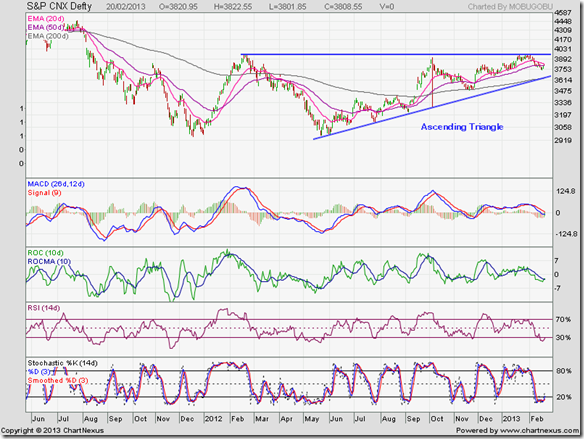
S&P CNX Defty_Feb2013

Two weeks back, the following comments were made: “The daily bar chart pattern of CNX Defty (Nifty measured in US Dollars) has formed a bullish ‘ascending triangle’ pattern from which the likely break out is upwards… Some more correction can’t be ruled out. If the 50 day EMA fails to provide downside support, expect stronger support from the rising 200 day EMA…”

The Defty chart did drop below its 50 day EMA for a few days, but is trying to move back above it. The index is trading above its rising 200 day EMA, which means there is no immediate threat to the nascent bull market. However, all four technical indicators have touched lower bottoms than the ones touched in Dec ‘12 whereas the Defty has touched a higher bottom.

The combined negative divergences mean some more correction is possible. But the index should get twin support from the rising 200 day EMA and the rising trend line of the ‘ascending triangle’.

Tuesday, February 19, 2013

Gold and Silver charts: an update

Gold Chart Pattern

Gold_Feb1913

Two weeks back, the 6 months daily bar chart pattern of gold was falling within a downward channel and showing signs of distribution. Last Friday’s (Feb 15) high volume drop has confirmed that bears are once again taking the upper hand in the near term.

On the 2 years weekly bar chart pattern above, gold’s price is trading well above its rising 200 week EMA – indicating that the long-term bull market is intact.

But there are signs that the lower end of the trading range between 1525 and 1800 – within which gold’s price has consolidated since Sep ‘11 – may get tested.

Weekly technical indicators are bearish. MACD has dropped into negative territory below its falling signal line. RSI and slow stochastic are both falling below their 50% levels towards their oversold zones.

Silver Chart Pattern

Silver_Feb1913

On the 6 months daily bar chart pattern of silver, analysed two weeks back, the following comment was made: “All three EMAs are converging, which is often followed by a sharp move. The move can be in either direction.”

Unfortunately for the bulls, the sharp move was downwards – keeping silver’s price within a downward channel. However, the 200 week EMA is still rising – so the long-term bull market is intact.

Weekly technical indicators are bearish, which means the correction is likely to continue. MACD is below its signal line, and has entered negative territory. RSI and slow stochastic are falling below their 50% levels.

Monday, February 18, 2013

Stock Index Chart Patterns: S&P 500 and FTSE 100 – Feb 15, ‘13

S&P 500 Index Chart

S&P 500_Feb1513

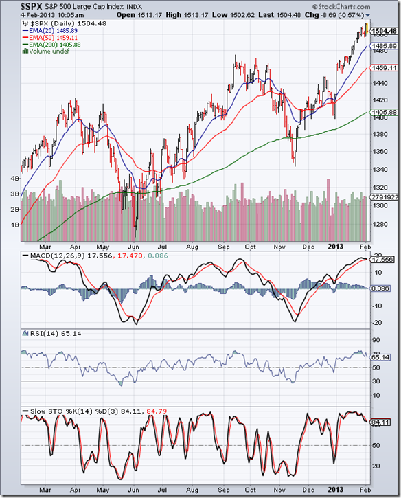
The daily bar chart pattern of S&P 500 index touched another new high mid-week, but drifted sideways thereafter. Friday’s (Feb 15) down-day volumes were the highest during the week. That could be a sign of distribution.
All three daily technical indicators failed to touch new highs with the index. The combined negative divergences, and the current state of the indicators close to, or inside, their overbought zones are hinting at a correction. But the sheer flood of liquidity is continuing to push the index higher.

Economic news remain mixed. Industrial production slipped a bit. But retail sales rose and unemployment claims fell more than expectations. Another recession may be off the table, but growth is painfully slow.

Hold, with a trailing stop-loss at the rising 20 day EMA.

FTSE 100 Index Chart

FTSE_Feb1513

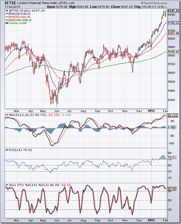
The daily bar chart pattern of FTSE 100 index had bounced up after testing support from its 20 day EMA on Fri. Feb 8. Last week, it rose to another new high of 6385 on Wed. Feb 15 ‘13.

However, all three daily technical indicators touched much lower tops – the combined negative divergences led to an immediate correction. The bull market is intact but showing signs of topping out.

Should the index fall below its Feb 7 low of 6217, a bearish ‘widening top’ pattern (higher highs, lower lows) would form. QE3 may turn technical analysis on its head – as easy availability of cheap funds can continue to push the index higher.

Hold, with a trailing stop-loss at the rising 20 day EMA.

Bottomline? The daily bar chart patterns of S&P 500 and FTSE 100 continue to touch new highs on a flood of liquidity. There is no point in doubting the duration or sustainability of the rallies. Stay invested, but maintain trailing stop-losses.

Sunday, February 17, 2013

BSE Sensex and NSE Nifty 50 index chart patterns – Feb 15, 2013

BSE Sensex index chart

In last week’s analysis, it was mentioned that the correction wasn’t over and may last a bit longer. On the weekly bar chart pattern of the BSE Sensex index below, note that three weeks of correction has brought the index down to the middle of the long-term resistance zone between 19000 and 19800.

The good news for the bulls is that the index is still trading above its rising 20 week and 50 week EMAs, which means the long-term bull market is intact – and will remain so as long as FIIs continue to buy. The bad news is the relentless selling by DIIs – partly due to redemption pressure from retail investors in mutual funds.

There has been concern in some investment groups – particularly those which put their faith on Elliott Waves – that the index may crash and breach the Dec ‘11 low. As of now, there are no signs of a crash on the chart.

Sensex_Feb1513

Weekly technical indicators have corrected from overbought conditions, but are not bearish yet. MACD has crossed below its signal line, and dropped from its overbought zone. ROC has crossed below its 10 week MA and is resting on the ‘0’ line. RSI is moving sideways above its 50% level. Slow stochastic has slipped down from its overbought zone.

The correction is likely to continue a bit longer. There should be good support at the 19000 level. A drop below 19000 may change the equation in favour of the bears.

NSE Nifty 50 index chart

Q3 results are over. They have been largely as per expectations, with a few positive and negative surprises here and there. The domestic business of Tata Motors and the overseas business of Tata Steel were in the red. Revival of the infrastructure sector is a few quarters away.

Efforts to reduce the government’s fiscal deficit through PSU disinvestments and oil price hikes are ongoing. The latter is likely to stoke the embers of inflation, and reduce RBI’s option of reducing interest rates. A Catch-22 situation.

Nifty_Feb1513

The daily bar chart pattern of NSE Nifty 50 index has dropped below its 20 day and 50 day EMAs, and is in the middle of the resistance zone between 5750 and 5950. The index is trading above its rising 200 day EMA, so the bull market is under no immediate threat.

All four daily technical indicators are not only bearish, but also showing negative divergences by touching lower bottoms (marked by blue arrows), while the index touched a higher bottom.

A continuation of the correction is the logical outcome. But the market doesn’t necessarily move on logic. Any selling by FIIs – who have been net buyers since Jun ‘12 – can lead to a sharp drop. A halfway decent budget can change the current negative sentiment.

Bottomline? Chart patterns of BSE Sensex and NSE Nifty 50 indices have continued with their corrections, and have dropped inside their long-term resistance zones. Will the resistance zones turn into support zones? The forthcoming budget proposals may provide the trigger. To protect profits, stop-losses can be placed at the lower edges of the respective resistance zones.

Friday, February 15, 2013

So, you think you can make money in the stock market?

Wait! You don’t have to answer that question yet, because there are a few more questions in a similar vein: ‘So, you think you can become a high court lawyer?’ or, ‘So, you think you can become a professional tennis player?’ or, ‘So, you think you can become a chef at a 5-star hotel?’.

A short answer to the questions are: Yes, but. Why ‘but’? Because one needs to have an inclination towards or an interest in a profession or activity, and then go through the necessary training and experience to become successful.

Can’t a lawyer (or doctor) or tennis player (or chess master) or 5-star chef (or sales manager) also make money in the stock market? Yes, but. Again ‘but’? Just because one is successful in a profession doesn’t mean the same success can be repeated in the stock market.

A classic example? What happened to Sir Isaac Newton – the discoverer of the Laws of Motion and inventor of Calculus – when he invested in the shares of the South Sea Company back in 1720. He lost 90% of his stake, and was quoted as saying: “I can calculate the movement of the stars, but not the madness of men.”

The point is: You can make money in the stock market, but it is not as easy as opening a demat account and punching in a buy or sell order. There is a learning process that one has to go through. The learning includes some basic knowledge of economics, mathematics, accounting, human psychology, and business operations.

Unless you can understand concepts like supply and demand, GDP, ratio analysis, depreciation, inventory, cash flow, herd mentality, confirmation bias - and how the inter-relation of these concepts eventually reflect in the price of a company’s share – chances are that your fate will be similar to that of Sir Isaac.

All of this understanding won’t happen in a few days, or by reading books. Though reading some well-known investment books will be a step forward in your understanding. The real test of your investing mettle will occur when the stock market starts correcting, and the stock that you just bought for Rs 18 (a ‘sure shot’ gainer because it can’t go down any more) drops to Rs 6.

Do you book a loss to preserve what little is left of your capital? Or, do you hold on, hoping against hope to get back your ‘buy’ price? Or, were you smart enough to set a 5% stop-loss and got out when the stock price dropped to Rs 17? If you don’t know the answer to the first two questions, or the concept of a stop-loss, you are not going to make money in the stock market.

Wednesday, February 13, 2013

A re-look at Gilt funds – a guest post

After a decent rally during 2012, backed by strong FII inflows in 2012, the stock market touched 2 year highs. A correction has ensued since then. Slow down in economic growth has forced the RBI’s hand in lowering repo and reverse repo rates, though inflation remains high.

In this month’s guest post, Nishit argues in favour of an investment in Gilt funds – since repo and reverse repo rates have started on their way down.

----------------------------------------------------------------------------------------------------------------------------------------

We had last reviewed Gilt funds in the month of August ‘11. A lot has changed since then. Let us take a look at where we stand now.

The 10 year bond was trading at 8.2% approx. In a period of 6 months, the rate has come down to 7.9% approx. A period of 6 moths and a rate drop of 0.3% - how does it translate into real returns for an investor?

The Birla Sun Life Government Securities fund, which is a blue chip fund with a 5 star rating from Valueresearcholine.com, has provided an absolute return of 6.61%. When annualized, it becomes 13.22%.

In the next 6 months, Interest Rates should fall by about another 0.5%. Typically in this Interest Rate cycle the peak and the bottom is usually 300 basis points minimum. The peak was about 9%, so the rates should bottom around 6 to 6.5% in the next 2 years.

Now is the time to invest in Government Securities funds, as the Interest rate cycle has clearly started its way down.

Government Securities are the highest rated securities. A default on them is almost impossible, as it would amount to a sovereign default of the Indian state.

If we look at other funds like Income funds, the rate of return has already declined. The trick to make profits from Gilt funds is to ride out the bottoming out of Interest Rate cycle and then move the money back to equity. Typically when the Interest Rate cycle bottoms, it is time to move back into equity.

This happened during October 2008 to March 2009. It happens because rate cuts stimulate the economy - which also means the economy is doing pretty badly. Stock markets are usually 6 months ahead of the economy. When the rate cuts stop and the yield bottoms out, it is also time to invest in equity.

The chart below illustrates how the cycle works. One can compare it with the equity cycle. The rate cuts bottomed out in Dec 2008 and equity markets bottomed in March 2009.

clip_image002

The idea of investing is to safely make a compounded return of around 15-16% every year. When the equity markets are headed downwards, it is time to make money in Gilts and when Gilts are headed down, it is time to make money in Equity Markets.

----------------------------------------------------------------------------------------------------------------------------------------

(Nishit Vadhavkar is a Quality Manager working at an IT MNC. Deciphering economics, equity markets and piercing the jargon to make it understandable to all is his passion. "We work hard for our money, our money should work even harder for us" is his motto.

Nishit blogs at Money Manthan.)

Tuesday, February 12, 2013

WTI and Brent Crude Oil charts: back in bull markets

WTI Crude chart

WTI Crude_Feb1213

The ‘golden cross’ of the 50 day EMA above the 200 day EMA on the 6 months daily chart of WTI Crude oil technically confirmed a return to a bull market. Shortly thereafter, oil’s price touched an intra-day high above the 98 mark – a level last touched back in Sep ‘12.

However, all three technical indicators formed double-top reversal patterns that led to a correction down to the 20 day EMA. Oil’s price appears to have received good support from its short-term moving average. Of late, volumes on up-days have been higher than on down-days. The rally may resume after the brief correction.

Daily technical indicators have corrected overbought conditions, and seem to be supporting a resumption of the up move. MACD is below its signal line in positive zone, but has stopped falling. RSI dropped from its overbought zone, but has turned up before reaching its 50% level. Slow stochastic dropped sharply below its 50% level from its overbought zone, but is turning up.

WTI Crude oil’s price seems poised to reach the three figure mark in the near future.

Brent Crude chart

Brent Crude_Feb1213

The 6 months daily chart pattern of Brent Crude oil rallied sharply during the past month, without a hint of a correction. After hesitating for a few days near the support-resistance level of 117.50 (reasons mentioned in the previous post), oil’s price shot up to 119 before pulling back towards the support-resistance level.

Note that two of the three technical indicators – RSI and slow stochastic – showed negative divergences by failing to touch higher tops. RSI formed a double-top reversal pattern inside its overbought zone. Slow stochastic touched a lower top.

The break out above the support-resistance level of 117.50 was not accompanied by a substantial increase in volumes. That opens up the possibility of the current pullback continuing a bit longer before the up move can resume.

The rise in oil’s price may be attributed to some supply constraints from Oklahoma and Nigeria, but more due to speculation about greater imports by China and tensions in Iran.

Monday, February 11, 2013

Stock Index Chart Patterns: S&P 500 and FTSE 100 – Feb 08, ‘13

S&P 500 Index Chart

S&P 500_Feb0813

In last week’s analysis of the daily bar chart pattern of S&P 500, it was observed that a sideways consolidation was in progress. Last Friday (Feb 8 ‘13), the index broke out higher to touch another new 3 year high.

But the break out volume was the lowest of the week. All three technical indicators, which are in or near their overbought zones, failed to touch new highs with the index. The combined negative divergences may be hinting at a correction.

Note that the market can stay overbought for long periods – more so when QE3 is in progress. The bull market is unlikely to end any time soon – as per this article.

Hold, with a trailing stop-loss to protect your profits.

FTSE 100 Index Chart

FTSE_Feb0813

Last week, the daily bar chart pattern of FTSE 100 seemed to be defying gravity (just as the S&P 500 appears to be doing) as it kept moving ever higher despite overbought conditions.

The following remarks were made: “…the index is trading 500 points above its 200 day EMA. That is a red flag. At the time of writing this post, FTSE was down more than 80 points. Worse may follow. No need to sell in a panic. It is a bull market correction, and the dip can be used as an adding opportunity.”

The index corrected down to its 20 day EMA, where it received good support and bounced up (though Friday’s up-day volume – not shown in chart - was lower than Thursday’s down-day volume). MACD is positive; both RSI and slow stochastic are above their respective 50% levels; but all three daily technical indicators are falling – which means the correction may not be over yet.

If you decide to use this dip to add, maintain a tight stop-loss.

Bottomline? The daily bar chart pattern of S&P 500 index touched a new 3 year high and is looking ripe for a correction. The FTSE 100 index has started correcting after reaching a 3 year high. Dips can be used to add, but with tight stop-losses.

Saturday, February 9, 2013

BSE Sensex and NSE Nifty 50 index chart patterns – Feb 08, 2013

BSE Sensex index chart

Note the following comment in last week’s analysis of the daily bar chart pattern of BSE Sensex index: “Daily technical indicators are looking bearish, which means the correction isn’t over.”

It was no great surprise that the correction continued, despite continued buying by FIIs. DIIs remained net sellers. There were reports that LIC turned seller in several index stocks - though the Chairman mentioned in a TV interview that the company was a net buyer.

The 50 day EMA provided only a couple of days’ support before the index slipped lower. The 19000 level, which is the lower edge of the resistance zone, should provide stronger support. Should the 19000 level get breached on the downside, the rising 200 day EMA would be the next support (currently at 18500).

Sensex_Feb0813

Can the Sensex fall even lower – to the lower edge of the upward-sloping channel? The possibility can’t be ruled out. But if it does, it will provide a good opportunity to buy.

Daily technical indicators are looking bearish to the point of being oversold. MACD is falling below its signal line, and about to enter negative territory. ROC is dropping deeper into negative zone, and is below its falling 10 day MA. Both RSI and slow stochastic have entered their respective oversold zones.

A more bearish sign is the negative divergences visible in all four technical indicators, which have touched lower bottoms than the ones touched in Dec ‘12 while the index has touched a higher bottom. The correction is likely to last a bit longer.

NSE Nifty 50 index chart

The expected low GDP number of 5% for the year has dampened the enthusiasm of domestic investors – both institutional and retail. Q3 results failed to act as a positive trigger, as there were very few positive surprises and clear evidence of margin pressure.

Exports are down. So is government spending – probably in an effort to curtail the fiscal deficit. Disinvestment in PSU shares have started in earnest. That may be one of the reasons for selling by DIIs in the secondary market.

Pushing through the FDI in retail proposal despite vehement opposition from several quarters has yielded zero result till date. The forthcoming budget is unlikely to change the gloomy market sentiment.

Nifty_Feb0813

The weekly bar chart of NSE Nifty 50 index has dropped inside the long-term resistance zone between 5750 and 5950. The Nifty is trading above its rising 20 week and 50 week EMAs. Two weeks of correction haven’t changed the longer-term bullish outlook.

Weekly technical indicators have begun to correct overbought conditions. MACD has slipped below its signal line in overbought zone. RSI has crossed below its 10 week MA, and seems ready to enter negative territory. RSI is falling towards its 50% level. Slow stochastic is about to drop from its overbought zone after 6 months. The correction in the Nifty isn’t over yet.

Bottomline?  Chart patterns of BSE Sensex and NSE Nifty 50 indices have dropped back into their long-term resistance zones after correcting from 2 year highs. Some more correction is on the cards. No need to sell in a panic. The indices are in early stages of bull markets. Look for opportunities in fundamentally strong stocks that are being beaten down.

Friday, February 8, 2013

How Asian stock indices have performed vs. BSE Sensex

In a post on Sep 15 ‘12, a comparison was posted between Asian stock indices and BSE Sensex. Except for the stock indices of Malaysia and Singapore, which had outperformed the Sensex over the previous 12 months, the Sensex did better or was an equal performer – thanks to good FII inflows.

Of late, the Sensex has been correcting after crossing the psychological 20,000 level. It could be due to the poor GDP number; or, it could be collective fear due to proximity to previous tops (which were followed by big corrections); or, it could be routine profit booking. Whatever be the reason, smart investors are probably using the dip to add.

Note that the Sensex has given positive returns over the past 6 months, as have 6 of the 7 Asian indices – with the Malaysian index being the sole exception.

China (Shanghai Composite) vs. Sensex

Shanghai_Feb13

China’s economic growth has been higher than India’s, but that is not reflected in the Shanghai Composite index, which has underperformed the Sensex – except in the first week of Feb ‘13.

HongKong (Hang Seng) vs. Sensex

HangSeng_Feb13

For a couple of months – from mid-Aug to Mid-Oct ‘12 – the Sensex outperformed the Hang Seng index. Thereafter, Hang Seng has been the better performer despite correcting in Feb ‘13.

Taiwan (TSEC) vs. Sensex

TSEC_Feb13

Sensex trailed Taiwan’s TSEC index in Aug and Sep ‘12, but has outperformed thereafter.

Indonesia (Jakarta Composite) vs. Sensex

Jakarta_Feb13

Jakarta Composite  moved pretty much in tandem with the Sensex till Nov ‘12, but fell behind thereafter.

South Korea (KOSPI) vs. Sensex

KOSPI_Feb13

South Korea’s KOSPI index led the Sensex till mid-Sep ‘12. Subsequently, Sensex has been the outperformer.

Malaysia (KLCI) vs. Sensex

KLCI_Feb13

Malaysia’s KLCI index is the only one that has given negative returns in the past 6 months. No wonder Sensex has outperformed it by a wide margin, despite falling behind in Aug ‘12.

Singapore (STI) vs. Sensex

STI_Feb13

Sensex outperformed Singapore’s STI index during the past 6 months – which is a bit of a surprise.

Thursday, February 7, 2013

Stock Chart Pattern - Tata Motors (An Update)

In the previous technical update of the stock chart pattern of Tata Motors on Dec 15 ‘11 (date marked by grey vertical line on chart below), the following comments were made: “Even if it doesn’t break the previous low, such a large-cap index stock is likely to consolidate for a while and enter some sort of a bottoming pattern. That would be a better time to start accumulation.”

The advice was good, but my chart observation wasn’t - I missed the ‘diamond’ reversal pattern that formed during Aug-Sep ‘11, from which the stock price broke out upwards on rising volumes on Oct 7 ‘11.

On Oct 28 ‘11, the stock price rose above all three EMAs to touch an intra-day high of 207.90 – just short of the long-term support-resistance level of 215. For the next couple of months, the stock consolidated within a symmetrical triangle – which turned out to be a continuation pattern, as the stock price broke out upwards on Jan 3 ‘12 on rising volumes.

TataMotors_Feb0713

The resistance level of 215 was crossed on rising volumes – turning the resistance level into a support level for future down moves. After a brief hesitation, the stock price of Tata Motor resumed its up move, and on Feb 15 ‘12 it sailed past its Dec ‘10 top of 276.30 to touch a new intra-day high of 292.

The next leg of the rally touched new highs in Mar ‘12 and Apr ‘12, but all four technical indicators showed negative divergences – MACD and ROC touched lower tops; RSI and slow stochastic failed to touch higher tops (marked by blue arrows) – warning about a possible correction.

A sharp correction dropped the stock price below all three EMAs, but the 215 level provided good support. After a brief upward bounce that failed to cross above the 50 day EMA, the stock price dropped to a lower low of 202.95 on Jul 26 ‘12. However, three of the four technical indicators showed positive divergences (RSI being the lone exception) indicating that the correction was coming to an end.

The subsequent rally took the stock price to an all-time high of 337 on Jan 10 ‘13. This time negative divergences in ROC, RSI and slow stochastic heralded another correction. The stock price dropped sharply but found support from its rising 200 day EMA.

Daily technical indicators are looking bearish to the point of being oversold. MACD is falling below its signal line in negative territory. ROC has crossed above its 10 day MA, but hasn’t entered positive zone yet. RSI has dropped inside its oversold zone, where it doesn’t like to stay for long. Slow stochastic has emerged from its oversold zone but is well below its 50% level.

There have been recent reports of slowing JLR (Jaguar-Land Rover) sales in Europe and even in China. Domestic sales of Indica/Indigo are on a downslide. Commercial vehicle sales – particularly MHCV – have not picked up. However, the dip can be used to add to existing holdings.

Those who feel that the stock price is too high can consider investing in Tata Motor DVR shares (with lower voting rights but higher dividends).

Bottomline? The stock chart pattern of Tata Motors is in a bull market, but facing both fundamental and technical headwinds. However, the correction may be a good opportunity to enter the stock with a stop-loss at 270 (level of 200 day EMA). Such stocks help build long-term wealth, but the investment horizon needs to be long.

Wednesday, February 6, 2013

Nifty and Defty charts: a mid-week technical update

Nifty chart

Nifty_Feb0613

In the previous mid-week Nifty update posted two weeks back, the following comments were made: “…all four daily technical indicators are showing negative divergences by failing to touch new highs. That is probably hinting at some consolidation or correction. The correction is not expected to be steep – at worst the index can drop inside the resistance zone.”

The negative divergences occurred during the up move from Dec ‘12 to Feb ‘13 (marked by blue arrows in chart above). The index is receiving triple support – from its 50 day EMA, the 5950 level, and the blue uptrend line drawn within the upward-sloping channel.

Can the index drop back inside the resistance zone between 5750 and 5950? Bearish daily technical indicators seem to suggest so. MACD is positive, but falling below its signal line. ROC has crossed below its 10 day MA into negative territory. RSI formed a head-and-shoulders reversal pattern and has dropped below its 50% level. Slow stochastic has entered its oversold zone.

Nifty is trading above its rising 200 day EMA, so this bull market correction is an opportunity to add. The 5750 level is likely to provide strong downside support.

Defty chart

S&P CNX Defty_Feb0613

The daily bar chart pattern of CNX Defty (Nifty measured in US Dollars) has formed a bullish ‘ascending triangle’ pattern from which the likely break out is upwards.

The index showed some hesitation as it neared its Feb ‘12 top. Such hesitation is quite expected near a previous top. Also, three of the four technical indicators – ROC, RSI, slow stochastic – showed negative divergences.

The FIIs have remained net buyers, so any correction due to DII selling is unlikely to be a deep one. Technical indicators haven’t turned bearish yet. MACD is positive, but has slipped below its signal line. ROC has crossed below its 10 day MA, and about to enter negative territory. RSI is above its 50% level. Slow stochastic has dropped to its 50% level.

Some more correction can’t be ruled out. If the 50 day EMA fails to provide downside support, expect stronger support from the rising 200 day EMA, which has merged with the uptrend line of the ‘ascending triangle’.

Tuesday, February 5, 2013

Gold and Silver charts: in down trends

Gold Chart Pattern

Gold_Feb0513

After testing the 1800 level back in Oct ‘12, the 6 months daily bar chart pattern of gold has been falling within a downward channel – forming a bearish pattern of lower tops and lower bottoms.

The price of the yellow metal has closed below its 200 day EMA for 8 straight trading days, with down-day volumes regularly exceeding up-day volumes. That is an ominous sign of distribution – which means lower levels are likely.

Daily technical indicators are looking bearish. MACD is entangled with its signal line in negative territory. RSI is trying to cross above its 50% level. Slow stochastic – which is showing a negative divergence by touching a lower bottom while gold’s price touched a higher bottom on Jan 28 - is below its 50% level and turning down.

The 50 day EMA is still above the 200 day EMA. If it crosses below the long-term moving average (‘death cross’), it would technically confirm a return to bear territory.

On longer-term weekly bar chart (not shown), gold’s price is consolidating within a rectangular band between 1525 and 1800 - well above its rising 200 week EMA, keeping the long-term bull market intact.

Silver Chart Pattern

Silver_Feb0513

Silver’s 6 months daily bar chart pattern is in a clear down trend – touching lower tops and lower bottoms – since Oct ‘12. In a post 2 weeks back, the following comment was made: “Falling volumes indicate that the rally may be on its last legs.”

Silver’s price touched an intra-day high of 32.50 on Jan 23 ‘13 and has been consolidating within a small symmetrical triangle. All three EMAs are converging, which is often followed by a sharp move. The move can be in either direction. A convincing up move – i.e. supported by increase in volumes – above the 33.50 level may change the down trend.

Daily technical indicators are mildly bullish, but showing signs of weakness. MACD is slightly above its signal line, and barely positive. RSI is above its 50% level, but moving sideways. Slow stochastic is also above its 50% level, but moving down.

On longer-term weekly bar chart (not shown), silver’s price is trading above its rising 200 week EMA – which is a bullish sign.

Monday, February 4, 2013

Stock Index Chart Patterns: S&P 500 and FTSE 100 – Feb 01, ‘13

S&P 500 Index Chart

S&P 500_Feb0113

Last week’s analysis of the 1 year daily bar chart pattern of S&P 500 concluded with the following comment: “The odds of a correction/consolidation is increasing by the day.” All three technical indicators were looking overbought, and such a condition usually precedes a correction or consolidation.

A sideways consolidation is in progress; overbought conditions in the three technical indicators have been partly rectified. MACD is still in overbought zone, but has dropped down to touch its signal line. RSI has slipped below its overbought zone. Slow stochastic is inside its overbought zone, but has started sliding down after forming a head-and-shoulders reversal pattern.

Fundamentally, the negative GDP number for the last quarter of the year was an unpleasant surprise. A big drop in defense spending was the probable culprit. However, for the whole year, GDP grew by a modest 2.2%, which was higher than the 1.8% growth in 2011. Technically, the index is still trading 100 points above its rising 200 day EMA, and that is a sign of an overbought market.

Hold with a trailing stop-loss, or book part profits (depending on your risk tolerance).

FTSE 100 Index Chart

FTSE_Feb0113

The 1 year daily bar chart pattern of FTSE 100 seems to be going from strength to strength – despite overbought conditions in the daily technical indicators. The 6300 level fell by the wayside as the index closed the week near 6350.

A brief 2 days correction last week didn’t change the overbought situation too much - all 3 technical indicators are still in their overbought zones. But this is a good time to remember phrases like ‘reversion to mean’ and ‘what goes up must come down’.

All three EMAs are moving up, but the index is trading 500 points above its 200 day EMA. That is a red flag. At the time of writing this post, FTSE was down more than 80 points. Worse may follow. No need to sell in a panic. It is a bull market correction, and the dip can be used as an adding opportunity.

Bottomline? Daily bar chart patterns of S&P 500 and FTSE 100 indices are correcting/consolidating after reaching 3 year highs. Dips can be used to add, but with tight stop-losses.

Sunday, February 3, 2013

BSE Sensex and NSE Nifty 50 index chart patterns – Feb 01, 2013

BSE Sensex index chart

In last week’s analysis of the weekly bar chart pattern of BSE Sensex, it was pointed out that weekly technical indicators were looking overbought, and some consolidation or correction was expected. The daily chart pattern of Sensex indicates that the expected correction has commenced.

After a brief foray above the upper edge of the upward-sloping parallel channel, the index has dropped below its 20 day EMA back inside the long-term resistance zone between 19000 and 19800. Is this the start of a big fall? Nothing can be ruled out in the stock market, but a big fall seems unlikely for two reasons.

The rising 50 day EMA should provide some support to the falling index. Stronger support can be expected from the 19000 level (lower edge of the resistance zone). Why? Because the index had breached the resistance of the 19000 level in end-Nov ‘12 with strong volume support (not shown in chart below). That usually indicates that the breached resistance will turn into a strong support.

SENSEX_Feb0113

FIIs continue to be net buyers, and their volume of buying and selling appears to be increasing. However, considerable DII selling swung the pendulum towards the bears last week. Some profit booking due to F&O expiry added to the bearishness. These are routine strategies.

Thanks to RBI’s recent policy action, which cut the repo, reverse repo and CRR rates by 25 bps (0.25%), the banking system will get increased liquidity. Hopefully, that will translate into increased borrowing by companies, and in turn rise in capital expenditure for productive purposes – leading to stronger top and bottom lines in the next few quarters.

Daily technical indicators are looking bearish, which means the correction isn’t over. MACD is positive, but has fallen below its signal line. ROC has dropped below its 10 day MA into negative territory. Both RSI and slow stochastic have slipped below their respective 50% levels. (Note that the RSI formed a small head-and-shoulders reversal pattern.)

NSE Nifty 50 index chart

Q3 results declared so far have been a mixed bag. Stocks with any hint of ‘infrastructure’ tagged to their business have been taking it on the chin. Lower top and bottom lines haven’t helped. The few positive surprises have been few and far between, and not enough to turn around negative sentiments of retail investors.

All eyes seem to be shifting towards the budget at the end of the month. For the past couple of years, the budget had turned out to be a non-event with incremental changes. It is unlikely that a pre-election year budget will make any drastic changes. The government is finally waking up about curtailing deficit through disinvestment of PSU shares and tweaking diesel price.

Nifty_Feb0113 

Nifty continues to trade within the upward-sloping parallel channel and well above its rising 20 week and 50 week EMAs. There is no immediate threat to the bull market. Any correction/consolidation will improve the technical health of the index and enable it to scale greater heights.

Weekly technical indicators are bullish, but showing signs of correcting from overbought conditions. MACD has started to drift down towards its signal line in overbought territory. ROC is positive, but dropping towards its 10 week MA. RSI has slipped below its overbought zone. Slow stochastic is well within its overbought zone, but gradually sliding down.

Bottomline? Chart patterns of BSE Sensex and NSE Nifty 50 indices are correcting after touching 2 year highs. Such bull market corrections provide opportunities to enter and improve technical health of charts. Be selective about which stocks to buy. Sticking to proven performers never hurt.

Friday, February 1, 2013

Stock Chart Pattern - Thermax Ltd. (An Update)

The concluding remarks in the previous technical update  to the stock chart pattern of Thermax Ltd., posted on Nov 30 ‘11 (marked by grey vertical line on chart below) were: “The bear market isn’t over. No need to buy in a hurry. But slowly accumulating the stock may be a good idea.”

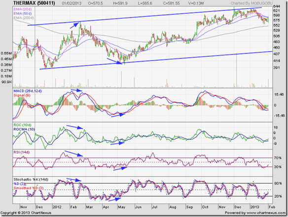
Turns out that the recommendation was quite appropriate. About a month after that post, the stock price of Thermax Ltd. touched an intra-day 52 week low below the 400 level (along with the broader market), formed a small double-bottom reversal pattern, and started on an up trend that is ongoing.

The stock price rose to touch an intra-day high of 568.65 on Feb 21 ‘12, but all four technical indictors touched lower tops (marked by blue arrows). The combined negative divergences warned of the correction that followed.

Thermax_Feb0113

The opposite happened when the stock dropped to an intra-day low of 401.60 on May 15 ‘12. All four technical indicators touched higher bottoms (marked by blue arrows). The positive divergences signalled that the correction was over.

Note that the stock price touched progressively higher tops during Oct ‘12 and Dec ‘12, but all four technical indicators touched progressively lower tops that hinted at a possible correction that is going on now.

Such divergences are not always visible on charts, and the extent of the subsequent down or up move can not be ascertained, but when all four indicators are showing divergences then one should heed the signal and take appropriate buy/sell decisions.

The stock has been trading within an upward-sloping channel for more than a year now. Resistance from the upper boundary of the channel has been fairly strong for two reasons: Traders who follow technical analysis have obviously used the proximity to the top of the channel to sell.

The other reason is a long-term support/resistance zone between 650 and 700 (mentioned in the previous update). Observant readers may note that the price breakdown below 650 during Apr-May ‘11 (shown on chart in previous update) was accompanied by a spurt in volumes.

Upward break outs above resistance levels require stronger volumes for technical validity, but downward breaks of support levels need not be accompanied by strong volumes.

However, when a downward break of a support level is accompanied by a volume spurt, it usually means that the support level (of 650 in this case) will turn into a strong resistance to future up moves. The stock price of Thermax Ltd. touched a peak of 639.90 on Dec 3 ‘12 – above the upper edge of the parallel channel – before retreating.

Daily technical indicators appear to be recovering from oversold conditions, though MACD and ROC are still negative, and both RSI and slow stochastic are below their 50% levels. This may be a good time to start accumulating the stock from the technical point of view.

Fundamentally, headwinds are still strong – as for most companies in the capital goods sector. Q3 (Dec ‘12) results showed slippage in top and bottom lines, though order intake is improving.

Bottomline? The stock chart pattern of Thermax Ltd has returned to a bull market, but is nowhere near its glory days. Patient long-term investors would do well to start accumulating the stock. Short-term players looking for quick profits should look elsewhere.