Sunday, September 30, 2012

BSE Sensex and NSE Nifty 50 index chart patterns – Sep 28, 2012

BSE Sensex index chart

One of the enduring myths of the stock market is that good news and bad news get ‘discounted’ in advance. It doesn’t really, though it may appear to be so sometimes. Despite various rules and regulations by the authorities, insider trading remains alive and kicking. It is often insider buying or selling that triggers movements in a stock’s price.

It is more difficult to manipulate an index or large-cap stocks. When the Sensex fell to its low in Jun ‘12, it was mainly FII buying that pushed the index upwards. DIIs were sellers. Did the FIIs know something in advance that the DIIs didn’t? Highly unlikely. The FIIs may have bet on the likelihood of the UPA government announcing some reforms.

FIIs had bought heavily during the Dec ‘11 to Feb ‘12 rally – but the FDI in retail proposal was rolled back at that time and diesel price hike never happened. The deteriorating economic outlook, plethora of scams and a tardy monsoon caused a sell-off. More often than not, the stock market reacts to news rather than ‘discounting in advance’.

Sensex_Sep2812_ST

The 220 points gap in the daily bar chart pattern of the Sensex was formed after the announcements by ECB and the US Fed about another round of QE3. Announcements about FDI in retail and aviation plus a hike in the price of diesel by the UPA government ensured that the Sensex remained above the gap instead of filling it.

Why is the index hesitating just below the 19000 level? Is it worried about some impending bad news? This is where technical analysis comes into play. The zone between 19000 and 19750 is a long-term support/resistance zone. Also, the index is looking overbought as it is trading 1500 points above its 200 day EMA.

Technical indicators are bullish, but correcting overbought conditions. Expect a correction down to the top of the gap, or a sideways consolidation, before the bulls manage to push the Sensex past the resistance zone. If the gap remains unfilled, or gets partly filled, it will be a ‘measuring gap’ with an upward target of 20600 for the Sensex.

NSE Nifty 50 index chart

For a change, our PM has stood firm against the ruckus raised by the UPA’s allies and the opposition parties about rolling back the announced reform proposals. Lack of foresight shown by the BJP in stalling the monsoon session of parliament, and by Mamata Banerjee’s TMC by withdrawing support to the UPA may come back to haunt them during the next election in 2014.

By then, the Walmarts and Tescos and Carrefours may open retail stores, and the benefits to farmers and local suppliers will become visible to all. FDI in other sectors have brought great benefits to India in terms of job creation and quality of life. Suddenly, FDI in retail has made everyone and his brother-in-law a champion of the poor farmers. What did the politicians do when farmers were committing suicide due to failed crops or low prices? 

Nifty_Sep2812

The weekly bar chart of the Nifty shows a break out from a symmetrical triangle, followed by a pullback to the top of the triangle and a sharp upward bounce that has taken the index back into bull territory. The ‘golden cross’ of the 20 week EMA above the 50 week EMA has technically confirmed a bull market.

The index is expectedly facing strong resistance from the resistance zone between 5700 and 5950. The rising volumes indicate that the bulls may have adequate firepower to overcome the resistance zone, but perhaps after a period of consolidation or correction.

Weekly technical indicators are looking bullish, but overbought. MACD is rising above its signal line in positive territory. ROC has crossed above its 10 week MA in positive zone. Both RSI and slow stochastic are inside their overbought zones.

Bottomline? Chart patterns of BSE Sensex and NSE Nifty 50 indices have entered new bull markets, but have come up against strong resistance zones. Use dips to enter, but be very selective about the stocks and funds you choose. This is not a runaway bull market yet. Inflation and interest rates need to come down for the markets to gain upward momentum.

Friday, September 28, 2012

Notes from the USA – a guest post

For the past 4 months, FIIs have been net buyers in the Indian stock market while DIIs have remained net sellers. QE1 by the US Fed had released a flood of liquidity in global markets that led to a strong bull rally from early 2009 to end 2010.

QE2 had less of an impact on the Indian stock market, but helped the US market to scale new highs. Now QE3 has finally come along, and perhaps in anticipation, FIIs have been in a party mood. Despite all the liquidity flow, the underlying economies in US and Europe have remained weak while China and India are in the midst of slowdowns.

In this month’s guest post, KKP explains some of the new financial terminologies and the ‘fiscal cliff’ that the US will be confronting soon. He also suggests a course of action for small investors. 

---------------------------------------------------------------------------------------------------------------------------------------

QE3 and Fiscal Cliff – New Vocabulary for our World!

We learned a lot of new words from Greenspan, and in recent years, we have started to hear about Quantitative Easing…LSAP…LTRO from Fed and Central Banks. What does all this mean to us as small investors in the US and India?

Well, LSAPs are Large Scale Asset Purchases that the US Government started in 2008 to create a balance under special circumstances. EU’s version of the same is called LTROs, which are Long Term Financing Options. Both of these flavors are nothing but a method of pumping fiat money into the economy at the discretion of the Fed/Central Bank to create a balance where they determine the situation/environment has created an imbalance. Of course, it is done with a controlled private risk.

The unusual situation is that in the last 50+ years, the primary tool of monetary policy has been the Federal Funds rate. During the recent crisis, however, the Federal Reserve unveiled a variety of new policy measures never used before. What forced its hand initially was the disruption of credit markets in the wake of the deterioration of the subprime mortgage market, which began in August of 2007. By February of 2009, however, a second factor came into play i.e. the Funds rate effectively reached its lower bound (zero), implying that despite the severity of the recession, the conventional option of reducing the Funds rate was no longer available as the common Fed weapon. Fed kept giving solace to the markets that the future path is zero rates for Fed Funds, but had to come up with these special measures to combat and stimulate the economy.

Shortly after the meltdown that followed the Lehman failure in September 2008, Fed initiated QE1, which was purchase of a variety of high grade securities, including agency mortgage backed securities (AMBS), agency debt, and long term government bonds, with AMBS ultimately accounting for the bulk of the purchases. It also set up a commercial paper lending facility, which involved the purchase of commercial paper since the Fed accepted these instruments as collateral for loans made to the facility. In October 2010, the Fed announced a second wave of asset purchases (QE2), this time restricted to long term government bonds that was smaller in scale than QE1.

Finally, in September 2012, the Fed embarked on QE3, specifically targeting mortgage bonds in particular, on the grounds that lower mortgage-bond yields will feed through into lower mortgage rates, which in turn will feed through into healthier housing prices, igniting jobs. In short, the Fed is not trying to kick-start the economy any more: instead, it’s promising a steady extra flow of monetary fuel for the foreseeable future — or at least until the labor market improves “substantially”, which is likely to be a pretty long time. I kid you not, this is a large deal by itself since they have all but promised a zero interest rate environment until mid-2015 with a $40B per month funding out of QE3.

In short, the Fed has already pumped a lot of money into the economy, has already put interest rates at subterranean levels at this point and if those interest rates aren't low enough now to get people to borrow money, it's not totally clear to anyone that it is guaranteed to have the desired huge effect going forward. Ben Bernanke is making a fairly simple bet that a stable stock market is going to be better for the economy than a collapsing stock market, and lower mortgage rates are going to be better than higher mortgage rates at this point. And he's hoping that all of this will boost confidence and give people more money to spend, which in the end can boost job creation.

There's some evidence to support both of those points, but he also seems to realize that this isn't going to really solve all problems. In his commentary carried live on CNBC and Bloomberg, he was very clearly pointing out that Fed can't fix our underlying problems with any guarantee, but will be fully supportive in doing whatever it needs to do. Central Banks in EU are pretty much convinced of making similar moves, and getting similar results. For now, EU is getting support from the investment community, in a similar manner to that in the US.

In the short term, I am expecting to see higher stock markets in EU and the US – probably till November (US elections). I will then look for signs in the economy that will show deterioration in the under-current of the economy (tax dole-outs/receipts, housing, manufacturing, welfare programs, import/export, retail sales, big-ticket-items, leading-indicators, unemployment, corporate revenue/earnings, and of course the insider trades). The biggest of all will be the “Fiscal cliff” - which is the popular shorthand term used to describe the conundrum that the US government will face at the end of 2012, when the terms of the Budget Control Act of 2011 are scheduled to go into effect.

These laws have to do with the 2001-03 tax-cuts, taxes related to Obama Health Care, 1000+ government program cuts and other elements. We’ll definitely get events from Central Banks in EU as well as the Fed that will shake the perception of the investment community. If all of that is not enough, remember that the first year of a new president is always a down year, since there are no promises of the ‘better world’ (mostly given during the election year). So, between now and November, going long might be OK, but get ready for going to cash or short after that in most global markets.

---------------------------------------------------------------------------------------------------------------------------------------

KKP (Kiran Patel) is a long time investor in the US, investing in US, Indian and Chinese markets for the last 25 years. Investing is a passion, and most recently he has ventured into real estate in the US and also a bit in India. Running user groups, teaching kids at local high school, moderating a group in the US and running Investment Clubs are his current hobbies. He also works full time for a Fortune 100 corporation.

Thursday, September 27, 2012

Stock Chart Pattern - Colgate Palmolive India (an update)

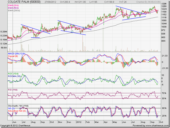
The previous update to the technical analysis of Colgate’s daily bar chart pattern – posted on Jun 2, 2011 (marked by grey vertical line on chart below) - had the following concluding comments:

“The stock chart pattern of Colgate Palmolive is poised to test, and possibly breach, its all-time high of 996. The stock has been in a bull market since touching its 2007 low of 300 – tripling in four years. This is the kind of stock that small investors should buy whenever they have some spare cash, with the object of leaving it as a family treasure for future generations to enjoy.”

On Jun 29 ‘11, within a month of writing the previous post, a high volume spurt took the stock to a new intra-day high of 1002. It rose further to touch another new high of 1022 on Jul 4 ‘11, but formed a small double top and fell into a down trend. A triple-bottom at 896 in Aug ‘11 ended the correction. A sharp up move touched a new high of 1047 on Sep 7 ‘11.

Colgate_Sep2712

A pullback found support from the down trend line. A sideways consolidation with an upward bias followed till the end of Oct ‘11. On Nov 1 ‘11, another high volume spurt took the stock to another new high of 1060, and then to 1075 three days later.

A 3 months long consolidation within a ‘falling wedge’ pattern took the stock price down below its rising 200 day EMA, where it formed a higher bottom at 932. The up move resumed and broke out of the ‘falling wedge’ on Jan 31 ‘12. The break out was not accompanied by an increase in volume.

The stock consolidated sideways till a volume spurt pushed the stock out of its consolidation zone to another new high of 1081 on Feb 27 ‘12. Thereafter, the stock price kept rising and touching new highs on almost a fortnightly basis till it touched 1250 on May 28 ‘12.

A 2 months long consolidation within a ‘symmetrical triangle’ pattern ended with another low volume break out, followed by a pullback to the top of the triangle and then a sideways consolidation. The stock price rose again to touch 1264 on Sep 13 and 14 ‘12 – giving 4-bagger returns in 5 years from its 2007 low of 300.

Note that all four technical indicators touched lower tops than their May ‘12 tops while the stock price rose higher. The combined negative divergences caused a sharp correction that may not be quite over yet. A drop to the rising 200 day EMA (at about 1125) is a possibility.

Over the past 12 months, the company’s stock provided a capital appreciation of 25% plus a total dividend of Rs 25 per share. The record date for the first interim dividend of Rs 13 per share for the current year is Oct 3 ‘12. The company continues to generate a ton of cash, has huge reserves and is debt-free. Top line has grown by 80% and bottom line by more than 100% during the past 5 years.

Bottomline? The stock chart pattern of Colgate Palmolive is undergoing one of its periodic corrections that provide adding opportunities. For small investors – specially those who are not adept at stock picking - Colgate is an ideal ‘SIP’ping candidate. If you think the price is too high, so is dinner at a good restaurant! Buy just 5 shares every month.

Wednesday, September 26, 2012

Nifty and Defty charts: mid-week technical update

Nifty chart

Nifty_Sep2612

The 6 months daily bar chart pattern of Nifty shows the 80 points gap that formed on Sep 14 ‘12. If it remains unfilled, or gets partly filled, then it will be a ‘measuring gap’ with an upward target of 6200. A gap usually gets filled – but there is no rule that it must do so. Even if it does, the up move should resume.

In last Saturday’s post, the band between 5700 and 5950 was mentioned as a strong resistance zone. The Nifty has expectedly failed to cross the resistance zone in its first attempt. But volumes have picked up considerably on up-days, which is a bullish sign.

Technical indicators are overbought, and showing signs of correcting. The index may correct some more and try to fill the gap. If the gap gets filled, the rising 50 day EMA and the blue up trend line should provide support.

All three EMAs are rising and the index is trading above them. That is the sign of a bull market.

Defty chart

S&P CNX Defty_Sep2612

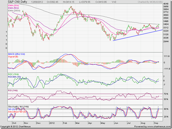
The Defty has broken out above its 200 day EMA with a gap. A break out with a gap is supposed to be a ‘stronger break out’. Note that the Defty has been forming a bullish pattern of higher tops and higher bottoms since the break out. The gap hasn’t even been tested yet.

The 20 day EMA has crossed above the 200 day EMA. The 50 day EMA is likely to do so soon, and technically confirm a return to a bull market. The Feb ‘12 top of 3967 is still almost 300 points away. The bulls have got a lot of work to do before they can regain control.

Technical indicators are overbought and showing signs of correction. On the downside, there is a strong support zone between the rising 20 day EMA and the blue up trend line (3250 to 3500). Unless a ‘black swan’ event happens, the up trend should continue.

If you are waiting for much lower levels to buy, your wait may never end. That doesn’t mean indiscriminate buying. Be selective, and maintain stop-losses.

Tuesday, September 25, 2012

Gold and Silver chart patterns: an update

Gold Chart Pattern

Gold_Sep2412

The one year daily bar chart pattern of gold shows a ‘U’ shaped recovery with almost a vertical rise during the month of Sep ‘12. Such sharp rises are difficult to sustain for long. Gold’s price tested its Feb ‘12 top and has been consolidating within a rectangular band between 1760 and 1780.

Usually, a rectangular consolidation is a continuation pattern. That means gold’s price should break out upwards to cross above the 1800 level and test its all-time high of 1925. However, all three technical indicators are correcting from overbought conditions. Also, gold’s price and its 20 day EMA have moved too far above the 200 day EMA.

A correction down to 1740 is a possibility. Note that gold is in a long term bull market, so dips can be used to add.

Silver Chart Pattern

Silver_Sep2412

The ‘golden cross’ of the 50 day EMA above the 200 day EMA has technically confirmed a return to a bull market in silver’s one year daily bar chart. An ongoing rectangular consolidation between 34 and 35 should be followed by an upward break out.

However, silver’s price rose too fast, and technical indicators remained overbought for a month. The sideways consolidation has corrected overbought conditions. Silver’s price may dip to the 33 level before the up move resumes. A test of the Feb ‘12 top of 37.50 is likely.

In longer-term weekly chart (not shown), the 20 week EMA is yet to cross above the 50 week EMA, but it should happen soon enough. That will technically confirm a return to a long-term bull market.

Monday, September 24, 2012

Stock Index Chart Patterns: S&P 500 and FTSE 100 – Sep 21, ‘12

S&P 500 Index Chart

S&P 500_Sep2112

It was observed that technical indicators were looking overbought in last week’s analysis of the bar chart pattern of S&P 500 index. Such a condition usually precedes a correction or consolidation. It came as no surprise that the index consolidated sideways last week.

Technical indicators are bullish, but correcting overbought conditions. MACD has slipped down to touch its signal line in positive territory. RSI has dropped from its overbought zone. Slow stochastic is likely to follow suit.

In case the sideways consolidation turns into a correction – as it is showing signs of doing at the time of writing this post – support can be expected from the rising 20 day EMA (at about 1440) and stronger support from the 1425 level (previous tops in Apr and Aug ‘12 – that formed a bullish ascending triangle pattern).

The index is in a bull market. Dips can be used to add.

FTSE 100 Index Chart

FTSE_Sep2112

Negative divergences in technical indicators were observed in last week’s analysis of the bar chart pattern of FTSE 100 index. The index touched a new 5 months high, but the indicators failed to do so. A correction or consolidation was the expected outcome.

Technical indicators are bullish, but in corrective mode. MACD is about to move down to touch its rising signal line in positive territory. RSI is drifting downwards, but remains above its 50% level. Slow stochastic has slipped down from its overbought zone. The correction may continue a bit longer.

The index is in a bull market, and has been in an up trend since its Jun ‘12 bottom. Dips can be used to add, but with appropriate stop-losses.

Bottomline? Chart patterns of S&P 500 and FTSE 100 indices are undergoing corrections in bull markets. Such corrections provide entry opportunities. But maintain trailing stop-losses to protect profits.

Saturday, September 22, 2012

BSE Sensex and NSE Nifty 50 index chart patterns – Sep 21, 2012

BSE Sensex index chart

A holiday-shortened trading week had no dearth of tension and excitement – both in the political arena and the stock market. There was initial euphoria in the market following a slew of FDI (Foreign Direct Investment) policy announcements made by the UPA government. 

That got tempered by the uncertainty of whether the pullout by Mamata Banerjee’s TMC from the UPA alliance would weaken the stability of the government and force a rollback in policy announcements. For a change, the Prime Minister refused to give in to its ally’s pressure tactics – just as he had stood up to the Communist ally’s pressure tactics against the US Nuclear deal.

Friday’s (Sep 21 ‘12) drama of resignation by 6 TMC ministers and withdrawal of support to the UPA government turned out to be a damp squib. In anticipation, there was a 400 points jump in the Sensex. 

SENSEX_Sep2112

The weekly bar chart of the Sensex is in an up trend – marked by the blue trend line - since touching its Dec ‘11 low. It has formed a bullish pattern of a higher bottom and a higher top, and touched a 52 week high of 18867. The ‘golden cross’ of the 20 week EMA above the 50 week EMA has technically confirmed a new bull market.

Weekly technical indicators are bullish, but beginning to look overbought. MACD is rising above its signal line in positive territory. ROC is positive and has crossed above its 10 week MA. RSI is just inside its overbought zone, where it doesn’t like to stay for long. Slow stochastic is well inside its overbought zone.

Is it a good time for investors to start buying? Any time is a good time to buy, if you have the money. But a better time to buy was back in Jun and Jul ‘12, when the Sensex formed a higher bottom and started rising. The upside risk increases when an index or stock touches a new 52 week high.

Note that the Sensex is very close to a strong resistance zone between 19000 and 19750. Some consolidation or correction can be expected before the resistance zone is overcome. With the pesky TMC out of the way, more big ticket reforms announcements may be in the offing. That will help to propel the Sensex past the resistance zone.

NSE Nifty 50 index chart

The FIIs are pouring in money – though its colour may be debatable. There is strong suspicion in various quarters that unaccounted for Indian money is round-tripping through Mauritius and Singapore channels.

Inflation remains high, and the hike in diesel price isn’t going to reduce it. Interest rates are also high. So is oil’s price. Exports have taken a hit due to the economic slowdown in Europe and USA. The government needs to do far more to curtail its fiscal deficit.

The economic environment is not yet conducive for a runaway bull rally. Some of the liquidity in the system was drained out by advance tax payments. Equity sell-off in several PSUs have been lined up. That will put further strain on liquidity. It may be better to be cautiously optimistic than being ecstatically bullish. In other words, be very selective about what kind of investments you make.

Nifty_Sep2112

The shorter-term up trend in the daily bar chart pattern of the Nifty from the Jun ‘12 low remains intact. The 80 points gap formed on Sep 14 ‘12 was tested last week but not filled. If the gap remains unfilled in the days to come, or gets only partially filled, then it may turn out to be a ‘measuring gap’ with an upward target of about 6200 for the Nifty.

Technical indicators are bullish, but looking overbought. MACD is rising above its signal line in positive territory. ROC is positive and above its 10 day MA. RSI is inside its overbought zone. So is the slow stochastic. All four technical indicators failed to touch new highs as the Nifty rose to a new 52 week high. The negative divergences may lead to a correction or consolidation.

In last week’s analysis, it was mentioned that the band between 5700 and 5950 was a strong resistance zone. Nifty briefly entered the resistance zone on Friday before closing just below it. If a correction closes the unfilled gap, expect support from the 50 day EMA and the blue uptrend line (at about 5350).

Bottomline? Chart patterns of BSE Sensex and NSE Nifty 50 indices have entered new bull markets. Use dips to enter, but pick proven large-cap or mid-cap stocks/funds. Don’t forget to follow an asset allocation plan for your investments.

Thursday, September 20, 2012

Stock Chart Pattern - Bilcare Ltd (An Update)

The previous technical update to the stock chart pattern of Bilcare Ltd was posted back in May 2011. Small investors were again advised to avoid the stock. But there seems to be a fatal attraction for stocks with which the RARE bull’s name has been linked. Readers keep visiting the Bilcare posts on the blog.

That can mean one of two things. Those who had read the earlier posts may have hung on to their holdings – most likely purchased at higher levels – in the hope of recovering their ‘buy’ price. New readers may have been attracted by the recent high volume spurt in the stock’s price.

If you fall in either of those two categories, use the current rally to bail out. The company has recently sold its US and UK clinical businesses for Rs 300 Crores in an effort to clean up its balance sheet, as its financial expenses exceeded net profit in year-ending Mar ‘12. Q1 results showed a sharp drop in net profit. Much better stocks are available in the pharmaceutical sector.

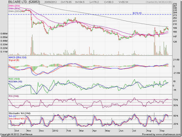
A look at the one year daily bar chart pattern of Bilcare Ltd shows that bears are yet to release their strong grip on the stock:

Bilcare_Sep2012

There are a few important technical points to note on the above chart:-

  • Back on Nov 14 ‘11, the Mar ‘09 bear market bottom of 279 was breached on a volume surge. A high volume penetration of a support level usually turns it into a strong resistance level during subsequent up moves.
  • A high volume ‘panic bottom’ was formed at 190 on the next day. A high volume bounce was followed by a few days of sideways consolidation before the stock price dropped like a stone to a new low of 157 on Dec 22 ‘11 – proving the old saying: “A panic bottom seldom holds.”
  • The stock price rallied along with the broader market to touch an intra-day high of 255 on Feb 21 ‘12 – gaining a substantial 62% from its Dec ‘11 low and providing a decent trading opportunity – but failed to test its Mar ‘09 level of 279.
  • The down trend resumed and the stock dropped to a lower intra-day low of 132 on May 31 ‘12 – maintaining a bearish pattern of lower tops and lower bottoms and under-performing the Nifty which touched a higher bottom in Jun ‘12.
  • The rally from the low of 132 touched a lower top of 194 on Sep 14 ‘12 – despite a surge in trading volumes. The stock price has started correcting after facing resistance from the falling 200 day EMA.

Technical indicators are bullish, but correcting overbought conditions. MACD is positive and above its signal line, but sliding down. ROC is also positive, but has dropped to touch its 10 day MA. RSI briefly entered its overbought zone, but looks ready to come down. Slow stochastic has moved down from its overbought zone.

The stock price may find support from its rising 20 day or 50 day EMAs and make another attempt to cross its 200 day EMA. Even if it is able to do so, it is unlikely to move above the 279 level in a hurry.

Bottomline? The stock chart pattern of Bilcare Ltd is still in a long-term bear market. After touching a high of 1830 in Jan ‘08, the stock lost a massive 93% to touch a low of 132 in May ‘12. Small-cap stocks rarely (no pun intended) recover from such huge falls. Those with a penchant for risk can play for a possible 100 point gain from current levels. But smart investors should stay far away from all RARE stocks.

Wednesday, September 19, 2012

About FDI in Aviation and multi-brand retail – a guest post

When the UPA government first proposed introduction of FDI in multi-brand retail about a year back, the BJP opposed it vehemently and Mamata Banerjee’s TMC threatened to pull out of the UPA alliance. The government back-tracked and postponed the issue.

Now that FDI in Aviation and multi-brand retail have been re-introduced, the usual suspects are doing their song-and-dance routine once more. Will the government succumb again to their pressure tactics, or will they try to push through the much-needed reforms? Only time will tell.

In this month’s guest post, Nishit presents his point of view about how FDI in Aviation and multi-brand retail may benefit India and some Indian companies.

--------------------------------------------------------------------------------------------------------------------------------------

TV channels and newspapers are abuzz with the policy decisions of the Government in the past week. Let us look at a couple of decisions. FDI in Aviation and FDI in Multi-brand retail.

FDI in Aviation means foreign companies/airlines can hold up to 49% stake in Indian airline companies. Indian aviation sector is bleeding and there are airlines like Kingfisher which are on the verge of closing down. The main reasons for this are high Aviation Turbine Fuel (ATF) charges and price under-cutting by competing airlines.

Why will a foreign airline be interested in an Indian carrier? India is one of the fastest growing aviation markets in the world. Airlines like Emirates have flights from major cities in India to Dubai. They have not been able to penetrate Tier-2 cities, which have a lot of potential for out-bound travel. Now, if they take a stake in a domestic carrier they will be able to attract the customers of the domestic carrier for their international routes. E.g., if Emirates have a flight from Chennai to Dubai, then passengers from nearby smaller cities like Madurai can fly to Chennai on a domestic carrier in which Emirates has a stake before boarding the international flight to Dubai. They can also bring international best practices to optimise domestic business.

The companies most likely to benefit from FDI in Aviation could be Jet Airways and SpiceJet. In the unlisted space, GoAir stands a pretty good chance as well. Indigo has the option of going public to raise funds. Kingfisher has too many problems for anyone to be seriously interested.

FDI in multi-brand retail is a contentious issue. Opponents argue that it will hurt the Indian farmer and local ‘kirana’ stores. Contrary to this, it will hurt the middle-man and the trader community who make fat profits by buying vegetables very cheap from the farmer and selling it at expensive rates to the consumers. Peas, which the farmer sells at Rs 8, retail at Rs 32. The price hike is due to the commissions of the middle-men.

There are several safeguards in place for allowing FDI in multi-brand retail. Such stores can only be opened in cities with population exceeding 10 lakhs. There are only 53 such cities (out of 8000) across the country. Other safeguards include investment in cold chain, countervailing duties against cheap imports. Also, it would be too expensive to import vegetables. The farmer may gain thanks to contract farming. Consumers will gain thanks to cheaper pricing. An example is that of packaged products. The local grocer sells a packet of Brooke Bond Red Label tea to me for Rs 330. The mall gives it to me for Rs 289.

Organised retail already exists in the country, and their market share is a meager 4%. It also generates employment for semi-educated youth. ‘Kirana’ stores are existing side-by-side with large malls. Large amounts of agricultural produce rots every year because of insufficient transportation and storage facilities. FDI in multi-brand retail is expected to improve back-end logistics and systems that will reduce wastage and loss to farmers. Ultimately, old and inefficient ways of doing business have to make way for more modern and efficient processes.

In retail stocks, one can look at Pantaloon, Shopper’s Stop and Trent. Pantaloon is the best positioned as it has structured its business in such a way that it can have multiple tie-ups.

--------------------------------------------------------------------------------------------------------------------------------------

(Nishit Vadhavkar is a Quality Manager working at an IT MNC. Deciphering economics, equity markets and piercing the jargon to make it understandable to all is his passion. "We work hard for our money, our money should work even harder for us" is his motto.

Nishit blogs at Money Manthan).

Related Post

Will FDI in retail be good or bad for India?http://investmentsfordummieslikeme.blogspot.in/2011/12/will-fdi-in-retail-be-good-or-bad-for.html

Tuesday, September 18, 2012

WTI and Brent Crude Oil charts: an update

WTI Crude chart

WTI Crude_Sep1812

In a post two weeks back about the 6 months daily bar chart pattern of WTI Crude Oil, technical indicators were bullish, but the following observation was made: “Only a convincing move above the 101 level will put the bulls back in control.”

Oil’s intra-day price almost touched the 101 mark, before retreating – providing another example of how a previous bottom can act as a resistance to future up moves. Note that multiple bottoms near 101 were touched back in Apr ‘12.

How strong will the resistance at 101 be? Note that the sharp break below the 101 level in early May ‘12 was accompanied by a volume spike. Such volume action means that it may require some effort by bulls to overcome the resistance.

All three technical indicators are bullish, but showing negative divergences by touching lower tops while oil’s price rose higher. Volumes on the previous two down days have been higher than those on the up days. The 50 day EMA is yet to cross above the 200 day EMA. The entire rally from the Jun ‘12 low has the characteristics of a bear market rally.

Brent Crude chart

BrentCrude_Sep1812_weekly

The long-term bull market on the 2 years weekly closing chart of Brent Crude oil remains intact. The 20 week EMA has just crossed above the 50 week EMA, and both are well above the rising 200 week EMA.

However, the sharp rally from the bottom of Jun ‘12 was accompanied by falling volumes and no meaningful correction. The on-going correction, if it continues for a while, will improve the technical health of the chart.

Technical indicators are bullish, but showing signs of turning down. An upward bounce from 110 will provide a buying opportunity. A drop below 110 will be bearish.

Monday, September 17, 2012

Stock Index Chart Patterns: S&P 500 and FTSE 100 – Sep 14, ‘12

S&P 500 Index Chart

S&P 500_Sep1412

In last week’s analysis, a pullback to the support/resistance level of 1425 on the daily bar chart pattern of the S&P 500 index was expected. Instead, the index consolidated between 1430 and 1440 before spiking up on good volume support to touch a new 3 years high of 1475 – thanks mainly to the QE3 announcement from Ben Bernanke.

All three EMAs are rising in tandem and the index is trading well above them – the sign of a runaway bull market. Technical indicators are bullish to the point of being overbought. MACD is moving up above its signal line in positive territory. RSI is inside its overbought zone – where it doesn’t like to stay for too long. Slow stochastic is also inside its overbought zone, but showing negative divergence by touching a lower top.

The index may consolidate a bit before its next up move.

FTSE 100 Index Chart

FTSE_Sep1412

In last week’s analysis of the daily chart pattern of the FTSE 100 index, technical indicators were turning bullish – which led to the following observation: “The index needs to cross above the 5900 level for bulls to regain complete control.”

The US Fed’s announcement of unlimited buying of mortgage-backed securities provided just the impetus bulls needed to push the index past the 5900 mark on a strong volume surge (not shown in chart). Any pullback towards the Aug ‘12 top of 5876 can be used to add.

Technical indicators are looking bullish. MACD is positive and above its signal line. RSI is rising above its 50% level. Slow stochastic has entered its overbought zone. Both MACD and slow stochastic touched lower tops while the FTSE rose higher. RSI also failed to move higher. Combined negative divergences are hinting at a correction or consolidation.

Bottomline? Chart patterns of S&P 500 and FTSE 100 indices are back in the control of bulls – thanks to promises of unlimited liquidity from the US Fed and the ECB. Underlying economic growths in US and UK remain dismal. As indices keep rising higher, upside risk increases. Two ways to protect profits are partial profit booking (for risk averse investors) and staying invested with trailing stop-losses (for brave hearts).

Sunday, September 16, 2012

BSE Sensex and NSE Nifty 50 index chart patterns – Sep 14, 2012

BSE Sensex index chart

From the fundamental point of view, the previous week’s upward bounce from the blue uptrend line on the Sensex daily bar chart could be attributed to the unlimited bond buying announcement by ECB’s Mario Draghi. The gap-up move last Friday (Sep 14 ‘12) can be similarly attributed to US Fed’s announcement of unlimited buying of mortgage-backed securities.

Technically, the ‘good news’ had already been ‘discounted’ by the stock market – as can be seen from the higher bottom formed in Jun ‘12 and the subsequent rally, backed by a steady flow of FII money, that took the Sensex past its three EMAs.

The higher inflation number was bad news for the economy and the stock market. It is a clear evidence of underlying bullish sentiment when such bad news is totally ignored by market players. 

SENSEX_Sep1412

The 270 points upward gap formed on the Sensex chart may have important bullish implications if the gap is not filled quickly, or only gets filled partly. For more on gaps and how to trade them, read this post.

Technical indicators are bullish, but beginning to look overbought. MACD is positive and rising above its signal line. ROC has moved sharply above its 10 day MA in positive territory. RSI has just entered its overbought zone. Slow stochastic is well inside its overbought zone.

When bullish sentiment is strong, an index (or stock) can remain overbought for long periods. That doesn’t mean you have to jump in with both feet. Two of the indicators – MACD and RSI – are showing negative divergences by touching lower tops while the Sensex moved higher.

If you do enter, keep a stop-loss at the lower edge of the gap (at about 18000). On the up side, there is a strong resistance zone between 19000 and 19800. Some consolidation/correction can be expected at or near the resistance zone before the Sensex can move up to test its Nov ‘10 top. On the downside, support can be expected from the blue uptrend line and the 50 day EMA (at about 17500).

NSE Nifty 50 index chart

Hike in the price of diesel and re-introduction of FDI in multi-brand retail by the beleaguered UPA government is likely to further boost bullish fervour in the coming week. Nationwide protests against these unpopular but necessary decisions have been planned by the opposition parties and some UPA allies.

These are nothing but cheap vote-bank politics. The former BJP-led NDA government had first raised the issue of FDI in retail – which could be a game-changer for the Indian economy. Now the BJP is taking the lead in opposing the policy instead of supporting it. Talk about hypocrisy!

Nifty_Sep1412

The weekly bar chart of Nifty index has technically entered a bull market as the 20 week EMA has crossed above the 50 week EMA (the ‘golden cross’ marked by light blue circle). The uptrend from the Dec ‘11 bottom is now approaching a strong resistance zone between 5700 and 5950. Some correction or consolidation can be expected before the Nifty overcomes the resistance and tests its Nov ‘10 top.

Technical indicators are looking bullish. MACD is rising above its signal line in positive territory. ROC is also positive, and has moved up to touch its 10 week MA. RSI is at the edge of its overbought zone. Slow stochastic is inside its overbought zone. Three of the four indicators – ROC, RSI, slow stochastic – have touched lower tops while the index has moved higher. The negative divergences are hinting at a correction.

Bottomline? Chart patterns of BSE Sensex and NSE Nifty 50 indices are in up trends and have entered new bull markets. For the past few weeks, investors were urged to buy fundamentally strong, low debt companies. There are several such companies whose stocks are still selling at reasonable valuations. Start accumulating them at every dip. Waiting works best when you already have a portfolio of good stocks bought at lower prices.

Saturday, September 15, 2012

How Asian stock indices have performed vs. BSE Sensex

Strong inflow of FII money has taken the Sensex to a 6 months high – just below its 52 week high touched in Feb ‘12 – making the Sensex one of the better performing stock indices globally. But FIIs have been buying into other countries as well – boosting their stock indices.

Here is a look at how the one year closing chart of the Sensex (in green) compares with charts of some Asian indices (in blue).

China (Shanghai Composite) vs. Sensex

Shanghai

Despite its high-growth economy, China’s Shanghai Composite index has given negative returns and hugely underperformed the Sensex over the past 12 months – moving in the opposite direction since Jun ‘12.

HongKong (Hang Seng) vs. Sensex

HangSeng

In contrast, HongKong’s Hang Seng index has given positive returns during the past 12 months and managed to outperform the Sensex during the first 6 months of this calendar year. Only during the past 3 months has the Sensex been able to overtake the Hang Seng.

Taiwan (TSEC) vs. Sensex

TSEC

Taiwan’s TSEC index has provided marginally positive returns over the past year. After matching the Sensex performance till Jun ‘12, it got left behind during the last 3 months’ rally.

Indonesia (Jakarta Composite) vs. Sensex

Jakarta

Despite some underperformance during Oct & Nov ‘11 and Feb ‘12, Indonesia’s Jakarta Composite index has kept pace with the Sensex and provided positive returns over the past 12 months.

South Korea (KOSPI) vs. Sensex

KOSPI

South Korea’s KOSPI index outperformed India’s Sensex during a 7 months period from Dec ‘11 to Jun ‘12, before the Sensex caught up during the past 3 months – both indices providing positive returns over the past year.

Malaysia (KLCI) vs. Sensex

KLCI

During Sep to Nov ‘11 and Feb ‘12, Sensex performed better than Malaysia’s KLCI index. Otherwise, KLCI outperformed the Sensex and gave better returns during the past year.

Singapore (STI) vs. Sensex

STI

Singapore’s Straits Times index outperformed India’s Sensex – except during Oct & Nov ‘11 – and gave better returns over the past one year.

Thursday, September 13, 2012

Stock Chart Pattern - Hero MotoCorp (An Update)

In the previous technical update back in Jul ‘11 (marked by grey vertical line on chart below), the chart pattern of Hero MotoCorp (formerly Hero Honda) was in the midst of a recovery from an intra-day fall below the 1400 level in Feb ‘11.

Termination of the long association with Honda of Japan had been the major reason for the fall in the stock’s price. Uncertainty about future technological inputs was compounded by Honda’s independent entry into the Indian two-wheeler market.

Shortly after the previous post, the stock price dropped to the long-term support/resistance level of 1700, only to bounce up smartly and rise to a new high of 2232 in Sep ‘11. Doubts about the future of this blue-chip company seemed to exhaust the enthusiasm of the bulls.

For the past 16 months, the daily bar chart pattern of Hero MotoCorp has been stuck in a rectangular band between 1700 and 2250 – testing the patience and resolve of long-term investors.

HeroHonda_Sep1312

The interesting thing to note technically is the behaviour of the 50 day EMA, as the stock price oscillated between the two extremes of the rectangular band. During Jan-Feb ‘12 and again during Jun ‘12, the 50 day EMA merged briefly with the 200 day EMA, but bounced up on both occasions.

However, on Aug 30 ‘12, the 50 day EMA dropped below the 200 day EMA – the ‘death cross’ that confirms a bear market. After a single day’s breach of the upper edge of the rectangular band on May 2 ‘12, the stock price has formed a bearish pattern of lower tops and lower bottoms – by touching a lower top in Jun ‘12 and a lower bottom earlier this month.

Technical indicators are bearish, but correcting from oversold conditions. MACD is negative, but has just crossed above its signal line. ROC has moved up sharply above its 10 day MA into positive territory. RSI is trying to emerge from its oversold zone. Slow stochastic has come out of its oversold zone, but remains well below its 50% level.

What should small investors do? Existing holders can continue to hold. The more adventurous may trade the range between 1700 and 2250. New investors can enter with a strict stop-loss at 1700.

There are fundamental reasons behind the suggestion. The company has recently tied up with an Italian design firm – its third technology tie-up after the ones with EBR, USA and AVL, Austria. Looks like the Munjals are working hard at competing with Bajaj Auto and Honda by getting access to latest technological inputs. Two wheeler capacities are being enhanced – both for scooters, which are selling well and for motorcycles, which are under some demand pressure.

Bottomline? The stock chart pattern of Hero MotoCorp has been consolidating within a rectangular band for the past 16 months. Long consolidations are often followed by strong break outs. Break outs from rectangles can happen in either direction. A drop below 1700 may lead to a test of the previous bottom of 1380. A break out above 2250, if accompanied by a volume surge, can take the stock to 2700.

Wednesday, September 12, 2012

Nifty and Defty charts: a mid-week update

Nifty chart

Nifty_Sep1212

The Nifty index bounced up smartly from the blue uptrend line and the support zone between 5200 and 5250. Rising volumes indicate bullishness. All three EMAs are moving up and the index is trading above them. Despite the economic slowdown – evident from the disappointing IIP number - and policy paralysis in India, a rush of liquidity from FIIs has propelled the Nifty into a bull market.

There may be some hesitation as the Nifty approaches the zone between 5450 and 5500, where it had made previous tops in Aug ‘12 and Mar ‘12. Remember that resistances during an up move are usually provided by previous bottoms – not tops. Any profit booking in the 5450-5500 zone will be an entry opportunity. Strong resistance is expected only at 5700. That means the Feb ‘12 top of 5630 may get crossed during the current up move.

Technical indicators are looking quite bullish. MACD bounced off the ‘0’ line and has crossed above its signal line. ROC has moved above its 10 day MA into positive territory. RSI has risen above its 50% level. Slow stochastic has climbed sharply to enter its overbought zone. The rally should continue, with occasional profit booking.

RBI is unlikely to tinker with interest rates, as inflation is still quite high. The government is slowly coming around to the idea that some unpopular decisions may need to be taken to reduce the fiscal and current account deficits. So far, they haven’t walked the talk. The stock market seems to have anticipated that government’s hands may be forced by the economic situation.

Defty chart

S&P CNX Defty_Sep1212

In previous week’s technical update, following remarks were made about the daily bar chart pattern of Defty: “If the support from the uptrend line holds, Defty is likely to cross above its 200 day EMA during the next up move.”

The uptrend line provided excellent support. Defty bounced up above its 20 day and 50 day EMAs and looks all set to cross above its 200 day EMA. However, a bull market will be technically confirmed only when the 50 day EMA crosses above the 200 day EMA. Even then, it is unlikely to be a runaway bull market.

Technical indicators have turned bullish. MACD has bounced up from its ‘0’ line and just crossed above its signal line. ROC has entered the positive zone above its 10 day MA. RSI has moved above its 50% level. Slow stochastic has entered its overbought zone.

This is not the time to chase after unknown or beaten-down or ‘cheap’ mid-cap or small-cap stocks. Look at well-known and established blue-chip stocks from the large-cap or mid-cap universe, even if their valuations do not appear that attractive. The market always values the better stocks at a premium.

Tuesday, September 11, 2012

Gold and Silver chart patterns: bulls rule again

Gold Chart Pattern

Gold_Sep1012

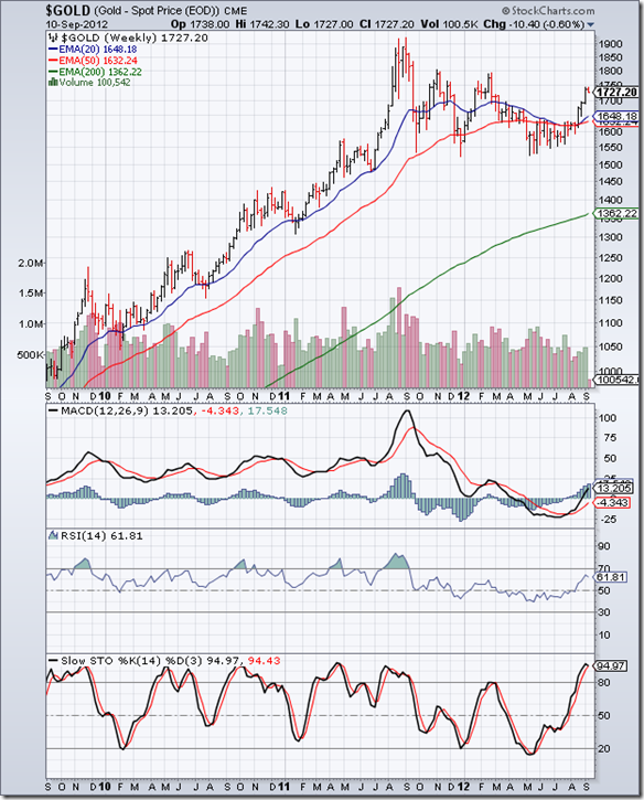
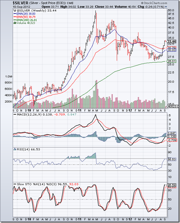
In an update two weeks ago about gold’s price chart pattern, the following remarks were made: “On the longer-term weekly gold chart (not shown), the 20 week EMA had merged with the 50 week EMA for the past month, and now both EMAs have started moving up with gold’s price trading above them. These are bullish signs.”

In the 3 years weekly bar chart pattern above, note that the 20 week EMA had remained merged with the 50 week EMA for almost 3 months before finally moving up. The 50 week EMA, which had remained flat since Mar ‘12, is also moving up. Both EMAs are trading well above the rising 200 week EMA. Gold’s price break out above the resistance from its 20 week and 50 week EMAs was accompanied by rising volumes.

Most importantly, the large descending triangle bearish pattern, within which gold’s price had been consolidating ever since forming a double-top reversal pattern back in Sep ‘11, was negated when the price crossed above the 1640 level. The long-term bull market in gold has resumed.

Technical indicators are looking bullish. MACD is above its signal line, and has climbed up into the positive zone. RSI is above its 50% level. Slow stochastic is inside its overbought zone. On the upside, resistance can be expected from the 1800 level. On the downside, the top of the descending triangle should provide support at about 1640.

Silver Chart Pattern

Silver_Sep1012

In an update two weeks ago about silver’s price chart pattern, the following remarks were made: “On the longer-term weekly chart (not shown), silver’s price has crossed above its 20 week EMA but is facing resistance from its 50 week EMA.”

The 3 years weekly bar chart pattern of silver shows that resistance from the 50 week EMA was overcome quickly, accompanied by good volumes. By crossing above the 31 level, the large descending triangle bearish pattern, within which silver’s price was consolidating since the peak touched in Apr ‘11, has been negated. Once the 20 week EMA crosses above the 50 week EMA, the long-term bull market in silver will resume in earnest.

Technical indicators are looking bullish. MACD is rising above its signal line, and has just entered positive territory. RSI is right below the edge of its overbought zone. Slow stochastic is inside its overbought zone. Resistance can be expected at 37.50 on the upside. Downside support should be provided by the top of the descending triangle at 31.

Use dips to add.

Monday, September 10, 2012

Stock Index Chart Patterns: S&P 500 and FTSE 100 – Sep 07, ‘12

S&P 500 Index Chart

S&P 500_Sep0712

In last week’s analysis, it was observed that the daily bar chart pattern of the S&P 500 index was consolidating within a ‘flag’ pattern. The following remarks were made: “A ‘flag’ is usually a continuation pattern. Since it is forming after a substantial up move, there is every possibility that the index will break out upwards from the ‘flag’ and resume its up move.”

The index behaved as per expectation by breaking out upwards from the ‘flag’, and crossed the resistance level of 1425 to touch a 3 year high of 1438. The supporting volume spurt validated the break out. The remote possibility of a ‘double top’ reversal pattern is off the table. All three EMAs are rising and the index is trading above them. Bulls are back on top.

So, is it a good time to buy? Bullish technical indicators are suggesting as much. MACD is positive and has crossed above its signal line. RSI has risen to the edge of its overbought zone. Slow stochastic has climbed sharply to enter its overbought zone. But MACD is showing negative divergence by touching a lower top.

Break outs are often followed by pullbacks. In this case, a pullback towards 1425 may provide a better entry opportunity. The jobs report was disappointing. The rise in gold’s price means that the market is expecting that the Fed may have little option but to announce some form of a QE3. If it doesn’t come through, the index may correct.

FTSE 100 Index Chart

FTSE_Sep0712

The correction in the daily bar chart pattern of the FTSE 100 dropped the index all the way down to the 200 day EMA. Just when the bears were expecting to dominate, the tables were turned by the ECB President’s announcement of an unlimited bond buying programme to bail out the debt-ridden Euro nations. 

Global stock markets bounced up in euphoria as the possibilities of a collapse of the euro and a break up of the Eurozone receded to the background. The bond buying programme is hardly a solution to the sovereign debt problems. So, the whole drama may get re-enacted some time in the not-so-distant future. Till then, bulls may try to make merry.

Technical indicators are turning bullish again. MACD bounced up from the ‘0’ line, but is below its falling signal line. RSI has managed to cross above its 50% level. Slow stochastic has emerged from its oversold zone and rising sharply towards the 50% level. The index needs to cross above the 5900 level for bulls to regain complete control.

Bottomline? Chart patterns of S&P 500 and FTSE 100 indices are looking bullish after emerging from brief periods of consolidation/correction. Stay invested, or add with suitable stop-losses. Despite sluggish economies in the USA and UK, the stock indices are rising on a surge of liquidity. Enjoy the party while it lasts. De-risk your portfolios with partial profit booking from time to time.

Sunday, September 9, 2012

BSE Sensex and NSE Nifty 50 index chart patterns – Sep 08, 2012

BSE Sensex index chart

In last week’s analysis of the BSE Sensex index chart, the following comment was made: “The zone between 17150 and 17300 should provide strong support to any further fall in the Sensex.”

The index touched a weekly low of 17251 – right inside the support zone mentioned above – and bounced up strongly. Though the index dropped below the blue uptrend line (connecting the Jun and Jul ‘12 bottoms), it received good support from the top of the symmetrical triangle and the entwined 20 week and 50 week EMAs.

Those who don’t believe in, nor understand, technical analysis concepts may say that it was ECB President Mario Draghi’s announcement of an unlimited bond purchase programme that caused global stock markets to jump up – and they wouldn’t be entirely wrong. But it is funny how time and again, stocks or indices tend to bounce up from strong support zones on some pretext or the other.

SENSEX_Sep0712

Have the bears - read DIIs - been vanquished? They did join the bullish bandwagon of the FIIs by turning net buyers on Fri. Sep 7 ‘12. Will there be follow-up buying next week? There is every possibility of that – considering the bullishness visible in the weekly technical indicators.

MACD is positive and above its signal line. RSI has re-entered its overbought zone. Slow stochastic has remained inside its overbought zone for the past 4 weeks. Only the ROC is showing loss of upward momentum by touching a lower bottom and crossing below its 10 week MA. The ‘golden cross’ of the 20 week EMA above the 50 week EMA, which will technically confirm a bull market - is still awaited.

Don’t expect a runaway rally – but any time an index (or stock) bounces up from known support, it provides a buying opportunity. Remember that stock markets tend to discount good and bad news in advance. In this case, the Indian economy is showing signs of bottoming out – and that is definitely good news for the stock market.

NSE Nifty 50 index chart

The main opposition party held the nation to ransom by stalling the functioning of parliament during the entire monsoon session. Only 4 out of the 31 or so bills that were supposed to get tabled were passed. Their motives for demanding the PM’s head was less than altruistic. It was a desperate effort by a party to topple an elected government.

For more than 60 years, corrupt and self-serving politicians have impeded the economic progress of India. It is to the credit of businessmen and entrepreneurs that they have built and fostered companies that are respected for their expertise, innovation and staying power despite a thousand hurdles thrown in their way. India may not be shining as brightly as China, but there is no doubt that the country will grow and prosper economically. 

Nifty_Sep0712

The NSE Nifty 50 index dropped below its 50 day EMA to an intra-day low of 5216 during the past week – just short of the 200 day EMA and the 5200 level – before bouncing up with a gap on Fri. Sep 7 ‘12. The strong support zone between 5200 and 5250 held, and the uptrend from the Jun ‘12 low is intact.

Technical indicators are beginning to turn around from oversold conditions, but aren’t quite bullish yet. MACD has bounced up from the ‘0’ line but remains below its falling signal line. ROC has crossed above its 10 day MA but is yet to climb out of negative territory. RSI has bounced up from the edge of its oversold zone, but hasn’t reached its 50% level. Slow stochastic is emerging from its oversold zone.

If you are still waiting for lower index levels for buying, it may be a long wait. The time to accumulate good stocks is now. But the key word is ‘good’. Don’t expect to get rich by buying several thousand shares of an unknown penny stock. Wealth building takes time, patience and planned effort.

Bottomline? Chart patterns of BSE Sensex and NSE Nifty 50 indices have bounced up from strong support zones – providing buying opportunities. Bank FD rates are being lowered, even though RBI has not cut interest rates. That shows adequate liquidity in the system. FIIs are still in buying mode – despite the lack of policy reforms. This isn’t a time for pessimism. Be cautiously optimistic instead.

Thursday, September 6, 2012

Stock Chart Pattern - Exide Industries (An Update)

The previous update of the daily bar chart pattern of Exide Industries was posted back in Apr ‘11 (marked by grey vertical line on the left of chart below). The stock was recovering after a sharp correction from 180 (touched in Oct ‘10) to 112 (touched in Jan ‘11). The company is fundamentally strong, debt-free and a market leader in the auto-ancilliary space, but the concluding remarks in the post was: “Valuations are not cheap, plus margins are under pressure. Use dips to add.”

The stock price dropped after the previous post, but received good support from all three EMAs, which had converged together. As often happens when the EMAs converge, a sharp move followed. The stock price rose to a slightly lower top of 173 on Jul 20 ‘11, but formed a ‘reversal day’ pattern (higher high, lower close) that marked the end of the up move from the Jan ‘11 low of 112.

Note that during the last leg of the rally from May ‘11, all four technical indicators touched lower tops as the stock price rose higher. The combined negative divergences – marked by blue arrows – gave advance warning of an impending correction/consolidation.

Exide_Sep0612

What followed was another sharp correction that pushed the stock price below all three EMAs and into a bear market – from which it has been trying to extricate itself for a year. The stock price fell to a high-volume ‘panic bottom’ of 107 on Oct 25 ‘11 – falling lower than its Jan ‘11 low of 112.

An old stock market adage states: ‘A panic bottom seldom holds’. Sure enough, after a couple of attempts to bounce up, which faced resistance from the falling 20 day and 50 day EMAs, the stock price dropped to a new intra-day low of 99 on Dec 22 ‘11.

A couple of interesting patterns can be observed here. The stock made a ‘reversal day’ pattern (lower low, higher close) that marked the end of the intermediate down move, though volumes were not substantially higher. Three of the four technical indicators showed positive divergences by touching higher bottoms while the stock price dropped lower.

The subsequent uptrend is into its 9th month (marked by the blue uptrend line), but the stock price hasn’t been able to move convincingly above the long-term support/resistance level of 150. Why is a well-known market leader like Exide Industries struggling to get out of a bear market?

Apparently, the company botched up its sales strategy by concentrating on OEM supplies to auto makers and left the replacement market flank wide open for competitors. Since margins tend to be better in the replacement market, the company’s bottom line has suffered. Also, by entering the inverter manufacturing space, it has alienated other inverter manufacturers who used to source batteries from them. It may take a while before the company’s profits margins improve. The negative sentiment is providing an opportunity for small investors to buy the shares of this well-respected company.

Technical indicators are bullish, but correcting overbought conditions. MACD is rising above its signal line in positive territory. ROC is positive, but had climbed to far above its 10 day MA and is moving down. RSI has drifted down after touching the edge of its overbought zone. Slow stochastic is inside its overbought zone, but showing signs of slipping down.

Bottomline? The stock chart pattern of Exide Industries is trying to get out of the clutches of bears. It has hardly given any returns to investors over the past 12 months. The time to buy a good company is when some temporary setback has depressed the stock price. Accumulate with a strict stop-loss at the uptrend line (currently at 125). Add more on a convincing break out above 150.

Wednesday, September 5, 2012

Nifty and Defty charts: a mid-week technical update

Nifty chart

Nifty_Sep0512

In last week’s update, the importance of the support zone between 5200 and 5250 was explained. At today’s close, the Nifty index has taken support at the blue uptrend line - exactly in the middle of the support zone. Combined support from the 200 day EMA and the 5200 level is expected in case the uptrend line is breached.

A convincing breach of the 5200 level and a drop below the Jul ‘12 low of 5032 would mean the end of the intermediate uptrend that started from the Jun ‘12 low of 4770. Will the Nifty bounce up from the support zone? Or, will it start a down trend?

Bearish technical indicators are pointing to a continuation of the correction. MACD is falling below its signal line, and about to enter negative territory. ROC is below its 10 day MA, and falling deeper into negative territory. RSI has dropped to the edge of its oversold zone. Slow stochastic is inside its oversold zone. Except for MACD, the other three indicators are looking oversold. So, an upward bounce can occur at any time.

RBI has maintained status quo on interest rates for the past few months, but banks have started to pare their lending rates. The marginally higher GDP figure for Q1 is another indication that the economy may be bottoming out. The current dip can be used to buy the shares of fundamentally strong, low debt companies – but with appropriate stop-losses in case the uptrend comes to an end.

Defty chart

S&P CNX Defty_Sep0512

The daily bar chart pattern of Defty (Nifty calculated in US Dollar terms) is in a bear market, as it is trading below all three EMAs. However, the blue uptrend line connecting the Jun and Jul ‘12 bottoms hasn’t been tested yet. If the support from the uptrend line holds, Defty is likely to cross above its 200 day EMA during the next up move.

Technical indicators are looking bearish, to the point of being oversold. MACD is falling below its signal line, and ready to enter the negative zone. ROC is negative, and falling below its 10 day MA. RSI is just above its oversold zone. Slow stochastic is inside its oversold zone.

The stalemate between the UPA and BJP continues in Parliament – a case of the pot calling the kettle black! With just a couple of days left for the Monsoon Session, there is very little chance of any important bills getting passed. The shocking sight of MPs indulging in fisticuffs in the upper house shows that India is far away from earning a place among global leaders.

In spite of the pathetic state of our political leadership, some companies will continue to thrive because of their innovative managements and strong product/service portfolios. When there is uncertainty and gloom all around, a contrarian approach can reap rich dividends.

Tuesday, September 4, 2012

WTI and Brent Crude Oil charts: oil is boiling again

WTI Crude chart

WTI Crude_Sep0412

The following remarks were made two weeks back about the 6 months daily bar chart pattern of WTI Crude oil: “All three technical indicators are looking a bit overbought. Volumes during the later stage of the rally have been falling…The entire trading pattern for the past 3 months appears to be forming a bearish ‘rising wedge’. There is no need to jump in. A cross above 101 can put the bulls back in control.”

As often happens when technical indicators become overbought and volumes fall during a rally, a correction or consolidation follows. Oil’s price formed a ‘reversal day’ pattern (higher high, lower close) on Aug 23 ‘12, dropped down to its 200 day EMA on Aug 30 ‘12 and briefly breached the uptrend line connecting the Jun ‘12 and Aug ‘12 bottoms. The upward bounce the following day on a volume spurt was probably aided by short-covering prior to the Labor Day weekend.

The 20 day EMA has crossed above the 200 day EMA, but the 50 day EMA is yet to do so. Technically, the entire rally from the Jun ‘12 low appears to be a bear market rally within a ‘rising wedge’ pattern. A downward break out is the likely outcome from such a pattern (not drawn on chart). Only a convincing move above the 101 level will put the bulls back in control.

Technical indicators are looking bullish, after correcting overbought conditions. MACD is positive, but has crossed below its signal line. RSI has dropped from its overbought zone, and bounced up before reaching its 50% level. Slow stochastic has fallen from its overbought zone, but remains above its 50% level.

Brent Crude chart

BrentCrude_Sep0412_weekly

The two years weekly closing chart pattern of Brent Crude oil continues to trade in a long-term bull market. The 20 week EMA is about to cross above the 50 week EMA. That should restore bullish dominance. However, weekly volumes have been sliding during the entire rally from the Jun ‘12 low. Without volume support, the rally may not sustain much longer.

Weekly technical indicators are looking bullish. MACD is rising above its signal line, and is about to enter positive territory. RSI has moved above its 50% level but its upward momentum is slowing. Slow stochastic is well inside its overbought zone, but turning down.

There was an explosion and fire in Venezuela’s biggest refinery that has halted production. Hurricane Isaac caused production disruption in offshore platforms in the Gulf of Mexico. Lack of supply from Iran due to sanctions is another concern. But it still appears that speculation has been the over-rising factor for the 3 months long rally. Any further rise in oil’s price will begin to affect the growth prospects of the global economy. That won’t be in the best interests of the biggest oil producers.

Monday, September 3, 2012

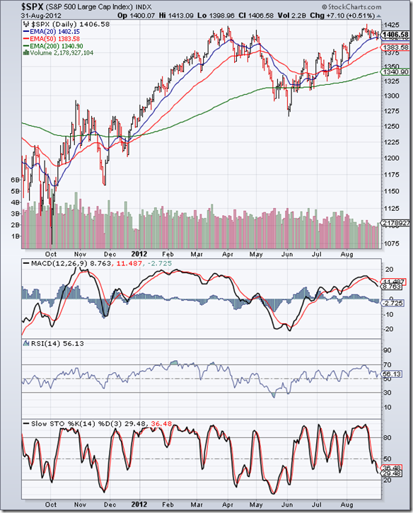
Stock Index Chart Patterns: S&P 500 and FTSE 100 – Aug 31, ‘12

S&P 500 Index Chart

S&P 500_Aug3112

The one year bar chart pattern of the S&P 500 index has been consolidating within a small ‘flag’ pattern after testing its Apr ‘12 top. The 20 day EMA has provided good support to the index so far. The consolidation may not be over yet, which means the index may fall below the 20 day EMA.

A ‘flag’ is usually a continuation pattern. Since it is forming after a substantial up move, there is every possibility that the index will break out upwards from the ‘flag’ and resume its up move. The index is trading above all three EMAs. The 50 day and 200 day EMAs are moving up. These are signs of a bull market.

However, the index is trading near a 3 year high. Plus there is a possibility – however remote – of a double-top reversal pattern forming. It may be better to err on the side of caution. Stay invested. Buy only on a convincing move above 1425.

Technical indicators are turning bearish. MACD is positive, but falling below its signal line. RSI has bounced up a bit after dropping to its 50% level. Slow stochastic has moved sharply below its 50% level and still falling.

The US economy is growing – but very slowly. Q2 GDP was adjusted marginally higher, and probably forced the Fed’s hand in postponing QE3. Initial jobless claims remain below the critical 400,000 mark, but there are some signs of it inching upwards. A recession may be off the table, but the rally in the index seems a bit overdone.

FTSE 100 Index Chart

FTSE_Aug3112

Unlike the S&P 500 index, the one year bar chart pattern of the FTSE 100 index is showing much more weakness, though the uptrend for the Jun ‘12 low is still intact. The index touched a lower top, and dropped below 5800 and its 20 day EMA to seek support from its 50 day EMA. If the support doesn’t hold, the uptrend may get reversed.

Technical indicators are looking bearish. MACD is positive, but falling rapidly below its signal line. RSI has slipped below its 50% level. Slow stochastic has entered its oversold zone. Any upward bounce should be accompanied by good volumes, otherwise bears may use the bounce to sell.

UK’s economy remains in a recession, despite some improvement in the manufacturing PMI in Aug ‘12. With the Eurozone situation showing very little signs of improvement, UK’s exports are unlikely to pull the country out of its doldrums.

Bottomline? Chart patterns of S&P 500 and FTSE 100 indices are undergoing corrections after rallying for 3 months. Such corrections improve the technical health of the charts and help to strengthen the next up moves. But one should remain cautious in case the corrections turn out to be trend reversals. The best way to protect your investments is to book partial profits, or hold with suitable stop-losses.