I have been analysing individual index chart patterns of the Asia Pacific region for quite some time. Hope readers from the Asia Pacific region have found them useful. In today’s post, I wanted to put up the 5 year chart patterns of the various indices in one place. It makes interesting viewing.
Shanghai Composite Index Chart
The Chinese economy is now the second largest in the world – after the USA, and the fastest growing. The Shanghai Composite index chart shows that economic prowess does not necessarily get translated into stock market returns. The index is below the falling 200 day EMA, and is in a long-term bear market since Oct ‘07.
Hang Seng Index Chart
The Hang Seng index chart pattern is doing somewhat better than its mainland counterpart. It is rising above a flat 200 day EMA and has made a bullish inverse head-and-shoulders pattern. But to return to a bull market, the 2007 top has to be conquered – and that is a long way away.
The Taiwan TSEC chart pattern has also made an inverse head-and-shoulders bullish pattern. It is above the rising 200 day EMA, and not too far away from the 2007 top. The TSEC looks the most bullish among the three Chinese indices.
Australia All Ordinaries Index Chart
The Australia All Ordinaries index chart has got its nose above the 200 day EMA, but the long-term moving average is falling. A rise above the 5000 level will form a bullish higher tops and higher bottoms pattern. Till then, it remains in a long-term bear market.
New Zealand NZX50 Index Chart
The New Zealand NZX50 index chart pattern is looking very similar to the Australia All Ordinaries chart – but has only a short climb to form a bullish higher tops and higher bottoms pattern. Both indices need to go past the 2007 tops for the bulls to regain control.
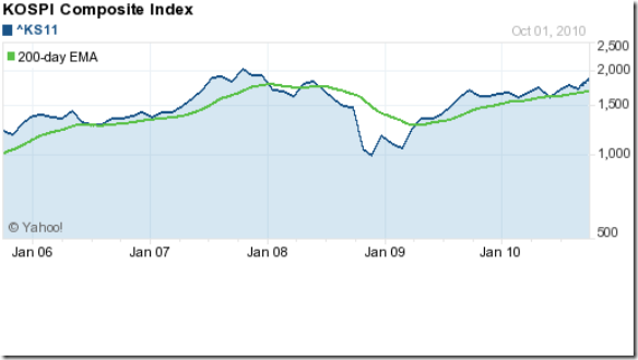
Korea KOSPI Index Chart
The Korea KOSPI index chart pattern is in a bull market, though it is still below the 2007 top. It is just a matter of time before a new high is touched. The index is taking good support from the rising 200 day EMA on its way up.
Malaysia KLCI Index Chart
The Malaysia KLCI index chart pattern is in a clear bull market – no ‘ifs’ and ‘buts’ here. A bit of hesitation near the 2008 top is to be expected. The index has risen quite sharply. A correction at this stage will be healthy for the long-term bull market.
Singapore Straits Times Index Chart
The Singapore Straits Times index chart pattern is looking bullish – taking support from the rising 200 day EMA on its way up. But it needs to move above the 2007 top, and that could take a while.
Jakarta Composite Index Chart
The Jakarta Composite index chart is the hands-down clear winner by several lengths in the bullish sweepstakes of the Asia Pacific index charts. It has soared past its previous top and is in ‘blue-sky’ territory. That means there are no known resistance levels.
Japan Nikkei Index Chart
The Japan Nikkei index chart pattern wins the ‘wooden spoon’ – the consolation award given to the last place finisher. How the mighty has fallen. Not only has Japan lost its second place in the global economic stakes, the Nikkei seems ready to plunge to new depths.
Bottomline? The long-term chart patterns of the Asia Pacific indices are widely ranged from extreme bearishness to exuberant bullishness. As a contrarian play, it may be a good idea to book profits in Jakarta and Malaysia and redeploy in Taiwan, Korea and Singapore.


No comments:
Post a Comment