Monday, September 30, 2013

Stock Index Chart Patterns: S&P 500 and FTSE 100 – Sep 27, ‘13

S&P 500 Index Chart

S&P 500_Sep2713

The 6 months daily bar chart pattern of S&P 500 index corrected down to its 20 day EMA last week. At the time of writing this post, it has further corrected down to its 50 day EMA. Is this the end of the bull market? Not by a long shot. Look at the rising 200 day EMA. The bull market is alive and well.

Is the correction over? Not yet. The daily technical indicators have turned bearish, but not looking oversold yet. MACD is positive, but has crossed below its signal line. RSI has slipped below its 50% level. Slow stochastic is falling below its 50% level.

Such corrections help to improve the technical ‘health’ of price charts, allowing them to rise to new highs. So, the dip is an opportunity to add to existing holdings. The index is barely 3% below its lifetime high. Some amount of caution is warranted near lifetime highs. In other words, keep suitable stop-losses to avoid getting blind-sided by bears.

The US economy seems to be progressing slowly on the recovery path. Unemployment is coming down. Corporate profits are up. So are new home sales. Q2 GDP grew at a modest 2.5%. Debt ceiling concerns and the possibility of a government shutdown is keeping the bears active. All is likely to be well after some last minute brinkmanship by legislators.

FTSE 100 Index Chart

FTSE_Sep2713

In last week’s analysis, the 6 months daily bar chart pattern of FTSE 100 index was struggling to move above the 6600 level. Signs of distribution had given early warning of a bear attack. The index dropped below its 20 day and 50 day EMAs, but managed to close above the 6500 level.

Daily technical indicators are turning bearish. MACD is barely positive, and touching its signal line. RSI has slipped below its 50% level. So has Slow stochastic. The correction is likely to continue till uncertainty regarding the US debt ceiling issue gets resolved.

At the time of writing this post, the index is trading below the 6500 level. However, it is trading above its rising 200 day EMA. The long-term bull market is under no immediate threat.

The UK economy is showing signs of recovery. The housing market is picking up with home prices rising moderately. Manufacturing and construction indices are strengthening – as per this article.

Bottomline? 6 months daily bar chart patterns of S&P 500 and FTSE 100 indices are facing bull market corrections. Such corrections provide adding opportunities. But be selective, and maintain suitable stop-losses.

Sunday, September 29, 2013

BSE Sensex and NSE Nifty 50 index chart patterns – Sep 27, 2013

Improvement in merchandise and software exports coupled with lower oil price and import restrictions on gold and luxury items may finally bring down the current account deficit within manageable limits. However, Q1 (Jun) deficit may climb a bit due to seasonal reasons – as per this Reuters report.

Partial recovery in the value of the Rupee, and expectation that the Indian economy may have bottomed out finally have encouraged FIIs to turn net buyers. DIIs have become net sellers. Small investors are confused by index volatility and continued weakness in mid-cap and small-cap stocks.

The stock market is looking ahead to Q2 results – to be announced from Oct. onwards – for clearer direction in the stock indices. Not many positive surprises are expected. IT, pharma, FMCG should continue to do well. Metals, infra, power, real estate will drag.

BSE Sensex index chart

Sensex_Sep2713_ST

The daily bar chart of Sensex rallied a huge 3300 points from its 52 week low of 17449 (on Aug 28) to its 52 week high of 20740 (on Sep 19) in just 15 trading sessions. Even seasoned investors were taken aback by the ferocity of the bulls.

Such sharp rallies are difficult to sustain. The index dropped down to seek support from its 20 day EMA. Note that overbought conditions and reversal patterns were visible on the daily technical indicators last week, so the correction should not have come as a surprise.

Daily technical indicators are beginning to turn bearish, which means the correction may not be over yet. MACD has dropped from its overbought zone to touch its signal line. ROC dropped below its 10 day MA into negative territory after forming a double-top reversal pattern. RSI has formed a head-and-shoulders reversal pattern, and is falling towards its 50% level. Slow stochastic has slipped below its 50% level.

Use the dip to accumulate fundamentally strong stocks. If you think that the better stocks look expensive, you are right. They are. So, buy a small quantity from your savings every month, instead of chasing ‘cheap’ stocks.

NSE Nifty 50 index chart

Nifty_Sep2712_LT

The weekly bar chart pattern of Nifty continues to trade in a long-term up-trend (marked by the blue up-trend line). In spite of three consecutive intra-week drops below the trend line recently, the index did not close below the trend line even once.

In fact, the weekly chart of Nifty has closed above the trend line every week for the past 22 months - since the up-trend started from the Dec ‘11 low. Nifty is trading above both its weekly EMAs and is back in a bull market.

Weekly technical indicators are showing signs of bearishness. MACD is just above its signal line, but in negative territory. ROC failed to enter positive territory, and has dropped down to its 10 week MA. RSI moved above its 50% level, but starting to slide down. Slow stochastic has reached the edge of its overbought zone, but its upward momentum is receding.

Bottomline? Chart patterns of BSE Sensex and NSE Nifty indices are back in bull territories after facing sharp bull market corrections. Bears are still active, so caution is advised. Remember that money is made in bull markets by buying – not by fearing disaster. Buy carefully with adequate stop-losses in place.

Tuesday, September 24, 2013

WTI and Brent Crude Oil charts: an update

WTI Crude chart

WTI Crude_Sep2313

The 6 months daily bar chart pattern of WTI Crude oil has corrected below its 20 day and 50 day EMAs, and may move down further to test its rising 200 day EMA.

Negative divergences in all three daily technical indicators – observed in a post two weeks back – had given advance warning of the likely correction. As the possibility of an air attack on Syria by the US receded, speculators resorted to profit booking.

Daily technical indicators are looking quite bearish, but haven’t reached oversold conditions yet. MACD has slipped into negative territory below its signal line. RSI has dropped below its 50% level, and still falling. Slow stochastic has just entered its oversold zone.

All three indicators are again showing negative divergences by falling below their respective Aug ‘12 lows, while oil’s price is above its Aug ‘12 low of 102. Strong volumes on down days is another indication that bears are on top.

Brent Crude chart

Brent Crude_Sep2313

The brief foray into bull territory, followed by a speculative spurt above the 117 level on strong volumes, appears to be coming to an end. The 6 months daily bar chart pattern of Brent Crude oil is struggling to stay above its 200 day EMA.

Strong volumes on down days and a bearish reversal pattern formed by the Slow stochastic indicator – observed two weeks back – had warned about a drop in price to the 50 day EMA. Active bears are now on the verge of pushing oil’s price back into a bear market.

Daily technical indicators are looking bearish. MACD has dropped inside negative territory. RSI is treading water below its 50% level. Slow stochastic has re-entered its oversold zone after a brief effort to move up.

Some more correction is likely.

Monday, September 23, 2013

Stock Index Chart Patterns: S&P 500 and FTSE 100 – Sep 20, ‘13

S&P 500 Index Chart

S&P 500_Sep2013

The 6 months daily bar chart pattern of S&P 500 soared past its Aug ‘13 top of 1710 to touch a life-time high of 1730 on Sep 19. But the index formed a ‘reversal day’ pattern (higher high, lower close) and dropped down to the 1710 level on huge volumes. Previous tops often act as support levels. But 1710 may get breached, as Fridays large volumes means that bears will be active.

Bernanke’s decision to hold off on QE3 tapering surprised the market, and bulls went on a rampage in global markets at the thought of a longer period of cheap and easy liquidity. By the end of the week, the euphoria abated. Realisation dawned that the economy wasn’t growing as well as expected.

Daily technical indicators are bullish, but showing signs of weakening momentum. MACD is positive and above its signal line, but showing negative divergence by failing to touch a new high with the index. RSI has dropped from its overbought zone. Slow stochastic is inside its overbought zone, but failed to touch a new high and has started to slip down.

The bull market is intact, but facing another correction.

FTSE 100 Index Chart

FTSE_Sep2013 

The 6 months daily bar chart pattern of FTSE 100 is back in bull territory, but struggling to cross the 6600 level convincingly. Unless it can move above its Aug ‘13 top of 6700 – thereby forming a bullish pattern of higher tops and higher bottoms from the Jun ‘13 low – the index will continue to consolidate sideways.

Sharp rise in volumes on the two down-days last week is a sign of ‘distribution’. Bulls need to be prepared for another bear attack.

Daily technical indicators are bullish, but showing signs of weak upward momentum. MACD is positive and just above its signal line. RSI is oscillating in bullish zone. Slow stochastic has dropped from its overbought zone.

Bottomline? 6 months daily bar chart patterns of S&P 500 and FTSE 100 indices are in bull markets, but likely to encounter corrective moves. Hang on to existing holdings. The likely dips can be used to add very selectively.

Saturday, September 21, 2013

BSE Sensex and NSE Nifty 50 index chart patterns – Sep 20, 2013

There was an anti-climax and a negative shock for the Indian stock market last week. The much-awaited QE3 ‘tapering’ announcement by the US Fed turned out to be a non-event. Status quo was maintained as the economic recovery in the US remained anaemic. Global markets rejoiced that the environment of easy and cheap liquidity would continue, and many rose to new highs.

RBI ‘s announcement of a 25 bps (0.25%) repo rate hike poured cold water on the ardour of enthusiastic bulls. With WPI and CPI inflation creeping up again, RBI’s move was logical but unexpected. Bears used the opportunity to reassert themselves, leaving small investors confused about what to do next.

What are the chart patterns of Sensex and Nifty indicating after the violent gyrations in the week gone by? Is this a good time to buy, sell or stay put? To remove some of the ‘noise’ associated with bar charts, let us take a look at the closing charts of the two indices.

BSE Sensex index chart

SENSEX_Sep2013

The 1 yr closing chart pattern of Sensex shows several technical patterns that may be of interest to traders as well as investors. The corrective move from Jan – Apr ‘13 terminated with a double-bottom reversal pattern (marked DB1) at about 18220. Sensex rose to touch a closing high of 20286 in May ‘13 (marked T1), but formed a head-and-shoulders reversal pattern, and started correcting again.

A second double-bottom reversal pattern (marked DB2) formed at about 18550 in Jun ‘13 – more than meeting the downside target of the head-and-shoulders pattern at T1. The subsequent rally took the Sensex to a closing high of 20302 in Jul ‘13 (marked T2) – forming a larger double-top reversal pattern.

The double-top pattern was technically confirmed when Sensex dropped below the ‘valley’ level of DB2. The downward target from the double-top pattern (T2 – DB2 = 1750; DB2 – 1750 = 16800) was not met, as the Sensex formed a third double-bottom reversal pattern (marked DB3) at about 17900 in Aug ‘13. Note that technical analysis is not a science, and arithmetic calculations of likely stock/index levels are approximate – based on empirical observations.

The sharp rally from DB3 took the index above the resistance level of T1, T2 (at about 20300), followed by a pullback towards the resistance level. Such pullbacks offer buying opportunities, but caution is advised because of the overbought conditions of daily technical indicators.

MACD has risen well inside its overbought zone, and looks ripe for a pullback. ROC is showing negative divergence by forming a double-top reversal pattern inside its overbought zone, and has dropped below its 10 day MA. RSI is ready to fall from its overbought zone. Slow stochastic is inside its overbought zone, but showing negative divergence by touching a lower top.

There is every possibility of Sensex dropping below the resistance level of T1, T2 (at 20300). But there is no reason to sell in a panic. The index is in a bull market, and is trading above all its three rising EMAs. The likely dip can be used to enter fundamentally strong stocks.

NSE Nifty 50 index chart

Nifty_Sep2013

The weekly closing chart pattern of Nifty gives several indications that ought to make bulls happy. The down-trend line (marked DTL) has been breached. The 20 week EMA has bounced off the 50 week EMA, and both weekly EMAs have started to rise. Volumes have been quite strong. Weekly technical indicators are turning bullish. FIIs have been net buyers.

But bears have not thrown in the towel yet. Note that Nifty hasn’t yet surpassed its Jul ‘13 top, and is 200 points below its May ‘13 top. (Why the disconnect with the Sensex, which touched a 2 yr high? The composition of the two indices are different, with different weightages for index components.)

DIIs have been net sellers, and are making sure that the index doesn’t run away upwards. MACD is about to cross above its signal line, but is still in negative territory. ROC crossed above its 10 week MA, but hasn’t yet entered its positive zone. However, RSI and Slow stochastic are both above their 50% levels.

There is a possibility that the index may pullback towards the down-trend line (DTL). On the daily closing chart of Nifty (not shown), the index has already started to pullback towards DTL. Since Nifty is in a bull market – trading above both weekly EMAs – the pullback can be used to add.

Bottomline? Chart patterns of BSE Sensex and NSE Nifty indices have breached important resistance levels. But the breaches have not been convincing yet. Both indices may pullback below the resistance levels. The dips can be used to add selectively. Despite RBI’s hawkish stance towards inflation, the worst seems to be over for the economy.

Thursday, September 19, 2013

Did the Sensex jump up due to the ‘Butterfly Effect’?

The short answer to that question is: It seems so. For the long answer, a small digression is necessary. The term ‘Butterfly Effect’ is used in ‘Chaos Theory’ to explain why a small change in the initial condition of a complex, non-linear system can lead to a significantly large change in the system subsequently.

In simple English, it means that the flapping of the wings of a butterfly in India can cause a typhoon in the South China Sea. Exaggeration, you say? Apparently not. To test the ‘Butterfly Effect’, a fighter jet formed a ‘figure of 8’ contrail with its exhaust over California. Weather scientists tracked the contrail all the way to Texas – 2200 KM to the east – over the next several weeks. By then, the contrail had turned into a 800 KM long cloud formation!

The US Fed briefly flapped its wing on Sep 18 by maintaining status quo on the QE3 bond-buying programme. After testing global markets with its ‘tapering’ call earlier – which sent FIIs scurrying away from emerging markets – kicking the debt can down the road was taken as a positive surprise by market players.

The liquidity tap shall remain open – probably for another month or two – when every one was expecting at least a $10 Billion cut to the US Fed’s $85 Billion per month bond-buying programme. Bulls celebrated, and the remaining bears capitulated. S&P 500 touched a life-time high. Sensex touched its highest level in 3 years.

Every one seemed to forget that the status quo hinted at a less-than-satisfactory US economic growth. In the short-term, the market acts like a voting machine – and the vote was firmly in favour of bulls. So, what should small investors do now? Jump in? Book profits? Hold for higher levels?

That depends on the state of one’s portfolio and asset allocation plan. Turmoil in the stock market should not determine your investment action. Your asset allocation plan should. If you don’t have a plan, how will you achieve your investment goals? You haven’t set any investment goals yet? Your portfolio is probably giving no returns.

Related Posts

How to reallocate your assets
How to generate income and build wealth
Are you emotional or logical in your investment decisions?

Wednesday, September 18, 2013

Look at fixed income in a choppy market – a guest post

Many investment experts, who regularly appear on business TV channels, suffer from herd mentality. When the stock market rallies, they jump on to the bull bandwagon and start predicting higher and higher index levels.

When the market corrects, the same experts suddenly turn gloom and doom mongers and predict ever lower levels. Since the stock market’s nature is to fluctuate, opposing views from the same set of experts tend to confuse small investors – who end up sitting on their hands.

In this month’s guest post, Nishit takes a look at some fixed income options that small investors can look at, without taking undue risks in a choppy stock market.

-------------------------------------------------------------------------------------------------------------------------------------

Stock Markets are going crazy with wild swings. Government Securities funds, which trade mainly in Government 10 year paper, are swinging too. So, what are fixed income instruments one can invest in?

There are a slew of investment opportunities in fixed deposits from second tier companies like India Infoline and Muthoot. These are medium risk and high return investments. I would advise people to stay away from these, especially those who depend on fixed income for livelihood. In case of default they can lose the entire amount. For those who can afford to take the loss, a small amount can be invested.

Options are also available for Non Convertible Debenture (NCD) side of the market, which are not given much prominence but are lucrative. Older series L&T Finance NCDs are traded on the BSE. They are giving a yield of 10-10.5% (taxable) and pay interest twice a year. If one digs deeper one can find out other such investment opportunities.

There is one more lucrative option started by Government called Tax-Free bonds. These are bonds issued by PSU undertakings with tenures of 10 to 20 years. They give returns of 8.5-8.75% or so. The Interest earned from these bonds is tax free. Rs 1 lakh invested in say Hudco bonds - currently on offer - will yield you Rs 8760 tax-free every year. Now, if a bank FD at 10% gives you Rs 10000 for the same principal of Rs 1 lakh, then at highest tax bracket ( approx. tax of 30.9%), you would be left with only Rs 6910 after tax.

Effectively, if you are in the highest tax bracket, you are getting safe return equivalent to that of a 12.5% bank FD. So, what is the catch? None on the face of it. Since, the bonds are listed on the stock exchanges, one can get out whenever one wants to.

If all this doesn’t appeal to you, then you have the good old bank Fixed Deposits. Interest rates are attractive for tenures of just over a year. If one wants to invest in the market after the current volatility gets over that is another option.

Also, if one looks at Gilt funds, the 10 year yield is now at about 8.45%. If the new RBI Governor walks his talk, one can see a cooling off of interest rates after some time – which will increase 10 year yields. However, this option is only for patient investors.

Thus, even amongst market turbulence, there are investment options which are safe and low profile. Investing is all about being smart not flashy.

-------------------------------------------------------------------------------------------------------------------------------------

(Nishit Vadhavkar is a Quality Manager working at an IT MNC. Deciphering economics, equity markets and piercing the jargon to make it understandable to all is his passion. "We work hard for our money, our money should work even harder for us" is his motto.

Nishit blogs at Money Manthan.)

Tuesday, September 17, 2013

Gold and Silver charts: an update

Gold Chart Pattern

Gold_Sep1613

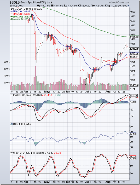
In an analysis of the 6 months daily bar chart pattern of gold two weeks back, it was explained why the 1425 level was an important technical resistance level. The following cautionary remark was also made: “If gold’s price falls below its 50 day EMA (currently at 1350), it can fall to much lower levels…”.

After receiving temporary support from its 50 day EMA, gold’s price dropped sharply lower to the 1300 level last week. The 2 months long bear market rally appears over. A pullback towards the 50 day EMA is a possibility, though there are no such signs from the daily technical indicators as yet.

MACD has dropped into negative territory below its signal line. Note the bearish rounding-top pattern formed by the signal line. RSI has fallen below its 50% level. Slow stochastic is inside its oversold zone. Bears are back in control; gold’s price should seek lower levels.

On longer-term weekly chart (not shown), the 50 week EMA is hurtling down towards the 200 week EMA. A drop below the long-term moving average will technically confirm a long-term bear market.

Silver Chart Pattern

Silver_Sep1613

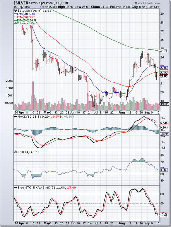
The 6 months daily bar chart pattern of silver shows the sharp bear market rally during Aug ‘13 that received strong resistance from its 200 day EMA and reversed direction. Such rallies provide exit opportunities to investors who may have been stuck at higher levels. Silver’s price is trading below all three EMAs. Bears are back in control.

Daily technical indicators are looking bearish. MACD is still positive, but is falling towards negative territory. Note the bearish rounding-top pattern formed by the signal line (in red). RSI has fallen below its 50% level after forming a ‘double top’ reversal pattern inside its overbought zone. Slow stochastic also formed a ‘double top’ reversal pattern and has dropped inside its oversold zone.

On longer-term weekly chart (not shown), silver’s price is trading below all three weekly EMAs. A test and possible breach of the Jun ‘13 low appears likely.

Monday, September 16, 2013

Stock Index Chart Patterns: S&P 500 and FTSE 100 – Sep 13, ‘13

S&P 500 Index Chart

S&P500_Sep1313

The 6 months daily bar chart pattern of S&P 500 index moved up into bull territory, backed by good volumes. All three EMAs are rising again, and the index is trading above them. Bulls appear to have regained control after the index corrected during Aug ‘13. But there  are some technical headwinds ahead.

Note the ‘downward gap’ between 1685 and 1680 formed on Aug 15 ‘13. After moving up to fill this ‘gap’, the index formed a ‘reversal day’ pattern on Sep 12 ‘13. Filling of a ‘downward gap’ is usually followed by a resumption of the down move. There is a chance that the rally may stall.

Daily technical indicators are looking bullish. MACD has crossed above its signal line into positive territory. RSI is above its 50% level. Slow stochastic is inside its overbought zone. However, the index is trading a good 100 points above its 200 day EMA and looks ready for a correction.

Initial jobless claims dropped below the 300,000 mark to its lowest level in 7 years. That may be a clear signal of an economic turnaround. But retail sales remain a concern.

FTSE 100 Index Chart

FTSE_Sep1313

The 6 months daily bar chart pattern of FTSE 100 shows bears grudgingly giving ground to the bulls.  The index moved up to the 6600 level but struggled to cross above it. The 20 day EMA has formed a bullish ‘rounding bottom’ pattern and all three EMAs are rising with the index above them.

Daily technical indicators are in bullish zones. MACD has crossed above its signal line into positive territory. RSI is above its 50% level. Slow stochastic has entered overbought zone. However, sliding volumes remain a bit of a concern.

Increasing construction activity and rising manufacturing numbers are providing a positive outlook to UK’s economy.

Bottomline? 6 months daily bar chart patterns of S&P 500 and FTSE 100 indices are back in bull territories. Global stock markets are awaiting the US Fed’s announcement of a possible tapering of QE3 bond-buying on Sep 18. Await the announcement before opening your purse strings.

Saturday, September 14, 2013

BSE Sensex and NSE Nifty 50 index chart patterns – Sep 13, 2013

Global stock markets are anxiously awaiting the US Fed’s probable announcement of a tapering (i.e. reducing) of the QE3 bond-buying programme. Indian stock market is likely to be impacted if the US Fed announces a larger than US $10 Billion per month tapering. Why? Because markets have already ‘discounted’ the US $10 Billion figure. Anything more may lead to a partial sell-off by FIIs.

FIIs have turned net buyers of late, and that has helped the bulls to extricate themselves from a strong bear grip. However, the bears are not out of the game yet – as the Sensex and Nifty charts below will show. The IIP number came as a positive surprise. The economy may be finally turning up.

Narendra Modi received the much-expected official endorsement as the BJP’s Prime Ministerial candidate for the upcoming general elections, despite opposition from senior leaders within the party. India Inc. seem to have thrown their lot behind NaMo. It is a moot point whether BJP will be able to form a government or not.

BSE Sensex index chart

Sensex_Sep1313

Some interesting technical patterns are visible on the daily bar chart pattern of Sensex. After crossing above all three EMAs during the recent rally, Sensex formed a small ‘upward gap’. Profit booking ensued. Charts don’t like gaps, and most gaps eventually get filled – though sometimes they remain unfilled for many months or even years. So, expect the ‘gap’ to be filled soon. Since it is an ‘upward gap’, the index may resume its up move subsequently.

The blue down trend line, connecting the May ‘13 and Jul ‘13 tops, is likely to provide upside resistance. Note that the 50 day EMA, after briefly falling below the 200 day EMA, is trying to cross above the long-term moving average. The 20 day EMA is doing likewise. All three EMAs have converged together (marked by light blue circle). A sharp move usually follows. Will the move be up or down?

That’s a good question. Daily technical indicators are bullish, but correcting from overbought conditions. Profit booking may continue next week. However, two of the four indicators are showing positive divergences. ROC has touched a higher top, and Slow stochastic touched its previous top while Sensex touched a lower top last week. Since the index is trading in bull territory above its three EMAs, it is quite possible that Sensex may first drop down to fill the small gap, and then move up sharply. The sharp move could be downwards if the US Fed announcement disappoints the market.

NSE Nifty 50 index chart

Nifty_Sep1313

The weekly bar chart pattern of Nifty returned back to bull territory after 6 weeks, by climbing above its 20 week and 50 week EMAs. The 20 week EMA has merged with the 50 week EMA without crossing below it – keeping the bull market intact. However, weekly volumes have dropped while the index moved up. The blue down trend line (marked DTL) is likely to provide upside resistance. Bears may not be ready to give up the fight.

Weekly technical indicators are turning bullish. MACD is negative, but looks ready to cross above its falling signal line. ROC is about to enter positive zone after crossing above its 10 week MA. RSI has moved up to its 50% level. Slow stochastic has just entered bullish zone above its 50% level.

Bottomline? Chart patterns of BSE Sensex and NSE Nifty indices have re-entered bull territories but are likely to experience some headwinds. Maintain a cautiously optimistic outlook. That means sticking to existing investment plans, and/or buying very selectively. Conservative investors may wait and watch the market’s reaction to the US Fed announcement.

Wednesday, September 11, 2013

Nifty chart: a mid-week update (Sep 11, ‘13)

Nifty_Sep0913

The closing chart pattern of Nifty shows an interesting tussle between bulls and bears that has not been satisfactorily resolved yet. Why not? Because of contradictory technical signals favouring both sides. The bullish and bearish signs are mentioned below:

Bullish

  1. The index is trading above all three EMAs – rallying sharply from oversold condition
  2. After dropping below the long-term up-trend line, the index formed an inverted head-and-shoulders reversal pattern and rose sharply above the trend line
  3. The sharp rally has been accompanied by rising volumes
  4. 3 of the 4 technical indicators – ROC, RSI, Slow stochastic - are showing positive divergences by touching or crossing their Jul ‘13 tops, while the index reached a lower top

Bearish

  1. Both 20 day and 50 day EMAs are below the 200 day EMA, though both are turning up; the ‘death cross’ was a ‘sell’ signal
  2. The index made a classic pullback to the long-term moving average after its initial breakdown below it, which is a ‘sell’ signal; it may fall below the up-trend line again
  3. The 5-days rally has been too sharp; such sharp rallies don’t sustain for long; the down-trend line (marked DTL) is likely to resist the rally
  4. ROC and Slow stochastic are in their overbought zones; RSI is about to enter its overbought zone; only MACD isn’t looking overbought; the rally may soon be over

FIIs have recently turned net buyers again, while DIIs have turned net sellers. The Rupee has gained a little against the US Dollar. Current account deficit has shown some contraction due to reduced imports and a slight improvement in exports. Several FDI projects have been cleared in a hurry. The cumulative effect of all these steps has led to an improvement in sentiment, though the economy is far from returning to a growth trajectory.

Improved sentiment leads to bullishness in the near term. Nifty chart is reflecting that. This is not the time to jump in with both feet. Pick your stocks carefully with a long-term view.

Tuesday, September 10, 2013

WTI and Brent Crude Oil charts: bull markets face headwinds

WTI Crude chart

WTI_Sep0913

The 6 months daily bar chart pattern of WTI Crude oil – which was consolidating sideways for the past 2 months - broke out upwards and touched an intra-day high above the 112 mark accompanied by a volume spurt. But the bears refused to surrender without a fight, and pushed oil’s price down to its rising 50 day EMA that has provided good support during recent down moves.

Oil’s price is continuing its up move. All three EMAs are rising and oil’s price is trading above them, which is the sign of a bull market in progress. But sliding trading volumes is not conducive for a sustained rally.

Daily technical indicators are in bullish zones. However, all three indicators are showing negative divergences by failing to touch new highs.

The possibility of an attack on Syria by the USA, which had led to the recent spurt in oil’s price, seems to be diminishing. Some profit taking may emerge.

Brent Crude chart

Brent_Sep0913

The 6 months daily bar chart pattern of Brent Crude oil spiked upwards on strong volumes on the possibility of a US air-attack on Syria.  Oil’s price started forming a flag-like pattern from which it has broken downwards into the resistance zone between 112.50 and 115, after US Congress vetoed the President’s proposal.

All three EMAs are rising and oil’s price is trading above them, which is the sign of a bull market. But strong volumes on down days shows that bears continue to be active.

All three daily technical indicators are correcting from overbought conditions, but remain in bullish zones. MACD is about to cross below its signal line. RSI is falling towards its 50% level. Slow stochastic is showing negative divergence by failing to touch a new high. It has also formed a bearish head-and-shoulders pattern with the left ‘shoulder’ and ‘head’ inside its overbought zone.

Oil’s price may drop towards its rising 50 day EMA.

Monday, September 9, 2013

Stock Index Chart Patterns: S&P 500 and FTSE 100 – Sep 06, ‘13

S&P 500 Index Chart

S&P500_Sep0713

Both good news and bad news for the bulls are visible on the daily bar chart pattern of S&P 500 index. First, the good news: the index was trying to find a bottom at the 1630 level a week ago; it seems to have done so. The index rallied in a holiday-shortened week, and briefly entered bull territory (above its three EMAs), but encountered twin resistances from its 20 day and 50 day EMAs.

There was decent volume support. The 200 day EMA is rising and the index is trading well above it – a sign of a bull market. Daily technical indicators are turning bullish, but haven’t done so yet. MACD is trying to cross above its signal line in negative territory. RSI has moved up towards its 50% level. Slow stochastic has climbed above its 50% level.

Now, the bad news. All three daily technical indicators are showing negative divergences by forming bearish patterns of lower tops and lower bottoms from May ‘13 onwards, while the index has formed a bullish pattern of higher tops and higher bottoms. The combined negative divergences may lead to a deeper correction.

The jobs report was a bit of a damp squib. Initial claims of unemployment benefits continued to slide. But jobs growth was lower than expected. Jun ‘13 and Jul ‘13 job growth rates were adjusted down. These are not good signs for an economy that is trying to return to a growth path.

FTSE 100 Index Chart

FTSE_Sep0713

The 6 months daily bar chart pattern of FTSE 100 index is back in bull territory. It overcame resistance from its entangled 20 day and 50 day EMAs to close above the 6500 level. However, volumes have not been encouraging, which may hamper the sustainability of the rally.

Daily technical indicators are turning bullish. MACD is slightly negative but has moved above its signal line. Both RSI and Slow stochastic have risen above their respective 50% levels. The index is trading above its rising 200 day EMA, and is in a long-term bull market is intact though it has made no gains since touching its May ‘13 top.

UK’s economy seems to be recovering better than expected – going by rising car sales and home prices.

Bottomline? 6 months daily bar chart patterns of S&P 500 and FTSE 100 indices are trying to recover from bull market corrections, but are not quite out of the woods yet. Invest gradually, with strict stop-losses at the recent Aug ‘13 lows.

Saturday, September 7, 2013

BSE Sensex and NSE Nifty 50 index chart patterns – Sep 06, 2013

The new RBI governor made a strong start by announcing a number of proposals that is likely to help the value of the Rupee to stabilise by ensuring more forex inflows. Banks will be given freedom to raise overseas funds. RBI will subsidise hedging costs incurred by banks in attracting NRI deposits. The value of the Rupee, which had fallen to almost 70 to the US Dollar, recovered to 66. The stock market celebrated. FIIs turned net buyers on the last two days of the week.

The Finance Minister is trying to reduce the current account deficit by curtailing import of gold, luxury and electronic goods by increasing import duty. However, such a stop-gap measure may be counter productive as it will encourage smuggling. The need of the hour is to promote production and export of quality goods without too many bureaucratic hurdles.

Sensex has managed to re-enter bull territory, which will be clear from the daily bar chart pattern of Sensex below. Nifty hasn’t quite regained bull territory yet, but has retraced more than 50% of its fall from its May ‘13 top of 6229 to its Aug ‘13 low of 5119, by touching an intra-week high of 5689. A retracement of more than 50% often means that the previous trend has been reversed.

BSE Sensex index chart

Sensex_Sep0613

The Sensex chart shows a spirited fightback by bulls after a successful test of the long-term up-trend line connecting the Dec ‘11 and Jun ‘12 lows. The index is trading above all three EMAs in bull territory. The 50 day EMA had slipped below the 200 day EMA (‘death cross’), which technically confirms a bear market; but it has started to turn up again – as has the 20 day EMA.

The ‘gap’ formed back in Sep ‘12, which was partly filled in Apr ‘13, has been completely filled. Contrary to popular belief, filling of an ‘upward gap’ - formed when the index was moving up - is not bearish. The up move was expected to resume after the ‘gap’ got filled. Can the rally last a bit longer?

Daily technical indicators seem to suggest so. MACD is still negative, but is rising sharply above its signal line. ROC is above its 10 day MA, and about to enter its overbought zone. RSI has climbed above its 50% level. Slow stochastic has just entered its overbought zone. The lack of any significant profit booking before a long weekend is a bullish sign.

NSE Nifty 50 index chart

Nifty_Sep0613

The weekly bar chart of Nifty rallied strongly, but is facing twin resistance from its 20 week and 50 week EMAs. Note that the 20 week EMA is almost touching the 50 week EMA, but hasn’t crossed below it – keeping the long-term bull market intact. The long-term up-trend line is also intact technically – despite three consecutive intra-week drops below it – because Nifty’s weekly closing level has been above the trend line since Dec ‘11.

Weekly technical indicators are beginning to turn bullish, but haven’t done so yet. MACD has started to rise, but remains below its signal line in negative zone. ROC is also negative, but has managed to cross above its 10 week MA. RSI and Slow stochastic have emerged from their respective oversold zones, but remain below their 50% levels.

Bottomline? Chart patterns of BSE Sensex and NSE Nifty indices have survived strong bull market corrections, and look all set to rise to new highs. It is not expected to be smooth sailing, as bears won’t give up without a fight. The gloom and doom analysts and their talk of much lower levels on both indices will keep investors cautious. That doesn’t mean investment should be avoided. This is a good time to pick fundamentally strong but beaten down stocks with a 2-3 years timeframe.

Tuesday, September 3, 2013

Gold and Silver charts: bear market rallies face resistance

Gold Chart Pattern

Gold_Aug3013

The 6 months daily bar chart pattern of gold shows a strong bear market rally for the past 2 months that took gold’s price above its 20 day and 50 day EMAs, and looked all set to test its falling 200 day EMA. But the rally stalled near the 1425 level for two technical reasons: (i) 1425 was the previous top touched in Jun ‘13 - prices tend to hesitate near a previous top; (ii) on long-term weekly chart (not shown), 1425 was the level of the falling 200 week EMA.

The price break out above the bearish ‘falling wedge’ pattern (mentioned in the previous post) was not accompanied by a volume surge, which is a pre-requisite for a valid break out. The ‘false’ break out was followed by a drop back inside the ‘falling wedge’. On the downside, support can be expected from the rising 20 day and 50 day EMAs. Remember that the bear market has not ended, as gold is trading below both its 200 day and 200 week EMAs.

Daily technical indicators are correcting from overbought conditions. MACD has turned down, though it is still above its signal line in positive territory. RSI has dropped down after a brief sojourn in overbought territory. Slow stochastic is about to slip below its overbought zone, after forming a bearish ‘double-top’ reversal pattern.

If gold’s price falls below its 50 day EMA (currently at 1350), it can fall to much lower levels – even below its Jun ‘13 low of1180. The good news for bulls is that mining companies are reportedly shelving expansion plans due to the 2 years long bear phase. Eventually that will cause a supply-demand mismatch causing gold’s price to rise.

Silver Chart Pattern

Silver_Aug3013

The 6 months daily bar chart pattern of silver continued its sharp bear market rally that tested its 200 day EMA, but formed a ‘reversal day’ pattern on strong volumes. Note that on Aug 19 also, a ‘reversal day’ pattern was formed, but volumes were not strong enough to reverse the rally. On longer-term weekly chart (not shown), silver’s price failed to reach its falling 200 week EMA.

Daily technical indicators are correcting from overbought conditions. MACD is reversing from its overbought zone. Both RSI and Slow stochastic formed ‘double-top’ reversal patterns inside their overbought zones and have started to fall. Looks like the bear market rally is over and the down move has resumed.

Silver is in a long-term bear market as it is trading below both its 200 day and 200 week EMAs.

Monday, September 2, 2013

Stock Index Chart Patterns: S&P 500 and FTSE 100 – Aug 30, ‘13

S&P 500 Index Chart

S&P500_Aug3013

The concluding comments in a technical analysis of the daily bar chart pattern of S&P 500 index two weeks back were: “A deeper correction is possible. Partial profit booking may be in order…” The index embarked on a small rally that almost reached the 1670 level but faced resistance from the falling 20 day EMA. It formed a ‘reversal day’ pattern (higher high, lower close), and dropped to the 1630 level.

The index is trying to find a bottom at the 1630 level. The 20 day EMA is ready to cross below the 50 day EMA, and both EMAs are falling. Higher volumes on down days means the bears are in no mood to give up yet. However, the index is trading well above the rising 200 day EMA, so the long-term bull market is intact.

Daily technical indicators are bearish, and not showing any signs of a turnaround yet. MACD is falling below its signal line in negative territory. RSI is moving sideways above its oversold zone. Slow stochastic is inside its oversold zone. More downside is likely.

Q2 GDP was revised upwards from 1.7% to 2.5% – thanks to higher exports of goods and services. Corporate profits are rising despite the slow economic recovery. Initial jobless claims continue to trend down. However, weak consumer spending, and negative growth in housing starts and existing home sales are worrying signs. Wait for the correction to play out.

FTSE 100 Index Chart

FTSE_Aug3013

Two weeks ago, technical indicators of the daily bar chart pattern of FTSE 100 were looking bearish. A deeper correction was expected. Instead, the index entered a rectangular consolidation pattern between 6400 and 6500. Rectangles tend to be unreliable patterns, which means the break out from the pattern can be in either direction. But they tend to be continuation patterns, so the likely break out is downwards.

Daily technical indicators are bearish. MACD is negative and falling below its signal line. RSI is falling below its 50% level. Slow stochastic is about to re-enter its oversold zone. Wait for the break out to initiate action. Note that the 200 day EMA is still rising and the index is trading above it. The long-term bull market is still intact.

UK’s manufacturing sector is getting new orders, and business is booming at pubs and restaurants. These are encouraging signs of economic recovery.

Bottomline? 6 months daily bar chart patterns of S&P 500 and FTSE 100 indices are in the midst of bull market corrections. Wait for the corrections to play out before considering re-entry.