Wednesday, November 30, 2011

Stock Chart Pattern - Thermax Ltd. (An Update)

A little more than a year back, I had written a technical analysis of the stock chart pattern of Thermax Ltd. The stock had closed at 900 after touching an intra-day high of 927 (a little below its Oct ‘07 top of 968).

The technical indicators were looking quite overbought. The stock was trading at a TTM P/E of more than 50. A correction had looked imminent, and I had suggested that existing holders could book partial profits. Fundamentally strong stocks can get overpriced due to prevailing market sentiments. One of my concluding comments is worth repeating:

“The ability to discern and interpret technical analysis signals enable good entry/exit points for optimising returns.”

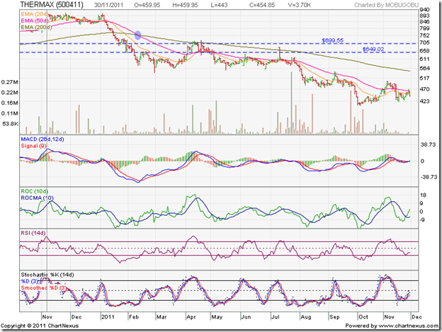
Going through reader comments on the earlier post is quite interesting, and provides some insights into the minds of small investors (despite the very small sample size). Buying and selling stocks is not as simple as opening a demat account and giving instructions to your broker. It requires a fair amount of skill if you want to get it right – and the one year bar chart pattern of Thermax Ltd. is a good example of that:

Thermax_Nov3011

(The vertical line in Nov ‘10 indicates the day I had written my previous post on Thermax.)

I had no clue that the stock will start falling from the very next day after I wrote the earlier post, but if you note the state of the technical indicators, you will see that all four were looking overbought. The MACD was positive and well above its signal line. The ROC was also positive and well above its 10 day MA. Both the RSI and the slow stochastic were well inside their overbought zones. The technical set-up was of a ‘perfect storm’.

What one doesn’t know in advance is the extent of the subsequent correction. It could be a 10-15% correction, or it could lead to a change of trend and a huge fall. A trend change doesn’t occur over a couple of days. Typically, some sort of a reversal pattern will get formed over a few weeks or months. In the chart above, the stock formed a rare triple-top reversal pattern over two months – touching 927 on Nov 4 ‘10, 913 on Nov 25 ‘10 and 907 on Jan 4 ‘11.

What should have been the strategy of an investor who booked partial profits on Nov 5 ‘10 at say, Rs 900? The zone between 650 and 700 had acted as a support-resistance zone on the way up. So, it should have acted as a support-resistance zone on the way down. Did it?

Note that the stock fell right through the zone - after hesitating a bit during late Jan ‘11 and early Feb ‘11 – to a low of 577 on Feb 10 ‘11. The ‘death cross’ of the 50 day EMA below the 200 day EMA (marked by the light blue oval) confirmed a bear market. The technical indicators were looking oversold, but they can remain oversold for long periods some times. What happened next is interesting. The stock rose to the 650 level, faced resistance, and dropped to a new low of 543 on Feb 28 ‘11, but all four technical indicators touched higher bottoms.

The positive divergences gave a short-term buy signal. Why short-term? Because the stock was in a bear market, and counter-trend rallies are short and swift before they attract selling pressure. Note that the stock climbed up on a high volume spike to the 700 level on Apr 8 ‘11, failed to break through the dual resistance from the 700 level and the 200 day EMA, and has since been falling deeper into a bear market. All four technical indicators were looking overbought – clearly indicating a selling opportunity.

At its recent intra-day low of 407 touched on Oct 5 ‘11, the stock corrected 56% from its Nov 4 ‘11 peak. All four technical indicators looked oversold – hinting at another short-term rally. The market rally during Oct ‘11 helped the stock to climb above its falling 20 day and 50 day EMAs to a high of 503 on Nov 4 ‘11. This time, the overbought technical indicators signalled that the rally was over. The stock remains in a firm bear grip, and all rallies are being used to sell.

Q2 results were reasonably good. Top line increased by 19.4% on a YoY basis; bottom line rose by 13.6%. On a TTM EPS of 34.26, the stock is trading at a P/E of 13.3. But the negative sentiment in the capital goods sector may keep the stock’s price under pressure.

Bottomline? The stock chart pattern of Thermax Ltd has been in a bear grip for more than a year, and there doesn’t seem to be any respite in sight. But the company is fundamentally strong, well managed with negligible debt on its books. Just the kind that small investors should think about adding to their portfolio. The bear market isn’t over. No need to buy in a hurry. But slowly accumulating the stock may be a good idea.
Tuesday, November 29, 2011

Notes from the USA (Nov 2011) - a guest post

The US economy is slowly recovering from a massive downturn. To boost growth, interest rates have been maintained at near zero levels. Despite two rounds of Quantitative Easing, growth hasn’t picked up as expected. So, inflation has also remained low.

India has the opposite problem. High inflation has been fuelled by strong growth. To contain inflation, interest rates have been increased. But the inflation adjusted fixed income returns are negligible in both countries. In this month’s guest post, KKP gives his views on how to truly get rich by boosting your inflation-adjusted returns.

-----------------------------------------------------------------------------------

Feel Rich Only with ‘Real’ Inflation-Adjusted Net-Worth-Growth

The 8th wonder of the world is ‘% rate compounding’. In simple terms it means that growth in money based on money-making-money. In the US schools, I have taught kids how to become a millionaire by starting a part-time job at age 16 and putting $100 per month into an interest bearing account that multiplies money over the next 20-40 years of their life. On a side note, it is very interesting how many millionaires there are in the US, and in general, their profiles/habits/investment-styles (Google search for this info).

Well, the same effect of compounding works against us when it comes to inflation. In mainstream economics, the word ‘inflation’ refers to a general rise in prices measured against a standard level of purchasing power. Previously the term was used to refer to an increase in the money supply, which is now referred to as expansionary monetary policy or monetary inflation. Inflation is measured by comparing two sets of goods/services at two different points in time, and computing the increase in cost not reflected by an increase/decrease in quality. This is something that emerging economies grapple with during their entire growth phase, and we call that ‘growth pains’.

The inflation rate in India was last reported at 10.1% in Sep 2011. From 1969 until 2011, the average inflation rate in India was 7.99% reaching an historical high of 34.68% in Sep 1974 and a record low of -11.31% in May 1976 (strange but reported as negative). Many banks in India are offering 9% to 10% FD rates today, with corporate FDs getting much higher rates (at higher risk levels). Well, that is just a net 1% to 2% rate of return (after inflation). The chart below shows fluctuations in inflation within our Indian (a.k.a emerging) economy over the past three years. So, money is growing at a net-rate of only 1% to 2% in FDs or FMPs.

clip_image002

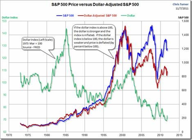
The US is about to move from a highly controlled non-inflationary environment into a high-inflation environment due to the non-stop printing of treasury bonds (no gold collateral is needed as everyone knows). Inflation basically makes you shell out more dollars to buy the same product (same quality and quantity assumed). So, one needs to earn more as a result - just to keep up with the inflation. Now, what really happens with inflation is a reduction in the value of the currency. So, as an example, one needs more dollars to buy an asset like a home, a gold coin or gallon of milk. See the chart below and study it for a couple minutes. Has the S&P500 really grown even though our Mutual Fund account might be showing net-growth-in-value? Maybe, slightly!

clip_image002

On the other hand, companies pay employees more every year to keep up with the inflationary environment, and over a period of time everyone feels good that they were earning $24,000 per year in 1996 or 2001, and now, they are earning $50,000 per year. But, when you measure it in terms of the depreciation in the dollar (caused by inflation), are they really better off with the higher salary? Or, would they rather have a no-inflation environment and get paid slightly more for their growth in experience and skills?

So, compounding effects of inflation in every economy around the world is really killing the value of the underlying savings that we hold, unless we keep growing that money ABOVE the inflation rate on a consistent basis. So, in India, if one had Rs 10 Lakhs in 2001, and now has Rs 21.58 Lakhs, then at the average inflation rate of 8% per year, their net-growth in wealth is a BIG ZERO. Same zero growth applies if one had Rs 1 Crore in 2001 and now has Rs 2.158 Crores. Yet, all of us feel good about the growth in the ‘total raw value of our accounts’.

Emerging economies give a lot of people a false sense of security that they have grown their income or assets by a huge amount over time, but one needs to beware of the 8th wonder of the world working in ‘reverse’. India is going to generate the largest population of ‘middle income earners’, but one has to consider what a ‘real middle income level’ is, as inflation rate is eating away a lot of the increased income. As a result of the growth in the underlying Indian economy, a lot of low income earners will start feeling like middle-income-families, but for many it is a false sense of hope and feeling. Beware and generate a Return on Investment (ROI) way above inflation through a mixture of Stocks, Bonds, Real Estate, Commodities, FMPs and FDs.……That is the only way to feel rich and get truly rich!

-----------------------------------------------------------------------------------

KKP (Kiran Patel) is a long time investor in the US, investing in US, Indian and Chinese markets for the last 25 years. Investing is a passion, and most recently he has ventured into real estate in the US and also a bit in India. Running user groups, teaching kids at local high school, moderating a group in the US and running Investment Clubs are his current hobbies. He also works full time for a Fortune 100 corporation.

Monday, November 28, 2011

Stock Index Chart Patterns – S&P 500 and FTSE 100 – Nov 25, ‘11

S&P 500 Index Chart

SnP500_Nov2511 _ Triangle-001-001

The S&P 500 index chart had another lower close in the Thanksgiving holiday week. I had made the following comment last week: “ (the index) is likely to fall to about 1160 before one can expect some recovery.” As if on cue, the index closed the week at 1159. Some times technical analysis works like magic – but no sleight of hand here. The downward target was arrived at by drawing a line parallel to the upper boundary of the symmetrical triangle pattern (in yellow).

The sharp correction has brought the 20 day EMA down to the 50 day EMA. A cross below will be the final confirmation of a return to a bear market. The technical indicators are looking bearish to the point of being oversold. The slow stochastic is deep inside its oversold zone. The MACD is falling below its signal line into negative territory. The RSI is just above its oversold zone. The ROC is sliding deeper into the negative zone. A likely upward bounce may be used by the bears as a selling opportunity.

The US economy is taking baby steps towards recovery. Q3 corporate profits rose 11.4% on a YoY basis. Initial unemployment claims rose by 5000 to 393,000 but remained below the psychological 400,000 mark. Rail traffic rose about 2% YoY. Durable goods orders declined a bit. Same store retail sales grew 2.8% YoY. A double-dip recession seems unlikely, provided problems in China and the Eurozone don’t aggravate.

FTSE 100 Index Chart

FTSE_Nov2511 _ Triangle-001-001 

The FTSE 100 index chart broke below the descending triangle pattern (in yellow), as was expected last week, and touched an intra-day low of 5075 on Nov 25 ‘11. But it turned out to be a ‘reversal day’ (lower low, higher close), as the bulls were helped by short covering.

Sharp falls from a clearly visible bearish pattern are often followed by equally sharp pullbacks. At the time of writing, the index had gained 3%. But the dual resistance from the falling 20 day EMA and the lower boundary of the descending triangle may prove too strong. The break below the triangle was a selling opportunity. The pullback is another opportunity to sell.

The technical indicators are bearish, but showing signs of turning back from oversold conditions. The slow stochastic is in its oversold zone, but turning up. The MACD is still falling below its signal line in negative territory. The RSI stopped short of dropping into its oversold zone. The ROC is negative, but bounced up sharply.

The Paris-based OECD expects the UK economy to enter a double-dip recession with GDP  growth projected at only 0.5% in 2012. The Bank of England may need to increase its QE amount to promote growth. Cash-strapped companies are finding it difficult to hire, invest and get bank loans. The German bond issue flopped. Italy’s yields are rising to unsustainable levels. Eurozone worries remain.

Bottomline? The chart patterns of the S&P 500 and FTSE 100 indices have fallen deeper into bear markets, and may be heading towards their Oct ‘11 lows. At times like these, no action may be the best action. Preserve your cash.

Sunday, November 27, 2011

BSE Sensex and NSE Nifty 50 index chart patterns – Nov 25 ‘11

BSE Sensex index chart

SENSEX_Nov2511

In last week’s analysis, I had made the following comment:

“There is a good chance that the index may drop to the lower edge of the downward channel.”

How did I know that the 15700 level, which had provided strong support for the past three months, would be breached? I didn’t. It was a calculated guess based on logic. The Sensex has been trading within the downward sloping (blue) channel for 11 months. Unlike the previous two occasions in Apr ‘11 and Jul ‘11, the index failed to reach the top end of the channel during the Oct ‘11 rally. That was a sign of weakness. The bearish technical indicators had confirmed the weakness.

As expected, the Sensex did bounce up after touching the lower edge of the channel and managed to close the week just below the crucial 15700 support level. Technically, the 15700 level has not been convincingly breached because the index hasn’t closed more than 3% below it yet. Does that mean that a counter-trend rally is likely?

The technical indicators are looking quite bearish. The MACD is falling deeper into negative territory, and the gap with its falling signal line is widening. The ROC is attempting a recovery, but remains negative and below its 10 day MA. Both the RSI and the slow stochastic are trying to turn around after dropping well inside their negative zones. Any rally will probably be short-lived, and may not get past the falling 50 day EMA.

NSE Nifty 50 index chart

Nifty_Nov2511

The weekly Nifty 50 bar chart pattern has closed lower for four straight weeks, but got good support from the lower end of the downward-sloping channel and closed just above the crucial 4700 level. (The importance of the 4700 level was explained in last Wednesday’s post.)

Have a look at the rising volumes during the last four weeks’ fall (the apparent drop in volumes three weeks ago was because there were only three trading days that week). Rising volumes in a falling market is an ominous sign for bulls.

The technical indicators are turning bearish. The MACD is touching its signal line in negative territory. The ROC has dropped below its 10 week MA into the negative zone. The RSI is moving sideways just below its 50% level. The slow stochastic has fallen below its 50% level. Any upward bounce is likely to be used by the bears to sell.

Inflation moderated a bit last week – more due to ‘base effect’ than any real drop in prices. The UPA government finally approved conditional 51% FDI in multi-brand retail after dilly-dallying for two years. The market didn’t get too enthusiastic about either news. Eurozone debt problems remain unresolved. A few long-only funds have started to sell-off. These are bearish signs.

Bottomline? The BSE Sensex and the Nifty 50 index chart patterns continue to trade within downward-sloping channels, and may do so for some more time. Any breach below the channel can lead to a sharp drop of 8-10%. Be prepared with a list of fundamentally strong stocks that can be accumulated slowly on dips – but this is no time to be aggressively bullish. The bear phase can last longer than you think.

Friday, November 25, 2011

Stock Index Chart Patterns – Jakarta Composite, Korea KOSPI, Taiwan TSEC – Nov 25 ‘11

Jakarta Composite Index Chart

image

The Jakarta Composite index chart continues its struggles to shake off the bears. In today’s trade (not shown in above chart), the index tested its Nov ‘11 intra-day low of 3624 and closed at 3637 – the lowest close in Nov ‘11. The index has closed below the 200 day EMA on a weekly basis, and is forming a bearish pattern of lower-tops-and-lower-bottoms.

Note that the RSI, which has slipped below the 50% level, formed a head-and-shoulders reversal pattern (the possibility was mentioned two weeks back). The slow stochastic has also fallen below its 50% level. The ROC has entered the negative zone. The MACD, which is dropping below its falling signal line, is about to turn negative.

The bears are trying to regain control. If the index drops below 3550, it may go down to test the Oct ‘11 intra-day low of 3256.

Korea KOSPI Index Chart

image

The KOSPI index chart pattern had dropped below all three EMAs two weeks back with a big downward gap. The bulls made a brave attempt at another rally, and managed to close the gap but failed to reach the 200 day EMA. On Wed. Nov 16 ‘11, the index formed a ‘reversal day’ pattern on strong volumes and dropped below all three EMAs once again.

This time, there was no respite from the bear selling. The 20 day EMA has crossed below the 50 day EMA, and the index is trading well below all three EMAs. All four technical indicators have turned bearish. Note that both the ROC and RSI formed head-and-shoulders reversal patterns. The slow stochastic is inside its oversold zone. The MACD has entered the negative zone below its signal line.

There is hardly any doubt that the bears are back in control.

Taiwan TSEC Index Chart

image

The Taiwan TSEC index chart pattern continues to be the weakest among the three Asian indices. Two weeks back, I had mentioned the possibility of the index testing its Sep ‘11 low of 6877. In today’s trade (not shown in the chart above), the TSEC dropped all the way to 6751 – a 2 years low.

The technical indicators are very bearish. The slow stochastic is inside its oversold zone. The MACD is below its signal line and falling deeper into negative territory. The ROC is deep inside negative territory. The RSI is hovering above its oversold zone. The index is trading well below all three EMAs.

The index is under complete bear control. Any counter-trend rallies or upward bounces are likely to provide more selling opportunities.

Bottomline? The Jakarta Composite index chart is in a long-term bull market, as it is trading well above its Jan ‘08 bull market top - but is struggling to shake off a bear attack. The Korea KOSPI index rose above its previous bull market top, but is now in a bear market. The Taiwan TSEC index failed to get past its previous bull market top, and is in a bear market. Stay on the sidelines. Lower levels are likely.

Related Post

Stock Index Chart Patterns – Hang Seng, Singapore Straits Times, Malaysia KLCI – Nov 18 ‘11

Thursday, November 24, 2011

Do investors have the ‘if-its-free-I’ll-take-two’ syndrome?

Before I can answer the question, I need to tell the story about the syndrome.

A young boy was being taught by his father about prudence in handling money. Here are the three important guidelines provided by the father:

  • Live within your means and try to save money from whatever little you may have
  • Always ask the price of anything you wish to buy, and then decide if you can afford to buy it
  • Don’t blindly accept a quoted price; try to bargain and buy at a lower price

Well-versed in the guidelines, the young boy went to the local ‘paanwala’ to buy some candy. On being told that the candy cost a Rupee, he promptly started to bargain. Despite repeated pleas by the ‘paanwala’ that there was no discount on a candy costing a Rupee, the boy would not relent. A small crowd had gathered on hearing the commotion, and potential customers were walking away. In desperation, the ‘paanwala’ handed over a candy to the boy, saying: “Take this. It’s free. Now please leave.” The boy was delighted, but refused to budge. “It’s free? Then I’ll take two!”

That boy must have grown up to be a stock investor. He also must have told all his friends – who also became stock investors. How do I know this? Because of the proliferation of web sites offering “sure-shot free stock tips” and “99.9% success guaranteed Nifty tips”.

There was a time when I used to go out of my way to provide free advice to young investors about what stocks to pick and how to build a portfolio. But I no longer give free advice – except in my blog posts. Why? Because I found out that most investors were not following my advice at all. In fact, they were doing just the opposite. They would not buy the stocks I’d recommend, and would go right ahead and buy the stocks I suggested that they avoid!

Then a wise reader related the story of a doctor in a small town who decided to treat patients for free after his retirement. Hardly any one showed up at his chamber. Then he decided to charge a reasonable fee. Soon, he had several patients visiting his chamber every day. The moral of the story is: No one respects free advice.

The other day, I received an email: “Can you please suggest one multibagger stock?” Usually, I ignore such emails, or answer back: “I don’t provide free stock advice.” But I was in a genial mood that day, and wrote back: “Buy Tata Steel.” The response floored me completely. Let alone thank me, this smart fellow came back with: “Any penny-stock multibagger?” This is what I meant by ‘if-it-is-free-I’ll-take-two’ syndrome!

A more dangerous affliction is the ‘if-it-is-free-I’ll-take-as many-as-possible’ syndrome. I got this email from such an investor: “I would like to buy some fundamentally strong stocks in this bear market. Please send me a list of such stocks.” I answered: “I don’t give individual stock advice for free. But you can take a look at some of the beaten down stocks in the Sensex and Nifty indices.”  Back came a response: “OK, I promise to send your fee, but send me the list of stocks now.” I didn’t bother to reply, only to receive this reminder: “I still haven’t received the list of stocks.” Later, I found out that this freeloader was regularly providing free stock tips in one of the investor forums!

The answer to the original question is: Many investors do. I think it is part of the human psyche that we get swayed by products that are offered ‘free’. That is why retailers periodically offer “Buy-1-get-1-free” deals to get rid of unsold or unfashionable or oversized/undersized stock. Shops tend to be overcrowded during such offers.

When it comes to stock advice, ‘free’ usually means ‘not good’. Investors need to appreciate that. If some one really knew which stocks will become multibaggers in future, he would not tell a soul and buy as many of those stocks he could afford before the stock market got wind of it. 

Wednesday, November 23, 2011

A mid-week update on the Nifty chart pattern

There is some good news and some bad news. Let us start with the good news first.

The Nifty dropped to an intra-day low of 4641, but bounced up from the support of the lower edge of the blue downward sloping channel. A drop below the channel – which would have opened up the possibility of a vertical fall – has been prevented by the bulls.

At the day’s close at 4706, the Nifty climbed above the crucial 4700 support level. Why crucial? Because it corresponds with tops made in Apr ‘09 and Jun ‘09 (marked by down arrows). Previous tops tend to act as supports – as marked by the up arrows (in Feb ‘10, Aug ‘11, Oct ‘11).

The RSI and the slow stochastic have dropped deep inside their oversold zones. The probability of an upward bounce has increased. Whether the bounce turns into a full-fledged rally, like the one we witnessed in Oct ‘11, is questionable.

Nifty_Nov2311

Now, the bad news. This is what I wrote in last Sunday’s post:

“The support level of 4700 is likely to be tested and broken soon. In case the index bounces up from 4700, use it as a selling opportunity.”

The 4700 level was broken on an intra-day basis, but not on a closing basis. Technically, the support has held. But the Nifty has made its intentions clear – it wants to fall lower. Since the channel has not been breached yet, we will hope for a gradual fall within the downward-sloping channel. But, be prepared for a sudden, sharp fall below the channel.

All four technical indicators are looking bearish, to the point of being oversold. While the index can remain oversold for some time, the positive divergence in the MACD – which did not fall to a lower bottom with the index – is signalling a bounce up. The positive divergence is not supported by the other three indicators; any bounce up may be short-lived and provide a shorting opportunity to the bears.

Take a look at the volume bars, on which a 14 day MA has been superimposed to smoothen out the ‘noise’. Note that during the rally in Oct ‘11, the Volume MA was falling, but during Nov ‘11 correction the Volume MA has been rising. This is a contrary indication, as volumes are supposed to go up during rallies and come down during corrections. Not a great sign for the bulls.

Last, but not the least, is that all three EMAs are moving down and the index is trading well below them. Also, look at the bearish rounding-top pattern being formed by the 200 day EMA. These are clear signals that the bears are dominating, and any rallies will be selling opportunities.

How low can the Nifty go? In a post written exactly three months back, I had mentioned the probable Fibonacci retracement levels on the Nifty chart. If you missed that post, please go through it. The link is given below.

Related Post

About Nifty Fibonacci retracement levels

Tuesday, November 22, 2011

Gold and Silver Chart Patterns: an update

A few months of correction, and all the chatter about a return to the gold standard and the dollar no longer being a reserve currency is off the table! The signs of revival seen on the chart patterns of gold and silver two weeks back proved to be illusory.

Both precious metals are now trading below their 14 day, 30 day and 60 day SMAs, and may drop down to test their Sep ‘11 lows. Will that provide a buying opportunity?

Gold Chart Pattern

image

The answer should be ‘Yes’ for gold, because it is trading well above a rising 200 day SMA and is in a bull market. Note that the 1750 level provided good support till gold’s price chart formed a small ‘double-top’ reversal pattern and suddenly dived on Thu. Nov 17 ‘11.

A test of the 1600 support level is on the cards. The support should hold since the 200 day EMA is also near 1600. Just in case 1600 gets broken – nothing is certain in technical analysis – 1530 should be a stronger support due to the multiple tops formed near that level during Apr – Jun ‘11.

The downside to a bounce up from 1600 is that a bearish ‘descending triangle’ will get formed, from which gold’s price may fall all the way to 1300. This is a hypothetical possibility as of now, so no need to be alarmed. Let the chart pattern unfold. But it may be prudent not to be gung-ho bullish about buying the likely bounce up from 1600.

Silver Chart Pattern

image

The answer to the question is ‘Not yet’ for silver, because the white metal and all three of its moving averages (only the 14 day SMA is shown on the chart) are trading below the 200 day SMA – which indicates a bear market. The Sep ‘11 low of 28 may be tested and broken.

Note that silver’s price was consolidating within a small symmetrical triangle formed near the support level of 34, before breaking down sharply on Thu. Nov 17 ‘11. Drawing lines through tops formed in Apr ‘11 and Aug ‘11, and bottoms formed in May ‘11 and Sep ‘11 will form a broad downward-sloping channel pattern with its lower end currently at 26. That is a level which provided support in Nov ‘10 and Jan ‘11 – so an upward bounce can be expected from 26.

Bravehearts may try to bottom-fish at 26. Conservative investors should buy only on a convincing break out above the downward-sloping channel.

Monday, November 21, 2011

Stock Index Chart Patterns – S&P 500 and FTSE 100 – Nov 18, ‘11

S&P 500 Index Chart

image

In last week’s analysis of the S&P 500 index chart pattern, I had observed a symmetrical triangle consolidation pattern. Since consolidation patterns tend to be continuation patterns and the index had entered the triangle from below, the expected break out was upwards. But triangles are often unreliable, so I had warned investors to trade with caution because a break out could occur in either direction.

On Thur. Nov 17 ‘11, the index broke downwards on the highest volumes of the week, and dropped below all three EMAs. The 20 day EMA - which had crossed above the 200 day EMA and raised hopes of a return to a bull market - has dropped back on to the long-term moving average. The 50 day EMA failed to get close to the 200 day EMA, let alone cross above it. Though the index managed to close above the 1200 level on a weekly basis, it is likely to fall to about 1160 before one can expect some recovery.

The technical indicators are looking quite bearish. The slow stochastic is about to enter its oversold zone. The MACD is barely positive, and is falling below its signal line. The RSI has dropped below the 50% level. The ROC failed to enter positive territory, and is sliding down. The bears are regaining control once again.

The US economy is finally sprouting some green shoots. October housing starts showed marginal improvement, and industrial production rose by 0.7% (an improvement over the 0.1% drop in September). Weekly unemployment claims fell to 388,000. These numbers are not worth celebrating by any means, but a sign that the tide may finally be turning. But the Eurozone debt problems remain a bearish overhang on the stock market.

FTSE 100 Index Chart

image

Last week, I had made the following comment about the FTSE 100 chart pattern:

“The index is consolidating within a triangle pattern, but it looks like a bearish descending triangle from which the likely break will be downwards.”

Unlike a symmetrical triangle that is unreliable in indicating the direction of the eventual break out, descending (and ascending) triangles typically break out through the horizontal side of the triangle.

The FTSE 100 made another futile effort to cross above the 200 day EMA, dropped below all three EMAs by the end of the week and just about managed to remain within the descending triangle. But the bears have prevailed as expected. At the time of writing this post, the index has dropped more than 125 points, and is likely to test its Oct ‘11 low in the near future.

The technical indicators are looking bearish. The slow stochastic and the RSI are about to fall into their oversold zones. The MACD is below its signal line, and on the verge of turning negative. The ROC is inside negative territory. More correction is on the cards.

The Bank of England has warned that the UK economy is grinding to a halt and has cut the GDP growth forecast for 2012 to 1% (from the previous forecast of 2%). Unseasonably warm weather has reduced offtake of winter garments in retail outlets. Change of guard in Greece, Italy and Spain has not removed the Eurozone debt problems. The  economic woes continue.

Bottomline? The chart patterns of the S&P 500 and FTSE 100 indices have technically slipped back into bear markets. Things may get worse before they get any better. Stay in cash, and wait for the selling to abate.

Sunday, November 20, 2011

BSE Sensex and NSE Nifty 50 index chart patterns – Nov 18 ‘11

BSE Sensex index chart

SENSEX_Nov1811

The BSE Sensex weekly bar chart pattern continues to slide within a downward sloping channel. The counter-trend rally during Oct ‘11 failed to move above the 50 week EMA convincingly. The bears used the rally as a selling opportunity. The 15700 level, which had provided good support on three previous occasions, is under threat again. There is a good chance that the index may drop to the lower edge of the downward channel.

The technical indicators are turning bearish. The MACD is still above its signal line, but has started slipping in negative territory. The ROC has dropped sharply into the negative zone, and is touching its 10 week MA. The RSI failed to move above the 50% level, and has started moving down. The slow stochastic is falling towards its 50% level. Any upward bounce from the 15700 level may provide another selling opportunity to the bears.

NSE Nifty 50 index chart

Nifty_Nov1811

Rising volumes in a week when the Nifty 50 index fell vertically is an ominous sign. Volumes are supposed to taper off during down moves. Bulls may be giving up and heading for the exit doors. The support level of 4700 is likely to be tested and broken soon. In case the index bounces up from 4700, use it as a selling opportunity.

The technical indicators are looking bearish to the point of being oversold. The MACD is well below its signal line, and has entered negative territory. The ROC is negative, and has developed a big gap with its 10 day MA. Both the RSI and the slow stochastic have entered their oversold zones.

Our Finance Minister expressed satisfaction at the weekly drop in food inflation, but the inflation rate still remains very high. Even if interest rates are not raised in Dec ‘11, it is likely to remain at the current high level for a couple of months. The Eurozone debt problems haven’t been solved yet, and the possibility of a double-dip recession can’t be ruled out. Q3 results of India Inc. are likely to be worse than Q2, as top-line growth is getting affected.

Bottomline? The BSE Sensex and the Nifty 50 index chart patterns are trading within downward-sloping channels, and may continue to do so for some more time. At some point, the last of the bulls may capitulate and both indices may face sharp drops below the channels. Instead of waiting for that to happen, one can start accumulating fundamentally strong stocks in a staggered manner, with appropriate stop-losses. Alternatively, wait for the bear market to play out by investing in bank fixed deposits.

Friday, November 18, 2011

Stock Index Chart Patterns – Hang Seng, Singapore Straits Times, Malaysia KLCI – Nov 18 ‘11

The sharp bear market rallies on the Asian index chart patterns are clearly over, and the bears are regaining their control with a vengeance. Three weeks back, the strong upward momentum on the indices, backed by good volumes, had hinted at possible trend reversals. Those hopes have been belied.

Hang Seng Index Chart

HangSeng_Nov1811

The big gap in the Hang Seng chart – marked by the blue dotted rectangle – remains unfilled. The 200 day EMA has fallen below the gap. The two together are likely to provide strong resistance to any up moves in the near future.

Note that the 20 day EMA became entangled with the 50 day EMA, but failed to cross above it. The Hang Seng index is again trading below all three EMAs after spending some time above the 50 day EMA, and is technically in a bear market.

All four technical indicators have turned bearish. The MACD is below its signal line, and about to drop into the negative zone. The ROC is below its 10 day MA, and both are falling in negative territory. The RSI is ready to enter its oversold zone. The slow stochastic has already done so. A test of the Oct ‘11 low of 16170 is a distinct possibility.

Singapore Straits Times Index Chart

Straits Times_Nov1811

There are two gaps on the Straits Times index chart – marked by dotted rectangles – which remain unfilled, and the 200 day EMA has slid below both gaps. Note how the two rallies in Aug ‘11 and Oct ‘11 stopped short of the lower (smaller) gap.

Like on the Hang Seng chart, the 20 day EMA failed to cross above the 50 day EMA despite the STI spending several days above the medium-term moving average. The index is trading below all three EMAs and is in a bear market.

The technical indicators are looking bearish. The MACD is still positive, but is falling below its signal line. The ROC is below its 10 day MA, and inside negative territory. The RSI has dropped to the edge of its oversold zone. The slow stochastic has entered the oversold zone. The Oct ‘11 low of 2522 may be tested.

Malaysia KLCI Index Chart

KLCI Malaysia_Nov1811

The gap on the KLSE index chart formed well above the 200 day EMA, and remains unfilled. The index made a valiant effort to cross above the long-term moving average, but failed to do so convincingly despite strong volume support. The index retraced almost 64% of its fall from the Jul ‘11 top of 1597 to the Sep ‘11 bottom of 1311, and the 20 day EMA crossed above the 50 day EMA.

But the last two days’ selling by the bears seems to have undone all the good work by the bulls. The technical indicators are turning bearish, which means a deeper correction is likely. The MACD is positive, but has crossed below its signal line. The ROC has entered the negative zone, and is below its falling 10 day MA. The RSI and the slow stochastic have fallen sharply below their 50% levels. The index is trading below all three EMAs and is technically in a bear market.

Bottomline? The Asian index chart patterns have returned to their bear markets, after sharp counter-trend rallies last month raised the prospect of trend reversals. All rallies and up moves are being used by bears as selling opportunities. Time to conserve cash. A long winter is ahead, but the bears are not in a hibernating mood.

Thursday, November 17, 2011

Spreading some good cheer in a gloom and doom market

You haven’t misread the title. I do intend to spread some good cheer on a day when the Nifty fell by nearly 100 points and the Sensex tanked by more than 300 points. Many large-cap stocks are sliding, which means the correction in the indices are not yet over. 

Many readers may think – specially after reading my recent posts and comments - that I am a perennial bear who advises caution during bull phases and staying away during bear phases. They won’t be too far off the mark in their assessment. Over the past five years, I have been a net seller in the markets.

But that doesn’t make me a bear – more a realist. After 25 years of investing in the stock market, I have learned from experience that a bullish stance causes more losses than a bearish stance. Warren Buffett’s two investment rules should always be remembered:

  • Rule No. 1: Never lose money
  • Rule No. 2: Never forget Rule No. 1

The trick to long-term wealth building is not to try and make a lot of money in a short time, but to ensure that your losses are taken quickly and kept to a minimum (through appropriate use of stop-loss levels) and profits should be allowed to run.

OK, enough pontification for today. Now, to the subject matter of today’s post. In a recent article in MoneyWeek,  author Cris Sholto Heaton made the following comments that may sound like music to the ears of small investors:

  • India's inflation is too high. That's been caused by growth running too rapidly for the amount of spare capacity in the economy. So if you want to bring prices under control, you're going to have to curb growth for a bit.
  • Ultimately, if EM governments are willing to act to slow their growth at this stage of the cycle, it's healthier for their economies in the long run.
  • This is the normal cycle. Growth peaks amid rising inflation, slows as interest rates rise, and then can begin to pick up again as the central bank loosens policy.
  • EM policymakers are likely to be able to declare inflation beaten for this cycle over the next three months or so. Most can then begin loosening policy. And as long as Europe avoids the very worst outcomes (a bad outcome is a foregone conclusion at this stage), EM growth is likely to pick up again within the year.
  • It's been a tough five years for EMs. We've seen the global financial crisis and the eurozone crisis, both of which have encouraged investors to flee to safer assets. Yet over this period, the MSCI Asia ex-Japan is still handily ahead of the S&P 500.
  • EMs wobble more when inflation gets high and interest rates start to bite. And they certainly sell off harder during a panic. That's what we've seen in 2011.
  • But the other side of this is that they perform much better when growth is strong and they're likely to do better over the course of the economic cycle. So while the news is unlikely to get any cheerier in the next few months, it should be setting EM investors up for a much better 2012-2013.

I thoroughly endorse the authors views.

Wednesday, November 16, 2011

Stock Chart Pattern: Akzo Nobel (ICI) India – An Update

During my previous technical update of the stock chart pattern of Akzo Nobel (ICI) India more than a year back, the stock had corrected down to 845 after touching an all-time high of 970 in Sep ‘10. The technical indicators were looking oversold while the OBV indicated accumulation. That led me to surmise that the next up move could touch the 4-digit mark. I had also suggested that any drop below 845 could be used to enter with a stop-loss at 750.

It is time to have a look at the two years bar chart pattern of Akzo Nobel and see what kind of returns the stock has provided:

ICI_Nov1611

The stock did eventually rise to a new all-time high of 1045 in Jul ‘11, but not before inflicting pain on investors. Such are the hazards of relying on technical analysis – chart patterns don’t always play out as per expectations.

Note that the 750 level provided good support during Nov ‘10. It was briefly penetrated in Dec ‘10, before the stock price bounced up nicely. Through most of Jan ‘11, the stock managed to stay above the 750 level. But once the support was broken, the stock fell quickly to a low of 680 – a 30% correction from the top of 970 that briefly pushed the stock into a bear phase. The 680 level coincided with the top of Jan ‘10 – an example of how a previous top can often act as a support.

The bear domination didn’t last long. Within 5 weeks of touching the low of 680 in Feb ‘11, the stock broke out above the 750 level on a sharp volume spike, and proceeded to rally to an all-time high over the next 4 months.

Couple of interesting points to note here. When the stock price dropped to its 52 week low of 680 in Feb ‘11, all four technical indicators touched higher bottoms (marked by short blue arrows). The combined positive divergences gave advance notice that the bear phase won’t last long. Again, during the four months long rally to the all-time high of 1045 in Jul ‘11, all four technical indicators reached lower tops (marked by long blue arrows). The combined negative divergences warned that the bull rally was over.

Technical analysts often claim that the fundamentals are ‘in the price’. In this case, they would have been correct. Q2 ‘12 results announced last month showed good top line growth but a sharp drop in profits at the gross and net levels, thanks to the rise in raw material costs. The stock price dropped vertically below the 200 day EMA post the results announcement to the support of the blue up-trend line, but the stock had already corrected more than 10% from its peak prior to the results.

The 200 day EMA is providing resistance to the efforts of the bulls to take the stock price back into a bull market. The falling 50 day EMA is still above the long-term moving average, but a cross below the 200 day EMA (‘death cross’) may push the stock price down to the support zone between 680 – 750.

The technical indicators are giving mixed signals. The MACD is above the signal line, but inside negative territory. The ROC is falling sharply towards its negative zone. Both the RSI and the slow stochastic are above their 50% levels. Bounce ups on good volumes from the up-trend line, the 750 level or the 680 level may be good entry points.

Bottomline? The stock chart pattern of Akzo India (ICI) Ltd is an example of why small investors should look at fundamentally strong companies with solid balance sheets and trustworthy managements. While the Akzo stock has provided zero returns (not counting dividend of Rs 18 per share) in the past 12 months, it has given nearly 50% returns over the past two years. Compare that with the Sensex, which has provided negative returns in the past 12 months and zero returns in the past two years.

Tuesday, November 15, 2011

Investing strategies in inflationary times – a guest post

The business channels and pink papers have been obsessive about high inflation in the Indian economy and the consequent rise in interest rates – and well they should be. The government doesn’t seem too perturbed about the deleterious effect that high inflation causes – not just to GDP growth, but also to the wallets of common citizens.

During such times, savings and investments may be farthest from people’s minds as they struggle to make both ends meet. However, there are some comparatively less risky investment opportunities that smart investors can avail of – and Nishit discusses them in this month’s guest post.

--------------------------------------------------------------------------------------------------------

Inflation is rising, cost of loan repayments (EMIs) is going up and jobs are getting lost. How does a common man deal with such a situation?

Government bond yields have almost reached 9%. This means interest rates may rise further in the times to come. EMIs may go up if the RBI hikes the Repo rate, which is currently at 8.5%. In the case of loans, it is best to pre-pay some amount rather than letting the tenure increase. Many people will not get a tenure extension if their tenure has reached the maximum limit of about 25 years.

This is a good time to lock in your savings in high yield fixed investments. Non Convertible Debentures of L&T Finance gives an yield of about 10%. Other fixed income investments like Bank FDs should be utilized to avail of high interest rates. A SIP can be started in a Gilt fund. The interest rate cycle is about to peak soon and Gilt funds are likely to give good returns.

The recently increased limit in PPF investments from Rs 70,000 to Rs 1 lakh, and the higher rate of PPF return of 8.6% is a wonderful opportunity and should be made use of by small investors.

The markets are headed downwards. This scenario is likely to remain till interest rates start moving down. At every decline to key support levels, one can add blue chip shares to the portfolio keeping a 5 years horizon in mind. Supports for the Nifty are at 4700, 4300 and 3700.

Gold as an investment can be looked at only when the previous high of US $1900 per oz is taken out, or near the support level of US $1600 per oz.

For astute investors, cash is king. In a slow GDP growth environment, if one is willing to put down cash then real estate as well as automobiles may be available at good discounts. Plummeting car sales indicate that good cars may soon get sold at discounts just to clear off the inventory and keep the assembly lines working.

This is a great time for an investor to build an entire new portfolio. The portfolio should comprise of fixed income instruments, stocks, commodities and real estate. A proper balance of allocation to these assets will generate wealth going forward.

--------------------------------------------------------------------------------------------------------

(Nishit Vadhavkar is a Quality Manager working at an IT MNC. Deciphering economics, equity markets and piercing the jargon to make it understandable to all is his passion. "We work hard for our money, our money should work even harder for us" is his motto.

Nishit blogs at Money Manthan.)

Monday, November 14, 2011

Stock Index Chart Patterns – S&P 500 and FTSE 100 – Nov 11, ‘11

S&P 500 Index Chart

image

The S&P 500 index chart had another weekly close above the 200 day EMA, and is consolidating within a small symmetrical triangle pattern. The likely break out from such a triangle is upwards, since consolidation patterns tend to be continuation patterns. But triangles are unreliable patterns, and the break out can be in either direction – so trade with caution.

The technical indicators are giving mixed signals, which isn’t unusual during periods of consolidation. The slow stochastic is just above the 50% level, but touched a lower bottom. The MACD is positive, but below its signal line. The RSI is at the 50% level. The ROC has climbed back into positive territory, after touching a lower bottom. The 20 day EMA is entangled with the 200 day EMA. The 50 day EMA is rising, but is still below the 200 day EMA. The index is technically in a bull market, but things may change in a hurry.

The economy is showing a few encouraging signs. Weekly jobless claims fell to 390,000 – below the psychological 400,000mark. University of Michigan’s Consumer Sentiment Index came in at 64.2 – its third straight monthly improvement, but still below the average level of 69.3 during the past five recessions. The dark clouds haven’t blown away altogether. Container traffic between Asia and USA declined 3.8% in Q3, the first decline since Q4 ‘09. Rising oil price is another concern.

FTSE 100 Index Chart

image

Last week’s trading ended with a slightly higher weekly close for the FTSE 100 index chart, but a failure to cross above the 200 day EMA. The index is consolidating within a triangle pattern, but it looks like a bearish descending triangle from which the likely break will be downwards. The 20 day and 50 day EMAs are still rising, but are below the 200 day EMA. The struggle by the FTSE 100 to re-enter a bull market continues.

The technical indicators are looking bearish. Both the slow stochastic and the RSI are below their 50% levels. The MACD is below its signal line, and falling in positive territory. The ROC is trying to climb back into the positive zone. The index is technically in a bear market.

Unemployment in the UK is at a 17 year high, and is expected to rise further. A double-dip recession may be avoided, but the GDP growth in 2012 is likely to be a paltry 1.2%, as per this article. British companies like Vodafone, Diageo, Dixons, Unilever are reeling from the crisis in the Eurozone. Change of leadership in Greece and Italy – both new Prime Ministers are Ivy League trained economists – may provide temporary succour to stock markets, but long-term concerns about their debt problems remain.

Bottomline? The chart patterns of the S&P 500 and FTSE 100 indices continued their respective struggles – the former to remain in a bull market; the latter to get out of a bear market. This isn’t a time to be aggressive or proactive. Passive optimism and capital preservation should be the strategy till the end of the year.

Sunday, November 13, 2011

BSE Sensex and NSE Nifty 50 index chart patterns – Nov 11 ‘11

In last week’s analysis, I had explained why both the bearish descending triangle patterns and the bullish island reversal patterns that seemed to form on the Sensex and Nifty charts needed to be discarded.

The ruling patterns on both charts have now been redrawn as downward sloping channels, which have followed ‘diamond’ reversal patterns that marked the transition from a bull market to a bear market a year ago.

BSE Sensex index chart

Sensex_Nov1111

On the Sensex chart above, Gap1 had formed when the index broke down below the descending triangle. Instead of continuing the downward move to reach the triangle's target of 14000, the index started to consolidate in a rectangular band between 15700 and 17300. Such consolidations often follow when an index (or stock) breaks out of a previous pattern.

Since the overall trend of the market was down, it was expected that the Sensex would eventually resume its down move from the rectangular consolidation (a period when bulls and bears are equally matched). The index did just the opposite, by forming Gap2 and climbing back inside the descending triangle. This price action negated the bearish descending triangle, and raised the possibility of a bullish ‘island reversal’ pattern – the entire consolidation within the rectangular band forming an ‘island’ of trading separated by the two gaps.

Once again, the Sensex surprised by doing the exact opposite of technical expectations. It failed to rise convincingly above the falling 200 day EMA; could not test resistance from the upper edge of the downward-sloping channel; and, more importantly, filled the gap area on the chart. The filling of the gaps ruled out the bullish ‘island reversal’ pattern, and strengthened the case for the downward sloping channel.

Despite its name, technical analysis is more art than science because it tries to make sense of the combined fear and greed of market participants. Unlike scientific analysis, conclusions can’t be firmly drawn based on strict rules. The observation of different chart patterns at different times enable the technical analyst to form an opinion at best. Treating chart patterns as predictive tools and buying or selling only on the basis of such predictions is what causes losses.

The technical indicators are turning bearish, and signalling the possibility of a further correction. The ROC oscillated about its 10 day MA for a while, but has dropped below it into negative territory. The MACD is positive, but has crossed below its signal line. Both the RSI and the slow stochastic have dropped from their overbought zones, and are about to fall below their 50% levels.

The Sensex is technically in a bear market, and the downward sloping channel will continue to dominate the chart till the index can break out convincingly above the channel. That doesn’t appear likely in the near future. 

NSE Nifty 50 index chart

Nifty_Nov1111

In a trading week shortened by two holidays, bulls were reluctant to increase their commitments. Bears took the opportunity to reassert their domination of the past 12 months. The weekly chart pattern of the Nifty clearly shows that the rally during Oct ‘11 failed to cross the 50 week EMA convincingly.

The change in bullish momentum is visible on the technical indicators. The ROC reached a higher top than the one in Jul ‘11, but has dropped off sharply towards the negative territory and its 10 week MA. The MACD is above its signal line, but has stopped rising in negative zone. The RSI stopped short of its 50% level. The slow stochastic has risen above the 50% level, and is the only indicator that is looking bullish. Any up moves may provide another selling opportunity to the bears.

The change of guard in Greece and Italy, acceptance of austerity measures, and the determination shown by the Eurozone leaders to tackle the debt problems are likely to provide some welcome respite to global stock markets. But our market doesn’t have much to cheer about. Inflation remains high. IIP numbers clearly show growth deceleration. Q2 results are a stark example of how high interest rates affect corporate bottom lines. It may take another two or three quarters before the economy can get back on the growth track.

Bottomline? The BSE Sensex and the Nifty 50 index chart patterns have been trading within downward-sloping channels for the past 12 months. Unless inflation and interest rates begin to moderate, there is no point in feeling bullish. Capital preservation and very selective value buying should be the strategy for the next couple of quarters.

Friday, November 11, 2011

Stock Index Chart Patterns – Jakarta Composite, Korea KOSPI, Taiwan TSEC – Nov 11 ‘11

Jakarta Composite Index Chart

image

Three weeks back, the Jakarta Composite index rallied strongly to climb above the 200 day EMA after forming a double-bottom bullish reversal pattern. But the bears started to sell immediately, and the index dropped below the long-term moving average. The index had retraced just about 50% of the fall from the Aug ‘11 peak of 4196 to the Sep ‘11 trough of 3218, and looked ready to drop back into a bear market like many of its Asian neighbours.

But the Jakarta Composite has not been one of the best performers among Asian indices for nothing. A renewed effort by the bulls pushed the index above the 200 day EMA to an intra-day high of 3875 on Oct 28 ‘11 – retracing 67% of its fall. Technically, that reversed the short bear phase, which was further confirmed by the 50 day EMA bouncing off the 200 day EMA and the 20 day EMA climbing above the 50 day and 200 day EMAs. That’s the good news.

The bad news is that the recent rally was accompanied by decreasing volumes. The index appears to be struggling to cross the Oct 28 ‘11 top, and has formed a small bearish double-top. The technical indicators are showing some weakness. The slow stochastic failed to re-enter the overbought zone, and is on its way down. The MACD is positive and above its signal line, but has started sliding. The ROC bounced off the ‘0’ line but is again falling down. The RSI is rising above the 50% level, but may be forming a bearish head-and-shoulder pattern.

The bulls haven’t conclusively regained control yet. However, since the index is technically in a bull market, dips can be used to add selectively.

Korea KOSPI Index Chart

image

The Korea KOSPI index rallied strongly to cross the 200 day EMA on an intra-day basis on Oct 28 ‘11, supported by rising volumes. But the bulls ran out of steam, as the long-term moving average provided strong resistance to further up moves.

The bulls appeared to throw in the towel as yesterday’s gap down opening pushed the KOSPI below all three EMAs and back into a bear market. Today’s 50 points recovery was partly due to short covering and hasn’t really changed the overall sentiment.

The technical indicators are turning bearish. The slow stochastic has dropped below the 50% level. The MACD is positive, but below its signal line. The ROC has fallen sharply into negative territory. Only the RSI is looking bullish by rising above its 50% level, but may be in the process of forming a bearish head-and-shoulders pattern.

Time to sell on rises.

Taiwan TSEC Index Chart

image

The Taiwan TSEC index is the weakest of the three Asian indices. Its Oct ‘11 rally failed to reach anywhere close to its falling 200 day EMA. Yesterday’s gap down day has pushed the index firmly down into a bear market.

The slow stochastic has broken down from a clear head-and-shoulders pattern, though it hasn’t quite fallen below the 50% level. The MACD is positive, but below its signal line. The ROC has entered negative territory. Only the RSI is giving a contrary signal by rising above its 50% level. A test of the Sep ‘11 low may not be surprising.

Bottomline? Chart patterns of the Jakarta Composite, the Korea KOSPI and the Taiwan TSEC indices appear to have completed their recent rallies. The Jakarta index is fighting to remain in a bull market. No such pretenses are being shown by the KOSPI and TSEC indices. Both have reverted to bear markets. This is not a time to be brave. Conserve your cash.

Thursday, November 10, 2011

What if the stock market remains in a down trend for another year?

The Sensex and Nifty indices had touched their peaks one year back. Since then, both indices have been in down trends – neither falling a lot, nor rising much during counter-trend rallies. A gradual drift downwards that has all but sapped the bullish energy of small investors.

Several rounds of interest rate hikes by the RBI have failed to restrain rising inflation, but has started affecting economic growth. The high interest rates have led to postponing or cancelling of capital expenditure by companies, which in turn has affected the order books of capital goods makers, and engineering and construction companies.

The RBI had indicated the possibility of pausing the rate hikes if inflation begins to moderate. If the situation doesn’t improve within the next month or so, the RBI may be forced to hike the interest rate again.

Even if there is a pause in the rate hike, the already high rates are unlikely to be reduced immediately. Market sentiments do not turn bullish when interest rates are high and the GDP growth is slipping. It is quite possible that the Sensex and the Nifty may continue to trend downwards for another year.

However unlikely or pessimistic the above may sound, the path to success in stock market investing is to assess the surrounding environment at all times, and have strategies and plans in place. So, what can small investors do to prepare for another year of down trend in the stock indices?

The most important – and I can’t emphasise this more – is to have a financial plan, and based on it, an asset allocation plan. The queries I receive from small investors are mostly of these two types: “This stock is going up in a bear market – should I buy now or wait” or, “That stock has fallen a lot – should I wait longer or buy now”.

Hardly anyone asks me: “How do I make a financial plan” or, “How do I work out an asset allocation plan”. Without a plan, random buying and selling of stocks will lead to an unwieldy portfolio and very little returns.

Once plans are in place, a portfolio to suit the plans and the risk tolerance level of an individual can be built. A stock market in a down trend is the best time to build portfolios, because many good stocks are available at bargain prices.

What if you are one of those enlightened investors who already has plans and a well thought-out portfolio in place? Allow your portfolio to grow and prosper. How do you do that in a down trend? Mostly by not being overly aggressive. Within an overall down trend, individual stocks may perform better or worse. Use opportunities to book part profits or add to fundamentally strong stocks that have been beaten down.

Needless to say, whether to buy, sell or hold should be determined not by market fluctuations or gut feel, but by your asset allocation plan. When you book part profits, try to control the impulse of buying some thing right away. The high interest regime has its benefits in the form of higher bank fixed deposit rates and good returns from debt funds. Invest in them – as per your asset allocation plan.

Use the stock dividends that you receive at this time of the year to reinvest in your portfolio companies. Dividend reinvestment is like adding fertiliser to your plants. It helps them to grow better and faster.

Continue with your regular savings and systematic investment plans. There is a tendency of many small investors to stop investing when the markets are down. If you haven’t developed the skills to time the market (very few investors do), stick to your regular investments. Again, follow your asset allocation plan in a disciplined manner.

That is all there is to it. No magic formula will produce phenomenal returns in a down trending market. Just a boring, disciplined approach to planning, saving and investing for building wealth over the long term.

Wednesday, November 9, 2011

Stock Chart Pattern - State Bank of India (An update)

The stock chart pattern of State Bank of India was last analysed more than two years back. A lot of water has flown down the Ganges since then, and the fortunes of India’s biggest public sector bank has almost waxed and waned with the river’s tides.

A change of guard at the top brought with it sweeping changes in some of the lending policies. The very popular but financially disastrous teaser home loan rates were scrapped. Cleaning up the balance sheet meant a one-time hit on the bottom line. The bad news came at a time when the overall market had begun correcting after a 20 months long bull run.

The effect on the stock’s price was dramatic, as the bears went on a vicious rampage. The stock not only dropped into a bear market, but lost more than 50% from its Nov ‘10 peak. Let us have a look at the 2 years bar chart pattern of State Bank of India and analyse whether it is a good idea to enter this beaten down stock:

SBI_Nov0911

The stock touched a new high of 2500 in Oct ‘09 – a full 100 points higher than its bull market top of 2396 in Jan ‘08. A corrective move followed; the stock’s price dropped more than 25% to a low of 1863 in Feb ‘10, and looked ready to enter a bear market. But the 200 day EMA provided strong support throughout Feb ‘10, and positive divergences in the technical indicators led to a strong bull rally.

The stock’s price struggled to move above its previous top of 2500 through most of Jul ‘10. A break out on a volume spurt in Aug ‘10 propelled the stock to an all-time high of 3515 on Nov 8 ‘10. Unfortunately, it turned out to be a ‘reversal day’ (higher high, lower close) that signalled the end of the bull rally. That wasn’t the only warning signal.

Note that all four technical indicators reached lower tops (marked by blue arrows) as the SBI stock touched its all-time high. The combined negative divergences also pointed to a correction – if not a trend reversal. Interestingly, the MACD formed a head-and-shoulders reversal pattern with a downward-sloping neckline during Aug through Nov ‘10.

The confluence of bearish signals had a disastrous effect on the stock’s price, which crashed to a low of 1709 on Oct 5 ‘11 – a 51% correction from its Nov ‘10 peak. Q2 results appeared good at first glance, but not so great on a more detailed look. The stock formed a ‘reversal day’ pattern backed by very heavy volumes today, and may drop down to test and break its Oct ‘11 low.

The technical indicators are turning bearish. The stock has formed a bearish pattern of lower tops and lower bottoms over the past year, and is trading below all three EMAs and the blue down-trend line. The downgrade of the banking sector by Moody’s couldn’t have come at a worse time.

Bottomline? The stock chart pattern of State Bank of India is deep inside a bear market, with no signs of bottoming out yet. If the Sensex has to revive, SBI has to revive as well – but it doesn’t look like a possibility any time soon. If you like the banking sector, look at HDFC Bank or even a Yes Bank. The PSU banks are increasingly looking less attractive.

Tuesday, November 8, 2011

Gold and Silver Chart Patterns: rallies reviving?

The sharp corrections seen on gold and silver chart patterns appear to be over, and the bull rallies are all set to resume. Gold’s price never dropped below the 200 day SMA, so technically it was just a bull market correction following a double-top reversal pattern. Silver’s price dropped below the 200 day SMA and has stayed below the long-term moving average for more than a month, raising the spectre of a bear market. However, there are signs of revival of late.

Gold Chart Pattern

image

Gold’s price is trading above its 14 day, 30 day, 60 day and 200 day SMAs, and all four moving averages are rising – which is the sign of a bull market. More importantly, the price has climbed above the 1750 level – the ‘valley’ level between the two tops at 1900.

Note that the 1750 level acted as a resistance during the recent up move, and once the resistance was overcome, the resistance level has turned into a support level. Gold’s price should start moving up towards its previous top of 1900, and eventually test and overcome the 1900 level to touch a new high.

A satisfactory resolution of the Eurozone debt problems may cause a renewed interest in risky assets and slow down the up move in gold’s price. But the bull market in gold is very much alive, and price dips can be used to add.

Silver Chart Pattern

image

Silver’s price is on a gradual recovery path, though it is still trading below the 200 day SMA. The fact that the white metal is trading above its 14 day and 30 day SMAs, and the 200 day SMA has started rising again point to a revival of interest in buying silver.

Intrepid investors can start accumulating slowly at current prices. The more prudent action will be to wait for a convincing cross above the 200 day SMA before buying. As with all purchases, a strict stop-loss should be maintained – say, at 32.

Monday, November 7, 2011

Stock Index Chart Patterns – S&P 500 and FTSE 100 – Nov 04, ‘11

S&P 500 Index Chart

image

Two weeks back, there were a few doubts whether the bears have been vanquished or not. Those doubts have now been removed. The S&P 500 index is trading comfortably above the 200 day EMA. The 20 day EMA has crossed above the 50 day EMA, and is about to cross above the 200 day EMA as well. Once the 50 day EMA climbs above the 200 day EMA, a return to the bull market will be confirmed.

The technical indicators are correcting overbought conditions, but remain bullish. The slow stochastic has dropped from its overbought zone, but remains above the 50% level. The MACD is positive and touching its signal line. The RSI dropped after touching the edge of its overbought zone, but has bounced up from the 50% level. The ROC has bounced up from the ‘0’ line, back into positive territory.

Note the positive divergences in all four technical indicators that preceded the sharp rally during Oct ‘11. The index dropped to a lower bottom, but all four technical indicators made higher bottoms.

The US GDP grew at an annualised rate of 2.5% in Q3 – nothing great, but growth nevertheless. The manufacturing PMI slipped to 50.8 in Oct ‘11 from 51.6 in Sep ‘11 – a sign of slowing expansion. Weekly unemployment claims were 397,000 – still high, but below the psychological 400,000 mark. Compared to the chaos in Europe, the US economy seems to be slowly grinding its way out of trouble.

FTSE 100 Index Chart

image

The FTSE 100 index chart tried to follow in the footsteps of the S&P 500 chart out of a bear market. But a brief foray above the 200 day EMA is all that it could manage so far. The index dropped below all three EMAs, and is currently facing resistance from the falling 200 day EMA.

The technical indicators are showing some weakness. The slow stochastic has slipped below the 50% level after dropping from the overbought zone. The MACD is touching its signal line, and has started sliding in positive territory. The RSI bounced up from its 50% level after touching its overbought zone. The ROC bounced back after dipping into negative territory, but is heading down again.

The chaos caused by last week’s Greek drama seems to be abating. They look all set to accept austerity measures to avail the debt bailout. The next big problem is likely to be Italy, where bond yields are reaching unrealistic proportions. UK’s Q3 GDP grew a miniscule 0.5%, while manufacturing PMI slipped to 47.4 in Oct ‘11 from 50.8 in Sep ‘11 – a sign of contraction. Looks like a long, hard winter ahead.

Bottomline? The chart patterns of the S&P 500 and FTSE 100 indices continued their surprisingly strong rallies, with brief forays above the 200 day EMAs. The S&P 500 is showing signs of returning to a bull market, thanks to an economy that is growing ever so slowly. The FTSE 100 may revert to a bear market as there are ominous signs that the UK economy may slip into a recession again. Remain stock specific. Unless Eurozone debt problems are resolved satisfactorily, there is no point in feeling too bullish.

Sunday, November 6, 2011

BSE Sensex and NSE Nifty 50 index chart patterns – Nov 04 ‘11

One of the interesting challenges of technical analysis is that chart patterns are never static. As patterns evolve with time, one needs to adapt to the changes by rejecting or modifying previous patterns. This may confuse inexperienced observers, but is very much a part of the ‘game’.

The ‘diamond’ reversal patterns formed on both the Sensex and Nifty charts during Oct – Dec 2010 marked the end of the bull rallies from the Mar ‘09 lows. The subsequent patterns appeared to be large descending triangles, from which expected downward break outs occurred with gaps and strong volumes in Aug ‘11.

After 11 weeks of consolidations within rectangular ranges below the descending triangles, the indices climbed up inside the triangles and filled the gap formed in Aug ‘11 over the past two weeks. This has negated the bearish descending triangle, as well as the bullish ‘island reversal’ discussed last week.

BSE Sensex index chart

Sensex_Nov0411

The past 10 months’ trading – following the break down below the ‘diamond’ reversal pattern – has been redrawn as a downward-sloping channel. Last week’s trading received overhead resistance from the 50 week EMA and support from the 17300 level.

Will the Sensex attempt to break out above the channel next week? The technical indicators are showing bullish signs. The MACD is negative, but is climbing above its signal line. The ROC is positive, but has moved too far above its 10 week MA. The slow stochastic has risen above its 50% level. The RSI is struggling to cross above its 50% level. The bears are likely to put up a fight on any attempted upward break out.

NSE Nifty 50 index chart

Nifty_Nov0411

The gap on the Nifty chart - marked with a dotted rectangle - was filled during last week’s trading, after the index failed to cross above the 200 day EMA. The possibility of the gap getting filled was mentioned in last week’s post. There are too many macro-economic headwinds for markets to turn bullish. Island reversals are quite rare anyway.

The good news is that the 20 day EMA has crossed above the 50 day EMA, and both have started rising. The bulls may have enough strength to take the index above the 200 day EMA. Any attempt at a break out above the downward-sloping channel is likely to attract selling pressure.

The technical indicators are showing signs of weakness. Both the RSI and the slow stochastic have dropped from their overbought zones, but remain above their 50% levels. The MACD is rising above its signal line in positive territory. The ROC is also positive, but is struggling to cross above its 10 day MA.

Inflation remains stubbornly high despite several interest rate hikes by the RBI. Petrol price hike is not going to help matters. A possible hike in diesel and kerosene will stoke the fire of inflation even more. Only bold policy decisions by the government can turn the situation around. But the government seems more interested in covering up its misdeeds than doing anything constructive. The Greek bailout may provide a temporary boost to global stock markets.

Bottomline? The BSE Sensex and the Nifty 50 index chart patterns are trading within downward-sloping channels. Only a convincing break out above the channels, accompanied by significant increase in volumes, can lead to a change of trend. Till that happens, the down trend will remain in force. It may be better to conserve your cash.