Monday, January 31, 2011

Stock Index Chart Patterns – S&P 500 and FTSE 100 – Jan 28, ‘10

S&P 500 Index Chart

image

In last week’s analysis of the S&P 500 index chart pattern, I had given technical and fundamental reasons that pointed to a likely correction. While the correction hasn’t quite happened yet, the market is likely to head downwards.

The S&P 500 rose smartly through the week and touched a new high of 1303 on an intra-day basis on Fri. Jan 28 ‘11, but gave up all the gains by forming a bearish ‘reversal day’ pattern (higher high, lower close) on strong volumes. It closed the week at 1276 - 7 points lower on a weekly basis.

All three technical indicators made lower tops while the index reached a higher one. The combined negative divergences are likely to drag the index down. The MACD is positive, but falling below the signal line. The slow stochastic has dropped from the overbought zone. The RSI has been making a series of lower tops and lower bottoms as the index climbed higher, and is poised just above the 50% level.

Real GDP (net of inflation) grew 3.2% in Q4, which was lower than estimates but higher than 2.6% in Q3 and 1.7% in Q2. Consumer spending grew 4.4% in Q4 vs. 2.4% in Q3. But unemployment remains at 9.4% and jobless claims hit 454000, which was about 50000 higher than estimates. The economy is recovering, but the stock markets appear to have run ahead too far.

Friday’s sell off was attributed by some to the turmoil in Egypt. Markets tend to correct after hitting new tops, and Egypt was just the excuse for doing so. A correction down to the rising 50 day EMA (or even a little lower) will restore the health and sustainability of the bull market. Investors may want to take some profits off the table, and re-enter at lower levels. 

FTSE 100 Index Chart

image

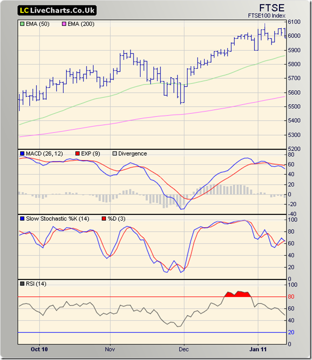
The FTSE 100 index chart pattern bounced up nicely from the support of the rising 50 day EMA and even managed to clear the 6000 level intra-day on Wed. Jan 26 ‘11. But all the good work by the bulls was spoiled by a high volume ‘distribution day’ on Fri. Jan 28 ‘11. The index slipped below the 5900 level and the 50 day EMA and closed the week at 5881 – another lower weekly close.

The technical indicators are looking bearish and pointing to further downward movement. The MACD is barely positive, and well below the signal line. The slow stochastic bounced up nicely from its oversold zone to reach the 40% level, only to reverse direction. The RSI unsuccessfully tried to regain the 50% level, and has started to move down.

Note that the 200 day EMA is rising and the index is trading more than 200 points above it. That means the bulls are alive and kicking. However, a drop below the Jan 20 ‘11 low of 5867 will form a bearish pattern of lower tops and lower bottoms. So, investors should remain cautious.

Bottomline? The S&P 500 and FTSE 100 indices are in the midst of bull market corrections. This may be a good time to get rid of the weaker stocks in your portfolio. Lower index levels may provide better entry points.

Saturday, January 29, 2011

BSE Sensex and NSE Nifty 50 Index Chart Patterns – Jan 28, ‘11

In a post on Jan 18 ‘11, I had mentioned that the zone between the Apr ‘10 and Aug ‘10 tops should provide strong support. It wasn’t crystal-ball gazing. Previous tops tend to provide support. Both indices stopped exactly in the middle of their support zones. Will the support hold? The sheer volume of FII selling gives that a low probability.

BSE Sensex Index Chart

SENSEX_Jan2811

In last week’s analysis, the weakness in the technical indicators led me to comment that the correction wasn’t over and only a mild pullback rally could be expected. The pullback halted at the falling 20 day EMA. The subsequent correction has dropped the Sensex below the 200 day EMA and rung the first warning bell of trend-change possibilities.

The technical indicators are hinting that the correction may continue. The MACD is falling below its signal line into deeper negative territory. The ROC remains negative, moving up to the ‘0’ line but reversing directions towards its 10 day MA. Both the RSI and and slow stochastic are in their oversold zones.

How low can the Sensex go? Market sentiments don’t care much for arithmetic, but here are some technical support levels:

  • The next zone of support is between 17500 (Oct ‘09 top) and 17800 (Jan ‘10 top)
  • A 20% drop from the Nov ‘10 top will take the Sensex to 16900
  • A 38.2% Fibonacci retracement level of the bull rally from Mar ‘09 to Nov ‘10 is at 16150
  • A 50% Fibonacci retracement level of the bull rally is at 14600

Can the Sensex go even lower? Nothing can be ruled out when the bears go on a rampage, but it seems highly unlikely at this stage. Any drop below 17000 should provide good buying opportunities.

NSE Nifty 50 Index Chart

Nifty_Jan2811

The drops below the 200 day EMA on Thu. Jan 27 ‘11 and into the support zone on Fri. Jan 28 ‘11 were accompanied by an increase in volumes, which doesn’t augur well for the bulls. Looks like the market wants to go lower – or, rather the FIIs would like to see lower levels. The technical indicators are not indicating any halt to the correction yet.

In case the support zone between 5400 and 5550 gets breached, the next support levels of the Nifty 50 can be:

  • the zone between 5200 (Oct ‘09 top) and 5300 (Jan ‘10 top)
  • at 5050, which is a 20% drop from the Nov ‘10 top
  • at 4900, which is the 38.2% Fibonacci retracement level of the bull rally from Mar ‘09 to Nov ‘10
  • at 4450, which is the 50% Fibonacci retracement level of the bull rally from Mar ‘09 to Nov ‘10

In technical analysis, we don’t deal with exact numbers, so the levels indicated have been rounded-off to the nearest 50. Remember that breach of any level is subject to a 3% ‘whipsaw’ lee-way.

It is not expected that the Nifty will fall too far below 5000. There is neither euphoria nor panic among investors. Q3 results declared so far have shown good growth in top and bottom lines of India, Inc. The companies that have fared poorly are getting hammered. The RBI is monitoring the economy well and there doesn’t seem to be any asset bubbles. Reforms are moving in fits and starts, but the track record of the Congress-led UPA has never been exemplary about taking bold decisions.

Now that food inflation has become a major problem, there is sudden talk of allowing MNCs to enter organised retail. That one single move can not only bring down food prices through better procurement, storage and distribution but also provide thousands of jobs to semi-literate youths. One can only hope that the Finance Minister takes this important step in the forthcoming budget.

Bottomline? The chart patterns of the BSE Sensex and NSE Nifty 50 indices have formed bearish patterns of lower tops and lower bottoms. Jan 2010 was also a down month, but it helped buyers to enter at lower valuations. So look at this correction as an opportunity to accumulate blue-chip stocks. The correction hasn’t played out yet; avoid aggressive buying.

Friday, January 28, 2011

Notes from the USA (Jan 2011) – a guest post

The US economy continues on its slow and tortuous path to recovery. The US stock market is discounting the fact well in advance and seems to be in fine fettle. FIIs are booking profits in more expensive markets like Indonesia and India and redeploying ‘back home’. This is as good a time as any to do a proper health check of your portfolio.

In his inimitable style, that is exactly what KKP has suggested by drawing a parallel between how we try to manage our health, and how we should approach managing our wealth. It is a ‘big picture’ approach that investors should pay close attention to. Some times we get too wrapped up with ‘what to buy’ and ‘what to sell’ and which way the Nifty is headed.

------------------------------------------------------------------------------------------------------------

Manage Calories or Lose Weight?

Counting calories has been the most common buzz word for most women at some time in their life or another……Men also choose to do this, although to a lesser extent. Some translate this to another buzz word called "diet". Well, diet does not mean eating less to lose weight—although that’s what we commonly associate it with today. Someone "on a diet" is trying to eat less, or stop eating sweets, to fit into a smaller pant size or dress.

Low calorie and fad diets are common in our society today, but few know that these can have some very serious health implications—insufficient vitamin and nutritional intake, lethargy, slowed metabolism, hormonal effects, and even dehydration. Dieters commonly experience intense feelings of hunger and deprivation, which can lead to "cheating" or bingeing over time.

So, what is it that we should be doing?

  • Managing Calories or
  • Managing our Diet or
  • Watching our Weight or
  • Getting on a Exercise Program or
  • a few more clichés!

Answer is “None of the above”. All of us need only one thing, and that is ‘net-weight-loss” to the point where we get our BMI (Body Mass Index) between 20 and 25 and our Height to Waist line ratio above 2. Getting involved in the ‘variety of actions’ versus focusing on stuff that ‘creates a bottom line’ is what matters. So, it is really all about “Focus on Stuff That Gets Stuff Done”.

So, why is all this relevant here?

Well, investing is pretty much along the same lines. Hang in here for a moment with me and I will share with you the similarities. We all get caught up in the various ‘tactical actions’ or ‘strategic planning’ that does not lead us to a fruitful bottom-line. If you do not get the actions down to the bottom line, then years later, your bottom line shows the poor growth in the accounts.

Small investors have a tendency to move from one strategy to another, not giving any strategy enough time to do its thing. So, what happens in the investment world is that we hear/read/discuss ‘tactical investment methodologies’. We have “Technical Analysis”, “Commodity/Currency”, “Mutual Funds and SIPs”, “Real Estate / Gold”, “FMP / FD”, “Trading Software”, “High Frequency Trading”, “Market Timing”, “Day Trading”, “Long Term Investing”, “ETF Trading” and tons of other tactical choices. All of these elements keep us involved in the ‘variety of actions’ versus focusing on stuff that ‘creates a bottom line’.

So, what is our bottom-line? It is Losing Weight when it comes to health. Some might call it Maintaining Weight (after you get to the ideal point) although nature has provided us a tendency to increase weight with age, so we are back to “Losing Weight”! In the investment world, this translates to “Total Return”. But this is also a cliché. What does that really mean?

In one global definition is it really ‘overall return on all of your assets’ that you have invested money whether you have it around your finger or neck (jewellery), under your feet (real estate), in the locker (diamonds), or in a demat account (stocks)? No. Because it should also include the cars parked in your driveway/garage, protection of assets, estate planning, education planning for kids, retirement accounts, past-and-future-inheritance management, and career growth (that leads to new income). Lets not stop there…..It continues onto the ‘advanced training that one needs to move up in a career’ as well as the ‘time and effort put into educating kids’. Once we include all of these elements (and I am sure I am missing some), it would classify as the variables that feed into the “Total Return”.

My current life style requires more than 24 hours in a day since I am managing so many elements of this Total Return, and making advances on all fronts in the best possible way I can. This is what keeps me motivated, constantly in a learning mode, and hopping from project to project throughout the day to move them an inch or two forward. Everyday is a stretch to learn, add movement to each of the variable-buckets that makes up the Total Return. It all leads to “Focus on Stuff That Gets Stuff Done”, and the “Stuff” here means the variables that make up the Total Return of my family life. With age comes wisdom that allows one to do this well…..The sooner you learn, the more your Total Return….

PS: By the way, I used the simple formula called “Output – Input > 0” meaning Output Calories minus Input Calories has to be greater than zero everyday to lose weight. Once this formula clicked in my mind, I lost 36 lbs or approx 17 kg in a short period of time, and have 18 lbs or 8 kg yet to go……It has been 13 months and 11 days from the day this “formula switch” flipped in my brain! So, to lose 1 lb of weight per week, you have to have a 3500 calorie deficit per week or 500 calorie deficit per day. Mathematically, Output – Input = 500 calories per day and you will be on your way to Net-Weight-Loss. Good luck…

------------------------------------------------------------------------------------------------------------

KKP (Kiran Patel) is a long time investor in the US, investing in US, Indian and Chinese markets for the last 25 years. Investing is a passion, and most recently he has ventured into real estate in the US and also a bit in India. Running user groups, teaching kids at local high school, moderating a group in the US and running Investment Clubs are his current hobbies. He also works full time for a Fortune 100 corporation.

Wednesday, January 26, 2011

Stock Chart Pattern - Sanghvi Movers (An Update)

In my previous update of the stock chart pattern of Sanghvi Movers back in Apr ‘10, I had mentioned about some bearish dark clouds on the horizon after the stock had met its upside target of 260 in Jan ‘10. Some of the observations made in my previous update may be worth repeating here:

‘Note that as the stock rose from 180 to 272 during Dec '09 - Jan '10, making bullish higher tops and bottoms, the slow stochastic and MACD made lower tops, and the RSI remained flat. All three indicators were showing negative divergence.

No wonder a correction has followed. The stock made lower tops and a flat bottom at 205 during the Jan '10 - Mar '10 period. That is a bearish 'descending triangle' from which the likely break is downwards. If it does break down, it may test the previous low of 138.’

Some interesting patterns have formed in the Sanghvi Movers chart in the past 10 months, which has pushed this favourite stock of the previous bull market into a bear market:

Sanghvi Movers_Jan2611

Note the negative divergences in the technical indicators during the Dec ‘09 – Jan ‘10 period. The stock price rapidly moved up to touch a high of 272 on Jan 15 ‘10 while the MACD, ROC, slow stochastic moved lower and the RSI remained flat (marked by blue arrows). A sharp decline to 205 was followed by a mild upward bounce and a test of support from the 205 level and the rising 100 day EMA.

A good up move in Mar ‘10 reached a lower top of 240, followed by another drop to the 205 level – forming a bearish descending triangle pattern. Triangles are notorious for being unreliable, but descending triangles usually indicate a downward break with measuring implications. In this case, the down side target was 138.

Instead of breaking downwards, the stock gave an upward break out! The high volume support for such a break out was lacking. The break out turned out to be ‘false’ and became an ‘end run’. The stock dropped below the 200 day EMA to 166 on Jun 7 ‘10. A sharp rally moved up above all four EMAs, but topped out at 210. This time, the correction led to a ‘death cross’ (50 day EMA crossing below the 200 day EMA), confirming a bear market.

The stock began a prolonged consolidation within another descending triangle, from which it broke down earlier this month. Though it is trading above the earlier downside target of 138, the break down from the second descending triangle has a lower target of 116. (210 – 163 = 47; 163 – 47 = 116.)

Is the price drop a result of any weakness in the fundamentals? Apparently not. Cash flows from operations are positive. Turnover and profits took a hit in year-ending Mar ‘10 – but it did so for many companies. Debt:Equity ratio is a little more than 1, but for a capital intensive business, that isn’t so unusual. Promoter holding is 45% and FII holding is almost 23%. Q2 results were better both on YoY and QoQ basis. The company has been paying regular dividends for the past 7 years.

Put another feather on the cap of technical analysis! A stock that seems to be doing well fundamentally has lost more than 40% from its peak in one year and is in a bear market. The descending triangle that I had spotted back in Apr ‘10 gave a good indication of the bearishness to follow.

Bottomline? The stock chart pattern of Sanghvi Movers is facing technical headwinds though fundamentals appear to be strong. Contrarian investing is all about picking up stocks that no one wants to buy – provided you are convinced about the company’s business model and integrity. Await Q3 and Q4 results before entering. Bravehearts can start accumulating on a drop below 138.

Tuesday, January 25, 2011

The Interest Rate hike was expected – why did the market fall?

As expected, the RBI hiked the repo rate and reverse repo rates by 25 basis points. For the uninitiated, that means a 0.25% rise. The repo rate (the interest rate at which banks borrow short-term funds from the RBI) is now 6.5%, and the reverse repo rate (the interest rate that banks receive for parking short-term funds with the RBI) is now 5.5%. Two other rates – the CRR and SLR – have been left unchanged.

Why was the interest rate hike expected? Primarily because core inflation (non-food) has been rising and 6 rate hikes in 2010 had little effect in cooling off prices. Every one knows that food inflation has almost gone out of control, and the Indian housewife is at her wit’s end trying to put nutritious food on the table within the family budget.

If 6 previous rate hikes haven’t managed to cool off inflation, will the 7th (1st in 2011) fare any better? That is a good question, and the RBI Governor knows it. He took pains to explain to the media that his choices were limited. Inflation needs to be controlled, otherwise high prices of essential commodities will increase input costs for India, Inc. That would dent bottom lines and may slow down expansion and capital expenditure. The severe crack in Hindustan Unilever’s stock price today is a clear example of investor nervousness.

Raising interest costs too much at one go will increase borrowing costs and hurt the growth prospects of companies. The RBI has chosen the middle path of a gradual increase in interest rates. If inflation continues to rise, another round of rate hikes may be inevitable. Already, the RBI Governor has relaxed the target core inflation rate to 7% from the earlier 5.5%. There lies the first clue to the market’s fall today. So far, the RBI and finance ministry officials have been making positive noises about controlling inflation through monetary measures coupled with the ‘base effect’ of higher inflation in the year gone by. This was the first official admission that things haven’t worked as planned.

The second clue is the unambiguous message that the RBI Governor sent to the commercial banks: Curb lending and increase deposit rates. That may be music to the ears of retirees who stay far away from the stock market and depend on fixed income avenues. Fixed deposit rates at banks will hit the double-digit mark soon. What is meat for retirees is poison for stock market investors. The combination of higher interest rate with lending curbs will throw a spanner in the works of India’s growth story.

Rate-sensitive stocks took a beating today, and don’t be surprised if the stock market cracks further after the Republic Day holiday. As small investors, there are a couple of things we should do. One, don’t panic and sell off everything. But if you are in profit in second rung stocks, book some or all of it. Two, prepare for a bigger correction by making a list of fundamentally strong stocks that offer some Margin of Safety. Let the correction play out. The next positive trigger may come from the Budget. Buy then.

Related Posts

What the CRR-SLR-Repo cuts mean for investors
What exactly is the Margin of Safety?

Monday, January 24, 2011

Stock Index Chart Patterns – S&P 500 and FTSE 100 – Jan 21, ‘10

S&P 500 Index Chart

image

The S&P 500 index chart pattern touched another new high of 1296 on Jan 18 ‘11, and closed at 1295 on strong volumes. The bulls seemed to pause for breath after a hectic rise from the Nov ‘10 dip. The index slipped to 1271 before close absolutely flat for the week at 1283.

The negative divergences in the technical indicators seem to have stalled the bull rally for the present. The MACD and slow stochastic made flat tops and the RSI made a lower top as the index rose to a new high. Will there be a deeper correction in the index? The possibility can’t be ruled out because of technical and fundamental reasons.

The S&P 500 index is still trading well above the rising 50 day EMA, and the gap between the 50 day and 200 day EMAs is widening. Such a situation is usually a harbinger of a correction. The MACD is positive, but has slipped below its signal line. Both the slow stochastic and RSI remain above their 50% levels, but have dropped sharply from their overbought zones.

Jobless claims fell by 37000, which was better than expected. Existing home sales rose more than expected. IBM and Apple declared great results. Despite the good news, the index failed to move up – which is a bearish sign. A drop to the 50 day EMA should not come as a surprise. The dip should provide a buying opportunity.

FTSE 100 Index Chart

image

In last week’s analysis of the FTSE 100 index chart pattern, I had mentioned the possibility of a correction or consolidation due to the weakness visible in the technical indicators. What happened last week was a technical analyst’s delight.

The FTSE 100 rose to 6066 and closed at a new closing high of 6056 on Jan 18 ‘11 on good volumes. The next day, the index rose higher to 6077, fell short of the Jan 6 ‘11 top of 6090, and closed lower on higher volumes. A bearish ‘reversal day’ pattern (higher high, lower close) got formed.

On Thurs. Jan 20 ‘11, the FTSE 100 dropped sharply and closed just below the rising 50 day EMA on much higher volumes. A high volume bounce up on the last day of the week could not prevent the index from closing below the 5900 level – more than 100 points lower on a weekly basis.

The technical indicators have weakened considerably. The MACD is still positive, but has dropped well below its signal line. The slow stochastic has slipped into the oversold zone. The RSI fell below the 50% level, but managed to regain its mid-point by the end of the week. Such corrections are good for the sustainability of the bull market, and a further dip to the 5800 level will be a buying opportunity.

Bottomline? Both the S&P 500 and FTSE 100 indices are facing bull market corrections. Such corrections provide buying opportunities. But there is no need to throw caution to the winds. Maintain judicious trailing stop-losses to preserve profits.

Sunday, January 23, 2011

Chart Patterns of 10 Sugar Sector Stocks

The Sugar sector is not one of my favourite sectors to invest in – and that is putting it mildly. For some strange reason, small investors seem particularly attracted to it. Probably because they enjoy consuming the product every day. Like all commodity sectors, the sugar sector has its ups and downs. Mostly downs – as you can see from the charts below. As in all sectors, there are always one or two stocks that buck the trend. Too many imponderables and too much government meddling makes this a sector small investors should avoid.

Bajaj Hindusthan

BajajHindustan_Jan2111

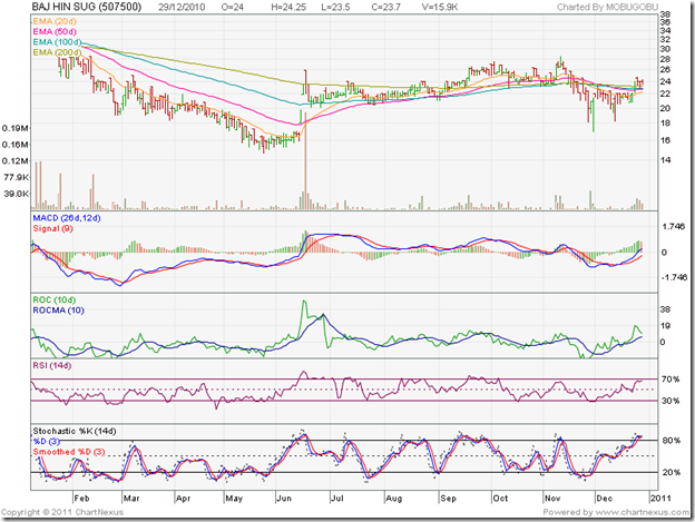
Bajaj Hindusthan is one of the bigger, and supposedly better, sugar companies. Not the stock, which is struggling to emerge out of a bear market. Note that the stock had a sharp rise above all four EMAs in Jun ‘10, only to meet heavy selling. In Nov ‘10, the stock reached a higher top but the four technical indicators made lower tops. A sharp correction followed.

The opposite is happening now. The stock touched a lower top but the technical indicators have reached higher tops. Any up move will provide an opportunity to sell. Why? The stock made a higher bottom in Nov ‘10 than the one in May ‘10. But the technical indicators have made flat or lower bottoms – signalling weakness. Avoid.

Balarampur Chini

BalrampurChini_Jan2111

Balarampur Chini was one of the better sugar stocks to invest in once upon a time. No longer. The management is keen to get rid of the company, but no one is agreeable to meet the price demanded. The stock is in a long-term bear market. Avoid.

DCM Shriram Industries

DCMShriramInd_Jan2111

The less said about DCM Shriram Industries the better. It is one of the most shareholder-unfriendly companies you can find. The stock is in a long-term bear market. Avoid.

Dhampur Sugar

DhampurSugar_Jan2111

Dhampur Sugar is struggling to emerge from a bear market. Periodic forays above the sliding 200 day EMA have been met with selling. Hold, with a stop-loss at 63.

Dwarikesh Sugar

DwarikeshSugar_Jan2111

Dwarikesh Sugar is faring slightly better than most sugar sector stocks. Though the stock is trading below the 200 day EMA, the long-term moving average is actually rising, which holds out some hope for the bulls. Hold, with a stop-loss at 75.

EID Parry

EIDParry_Jan2111

The EID Parry stock has been the star performer in the sugar sector. After touching the split-adjusted high of 290 earlier this month, the stock has corrected all the way down to its 200 day EMA. If the support holds, this could be a good buying opportunity. The technical indicators are in oversold territory, and an upward bounce is possible.

However, there is a bearish sign. Since Oct ‘10, the stock has made a broadening formation of higher tops and lower bottoms and can break downwards. Any buying should be with a strict 8% stop-loss.

Rajshree Sugar

RajshreeSugar_jan2111

Rajshree Sugar made a valiant effort to extricate itself from the bear grip. Since its Nov ‘10 top, it has been drifting down, making a bearish pattern of lower tops and lower bottoms. The 200 day EMA has started falling and the stock is trading below the long-term moving average. Sell.

Shree Renuka Sugar

ShreeREnuka_Jan2111

Shree Renuka Sugars has become one of the larger and better managed companies in the sector with a global scale of operations. The stock is consolidating within a triangle and is trading just above its rising 200 day EMA. Accumulate, with a stop-loss at 74.

Simbhaoli Sugar

SimbhaoliSugar_Jan2111

Simbhaoli Sugar is another stock struggling to get out of a bear market. The high volumes on up days indicate buying interest, but its efforts to remain above the 200 day EMA have not been successful. Hold, with a stop-loss at 40.

Ugar Sugar

UgarSugar_Jan2111

The chart pattern of Ugar Sugar is a bit of a surprise. It has made a bullish pattern of higher tops and higher bottoms since the double-bottom at 13 back in May ‘10. The up-trend line joining the May ‘10 and Aug ‘10 lows is holding. The stock seems to have found support at its 200 day EMA. Accumulate, with a stop-loss at 16.

Note: I don’t track the sugar sector, and have very little idea about the fundamental strength (or lack of it) of the stocks. Please do your own due diligence.

Friday, January 21, 2011

BSE Sensex and NSE Nifty 50 Index Chart Patterns – Jan 21, ‘11

Two week’s back, I had mentioned that ‘till the index trades above its rising 200 day EMA, technically the bull market remains in tact.’ And so it has, in spite of the selling by the FIIs. How much longer will the bulls be able to survive the bear onslaught?

BSE Sensex Index Chart

SENSEX_Jan2110

The BSE Sensex index chart pattern consolidated within a narrow 400 points range during the week. The bad news was the penetration of the 200 day EMA twice during the week on intra-day basis. The good news was that the support from the long-term moving average was not breached on a closing basis. In fact, the index made a token weekly gain of about 150 points.

The technical indicators are not holding out much hope of a pullback rally. The MACD is negative and below the signal line. The ROC has moved above its 10 day MA, but remains in negative territory. The RSI has entered the oversold zone. The slow stochastic remained inside its oversold zone for the second week in a row.

Two of the best performing markets in the Asia-Pacific region in 2010 – Indonesia and India – are undergoing the biggest corrections. All the bearish news about scams, inflation, poor governance may have played a role in the flight of FII money. But it seems more a part of a regional portfolio rebalancing, as the Europe and US markets are offering better valuations at present.

The logical conclusion? The correction isn’t over yet. Note that the blue downtrend line can get breached next week even by a sideways movement. But bullish hopes shouldn’t be raised too much. The fall has been a bit steep, and some sideways movement or even a mild pullback can be expected.

NSE Nifty 50 Index Chart

Nifty_Jan2110

In last week’s analysis of the Nifty 50 index chart pattern, positive divergences in the technical indicators were hinting at a mild pullback. It turned out to be a sideways consolidation within a range of 125 points that tested the support from the 200 day EMA. The bulls are probably relieved that the support held. But the relief may be short-lived. Wednesday’s (Jan 19 ‘11) down-day volumes were the highest during the week. The weakness in the technical indicators suggest a breach of the long-term moving average and a test of support from the Aug ‘10 top of 5550.

Q3 results declared so far have been mixed, and has failed to provide any bullish impetus to the market. The recent hike in petrol prices has kept inflation high. The ministerial reshuffle did not improve the poor perception of the UPA government. It once again failed to take tough decisions. RBI’s interest rate hike is now a foregone conclusion. The only debate is the quantum of hike.

The silver lining seems to be the resilience shown by the Nifty. After 10 weeks of a corrective move, the index has dropped only 11% and technically remains in a bull market.

Bottomline? The chart patterns of the BSE Sensex and NSE Nifty 50 indices continue their struggles to fend off the bears. There seems to be caution but no panic in the market. Long-term investors should remain invested. Short-term traders can trade the narrow range within which the indices are trading. New entrants can start gradually accumulating fundamentally strong large cap stocks, but with strict stop-losses.

Thursday, January 20, 2011

7 steps for selecting a mutual fund portfolio

For most small investors, the best way to get your feet wet in the stock market is to build a mutual fund portfolio. Why? Because there are a bewildering array of stocks traded every day. Stocks classified under ‘A’ group, ‘B’ group, ‘S’ group, ‘T’ group, ‘Z’ group can confuse any investor. Which ones from among the thousands should one add to one’s portfolio?

Stock selection requires basic knowledge of economics. Understanding concepts of supply, demand, inflation, recession, stagflation, repo rate, reverse repo rate, CRR, SLR, commodity prices, oil price, foreign exchange rates, GDP growth and how they may affect the performance of a sector and individual stocks can be a daunting task that requires perseverance and experience to master.

Then there are accounting concepts one needs to learn. Debit, credit, depreciation methods, inventory calculation methods, deferred taxes, assets, liabilities, capital expenditure, working capital requirements, profit, loss, cash flows, share holding patterns have to be added to an investor’s dictionary.

To make things even more complicated, there are ratios to be analysed and different valuation methodologies, and for those who like to look at graphs and charts – a variety of technical analysis concepts and patterns. (If you are investing in individual stocks without learning and applying most of the above-mentioned concepts, you are probably not making much money!)

There is a simple way to get the benefits of stock investing (beating inflation and getting tax-free returns) without spending a lot of time and energy in mastering concepts that may not come easily to you. Build a mutual fund portfolio. Leave it to the fund managers to do individual stock selections, and let them decide about when to buy and sell. The only downside to buying mutual funds is that you are handing over the control of your investments to some one else, and indirectly paying him for the privilege.

There are several types of funds to choose from. Equity funds, sector funds, index funds, debt funds, hybrid funds, liquid funds, open-ended funds, close-ended funds. Not to forget ETFs. Then there are growth options, dividend reinvestment options and dividend payment options. (The combination you choose should take into account your tolerance for risk, requirement of regular cash inflows and tax savings.)

How to find your way through this bewildering maze of funds and options? Here are 7 steps to build a mutual fund portfolio:

  1. Visit valueresearchonline.com. There are many other sites that you can visit, but I have been using this particular site and it provides all the information I need.
  2. Scroll down to the ‘Research Tools’ section of the home page. In the ‘Funds Selector’ window, select - Type:Open End; Category: All Equity (Exc. Sector Fund); Returns over: 5 years; Returns: Above 10% Gainers; Ratings: 5 star and 4 star. Click on ‘Get Data’.
  3. About 55 funds will get listed. From these choose about 10-12 equity funds based on low expense ratio and double-digit 1 year returns (two right-most columns).
  4. Repeat step 2, but with Category: Equity: Tax Planning. Choose 2-3 funds from the list of 7.
  5. Repeat step 2 once again, but with Category: Hybrid: Equity-oriented (better known as ‘Balanced fund’). Choose 2-3 funds from the list of 8. You can choose other categories of funds also. This is a suggested list.
  6. The number of equity funds in the portfolio should get pruned to 3; and 1 each from tax planning and hybrid for a total of 5 funds – which should be more than enough for a fund portfolio. The pruning will require some work. At the bottom of the home page of valueresearchonline.com is a link list of all fund houses. Click on the ones you have chosen. E.g. if you have chosen HDFC Top 200, click on ‘HDFC’ and then from the bottom of the list of HDFC funds, click on ‘HDFC Top 200’. Scroll down to ‘Portfolio Summary’ and click on ‘View additional holdings information’. List out the top 10-12 holdings. Repeat the process with all the chosen funds in your list. Short-list 2 large cap funds, 1 mid/small-cap fund, 1 hybrid fund and 1 tax planning fund (for less risk, select an index fund instead of a mid/small-cap fund) based on minimum common holdings for maximum diversification. In other words, if three funds have 7 common stocks among their top 10-12 holdings, short-list only one fund out of the three. If you don’t follow this process, your equity holding in the funds may get lopsided towards a few stocks.
  7. Visit your nearest broker, fund houses, or CAMS centre to fill-up KYC and application forms (or go online) and start investing regularly.

Wednesday, January 19, 2011

Stock Chart Pattern - Maharashtra Seamless (An Update)

In my previous update of the stock chart pattern of Maharashtra Seamless almost a year ago, I had made the following observations:

‘On crossing 393, it can move up to 460. On the down side, expect support in the 260-300 zone. This is a good mid-cap stock for long-term portfolios.’

How has the chart pattern played out over the past year? Did it move as per expectations? Is the stock still worth accumulating for long-term portfolios, or has the recent correction beaten it out of shape?

For answers, we need to take a close look at the one year bar chart pattern of Maharashtra Seamless:

Mah Seamless_Jan1911 

The stock dropped below the 100 day EMA to a low of 326 in Feb ‘10 – just above the support zone of 260-300 mentioned. It embarked on a strong rally, culminating in a top at 405 in Apr ‘10. A swift correction found support at the 100 day EMA.

The stock entered a period of sideways consolidation for the next three months, before moving up to touch a new high of 424 in Aug ‘10. Note that throughout the consolidation period, all four EMAs kept on rising, indicating a bull market.

This time the correction went a little deeper, almost to the 200 day EMA. The stock formed a bullish cup-and-handle continuation pattern, from which the upward break out took it to the top of 455 in Nov ‘10 – almost meeting the upside target of 460.

The subsequent correction has been severe, and has pushed the stock into a bear market. Why? For the answer, you will need to go through the four definitions of a bear market in yesterday’s post.

  1. From the top of 455, the stock dropped to a low of 346 on Jan 17 ‘11. Almost a 24% drop, satisfying the first definition of more than a 20% drop.
  2. The 3% ‘whipsaw’ lee-way below the 200 day EMA gives a level of 372. The stock closed below 372 in 8 straight trading sessions. The second definition, of a convincing drop below the 200 day EMA, has been met.
  3. The 50 day EMA is on the verge of dropping below the 200 day EMA (marked by the blue oval), giving a ‘death cross’ that signals a bear market. The fourth definition of a bear market is likely to happen soon.
  4. Only the third definition – a 50% retracement of the entire bull rally (from 115 in Mar ‘09 to 455 in Nov ‘10) – to a level of 285, is yet to be satisfied.

Does it mean that there is some hope for the bulls? The technical indicators are suggesting a likely upward bounce. It may have already happened today. The MACD is negative and below the signal line, but trying to rise. The slow stochastic is trying to move up from its oversold zone. The ROC is also negative, but has moved up almost to its falling 10 day MA. More importantly, it has made a higher bottom. The RSI has emerged out of its oversold zone, and also made a slightly higher bottom.

The higher bottoms in the ROC and RSI indicate positive divergences, because the stock price correspondingly touched a lower low. With three of the four bear market definitions having been satisfied, it may be prudent for investors holding the stock to exit.

Bottomline? The stock chart pattern of Maharashtra Seamless is an example of the perils of investing in mid-caps and small-caps – even if such stocks are fundamentally strong. While they tend to outperform in bull markets, they underperform in bear markets.

Tuesday, January 18, 2011

Is this a Bear Market, or a Bull Market correction?

Every time the stock market is in a down trend, small investors start to get worried. Is this a bear market? Should they sell and protect their cash? Or, is it a correction in a bull market that is providing a good opportunity to enter?

Food inflation is not getting controlled. Too many scams. FIIs are selling. IIP figure is not encouraging. Oil price is rising. Commodity prices are going higher. Q3 results declared so far have been a mixed bag. Seven out of ten previous Januarys have been down months. The indices failed to go past their Jan 2008 tops.

The scale is tilted towards the possibility that we may be in the early stages of a bear market. Even a leading technical analyst who writes for one of the leading pink papers feels that the Indian stock indices have slipped into bear territory. Have they? The short answer is: Not yet.

Why? Here are a few accepted technical definitions of a bear market. Let me list them out:

  1. A 20% correction from the top. The Nov ‘10 top in the Nifty 50 index was at 6336. A 20% drop would mean a level of 5070. Yesterday’s (Jan 17 ‘11) intra-day low was 5624. That means a correction of about 11% so far.
  2. A convincing drop below the 200 day EMA. The Nifty 50’s 200 day EMA is at 5650. A 3% ‘whipsaw’ leeway means a level of 5480. In the current down trend, the Nifty 50 is yet to close below the 200 day EMA, though it is showing signs of doing so.
  3. A greater than 50% retracement of the entire bull rally. From the Mar ‘09 low of 2539 to the Nov ‘10 high of 6336 was a strong rally of 3800 points. A 50% retracement means a 1900 point fall from the top – to a level of 4430. That is far away.
  4. The 50 day EMA dropping below the 200 day EMA. The 50 day EMA has started falling, but remains more than 350 points above the 200 day EMA.

None of the four definitions have been satisfied. This is still only a correction in a bull market.

The Nifty has tested support from its 200 day EMA and bounced up today on decent volumes. But it is showing signs of correcting some more. The zone between 5400 (Apr ‘10 top) and 5550 (Aug ‘10 top) should provide strong support. Note that the level of 5480 (mentioned in item 2 above) falls right in the middle of this support zone.

As long as the 5500 level is not breached, the bears will not get control. So that is the level to watch out for. But that is only if you trade in the Nifty. As small investors, we should watch our portfolios closely and check if any of the stocks are meeting one or more of the four bear market definitions given above. Bail out of such stocks.

Also look at stocks that are proving resilient in this correction and have fallen less in percentage terms than the Nifty 50 index. They may lead the next leg of the bull rally, and could be worth accumulating. Please do your due diligence before taking any buy/sell action.

Monday, January 17, 2011

Stock Index Chart Patterns – S&P 500 and FTSE 100 – Jan 14, ‘10

S&P 500 Index Chart

image

The S&P 500 index chart pattern charged up to another new high of 1293 on good volumes – though volumes were slightly lower than the previous week’s. The index continues to trade well above the 50 day EMA and the gap between the 50 day and 200 day EMA continues to widen.

I had expected a correction last week, but it didn’t happen. There are negative divergences in the MACD, which remained flat and just edged above the signal line; and the RSI, which has risen to the edge of its overbought zone. Both failed to make higher tops with the index.

There are mixed signals from the US economy. Companies continue to show good growth and profits, but employment figures remain dismal. The housing situation isn’t encouraging either. Consumer sentiment has taken a dip. But inflation and interest rates are low. Coupled with lots of liquidity and a market trading a little below its long-term average P/E ratio, the bull market seems unstoppable.

FTSE 100 Index Chart

image

The FTSE 100 index chart pattern oscillated around the 6000 level, before managing a slightly higher weekly close above it. The previous week’s high of 6090 wasn’t tested as the week’s high fell short at 6055. The index is consolidating within a symmetrical triangle from which the likely break out is upwards.

The weakening technical indicators may put a spanner in the (bull) works. The MACD is positive but falling below the signal line. The slow stochastic is moving down though it is above the 50% level. The RSI has slipped below the 50% level. All three are hinting at a correction or further consolidation.

As long as the FTSE remains above its rising 50 day and 200 day EMAs, there are no threats to the bull market.

Bottomline? Both the S&P 500 and FTSE 100 indices are in strong bull markets. Remain invested, and use any dips to add.

Sunday, January 16, 2011

When stock markets slide, FMCG is the sector where investors can hide

FMCG is my favourite sector to invest in, regardless of the state of the stock market and the economy. Strong brands, positive cash flows, low debt, generous dividends, bonus issues and stock splits make this sector worth every Rupee you invest in it.

But when stock markets start to slide sharply – with or without any logical reasons – investors learn to really appreciate the FMCG sector. Why? Because the stocks in the sector tend not to fall as much as the broader market. The high-flying momentum stocks with promises of bright futures may give you phenomenal returns in quick time, but there won’t be any place to hide when those same stocks start tanking.

The Indian markets have underperformed global indices for the past two months by correcting about 10% from its Nov ‘10 top. It is not a huge fall for a bull market that rose from 8000 in Mar ‘09 to 21000 in Nov ‘10. But investors are already showing signs of fear and panic. Corrections are part and parcel of investing in the stock market. If you lose sleep every time the market corrects, be overweight in the FMCG sector.

Here are the chart patterns of 10 leading stocks from the FMCG sector in alphabetical order. The sector is a great defensive bet but not all stocks are worth investing in at this point in time.

Brittania

Brittania_Jan1411

The Brittania chart pattern looks the weakest. Right after the 5:1 stock split in Sep ‘10, the stock hit a high of 535 (split-adjusted), made a high-volume reversal day pattern and moved into a down-trend. Of late, it has dropped below its 200 day EMA and is likely to breach the long-term support of 355. Avoid.

Colgate-Palmolive

Colgate_Jan1411

The Colgate chart pattern shows consolidation within a symmetric triangle after the stock touched a high of 996 and a low of 815 in Nov ‘10. A likely break below the triangle can test support from the rising 200 day EMA. Partial profit booking may be in order.

Dabur India

Dabur_Jan1411

After the 1:1 bonus in Sep ‘10, the Dabur stock hit a high of 112 (bonus-adjusted) before correcting down below its 200 day EMA to the support level of 91 in Nov ‘10. A sharp pullback took the stock above all four EMAs. It has been consolidating sideways between 99 and 105 for the past month. Accumulate.

Emami

Emami_Jan1411

Following the 1:1 stock split in Jul ‘10, the Emami stock steadily moved up to touch a high of 512 (split-adjusted) in Oct ‘10. It started to drift down and then suddenly collapsed below its 200 day EMA, down to 312 in Dec ‘10. A quick pullback has taken the stock above its long-term moving average, but the stock is trading below its falling 50 day EMA. Hold, with a stop-loss at 405 (200 day EMA).

Glaxo Healthcare

GlaxoHealth_Jan1411

The Glaxo Healthcare chart pattern is in a bull market. After reaching a high of 2460 in Nov ‘10, the stock has been consolidating in a symmetrical triangle from which the likely break out is upwards. The stock is trading above its rising 100 day and 200 day EMAs. Buy, on a high volume break out above the triangle.

Godrej Consumer

GodrejCons_Jan1411

The chart pattern of Godrej Consumer entered a downward-sloping channel after touching a high of 480 in Sep ‘10. It slipped below its 200 day EMA to get twin support from the level of 354 and the lower end of the channel in Dec ‘10. It has moved up to the upper end of the channel. Buy only on a high-volume break out above the channel.

Hindustan Unilever

HUL_Jan1411

From Jan ‘10 to May ‘10, the HUL stock traded well below its 200 day EMA, trying the patience of its long-term investors. It started its up move from Jun ‘10 and hit a high of 320 in Sep ‘10. It has since consolidated in a rectangular channel between 320 and 283. An upward break out earlier this month on decent volumes saw no follow-up buying, and the stock is back within the rectangular channel. The stock is trading above its rising 100 day and 200 day EMAs. Note that HUL reached a higher top than the one in Nov ‘10, while the Sensex made a lower top. Accumulate.

ITC

ITC_Jan1411

After the centenary 1:1 bonus issue, the ITC stock rose steadily to reach a high of 185 before starting a sideways consolidation between 166 and 181. The stock is trading above its rising 100 day and 200 day EMAs. Like HUL, the ITC stock touched a slightly higher top in Jan ‘11. Accumulate.

Marico

Marico_Jan1411

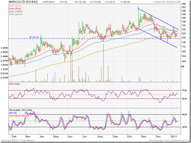
Like the Godrej Consumer stock, Marico is trading in a downward-sloping channel. After hitting a high of 153 in Oct ‘10, the stock fell below its 200 day EMA and the support level of 119 down to 115 in Dec ‘10 – a 25% correction. The recovery has been tepid. Buy only on a high-volume break out above the channel.

Nestle

Nestle_Jan1411

The Nestle chart pattern is in a strong bull market. It touched a high of 4199 in Nov ‘10 and has been consolidating sideways, with good support from the rising 50 day EMA. The 100 day and 200 day EMAs are also rising. Use dips to accumulate.

Related Post

Chart Patterns of 10 Banking Sector stocks

Friday, January 14, 2011

NSE Nifty 50 Index Chart Pattern – Jan 14, ‘11

The NSE Nifty 50 index chart pattern has opened up some interesting technical possibilities after this week’s trading. Before I delve into them, here are some of my observations from last week that will help to put things in perspective:

‘The weakness in the technical indicators are pointing to a deeper correction, and a possible test of the 200 day EMA. Immediate down side targets for the Nifty are 5800 (upward sloping trend line of the symmetrical triangle); 5650 (200 day EMA) and 5550 (Aug ‘10 top).’

Nifty_Jan1410

The support from the 100 day EMA was broken on Mon. Jan 10 ‘11. The next day, the Nifty touched an intra-day low of 5698 – testing the Nov 26 ‘10 intra-day low of 5690. Wed. Jan 12 ‘11 saw the index bounce up sharply, only to face resistance from the 100 day EMA.

Today’s trading took the index below the 200 day EMA when it touched an intra-day low of 5640. The close at 5655 was just above the long-term moving average. The expected test of the 200 day EMA has happened, and the support has held – so far. Will there be a pull back?

Positive divergences in three of the technical indicators are suggesting as much. Though the ROC has moved below its Nov 26 ‘11 low along with the Nifty, the RSI, slow stochastic and MACD are at slightly higher points than their Nov ‘10 lows.

Will it be a strong pull back? The bearish state of the technical indicators may not allow it. The MACD is falling in negative territory and is well below its signal line. The ROC is also falling in negative territory and is well below its 10 day MA. The RSI is at the edge of its oversold zone. The slow stochastic is in its oversold zone.

I have drawn a bearish descending triangle using the Nov 8 ‘10 and Jan 4 ‘11 tops, and the Nov 26 ‘10 and Jan 11 ‘11 bottoms. Today’s trading has broken below the descending triangle, though it has received support from the 200 day EMA. Triangles are not that reliable, but ascending and descending triangles have measuring implications.

The break down below a descending triangle means that Nifty may fall to the extent of the height of the triangle – which is about 650 points (6339 on Nov 5 ‘10 to 5690 on Nov 26 ‘10). So the Nifty 50 can fall to (5690 – 650 =) 5040. Will it, and if so, when?

Those are good questions, and I can not answer them with any certainty. If the Nifty 50 breaks below the 200 day EMA - and the probability is high - the zone between the Aug ‘10 top of 5550 and the Apr ‘10 top of 5400 should provide good support. If 5400 is also broken, we may see 5040 sooner than later.

The poor Nov ‘10 IIP numbers announced last week, continuing high food inflation and the insipid Infosys Q3 results have pushed bulls into a corner. The oil price rise isn’t helping matters. RBI may have no choice but to hike interest rates again, which will be another blow to the stuttering growth story.

Bottomline? The bull market in the Nifty 50 index has been stalled. Economic headwinds in India and recovering markets in USA and Europe have switched FII attention away from emerging markets. Long-term investors can hold with a stop-loss at 5550 (Aug ‘10 top). New entrants should control the urge to jump in, and concentrate on researching good stocks till the correction plays out.

Thursday, January 13, 2011

Oil is on the boil – how can investors benefit? (A guest post)

Oil price is once again making headlines as it inches up towards the $100 mark. Food inflation shows no signs of cooling off, making another round of interest rate hikes by RBI almost inevitable. Rising price of oil will be an additional headache that will lead to rising import costs, worsening India’s trade deficit. Another rise in petrol and diesel prices – unless the government becomes proactive by reducing taxes – will further stoke the fire of inflation.

Is it all darkness and doom? In his guest post this month, Nishit looks at the silver lining. He discusses two stocks that are likely to benefit from higher oil price. Before we get to Nishit’s post, here is an announcement from Nishit’s friend Anuraag about an interesting Panel Discussion that readers in Mumbai may want to attend:

With the purpose of spreading awareness among Market Participants, in association with Eco Ashram, we are organising a Panel Discussion on the topic “Stock Markets or Rigged Casinos?” on 21st of January 2011 at "Y. B. Chavan Centre, Mumbai" from 5:00 P.M. to 7:00 P.M. The event is called "NATIONAL ECONOMIC DEBATE".

The Panelists are Dr. Ajit Ranade (Chief Economist, Aditya Birla Group), Shri. G. Anantharaman (Former Whole-Time Member, SEBI) & Dr. R. Vaidyanathan (Professor, Finance & Control – IIM, Bangalore).

The discussion will be followed by release of the book, “Sense, Sensex and Sentiments – The Failure of India’s Financial Sentinels” written by Shri. M.R. Venkatesh, Chartered Accountant.

For more details, contact:

Anuraag Gupta
Profound Consulting Pvt. Ltd.
502, A-Wing, Delphi, Hiranandani Business Park, Powai, Mumbai - 400076
Telefax: 022 25704357
Cell: +919892832789; anuraag@nedindia.com

-------------------------------------------------------------------------------------------------------------

Crude prices have risen to 92 dollars a barrel. Now, the question is how do we benefit from this? One way is buying crude as a commodity on the MCX Exchange, which is beyond the reach of most retail investors. My sincere advice to retail investors is to stay away from Commodity Trading. So, how do we play it on the stock markets?

We could buy companies dealing in crude. The downstream players are HPCL, BPCL and IOC. Now these companies mainly refine crude and sell the products. They have to bear a subsidy burden on Diesel and Kerosene. The government has come with a formula of 1/3rd burden by refiners, 1/3rd by government and 1/3rd by the upstream companies like ONGC, Gail and Oil India. Now, crude prices can go over the roof and the government has no defined mechanism to handle it.

Keeping that in mind the downstream companies are strictly off the buy list. Coming to ONGC, the price which ONGC gets is strictly capped due to the subsidy burden. ONGC is supposed to come out with a FPO in mid-March 2011. The stock is getting split along with a bonus issue for which the record date is yet to be announced. So at the closing price of Rs 1205 (Jan 7 ’11), you would be getting 4 shares for every 1 share you buy now.

Arguments in favor of buying ONGC:

  1. Government Company - so a very safe buy
  2. EPS of 74 and P/E of 16 - so not very expensive. Safe play on crude oil. A multi-bagger over past 10 years. Can buy and hold
  3. If the Government wants the FPO to go through, they will clear the air on subsidy burden, thus making it an attractive offering

Argument against ONGC:

  1. The subsidy sword keeps dangling over ONGC. Until clarity comes nothing can be done to enhance profitability
  2. FPO in March ’11. Experience over past 1 year is stock prices of government companies which come for FPO are usually kept depressed before the FPO, so folks get a good rate

Cairn India is a good company, which I like and had written about in a post in August ‘10. Here is the link:

http://investmentsfordummieslikeme.blogspot.com/2010/08/cairn-india-oil-story-worth-betting-on.html

To update the story, Vedanta has to get approvals from the government, which are expected in the middle of February ‘11. If this goes through, the Open offer will be at Rs 355 for a 20% stake. The promoters of Cairn have been paid Rs 50 as non-compete fee. There is speculation that the open offer could well be at Rs 405.

Now taking crude oil prices to be around 96 dollars, the fair value of Cairn is already around Rs 350. Vedanta has the muscle to pump in funds to make acquisitions and companies taken over by Vedanta in the past have sizzled post acquisition. Sesa Goa and Hindustan Zinc are prime examples.

Government approvals should be in place, ONGC will negotiate to get rid of their royalty burden on joint oilfields with Cairn in return for giving a NOC.

How do we play all this?

In Cairn, the downside looks limited, so should be bought now. One can buy ONGC during the FPO. The reason for this is FPOs are always at a discount to market price, plus the retail fraternity gets additional 5% discount to the offer price. By buying Cairn now, we are getting a crude oil exposure. Crude going up means the fair value of Gold is 1380 dollars. Normally 1 ounce of Gold should buy 15 barrels of Crude Oil. Time to add Gold along with the Crude.

Cairn India’s market cap is 1/4th of ONGC’s. ONGC is the old giant whereas Cairn India is the new kid on the block.

-------------------------------------------------------------------------------------------------------------

(Nishit Vadhavkar is a Quality Manager working at an IT MNC. Deciphering economics, equity markets and piercing the jargon to make it understandable to all is his passion. "We work hard for our money, our money should work even harder for us" is his motto.

Nishit blogs at Money Manthan.)

Wednesday, January 12, 2011

Stock Chart Pattern - Sintex Industries (An Update)

In the comments section of the previous update to the stock chart pattern of Sintex Industries, a link to a Business Standard article dated Dec 31 ‘10 was provided. The article mentioned that valuations were attractive, a recent acquisition was likely to be top-line and bottom-line accretive, the company’s businesses were growing, the correction in the stock price had been undue, and the stock had a price target of 252.

Well, the valuations have become even more attractive as the stock price continues its correction from the Nov ‘10 top of 237 (adjusted for the 2:1 split in Oct ‘10). The face value of the stock is now Re 1 – and that could be one of the reasons for the ‘undue’ correction. The number of shares in the demat accounts of investors have doubled – thanks to the split. As often happens after bonus issues and splits, the additional liquidity leads to selling. In this case, the correction in the stock happened to coincide with the corrections in the BSE Midcap index, and the Sensex.

What should investors do? Let us look for clues in the one year bar chart pattern of Sintex Industries:

Sintex_Jan1211

The stock reached a split-adjusted high of 168 in Apr ‘10 (equivalent to 336 for the then Rs 2 face-value stock), and then corrected down to 131 where it received support from the 200 day EMA. The subsequent rally touched a new high of 229 in Oct ‘10 on a volume surge prior to the split.

Post-split, the stock resumed its rally and touched another new high of 237 in Nov ‘10 (which was still well below the Jan ‘08 split-adjusted high of 308). Note that while the stock price reached a new high, the MACD, ROC and RSI made lower tops (marked by blue arrows) – negative divergences that gave a warning about an impending correction. The slow stochastic touched a higher top, but was overwhelmed 3 to 1 by the other indicators. This is one reason for looking at several indicators in technical analysis.

The stock price broke below the 200 day EMA and the 168 level on Dec 22 ‘10 on a volume spurt, but managed to close above 168. A brief rally found resistance from the falling 100 day EMA, and this time the stock first fell below the long-term moving average before closing below 168 two days in a row. Today, the stock bounced up to close exactly at 168.

The technical indicators are all bearish, and the trend continues to be down. The 20 day EMA is about to drop below the 200 day EMA. The 50 day EMA is touching the 100 day EMA, and both are falling. The MACD is negative and below the signal line. The ROC is also negative and below its 10 day MA. The RSI twice failed to move above its 50% level and has almost dropped to its oversold zone. The slow stochastic has entered the oversold zone.

The only silver lining for the bulls is the positive divergences in all four technical indicators, which have made higher bottoms while the stock price made a lower bottom (marked by blue arrows). That could lead to another rally, but will it be strong enough to revive the bull market?

Technically, the answer is: no. The 33% correction from the recent high of 237 to yesterday’s low of 158 has pushed the stock into a bear market. The bearish pattern of lower tops and lower bottoms is in tact. Higher volumes on down days and lower volumes on subsequent up days indicate more sellers than buyers. The final confirmation of the bear market – the 50 day EMA falling below the 200 day EMA is still awaited, but seems imminent.

What about the fundamentals? Are they really attractive? Not quite. The debt/equity ratio is more than 1; profits took a hit and cash flows from operating activities turned negative last year. The market has been unkind to companies with large debt on its books. Things may improve in the next financial year, but we need to wait and see.

Bottomline? The stock chart pattern of Sintex Industries is an example of how a stock that appears to be fundamentally investment-worthy is to be avoided for technical reasons. Sell.

Tuesday, January 11, 2011

5 Convoluted reasons why the Sensex is falling

The Sensex is falling! The Sensex is falling! Six days in a row – no less! Already the pink papers are writing about how many lakh crores of investor money has disappeared into thin air. At the beginning of 2011, every one was talking about new highs. 11 days into 2011, and now the focus is on down side targets.

Why has the Sensex suddenly started falling? Here are 5 convoluted reasons:

1. Food inflation is going up. Look at the prices of vegetables! They are supposed to go down in winter, when supply is plentiful and wastage is less. ‘Base effect’ was supposed to kick in. The late rains caused havoc. Some jiggery-pokery is going on with onion distribution. But food inflation remained high throughout 2010, and the Sensex went up.

2. It is not food inflation then. So it must be the interest rates. To tackle inflation, the RBI has been increasing interest rates. Now the banks have started offering higher rates on fixed deposits. That means borrowing costs are also increasing. So people who borrow money to invest in the market have to pay more. They must have scaled down their borrowing. But RBI raised rates in 2010. Why is the Sensex falling now? Is it in anticipation of another interest rate hike?

3. It must have been the FPOs and IPOs, which sucked out large amounts of cash that would have otherwise been invested in the secondary market. See the massive amount that the Coal India IPO garnered. A totally corrupt and inept management, digging out poor quality coal that burns holes in boiler tubes, managed to sell a dream of great future growth and sold a lemon to the public. The newspapers made a big song and dance about employees not touching their allotted quota because of ‘foolish’ advice from their unions. Looks like they were the smart ones.

4. Could be the series of scams that came out of the woodwork? The Commonwealth Games scam, the Adarsh Housing scam, the telecom 2G scam, the realty finance scam, the mining scam, and god-knows-what-other scams. But all those scams were unearthed last year. The FIIs know about such risks in emerging markets. Otherwise, why would they invest in Indonesia – which is far more corrupt than India?

5. A-ha! So it is the FII selling that has triggered the sudden fall. But the FII selling has been matched by DII buying. The Sensex should have moved sideways instead of dropping like a stone. May be the FIIs are selling the Sensex 30 stocks and the DIIs are buying stocks other than the Sensex constituents. Then why are small and mid-caps also falling?

If small investors are feeling even more confused after reading those reasons, then don’t blame me. I did mention that the reasons are convoluted!

Forget about the reasons. Look at this correction as an opportunity to invest in some fundamentally strong stocks that have been beaten down. Remember Warren Buffett’s well-known secret about stock market success: Be greedy when others are fearful, and be fearful when others are greedy.

Related Post

The Sensex and Nifty are correcting: is it a buying opportunity?

Stock Index Chart Patterns – S&P 500 and FTSE 100 – Jan 07, ‘10

S&P 500 Index Chart

image

In last week’s analysis of the US stock market (Dow), I had mentioned the possibility of some more consolidation. The S&P 500 index chart pattern touched a new high of 1278 on Jan 6 ‘11, but traded within a 20 point range through the week. Volumes have picked up considerably, which is a bullish sign. So is the higher close on a weekly basis.

Note that the index is well above its 50 day EMA and the gap between the 50 day EMA and 200 day EMA is widening. The MACD is positive, but is touching the signal line. It has made a lower top while the index made a higher one. The slow stochastic is well inside the overbought zone, but has also made a lower top. The RSI has slipped below the overbought zone.

The index is looking overbought. Signs of gradual recovery in the US economy are visible. But the employment situation continues to disappoint. A spot of correction will improve the sustainability of the bull market. The technical indicators are conducive to such a correction. Let us see if it happens.

FTSE 100 Index Chart

image

The FTSE 100 index chart pattern shows some interesting developments. Bears were brushed off as the index moved above the 6000 level on a volume spurt. A new high of 6090 was reached on Jan 6 ‘11, but by the end of the week, the FTSE closed below the 6000 mark at 5984.

The higher weekly close and pick up in volumes are bullish signs. But the volatility is a sign of uncertainty. The technical indicators are looking weaker. All three made lower tops while the index touched a higher top. The MACD is positive, but about to slip below the signal line. The slow stochastic re-entered the overbought zone, but dropped down immediately. The RSI has fallen lower than last week, though it remains above the 50% level.

The negative divergences in the technical indicators may lead to a correction. Watch the 5900 level, which is a strong support. A breach could take the FTSE down to the 50 day EMA.

Bottomline? Both the S&P 500 and FTSE 100 indices have retreated a bit after touching new highs. The bull markets remain strong. Hold, with trailing stop-losses.

Sunday, January 9, 2011

In which IT Sector stocks should you invest?

The IT Sector had been one of the star performers in 2010. With the US and Eurozone economies showing signs of recovery, it is expected that the sector will perform well in 2011 also. A performing sector doesn’t mean all the companies in the sector are worth investing in. Some stocks are leaders; some are laggards. Some are just not getting anywhere.

Here are the chart patterns of 10 IT sector stocks – including the four big guys and a few mid-caps. With demand for experienced manpower on the rise, the problem of attrition is causing concern. The big guys with their geographically spread out operations in different verticals is better able to manage attrition than the smaller players.

TCS

TCS_Jan11

TCS is the jewel in the crown of the IT sector, and has been in a raging bull market, touching new highs on a regular basis. After a decent correction during Mar-May ‘10, when the stock almost fell to the 200 day EMA, the stock touched a lower bottom, but the RSI made a bullish higher bottom. For the past month, it has been in a consolidation mode with an upward bias. The stock is at an all-time high, so caution is advised. The RSI and slow stochastic are showing negative divergences. Hold. Add on a slightly deeper correction.

Infosys

Infosys_Jan11

The Infosys stock is also in a strong bull market, touching higher tops and bottoms for the past 12 months. The correction during Apr-May ‘10 touched a higher bottom. Both the RSI and slow stochastic have fallen sharply from their overbought zones. The correction may continue for a while longer. Hold, and add the dips.

Wipro

Wipro_Jan11

Wipro is also in a bull market, but the Oct ‘10 high has not been breached yet. The stock is showing some weakness near its previous high, and a bearish double-top pattern may be forming. Wipro has never quite been in the same league as TCS and Infosys. It is reflected in the stock’s performance. Book partial profits.

HCL Tech

HCL Tech_Jan11

HCL was an established company when Infosys first appeared on the scene. Somehow, their head-start in the small computer manufacturing and marketing field could not be leveraged into leadership in the software services field. That doesn’t mean that their stock is doing badly. It is in a bull market, and has given decent returns in the past 12 months. Can be added on dips.

Oracle Financials

Oracle Fin_Jan11

The Oracle name hasn’t changed the fortunes of the original iFlex. Though the stock is technically in a bull market (trading above a rising 200 day EMA), it has traded in a sideways range for the past year and has given negative returns to shareholders. Switch.

MPhasis

Mphasis_Jan11

Mphasis hit a peak in Feb ‘10, fell well below the 200 day EMA, and has since been oscillating around its long-term moving average. The stock has given negative returns to its shareholders in the past year. Switch.

Tech Mahindra

Tech Mahindra_Jan11

Tech Mahindra is trading below its falling 200 day EMA, making lower tops and bottoms and is technically in a bear market. The British Telecom connection has broken and the Satyam amalgamation will be a heavy cross for investors to bear. Avoid.

Mindtree

Mindtree_Jan11

The Mindtree stock is not going anywhere. It is making an effort to move above its 200 day EMA, but is trading within a bearish pattern of lower tops and bottoms. Not quite as bearish as Tech Mahindra, but an ‘avoid’.

KPIT Cummins

KPIT Cummins_Jan11

The KPIT Cummins stock dropped like a stone below its 200 day EMA back in May ‘10. It recovered sharply to double in value in Aug ‘10. It has been in a down trend ever since, and is about to drop into a bear market. Sell.

Tata Elxsi

Tata Elxsi_Jan11

Tata Elxsi touched a high-volume peak in Mar ‘10, and has been oscillating around its 100 day EMA since then. Shareholders have got no returns. The stock is technically in a bull market, but the chart pattern does not inspire any confidence. Hold.

Related Posts

Should you invest in Telecom Sector stocks?