Saturday, July 31, 2010

BSE Sensex Index Chart Pattern - Jul 30, '10

The BSE Sensex index chart pattern showed distinct uneasiness as it moved above the Apr ‘10 high of 18048. I had given ample warning last week to investors that celebrating the new high in the Sensex may be premature.

The negative divergences in the technical indicators, and the proximity of the index to the upper end of an upward sloping channel (from where it had retreated three times) were signs that bears may emerge from the shadows.

Let us take a look at the 1 year bar chart pattern of the BSE Sensex index:

SENSEX_Jul3010

The index was earlier consolidating within a slightly broader rectangular band between 15300 and 18000. Since the Sensex made several tops in July above the Apr ‘10 high of 18048, an upward sloping channel with a width of about 2300 points has been drawn on the chart.

What caused the retreat from the upper end of the channel? Was it the proximity to the upper trend line from where the Sensex has corrected before? Or, was it the negative divergences in the technical indicators? Or, could it be that most of the Q1 results are out and they have been a mixed bag? Or, was it the hike in the repo and reverse repo rates?

May be due to some or all of those reasons – depending on who is doing the explaining. As far as I am concerned, the Sensex is back inside the sideways consolidation zone of the past 11 months – whether you choose the rectangular band or the up-sloping channel.

The break above the Apr ‘10 top of 18048 was not valid technically, as the Sensex failed to close above 18600 (the 3% ‘whipsaw’ lee-way above 18048). The 50 day and 200 day MA are both rising with the index above them. So, the long-term bull market is in tact.

The technical indicators are favouring the bears. The MACD is positive but has slipped below the signal line. The RSI has dropped below the 50% level. The slow stochastic has entered the oversold zone.

On the down side, look for supports at 17500 (50 DMA), 17200 (200 DMA), 16300 (lower trend line of the up-sloping channel) and 15300 (the bottom of the rectangular band). Can the Sensex go below 15300? Sure it can, specially if the FIIs turn sellers.

The FIIs have been net buyers all through last week while the DIIs were net sellers. Still the Sensex dropped below 18000. If things suddenly go wrong in Europe or USA, and FIIs start to pull out – the Sensex could be in for a deeper cut.

As long as the index stays above the rising 200 day MA, there is no cause for alarm. A bounce up from 16300 could be an opportunity to buy. If 16000 breaks, then we may need to change strategy, as the bull market will be in danger.

Bottomline? The BSE Sensex index chart pattern is confusing and confounding investors by steadfastly remaining in a sideways consolidation pattern. Be very selective in buying, and maintain strict stop-losses. The down side risk appears greater. Hold on to your good portfolio stocks till a clearer trend emerges. Get rid of junk.

Friday, July 30, 2010

Stock Index Chart Patterns - Shanghai Composite, Malaysia KLCI, Hang Seng - Jul 30, '10

Shanghai Composite index chart

ShanghaiComp_Jul3010

In last week’s analysis of the Shanghai Composite index chart pattern, I had mentioned that any resistance from the falling 50 day EMA would be a temporary one, as the technical indicators were all showing positive divergences that pointed to further bullishness.

The index hovered near the medium-term EMA for the first two days of the week before decisively moving up, and above the 2600 level after 2 months. It remained above 2600 till the end of the week, closing with a 2.5% weekly gain.

The bull rally has lasted 4 weeks and still the index is well below the falling 200 day EMA. The slow stochastic is inside the overbought zone. The MACD is above the signal line and rising in positive territory. But the RSI has dipped after touching its overbought zone, and the ROC has drifted lower after almost reaching the 200 level. The latter two indicators are showing negative divergences that could lead to a pause in, if not a correction to, the up move.

The bears remain in charge as long as the Shanghai Composite remains below its long-term moving average.

Hang Seng index chart

HangSeng_Jul3010

The Hang Seng index chart pattern has broken through the bear shackles as it rapidly climbed over one barrier after the other – first the 200 day EMA, next the Jun ‘10 high of 20957 and finally, the 21000 level.

But the bulls are not out of the woods yet. The Apr ‘10 top of 22389 is more than 1350 points (6%) above the week’s closing level of 21030. The bull rally has lasted 2 months – making a pattern of higher tops and higher bottoms. But the volumes have been muted at best. Without volume support, the rally may fizzle out before testing the Apr ‘10 top.

The technical indicators are bullish, but giving mixed signals. The slow stochastic is in the overbought zone and the MACD is above the signal line in positive territory. But the ROC has dipped after touching the 1000 mark and the RSI has slipped after reaching the overbought zone.

Malaysia (KLCI) index chart

KLCI Malaysia_Jul3010

In my previous analysis of the Bursa Malaysia (KLCI) index chart pattern, I had observed the lack of volume support as the index rallied from a fall below the 200 day EMA to climb above all the three EMAs. It was no great surprise that the index dropped below the entangled 20 day and 50 day EMAs.

This time, the bulls mustered up enough volume support and the rally has been much stronger, not only taking the index back to bull territory but making new daily and weekly closing highs. All three EMAs are rising with the index above them.

The technical indicators are bullish, but giving mixed signals in the KLCI index also. The slow stochastic is well inside the overbought zone. The MACD is above the signal line in positive territory, but has stopped rising. The ROC is drifting down after touching the 50 level. The RSI is moving sideways just below the overbought zone.

Bottomline? The bear grip is definitely loosening from the Asian indices. The Shanghai Composite index is still in a bear market, but the Hang Seng and Malaysia KLCI are back in bull territory. Time for some selective buying, but don’t bet the farm. The developed economies are nowhere near full recovery yet.

Thursday, July 29, 2010

Notes from the USA (July 2010) – a guest post

I have been writing a weekly technical analysis of the Dow Jones (DJIA) index for some time. Most of the information sources for those posts have been ‘second-hand’, viz. data available on the Internet and from magazines.

Kiran Patel has been working and investing in the USA for a long time. He is also a regular participant in various investment group discussions. Here are his first-hand, ground zero views about the US economy and investment opportunities.

Hopefully, these posts will appear every month – depending on how much time Kiran can spare from his busy schedule. Readers are requested to encourage and motivate him by leaving your comments and questions.

-------------------------------------------------------------------------------------

Is the US Economy Recovering?

There are many who are enjoying the thought of recovery, others who are hoping for a recovery and still others who are asking everyone ‘what recovery’! So, what is the real truth when it comes to the US? This is a ground zero view from the US.

image

Recovery of an economy really should translate to job growth, consumer spending, corporate spending and most importantly, reduction in unemployment benefits. Well, none of these factors reported by the US Government show a real recovery. So, where is the recovery and why the sudden feeling that things are OK? The only recovery that one sees is the comparison of quarterly earnings of corporations between 2010 and 2009. Last year’s earnings were so weak that any improvement in this year’s earnings is giving a false impression of recovery in comparison with a much lower base.

Obama had offered a special incentive of $8000 to first time home buyers who have a signed contract by Apr 30, 2010, and do the ‘closing’ (execute the purchase) by Sep 30th, 2010. There is a huge backlog of deals in the works that is in the process of ‘closing’. All of this has created a temporary bump up in economic activity, reduced the inventory of homes, but at the end of the day, I still call this ‘artificial’. It is artificial since it was created by a stimulus injection, and now that the effects of that stimulus injection have worn off, housing sales have slumped since May 2010. Inventory of homes is increasing, and homes that did not sell are coming back to the market place at reduced prices.

Why are investors like me buying? Home is where the heart is. Everyone needs a home, whether it is small, medium or big. People who have lost their homes due to non-payment of mortgage, bankruptcy, foreclosure, short sale or any other fancy word used today in the US, need a place to live. So, my deal is to buy deeply undervalued homes (30c to a dollar), fix them up, and rent them out to some of the large population of people who have to rent since they cannot afford to buy, or do not have the credit to purchase a home (with a mortgage). Inventory for homes that fit my ‘buy profile’ is a bit depleted due to the Obama incentive, but since May-June, it is starting to go back up. As winter approaches starting from Nov, these deals will get mouthwatering once again. In the meantime, investors are making offers to purchase these deeply undervalued homes from the banks, who own them today (reclaimed from the original home owners who could not pay their mortgages) and are pricing it way below market prices.

So, recovery? A bump up might be the closest thing it can be called, but we will probably see a dip back down to a soft-landing or a double dip recession in the next 6-9 months (starting this winter). Manufacturing activity (ISM report), Leading Economic Indicator (LEI report), and other internal indicators are pointing to this upcoming dip. The best of the best is the WLI – Weekly Leading Index Growth Indicator (created by an Indian Scholar along with 3 other partners) is pointing downward. That means the US economy is about to turn back down, since the WLI is a leading indicator.

image

Are the BRICs (Brazil, Russia, India and China) ready to withstand this bruising from the potential double dip recession? Are they going to have their own corrections, once again showing that each of those markets is still co-related and inter-dependent on the US? I think so. What do you think, dear reader?

---------------------------------------------------------------------------------

KKP (Kiran Patel) is a long time investor in the US, investing in US, Indian and Chinese markets for the last 25 years. Investing is a passion, and most recently he has ventured into real estate in the US and also a bit in India. Running user groups, teaching kids at local high school, moderating a group in the US and running Investment Clubs are his current hobbies. He also works full time for a Fortune 100 corporation.

Wednesday, July 28, 2010

Stock Chart Pattern - Havell's India (An Update)

The previous analysis of the stock chart pattern of Havell’s India was written 11 months back. The stock had entered a sideways consolidation pattern after more than tripling in value from its bear market low of 100.

A bullish ‘ascending triangle’ pattern was in the process of being formed, and I had advised investors to either buy during the consolidation phase, or after the break-out upwards. Readers who heeded my advice have more than doubled their investments in the intervening period.

There are several interesting technical patterns worth noting on the 1 year closing chart pattern of Havell’s India:

Havells_Jul2810 

The consolidation within the ‘ascending triangle’ (flat tops and rising bottoms) lasted a little more than 3 months – from Jun ‘09 till Sep ‘09 - before the first upward break out on an uptick in volumes occurred. This has been marked by the arrow on the left.

The stock price soon drifted back into the triangular consolidation area on much reduced volumes, took support at the up-trend line and the 50 day MA, and again broke out upwards in early Oct ‘09. Note that the volumes were a little lower during the second break out (marked by the arrow on the right) – which made the subsequent up move questionable.

In a classic example of a ‘bear trap’, a small head-and-shoulders pattern met its down-side target below the 50 day MA, and what looked like a ‘false break-out’ (highlighted by the blue oval) turned into a strong bull rally. Symmetrical triangles tend to be unreliable, as price break outs can happen in either direction. But ascending (and descending) triangles tend to be much more reliable for trend prediction.

Note that from Dec ‘09 to Apr ‘10, the stock made new highs on strong volumes – but the volume peaks were lower for each high. All three technical indicators – MACD, RSI, slow stochastic – made lower tops. The negative divergences warned about the 135 points (20%) correction that followed during Apr and May ‘10.

The stock has since made up the entire correction and gained more than 150 points to reach a new high of 692. It faced a long-term resistance level and has dipped down. A test of the Jan ‘08 high of 750 is on the cards.

The technical indicators are showing negative divergences again, making flat tops as the stock made a higher top. The stock may consolidate sideways or drop some more before attempting to climb to a new high.

Bottomline? The stock chart pattern of Havell’s India is in a strong bull market, as it is above its rising 50 day and 200 day MAs. Existing investors can hold, or book partial profits. New investors should refrain from entering so near its all-time high, and buy only after a correction.

Tuesday, July 27, 2010

The RBI has increased the Repo and Reverse Repo rates – should investors be concerned?

Many small investors tend to be oblivious about repo rates, reverse repo rates, economic and monetary policies, and the tools that the RBI has at its disposal to control the supply of money (liquidity) in the financial system. But ignorance is not necessarily bliss.

Here is a simple Q&A to try and understand some of the basics:

Q. Why did the RBI raise the repo rate from 5.5% to 5.75% (‘25 basis points’ is another way of saying ‘0.25%’) and the reverse repo rate from 4 to 4.5%?

A. To keep inflation under control. Recent hikes in the repo, reverse repo and CRR rates had failed to contain inflation, and another round of rate hikes became inevitable.

Q. What causes inflation?

A. An excess of liquidity in the financial system.

Q. Why is there excess liquidity in the financial system?

A. Three main reasons:-

  1. reduction in the repo and reverse repo rates by the RBI during the downturn in 2008 and 2009
  2. continuous inflow of large sums of FII money into the Indian stock markets
  3. larger inflow of remittances from NRIs into India (due to the economic downturn in Europe and USA)

Q. Why had the RBI reduced the repo and reverse repo rates in 2008-09?

A. Higher interest rates earlier had led to a slow down in the economy as industries reduced borrowings at high rates and put expansion plans on hold. The reduction in rates helped to stimulate the economy.

Q. Will raising the rates slow down economic growth?

A. Hopefully, not. The CRR rate has been kept unchanged. The Indian economy is almost back on its earlier growth trajectory, so the availability of money at lower interest rates is being curtailed. Companies are expected to finance part of their capital expenditure from internal accruals.

Q. What is the likely effect of the hike in repo and reverse repo rates on small investors?

A. Banks may have no option but to raise lending rates and deposit rates. An increase in lending rates will reduce profitability for those investors who indulge in leveraged buying (i.e. buying stocks with borrowed money).

An increase in deposit rates may lead to a ‘flight to safety’ (i.e. investors may book profits in riskier stock market investments and reinvest the proceeds in safer bank fixed deposits).

Q. Will the stock markets crash because of higher interest rates?

A. A crash is unlikely. The hike in the repo and reverse repo rates were already ‘discounted’ – which means that it was within expected limits. The 50 points rise in the Sensex today is proof that the market players are not unduly concerned.

Q. Should investors buy, sell or hold?

A. That is a tough question, and will depend on individual investors. Interest rate hikes are not conducive to bull markets, as it raises the cost of doing business and affects profitability. So, the upside may get limited. As it is, the Sensex has been trading in a range for 11 months.

If you want to buy, select only fundamentally strong stocks with a track record of flourishing through several bull and bear phases. If you already have such stocks in your portfolio, hold with trailing stop-losses and ride the bull. Book profits in any second or third rung stocks that you may own.

Please remember that as long as the Sensex trades above a rising 200 day EMA, we are in a bull market. So, there is no reason to sell in a panic, or worry about what happened in late 2007. Setting stop-losses will save portfolios from getting destroyed.

Related Post

What the CRR-SLR-Repo cuts mean for investors

Monday, July 26, 2010

Dow Jones (DJIA) Index Chart Pattern - Jul 23, '10

Last week’s analysis of the chart pattern of the Dow Jones (DJIA) index had the following comment:

‘The bulls may try to re-group and launch another pull back effort.’

The technical indicators were looking quite positive in spite of the sharp dip of the index below the 200 day EMA. So another pull back above the long-term average was no great surprise. In the process, a short-term bullish pattern of higher tops and bottoms have formed.

Trading volumes have been moderate, which indicates lack of buying momentum and puts a question mark on the sustainability of the rally. The Jun ‘10 top of 10627 remains the immediate barrier that the bulls need to overcome.

A look at the 6 months closing chart pattern of the Dow Jones (DJIA) index doesn’t give any clear trend signals yet:

Dow_Jul2310

The 50 day EMA has managed to stay above the 200 day EMA during the corrective period since the Apr ‘10 top. That means, technically the Dow did not enter a bear market. The 20 day EMA is about to move above the 200 day EMA, which is another bullish sign.

The technical indicators are aiding the bulls. The slow stochastic has entered the overbought zone. The RSI is above the 50% level and rising. The MACD is above the signal line and beginning to rise in positive territory. The ROC is positive but has dipped a bit.

The economic indicators are far from bullish. Housing starts have dipped. Unemployment has increased. Corporate results from the bigger companies have been encouraging, but they seem to be sitting on their cash – neither expanding nor hiring.

Bottomline? The chart pattern of the Dow Jones (DJIA) index is trying to extricate itself from a tight bear hug, with a modicum of success. Investors may buy selectively with tight stop-losses. Possibility of a double-dip recession hasn’t been ruled out.

Sunday, July 25, 2010

Stock Index Chart Patterns - FTSE 100, CAC 40, DAX - Jul 23, '10

FTSE 100 Index Chart

FTSE_Jul2310

The chart pattern of the FTSE 100 index took support from the rising 20 day EMA, rose past the 200 day EMA, and closed above the 5300 level after more than 2 months. Volumes picked up some what but isn’t strong enough yet to sustain the rally for long.

The index has made a bullish pattern of higher tops and bottoms and the technical indicators are supporting the bulls. The slow stochastic and RSI have entered their overbought zones. The MACD is above the signal line and in positive territory. The MFI is above the 50% level, but showing the effects of Friday’s lower volumes.

Note that the MACD and MFI made higher bottoms in Jul ‘10 even as the FTSE 100 made a lower one. The positive divergences (even the RSI and slow stochastic had flat bottoms and not lower ones) could have triggered the bull rally.

The May ‘10 top of 5435 – just about 120 points away – will be the next target for the bulls. But the real barrier will be the Apr ‘10 top of 5825. The FTSE 100 is displaying a bullish inverse head-and-shoulders pattern. If the pattern plays out, then a test of the Apr ‘10 top may be on the cards.

DAX Index Chart

DAX_Jul2310

The DAX index chart pattern never really entered a bear market, with the rising 200 day EMA acting as a pillar of support for the bulls. Though one German bank was among the seven (out of 91) Eurozone banks that failed the recent stress test, the bulls have taken the setback in stride.

Low trading volumes and a marginally negative MACD indicator are the only concerns. The other three indicators – slow stochastic, RSI and MFI – are all above their 50% levels and rising. The 20 day EMA has inched above the 50 day EMA.

The DAX index has been trading within a symmetrical triangle for the past month - with the tops of Jun ‘10 and Jul ‘10 and the two bottoms in Jul ‘10 forming the boundaries of the triangle.

An upward break out from the triangle may be imminent. Watch out for an increase in trading volumes on the likely break out – otherwise, it may turn out to be a ‘false’ break out.

CAC 40 Index Chart

CAC_Jul2310

All the French banks passed the stress test, and the bulls celebrated by pushing the CAC 40 index above the 20 day and 50 day EMAs. Trading volumes have been decent.

A symmetrical triangle has formed from which an upward break out is likely. A break out on an increase in volumes could see the CAC 40 move above the 200 day EMA.

The technical indicators are supporting the bulls. The RSI, MFI and slow stochastic are above their 50% levels. The MACD is barely negative and touching the signal line.

Bottomline? The chart patterns of the European indices are showing signs of recovery after a three months long spell of bearishness. Selective buying in ‘defensive’ stocks can be started. This isn’t a good time to look for would-be ‘multibaggers’.

Saturday, July 24, 2010

BSE Sensex Index Chart Pattern - Jul 23, '10

After a valiant struggle, the BSE Sensex index chart pattern crossed the strong barrier at 18000 and had back to back closes above the 18000 mark on Thursday (Jul 22, ‘10) and Friday (Jul 23, ‘10).

Friday’s trade touched several milestones. The intra-day high of 18238 was a 2 year high. The closing level of 18131 was the highest daily and weekly close in 2 years. Volumes also picked up a bit.

The Sensex is above the 200 day MA and both are rising. It won’t be surprising if the bulls start celebrating. But one must be wary about joining them. A look at the bar chart pattern of the BSE Sensex index since the bull run began in Mar ‘09 may explain why:

SENSEX_Jul2310

From Sept ‘09 onwards, i.e. for almost 11 months, the Sensex has been moving sideways in a parallel channel of about 2300 points, with a slight upward bias. Four times - marked by arrows, it has bounced up from the lower end of the channel.

Three times in-between, the Sensex turned down after reaching the upper end of the channel. As of Friday’s close, the Sensex is about 200 points below the upper end of the channel. Is it time for the index to head down once again?

The technical indicators are all showing negative divergences. The MACD is positive and just above the signal line. The RSI and slow stochastic have entered their overbought zones. However, all three have made lower tops as the Sensex made a higher top.

In the near term, buying by the FIIs will determine the index direction. Technically, a move above the upper end of the channel at about 18350, accompanied by strong volumes will be treated as a break out. An upward break on muted volumes may turn out to be a ‘false’ break out.

For a confirmed technical break upwards, the Sensex needs to close above 18900 (including the 3% ‘whipsaw’ lee-way above 18350). The probability of that happening is increasing with the daily FII inflows.

Concerns about the economies of the Eurozone and the USA remain. Inflation has not been tamed in India yet and another round of interest rate hikes may be in the offing. The monsoon is deficient till date. Q1 results announced so far have been mostly good, with a few exceptions.

Bottomline? The chart pattern of the BSE Sensex index has been trading in a sideways channel for 11 months, and may continue to do so for some more time. The scale is tipping towards the bulls for now, but the time isn’t ripe for all-out buying. Stay invested with strict trailing stop-losses.

Friday, July 23, 2010

Stock Index Chart Patterns - Shanghai Composite, Jakarta Composite, Hang Seng - Jul 23, '10

Shanghai Composite index chart

ShanghaiComp_Jul2310

The Shanghai Composite index chart pattern is still mired in bear country, but showing signs of extricating itself with a nice pull back effort. The overhead resistance of the past 3 months from the 20 day EMA has been overcome.

The 50 day EMA stopped the rally this week. The bears may try to push the index down from here. The technical indicators suggest that the halt may be a temporary one. All four are showing positive divergences.

The slow stochastic has entered the overbought zone for the first time in more than 3 months. The MACD is above the signal line and rising in negative territory. The ROC has reached its Apr ‘10 top. The RSI is well above the 50% level.

The Shanghai Composite is still 200 points below the falling 200 day EMA. Till it crosses above the long-term moving average, the bears will technically remain in control. It looks as if the index has completed one half of a bullish rounding bottom pattern – which could lead to strong up sides if the Apr ‘10 top can be overcome.

Hang Seng index chart

HangSeng_Jul2310 

The Hang Seng index chart is on much firmer footing, as it has managed to move above all the three EMAs. The pull back rally is unconvincing so far, as transaction volumes have ebbed away.

The slow stochastic and RSI are both above their 50% levels. The MACD is barely positive and just above the signal line. The ROC is in positive territory.

Despite today’s 225 points up move, the Hang Seng is 100 points below its Jun ‘10 high. A strong close above the 21000 level will be the first indication that the bulls have regained control – as a bullish pattern of higher tops and higher bottoms will get established.

Jakarta Composite index chart

Jakarta_Jul2310

One look at the Jakarta Composite index chart should be enough to convince any one that the bulls are rampaging in Indonesia and not in Spain. All three EMAs are rising with the index above them. The correction during May ‘10 gave the index the fillip needed to reach an all-time high above the 3000 level.

Both the slow stochastic and the RSI are in their overbought zones. The MACD is positive and above the signal line. The ROC is in positive territory but dipping a bit. Both the MACD and ROC are exhibiting negative divergences, which could lead to a pause in the up move.

Bottomline? The Shanghai Composite index is still looking weak, but selective buying is recommended on a cross above the 50 day EMA. The Hang Seng is doing better, and investors can start buying if the 21000 barrier is convincingly crossed. The Jakarta Composite is in a strong bull market. Buy the dips. 

The Sensex closed above 18000 – is it of any significance?

Just in case you aren’t confused enough about why the Sensex is acting coy near the 18000 level, my short answer to the question is: yes and no!

Now, the long answer. The Sensex had surpassed the 18000 mark once in Apr ‘10, and 5 times in the past 9 trading sessions – but all on intra-day basis. Today’s close at 18113 is the highest close in more than 2 years. It should be an occasion for the bulls to celebrate.

The bears will counter that argument by pointing out that the break above 18000 is not technically significant, since the 3% ‘whipsaw’ lee-way has not been overcome yet. The 18500-18600 zone is likely to offer long-term resistance.

The volumes have been gradually waning during the entire pull back rally from the intra-day low of 15960 back in May 25, ‘10. Technical indicators like the slow stochastic, RSI, MFI and MACD are all showing negative divergences. These are not bullish signs.

The FIIs have been buying heavily. The DIIs are selling. Today the net sells by DIIs exceeded the net buys of the FIIs. Still the Sensex moved up. We may infer that the FIIs were buying Sensex stocks. As long as the FIIs keep buying, the Sensex will keep moving higher.

The question is: how long will they keep up their buying? Are they setting every one up for a big sell-off? The Indian economy is almost back on its tracks, and GDP growth may remain on an upward path for the next few quarters. But things are not so great in the US and the Euro zones.

At the first hint of trouble at ‘home’, the FIIs will pull the plug. There is not strong enough reasons for them to do so just yet. Investors should not panic. Just remain cautious and stay invested with trailing stop-losses. This is not the time to be gung-ho bullish either. A great time to learn the virtue of patience.

Monday, July 19, 2010

Dow Jones (DJIA) Index Chart Pattern - Jul 16, '10

In last week's analysis of the Dow Jones (DJIA) index chart pattern, I had made the following observations:

'A fresh attempt may be initiated by the bulls to rise above the 200 day and 50 day EMAs. The 1 year bar chart pattern of the Dow Jones (DJIA) index shows that the bears are not quite ready to surrender their advantage...The Jun '10 top of 10627 needs to be conquered before the bear grip is weakened.'

The chart pattern pretty much followed the script - managing to move above both the 50 day and 200 day EMAs, but falling short of the Jun '10 top.

The bears took the opportunity to go on a selling spree. The week's trading saw the highest volumes on Friday, as the Dow fell more than 250 points and closed 100 points lower on a weekly basis.

The 6 months closing chart pattern of the Dow Jones (DJIA) index clearly shows that the bearish pattern of lower tops and lower bottoms remains in tact. The bulls may point out that the downward momentum has slowed down.

Dow_Jul1610

In spite of Friday's big fall, the technical indicators are not looking too bad. The 50 day EMA has not sunk below the 200 day EMA, keeping bullish hopes alive.

The slow stochastic is above the 50% level, but has turned down. The ROC and RSI are both above their 50% levels. The MACD is marginally positive and above the signal line. The latter is also showing positive divergence - making a higher bottom in Jul '10 as the Dow made a lower one.

The bulls may try to re-group and launch another pull back effort. But the fundamental news continues to be dreary. The Baltic Dry Index and industrial production figures are sliding. As per this article, mortgage applications for home purchases have dropped to a 13 year low, and real unemployment rate is more than double the official rate of under 10%.

The Dow has been trading between 9500 and 10500 for two months, and may continue to do so for some more time. The likely break from this range is downwards. Looks like it may be a slow grind down. Note that of late, the drops below the 200 day EMA are going deeper and the rises above the long-term average are less steep.

Bottomline? The chart pattern of the Dow Jones (DJIA) index is in a bear grip once more. The bulls haven't lost hope, so trading volatility should be a given. Not a market for investors to prosper, but a trader's delight.

Sunday, July 18, 2010

Stock Index Chart Patterns - FTSE 100, CAC 40, DAX - Jul 16, '10

FTSE 100 Index Chart

FTSE_Jul1610

The closing chart pattern of the FTSE 100 index is back in bear territory again, after a brief sojourn above the 200 day EMA. My concluding remarks from last week may seem almost prophetic, but it really was an educated guess:

'Volumes have been meagre during the pull back rally, and actually dropped on an up day on Friday. That doesn't hold out great hopes for the sustainability of the rally. As the Boy Scouts would say: 'Be Prepared' (for a bear attack).'

The FTSE 100 tested the Jun '10 top of 5299, but fell short and started falling again. Volumes remained meagre during the week but increased on Friday's down day. A sign of distribution. The bulls will point out that the index closed slightly higher on a weekly basis, and hasn't dropped below the 20 day EMA yet.

The technical indicators are looking promising. The MFI and RSI are above their 50% levels. The MACD is marginally positive and above the signal line. The slow stochastic is showing weakness, by turning down after touching the overbought zone.

One can expect a bit of sideways consolidation between 4800 and 5300, before the FTSE 100 makes up its mind about which direction it wants to go.

DAX Index Chart

DAX_Jul1610 

The low volumes and negative divergences in the slow stochastic and RSI last week had hinted at an end to the pull back rally in the DAX index chart. A 'reversal day' pattern (higher high, lower close) on Thursday Jul 15 '10 was followed by Friday's 100 point fall on the highest volume of the week. Signs of distribution.

The index closed 25 points lower on a weekly basis. But the technical indicators are looking slightly bullish. The MACD is positive and above the signal line. The RSI and MFI have edged above the 50% level. The slow stochastic is also above the 50% level, but has turned down.

Since hitting the Apr '10 top, the DAX is moving sideways, oscillating about the 50 day EMA. The 200 day EMA is rising with the index above it. The long-term bull market is still in tact.

CAC 40 Index Chart

CAC_Jul1610

The CAC 40 index chart pattern remains the weakest of the three European indices, and has reverted to the bear market. The index managed to touch the 200 day EMA from below on intra-day basis on Wednesday and Thursday, but the resistance from the long-term average proved too strong.

The technical indicators have turned mildly positive. The MFI, RSI and slow stochastic are above their 50% levels but have stopped moving up. The MACD has just entered positive territory and above the signal line.

Bottomline? The pull back rallies in the chart patterns of the European indices have come to an end for now. The bears will try to push their feet down on the gas pedal to accelerate the fall. The bulls will try to keep the index above the lows made earlier in the month. Wait and watch till a clearer trend emerges.

Saturday, July 17, 2010

BSE Sensex Index Chart Pattern - Jul 16, '10

In last week's analysis of the BSE Sensex index chart pattern, I had put forth the possibility of a reversal pattern with a head with multiple shoulders, till a new high above the April '10 top of 18048 was made.

The continuous inflow of FII money ensured that the inevitable happened. The Sensex made a new intra-day high of 18167 on Jul 15, '10 and closed about 1% higher on a weekly basis. A higher high and a higher close should delight the bulls.

The DIIs have been net sellers of late and have acted as a braking mechanism against the rampaging bullishness of the FIIs. The deeper pockets of the latter are gradually moving the Sensex higher. The 6 months closing chart pattern of the BSE Sensex index makes interesting viewing:

SENSEX_Jul1610

All the three EMAs are rising with the index above them - the sign of a typical bull market. The Sensex twice took support from the rising 20 day EMA before making the new high. Should you ignore all the negative news flows and plunge into the market with your buy list?

There are several technical reasons to keep your cheque book hidden - and they are worth noting.

  1. Volumes have been decreasing for the past month as the Sensex has rallied. A bull rally requires volume support to sustain
  2. All the four technical indicators - the slow stochastic, MACD, ROC and RSI, are showing negative divergence - made lower tops as the Sensex made a new 52 week high
  3. On a closing basis, the Sensex chart has not quite made a new high and remains below the 'line of control' at 18000; even on an intra-day basis, the new high of 18167 is not a technically valid break-out yet, as it is within the 3% 'whipsaw' lee-way of the previous high of 18048.

The fundamental news isn't very encouraging, with inflation still in double digits. The PM's economic adviser, Kaushik Basu, has put a nice spin on it by saying the higher base effect will bring it down to single digit. Another round of interest rate hike may be the only alternative left for the RBI.

The monsoon has been below par, and the stock market is ignoring that. Q1 results declared so far have been better than expected. Even Infosys' slightly muted results was caused by steep salary hikes and not due to any deterioration in the business front.

The FII buying spree can push the Sensex up to test the 18500-18600 resistance zone. In which case, the 'head' at 18048 can become the third left shoulder (LS3), and the possible new high can become the 'head' of a head-and-multiple shoulders pattern.

If the Sensex reverses direction next week - the negative divergences in all four technical indicators is hinting that - then we may need to look at a 'double-top' with the two peaks at 18000 and the valley in-between at 16000 (with a down side target of 14000).

Bottomline? The chart pattern of the BSE Sensex index seems unable to generate upside momentum despite heavy FII buying. The down side risk is increasing with each passing day. But none of the technical indicators have turned bearish - so stay invested with trailing stop-losses.

Thursday, July 15, 2010

The bullish case for Bharti Airtel - a guest post

Readers of this blog may know that I am not very hopeful about a rosy future for the telecom services industry in India, and aired my bearish views in a post back in Oct '09.

My friend Nishit was one of the first to write back with his counter arguments. I continue to remain sceptical about telecom services sector stocks, while Nishit is much more optimistic. He has written a guest post with his well-argued bullish views.

Please be generous with your comments, so that Nishit may get motivated to present his views every month - and readers will get the benefit of a different outlook and experience. Without further ado, here is Nishit's post.

---------------------------------------------------------------------------------------

What does one look for while buying a stock? Let me begin this post by asking the question which most of us grapple with every time we think of buying a stock.

A company with ethical Management, a business model which is scalable, a sector which offers immense growth potential, and right valuations. If our stock has all these four attributes then we have a winner on our hands.

Let us start by talking about the Sector. The Indian Telecom story is a strong and vibrant example of our progress in the world. This is due to the enabling policies of the government in liberalizing the sector and an example of private sector entrepreneurship.

We have 654 million mobile phone subscribers (as of May 2010) - second largest after China, and one of the fastest growing markets in the World. It’s not the numbers that excite me, or the number of subscribers being added. It’s the potential for exploiting the 3G and Wireless Broadband services.

Mobile Number Portability (MNP) has been further delayed to October 2010. Implementation of this will only benefit the big players. This is because the heavy spenders want good quality networks that the big players offer. The people who will switch from Bharti or Vodafone will be the low-end folks who will want to save the extra penny.

India is a country where Broadband penetration has been poor. This is due to the lack of infrastructure and laying out of cables across the country. Wireless Broadband wipes out the problem in one sweep. The existing cell phone towers can be used to relay the transmission.

Data Services would be the key going forward. Today, Corporates use the Photo Data card for access of its employees to their networks after office hours. The minimum amount of rent paid is Rs 500 and upward. This is just a precursor of things to come with 3G rollout. As we move forward towards 4G and 5G, broadband capacities would permit us to watch Television on mobile phones using the bandwidth.

Rural India suffers from acute shortage of infrastructure. Using Wireless, the government can leapfrog this bottleneck and offer various services like Mobile Banking, Weather Updates, and Health-care, using Tele-medicine. The key as usual lies in the execution.

Bharti is India’s largest pan-India operator with almost 30% market share in terms of revenue. It is better to look at the revenue than the number of subscribers. More importantly, Bharti has a large number of corporate subscribers who use the entire gamut of services offered by Bharti in terms of mobile connections, and bandwidth for Internet connectivity. Bharti also has landing stations for Internet gateways from abroad.

Another business stream, which is currently loss making for Bharti, is DTH, or Direct to Home Services. This I believe is the future for satellite TV viewing in India. The cable operators do not offer High Definition (HD) broadcasts, there is no transparency and no control over what one can watch. Many times I end up missing Formula One racing because the cable guy has only 3 channels available for sports and is showing Cricket on two of them and Football on the third. No cable operator offers recording of live television or pay-per-watch movies.

Bharti has 2.5 Million subscribers now and about 25% market share in incremental subscriptions. The Indian Telecom story would get saturated in new subscriber acquisitions sooner or later. Bharti has taken over the Zain operations in 15 countries in the African continent. This would catapult Bharti to Number 5 in the World in terms of subscribers.

Bharti has a very strong Management led by Sunil Bharti Mittal. It also has a very good second line that takes care of operations (like Manoj Kohli and Akhil Gupta). The investors in Bharti Airtel include Singtel, which owns about 32% of Bharti.

The Downside Risk comes from further price wars in this sector. We believe that eventually there would be a shakeout with only 3-4 operators other than BSNL and MTNL existing per circle.

Bharti is currently trading just under Rs 300, with EPS of Rs 24.39 and P/E of about 12. One could add on declines closer to its 52 week low of Rs 255 and hold it for 5 years.

---------------------------------------------------------------------------------------

(Nishit Vadhavkar is a Quality Manager working at an IT MNC. Deciphering economics, equity markets and piercing the jargon to make it understandable to all is his passion. "We work hard for our money, our money should work even harder for us" is his motto. Nishit blogs at Money Manthan.)

Wednesday, July 14, 2010

The Sensex has made a new high - are you feeling excited?

When the Sensex moves up towards a new high, the excitement becomes palpable all around. Unwanted SMSes and emails start flying around recommending stocks that no one has heard of and may not even exist!

Every day that the index moves up by 50 or 100 points, the talking heads on business channels bestow beaming smiles at the camera and talk about 'another good day' in the markets. If the index falls 75 points, the smiles disappear and solemn-faced comments pour forth - like, 'not a great day, may be tomorrow will bring some cheer'.

Participation in investment group discussions increase by leaps and bounds. Every one wants to buy. A paint company meandering below 600 for several weeks suddenly jumps up like a jack-in-the-box, and every one who ignored it earlier is now desperate to get in at 800 in the hope of seeing 1000.

The global economic situation is no longer grim, but has a long way to go before real and sustainable growth becomes visible. No wonder FIIs are pouring in money into Asian markets that have not only survived the down turn but are back on the earlier growth track.

How long will the current bullish fervour last? No one really knows. When some one else is paying for your (bull) party, why worry about when the party will end? Enjoy yourself while it lasts.

Like all parties, the good times will come to an end. Will you be the one who passes out on the floor and won't be able to get to work the next day? Today's trading made a 'reversal day' pattern - a higher high but a lower close. A sign of distribution?

Just buy two insurance policies, and you will have nothing to worry about. First, lock your cheque book in a cabinet and hide the keys. Second, for each and every stock in your portfolio, set tight trailing stop-losses. (If you don't know how to set trailing stop-losses yet, then you haven't read my FREE eBook.)

While it may be a good idea to be a contrarian - and be bearish when the whole world is excitedly becoming bullish - please don't make the mistake of selling every stock you own and move to cash. That is 'market timing' at its worst and can seriously erode your ability to become wealthy.

As you may have noticed, stock prices tend to rise in brief spurts, followed by longer periods of little or no upward movements. Unless you remain invested in the market, you will miss out on these price spurts in individual stocks.

By all means book partial profits, in stocks that have run up too high, or, to rebalance your portfolio. But do stay invested in your carefully built-up portfolio with trailing stop-losses, and sell when the stop-losses are hit.

If all you own are small-cap shares of questionable pedigree and management, then use this up move to sell out. When the correction comes - which it inevitably will at some point, make sure you use the cash to buy the L&Ts, and ITCs, and M&Ms, and Glaxos, and other such stalwart stocks. 

Monday, July 12, 2010

Dow Jones (DJIA) Index Chart Pattern - Jul 09, '10

The chart pattern of the Dow Jones (DJIA) index pulled back smartly from the previous week's low of 9596. The bulls regrouped during the long weekend and tried to assert their independence from the bears.

The possibility of a bounce up from the 9500 level was mentioned in last week's analysis, as it corresponded with the 38.2% Fibonacci retracement level of the bull rally from the Mar '09 bottom to the Apr '10 peak.

In technical analysis, as in a game of horseshoes, 'close enough' works most of the time. Exact levels, like 'ringers', are hit less often. So, 9596 is treated as 'close enough' to 9500.

What is amazing is how the 200 day EMA comes in to play repeatedly on chart patterns. Last week's smart pull back stopped almost exactly at the 200 day EMA. But it ensured that the 'death cross' of the 50 day EMA below the 200 day EMA was avoided. The technical confirmation of a bear market is still awaited.

A fresh attempt may be initiated by the bulls to rise above the 200 day and 50 day EMAs. The 1 year bar chart pattern of the Dow Jones (DJIA) index shows that the bears are not quite ready to surrender their advantage:

Dow_Jul0910

Note that the bearish pattern of lower tops and lower bottoms, which started after the Dow hit the Apr '10 high of 11309, is unchanged. The Jun '10 top of 10627 needs to be conquered before the bear grip is weakened.

Volumes actually declined on the last two days of the week (not shown in the chart) as the Dow inched higher. Expect the bears to put up a good fight in the zone between the 50 day and 200 day EMAs.

The technical indicators have improved but have not turned bullish yet. The MACD has just moved above the signal line, but remains in negative territory. The RSI bounced up from the oversold zone, but is below the 50% level. The slow stochastic has also emerged from its oversold zone and has reached its mid-point.

The fundamental news continues to be a mixed bag. The rate of unemployment is decreasing, but remains the highest since the early 1980s. The Baltic Dry Index has started to drop sharply after moving sideways for a few months. The Euro has regained some of its losses against the Dollar.

Bottomline? The chart pattern of the Dow Jones (DJIA) index is at a technically significant juncture, but the bias is negative. A resumption of the down move can provide shorting opportunities for traders. Investors can continue to wait for lower entry points.

Sunday, July 11, 2010

Stock Index Chart Patterns - FTSE 100, CAC 40, DAX - Jul 09, '10

FTSE 100 Index Chart

FTSE_Jul0910

A nice pull back on the chart pattern of the FTSE 100 index that should not have come as a surprise to the readers of this blog. The index had fallen too far below the 20 day EMA, plus the positive divergences observed in the MFI and MACD last week had hinted at a pull back.

The smart 6% weekly gain could not take the FTSE 100 up to the 50 day EMA, which has slipped below the 200 day EMA. Bulls will need to continue with their endeavours next week and push the index above the 200 day EMA to get out of the clutches of the bears.

The technical indicators are turning positive, but are not bullish yet. The slow stochastic has emerged from the oversold zone but hasn't reached the 50% level. The MACD has moved up but remains in negative territory and is touching the signal line. The RSI has bounced off its oversold zone but is still below the 50% level. The MFI is touching its mid-point.

Volumes have been meagre during the pull back rally, and actually dropped on an up day on Friday. That doesn't hold out great hopes for the sustainability of the rally. As the Boy Scouts would say: 'Be Prepared' (for a bear attack).

DAX Index Chart

DAX_Jul0910 

The chart pattern of the DAX index just refuses to let the bears get the upper hand, and not only bounced up sharply from the 200 day EMA but proceeded to climb above the intertwined 20 day and 50 day EMAs.

Note that the 200 day EMA has provided excellent support to the DAX - five times in the past 6 months. So, is it time for the bulls to run riot, as they do in Pamplona every year? The low volumes don't inspire confidence at all. Neither do the technical indicators.

The MACD is still negative and below the signal line. The RSI, MFI and slow stochastic are trying to move up but all three are below their 50% levels. A bigger concern for the bulls are the negative divergences visible in the RSI and slow stochastic - lower bottoms while the DAX index made a higher one.

CAC 40 Index Chart

CAC_Jul0910

The chart pattern of the CAC 40 index caught the bullish contagion, pulled back sharply above the 20 day EMA but stopped short of the 50 day EMA. Volumes fell off during the last three days as the index climbed. Not a good sign for bulls.

No surprise that the MFI has dropped to the 50% level. The RSI and slow stochastic are moving up but remain below their 50% levels. The MACD has moved up a bit in negative territory, but not above the signal line.

Bottomline? The chart patterns of the FTSE 100 and CAC 40 are still in bear territory. The DAX chart has managed to keep the bears at bay - at least for now. These are troubled waters, and only the intrepid should venture out for fishing. Investors may continue to wait for a clearer trend to emerge.

Saturday, July 10, 2010

BSE Sensex Index Chart Pattern - Jul 09, '10

The chart pattern of the BSE Sensex index rose up on a high tide of FII money. The IMF statement upgrading India's GDP growth rate didn't hurt either.

Last week, I had mentioned about the possible formation of a variation of the bearish head-and-shoulders pattern on the Sensex chart - one with multiple shoulders. We will stay with that possibility till a new high above 18048 (the current 'head') is formed.

The Sensex closed the week 2% higher at 17834 - just about 200 points from the 52 week high made in Apr '10. Continued FII inflows should take the index to a new high soon.

A look at the 1 year bar chart pattern of the BSE Sensex index makes it amply clear that the bulls are back on top:

SENSEX_Jul0910

The index took good support from the 20 day MA and started to rise. It is above all the three EMAs. The 20 day and 200 day MAs are rising and the 50 day MA has flattened after drifting down towards the 200 day MA.

The technical indicators are supporting the bulls. The MACD has moved up to touch the signal line in positive territory. The RSI dropped to the 50% level but didn't fall further. The slow stochastic has entered the overbought zone.

But have a look at the space between the 20 day and 50 day MAs. During the formation of the two left shoulders (marked 'LS1' and 'LS2') and the head (marked 'H'), the space between the two increased. This was followed by sharp corrections. If the pattern repeats, the bears may regain the upper hand quickly.

A drop below the 200 day MA will be a strong warning that a test of the neck line may follow. Investors should remember that this unresolved tussle between the bulls and bears has limited the Sensex movements to a range between 15300 and 18000 for more than 10 months.

A break above or below the range with a 3% 'whipsaw' lee-way will finally resolve the trend. Going by the state of the strengthening Indian economy, the Sensex should logically move higher.

But logic does not work well in the stock market. Any deterioration in the global economic environment, or a 'black swan' event may lead to an outflow of FII money, and pull the index down.

Bottomline? The chart pattern of the BSE Sensex index is on the verge of making a new high. Investors should wait for a convincing close above 18600 to turn bullish. Going by the past 10 months' experience, the Sensex may remain in the broad range for some more time. Stay invested, and rebalance your portfolio as per your asset allocation plan.

Friday, July 9, 2010

Stock Index Chart Patterns - Shanghai Composite, Korea KOSPI, Hang Seng - Jul 09, '10

Shanghai Composite index chart

ShanghaiComp_Jul0910

The bar chart pattern of the Shanghai Composite index is trying to engineer a turnaround from the 2300 level. Today's higher close of 2471 meant a 3.5% gain on a weekly basis. The index just about reached its falling 20 day EMA, and continues to remain in a strong bear grip.

Note the positive divergences in the MACD and RSI - both of which made higher bottoms as the Shanghai Composite made a lower one. That could lead to the rally continuing next week.

But the bulls should not get too excited. The 20 day EMA is below the 50 day EMA and both moving averages are falling. Till the index moves above its previous high of 2600 and the 50 day EMA, buying should remain low-key.

All three technical indicators have started moving up but have not turned bullish yet. The MACD is negative and touching the signal line. The RSI and slow stochastic are both below their 50% levels.

Hang Seng index chart

HangSeng_Jul0910

The chart pattern of the Hang Seng index seems to be playing hide-and-seek with the bears - alternately spending a few days above and below the 200 day EMA. Today's 328 points rise has taken it to the long-term moving average (not updated on the chart).

The global indices are rallying, and the Hang Seng is trying not to be left behind. Till it clears the previous high around the 21000 level, the advantage stays with the bears. The Apr '10 top of 22389 will remain the longer-term hurdle for the bulls.

The MACD is at the '0' level but below the signal line. The RSI is at the 50% level and exhibiting positive divergence - making a higher top while the index made a lower one. The slow stochastic is in the oversold zone, but the %K line has just crossed above the %D.

Any buying should be very selective.

KOSPI (Korea) index chart

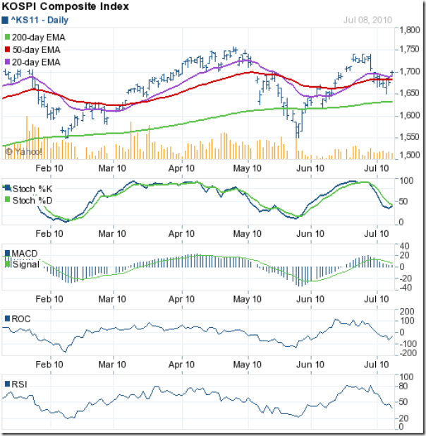
Kospi_Jul0910

The chart pattern of the KOSPI (Korea) index hadn't quite shaken the bears off when I last looked at it a month back. It did so shortly thereafter and soared up to test the Apr '10 top of 1758, but fell short of the 1750 mark.

The bears attacked and pushed the index below the 20 day and 50 day EMAs. The KOSPI got support from the 1650 level, and stayed above the 200 day EMA. Today's close at 1723 may lead to a test of the Jun '10 high of 1741 next week.

The technical indicators are giving bearish signals. The slow stochastic is below the 50% level. The MACD is barely positive and below the signal line. The ROC is in negative territory. The RSI is below the 50% level and falling.

Bottomline? The chart patterns of the Asian indices are trying to display varying signs of strength. The Shanghai Composite remains in a bear market. The Hang Seng is on the border between bull and bear country. The KOSPI is in bull territory, but things could change in a hurry. Investors should wait and watch till a clearer trend emerges.

Thursday, July 8, 2010

Gold Chart Pattern: more correction on the cards?

Last month, I had used the 'Bank Customer Services Representative's Behavioural Index' to surmise that the gold chart pattern was near a market top. Commodities and precious metals investors or traders need not be unduly concerned about this particular index, because it is a figment of my imagination.

The young lady at my bank branch - who usually tries to sell me the bank's Mutual Fund and insurance products - tried to sell me gold coins and even a gold 'biscuit' last month. Her unsuccessful sales pitch concluded with the plea: Every one is buying!

When every one is buying, I like to sell. But I don't have any investments in the yellow metal or in gold ETFs. So the next best thing was to caution investors from buying near what was obviously a market top.

In last month's analysis, I had observed a symmetrical triangle consolidation pattern in the gold chart, from which I expected an upward break out. A look at the 1 year gold chart pattern will show that the upward break out was followed by a new 52 week high:

Gold_Jul2010

Gold's price used the 14 day MA as a ramp as it rose to touch a high of 1261. The bears pounced almost immediately. The price dropped to the 14 day MA and after a brief bounce, fell sharply to the 1200 mark.

After another brief bounce up, gold's price has slipped below the 1200 level. At the time of writing this post, the price of the yellow metal is near the 1190 level. There is support at the 1160 level and then at the 200 day MA at 1120.

Note that the price has not dropped to the 200 day MA in more than a year. It is quite possible that the chart will bounce up towards the falling 14 day MA, as it doesn't appear to enjoy staying below the short-term moving average for any length of time.

There are still a lot of gold bulls out there - including well-known investors like Jim Rogers. There is no reason to doubt that the bull market in the gold chart pattern is robust and healthy, and will remain so as long as the 200 day MA is rising below the price chart.

The correction from the recent top is less than 6%, and a further drop to the 1160 mark may provide an opportunity to enter. I still have the feeling that much of the recent spurt in prices has been due to panic buying by investors who are worried about a further deterioration in the global economy.

The growth in the global economy has been tepid at best, but it is a growth and not a contraction. As production and consumption slowly limp back to normal in the European and US economies, much of the panic buying in gold may get unwound.

It may not happen tomorrow, or in the near future, but it may be a sharp unwinding when it does happen. As in any good investment strategy, stick to your asset allocation plan - where gold's percentage allocation should be in the 5-10% range.

Wednesday, July 7, 2010

Stock Chart Pattern - Sesa Goa (An Update)

The previous analysis of the stock chart pattern of Sesa Goa was written in Aug '09 at a time when the stock was taking a breather after a splendid rise from its bear market low. The stock had closed at 218 and the technical indicators were hinting at some more correction.

But the stock was near its 50 day MA, a likely support. Coupled with the strong fundamentals - high margins, strong cash flows from operations, good sales growth, regular dividends, low debt - led me to conclude as follows:

'The stock chart pattern of Sesa Goa is showing some weakness. Investors can use the opportunity to enter by buying small quantities at every dip.'

Let us have a look at the 1 year bar chart pattern of the Sesa Goa stock to see how this iron ore export company is faring:

Sesa Goa_Jul0710

There are several technical points worth noting. I will cover them one by one starting from the bottom left to the top right of the chart.

The bearish 'rounding top' formation during Jul and Aug '09 saw the stock correct down from 259 to 208 - just below the 50 day MA. The correction retraced only 27% of the rise from 71 to 259, which meant that the bull market in the stock was in tact.

After getting support from the up trend line, the Sesa Goa stock embarked on the next leg of its rally - making higher tops and higher bottoms, and getting support from the 20 day MA, 50 day MA and the up trend line - till it hit 493 in Apr '10.

The correction that followed was forewarned by the MACD and the RSI, which were making lower tops as the stock was making higher ones. The stock subsequently entered a 'symmetrical triangle' consolidation pattern.

Triangles can be fickle - they can break upwards, or downwards, or even fizzle out by moving sideways through the apex. But in this case, the most likely move will be down. Why?

Triangles are usually continuation patterns - which means the break out should be in the same direction that the stock was headed prior to entering the triangle. The stock moved down into the triangle from a top.

The break-out criteria has also been met - touching the falling trend line twice (marked by 1 and 3) and the rising trend line twice (marked by 2 and 4). The stock has not yet reached the apex of the triangle. So, we can expect the stock to break downwards from the triangle soon.

The most important bearish indication is that the 50 day MA has crossed below the 200 day MA - the 'death cross' in technical parlance. Near term down side targets will be the previous tops at 285 and 259.

The technical indicators are bearish. The slow stochastic has entered the oversold zone. The RSI is below the 50% level and sliding. The MACD is below the signal line in negative territory.

Bottomline: The stock chart pattern of Sesa Goa is a good example of how a fundamentally strong stock can turn technically weak. Metal stocks are cyclical and the way investors can make money on them is to do longer-term trading. Book part profits on the break down from the triangle (or on any subsequent pull back) and re-enter at lower price points.

Tuesday, July 6, 2010

Strategies for buying and selling stocks and mutual funds – analysis of readers' exercise (Part II)

Last week, I had analysed the first three questions of the readers' exercise about strategies for buying and selling. Today, the balance three questions are being addressed. To jog reader memories, and for the benefit of those who missed the earlier posts, here are the last three questions:

Q4. You had bought 500 shares of a small cap company about 2 months back. After stagnating for a while, the price recently shot up by 25%. Will you:

(a) sell all 500 shares and book short-term profits?

(b) sell 250 shares and reduce your holding cost on the balance shares?

(c) hold on for higher prices?

(d) buy another 200 shares at the 25% higher price?

Q5. You had bought 1000 shares of another small cap company about 6 months ago. The stock has been stagnating since then. A recent announcement of 20% dividend and a stock-split perked up the price by 10%. Will you:

(a) use the up-tick in price to sell out?

(b) wait for the dividend and stock split and then decide?

(c) buy another 250 shares at the 10% higher price?

Q6. You have been holding a well-managed mid cap MNC company's stock for a couple of years. The company recently announced delisting of its shares from the stock exchanges at a buy-back price that was 15% higher than market. Subsequently the price has spurted by 30%. Will you:

(a) hold on with the hope that the company may increase the buy-back price?

(b) sell your entire holding at the current market price?

(c) sell 80% of your holding now, but keep 20% aside in case the company increases the buy-back price?

(d) sell to the company at the announced buy-back price?

------------------------------------------------------------------------------------

Q4 and Q5 appear similar, but I would like to point out the differences. Small cap stocks are inherently risky because few analysts cover them and there is little information publicly available about their operations.

As small investors, it should be our primary goal to reduce the risk of losses. A spurt of 25% in 2 months is equivalent to an annual gain of 150%. The logical answers should be (a) or (b). Option (c) won't reduce the risk. Option (d) will increase the risk by buying more at a higher price.

If you have read my post about 'How to use Financial News', you will know that dividend and stock-split announcements can be classified as 'good news'. The effect of such news on the stock's price is temporary - lasting not more than 2-3 days - so it doesn't make much sense to trade on it. So, the logical answer should be (b).

A few words about stock-splits and bonus issues may be in order. In small caps, unscrupulous promoters often announce splits or bonus to jack up the stock's price through circular trading, only to cash out at the higher price and leave small investors in the lurch.

But reputed promoters either use stock splits to increase liquidity of high-priced stocks, or announce bonus shares to indicate that the company is in good enough financial health to shoulder the liability of the increased equity capital.

Theoretically, stock splits and bonus issues do not add to investor wealth because the stock's price gets adjusted after the split/bonus. But what actually happens in the market is beneficial for investors who hold for the longer-term.

Once the increased number of stocks following the split/bonus is credited to investor accounts, there is a tendency towards some selling, which reduces the split/bonus adjusted price some more. After a few months, the selling subsides and the stock price starts to move up again.

For well-managed companies, the price eventually surpasses the split/bonus adjusted price. Typically, a dividend paying company reduces the per-share dividend according to the split/bonus ratio, so that the dividend received by investors prior to the split/bonus remains the same.

Over the next few years, if the per-share dividend is increased (which is often the case), investors gain on both capital account and dividend account without investing a single paisa.

For the last question, option (b) should be the logical answer. Options (a) and (c) are speculation and not investment options. Option (d) leads to capital gains tax as per current rules, since selling to the company does not incur STT (securities transaction tax).

If the stock is infrequently traded, and an investor holds a large chunk, then option (b) may not be practical. Investors would have no choice but to sell the shares back to the company.

--------------------------------------------------------------------------------------

A Clarification about subscribing to my Monthly Investment Newsletter

The recent announcement of re-opening of a limited number of subscriptions to my Monthly Investment Newsletter has received a very encouraging response from readers, several of whom have signed up already.

Some readers who received and read my FREE eBook: 'How to become a better Investor', may have assumed that the subscription to my Monthly Investment Newsletter was also free. It isn't. It is a pre-paid subscription. I do regret any confusion.

If you are interested in subscribing to the Monthly Investment Newsletter, send me an email at mobugobu@yahoo.com for details. But do so at the earliest. Subscriptions will close on July 21, 2010.

Monday, July 5, 2010

Dow Jones (DJIA) Index Chart Pattern - Jul 02, '10

The chart pattern of the Dow Jones (DJIA) index is becoming more bearish with each passing day. I had mentioned about a possible upward bounce last week, as the index had closed near a long-term support level. No such thing happened.

Technically, a 20% drop from the Apr '10 top of 11309 (i.e. to 9047) will confirm a bear market. The other indicator confirming a bear market is what is called the 'death cross' - when the 50 day EMA drops below the 200 day EMA.

Both of these technical confirmations are still awaited. But one look at the 1 year bar chart pattern of the Dow Jones (DJIA) index will leave no doubts that the index is back in a bear market:

Dow_Jul0210

The Dow has made a head-and-shoulders bearish pattern - with the left shoulder at the Jan '10 top, the head at the Apr '10 top, the right shoulder at the Jun '10 top and the neck line passing through the bottoms made in Feb '10 (9823) and May '10 (9756).

Head-and-shoulders patterns are fairly reliable at indicating trend reversals, and also provide price targets. For ease of calculation, let us assume that the head is at 11300 and the neck line at 9800. The down side target is calculated as follows:

Head to neck line distance = 11300 - 9800 = 1500; target below neck line = 9800 - 1500 = 8300.

The index closed last week at 9686. That means it has penetrated the neck line, but the 3% 'whipsaw' lee-way means the downward break will get confirmed once the Dow falls below 9500.

We can also use Fibonacci retracement levels to calculate down side targets. The rise from the Mar '09 low of 6531 to the Apr '10 peak of 11309 was of 4778 points. A 38.2% Fibonacci retracement gives a target of 9484. A 50% retracement gives a target of 8920. A 61.8% retracement gives a target of 8356.

Note that market players are aware of these levels and bulls are likely to defend them. That means upward bounces are quite likely from the 9500, 8900 and 8300 levels. Bears will use such bounces to press sales.

The technical indicators are all bearish. The 50 day EMA is still above the 200 day EMA, but the 'death cross' is imminent. The slow stochastic is in the oversold zone. The MACD is below the signal line, and falling in negative territory. The RSI is about to drop into the oversold zone.

Note that the RSI peaked in Mar '10 - more than a month before the Dow peak in Apr '10 - and after remaining in the overbought zone for several trading sessions, started falling. The negative divergence was an advance warning of the correction to follow.

Bottomline? The chart pattern of the Dow Jones (DJIA) index is making lower tops and bottoms, and is well below the 200 day EMA. It is likely to enter a technically confirmed bear market soon. This is not the time to buy the dips, but to sell on rises. Patient investors should wait for lower entry points.

Sunday, July 4, 2010

Stock Index Chart Patterns - FTSE 100, CAC 40, DAX - Jul 02, '10

FTSE 100 Index Chart

FTSE_Jul0210

Only one conclusion can be drawn from the chart pattern of the FTSE 100 index: the penny has finally dropped - in technical parlance, the 50 day EMA has slipped below the 200 day EMA - and it is all over bar the shouting for the bulls.

All three EMAs are moving down with the index below them. The slow stochastic has entered the oversold zone. The MACD is below the signal line and falling in negative territory. The RSI is about to enter its oversold zone. The MFI is just below the 50% level.

But a couple of slivers of sunlight are peeking through the dark clouds. The index is nearly 300 points below the 20 day EMA, and may lead to a pull back. Both the MACD and MFI are showing positive divergence as they made higher bottoms while the FTSE 100 made a lower one.

Any pull back attempt by the bulls is likely to be used as selling opportunities by the bears.

DAX Index Chart

DAX_Jul0210

Last week, the falling DAX index chart pattern had received support at the 50 day EMA, and I had surmised as follows:

'The index found support from the 50 day EMA and it is possible that the bulls may use that to start another rally. The technical indicators are not supporting such a possibility.'

Note how the index bounced up from the 50 day EMA and even closed above the 20 day EMA. The bears attacked immediately and pushed the DAX all the way down to seek support from the 200 day EMA. The 20 day EMA is about to drop below the 50 day EMA.

The technical indicators are suggesting that the DAX will be formally entering a bear market in the near term. The slow stochastic has fallen to the edge of the oversold zone. The MACD is below the signal line and has turned negative. Both the RSI and MFI are below their 50% levels.

A bounce up from the 200 day EMA won't be surprising and can be used to sell.

CAC 40 Index Chart

CAC_Jul0210

The CAC 40 index chart is sinking deeper into bear country, and has stopped just short of the May '10 low of 3288. That, and the positive divergences in the MACD and MFI are the last hopes for the bulls.

Any pull back is likely to be short-lived. The slow stochastic is at the edge of the oversold zone. The MACD is below the signal line and falling in negative territory. The RSI is below the 50% level. Only the MFI is above the 50% level, and holding out faint hope.

Bottomline? The chart patterns of the European indices are ringing 'game over' for the bulls. Sell on rises, or, follow the sentiment expressed in an old Jethro Tull song: 'I really don't mind if I sit this one out'.

Saturday, July 3, 2010

BSE Sensex Index Chart Pattern - Jul 02, '10

In last week's analysis of the BSE Sensex index chart pattern, I had surmised that the hike in the oil prices may be followed by an increase in the interest rates by RBI. As if on cue, the already double-digit inflation (that keeps going up instead of falling) has led to a 25 basis points (0.25%) increase in repo and reverse repo rates.

The rate increases were announced after trading hours on Friday. Will there be a negative fall out in the market on Monday? The rate increase is small enough for the market to take it in its stride. Or, it may act as a trigger for the bears to press fresh sales.

Last week's trading saw alternate days of higher and lower closes till Friday's lower close of 17461 broke the pattern, as the Sensex closed more than 100 points lower on a weekly basis.

The index is poised on the 20 day MA. Bulls will hope for a bounce upwards. The Sensex has been an island of strength amidst collapsing Asian, European and US indices. How long will it be able to swim against the tide? A look at the 10 months bar chart pattern may give us some clues:

SENSEX_Jul0210

The Sensex continues to consolidate in the broader trading range between 15300 and 18000. Last week, I had mentioned about four bearish possibilities. A variation of the head-and-shoulders trend reversal pattern happens when multiple shoulders get formed - prolonging the agony of investors.

In the chart above, I have marked the Oct '09 top as 'LS1' (i.e. the first left shoulder) and the Jan '10 top as 'LS2' (i.e. the second left shoulder). The Apr '10 top is marked as 'H' (i.e. the head) and the recent Jun '10 top as 'RS1' (i.e. the first right shoulder).

If this pattern plays out, we may get to see a second right shoulder after 2 or 3 months. In which case, it is possible that the Sensex may bounce up from the 20 day, or 50 day, or 200 day MA, or even the 'neck line'.

The head-and-shoulders is usually a reliable trend reversal pattern. But like any pattern in technical analysis, there is no certainty - some times expected patterns, which appear to have formed, actually end up failing.

That means, there is a possibility of the Sensex moving up and making new highs from here. The technical indicators have turned bearish and the probability of an immediate up move is low.

The slow stochastic is below the 50% level and dropping fast. The MACD is in positive territory but has given a bearish cross below the signal line. The RSI has fallen sharply from its overbought zone to the 50% level. The bulls will take heart from the 200 day MA which is moving up with the index 400 points above it.

Bottomline? The chart pattern of the BSE Sensex index is poised at a crucial support, but looking weak. If the 'neck line' of the probable head-and-shoulders pattern is broken, there will be a much deeper correction. Till then, there is no cause for panic. Any buying should be on a very selective basis.