Tuesday, March 30, 2010

The Sensex fell 120 points - is it time to hit the panic button?

Regular readers of this blog will not even think about hitting the panic button just because the Sensex fell 120 points. They would have heeded my recent advice about being prepared for a possible correction as the index approached the Jan '10 top.

Probably just routine profit booking after four straight up days. May be even an effort by bulls to trap the bears. Why? Because the FIIs were net buyers even today and market breadth was positive after several days. That means, index heavyweights were sold (e.g. Infosys, HDFC) which pushed the index down and stocks outside the index were bought.

However, the fact that the Sensex tested the Jan 6 '10 top of 17790 two days in a row and briefly crossed it to hit 17793 on Mar 29 '10 before retreating by 200 points could also be a sign that an intermediate top has been made. So the index could be heading down soon.

The advance-decline line is showing a huge divergence with the Nifty index (thanks to reader Sanjeev - who sent me the link to the chart at the icharts.in site):-

Nifty A-D line_Mar3010

Note that during Sept and Oct '09 there was a wide divergence between the falling A-D line and the rising Nifty index which culminated in a sharp correction.

From Nov '09 to Feb '10, the Nifty index and the A-D line moved together in lock-step. Post the budget, the Nifty index has soared while the A-D line has plummeted. Such a situation is unlikely to continue much longer.

Investors can play this three ways:

  1. Book profits and wait for the correction to re-enter. That will be the riskiest way.
  2. Book partial profits to generate some cash that can be redeployed during the correction. Less risky.
  3. Stay invested with strict stop-losses - say, around 5150 for the Nifty and 17200 for the Sensex. Of course, this assumes that you are invested in index funds or index ETFs.

For individual stocks, the stop-loss levels should be placed at the previous (lower) tops. If the Sensex resumes its rally, remember to maintain trailing stop-losses.

(If you don't understand how to set stop-loss levels or what is a trailing stop-loss, you should read my FREE investment eBook.)

Related Post

Why you should forget about the Sensex and Nifty and look at the Advance-Decline (A-D) line instead

Monday, March 29, 2010

Dow Jones (DJIA) Index Chart Pattern - Mar 26, '10

Last week I had mentioned the possibility of a period of consolidation or a correction because of the high volume reversal day pattern in the Dow Jones (DJIA) index chart at the end of the week. I had also advised investors to stay invested with trailing stop-losses, as this liquidity driven bull rally has defied all bearish technical indications.

A high volume distribution pattern occurred on Thursday - the open and close levels were near the lowest point of the day while the index hit a new high of 10985.  A few more such days and the up move may get reversed - which will actually be good for the long-term sustainability of the bull market.

The Dow closed the week at 10850 - more than a 100 point gain on a weekly basis. The bulls are in complete control and the bears must be thinking about going into hibernation just when the nice weather is around the corner.

Let us take a look at the 6 months bar chart pattern of the Dow Jones (DJIA) index:-

Dow_Mar2610

All three EMAs are moving up with the index above them. Volumes have been decent. The slow stochastic is still in the overbought zone. The RSI is starting to drop below the overbought zone. The MFI is moving sideways at the edge of the overbought zone. The MACD is positive and above the signal line, but has stopped rising.

The last hope for the bears remains the 11100 level - which is the 61.8% Fibonacci retracement level of the entire bear market fall. Coincidentally, the 3% whipsaw leeway for crossing the Jan '10 high of 10767 is 11090. The bulls need to convincingly go past the 11100 level for the bull rally to reach new heights.

Bottomline? The Dow Jones (DJIA) index chart pattern is approaching a technically critical level, so it will be wise to remain cautious. The trick to making money in bull markets is to stay invested but maintain trailing stop-losses - specially near previous tops and technical levels. Buy only after a correction or selectively after the Dow crosses 11100.

Sunday, March 28, 2010

Stock Index Chart Patterns - FTSE 100, CAC 40, DAX - Mar 26, '10

FTSE 100 index chart

FTSE_Mar2610

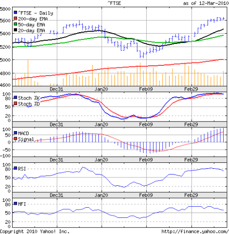
There is only one possible conclusion that can be drawn from the FTSE 100 index chart pattern - it is all over for the bears, bar the shouting. The index made another new high of 5737 before ending the week just above the 5700 mark. A higher weekly close of 53 points.

All three EMAs are moving up, up and away with the FTSE index well above them. The slow stochastic is firmly inside the overbought zone. But the other three technical indicators are showing some signs of weakness that could trigger a correction.

The MACD has stopped rising and is touching the signal line. The RSI has dropped from the overbought zone and failed to make a new high with the index. The MFI also did not make a new high and has dipped a little.

For all the bears out there, who are ready to throw in the towel, here are a few glimmers of hope. To convincingly clear the Jan '10 high of 5600, the 3% leeway for whipsaws have to be applied. That gives a target of 5768, which hasn't been crossed yet.

There is an outside chance of the FTSE 100 developing a bearish head-and-shoulders pattern - with the left shoulder formed in Jan '10. The head is currently being formed, and we will be more certain of the possibility if the index drops below the Jan '10 high of 5600. A fall to the 200 day EMA followed by a bounce upwards will confirm the formation of the head.

In technical analysis there are no certainties, but one should remain aware of the possibilities before plunging in feet first.

DAX index chart

DAX_Mar2610

The bulls are back in control as the DAX index chart went past the Jan '10 high of 6094, touched 6140 before closing the week at 6120 - a weekly gain of 38 points.

The slow stochastic remained in the overbought zone. The MACD is rising and is above the signal line. The RSI slipped below the overbought zone before rising back up, but made a lower top. The MFI also made a lower top as it slid down to the 50% level.

All three EMAs are rising and the index is above them. So the bulls have no immediate concerns. The rounding bottom pattern - visible clearly in the 20 day and 50 day EMAs - is a bullish sign.

CAC 40 index chart

CAC_Mar2610

The CAC 40 index chart pattern is looking stronger than last week, but has so far failed to go past the Jan '10 high. It managed to edge past the 4000 mark before closing the week at 3989 - 64 points higher for the week and still nearly 100 points below the Jan '10 high.

The slow stochastic is in the overbought zone. The MACD is positive and just above the signal line. The RSI has dropped from the overbought zone and is headed down. The MFI is looking the weakest, as it has slipped below the 50% level.

The three EMAs are moving up with the index above them. It is a matter of time before the index emulates its European neighbours in making a new high.

Bottomline? The chart patterns of the European indices are looking bullish. The negative divergences in the RSI is the only concern. Stay invested with trailing stop-losses and be very selective in buying.

Saturday, March 27, 2010

BSE Sensex Index Chart Pattern - Mar 26, '10

A week that was shortened by a holiday and included the monthly F&O expiry seemed to have little effect on the bull rally. The BSE Sensex index chart continued to climb up, fed by strong FII inflows.

The Sensex closed higher for the seventh straight week, gaining more than 1850 points, and is only 145 points below its Jan '10 high of 17790. It is only a matter of days before the previous high is tested and crossed.

Till that happens, there remains a possibility - however remote - of the Sensex facing resistance at its previous high and correcting sharply. What is causing this circumspection? It is the low volume of transactions.

Ever since the election results back in May '09, the Sensex has been moving up on progressively lower volumes. Watch out for a sudden spurt in volumes as the index tries to make a new high. It could be an indication of buying exhaustion following which the index could plummet.

Technical analysis is not a science and therefore doesn't work according to formula. But it helps to provide a different perspective to the market situation. Just when investors get convinced about the continuation of the upward move, the bears usually strike hard.

There is no certainty that such a quick turnaround in sentiment will happen at all. But if it does, then you should not be the one holding high priced stocks at a market peak.

Let us have a look at the 6 months bar chart pattern of the BSE Sensex index:-

Sensex_Mar2610

The technical indicators are looking strongly positive. All three EMAs are moving up with the Sensex well above them. The slow stochastic is comfortably inside the overbought zone. The MACD is positive and above the signal line, but the upward momentum has slowed down. The RSI dropped from the overbought zone but is trying to move back in again. The MFI bounced off the 50% level, but is not looking as strongly positive as the other indicators - reflecting the low volumes.

Bottomline? The chart pattern of the BSE Sensex index is getting close to its previous high. Stay invested, maintain tight stop-losses and enjoy the good times. But be prepared for a sudden bear attack - even if it seems unlikely from the chart pattern.

Friday, March 26, 2010

Stock Index Chart Patterns - Shanghai Composite, Taiwan TSEC, Hang Seng - Mar 26, '10

Shanghai Composite index chart

ShanghaiComp_Mar2610

The chart pattern of the Shanghai Composite index shows another week of inconclusive struggle as the bulls failed to clear the resistance of the 50 day EMA and the bears were unable to break the support of the 200 day EMA.

The indecisiveness is evident from the three EMAs. The 20 day EMA is moving sideways. So is the 200 day EMA. The 50 day EMA is still falling but looks like it is flattening out.

The slow stochastic moved above the 50% level but wants to head down. The MACD is marginally negative and touching the signal line. The ROC has dropped into the negative zone. The RSI has edged above the 50% level.

The index ended about 8 points lower on a weekly basis, but closed above the 3000 level on all 5 days. Expect more sideways consolidation to continue before this fight finally gets resolved. The bears seem to be ahead on points.

Hang Seng index chart

HangSeng_Mar2610

Last week, I had mentioned about the significance of the level of 21441 in the Hang Seng index chart pattern, which was touched twice before the index retreated and closed lower. This week the index didn't even come close to the 61.8% Fibonacci retracement level of the entire bear market fall.

The Hang Seng index closed below the psychological level of 21000 thrice during the week before today's up move helped it to close the week at 21053 - more than 300 points lower on a weekly basis.

The technical indicators have turned weaker. The 20 day EMA remained merged with the 50 day EMA almost exactly at the 21000 level. The 200 day EMA is almost flat.

The slow stochastic dropped from the overbought zone to the 50% level. The MACD is positive but falling and just hanging on to the signal line. The ROC has dipped into the negative zone. Only the RSI is showing some strength as it bounced off the 50% level.

Taiwan (TSEC) index chart

TSEC_Mar2510

Four weeks ago, the Taiwan (TSEC) index chart pattern was looking quite weak as the bears had a firm grip on the situation. The bulls have staged a decent recovery with a higher-tops higher-bottom bullish pattern. The resistance from the 7500 level has been cleared convincingly, but the TSEC is still more than 500 points below its Jan '10 high of 8395 and closed lower on a weekly basis.

The TSEC technical indicators look much stronger than those of its mainland counterparts. The slow stochastic is in the overbought zone. The MACD is positive and above the signal line. The ROC has managed to remain positive. The RSI twice reacted from the overbought zone but is heading up again.

Bottomline? The chart patterns of the Asian indices are still fighting hard to fend off the bears. The Jan '10 highs remain tough hurdles. Stay invested with strict stop-losses. Buying should start only when volumes pick up during up moves.

Thursday, March 25, 2010

Do you invest with your head, or do you invest with your heart?

One of the building blocks - may be the most important one - of becoming a successful investor is to know yourself. To help you understand if you invest with your head or your heart, here are some practical situations that you are likely to face:-

1. March is usually the time for last-minute tax-saving investments. So you start looking at some ELSS funds. You hold the SBI Magnum Tax Gain fund since Mar '07. It was one of the best ELSS funds then and gave good dividends.

Your head tells you to sell it because of its recent under-performance and switch to Canara Robeco Tax Saver or DSPBR Tax Saver. Your heart urges you to stick with it as it will surely return to its earlier glory.

2. The Nifty is trading just short of its Jan '10 high for the past 6 trading sessions. Your head is saying 'be careful' because a previous top made some time ago can be a tough hurdle to cross. Your heart is saying 'a new high is imminent' and this is the time to jump in.

3. You had made a killing in the Bharti Airtel stock when you sold part of your holdings when it hit 1200 (pre-split) back in 2007. The rest of your holding effectively became 'free of cost'. Ever since, the stock has been sliding, but you held on because your holding cost was zero.

Your head is urging you to get rid of it, as the entire telecom services space has lost its pricing power with the entry of big global players. Your heart is forcing you to hold on because Bharti has proven management and the stock will definitely move above 500 soon.

4. Your decision to pick up OnMobile Global shares at 250 in Mar '09 turned out to be a really judicious move, as the stock zoomed to hit 700. Out of the blue, the bears attacked and the stock halved in value to 350.

Your head is accepting the fact that you got a lucky break initially, but you goofed by not booking profits at 700. Your heart is considering it as plain bad luck that your smart pick suddenly changed direction through no fault of yours.

5. You read my blog post about Indraprastha Gas back in July '09 when the stock was trading at 137. I had mentioned a possible target of 180. You decided to spend some time to research the stock thoroughly. But within a month, before you could gather sufficient details, the stock hit 180.

Your head told you to wait for better valuations. Your heart decided that you should buy before the stock runs away even higher.

6. Cranes Software was a hot stock in the previous bull market. It sold engineering software products to overseas clients and made huge profits. Because of the down turn, the stock hit the skids but at 45 it seemed like a screaming buy.

Your head warned you not to try and catch a falling knife. Your heart ignored the warning as the downside seemed very limited, and you bought a large chunk and then averaged down at 30.

If you are like most investors, you some times invest with your head and at other times invest with your heart. There are no guarantees which will be a better investor - your head or your heart. Logically, for long-term investors, the head should rule the heart. But stock markets can be illogical in the short-term.

Wednesday, March 24, 2010

Stock Chart Pattern - Voltas Ltd (An Update)

My previous look at the stock chart pattern of Voltas Ltd was back in June 2009. The stock of this fundamentally strong infrastructure company from the Tata group had a one way ride from the low of 31 in Mar '09 to a high of 146 in Jun '09 and was pausing to catch its breath at 122.

The technical indicators were hinting at a further correction down to the 90-100 zone, which could have provided a decent entry point for new investors who had missed the first part of the rally. It is time for an update, so let us have a look at the 1 year bar chart pattern of Voltas Ltd:-

Voltas_Mar2410

The very next day (Jun 18 '09) after I wrote about the stock, it dropped to a low of 107, recovered and then tested the low by falling again to 109 on Jul 6 '09. That is the lowest price it has seen since, as it steadily moved up to make a high of 190 on Jan 20 '10.

A sharp correction took the stock down to the 150 mark, where it received strong support from a long-term support-resistance zone (145-150). A couple more tests of the support was followed by a sideways consolidation from which it has broken out upwards this week to touch a high of 180.

The 20 day EMA has moved above the 50 day EMA after spending a few days below it. The 200 day EMA is moving up nicely. The OBV remained pretty flat during the recent correction. The MACD has re-entered positive territory and is above the signal line. The RSI is rising above the 50% level. The technical indicators are hinting at a test of the recent high.

In the longer term 3 years chart, the stock made a mountain-like pattern from which most small and mid-cap stocks face a tough time in recovering:-

Voltas_Mar2410_2

From the high of 267 made in Dec '07, the stock dropped a massive 88% to the low of 31 in Mar '09. The subsequent recovery to 190 in Jan '10 has already retraced 67% of the entire bear market fall.

The 61.8% Fibonacci retracement level of the entire bear market fall is at 146. Isn't it amazing that the stock had reacted exactly from this level back in June '09, and failed to clear that level convincingly till Aug 25 '09? No wonder in technical parlance the 0.618 ratio is some times called the 'golden ratio'.

Valuation wise the current stock price does not leave much in terms of 'margin of safety'. The Dec '09 quarterly result was nothing to write home about - both sales and profits were down quarter-on-quarter. But this conservatively managed company will surely return back to the growth path in the near future.

Bottomline? The stock chart pattern of Voltas Ltd is showing resilience at the 150 level. Existing holders can place a stop-loss at 150 and remain long. New entrants can use any dips to the 150 level to enter, with a tighter stop-loss. Those who are stuck in debt-ridden, operating cash flow negative stocks, like Punj Lloyd, can make a switch.

Tuesday, March 23, 2010

Why you should forget about the Sensex and Nifty and look at the Advance-Decline (A-D) line instead

The Advance-Decline line is very simple to construct and the starting point can begin from any day. Why should one use it? The Sensex comprises only 30 stocks, and the Nifty comprises 50 stocks. Mostly these are large-cap shares. They are supposed to represent the overall stock market.

But the stock market trades a few thousand shares every day - mostly mid-cap and small-cap stocks which are preferred by small investors. So looking at an index of 30 or 50 large cap stocks may not provide the complete picture.

The BSE 500 index comprises 500 shares, and may be more representative of daily market trading action. But it is not a popular index. Technical analysis experts on business channels and the pink papers mostly rely on Sensex or Nifty levels in trying to gauge the state of the markets.

The Advance-Decline line is a proper market breadth indicator. Which means it gives the real picture of what happens every day about all the stocks traded on that particular day. Not the 30 or 50 or 500 that make up different indices.

The calculation is so simple that a school-going child can figure it out:-

A-D line = (No. of advancing stocks - No. of Declining stocks) + previous day's A-D line value

Let us say we want to start from today, when the total number of shares that advanced in value in today's trading was 1323 and the total number of shares that declined in value was 1600. So the value of the A-D line for today is (1323 - 1600 =) -277.

To avoid dealing with negative numbers, we can start with an arbitrary large number like 10000. In which case, today's A-D line value will be (10000 - 277 =) 9723. Wednesday is a trading holiday, so Thursday's value of the A-D line will be 9723 + (No. of advancing shares - No. of declining shares).

The A-D line can also be expressed as a ratio:-

A-D ratio = {(No. of advancing stocks - No. of declining stocks)/Total no. of stocks traded} + previous day's A-D ratio

Now that we know all the arithmetic behind the A-D line, how do we make use of it? Very simple. During bull markets, the A-D line is supposed to rise. During bear markets it is supposed to fall. But what we are really interested in is any divergences.

If the Sensex or Nifty rises and the A-D line falls (like today), then it indicates poor breadth and a possible change of trend. Now one day's divergence can't be taken too seriously. But if the index continues to rise when the A-D line is falling, or vice versa, a trend reversal is the likely outcome.

We also look at divergences like the index making a new low while the A-D line makes a higher low, or the index making a new high while the A-D line makes a lower high.

As with other technical indicators, the A-D line is not fool-proof. It tends to work better at giving warnings about impending market tops (usually peaking before the index) rather than about market bottoms.

Unfortunately, none of the chart software I have access to include the advance-decline line indicator. So I'm not able to provide a practical example. However, the Advance-Decline (A-D) line indicator is so easy to construct, that a simple graph paper and pencil is all you need to draw it.

(If any reader has software that supports the A-D line, I'll be grateful if you can email me a Sensex with A-D line graph for the past 3 years. I'll post it with due acknowledgement.)

Monday, March 22, 2010

Dow Jones (DJIA) Index Chart Pattern - Mar 19, '10

In last week's analysis of the Dow Jones (DJIA) index chart pattern I had expected the bulls to try and extend the rally to test and surmount the Jan '10 high of 10767. The bulls did exactly that.

On the last three days of the week, the index moved above the 10767 mark, making new highs each day. But only on Thursday did it manage a close at 10779. Friday's trading created a reversal day pattern - a higher high but a lower close at 10742, on the highest volumes of the week.

Technically, this is a sign of buying exhaustion and could lead to a period of consolidation or a correction. The 10767 level has not been crossed convincingly yet, and bears have little option but to grab at that straw.

The 6 months bar chart pattern of the Dow Jones (DJIA) index shows that the bulls are well in control - whatever be the state of the economic recovery:-

Dow_Mar1910

All three EMAs are moving up with the index well above them. The slow stochastic has remained inside the overbought zone for three weeks. The MACD is rising in the positive zone and is above the signal line. But it failed to reach the Nov '09 high while the Dow made a new high - a negative divergence.

The RSI is well above the 80% level and is looking overbought. The last few times it touched the overbought zone and reacted down almost immediately. The MFI is also in the overbought zone, but trying to drop down.

There are other indications of a pause or even a reversal of the rally, because a surge in put or sell options in New York and a decline in call or buy options is a classic signal of a stock market trend reversal.

The economic recovery remains weak. Unemployment claims declined for the week while continuing claims expanded, signaling that layoffs are leveling off but that hiring or recalls have not begun in earnest.

Bottomline? The Dow Jones (DJIA) index chart pattern seems to be hesitating near its previous top, and a possible correction or a period of consolidation may be in the offing. Stay invested with strict trailing stop-losses.

Sunday, March 21, 2010

Stock Index Chart Patterns - FTSE 100, CAC 40, DAX - Mar 19, '10

FTSE 100 index chart

FTSE_Mar1910

The FTSE 100 index chart pattern brushed aside the bearish concerns raised last week and made a new high of 5691, but closed barely 25 points higher on a weekly basis. It also traded within a narrow range of 103 points - between the low of 5588 on Mar 15 '10 and 5691 on Mar 19 '10.

Volumes were significantly higher on Friday, which need not be too favourable for the bulls. Why? Because the index made a new high but closed just above the low of the day. That could well be a sign of buying exhaustion.

All three EMAs are moving up and the FTSE index is well above them. The slow stochastic is inside the overbought zone where it has remained for 3 weeks. The RSI has also entered the overbought zone where it has not spent much time of late and looks like it wants to come down. The MACD is in the positive zone and above the signal line, but it has finished slightly lower than a week ago. The MFI is moving up above the 50% level.

Everything looks favourable for the bull rally to continue, except for the negative divergence in the MACD and the slight sign of weakness in the RSI.

DAX index chart

DAX_Mar1910

The bulls continued to rule as the German DAX index chart came within 50 points of its Jan '10 high of 6094. But the high volume reversal day pattern (of higher high and lower close) formed on Friday keeps the possibility open for a double-top bearish pattern.

All three EMAs are moving up with the index above them. The slow stochastic and the RSI are both in the overbought zone. The MACD is positive and above the signal line. But the MFI has dipped down to the 50% level.

The bulls have continued their party in spite of the slow recovery in the economy, and they are in no mood to give up. But the previous high of Jan '10 needs to be cleared convincingly before the bears throw in the towel.

CAC 40 index chart

CAC_Mar1910

The French CAC 40 index chart pattern is looking a bit weaker than the DAX index as it failed to reach anywhere close to the Jan '10 high of 4088. The reversal day pattern on decent volumes on Friday indicates that the bulls may be running out of steam.

The three EMAs are moving up with the index above them, so the bulls are under no great threat. The slow stochastic is in the overbought zone. The RSI has dipped below the overbought zone and the MFI has dropped to the 50% level. The MACD is positive and above the signal line, but remained flat through the week.

Bottomline? The FTSE 100 index chart has moved above the Jan '10 high, but hasn't done that convincingly yet. The CAC 40 and DAX index charts are still struggling to reach new highs. The reversal day patterns could lead to a possible correction. Any buying should be done with tight trailing stop-losses. Investors may be better off sitting on the sidelines.

Saturday, March 20, 2010

BSE Sensex Index Chart Pattern - Mar 19, '10

In last week's analysis, I had observed the bullishness in the technical indicators of the BSE Sensex index chart pattern and concluded that the Sensex could gain some more.

Relentless FII inflows propelled the Sensex briefly above the 17600 level on Friday - less than 200 points away from the Jan '10 high of 17790. The index closed the week at 17578 - its sixth straight higher close on a week-on-week basis.

Looks like it's game over for the bears, doesn't it? A look at the 6 months bar chart pattern of the BSE Sensex index reveals some dark clouds that could pour cold water on the bull fervour:-

Sensex_Mar1910

It has been a one-way up move since the low of 15652 made on Feb 8 '10. All the three EMAs are moving up nicely with the index well above them. If the FIIs keep up their buying spree, the bears will get completely routed.

What about the dark clouds? Look at the volume bars. Except for a couple of big spikes, volumes have almost petered out. A sustainable bull rally requires strong volume pressure. This entire rally has been a tale of steadily decreasing volumes, which is technically suspect.

Next, the RSI. It is looking hugely overbought. Typically it reacts immediately after touching or entering the overbought zone. This time it is trying to play catch up with the slow stochastic, which has been inside the overbought zone for almost 3 weeks.

Next, the MACD which is rising and is above the signal line. But it is lower than the highs made in Sept and Oct '09, while the Sensex moved higher than its Sept and Oct '09 highs. Likewise, the MFI is also showing negative divergence.

So we have two indicators that are looking very overbought, and two that are showing negative divergence. Even if the previous high of 17790 is cleared, caution should be the watchword. If the previous high is not cleared, then the bulls may have a real problem on their hands.

A bearish double-top formation, with the two tops separated by nearly 3 months, could lead to a strong correction that could take the Sensex down to the 13500 level. There is no certainty that such a double-top will form - but investors need to be prepared for the eventuality.

The economy seems to be chugging along nicely, and growth is much better than that of the developed western economies. The advance tax numbers have been quite encouraging. But the inflation numbers are in double digits and the RBI took quick action to raise the repo and reverse repo rates to try and cool down any overheating.

Bottomline? The chart pattern of the BSE Sensex index is looking overbought. This bull rally has defied a wall of worries. Don't need to get out in a hurry. Stay invested but stay nimble. And most important of all, be patient.

Friday, March 19, 2010

Stock Index Chart Patterns - Shanghai Composite, Jakarta Composite, Hang Seng - Mar 19, '10

Shanghai Composite index chart

ShanghaiComp_Mar1910

In last week's analysis I had observed that the bears were gaining ground and expected a test of support from the 200 day EMA. The Shanghai Composite index chart dipped below the long-term moving average on the first two days of the week before recovering to move above the 20 day EMA. Once again, the bulls failed to get the index past the resistance of the falling 50 day EMA.

All the technical indicators have weakened a bit more than the previous week. The slow stochastic just about managed to move above the 50% level after dropping below it. The MACD is touching the signal line and remains in negative territory. The ROC is now in the negative zone, trying to clamber up. The RSI is at the 50% level.

The index closed 54 points higher week-on-week and stayed above the 3000 level. The question is: how much longer will the mauled bulls be able to fend off the bears?

Hang Seng index chart

HangSeng_Mar1910

The Hang Seng index chart slipped below the 21000 level on Monday and Tuesday, filling the gap formed last week. It bounced off the support from the 50 day EMA and hit a high of 21441 for the week before closing at 21371, with a modest week-on-week gain of 160 points.

The level of 21441 is almost exactly the 61.8% Fibonacci retracement level of the correction from the Jan '10 high of 22672 to the Feb '10 low of 19423.

The technical indicators are looking bullish. The slow stochastic is in the overbought zone. The MACD is rising in the positive territory and is above the signal line. The ROC is marginally positive and the RSI is moving up towards the overbought zone.

Jakarta Composite index chart

Jakarta_Mar1910

Four weeks back, the Jakarta Composite index was trying to recover from a bout of correction and looked like it wanted to correct some more. Instead, it went into a sideways consolidation just below the 2600 level.

An upward breakout from the range was accompanied by an increase in volumes as the bulls took charge. On Thursday, Mar 18 '10 the index hit a new high of 2779 accompanied by a smart increase in volumes. But it made a 'reversal day' pattern in the process (higher high but lower close) that could indicate buying exhaustion.

The slow stochastic is in the overbought zone. The MACD is rising in the positive territory and has moved way above the signal line. The ROC has dipped after touching the 200 mark. The RSI has just entered the overbought zone. However, note the negative divergences in the MACD and RSI which have failed to make new highs.

Bottomline? The chart patterns of the Shanghai Composite and Hang Seng indices are still struggling to extricate themselves from the bear's grip. The Jakarta Composite made a new high, but is looking overbought. Investors should remain on the sidelines and look for possible opportunities in beaten down sectors.

Thursday, March 18, 2010

How to overcome Uncertainty in Stock Market investing

Many investors shy away from investing in the stock market because of the uncertainty of making any profits. A fixed deposit in a bank or an investment in a PSU bond has much less uncertainty. You are pretty much assured of getting back your invested capital, as well as earning some interest income.

In the stock market, there is uncertainty about receiving any income because a company is not obliged to pay any dividends even if it is making super profits. For example, a profitable company like Bharti Airtel paid its first dividend only in 2009 - 7 years after going public.

And there is uncertainty about getting back your invested capital. If you had bought Bharti at 600 in Dec '06, and sold at today's closing price of 300 (2:1 split adjusted) you would have actually lost a small part of your capital due to brokerage and tax payments.

But these are uncertainties that can be managed and, to a certain extent, measured. What we term as 'risk' is nothing but the possibility of having an unfavourable outcome. We can try to reduce the risk by quantifying the uncertainty of the outcome. How?

Let us say, you plan to buy 100 Tata Steel shares @600. You assign a probability of 80% that the stock will test its recent high of about 650.  There is also a 20% probability that the stock may drop to its 200 day EMA at 520. That means a 80% chance that you will make 5000 but a 20% chance that you will lose 8000. Your risk of loss can be quantified as: (600-520)x100x0.20= 1600.

After looking at the numbers, will you still decide to buy Tata Steel at 600? There is no reason why you shouldn't - specially if you have learned to set a stop-loss for all purchases. (Don't know how to set a stop-loss yet? You have only yourself to blame - because it is clearly laid out in Chapter 2 of my FREE eBook.)

What stock markets dislike are uncertainties associated with external factors and events, such as rate of inflation, interest rates, quarterly earnings results, oil prices, war, terror attacks, political climate. Adverse effects of such uncertainties usually get reflected immediately with 2 or 3 days of correction. Smart investors use such dips to buy.

But the worst uncertainty is about the state of the economy. If there is a possibility of a recession or a depression, stock markets tend to tank as investors rush to the exit doors and invest their money in safer havens.

The best way to overcome the fear associated with uncertainty is to always stay well-informed about the business and economic environment around you. Most business magazines and newspapers have web editions that you can browse without leaving your seat. Also visit web sites like CNN Money, FT and WSJ Marketwatch to get an international perspective. Make it a daily habit.

Wednesday, March 17, 2010

Stock Chart Pattern - Bartronics India (An Update)

The reason for analysing the stock chart pattern of Bartronics India back in June 2009 was not because this small investors' and brokers' favourite was looking like a 'good buy'. It was to suggest to existing holders that it was time to say 'good bye' to the stock.

Why? The company is in a supposedly high-tech field with great growth opportunities. Technically also, the chart was looking impressive. But one look at the fundamentals painted a completely different picture. It supports my oft-repeated refrain that a stock should be bought only when the technicals and fundamentals are indicating a 'buy'.

The cash flow from operations for year ended Mar '09 improved considerably over the previous year, but still remained negative. Which means, the 10% dividend and the tax on 'profits' were paid out of borrowed money. No wonder the debt to equity ratio increased from 1.3 to 1.8 and financial expenses zoomed more than 5 fold from Rs 4 Crores to Rs 22 Crores.

That dented the NPM from 17.8% to 12.8%. Prudent management would not have declared a dividend on such worsening financials. May be it was an effort to improve sentiment and keep the stock price high. Guess what? It didn't work.

The 2 years bar chart pattern of Bartronics India shows that the stock has gone nowhere:-

Bartronics_Mar1709

Nine months back, the stock had closed at 165. Today it closed at 150. In between, it peaked at 194 in July 2009, made a trough at 130 in Nov 2009 and fluctuated within the 130-194 band.

The stock has sought support from the 200 day EMA several times and both the MACD (which is in the negative zone) and the RSI (which is below the 50% level) are showing weakness.

Only the OBV is showing positive divergence - moving up while the stock moved sideways. But looks can deceive. What looks like 'accumulation' is actually 'distribution'. Why? A look at the shareholding pattern will reveal all.

The Indian promoters (27% holding) and the FIIs (6% holding) have been reducing their holdings while the general public, which now holds a whopping 45% of the steadily rising equity capital, have increased their share over the previous two quarters. No better example of stocks moving from strong hands to weaker ones.

Bottomline? The stock chart pattern of Bartronics India and the fundamentals are looking quite weak. Get out before it is too late. Die-hard hopefuls should note the strong resistance zone between 180 and 195. Only a cross above the zone can take the stock to a new high.

Tuesday, March 16, 2010

Does real estate really qualify as an investment?

For most small investors with only a few lakhs to spare, investing in real estate is out of the question. If you want to buy a piece of land and build a house to live in, or buy an apartment for personal use - it really doesn't count as an 'investment'.

The online Merriam-Webster dictionary defines 'investment' as an outlay of money usually for income or profit. From that perspective, the house or apartment that you live in does not qualify as an investment because it neither produces any income (unless of course you rent out a portion) nor any profit (unless you sell it).

Buying a house and renting it out completely can qualify as an investment. Some people book or buy apartments only for the purpose of selling at a profit. This type of 'investing' requires serious amounts of money - upwards of Rs 3-5 Million - which puts it beyond the reach of small investors.

In several posts I've written about why investors should have an asset allocation plan (read Chapter 12: How to Reallocate your Assets in my FREE eBook) and then be disciplined about sticking to that plan. Several readers have asked me why I have not included real estate in an asset allocation plan.

The main reason is mentioned above - it costs too much. The other reason is the lack of liquidity. If you've ever tried to sell an apartment or a house, you will know that it is a long drawn out procedure with the involvement of property brokers, lawyers, local toughs (with each extracting their pound of flesh). Not to speak about the contrasting colours of money used in completing the transaction.

There are some real estate funds from HDFC, Kotak, ICICI. They are mostly targetted at high networth investors (HNIs) with a minimum investment of Rs 2.5 Million and are closed-ended funds of long duration that invest in real estate projects. Again, beyond the reach of most small investors.

ICICI has a hybrid real estate fund that invests in the equity and debentures issued by real estate companies like DLF, Purvankara and others but its performance is nothing to write home about. A couple of real estate venture capital funds have also been floated by DHFL (Dewan Housing) and Kshitij (Pantaloon) - meant for HNIs.

Last, but not the least, are stocks of real estate companies. Many such companies are emerging out of the woodwork of late with fancy-priced IPOs. They should be avoided like the plague. The leaders (in terms of market cap) like DLF and Unitech don't really have stellar reputations or track records either.

If you like and understand the real estate space (I don't) and want to invest in it, the best bet might be to go for stocks of companies that have already established a good reputation in other group activities - e.g. Godrej Properties, or Mahindra Lifespaces. The chances of incomplete projects or poor construction materials are likely to be less.

That was the long answer. The short answer is: it doesn't.

Monday, March 15, 2010

Dow Jones (DJIA) Index Chart Pattern - Mar 12, '10

The Dow Jones (DJIA) index chart pattern closed about 0.5% higher week-on-week but the index traded within a narrow band of 200 points and failed to get past the Jan '10 high of 10767.

An attempt by the bulls to push the index up to test and cross the previous high is very much on the cards. But remember that a failure to go past the previous high could lead to a bearish double-top pattern - a possibility that is present in the European indices as well.

The 3 months bar chart pattern of the Dow Jones (DJIA) index shows that the bulls are pretty much in control:-

Dow_Mar1210 

The 20 day EMA is now above the 50 day EMA and all three EMAs are rising with the index above them. The volumes have been quite decent as well. The only jarring note for the bulls is that except for Thursday's trade, the opening and closing levels of trade on the other four days were very nearly the same - indicating indecision.

The slow stochastic is inside the overbought zone and looks like it wants to stay there a while. The MACD is rising in positive territory and is above the signal line. The MFI is above the 50% level and rising slowly. The RSI is also above the 50% level but has dropped after touching the overbought zone, and showing negative divergence.

Looks like the economic stimulus had a very positive effect on the stock market. But it was supposed to stimulate the economy, wasn't it? How well has it done that so far? This article makes several important points to ponder about what will happen when the economic stimulus eventually gets withdrawn.

Bottomline? The Dow Jones (DJIA) index chart pattern is looking quite bullish but is nearing its previous top, which could be a likely resistance area. This is not a time for gung-ho buying. Wait for the previous top to be convincingly cleared.

Sunday, March 14, 2010

Stock Index Chart Patterns - FTSE 100, CAC 40, DAX - Mar 12, '10

FTSE 100 index chart

FTSE_Mar1210

In last week's analysis, it was observed that the FTSE 100 index chart had edged above the 5600 mark and closed exactly on this crucial level. The technical indicators were suggesting a continuation of the bull rally, but there were some bearish concerns that led me to conclude: 'The bears may try to stall, if not stop, the bulls.'

The FTSE 100 closed above the 5600 mark on all 5 days of trading but remained within a narrow range of 84 points - trading between the low of 5563 on Mar 9 '10 and the high of 5647 on Mar 12 '10.

The slow stochastic is well inside the overbought zone. The MACD is rising in the positive territory and remains above the signal line. But the RSI has moved down from the overbought zone and is showing negative divergence. So is the MFI, which is dropping towards the 50% level.

The up tick in volume on Friday was encouraging. All three EMAs are moving up with the FTSE 100 index more than 100 points above the 20 day EMA. The distance between the 50 day and 200 day EMAs is widening. A correction could lead to a bearish double-top chart pattern. The economic recovery is a lot slower than the bullish stock market seems to indicate.

DAX index chart

DAX_Mar1210

The bullish fervour continued in the DAX index chart, which soared towards the 6000 level and closed just about 150 points below the Jan '10 high of 6094. The 20 day EMA has crossed above the 50 day EMA and all three EMAs are moving up.

The slow stochastic is in the overbought zone. The MACD is rising in positive territory and is above the signal line. But both the RSI and MFI are showing negative divergences while drifting down above the 50% level.

The bears may try to make a stand as the DAX index nears the previous high. But the odds seem to be stacked against them.

CAC 40 index chart

CAC_Mar1210

The bulls continued their domination as the CAC 40 index chart remained well above the rising 20 day and 50 day EMAs. There is still hope for the bears as the index remains more than 150 points below its Jan '10 high of 4088.

The slow stochastic is in the overbought zone and the MACD is rising in positive territory - as in the FTSE and CAC indices. But the RSI is showing negative divergence. So is the MFI, which has dropped to the 50% level.

Bottomline? The chart pattern of the European indices are at or near their Jan '10 highs. The bulls are almost in total control once again. However, there is a good possibility of a correction, more so if the earlier highs are not crossed convincingly (i.e. by 3% or more). Buy with strict stop-losses.

Saturday, March 13, 2010

BSE Sensex Index Chart Pattern - Mar 12, '10

The BSE Sensex chart pattern closed the week at 17167, its highest weekly close since the week ending Jan 15 '10. Time to celebrate and pop open the bubbly? The bulls would certainly like to do that. Almost a 1000 point rally post-budget is no mean feat.

The FIIs continued their buying spree - in the cash market as well as in the F&O market. The DIIs played counterpoint with their selling. What may give bears some hope is the way the market seemed to ignore the excellent IIP numbers. The expected upward bounce in the Sensex was noticeably lacking.

The 6 months bar chart pattern of the BSE Sensex index does not give too many clues about a halt in the bull party:-

Sensex_Mar1210

The 20 day EMA has just given a bullish cross above the 50 day EMA, and both are rising along with the 200 day EMA. The slow stochastic is in the overbought zone. The MACD is rising in positive territory. The RSI is hesitating at the edge of the overbought zone. Only the MFI is showing negative divergence and has dropped towards the 50% level. A test of the previous high of 17790 seems imminent.

The view from 30,000 feet looks less bullish. The BSE Sensex 12 years monthly bar chart pattern shows some interesting formations:-

Sensex_LTerm_Mar1210

The period from 2000 to 2004 shows a cup-and-handle pattern that was followed by the biggest bull run in India's stock market history. Elliott Wave fans (and I can't really count myself as one) may see a clear 5-wave pattern from the low of May 2003 to the high of Jan 2008.

What happened subsequently was one of the worst bear market corrections ending with the low of March 2009. The current up move seems to be forming a bearish rounding-top pattern, with volumes declining.

A further correction can be quite severe - if it does happen. One can never be sure with technical analysis, specially when liquidity seems to be sloshing around in the financial system all over the globe. But die-hard bulls may have something to ponder about.

Bottomline? The chart pattern of the BSE Sensex index is looking bullish in the short-term, which means there can be some more gains. But the longer term chart hints at the possibility of a strong correction. Investors should stick to their asset allocation plans. This is not a time for aggressive buying or selling.

Friday, March 12, 2010

Stock Index Chart Patterns - Shanghai Composite, Hang Seng, Korea KOSPI - Mar 12, '10

Shanghai Composite index chart

ShanghaiComp_Mar1210

Another weak weekly effort by the bulls at the Shanghai Composite index failed to produce any conclusive result in the continuing battle with the bears.

A sideways move within the narrow range of the falling 50 day EMA and the flat 20 day EMA ended with a lower week-on-week close today below the 20 day EMA, and a test of support from the 200 day EMA.

The technical indicators show that the bears are gradually regaining ground. The slow stochastic has dropped below the overbought zone and is falling. The MACD didn't quite make it to the positive territory and is touching the signal line. The ROC is barely positive. The RSI is dropping to the 50% level.

Watch out for support from the 200 day EMA. If the bulls aren't careful, the Feb '10 low of 2890 could get broken. That'll form a bearish lower-top-lower-bottom chart pattern.

Hang Seng index chart

HangSeng_Mar1210

The bulls seem to be in much better shape at the Hang Seng index as the entire week's trading was above the 50 day EMA and the psychological 21000 level. The 20 day EMA has moved up to touch the 50 day EMA.

But looks can be deceptive. Note that the the week's trading started with a gap which remained unfilled, forming an 'island' and leaving the door open for a bearish 'island reversal' chart pattern. A positive spin to that is Thursday's partial filling of the gap, which is bullish. Investors should be prepared for both possibilities.

The volumes dropped off during the week which isn't too promising for the bulls. The slow stochastic is overbought. The MACD is rising in the positive territory. But the ROC has dipped towards the '0' line. The RSI is above the 50% level but indicating negative divergence.

The Hang Seng index chart pattern is interestingly poised with the bulls winning on points during this week's fight.

KOSPI (Korea) index chart

Kospi_Mar1210

Four week's back, the Korea KOSPI index chart had bounced off the 200 day EMA and was facing some resistance from the falling 20 day EMA and the 1600 level.

The bulls seem to have regained control with a vengeance as evinced by the higher volumes during the week's trading. The 20 day EMA has moved up and merged with the 50 day EMA.

The slow stochastic is in the overbought zone. The MACD is in positive territory and rising above the signal line. The ROC has dipped down towards the '0' line. The RSI has also dropped towards the 50% level.

Like in the Hang Seng index chart, the KOSPI chart may be developing a possible bearish 'island reversal' pattern that could end the bull recovery.

Bottomline? The Shanghai Composite index chart pattern is looking weak. The Hang Seng and KOSPI charts indicate more bullishness, but there are a few bearish concerns. At times like these - with no clear trend discernible - investor patience and resolve is tested. Curb the urge to 'do something'.

Thursday, March 11, 2010

Do you have the temperament to invest in the stock market?

'The most important quality for an investor is temperament, not intellect. You need a temperament that neither derives great pleasure from being with the crowd or against the crowd.' - Warren Buffet

There are several definitions of the word 'temperament' in the Merriam-Webster's online dictionary. The one most appropriate for an investor is: Characteristic or habitual inclination or mode of emotional response.

Do you feel elated when a stock you have picked rises 50% within a short time after you buy it? Of course you do, but what you do next is crucial. Do you buy more? Do you sell it all and book short-term profits? Do you sell a little and hang on to the rest? Do you hold on to all for much bigger returns?

What if the opposite happens and the stock dips by 20% immediately after you buy it and starts to drift down further? Do you have sleepless nights thinking about how you will recoup your losses? Do you sit tight, convinced that it will rise back up sooner than later? Do you buy more to lower your average cost of holding? Do you admit making a mistake and sell it at a loss?

Trying to answer these questions honestly (that means, no cheating allowed) to yourself will reveal what kind of an investor temperament you have.

In an article published in The Journal of Investment Consulting in 2004, Statman and Wood adapted the Keirsey Temperament Sorter that groups people into four main characteristics:-

1. Guardians are adept at logistics - managing, organising, checking and supporting. They tend to be savers and mostly invest in less risky fixed income instruments.

2. Artisans are good at tactics - troubleshooting and manipulating instruments and equipment. They often save less and make aggressive investments in stocks and mutual funds - which can lead to great fortune or total ruin.

3. Idealists shine in diplomacy - clarifying, unifying, inspiring, counselling. They are averse to risk and money may not be a priority in their lives.

4. Rationals excel in strategy - conceptualising, theorising, engineering, coordinating. Their analytical approach leads to some success in the stock market but the irrationality of markets can upset their plans.

I'm not expecting investors to suddenly become experts in psychology or behavioural science. But it may not be a bad idea to introspect and find out about your innate nature and understand your emotional responses to the ups and downs in the market.

By learning more about yourself, you will learn to be a better investor.

Related Posts

Become a successful investor by avoiding 'herd mentality'
The Hare (investor) and the Tortoise (investor)

Wednesday, March 10, 2010

Stock Chart Pattern - Sintex Industries (An Update)

My previous look at the stock chart pattern of Sintex Industries was 9 months ago. The stock had jumped more than 250% from a low of 70 to a high of 250 in 3 months before pausing for breath. I had then advised investors to await a correction to the 140-150 level before adding this Rs 2 face value stock.

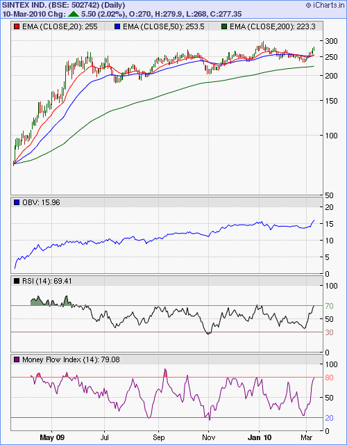
Let us have a look at the 1 year bar chart pattern of the Sintex Industries stock to check its progress through this long bull rally:-

Sintex_Mar1010

The stock did correct, but only down to 183 in July '09 before embarking on an up move that took it to a new high of 297 in Jan '10. Note that both the RSI and MFI made slightly lower tops while the stock made a new high.

The negative divergence led to a correction down to 233 before the post-budget bullishness pushed the stock up to today's high of 280 on decent volumes. Will the stock break above its previous top of 300?

The stock has long term resistance at the 300-310 zone. Also have a look at the RSI and MFI. Both are touching their overbought zones - from where they have retreated several times earlier. Chances are that the current up move may make limited progress.

The consolidated profits for Q3 '09 were flat while the standalone profits dipped more than 11%. The fly in the ointment was the poor performance of the textile segment and the not-so-great results of its overseas acquisitions.

With the automobile plastic moldings segment showing an up tick and the overall plastics business contributing nearly 87% of total revenues, the company should get back on the higher profits track from next year. The steady rise in the OBV indicates that investors are logging in.

After a dip in 2008, the cash flows from operations have perked up considerably. The company had resorted to a lot of borrowing (for a failed German acquisition) and is therefore sitting on a cash pile. A few more acquisitions may be on the cards. It acquired 6 companies in the past 2 years - 2 in the USA, 1 in France and 3 in India.

In the longer term charts, the stock had made a mountain-like pattern with a peak at 615 in Jan '08 followed by a steep drop of 88.6% to 70 in Mar '09. Small and mid-cap stocks usually have a tough time recovering from such huge falls. It is no wonder that the stock has retraced only 42% of its bear market fall and hasn't gained much in the past 9 months.

Bottomline? The stock chart pattern of Sintex Industries is getting close to a resistance zone with limited up side potential. Add only after a deep correction down to the 150-180 band. Existing holders can take some profits home.

Tuesday, March 9, 2010

Are you thinking of buying gold ETFs or a gold fund?

Four weeks back, I had raised the question: Is this a good time to buy gold? Guess I should have been a little more specific. I meant gold ETFs (or a gold fund) - not physical gold.

Buying physical gold has lots of associated hassles. How much should you buy? Coins, or biscuits, or bars? Where will you store them? Bank locker? Under the concrete floor of your basement?

Who will you buy it from? Your trusted jeweller? A Tanishq store? From a bank? How can you ensure purity? What if you want to resell some of it to raise liquidity? How will you go about it? How quickly can you complete the transaction?

Too many questions - which has prevented me from ever buying physical gold. But with the advent of gold ETFs and gold funds, almost all hurdles to 'buying gold' can be easily overcome.

Now comes another set of questions. Which gold ETF or gold fund to buy? How stable is the asset management company? What will be the returns like?

For the uninitiated, an ETF is like a mutual fund unit that can be traded in a stock exchange like an equity share. The NAV of each unit of a gold ETF approximately corresponds to the price of 1 gram of physical gold. So all gold ETFs give the same returns.

Now it is your choice whether you want to buy the ETFs from Benchmark (with the largest AUM) or SBI (the smallest) or from any one of the other handful of fund houses.

There are also gold funds that invest in gold mining companies and fund of funds (FoF) that invest in gold ETFs as well as in money market instruments, corporate debt and units of debt and liquid funds.

In the past one year, gold ETFs have returned about 5.5% - better than many debt funds, but a pale shadow when compared to more than 100% returns for the Sensex. The scene was different a year back, when gold ETFs were returning greater than 20% while the Sensex was in the red.

As I mentioned in my earlier post, allocate only a small portion of your portfolio to gold ETFs. Now a quick look at the 1 year gold chart pattern:-

Gold_Mar2010

After correcting from a high of USD 1212 in Nov '09 down to 1050 in Feb '10, gold prices started rising again and formed a bullish inverse head-and-shoulders pattern with the right shoulder getting support from the 14 day SMA.

The neckline at around 1140 was pierced from below, after which a pull back down to the neckline is in progress. The price chart pattern is likely to take support once again from the 14 day SMA which is almost at the same level as the neckline at 1140.

Till the previous peaks at 1150 and 1212 are not conquered, the bears will remain in the game, even though they seem to be losing ground rapidly. The 200 SMA continues its steady climb, so bulls have little to fear.

Monday, March 8, 2010

Dow Jones (DJIA) Index Chart Pattern - Mar 5, '10

In last week's analysis of the Dow Jones (DJIA) index chart pattern, I had made the following observations:

'The bulls are likely to make another attempt to push the index above the 10500 level, but their real hurdle will be the Jan 14 '10 top of 10767.'

Factory payrolls were up in the ISM report and the unemployment report came in better than expected along with same store retail sales that climbed by +4.1% year over year.

Bulls used the 'good news' to mount another rally but were thwarted by the bears from crossing the 10500 level during the first four trading days of the week. A final effort on Friday, accompanied by decent volumes took the Dow above the resistance zone of 10500-10550.

The 3 months bar chart pattern of the Dow Jones (DJIA) index remains below the Jan '10 high of 10767, and till the previous high is conquered the bears can not be counted out:-

Dow_Mar0510

The Dow is making a pattern of higher tops and bottoms since the Feb '10 low. The 200 day EMA is moving up with the index nearly 1000 points above it. The 20 day EMA has just crossed above the 50 day EMA. These are all good omens for the bulls.

The slow stochastic is inside the overbought zone. The RSI and MFI are both above their 50% levels. The MACD is above the signal line and both have entered positive territory. Again, all bullish signs.

But all is not well with the economy - in spite of the year-long stock market rally. Housing sales and auto sales – the two biggest drivers of the US economy – remain deep in recession, not to say depression – as they have fallen into a trough from which it is hard to see a way out.

Bottomline? The Dow Jones (DJIA) index chart pattern shows that the bulls are beginning to regain control - thanks to the ample liquidity from the economic stimulus. The index may rise some more, but valuations are beginning to look stretched. Investors may buy, but very selectively.

Sunday, March 7, 2010

Stock Index Chart Patterns - FTSE 100, CAC 40, DAX - Mar 5, '10

FTSE 100 index chart

FTSE_Mar0510

What a sea change in the FTSE 100 index chart in one week - as if the PIIGS have learned to fly! The realisation that Greece may not default on its sovereign debt after all (thanks to a little help from their Eurozone friends) was a huge relief for the bulls.

The FTSE not only tested its previous high of 5600 made on Jan 11 '10 but edged above it on Friday, and closed bang on the 5600 mark - its highest close since the bull rally began a year ago.

The technical indicators are suggesting that the bull party may continue. The 20 day EMA has moved above the 50 day EMA and all three EMAs are moving up with the index above them.

The slow stochastic is well inside the overbought zone. The MACD is rising in the positive zone and is above the rising signal line. The RSI is about to enter the overbought zone. The MFI is just below the overbought zone.

Have the bears been well and truly routed? Not quite. The FTSE 100 index has touched its previous high but hasn't gone convincingly above it as yet. Last week's rally has been on progressively decreasing volumes. The RSI is also showing a negative divergence. The bears may try to stall, if not stop, the bulls.

DAX index chart

DAX_Mar0510

The bulls shook off the bear shackles and made a spirited fight back as the German DAX index sailed above the 20 day and 50 day EMAs on decent volumes.

The slow stochastic has entered the overbought zone. The RSI and MFI are both above their 50% levels. The MACD has entered the positive zone after more than a month and is above the signal line. But the DAX still has to clear the Jan '10 high of 6094 before the bulls can take total control.

CAC 40 index chart

CAC_Mar0510

The French CAC 40 index also joined the bull rally with renewed vigour on good volumes. The 20 day EMA is still below the 50 day EMA but should cross above it next week.

The MACD has entered the positive zone and is above the rising signal line. The RSI and MFI are both above their 50% levels. The slow stochastic has entered the overbought zone.

The only solace for the bears is that the CAC 40 index is still 178 points below its Jan '10 high of 4088.

Bottomline? The chart pattern of the European indices show that a cloud (in the form of Greece's debt default) seems to have lifted and there is no holding back the bull rally. Investors can buy selectively after the previous highs are cleared.

Saturday, March 6, 2010

BSE Sensex Index Chart Pattern - Mar 5, '10

In last week's analysis of the BSE Sensex index chart pattern, I had mentioned that the bulls may get encouraged by the budget provisions but the rally may face resistance in the 16700 - 17500 zone.

In a 'Holi'day shortened week, the Sensex quickly entered the resistance zone and went as far as the 17100 mark - which was exactly in the middle of the resistance zone and just above the 61.8% Fibonacci retracement level of the fall from 17790 in Jan '10 to 15652 in Feb '10.

Though the index closed about 3.5% higher for the week it failed to close above the 17000 level. So, have the bears been rocked back on to the ropes and awaiting the knockout punch? The 3 months bar chart pattern of the BSE Sensex index would seem to suggest that:-

Sensex_Mar0510

The Sensex is forming a bullish saucer-like pattern which can take it at least to the Jan '10 high. May be even higher. Can't see the pattern? Take a look at the 20 day EMA, which is smoothly moving up towards the 50 day EMA and should cross above it next week.

The 200 day EMA continues its up move. Volumes have been decent for a change. The slow stochastic has entered the overbought zone. The RSI is about to do likewise. The MACD has turned positive and is well above the signal line. The MFI is above the 50% level and climbing.

Strong FII buying has been the single most important factor in the post-budget rally. The DIIs have sold heavily - may be to raise money for investing in the slew of forthcoming PSU divestments. They had to bail out a couple of recent FPOs.

The bears have a few straws to cling on to. The feel-good factor seems to be returning among retail investors as they try to lap up mid and small cap stocks. Valuations - particularly for the large caps - are beginning to look stretched again.

Technically, the RSI tends to react downwards soon after hitting the overbought zone. Will the Jan '10 pattern get repeated? It is a possibility that investors should keep in mind.

Bottomline? The chart pattern of the BSE Sensex index is poised at an interesting stage. Keep an eye on the Dow, which has started to soar again. The odds are favouring the bulls. Avoid sectors that have already moved up considerably. Look for fundamentally strong scrips in beaten-up sectors.  

Friday, March 5, 2010

Stock Index Chart Patterns - Shanghai Composite, Hang Seng, Singapore Straits Times - Mar 5, '10

Shanghai Composite index chart

ShanghaiComp_Mar0510

The bulls fought hard to keep the Shanghai Composite index above the 50 day EMA and the index closed above the medium-term average on Monday and Wednesday.

The bears gathered forces and mounted a swift counter-attack on Thursday. A 'reversal day' pattern (higher high but lower close) pushed the index down below both the 50 day and the 20 day EMAs. Today's weak attempt at a pull back was resisted by the 20 day EMA.

The corrective move continues as the technical indicators begin to turn weak. The slow stochastic is about to fall from the overbought zone with the %K and %D lines touching each other. The MACD is above the signal line but remains in negative territory.

The ROC is turning down towards the '0' line. The RSI is above the 50% level and moving sideways. We have an interesting technical situation where the 20 day EMA is trying to move up, the 50 day EMA is moving down and the 200 day EMA is almost flat.

Every time a bullish pullback makes a lower top, the bears gain a little more ground. Another test of the 200 day EMA may be on the cards.

Hang Seng index chart

HangSeng_Mar0510

Unlike the bulls in Shanghai, the Hang Seng index bulls warded off Thursday's bear attack a little better. The index got support at the 20 day EMA and today's 200 point pull back took the index back up to the 50 day EMA.

The slow stochastic is at the edge of the overbought zone. The MACD is well above the signal line and about to turn positive. The RSI is above the 50% level and moving sideways. The ROC has turned down after a quick up move.

The corrective move from the Nov '09 top of 23100 has not ended yet.

Straits Times (Singapore) index chart

Straits Times_Mar0510

When I looked at the Straits Times index chart four weeks ago, it was floundering below the 20 day and 50 day EMAs. It recovered its poise slightly, but has remained in a very narrow sideways range of 60 points or so - straddling the short and medium term moving averages.

The slow stochastic is moving sideways below the overbought zone. The MACD is moving up ever so slowly but remains in the negative zone. The ROC is touching the '0' level. The RSI is also moving sideways a bit above the 50% level.

It appears that the Singapore index is treading water, awaiting a clear direction from its two Chinese neighbours.

Bottomline? The corrective moves in the chart patterns of the Asian indices is still not revealing a clear trend. Remain cautious but nimble. Buy if you see value. Get rid of non-performers.

Thursday, March 4, 2010

Is every drop in the Sensex a buying opportunity?

There is no easy answer to that question. A drop in the Sensex can happen due to several reasons. Some external event like a terror attack or war can cause a sudden fall. Stock markets recover from such shocks pretty quickly - so it provides a buying opportunity.

It could also be an external event of a more 'fundamental' nature. The recent economic downturn had its origins in the financial excesses of the western world. But its ripple effects - large scale withdrawal by FIIs - caused a major bear market in the Sensex that lasted more than a year.

Many investors who were facing a bear market for the first time made the error of jumping in during April/May 2008 - only to find that the Sensex fell steeply thereafter making a big dent in their savings.

Newsworthy internal events can also induce a sharp fall. Remember the Satyam scam hitting the front pages in Jan 2009? The Sensex had a sharp downward reaction in the middle of a bear market that lasted two months. Most news driven index falls last only 2 or 3 days, and can be bought into.

Internal events of a more fundamental nature - a deteriorating economy or a major stock market scam (a la Harshad Mehta or Ketan Parekh) can cause the Sensex to change its trend from bull to bear in a flash. Bear markets are not the time to buy - except when it is close to, or emerging from, a major bottom.

Being able to identify such reversal points constitute the "Holy Grail" of stock market investment success. Which means it is easier said than done. But it isn't impossible.

One of the thumb rules for the Sensex that I have observed is the widening distance between the 50 day and 200 day EMAs. A reversal or correction occurs when the gap stretches to about 2000 points. Please remember that this is not a rule, but an observation.

The 'correct' answer to the question is another question: Why does it matter? Small investors don't buy the Sensex. They may invest in an index fund or an index ETF. In which case, they should be following a SIP method and be oblivious to Sensex gyrations.

Even if a small investor decides to buy individual stocks, it is unlikely that a particular stock's bull or bear phase will coincide with that of the Sensex.

HUL had a long bull market from 2006 to 2009 - right through the Sensex bear market. It hit its peak in July '09, 6 months before the recent Sensex top, and has been correcting for 8 months.

The bear phase in Tata Motors preceded the Sensex by a good 20 months. The bear market bottoms in the stock and the Sensex were formed together. The subsequent bull rally by the Tata Motors stock hugely outperformed the Sensex.

Keep close track of the individual stocks in your portfolio. Otherwise, the noise and hype created by the media about Sensex movements may confuse you into making a poor investment decision.