Monday, August 31, 2009

Dow Jones (DJIA) Index Chart Pattern - Aug 28, '09

The negative divergences from the RSI and MFI in last week's Dow Jones (DJIA) index chart pattern led to a sideways consolidation with a marginally higher weekly close.

The concern about the 'rising wedge' pattern on the longer term chart remains, as the week's trading was confined within the two converging lines of the wedge. The trend line connecting the Mar '09 and July '09 lows are at about the 9000 level. That is where the 50 day EMA is currently. A breach of the 9000 level may change the trend.

The economic scenario hasn't improved greatly. Things are still getting worse more slowly. Banks are failing. GDP growth remains negative. Unemployment is still high, and that is reflected in the steep fall in commercial real estate rentals. Housing foreclosures are mounting. Consumer spending remains weak.

Bull markets are supposed to climb a wall of worries. But the Chinese are not going to be buying as much US debt this time around. Which means the deficit can only be plugged by printing dollars - which will eventually lead to a fall in the value of the dollar.

For now, the party continues as the Dow keeps making new highs. The 3 months bar chart pattern of the Dow Jones (DJIA) index shows that the bulls are not ready to stop their charge:-

Dow_Aug2809

The technicals are looking a little better than last week. All the three EMAs are moving up with the index. Week-on-week volumes have improved.

The RSI and MFI are pretty much where they were last week. The slow stochastic has moved up to touch the overbought zone. The MACD has moved up a bit and touched the signal line.

The big fall in the Shanghai Composite index can slow down the bull rally, if not stop it. There still seems to be a lot of hesitation among investors about this being a new bull market. Unless the level of euphoria increases, the Dow is unlikely to face a big correction.

Bottomline? It seems the Dow Jones (DJIA) index chart pattern wants to rise some more - whether it is logically or economically justifiable or not. This is not the time for fresh investments - even if you are feeling 'left out' of the rally. Maintain existing holdings with tight stop losses.

Sunday, August 30, 2009

Stock Index Chart Patterns - FTSE 100, CAC 40, DAX - Aug 28, '09

The stock index chart patterns of the European markets were in an exuberant mood in the previous week - having joined the bull party a bit late - but there were concerns about the negative divergences from the technical indicators.

No wonder the indices had a week of sideways consolidation, as will be evident from the 3 months bar chart patterns below.

FTSE 100 index chart

FTSE_Aug2809

The FTSE managed a 1% higher close for the week, after touching a new high of 4944 last Friday. No particular significance of that level, which is a 45% retracement of the entire bear market fall from 6754 on Jul 13, '07 to 3461 on Mar 9, '09. 5100 is the 50% retracement level where a strong resistance can occur.

Volumes have improved but are not that encouraging. The RSI and MFI have started to move down, but are above the 50% level. The slow stochastic has re-entered the overbought zone. The MACD has edged above the signal line. A bit of a mixed bag with a slight positive bias.

All three EMAs are charging upwards, so the bull rally is intact and likely to continue for a while, in spite of the weaknesses in the RSI and MFI.

DAX index chart

DAX_Aug2809

The German index and the technical indicators are still playing catch up with the FTSE, like last week, while the DAX index also closed about 1% higher for the week after touching a new high of 5575. That's a 43.5% retracement of the entire bear market fall from 8152 on Jul 13, '07 to 3589 on Mar 9, '09.

Volumes have improved marginally. The RSI and MFI are both at the 50% level. The slow stochastic is about to enter the overbought zone. The MACD has moved up to touch the signal line.

Like the FTSE's averages, the three EMAs are moving up which means the bull rally is likely to continue a little longer.

CAC 40 index chart

CAC_Aug2809

Like last week's chart patterns, the CAC 40 is looking more like the FTSE 100 chart and stronger than the DAX, with a 2% higher close for the week. But the new high of 3724 last Friday has retraced only 34% of the bear market fall from 6168 on Jun 1, '07 to 2465 on Mar 9, '09. The 38.2% Fibonacci retracement level is 3880.

Much better volumes with all three EMAs on up moves. The RSI is moving down but is above the 50% level. The MFI is resting on the 50% level. The slow stochastic has re-entered the overbought region. The MACD is above the signal line.

Bottomline? The European index chart patterns are likely to continue moving up till they hit Fibonacci resistance levels. That means another 5-7% up side from current levels. Keep trailing stop losses and enjoy the rally while it lasts.

Saturday, August 29, 2009

BSE Sensex Index Chart Pattern - Aug 28, '09

Last week's analysis of the BSE Sensex index chart pattern concluded with the following observations:

'The BSE Sensex index chart pattern looks ready for a 10-15% correction. Some times the stock market does the exact opposite of expectations. The index may just start an up move towards the previous high of 16000 - specially if the FIIs start to buy big.'

Instead of correcting, the Sensex staged a 1100 point rally - from its close of 14810 on Aug 19, '09 to 15922 last Friday, Aug 28, '09. Strangely, it was more due to the buying of domestic financial institutions. On some of the 7 straight up days, the FIIs were net sellers.

That tells me that the forthcoming PSU divestments - particularly, the Oil India IPO at a large premium - is the probable cause of the domestic institutions propping up the market.

If that surmise proves correct, then the Sensex could move higher during the next couple of weeks till the IPO gets over. That would not be an occasion for celebration. It would lead to a perilous situation that I will discuss with a longer term chart.

But first, a look at the 3 months bar chart pattern of the BSE Sensex index, which is now looking a lot better technically:-

Sensex_Aug2809

The 7 days rally has negated a lot of the short-term bearishness. All three EMAs are now moving up together with the index. The volumes have started to perk up a bit.

But look at the sea change in the technical indicators. The RSI and MFI are both above the 50% levels and moving up. The sharp up move in the slow stochastic has brought it to the door step of the overbought zone. Even the MACD has edged above its signal line.

So, happy days are here again, right? May be for a few more days. There are a couple of concerns. The index is close to the 16000 level, where it faced resistance earlier in the month. It is also very near the 61.8% Fibonacci retracement level of 16043-16068. Keep a watch on those levels for good resistance.

The other, more important, concern is the distance between the 50 day EMA and the 200 day EMA, which is close to 2000 points. On prior occasions, such a distance between the medium and long-term moving averages have led to severe corrections or even trend reversals.

Sensex_Aug2809_2

In the 5 years closing chart of the BSE Sensex index above, note the bull market corrections in 2006 and 2007, when the 50 day EMA deviated too far from the 200 day EMA. In 2008 and 2009, the deviations were bigger which led to trend reversals.

Can the pattern repeat? I'll be willing to put some money on it. Will it be a big correction or a trend reversal? That will depend on how much further the Sensex rises from here.

For the sake of the bulls, let us hope that the correction comes soon - because on corrections the Sensex may not drop much below the 200 day EMA (which is now at 13000). The bears are probably licking their chops and egging the bulls onward and upward for an eventual reversal back to the bear market.

Bottomline? The BSE Sensex index chart pattern is coming close to a turning point - a big correction or even a trend reversal. It may not happen within the next two weeks, but it will happen. Avoid new investments, and keep booking partial profits. 

Friday, August 28, 2009

Stock Index Chart Patterns - Shanghai Composite, Hang Seng, Singapore Straits Times - Aug 28, '09

Shanghai Composite index chart

In last week's analysis of the Shanghai Composite index chart pattern, it was noted that there was weakness in the short and medium term. The view was supported by the weakening technical indicators.

Despite a bounce up from the 200 day EMA, the 6 months closing chart pattern of the Shanghai Composite index failed to make much upward progress:-

ShanghaiComp_Aug2809

The index faced resistance at the 3000 level, a little below the 50 day EMA. Its efforts to breach the level during the week proved futile. The 20 day EMA is resting on the 50 day EMA, and both averages are moving down. The 200 day EMA has flattened. The bull rally has halted for the time being.

The RSI managed to stay just above the oversold zone. The slow stochastic is trying to emerge out of the oversold zone. The ROC is in negative territory, but moved up a bit during the week. The MACD and its signal line are in the negative zone, but the MACD has stopped falling.

The technical indicators have improved marginally over last week, but are still showing weakness - hinting at some more consolidation.

Hang Seng index chart

Not much change from last week's chart pattern of the Hang Seng index, which continued to remain entangled around its 20 day EMA, and looks stronger than the Shanghai Composite.

Hang Seng_Aug2809

The 20 day EMA remains above the 50 day and 200 day EMAs - both of which are rising. The bull rally remains on course, albeit with slowing momentum.

Both the RSI and slow stochastic are below their 50% levels. The ROC is in negative territory. The MACD is positive, but has fallen a little from last week, and has stayed below the signal line. The technical indicators look a little weaker than last week, which may lead to further correction.

Straits Times (Singapore) index

The Singapore Straits Times index chart pattern is looking in much better shape than the two indices of its much bigger Asian neighbour. While all the attention of the world media was hogged by the Shanghai Composite and Hang Seng indices, the Straits Times index has quietly retraced 50.8% (close enough to the 50% Fibonacci retracement level) of the entire bear market fall when it touched a high of 2701 on Aug 4, '09.

Straits Times_Aug2809

The index corrected from its recent high, but received support from its 20 day EMA - much like the Hang Seng index - but managed to close above the short term average on all 5 trading days of the week. (The Hang Seng ended the week below its 20 day EMA; the Shanghai Composite closed below its 20 day and 50 day EMAs.)

The RSI is at the 50% level. The ROC is in positive territory, but looking down at the '0' level. The MACD has moved up a bit and is touching its signal line. The slow stochastic has moved up sharply above the 50% level, and looking bullish.

Bottomline? The stock index chart pattern of the Shanghai Composite continues to show weakness. The Hang Seng chart is also wanting to correct a bit more. Only the Singapore Straits Times chart seems ready to challenge the 50% Fibonacci resistance level (which neither the Shanghai Composite, nor the Hang Seng has been able to reach).

Thursday, August 27, 2009

Stock Chart Pattern - Carborundum Universal

The stock chart pattern of Carborundum Universal, much like the chart pattern of Havell's discussed yesterday, is forming a bullish 'ascending triangle' formation that could lead to an upward breakout.

Why is a conservative, 55 year old abrasives and refractories manufacturer from the Murugappa stable quoting at a P/E of 22? Is it because of its shareholder friendliness, giving regular bonus issues and dividends? Or, is it the conservative and prudent management that believes in growing slowly and steadily, keeping debt under control and using cash generated from operations to part finance the growth? Or, is it due to the carefully managed global ambition being achieved through judicious acquisitions in India, Russia and South Africa plus a joint venture in China?

In spite of several bonus issues, the current equity is only Rs 18 Crores, and with reserves at 20 times the equity, can another bonus issue be around the corner? Promoter holding of 43%, FII holding of 9%, debt-to-equity ratio less than 1 are other positives for taking a closer look at the Carborundum stock.

The one year bar chart pattern of Carborundum Universal is another example of how Fibonacci retracement levels appear time and again on stock charts:-

Carborundum_Aug2709

After hitting a peak of 215 (face value Rs 2) on Jan 12, '07, the stock fell into a long bear market that ended with a double-bottom - 76 on Oct 27, '08 and 77 on Mar 25, '09. The subsequent rally took the stock to 140 on June 1, '09 - retracing 46% of the entire fall.

A double-top made on June 23, '09 resulted in a good correction down to 101 on Jul 13, '09 - just less than the 61.8% Fibonacci retracement of the rally. A sharp rally temporarily breached the double-top of 140, only to find resistance at 145 - the exact 50% Fibonacci retracement of the fall from 215 to 76!

In the process, a bullish 'ascending triangle' has formed on the chart, with a strong probability of a break out upwards. Increasing volumes of late - though not clearly visible on the chart - are supporting the rally. The negative divergences in the technical indicators - the RSI, MFI, MACD and slow stochastic have all made lower tops - are concerns that the up move can face headwinds.

Bottomline? The stock chart pattern of Carborundum Universal may give an upward breakout. Investors should wait for the breakout before entering (keeping the 3% 'whipsaw' leeway in mind).

Wednesday, August 26, 2009

Stock Chart Pattern - Havell's India

The stock chart pattern of Havell's India is not that different from several other stock chart patterns discussed on this blog. The real difference lies in how a staid 50 years old low-end electrical equipment manufacturing company has managed to carve a niche for itself.

Industrial and domestic electrical switches, cables and wires, motors, fans and light fixtures isn't exactly a high margin product range to drool over. Against stiff competition from the organised and unorganised sector, the quality of their products has brought them fame and fortune from top clients in India, and export tie-ups with big overseas names like GE, Siemens-Electrium, Eatons, Geyer, Proteus.

60% promoter holding, nearly 18% FII holding, good growth through capacity expansion, regular dividends, strong cash flows from operations, low debt, low equity, huge reserves, back-to-back 1:1 bonus issues in 2005 and 2006 are adequate reasons for investors to put this stock on top of their buy list.

Let us take a look at the one year bar chart pattern of Havell's India to see if this is a good time to enter or not:-

Havells_Aug2509

After making a high of 750 (face value Rs 5) on Oct 18, '07, the stock entered a long term bear market triggered by its $300 Million acquisition of Sylvania, Germany's lighting business.

After a huge fall of 650, it made a double bottom at 100 (on Dec 2, '08) and 101 (on Mar 9, '09) before embarking on a sharp rally that took it to 332 on Jun 2, '09 - retracing 36% of the entire bear market fall (just below the 38.2% Fibonacci level of 348).

The stock is consolidating sideways for the past 3 months and has received good support from its 50 day EMA, which is rising along with the 200 day EMA.

Volumes haven't been great, but that's expected during a consolidation phase. The RSI has moved above the 50% level. So has the slow stochastic, with the %K line above the %D.

Bottomline? The stock chart pattern of Havell's India is beginning to show a bullish 'ascending triangle' formation, which has an upward breakout probability. A consolidation after an up move is usually a continuation pattern. That means, the direction of the move before entering the consolidation pattern will continue. Investors can make a small investment now, or wait for the upward breakout to get in.

Tuesday, August 25, 2009

When should you 'hold' and When should you 'fold' a stock?

There are four things you can do with a company's stock:-

1. Avoid it 2. Buy it 3. Hold it 4. Fold (or, sell) it.

In several blog posts, I have indicated the types of companies that an investor should avoid, and why. A quick recap may not be out of place here. Companies with

* questionable management
* negative cash flows from operations
* high debt and frequent share issues
* 'me-too' products with no competitive advantage
* low trading volumes
* high 'beta' (i.e. stock rises and falls more than the index)
* low growth in sectors that have seen better days, are the ones to pass on.

A series of articles have also been written about market cycles, sector selection, top-down and bottom-up methods for picking individual stocks, 'margin of safety' and 'circle of competence'. 'What to buy' should be supplemented with technical analysis to decide 'when to buy'.

Hopefully, readers have started absorbing some of the guidelines and are now sitting on (or in the process of building) a portfolio of well-chosen, fundamentally strong stocks, from sectors or industries that they can understand. That is only half the job done.

Buying a stock doesn't make any one any money. Holding it for a reasonable length of time, and then selling it at a profit completes the cycle.

How long should one hold a stock? Warren Buffett is ready to hold it forever. You may not have that long a time frame. But long term isn't one year. To get proper returns from a stock, you should hold it for at least 3 to 5 years. Like good wine, a stock should be given time to mature.

That doesn't mean you put it in a locker and forget about it. Industry and company developments should be regularly followed. (If you are unable, or unwilling, to track your portfolio - refrain from buying stocks. Invest in index funds/ETFs or balanced funds.) Irrational price movements - either up or down - should be used as opportunities to book partial profits or add to your portfolio.

When should you sell? That's the million dollar question. If you can learn the art of selling, you will be on the path to riches. Before we get to that, one must learn when NOT to sell. Do not sell a stock if

* the price has gone up from 41 to 48 in 15 days
* the quarterly results have been below expectations
* a temporary calamity has stalled production
* a big order has fallen through

There are only three reasons why a stock should be sold. By 'sold', I mean sold off completely from the portfolio.

1. You realise you've made a mistake in selecting the stock. Could be due to making incorrect assumptions, or, not researching the stock adequately.
2. The fundamentals of the company takes a turn for the worse. A failure of imported technology, fraud by top management, new and more nimble competitors changing the rules of the game, a big acquisition turning sour, could be some of the causes.
3. There is a sudden emergency or unforeseen requirement of money, for a medical condition or a job loss or a daughter getting admission in a foreign university or investment in an apartment.

I also use the 'sleeplessness indicator' - though it may not be universally reliable! If I'm unable to go to sleep at night because a stock investment isn't turning out the way it was supposed to, I sell it the next day.

(Readers may please share why they have sold stocks, if any mistakes were made and what lessons were learned.)

Monday, August 24, 2009

Dow Jones (DJIA) Index Chart Pattern - Aug 21, '09

Last week's analysis of the Dow Jones (DJIA) index chart pattern led me to surmise that the index was slipping into a proper correction. The technical indicators had weakened and the volumes were uninspiring.

The index corrected barely 2%, lasted all of 3 days, made a quick turnaround and jumped above the resistance at 9450 on increasing volumes. So much for the efficacy of technical analysis!

An interesting question is: Why did the resistance at the 9450 level - a 38.2% Fibonacci retracement of the entire bear market fall - get broken? It had been tested three/four times in the previous two weeks. Every time a resistance (or support) level is tested in quick succession, it gets weakened. Three or four is usually the maximum number of tests that can be endured.

So, have the bulls finally trampled the bears into submission? That question can be answered best by looking at two different charts. The first is a 3 months daily bar chart pattern of the Dow Jones (DJIA) index. The second is a longer-term 2 years weekly chart of the Dow.

Dow_Aug2109

The index is above all the three moving averages. Both the 20 day and 50 day EMAs are above the 200 day EMA and all three averages are ascending, indicating a new bull market. Two hurdles remain - the 50% (10360) and 61.8% (11290) Fibonacci retracement levels of the bear market fall from Oct '07 to Mar '09.

The RSI is above the 50% level. So is the MFI. Both are showing negative divergences from the Dow. The MACD has fallen below the signal line. The slow stochastic dipped sharply from the overbought zone, but has moved up and the %K line is above the %D. The indicators seem to have weakened while the index reached a new high.

Dow_Aug2109_2

The longer term chart has a bigger concern. The rally from the Mar '09 bottom has happened between two converging lines, one connecting the two bottoms in Mar and Jul '09, and the other connecting several tops from May '09 onwards.

Such an index chart pattern formation is called a 'rising wedge' - which shows that buying demand is getting weaker as the index is rising higher. It is a bearish pattern and the DJIA can drop sharply if the trend line connecting the two bottoms (currently at 9000) gets broken.

Bottomline? The Dow Jones index chart pattern seems to be in a short-term bull run. Enjoy the ride, but keep strict stop losses. The longer term weakness and concerns remain.

Stock Index Chart Patterns - FTSE 100, CAC 40, DAX - Aug 21, '09

Quite a contrast! The stock index chart patterns of the Asian markets were in a corrective mode last week, but the European markets seemed to shake off their depression and charge up with renewed vigour.

FTSE 100 index chart

FTSE_Aug2109

The FTSE seemed to give up on its bull market dreams in early Jul '09 and went below all the three moving averages - almost re-entering the bear market. Why almost? Note the confluence of the 20 day EMA and the 50 day EMA.

The short-term average bounced off the medium-term one, and the index literally charged up into a new bull market, dragging the 20 day EMA and 50 day EMA with it. The volumes have not been that great - which means the bull market is not receiving much buying support.

The slow stochastic did a quick turn from the oversold zone to the overbought zone. After a brief lull, it is heading back to the overbought zone. The RSI and MFI both entered overbought zones but have moved down. Both indicators are showing negative divergence with the index. The MACD has flattened and just touching the signal line.

DAX index chart

DAX_Aug2109

The DAX index seems to be moving in lock-step with the FTSE, but looks slightly less bullish. A close look at the technical indicators will reveal why.

The slow stochastic fell a bit more and is just above the 50% level. The RSI is at  its 50% level, while the MFI is just above the mid-point. The MACD is positive but below the signal line.

CAC 40 index chart

CAC_Aug2109

The CAC 40 index pattern seems more like the FTSE chart and more bullish than the DAX chart. But appearances can be misleading. The technical indicators are resembling the FTSE ones with one exception. The 50 day EMA is yet to move above the 200 day EMA - though that should happen next week.

Bottomline? The news about European markets coming out of the recession soon acted as a tonic. All three index chart patterns are showing strong bullish signs. But the negative divergences from the technical indicators remain a concern. Buying should be limited to well-selected stocks only. Partial profit booking is also encouraged.

Saturday, August 22, 2009

BSE Sensex Index Chart Pattern - Aug 21, '09

During the previous week's analysis of the BSE Sensex index chart pattern, I had observed that the bulls were beginning to lose control though the bears hadn't quite gained the upper hand. The Sensex continued its sideways consolidation, with the bulls and bears almost evenly matched.

The 'Butterfly Effect' of the big correction in the Shanghai Composite index led to a 626 point fall in the Sensex on Monday, Aug 17, '09. The index behaved like a yo-yo for the rest of the week, alternately going down and moving up, ending with a small week-on-week drop of 150 points.

Those who do not follow (or, do not wish to follow) technical analysis despite the constant barrage of charts and indicators on this blog, may think that a 150 points drop is no big deal and indicates nothing. They may be right - specially if one looks at price charts from a long-term point of view.

A closer look at the 3 months bar chart pattern of the BSE Sensex index will reveal that technical analysis can point out certain anomalies or divergences that help in forewarning about events to follow:-

Sensex_Aug2109 

Good support from the 50 day EMA saved the Sensex from a bigger fall. But note how the support has been tested 4 times in quick succession - on Aug 12, and then Aug 17, 18 and 19, '09. Supports (and resistances) get weakened by three or four tests, and may not be able to withstand the next one.

Also note that for 4 days in a row, the index closed below the 20 day EMA - which has flattened - before closing smartly above it on Fri Aug 21, '09. (Those little notches to the right of each price bar indicate the closing level each day; the notches on the left are the opening levels of each day.)

Such short term weakness is also confirmed by the other technical indicators. The volumes are petering off and making lower highs. The RSI and MFI are now both below their 50% levels. The slow stochastic has moved down more, but stopped short of entering the oversold zone. The MACD is below the signal line and barely positive.

Investors should watch the previous low of 13220, made on Jul 13, '09, closely. That level happens to be the upper end of the huge gap in the Sensex made on May 18, '09. The 200 day EMA is a couple of hundred points below it. The combination could prevent the Sensex from correcting into the gap area. 

Bottomline? The BSE Sensex index chart pattern looks ready for a 10-15% correction. Some times the stock market does the exact opposite of expectations. The index may just start an up move towards the previous high of 16000 - specially if the FIIs start to buy big. That should be used as an opportunity to sell. Otherwise, stay on the sidelines and research individual stocks (specially the ones that have been left out from the rally).

Friday, August 21, 2009

Stock Index Chart Patterns - Shanghai Composite, Hang Seng, Taiwan TSEC - Aug 21, '09

Shanghai Composite index chart

Two weeks back, the Shanghai Composite index chart pattern appeared ready for a bigger fall - specially if the support from the 50 day EMA and the 3100 levels failed. And what a fall it was!

Before we get into the gory technical details, please allow me to digress briefly to a Chaos Theory concept called 'The Butterfly Effect':

'Small variations of the initial condition of a dynamical system may produce large variations in the long term behavior of the system.'

What that means in plain English is: If a butterfly flaps its wings in China, it may cause a tornado in Texas! Further translating into stock market parlance means: If the Chinese stock index catches a cold, stock indices all over the world start to sneeze!

Enough mixed metaphors. Now a look at the 6 months closing chart pattern of the Shanghai Composite index:-

ShanghaiComp_Aug2109

After a 5 months long one way ride up, the Shanghai index came under a vicious bear attack and plummeted through the 20 day and 50 day EMAs before bouncing up from the support at the 200 day EMA.

In doing so, both the short-term and medium-term EMAs have turned down and the 20 day EMA is about to drop below the 50 day EMA. That means weakness in the short and medium term, while the long-term bullishness remains intact.

Before you start getting excited and jump back into the market with both feet, here are some facts. The index made a bull market high of 6124 on Oct 16, '07 and a bear market low of 1815 on Dec 31, '08. The recent high of 3478 on Aug 4, '09 was an almost exact 38.2% Fibonacci retracement of the entire bear market fall of 4309 points.

The 5 months rally, therefore, remains a bull rally in a long-term bear market - till the 50% Fibonacci (3950-4000) and 61.8% Fibonacci (4450-4500) retracement levels are conquered by the index.

The technical indicators are looking weak. The slow stochastic is in the oversold zone. The MFI is below the 50% level. The MACD is negative and well below the signal line. The RSI is about to enter the oversold zone.

Taiwan (TSEC) index chart

The last discussion on the Taiwan (TSEC) index chart pattern was 4 months back on April 12, '09, when the index had completed a bullish rounding bottom pattern, but a correction from the 6000 level was expected.

Let us see where the 6 months closing chart pattern of the Taiwan (TSEC) index is headed:-

Taiwan_Aug2109

The index did correct from the 6000 level (as expected), took support at the 200 day EMA and quickly moved above the 7000 mark. Ever since, it has been in a sideways consolidation pattern with multiple tops in the 7000-7200 level.

That resistance zone happens to be in between the 50% and 61.8% Fibonacci retracement levels of the entire bear market fall from 9786 on Nov 1, '07 to 3955 on Nov 21, '08.

The TSEC has slipped below the 50 day EMA but is still above the 200 day EMA. The slow stochastic is just above the oversold zone. So is the RSI. The MACD is marginally positive but below its signal line. The MFI is below the 50% level.

The technical indicators are pointing to a further correction, but is not looking as weak as the Shanghai composite index.

Hang Seng index

In last week's analysis of the Hang Seng index chart pattern, I had observed that the 21350 level remained the high water mark which the index needed to cross - failing which, the bull market could stall.

The 6 months closing chart pattern of the Hang Seng index has weakened quite a bit but is not looking as bad as its two Asian cousins:-

Hang Seng_Aug2109

The index is playing hide-and-seek with its 20 day EMA, and remains above both the medium-term and long-term averages. The slow stochastic is between the 50% and oversold levels. The MFI is above the 50% level. The RSI has just slipped below the 50% level. The MACD is positive but below the signal line.

The technicals are indicating that the index can correct some more.

Bottomline? All three stock index chart patterns are showing weakness of different degrees, with the Shanghai Composite the weakest, the Hang Seng the strongest and the Taiwan TSEC in between. All three indices have retraced from important Fibonacci levels. Investors may be better off to let the correction run its course before re-entering.

Thursday, August 20, 2009

Stock Chart Pattern - Bilcare Ltd

The stock chart pattern of Bilcare Ltd is almost a mirror-image of the Sesa Goa chart pattern we looked at yesterday. Sesa Goa had moved up to make a new all-time high. Bilcare is struggling to get out of the bear market. Let us find out why.

Bilcare Ltd can best be described as a pharmaceutical ancilliary company. Starting out in medicine packaging, they have now morphed into a clinical trial supplies, services and project management company, with offices in USA, UK and Singapore.

Their related services include solutions for compliance and brand protection issues, as well as educational programmes to create a pool of clinical trial technicians.

Consolidated sales in Mar '09 grew 31.5% to Rs 856 Cr and EBITDA grew 19% to Rs 194 Cr. With good growth, positive cash flows from operations, regular dividends, P/E < 11, P/BV < 2, Debt/Equity < 1 - this is an almost perfect example of Graham's 'value pick' criteria.

So why is the stock languishing? Two words: Rakesh Jhunjhunwala! The big bull, a big shareholder and director, recently resigned from his directorship in the company and sold a part of his stake. That was a trigger for the bears, who had already mauled the stock, to launch a renewed attack.

The 1 year stock chart pattern of Bilcare Ltd is a clear example why a stock chosen on the basis of fundamental analysis alone can become a 'multi-sagger' :-

Bilcare_Aug2009

The stock had made a low of 275 on Jun 14, '06. It then climbed dizzily all the way to a bull market top of 1830 on Jan 1, '08 - only to give up the entire gain as it dropped like a stone to a low of 279 on Mar 9, '09. Such a 'mountain-like' pattern makes it very difficult for any stock to recover its former glory.

The stock rallied with the rest of the market on sharply higher volumes and briefly went above its 200 day EMA, as it made a high of 549 on Jun 4, '09. The correction started almost immediately, and the long-term average quickly turned into a strong resistance level.

The efforts by the stock to remain above its 50 day EMA has also been thwarted, and now the medium-term average has switched from a support level to a resistance level.

The MFI is below the 50% level and moving down. The slow stochastic has just slipped below the 50% level and the %K line is below the %D. Of late, down-day volumes are higher. Looks like the bear grip will remain strong for a while.

Bottomline? The stock chart pattern of Bilcare Ltd is not inspiring confidence. A fall to the 300-350 zone may be a better entry point for bravehearts - but only after thorough homework.

Wednesday, August 19, 2009

Stock Chart Pattern - Sesa Goa

The stock chart pattern of Sesa Goa provides another example of a fundamentally strong, well-managed company that has cut through all the noise about Sensex index movements and forged ahead on its chosen path.

Strong growth in sales, high net margins, negligible debt, huge cash flows from operations, and regular dividends make this iron ore exporter a suitable stock for any long term investor's portfolio.

A dark cloud on the horizon may dampen Sesa Goa's party. There is a proposal by the steel ministry to charge a royalty of 10% from iron ore exporters. If that proposal goes through, then Sesa Goa's EPS may get reduced by about 10%.

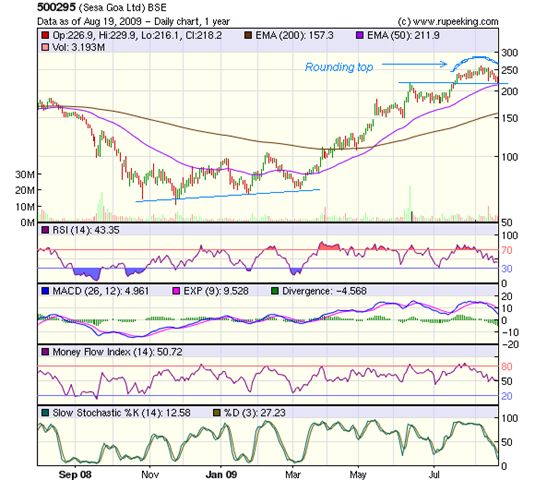
The stock market seems to be discounting that piece of 'bad news'. The 1 year bar chart pattern of Sesa Goa is showing a bearish rounding top formation:-

Sesa Goa_Aug1909

After making multiple bottoms in the 60-71 zone from Oct '08 to Mar '09, the stock embarked on a sizzling rally that took it to a new high of 259 on Aug 6, '09 - a 330% gain in 9 months.

The stock made a low today at 216, which is the same level as its two previous tops made on May 30, '08 and Jun 12, '09. It is also just above its 50 day EMA. Previous tops, combined with the proximity to the medium term moving average, should provide good support.

If that support fails, then further supports are at 180-185 level, and below that, at its 200 day EMA at 160 (for this Re 1 face value share).

Volumes have been strong, if not spectacular. The technical indicators are all pointing to some more correction.

The RSI is below the 50% level. The MFI is just above its 50% level, but moving down. The MACD is still positive, but is falling and has dropped below its signal line. The slow stochastic is well into the oversold zone.

Bottomline? The stock chart pattern of Sesa Goa is showing some weakness. Investors can use the opportunity to enter by buying small quantities at every dip.

Tuesday, August 18, 2009

The futile quest for the mythical 'multibagger'

Legend has it that the Philosopher's Stone had the unique ability of turning iron and other base metals into gold - the ultimate 'multibagger'. For a long time, the quest for the stone became an obsession in western alchemy.

"Many many years ago, a man decided that he would give up worldly comforts and riches, and dedicate his life to finding the Philosopher's Stone. He set out on his quest with an iron chain in his hand. Whenever and wherever he found a stone, he would stoop to pick it up and touch it against the chain to see if it turned to gold or not.

Many days and months passed, but he never wavered in his quest. He became thin and his hair turned into knots and his beard became long and unkempt. But the desire in his heart didn't wane.

He travelled through many countries and continents, from the mountains to the oceans. Never did he stop to appreciate the beauty of nature all around him. With a piercing gaze he picked out every single stone and kept touching it to the iron chain to check if it had turned to gold.

After a few years, it started to dawn on him that his quest may never reach fruition. Out of sheer habit, he carried on and picked up stones and touched the chain with them. He started getting weary and his heart became heavy, and he no longer bothered to check if the chain had turned into gold.

Once he was passing through a village square, where some small children were playing. They saw this wild-eyed man in tattered clothes, knotted hair and tangled beard coming towards them. One of them exclaimed: 'Look, look! That crazy man is carrying a shining gold chain.'

The man stopped dead on his tracks. In sheer disbelief, he looked at the chain in his hand. It was a solid gold chain. During his long quest, he had found the Philosopher's Stone after all. But he had thrown it away, like all the others, after touching it to his chain without checking.

In sheer despair, he sat down and pondered his fate for a while. After some time, he sighed, got up and resumed his quest."

The moral of the story? It is the rare and fortunate investor who can find more than one multibagger stock in his entire investment career. Such good fortune happens more through chance than by design.

Why is that? Because most of us do not plan to hold a stock long enough in our portfolio for it to generate stupendous returns. Does it mean that holding any stock for a long time will automatically generate multibaggers? The answer is obviously 'No'.

That is why, selecting fundamentally strong stocks is so important. Once the preliminary hard work of proper stock selection is done, one should keep holding such stocks, and at most, book partial profits from time to time.

The trick is to keep buying back these shares during a down turn, at lower prices. Doing this with just a couple of stocks, like Tata Steel or L&T, can provide huge returns.

Can momentum, or 'fashionable', stocks provide multibagger returns? The answer is 'Yes'. Pantaloon and DLF have been multibaggers. But how many small investors were able to reap the multibagger returns?

My guess would be, very few. Most would have exited after the stock doubled or tripled. And the unfortunate few, who actually got the multibagger returns, probably held on too long and are facing losses now because of the steep bear market fall.

(Notes: 1. The above story is a prose version of a famous Tagore long poem, titled 'Parash Pathor'. Satyajit Ray made a highly entertaining movie with the same title, about a person who actually finds the Philosopher's Stone and what happens to him because of it.

2. I'd be very interested to hear from readers about any multibaggers they hit or missed.)

Related posts

How to pick Stocks for Investment - Part III
How to build wealth using a buy and hold strategy

Monday, August 17, 2009

Dow Jones (DJIA) Index Chart Pattern - Aug 14, '09

During last week's analysis of the Dow Jones (DJIA) index chart pattern, I had surmised that the index may take a breather before deciding on its next course of action, and concluded with the following observation:-

'The Dow Jones (DJIA) index chart pattern is showing some hesitation at the 38.2% Fibonacci retracement level. Could it be a pause before a fall?'

During 4 of the 5 trading days last week, the Dow attempted to cross this important Fibonacci level at around 9450. On Aug 13, '09 it came within a whisker of touching it. But the resistance proved too much, and the index fell a modest 50 points from the previous week.

What is the next move for the Dow? Let us try to infer from the 3 months bar chart pattern of the Dow Jones (DJIA) index:-

Dow_Aug1409

Both the 20 day and 50 day EMAs are above the 200 day EMA, and all three EMAs are rising. The Dow is comfortably above all three moving averages. There seems no immediate threat to the bull rally for the time being. But the index seems to be making a bearish rounding-top formation.

The volumes are causing concern again. Tuesday, Aug 11 '09 was the lowest close of the week, but with the highest volume. On Wed and Thurs, the Dow made higher tops, bottoms and closed higher as well, but on decreasing volumes. This is the exact opposite of the volume action in a new bull market.

The RSI has dropped from the overbought zone, though it is above the 50% level. The MFI is at the 50% level, but itching to move down. The slow stochastic has just slipped below the overbought zone with the %K line below the %D. The MACD is falling and seems to be hanging from its signal line.

The technical indicators are definitely looking weaker than the previous week. Coupled with the volume action, a correction may be imminent. The unemployment figures and consumer spending and confidence levels seem to be taking the wind out of the bull sails.

At the time of writing this post, the Dow is down almost 2%. Will it fall more, just as the Asian indices have done earlier in the day? Tough question, but I'm tempted to answer:'Yes'.

Bottomline? The Dow Jones (DJIA) index chart pattern seems to be slipping into a proper correction. Watch out for support at the 8800-8900 zone, which is near the 200 day EMA. A break below may lead to a bigger fall. Time to book profits or stay on the sidelines.

Sunday, August 16, 2009

Hang Seng Index Chart Pattern - Aug 14, '09

In the two weeks since we last looked at the Hang Seng index chart pattern, the bull rally hasn't made a lot of progress. The index managed a gain of 320 points from the closing level of 20,573.33 on July 31, '09 - a mere 1.5% gain.

The low volumes continue to remain a concern, and the momentum of the up move has definitely slowed. Two weeks ago, I had advised caution but observed that the technical indicators were supporting a continuation of the bull rally.

The 6 months closing chart pattern of the Hang Seng index is presenting a different picture this time around:-

Hang Seng_Aug1409

In the first two weeks in Aug '09, the Hang Seng opened twice above the 21000 level, and twice it crossed that level on an intra-day basis. But there was only one close above it on Aug 11, '09.

What was the cause of this resistance? No prizes for guessing correctly. The 21,300-21350 zone is the 50% retracement of the entire bear market fall from 31960 in Oct '07 to 10680 in Oct '08.

It is quite amazing that the Dow Jones index is hesitating near the 38.2% Fibonacci retracement level while the BSE Sensex has bounced down from the 61.8% Fibonacci retracement level. Those numbers are reflecting the state of the different economies.

India had a downturn, not a recession, and continues to have lower but positive GDP growth. Hong Kong is out of a recession with a year-on-year growth in GDP, and an expected lower contraction in this year's growth. The USA is still not out of the recession.

What are the technicals indicating? All three EMAs are still moving up together, and the index is above them. That means the bull rally is still intact.

The RSI and MFI are above their 50% levels, but both dropped after touching their overbought zones. The slow stochastic has just slipped below the overbought zone. The MACD is quite positive, but has moved below the signal line.

Bottomline? Two weeks ago, I had observed that unless the Hang Seng index chart pattern moves convincingly above 21350, the bull rally may stop. Investors should remain cautious and continue to book partial profits. This isn't the time to be adventurous.

Saturday, August 15, 2009

BSE Sensex Index Chart Pattern - Aug 14, '09

Last week, some bearish possibilities were observed in the BSE Sensex chart pattern. The weakness in the index chart remains, despite the sudden 500 point jump on Thursday, Aug 13, '09. The volumes were lower than on the previous day, which was a 'down day'.

FIIs were net sellers on 4 of the 5 trading days last week. The only day that they were net buyers - which was also the day when the proposed tax reforms bill was made public - the BSE Sensex index jumped up.

Some observations made last week about a 'broadening top' formation, may be worth revisiting:-

'Such a formation is a distribution pattern, where the 'smart money' gets out and the 'weaker hands' (typically MFs and retail investors) jump in, trying not to miss the bus. Volumes tend to be uncertain, and price swings can be quite unpredictable.'

This week, let us look at the 3 months bar chart pattern of the BSE Sensex index that shows the entire post-budget trading:-

Sensex_Aug1409

The trading pattern of the last 3 months has been confined within a broad range of 13200 to 16000. This consolidation, after a spectacular rise from the bottom of 8000 in Mar '09, has gone on long enough. A break out, either up or down, could happen in the near future.

The broadening top and sudden swings in levels and volumes indicates a possible break down wards. But a flood of liquidity from the FIIs can change the direction of the market and make it move up at least by 4-5%. That will take it to the resistance zone at the 61.8% Fibonacci retracement level of the entire bear market fall.

A small bit of trivia. The current Sensex level is the same as that in July '07 and Aug '08. In between, the index made an all time peak at 21200, and a bottom at 7700. For all the gyrations of the BSE Sensex, and the zillions of words written and uttered on business media, we have made zero progress in 2 years!

This is as good an example as any, that investors should concentrate more on individual stock movements and worry less about the index directions. Over the longer term, all that will count for wealth creation is how well you have selected individual stocks based on fundamental analysis, using Graham's concept of 'Margin of Safety'.

Finally, a look at the technical indicators. The 20 day EMA was broken briefly. The index took support at the 50 day EMA before jumping up above the 20 day EMA, which has flattened. So, the short term trend is neutral; the medium and long term trends remain up.

The RSI is at the 50% level. Likewise for the slow stochastic, but the %K line is below the %D. The MACD is positive, but is below its signal line and moving down. The MFI is below the 50% level and also heading down.

The strong grip of the bulls seems to be slipping. The below average monsoon isn't helping the situation. The bears are fighting hard, yet haven't quite regained control.

Bottomline? The BSE Sensex chart pattern is not inspiring the confidence required for a full-fledged bull market, in spite of the 100% rise from the bottom. Keep booking profits wherever available. Avoid entering questionable or high beta stocks.

Friday, August 14, 2009

Stock Chart Pattern - Jagran Prakashan


The 2 years bar chart pattern of Jagran Prakashan is making a prolonged bullish saucer like formation that may see a new high in the medium term. But before we get to the technical nitty-gritties, a few words about the fundamentals.

The company's Hindi language newspaper, Dainik Jagran, not only has the largest circulation in the country, it exceeds the circulation of all the English language dailies put together.

Such a leadership position allows it to charge premium advertising rates which adds to profitability. It also owns, together with Yahoo, the largest Hindi language portal.

Steady growth into new towns and territories, decent profits, good cash flows from operations, regular dividends, managable debt - point to just the kind of stock that should find a place in any long-term portfolio. So, why did I pass it up when it was going abegging at 40?

Because of doubts about the management. This is a family-run outfit in the truest sense. That means, top management is stuffed with family members of various ages at fat salaries - some of whom are prone to bickering leading to litigation. That puts a question mark on the long term stability of the organisation in one's mind. The other negative is the high P/E of 33 which leaves very little 'margin of safety'.

Technically, the stock made a triple bottom and moved up from 40 to 105, which was a 50% Fibonacci retracement of the entire bear market fall from 170 to 40. Little wonder that it is facing resistance at current level.

The up move has seen three corrections, two of which took support at the 50 day EMA and one at the 200 day EMA. Such a move makes the likelihood of a further up move a little stronger. The next resistance should occur at 120, which is also near the 61.8% Fibonacci retracement of the bear market fall. Beyond 120, resistance levels are 140 and 170.

The four technical indicators - all oscillators - are tracking the stock movements. This is typical in long term charts, as the short term noise tend to get smoothened out.

Bottomline? The stock chart pattern of Jagran Prakashan is another example of why investors should worry less about index movements and concentrate on individual stocks.
Investors who like growth stocks can add a small quantity on a dip. This isn't a value play.

Related post

Are the media companies 'defensive'?

Thursday, August 13, 2009

How to use the Aroon indicator and oscillator

With Independence Day around the corner, it may be an opportune time to look at a technical indicator, called Aroon. Tushar Chande has a PhD in Engineering and owns a financial services firm in Iowa, USA. An author of several books and holder of 9 US patents, he developed the Aroon indicator and oscillator back in 1995.

The Aroon indicator consists of two lines - the Aroon Up and the Aroon Down. They are calculated based on the highest high and the lowest low made by a stock or index in a given period. Their values range between 0 and 100.

Though the method of calculating the two lines are fairly straight forward, I haven't included the formulae (which tend to scare off maths-shy
investors). If you love crunching numbers, check up the www.investopedia.com site, or write to me.

A trend following indicator, Aroon tends to score where MACD or moving averages may prove inadequate. Crossovers between the Aroon Up and Aroon Down lines are indicative of changes in trend.

The Aroon oscillator has values of +100 and -100 at the extremes, oscillating around the '0' level. Those who are familiar with the RSI and Stochastic oscillators - discussed in earlier posts - may make the Aroon an additional arrow in their quiver.


The 1 year bar chart pattern of the BSE Sensex index above will help us to understand how the Aroon indicator and oscillator works

When the Aroon Up line (in green) is between 70 and 100 and the Aroon Down line (in blue) is between 0 and 30, the trend is strongly bullish (between mid-Mar '09 to mid-Jun '09). The opposite, that is the Down line on the top range and the Up line on the bottom range is strongly bearish (between mid-Sep '08 to end Oct '08).

Crossovers indicate trend change - up trend when the Up line crosses above the Down line, and down trend when the Down line crosses above the Up line. Note that between Nov '08 and Feb '09, there were several crossovers while the Sensex consolidated sideways. Similar is the case between mid-Jun and mid-Aug '09.

The confusion created by frequent crossovers during consolidation periods can be alleviated to an extent by using the Aroon oscillator, which plots the difference between the Aroon Up and Aroon Down lines. The '0' level decides the trend. The farther away from the '0' line, the stronger the trend.

As with other technical indicators, applying the Aroon indicator and oscillator in actual investing requires experience and practice. Using it together with other indicators and oscillators is recommended, because technical analysis is not foolproof.

Wednesday, August 12, 2009

Stock Chart Pattern - Container Corporation of India

Container Corporation is a Govt. of India company, promoted by the Ministry of Railways. Regular readers of this blog may know of my aversion to government-owned companies. So why am I discussing the stock chart pattern of Container Corporation?

A one-word answer: monopoly. I like a company that is well-run, generates cash flows from operations, makes profits, pays dividend and has low debt. If it has a monopoly in its line of business - in this case, storing, handling and transporting of containerised goods through the railway network, a classic play on the India infrastructure story - then it makes the company doubly attractive.

The government holds 63% of the equity. FIIs hold more than 25%. The public holds just about 1%. No wonder it has a high price, but because of its profitability, trades at a P/E of less than 18. If there is one drawback, it is the low volume of trading.

Last year's top line was flat due to the economic down turn that severely affected exports and imports. Still, the company managed to improve its operating and net profit margins.

The one year bar chart pattern of Container Corporation is a clear example of a market favourite that is charting its own course, far removed from the gyrations of the BSE Sensex index:-

Container Corp_Aug1209

The stock made a low of 540 in Nov 21 '08 and a higher low of 610 on Mar 4 '09, before embarking on a bull rally with periodic corrections and consolidations. On Jul 29 '09, the stock hit a high of 1149, a level it had last touched in Sep '07 (adjusted for 1:1 bonus issue).

Thereafter, the stock has started consolidating in a triangle pattern. Of note is the big gaps between the 50 day and 200 day EMAs and between the stock price and the 50 day EMA (marked on the chart with blue arrows).

Does that mean the stock will face a trend reversal? Probably not. But a good correction may take it down to seek support at its 50 day EMA at around 1000, and then to the 200 day EMA at around 850.

The triangle pattern is usually a continuation pattern, so the stock price may very well move further up and try to reach its all time high of 1222, hit on Jun '07, before starting the correction. But triangles are quite unreliable, and the stock may just continue sideways for a while, negating the triangle.

Other than the EMAs, which are moving up strongly, the other technical indicators are showing weakness. Both the RSI and MFI have slipped down from overbought zones. The MACD is positive, but below its signal line. The slow stochastic is dropping towards the 50% level. These are bearish signs, indicating a correction in the near term.

Bottomline? The stock chart pattern of Container Corporation demonstrates that given the proper environment and business model, a government owned company can generate excellent returns. Investors would do well to keep this stock on their 'watch list' and enter on dips.

Tuesday, August 11, 2009

About advantages and disadvantages of mergers and acquisitions (M&A) and demergers

As a general rule, mergers and acquisitions (M&A) are value destructive for shareholders. Demergers or spin-offs are value accretive. In simple English, that means, avoid the shares of an acquiring company. But there may be money making opportunities in the companies being demerged or spun off.

There is a difference between a merger and an acquisition. Mergers are rare, as they happen between two companies that are equal in size and reach. Both companies lose their individual identities, and a third company is formed. For example, pharma companies Glaxo Wellcome merged with Smith Kline Beecham, and formed a third entity, Glaxo SmithKline.

In India, the situation was different. A much smaller but profitable and shareholder-friendly EsKayef lost its identity to the bigger but slower growing Glaxo. EsKayef shareholders were given Glaxo shares in the ratio of 1:2.

An acquisition, or a takeover, happens when a bigger company buys out a smaller company, with or without the smaller company's cooperation or willingness to be acquired. The usual motivations are economies of scale, killing a competitor, gaining market share and reach.

The biggest disadvantage of acquisitions is that they fail because of cultural mismatches. Every company is shaped over the years by the vision and background of its promoters or management. This is called 'company culture' - the way they project themselves in the market place, how they treat customers, employees, suppliers and shareholders, their social responsibilities, integrity and commitment, innovating capabilities.

No two companies do business the same way, even within the same sector. When one company acquires another, the cultural differences become very difficult to overcome. This leads to key personnel of the acquired company quitting and leaving with priceless intellectual property and customer relationships built up over many years.

Reverse takeovers, when a smaller company acquires a larger one, are even worse. Like Tata Steel buying Corus or Tata Motors buying Jaguar-Land Rover. In both cases, the the ambition was to become  global companies in quick time. But the prices paid in both cases were too high, and the timing was wrong. The shares of both companies tanked while they scrambled to raise money to cover the huge acquisition debt.

For shareholders of the company being acquired, an advantage could be a bidding war between two or more potential acquirers. This is currently happening with Great Offshore (earlier demerged from Great Eastern Shipping). Without any change in the fundamentals, the share price is going up as two likely acquirers are bidding up the offer price.

Opto Circuits is a notable example of an Indian company that has successfully used the acquisition route to grow its sales and profits quickly. Probably because they have shrewdly targetted companies with complementary products and geographical reach that were not doing well financially.

Demergers and spin-offs happen due to two main reasons:

1. Getting rid of an unwanted or less profitable division or subsidiary - like Larsen & Toubro did with its cement business, and ICI has done with its non-paint subsidiaries. Profitability and share prices of both companies increased significantly.

2. Spinning off a division or subsidiary into a stand-alone company because it has grown in size and value. Mahindra & Mahindra has done this a few times, with its financial services, information technology, holiday resorts subsidiaries.

Investors would do well to look out for companies that have 'hidden assets' in the form of profitable subsidiaries. Sooner or later, these subsidiaries will get demerged or spun off. With reforms in the financial sector a top priority of the Government, I would keep a close watch on companies with asset management (read, 'Mutual Funds') and insurance subsidiaries.

A few companies that come to mind are Reliance Capital (though I'm not particularly fond of the word 'Reliance'), Exide, HDFC, Sundaram Finance, SBI, Canara Bank.

(Interested readers can learn more about M&A from this article.)

Monday, August 10, 2009

Dow Jones (DJIA) Index Chart Pattern - Aug 07, '09

There were a couple of concerns about the Dow Jones (DJIA) index chart pattern last week. One was the up move on low volumes. The other was the likely resistance from the 38.2% Fibonacci retracement level (around 9450) of the entire bear market fall.

The first concern was short-lived, as the Dow trundled upwards on better volumes. Expectedly, the 9450 level is providing resistance. The index made a brief foray to 9467 last Friday, Aug 7 '09 on an intra-day basis, but made a quick retreat.

The 3 months bar chart pattern of the Dow Jones (DJIA) index is showing a different set of concerns - this time due to the negative divergences from some of the technical indicators:-

Dow_Aug1009

Dow's vigorous rise has brought the 50 day EMA within touching distance of the 200 day EMA, and barring extraordinary circumstances, it should go above the longer term average this week. The 200 day EMA is just about starting to move up. If the 9450 level is cleared convincingly, the bull rally can continue.

The RSI is still in the overbought zone, though it has started moving down. The MFI is treading water midway between the 50% level and the overbought zone. The MACD is positive and above the signal line, but has stopped moving up. Only the slow stochastic remains comfortably in the overbought zone.

The index may take a breather before deciding on its next course of action. This is also the time of year when fund managers and analysts in Europe and the USA like to take a vacation. Could it be that they are booking profits in China and India in preparation?

Here are a couple of one year closing charts, comparing the BSE Sensex index with the Dow and the FTSE:-

Dow vs Sensex_Aug0709 

FTSE vs Sensex_Aug0709

Note how the Dow and the FTSE outperformed the Sensex in percentage terms from Oct '08 till Mar '09. That was the period when the FIIs (Foreign Institutional Investors) were selling big in the Indian stock market.

From May '09 onwards, the picture changed dramatically, with the Sensex outperforming both the Dow and the FTSE. Guess what? The FIIs were pouring money into the Indian market.

Last week's dip in the BSE Sensex index was again mainly due to heavy selling by the FIIs. Meanwhile, both the Dow and FTSE advanced on renewed volumes. Call it profit booking, or manipulation. The fact remains that the FIIs are making the world indices dance to their tune.

Bottomline? The Dow Jones (DJIA) index chart pattern is showing some hesitation at the 38.2% Fibonacci retracement level. Could it be a pause before a fall? Wish I knew. But forewarned is forearmed. Stay nimble. (Incidentally, the BSE Sensex has corrected 6% from its 61.8% Fibonacci retracement level.)

Sunday, August 9, 2009

Shanghai Composite Index Chart Pattern - Aug 07, '09

We had a recent look at the Shanghai Composite index chart pattern when it was compared with the KOSPI (Korea) index chart pattern. The one way rally of the China index from the low of Mar '09 was looking a bit stretched.

Since China and India have produced two of the best performances among world stock indices in 2009, it may be a good idea to take a more detailed look at the 6 months closing chart pattern of the Shanghai Composite index (in blue) and compare it with the BSE Sensex index (in red).

ShanghaiComp_Aug0709

After underperforming during Feb and Mar '09, the Sensex outperformed the China index during May and Jun '09. The Jul '09 Sensex correction brought the two indices close together, and lately the two indices seem to be copying each others' moves.

Of special interest is last week's correction in both indices due to unloading by the FIIs. The Dow Jones (DJIA) index and the FTSE 100 index, which had hugely underperformed both the Shanghai Composite and BSE Sensex indices, actually went up during the past week on increased volumes.

That may be an indication of a reversal of the FII money flow - from Asia, back to Europe and the USA. Will it be just a temporary one week phenomenon? Only time will tell. But if it continues, then expect Asian indices to correct more while US and Europe indices move higher in the near term.

Let us see what the technicals are indicating. The 20 day EMA is trying to support the index. The 50 day and 200 day EMAs are still moving up. Bulls need not worry about the longer term. Shorter term, things could change in a hurry.

The slow stochastic has dropped from the overbought zone with the %K line below the %D. The MACD is positive, but has started to fall and has gone below the signal line. The ROC has dropped sharply and is now in the negative zone. The RSI is above the 50% level but slipping. All indicators are looking bearish.

Bottomline? The Shanghai Composite index chart pattern may correct some more. The next support should be at the 3100 level and the 50 day EMA. If that level is breached, there may be a bigger fall. Investors can book partial profits. New investing should be on hold.

Saturday, August 8, 2009

BSE Sensex Index Chart Pattern - Aug 07, '09

Before analysing the BSE Sensex index chart pattern, let us flash back a little. Regular readers of this blog may recall that I've been mentioning several bearish possibilities on the horizon, as the index kept making new highs.

A couple of my observations two weeks back were:

1. There is no doubt that the head-and-shoulders pattern had formed. Though the bulls managed to negate it, the underlying weakness that led to the pattern may not have gone away entirely.

2. If the Sensex does cross 15600 and goes to 16000 or so, and then turns back down and makes a low that is lower than 13220, we will get a higher high and a lower low. This would lead to a bearish 'broadening formation'.

During last week's discussion, I had mentioned 'that should the Sensex index fail to cross the 16043-16068 level convincingly and move down sharply again, the bear market from Jan '08 will technically still remain in force!'

Now a look at the 1 year bar chart pattern of the BSE Sensex index will clarify the relevance of the earlier observations:-

Sensex_Aug0709

The bulls tried valiantly to push the BSE Sensex above the 16000 level. Four days in a row, the 16000 level acted as a stiff resistance. The BSE Sensex failed the final test of a new bull market - crossing the 61.8% Fibonacci retracement level of the entire bear market fall from the Jan '08 top. The bears saw their chance, took back control, and the Sensex shed 3.25% for the week.

A bearish 'broadening top' pattern is in the process of being formed. Such a pattern usually has five small reversals before a larger fall. We have almost a text-book example of the pattern on the BSE Sensex chart. The five reversals have been marked, and they occured on:

1. May 19 - 14930; 2. May 26 - 13525; 3. Jun 12 - 15600; 4. Jul 13 - 13220; 5. Aug 4 - 16002.

Such a formation is a distribution pattern, where the 'smart money' gets out and the 'weaker hands' (typically MFs and retail investors) jump in, trying not to miss the bus.

Volumes (unfortunately, not updated on the chart) tend to be uncertain, and price swings can be quite unpredictable. All the ingredients for the 'broadening top' are in place.

As with any chart pattern (and technical analysis), relying totally on it may not be wise. Past experience says that the low of 13220 (point 4 in chart) should get broken before one can be absolutely sure.

The index halted at its 20 day EMA. The next support is at the 50 day EMA. The final support will be at 13220 and the 200 day EMA. If all three supports fail, the Sensex will finally move down to partially or fully close the 'gap' made on May 18, '09.

The RSI has dropped from the overbought zone and is at its 50% level. The MACD is still positive and above its signal line, but moving down. The ROC is just in the positive zone but also moving down. The slow stochastic dropped from the overbought zone and is still above the 50% level, but the %K line is below the %D line.

Bottomline? The BSE Sensex index chart pattern looks like it is poised for a dreaded (or hoped for) major correction. Do not panic, or act in haste. Keep taking profits wherever available. Or, stay on the sidelines.

Friday, August 7, 2009

FTSE 100 Index Chart Pattern - Aug 6, 2009

Quite a sea change in the five weeks since my last look at the FTSE 100 index chart pattern and perhaps a lesson why one should respect the market and not depend totally on technical analysis.

This is what I had mentioned in my earlier post:

'Once the 20 day EMA moves below the 50 day EMA, the index will be conclusively back in the bear market. Desperate efforts by the bulls to keep the index supported at the 4200 level seems doomed to failure.'

Let us see what actually happened. The 3 months bar chart pattern of the FTSE 100 index made an astonishing turnaround:

FTSE_Aug0609

The support at the 4200 level was broken and the 20 day EMA slipped slightly below the 50 day EMA. So far, so good. But instead of reverting back to a bear market, the FTSE had a 'reversal day' on Jul 13 '09, hit a low of 4100, jumped up with renewed vigour and had 11 straight days of gains.

What happened on Jul 13, '09 that made the FTSE 100 change directions so suddenly? Good question. I can only say what didn't happen. The economy didn't miraculously make an overnight improvement.

The 20 day EMA is now above the 50 day and 200 day EMAs. The 50 day EMA has its nose above the long-term moving average and all three averages are moving up. There should be no further doubts about the bull market.

The volumes did not increase sufficiently, which means the up move initially happened on short covering by the bears. Of late, volumes have picked up, but higher volumes on down days is not inspiring confidence.

The slow stochastic has remained in the overbought zone for nearly three weeks and could stay there a while longer. The MACD is positive and above the signal line. The RSI is in the overbought zone but moving down. The ROC has started to move down and showing negative divergence.

Bottomline? The economic recovery is going to take a long time. The FTSE 100 index chart pattern is reflecting bullishness borne of expectations of an early recovery. Time to be cautious. Enjoy the ride, but maintain trailing stop-losses.

Thursday, August 6, 2009

Stock Chart Pattern - Larsen and Toubro

The stock chart of Larsen and Toubro has been in a consolidation pattern since the election and requires a close look. Before that, a brief peek into history.

Two Danish engineers and school mates, Henning Holck-Larsen and Soren Kristian Toubro, left Europe to set up the company in Bombay back in 1938. Their first office was so small that only one of the partners could use it at a time.

How the company grew to become the largest engineering and construction conglomerate in India is a fascinating story. Interested readers can find out more by visiting the L and T site.

After the passing of Larsen in 2003 (Toubro preceded him in 1982), the company seemed to grow a new set of wings. A solid well-managed and fundamentally strong company with steady growth, cash flows and dividends, its stock was not doing anything exciting.

A futile effort by the Ambanis to wrest control of the company perked things up. The divestment of the cement business, which was like a millstone around its neck, to the Birlas of Grasim came as a real boost to growth.

The global economic boom, the emphasis on infrastructure projects in India, a 5:1 stock split followed by two 1:1 bonus issues acted as rocket fuel that made the company shoot up to the must-buy list of FIIs.

Several subsidiaries and joint ventures including units in finance, electronics, information technology are its hidden assets. An apparently disastrous high cost investment in scam-scarred Satyam is turning out to be a blessing in disguise.

Now the technicals. The one year bar chart pattern of Larsen and Toubro has been in a 'pennant' formation, that opens up a few different possibilities:-

LnT_Aug0609

After peaking at 2235 on Oct 30 '07, the L and T stock started falling and dropped by 75% to a low of 557 on Mar 9 '09. The subsequent bull rally seemed to stall at the 1000 level, but post election results, a gap-up move took it all the way to 1800 on Jun 18 '09.

The stock entered a consolidation pattern called a 'pennant'. It is a narrow triangular pattern that usually forms after a sharp up (or down) move. Volumes have steadily receded during the formation of the pattern, which is now 7 weeks old. Ideally, it should have broken out upwards from the pattern by now.

Notice how the technical indicators made lower bottoms while the stock made a higher bottom in Jul '09. A negative divergence. Since then, the stock has made a lower top, but the RSI, MFI and slow stochastic made higher tops. A positive divergence. The conflicting signals indicate indecision among market players.

The MACD is marginally positive. The RSI and slow stochastic are turning down from overbought zones, The MFI turned down before reaching its overbought zone.

If the stock breaks out upwards (as it should for a consolidation pattern in an up move), it should go the same distance as it did from the recent bottom of 557 to the top of 1800 (i.e. to about 2800).

If it breaks downwards, it may get support at the zone between its 200 day EMA and the top of the gap at 1100. It may also close the gap and find support at its previous top at 1000.

There is a third possibility. The stock may continue to consolidate sideways, in which case the 'pennant' formation will fail. Now you know why I keep mentioning that technical analysis is not a science!

Bottomline? The stock chart pattern of Larsen and Toubro is showing indecision. Existing holders should hold with a stop loss of 1350. If you want to add or enter, do so on a break above 1600, or on a correction to 1100-1150.