Sunday, August 31, 2014

BSE Sensex and NSE Nifty 50 index chart patterns – Aug 28, 2014

For the first time since Feb ‘14, both FIIs and DIIs were net buyers of equity during the month. Feb ‘14 had a cumulative net buying of about Rs 2100 Crores by FIIs and DIIs. Cumulative net buying in Aug ‘14 exceeded Rs 5000 Crores.

No wonder both Sensex and Nifty touched new lifetime highs at the end of a holiday-shortened week. The bull charge shows no signs of abating, though index valuations are no longer cheap. However, valuations are still reasonable – around the long-term averages.

The 5.7% GDP growth number was the highest in 9 quarters – giving some respite to the NDA government, which has been criticised by some FIIs for not moving fast enough in announcing reform measures. A deficient monsoon – despite floods in certain areas – is a lingering concern.

BSE Sensex index chart


The upward ‘gap’ formed on the daily bar chart pattern of Sensex on May 13 has not been filled yet, and it doesn’t look like getting filled any time soon. Why? Because the new up trend post-elections is moving further away from the ‘gap’ with each trading day.

The up trend line 2 is about to cross above the ‘gap’, with the 200 day EMA following suit. They are likely to provide a strong line of defence above the ‘gap’. The bull rally for the past 12 months had frequent but small corrective moves that have kept the chart technically ‘healthy’ and prevented a big crash (expected by some Wave theorists).

Technical indicators are in bullish zones. RSI and Slow stochastic are in their overbought zones. MACD, ROC and Slow stochastic are showing negative divergences by failing to touch new highs with the index.

Expect the rally to continue – with intermittent corrective moves. Use the rally to get rid of junk. Invest the proceeds by adding to existing holdings instead of looking for new ideas. Hold on to your good stocks with trailing stop-losses.

NSE Nifty 50 index chart


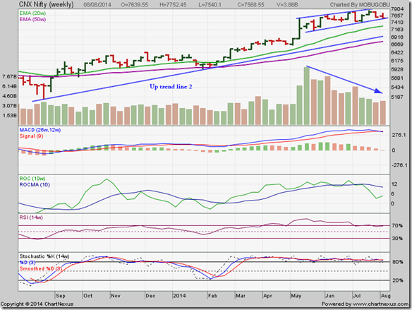
The weekly bar chart pattern of Nifty closed the week at a new lifetime high of 7954, and is giving indications that it wants to climb even higher. Sliding volumes during the past 3 months remain a concern, as bull rallies require volume support to sustain.

Weekly technical indicators are either inside or near their overbought zones – but that has been the case for the past 4-5 months. Just goes to show that a market index can remain overbought for long periods in a bull market.

Another indicator of bull domination is the number of stocks that are at or near their 52 week highs. More than 200 stocks touched their 52 week highs on Thu Aug 28. Snowman Logistics IPO was oversubscribed multiple times despite stiff pricing. Expect more IPOs to hit the market soon.

Bottomline? Chart patterns of BSE Sensex and NSE Nifty indices touched new lifetime highs once again. Periodic corrections have kept charts of both indices technically ‘healthy’. Curb the urge to book small profits. Patience is the key to making large gains in bull markets.

Wednesday, August 27, 2014

The importance of the upcoming state elections – a guest post

Almost every one had expected the Modi-led NDA to do well in the general elections held during Apr-May ‘14. But the thumping majority of NDA’s victory came as a complete surprise. Expectations from Modi’s government went sky-high. The stock market celebrated by regularly touching new highs.

Of late, there have been some murmurs of disappointment and discontent – both among domestic and overseas investors - about the lack of any major reforms announcements from the Modi government. It seems like the government is taking the path of incremental improvements of the existing system of working.

Perhaps, the failure to pass the insurance bill has necessitated this cautious approach. In this month’s guest post, Nishit gives his opinions on why the Modi government is proceeding with abundant caution instead of trying to bulldoze its way through with major policy reforms.

-------------------------------------------------------------------------------------------------------------------------------------------

The Modi Government was elected with a huge majority and it has been in power for nearly 100 days. The Government has made some progress but is treading lightly. Let us try and explore why, and what could be the road ahead in the next few months.

First of all, change is going to be gradual. The big-bang approach rarely works. India is world famous for the best of rules and regulations but compliance is very low. If compliance rate is fixed, most of the problems disappear on their own.

Second, the Government enjoys a big majority in the Lok Sabha, but in the Rajya Sabha it is badly in a minority. To pass any bill, it has to be passed in both houses to become a law. The other option is a Joint Session of Parliament where both Lok Sabha and Rajya Sabha sit together and a simple majority is needed.

Another option is asking other regional parties to support the passing of any bill, which itself becomes an issue because these parties may demand their own pound of flesh.

The best option therefore lies in having a majority in the Rajya Sabha also. The members of the Rajya Sabha are elected from the various States based on the respective party strength in the Vidhan Sabha of each state.

Now, the 4 States in which elections are going to be held soon, are Maharashtra, Haryana, Jharkhand and J&K. BJP has not been in power in these States for many years now. The elections will be held some time in October-November 2014. So, any aggressive reforms now may upset the applecart of the state elections. These elections become even more significant as they will be the first major test of Modi’s popularity after the general election.

This is the reason BJP is playing safe, and the stock market is buoyant but not too exuberant. A positive result for the BJP, at least in Maharashtra and Haryana, will send the market skyrocketing; else we may see the much awaited 10-15% correction from the top.

From now to November is the time to wait and watch, accumulate good quality stocks and enjoy the bull ride. Be prepared for stock prices to fall after you have bought them. Hence, the lineage of the stock is most important.

-------------------------------------------------------------------------------------------------------------------------------------------

(Nishit Vadhavkar is a Quality Manager working at an IT MNC. Deciphering economics, equity markets and piercing the jargon to make it understandable to all is his passion. "We work hard for our money, our money should work even harder for us" is his motto.

Nishit blogs at Money Manthan. You can reach him at nish.stockid@gmail.com)

Tuesday, August 26, 2014

WTI and Brent Crude Oil charts: an update

WTI Crude chart

WTI Crude_Aug2514

The 6 months daily bar chart pattern of WTI Crude oil tried to stabilise around the 97-98 level, where it had previously received support in Mar ‘14. But bear selling put paid to bullish hopes. Oil’s price plummeted to the 93 level. The 50 day EMA crossed below the 200 day EMA, technically confirming a bear market.

Is it ‘game over’ for bulls? As they say: Every dark cloud has a silver lining. Note that oil’s price closed at its lowest level since Jan ‘14, but RSI and Slow stochastic have touched higher bottoms. The positive divergences can lead to an upward bounce. But bears are unlikely to release their control in a hurry.

There is a support zone between 90-92. If oil’s price falls below 90, it can drop to 85. Daily technical indicators are looking oversold. But in a bear market, oversold conditions can continue for a while.

On longer term weekly chart (not shown), oil’s price has closed below its 200 week EMA for the first time since Dec ‘12. Weekly technical indicators are looking oversold. The 50 week EMA and the 20 week EMA have merged together and are falling towards the 200 week EMA. Some more correction can’t be ruled out.

Brent Crude chart

BrentCrude_Aug2514

The following remarks were made in the previous post on the 6 months daily bar chart pattern of Brent Crude oil: “The ‘death cross’ of the 50 day EMA below the 200 day EMA has technically confirmed a bear market. All attempts at rallies are getting thwarted by the falling 20 day EMA.”

The falling 20 day EMA has continued to provide resistance to any attempt to rally. Oil’s price has bounced up a bit from the long-term support zone between 100-102. But it has been a weak bounce that will likely attract bear selling.

Daily technical indicators have corrected oversold conditions, but remain in bearish zones. MACD is touching its signal line at the edge of its oversold zone. RSI is moving sideways below its 50% level. Slow stochastic has emerged from its oversold zone. There are no signs of respite for the bulls.

On longer term weekly chart (not shown), oil’s price has closed below its 200 week EMA for the second week in a row – some thing it has not done in the past 3 years. Weekly technical indicators are looking bearish, and a bit oversold. The long-term bull market is under threat.

Monday, August 25, 2014

Stock Index Chart Patterns: S&P 500 and FTSE 100 – Aug 22, ‘14

S&P 500 Index Chart

S&P 500_Aug2214

The 6 months daily bar chart pattern of S&P 500 shook off the bears by soaring past the 1960 level, and rose to touch new intra-day (1995) and closing (1992) highs on Thu Aug 21, before correcting a bit by the end of the week. By moving above its previous top of 1991 – touched on Jul 24 – the bulls seem to have regained complete control. Or, have they?

Volumes during the week’s rally were below the 6 months average. The index has moved too sharply above its 20 day moving average. All three technical indicators are showing negative divergences by failing to touch new highs with the index. These have bearish implications in the near term.

Also, by touching a marginally higher top on lower volumes (than on Jul 24), the possibility of a double-top reversal pattern has opened up. The double-top will get confirmed only if the index falls below its Aug 7 low of 1905. That may not happen – but forewarned is forearmed.

Daily technical indicators are in bullish zones, with the exception of Slow stochastic, which has reached overbought levels. The index is trading above all three EMAs in a bull market. The 4.3% correction from the Jul 24 top of 1991 was just a bull market correction. But it is better to be a little cautious than euphoric when the index is near a lifetime high.

On longer term weekly chart (not shown), the index is trading above all three weekly EMAs in a long-term bull market. Weekly technical indicators are in bullish zones but showing negative divergences by failing to touch new highs with the index. Sliding volumes is another concern for bulls. Booking part profits may be a good idea.

FTSE 100 Index Chart

FTSE_Aug2214

The 6 months daily bar chart pattern of FTSE 100 closed above its three EMAs in bull territory on all 5 days of the week, but was unable to make much upward progress. By failing to cross above its previous top of 6834, the bearish pattern of ‘lower tops and lower bottoms’ continue.

Technically, the index is in a bull market. Daily technical indicators are looking bullish. MACD has risen above its signal line into positive territory. RSI has climbed above its 50% level. Slow stochastic has entered its overbought zone.

The index appears to be forming a bullish ‘flag’ pattern. A likely upward break out from the ‘flag’ may take the index to a new high.

On longer term weekly chart (not shown), the index is trading above all three weekly EMAs in a long-term bull market. Weekly technical indicators are turning bullish.

Sunday, August 24, 2014

How to select good mid-cap and small-cap stocks for your portfolio without trying too hard

We are living in an age of instant gratification. No one has the time or patience to brew a nice cup of filter coffee. Too much hassle. Just go to the nearest coffee bar and pay through your nose; or, boil a cup of water and stir some instant coffee in it.

Want to buy a car? No need to save money for 10-15 years. Just go to a car dealer, show your income statement or tax return, pay a token lump sum amount and drive out in a shining new 4-wheeler, and then pay nearly double the cost of the car through monthly EMIs.

Want to enter the stock market? Just open a demat account and a trading account with a large broker or bank, and start buying the next Infosys and the next L&T being discussed in stock forums or business TV channels. Instant gratification doesn’t quite work in this case, does it? Where are the huge returns that every one seems to talk about?

Instant gratification usually ends up costing you much more – in terms of money, health, stress. If you are really interested in fabulous returns from the stock market, there is only one way out. Learning to do things the proper way – which means spending time and being disciplined and patient. Easier said than done for most people, who work hard, live fast and prefer to go for vacations at Langkawi or Nice.

If you neither have the time, nor the inclination to learn how to select good stocks – a process that requires learning how to read an Annual Report, calculating financial ratios, studying economic conditions in the country and overseas, supply and demand in various industrial and service sectors, and observing different patterns on price charts – here is a simpler process.

Select the top-ranked (by 5 yr returns) mid-cap and small-cap funds listed at valueresearchonline.com and check their top 10 equity holdings. The hard work has already been done for you. Just go through the table below.

Religare Invesco Mid N Small Cap BNP Paribas Midcap Franklin India Smaller Companies ICICI Prudential Value Discovery
Brittania VA Tech Wabag Finolex Cables ICICI Bank
DB Corp Idea Cellular Yes Bank Reliance Ind
Gateway Distripark Axis Bank Repco Home Fin Sadbhav Engg
ING Vysya Bank HPCL JK Lakshmi Cement PI Industries
Federal Bank Yes Bank Mindtree Exide
Redington IndusInd Bank Cyient Mindtree
Guj Pipavav Port Oil India Amara Raja Amara Raja
City Union Bank Alembic Pharma SKF India Guj Pipavav Port
AIA Engineering Orient Cement Axis Bank Balkrishna Ind
Greaves Cotton Motherson Sumi Aegis Logistics Max India

Leaving aside a few large-caps like ICICI Bank and Reliance Ind, the rest are a representative sample of good mid-cap and small-cap stocks. So, here are two things you can do:

1) Select a few stocks from the four funds and add them to your portfolio. Choose the ones whose businesses you understand to a certain extent. Alternatively, choose stocks that are appearing in more than one fund – like Amara Raja, Mindtree, Axis Bank and Yes Bank.

2) If you are really pressed for time (or lazy), start a SIP in any one of the four funds. Each of these funds has returned about 25% for the past 5 years. That indicates a consistency of performance over the long-term.

Related Posts

Can investments in only 3 funds provide adequate portfolio diversification?
How to pick Stocks for Investment - Part I
How to pick Stocks for Investment - Part II
How to pick Stocks for Investment - Part III

Saturday, August 23, 2014

BSE Sensex and NSE Nifty 50 index chart patterns – Aug 22, 2014

Why has the stock market behaved the way it has during August? One need not look further than FII and DII trading activities to find the answer. In the first 7 trading sessions (till Aug 11), FIIs were net sellers and DIIs were net buyers of equity. During the next 8 trading sessions (till Aug 22), FIIs turned net buyers and DIIs were net sellers.

So far in Aug. ‘14, FIIs have been net equity buyers of Rs 2600 Crores; DIIs have also been net equity buyers of about Rs 1600 Crores. No wonder both Sensex and Nifty touched new lifetime highs. How long will the buying continue?

There were concerns that the US Fed may raise interest rates, leading to a flight of FII money from emerging markets. But Janet Yellen took a cautious approach about raising interest rates despite a pick-up in the US job market. So, there is no reason to think that there will be a big outflow of FII money that can cause a crash in our market.

BSE Sensex index chart

SENSEX_Aug2214

In last week’s analysis of the daily bar chart pattern of Sensex, bullish signals from technical indicators had raised expectations that the index will touch a new high. The index didn’t disappoint. It rose to touch new intra-day (26530) and closing (26420) highs on Tue. Aug 19.

For the rest of the week, the index hovered near its new high – like it did back in Jun ‘14. Daily technical indicators are looking bullish, but showing negative divergences by failing to touch new highs with the index. Expect some consolidation or correction before the up move continues.

Sensex is trading above all its three EMAs in a long-term bull market. Periodic corrections have allowed adding opportunities, and kept the chart technically ‘healthy’. Another up trend line – connecting the index lows in May, Jul and Aug – has merged with the 50 day EMA. Up trend line 2 is just above the 200 day EMA. All technical signs point to continued bull domination.

Negative divergences in all four technical indicators for the past 3 months have led to shallow corrections. If you are sitting on good profits in unknown small-cap stocks, you may want to switch to large-caps. If you are holding large-caps from lower levels, suppress the urge to book profits. Continue to hold with a trailing stop-loss.

As the RaRe bull said some time ago: This is going to be the mother of all bull markets.

NSE Nifty 50 index chart

Nifty_Aug2214

The weekly bar chart pattern of Nifty closed at a new lifetime high of 7913 for the week, though trading volumes have not picked up significantly. One of the reasons why Nifty has been on a gradual up trend after the elections instead of in a runaway rally is because volumes have been sliding.

There are reports of large inflows into domestic mutual funds during the past 3 months, which is a sign of retail investor interest. But there is no sign of euphoria in the market. Some small-cap and mid-cap stocks shot up like rockets, but many have undergone good corrections from their recent highs.

Weekly technical indicators are looking bullish and overbought. MACD is entangled with its signal line, and moving sideways inside overbought territory. RSI has slipped a bit from its overbought zone. Slow stochastic is moving sideways inside its overbought zone. ROC is oscillating in positive territory, but remains below its falling 10 week MA.

Another shallow correction or consolidation can be expected next week. Nifty is trading above both its rising weekly EMAs in a long-term bull market – cruising like a Dreamliner at 30000 feet. Enjoy the ride.

Bottomline? Chart patterns of BSE Sensex and NSE Nifty indices touched new lifetime highs in long-term bull markets. Periodic corrections have prevented both indices from reaching euphoric levels. Hold on to your portfolios and watch your profits grow. If you are itching to do something, get rid of non-performers. Utilise the extra allocation to PPF allowed in the budget.

Friday, August 22, 2014

Emerging-Markets Medalists in a Topsy-Turvy Climate

These are excerpts from a recent article at morningstar.com:

“Diversified emerging-markets funds have faced exceptionally varied conditions in the past couple of years. Most of the world’s emerging markets posted sizable losses in the first half of 2013 due to worries about their currencies and various other local issues as well as concerns about the global economy.

Several markets, such as China and India, bounced back sharply in the second half of the year as local conditions improved and finished 2013 with modest gains or only limited losses. But many others, such as Brazil and Turkey, were sluggish or continued to struggle in the second half of the year and ended 2013 with double-digit declines.

Altogether, the MSCI Emerging Markets Index lost 2.6% in 2013, even though Taiwan, Malaysia, and most frontier markets posted nice gains.”

You can read the rest of the article here.

Wednesday, August 20, 2014

Nifty chart: a mid-week update (Aug 20 ‘14)

FIIs have been net buyers during the first three days of this week. DIIs were also net buyers on Monday, but turned net sellers on the next two days. The net result of all this buying and selling was that Nifty touched a new lifetime closing high of 7897.50 on Tue. Aug 19.

Apparently, some FIIs are disappointed that even after spending 3 months in office, the Modi government has failed to announce any big-bang reforms that could have propelled the index even higher.

The blocking of the insurance bill in the upper house has probably caused this policy reticence. BJP does not have the numbers in the Rajya Sabha to pass any controversial bills. Upcoming elections in a few states may have added to the cautious approach.

However, enough indications have been given about what the NDA government wants to achieve in the near term. Election victory in some of the larger states may lead to an acceleration in the reforms process.

Nifty_Aug2014

Nifty continues to trade above its three EMAs in a long-term bull market. The up trend line 2 has now merged with the 200 day EMA. Another intermediate up trend line, connecting Nifty lows since the general election results were announced, has merged with the 50 day EMA.

The current levels of the two trend lines are at about 7600 and 6920. Just above up trend line 2 is the 47 points ‘gap’ zone (see chart in this post). Those are the likely support levels in case there is a correction.

Discussing a correction when Nifty has just touched a lifetime high may seem pessimistic. But remember Buffet’s 2 rules of investing. Preservation of capital is more important than chasing after the last ounce of profit.

Sliding volume bars is a contra-indicator to a sustainable rally. Negative divergences in all four technical indicators, which have again failed to touch new highs with the index, is another concern for bulls. So far, Nifty has thumbed its nose at all the contra-indications to rise higher.

The gradual up move, interspersed with small corrective moves, have kept the Nifty chart technically ‘healthy’. That has allowed company earnings (E) to catch up with the rise in index valuation (P/E) – keeping current valuation around the long-term average.

In other words, Nifty’s rally is likely to continue without reaching euphoric levels. External events can undermine the clear domination by bulls. While such events can’t be predicted in advance, sticking to planned investments and maintaining a trailing stop-loss may let small investors sleep better at night.

Tuesday, August 19, 2014

Gold and Silver charts: an update

Gold Chart Pattern

$GOLD-001-001

The following were the concluding comments in the previous post on gold’s bar chart pattern: “… the price pattern formed since the intra-day high of 1345 on Jul 10 ‘14 is a ‘falling wedge’ from which an upward break out is likely.”

On Wed. Aug 6, gold’s price broke out upwards from the ‘falling wedge’ pattern. Any upward break out from a consolidation pattern should be accompanied by significantly higher volumes to validate the break out.

Note that volume was strong but not significantly higher. That put a question mark on the sustainability of the rally following the break out. Sure enough, the rally stalled after gold’s price crossed above its 200 day EMA – in spite of a couple of intra-day forays above the 1320 level.

Bears took the opportunity to reassert control. Gold’s price dropped below all three EMAs on a volume surge on Fri. Aug 15. Daily technical indicators are turning bearish. MACD is about to cross below its signal line into negative territory. RSI has slipped below its 50% level. Slow stochastic is falling towards its 50% level.

On longer term weekly chart (not shown), gold’s price is trading below all three weekly EMAs in a long-term bear market. Weekly technical indicators are giving mixed signals. MACD is barely positive and has merged with its signal line. RSI has just slipped below its 50% level. Slow stochastic is moving sideways above its 50% level. Some consolidation is possible before the down move resumes.

Silver Chart Pattern

Silver_Aug1814

Since touching an intra-day high of 21.65 on Jul 10 ‘14, the daily bar chart pattern of silver has been in an uninterrupted down trend that touched an intra-day low of 19.45 on Mon. Aug 18.

Expectations of an upward break out from a ‘falling wedge’ pattern were belied. Technical analysis is not a science. Patterns don’t always play out as expected. That is why buy/sell action should be initiated only after a convincing break out or break down occurs from a consolidation pattern.

The 20 day EMA has crossed below the 50 day EMA, and all three EMAs are falling. Silver’s price is trading below its three EMAs in a bear market. Daily technical indicators are bearish. MACD is falling below its signal line in negative territory. RSI is just above its oversold zone. Slow stochastic is inside its oversold zone.

On longer term weekly chart (not shown), silver’s price is trading below all three EMAs in a long-term bear market. Weekly technical indicators are in bearish zones. Bears appear to be in total control.

Monday, August 18, 2014

Stock Index Chart Patterns: S&P 500 and FTSE 100 – Aug 15, ‘14

S&P 500 Index Chart

S&P 500_Aug1514

The 6 months daily bar chart pattern of S&P 500 appeared to be recovering from a strong bear attack last week. However, the following cautionary remark was made: “The index needs to move convincingly above 1960 to reverse the down trend that started from the Jul 24 top of 1991.”

Note that the index touched an intra-day high of 1964 on Fri. Aug 15 but slipped down to close marginally lower than the previous day – forming a ‘reversal day’ pattern supported by the highest volumes during the week.

The bad news for bulls is the failure to convincingly cross the 1960 level, and the formation of the ‘reversal day’ pattern could end the rally. The good news is that the index closed above all three EMAs in bull territory for a 23 points gain for the week. Also, by closing above 1948, the index has crossed the 50% Fibonacci retracement level of the fall from 1991 to 1905.

Daily technical indicators are turning bullish. MACD is negative, but has crossed above its signal line. RSI and Slow stochastic have moved above their respective 50% levels. The rally is likely to continue, but bears may remain active till the Jul 24 top of 1991 is crossed convincingly.

On longer term weekly chart (not shown), the index is trading above all three weekly EMAs in a long-term bull market. Weekly technical indicators are in bullish zones after correcting overbought conditions.

FTSE 100 Index Chart

FTSE_Aug1514

In last week’s analysis of the 6 months daily bar chart pattern of FTSE 100, daily technical indicators were looking bearish and a bit oversold. An upward bounce was expected at any time.

The index bounced up smartly above all three EMAs to an intra-day high of 6743 on Fri. Aug 15, but bears used the opportunity to sell. The index dropped below the 6700 level to close just above its 200 day EMA, with a decent gain of 120 odd points for the week.

That was the good news for bulls. The bad news is that the downtrend and bearish pattern of lower tops and lower bottoms since the May 15 top of 6895 still continues. MACD, RSI and Slow stochastic are moving up, but remain in bearish zones. Bears are in no mood to give up.

The previous top of 6834 needs to be crossed to break the bearish pattern of lower tops and lower bottoms. At the time of writing this post, FTSE is trading at 6738. Bulls have their work cut out.

On longer term weekly chart (not shown), the index has closed above its 50 week EMA but has failed to cross above its 20 week EMA. However, it is trading well above its rising 200 week EMA in a long-term bull market. Weekly technical indicators are looking bearish, but showing signs of turning around. 

Sunday, August 17, 2014

Can investments in only 3 funds provide adequate portfolio diversification?

The short answer to the question is: Yes, provided you are willing to spend a little time in choosing the funds. How little is little time? That will depend on your internet connection speed and search skills.

Visit valueresearchonline.com. About half-way down on the home page are ‘Research Tools’. You can use the six tools provided to narrow down on funds you may want to invest in. It took me less than 15 minutes, even though my ADSL connection is pretty slow.

The ‘Fund Ranking’ tool allows you to check the performance of various categories of funds over different time periods. It was used to randomly select 3 funds. (Well, not so randomly because only funds ranked 5-star and 4-star were considered for selection.)

The table below shows the top 10 equity holdings of the 3 funds:

Quantum Long Term Equity HDFC Mid-cap Opportunities Reliance Tax Saver
HDFC Aurobindo Pharma TVS Motor
Bajaj Auto Mindtree ACC
Infosys Supreme Industries Alsthom T&D
Voltas IPCA Laboratories SBI
ONGC Torrent Pharma Titan
TCS AIA Engineering Wipro
Indian Hotels SKF India Honeywell Automation
Tata Chemicals Bayer Crop Science Schneider Electric
ACC Axis Bank Siemens
ING Vysya Bank Bank of Baroda Bharat Forge

The main reason for choosing these 3 funds was the lack of duplication in their top 10 holdings (except ACC). Effectively, any one investing in these 3 funds is investing in 29 different stocks covering sectors like financial institutions (both private and PSU), IT, chemicals, 2-wheeler, engineering, pharma, energy, consumer durables, hospitality and construction.

The absence of FMCG, 4-wheeler and metals (though AIA Engineering can be considered a ‘metal’ sector company) may be considered a drawback for adequate diversification. But these are 3 suggested funds to prove a point. Investors are free to choose other funds keeping in mind sector diversification and non-duplication of stocks.

Note that a large-cap fund, a mid-cap fund and a tax saving fund have been chosen for further diversification. Debt funds now have a tax implication that makes them less attractive than balanced funds. A gold fund can be added to the list, if required.

So there, you have it. Investing in individual stocks of the 3 funds to build a portfolio may cost an arm and a leg. But regular monthly investments of your savings in the 3 funds can help you build a well-diversified portfolio of top-performing stocks over time.

Saturday, August 16, 2014

BSE Sensex and NSE Nifty 50 index chart patterns – Aug 14, 2014

A holiday-shortened trading week often means both bulls and bears turn circumspect and reduce positions. But last week was a bit different, as FIIs and DIIs turned net buyers. Technically, both indices were at important support levels – so the upward bounce wasn’t a total surprise.

WPI moderated a bit, but CPI inflation rose due to higher food prices. The IIP number was positive, but lower than expected. The ‘green shoots’ of growth are showing signs of withering. PM’s slogan of “Come, make in India” during his Independence Day speech indicates the need for more FDI to kick-start growth.

India’s trade deficit crossed the $12 Billion mark, increasing by $0.5 Billion over the previous month and putting pressure on the Rupee. The unrest in Ukraine and economic sanctions on Russia are beginning to affect Eurozone economies. Stock markets in USA, Europe and even some markets in Asia are trying to recover from sharp corrections. Sensex and Nifty have been comparative outperformers.

BSE Sensex index chart

SENSEX_Aug1414

Sensex bounced up nicely after receiving good support from its 50 day EMA, and is trading above all three EMAs in bull territory. Fears of a big crash have been belied. Wave theorists are scrambling to review their counts – proving once again that it is futile to predict index movements.

Is the index all set to scale new highs? It would appear so from the bullish signals emanating from the technical indicators. MACD is ready to cross above its falling signal line in positive zone. ROC has crossed above its 10 day MA into positive territory. RSI is showing a bit of weakness by moving sideways just below its 50% level. Slow stochastic has climbed sharply above its 50% level.

The index is at the same level that it was on Jul 7 more than 5 weeks back. However, the rising 50 day and 200 day EMAs shows that the up trend is clearly in force. As small investors, we should make the trend our friend, instead of trying to second-guess index movements. Two dips during Jul and Aug provided adding opportunities.

Keep investing your savings regularly according to a plan. Let others worry about why the Sensex is moving up, down or sideways.

NSE Nifty 50 index chart

$CNXN-001-001

In last week’s analysis of the weekly bar chart pattern of Nifty, technical signals were used to explain why bulls were at an advantage in the near term. For the third time during the past 14 weeks, the index bounced up after finding support from the lower edge of the upward-sloping channel.

The index is trading above all three weekly EMAs in a long-term bull market. Weekly technical indicators continue to look overbought. MACD has merged with its signal line inside its overbought zone. RSI dropped down from its overbought zone, but looks ready to climb back in. Slow stochastic is moving sideways inside overbought territory.

An index (or stock) can remain overbought for long periods during a bull market. Instead of worrying about a correction, which can happen at any time, stay invested with a trailing stop-loss.

Bottomline? Chart patterns of BSE Sensex and NSE Nifty indices are in long-term bull markets. Periodic corrections should be used as adding opportunities. Both indices are near their all-time highs. It may be better to add to existing positions than to look for new ideas all the time. Selling one stock at a small profit and immediately jumping on to another one is unlikely to provide great returns.

Wednesday, August 13, 2014

5 enduring stock market myths debunked

The quote: “A lie repeated often enough becomes the truth” has been variously attributed to Vladimir Lenin and Joseph Goebbels. Adolf Hitler wrote in Mein Kampf: “The greater the lie, the greater the chances that it will be believed.”

Is a myth the same as a lie? Not quite. A lie is a deliberate attempt to suppress or conceal truth. Oxford Dictionary has this definition of myth: ‘A widely held but false belief or idea.’  So, a myth probably evolves from a lie.

Why do stock market myths exist, and why is it necessary to debunk them? One of the ploys used by analysts and fund managers is to propagate myths so that less-educated investors (in terms of stock market knowledge) remain confused.

Some times, analysts and fund managers hide behind these myths because they are confused about the price movements in the market and don’t want to look like fools if they predict something and the opposite happens.

It is the small investor who starts believing these myths and gets taken for a ride in the process. So, it is important to understand the difference between what is a myth and what is truth.

Here are some enduring and oft-repeated stock market myths, and the truth behind those myths:

1. The stock market is a ‘zero sum’ game because for every buyer there is a seller

Wikipedia defines a ‘zero sum’ game thus: ‘In game theory and economic theory, a zero-sum game is a mathematical representation of a situation in which a participant's gain of utility is exactly balanced by the losses of the utility of the other participant(s).’

The myth is not the ‘zero sum’ part, but the ‘for every buyer there is a seller’ part. Any one who has bought or sold a large lot knows that. If you try to sell 1000 M&M or L&T shares in the market, it is unlikely that some buyer is just waiting to buy those 1000 shares from you. Chances are, there are several buyers each wanting to buy 50 or 100 shares each.

If the stock price falls after you complete your selling, then you ‘win’ and the several buyers ‘lose’. If after a few days, the stock price starts to rise and goes above your selling price, then you ‘lose’ and the several buyers who bought from you ‘win’.

2. There is plenty of cash waiting in the sidelines

The myth is to justify why Nifty should move higher. The truth is: cash waiting on the sidelines will always remain on the sidelines in the secondary market. Why? Imagine you have just received a fat bonus due to excellent performance at work, or have made a big profit after selling some real estate. You now wish to enter the stock market to buy some shares, but are hesitant because of high prices.

So, you have cash waiting on the sidelines, right? Now, a correction sets in and you find some attractive buys to deploy your cash. What happens to the cash that you had on the sidelines? It just changes hands and goes to sellers of the stocks. Now you know why a stock market is actually called a stock exchange.

You exchange your cash for stocks. The seller(s) exchange their stocks for cash. The cash goes back to the sidelines – minus some STT and brokerage. (In the primary market, cash does go from the sidelines into a company conducting an IPO. That cash will be used for purchasing productive assets and hopefully won’t get stolen.)

3. Time in the market is better than timing the market

Say that to a Japanese investor (the Nikkei has gone nowhere for many years) and he will probably call you a ‘bakayaro’ or even a ‘chikuso’! This myth works great for fund managers, because the longer investors stay invested in a fund the better it is for the fund manager. He has more funds to invest and can make some long-term bets.

But if you want to generate market beating returns, you have to resort to ‘timing’ your entries and exits. That doesn’t mean frequent churning of individual portfolios. But exiting if the Nifty P/E moves above 22 or buying when Nifty P/E falls below 14 can significantly improve your returns.

4. This is a ‘hope’ rally, or a ‘liquidity-driven’ rally

This is what analysts say when they have advised investors to book profits at every rise, and Nifty keeps moving higher and higher. I mean, talk about stating the obvious! Has there ever been a rally without hope or liquidity? Investors buy because they have the money to invest and hope that the index will move up.

When liquidity gets sucked out of the market – whether due to profit-booking or bunching together of IPOs (though that hasn’t happened for some time) - what happens to the rally? It stalls. You don’t need a degree in Nuclear Physics to understand that.

5. This is a stock picker’s market

Except for the period between Oct and Dec 2007, when even cats and dogs turned into lions and tigers overnight, I can’t recall a time when it wasn’t a stock picker’s market. If you wish to build wealth for the long-term (as opposed to enjoying the adrenaline rush in day trading), you have to learn how to pick stocks that can and will stand the test of time.

How will you know that beforehand? The best way is to choose stocks that have already withstood the test of time – like HUL, Colgate, ITC, M&M, Tata Motors. Does that mean you should stay away from mid-cap and small-cap stocks? Yes, and no.

Yes, if you are not confident about the process of stock picking. No, if you follow these simple and well-documented steps. However, following those steps will require discipline and diligence. The eventual rewards will be much more than adequate.

Tuesday, August 12, 2014

WTI and Brent Crude Oil charts: bears tighten their grips

WTI Crude chart

WTI Crude_Aug1114

In the previous post on the 6 months daily bar chart pattern of WTI Crude oil, a strong bear attack had pushed oil’s price briefly below its 200 day EMA. Daily technical indicators were looking oversold, and a bounce up in price was expected. However, weekly technical indicators were looking bearish – which indicated some more correction or consolidation.

Shortly after the previous post, oil’s price dropped to an intra-day low of 99 before bouncing up above all three EMAs to touch an intra-day high of 104. Bears availed the opportunity to sell. Oil’s price dropped below its 200 day EMA once again, and fell almost to 96, before moving up to close above the 97 level.

Note the strong volumes on down days that indicate a strong bear grip. By touching a lower top and falling to a lower bottom, the bearish pattern of ‘lower tops and lower bottoms’ of the past 2 months continues. The 20 day EMA has crossed below the 200 day EMA. If the 50 day EMA follows suit, the ‘death cross’ will technically confirm a bear market.

Technical indicators are looking bearish and oversold, but showing mild signs of recovery. MACD and Slow stochastic are trying to emerge from their respective oversold zones. RSI received support from the edge of its oversold zone, but remains below its 50% level. Any attempt at a rally may cause renewed bear selling.

On longer term weekly chart (not shown), oil’s price is trading below its 20 week and 50 week EMAs and just 3.50 points above its rising 200 week EMA. A test of support from the 200 week EMA is a possibility. Weekly technical indicators are looking bearish. Some more correction or consolidation is likely.

Brent Crude chart

BrentCrude_Aug1114

The 6 months daily bar chart pattern of Brent Crude oil has spent a whole month below its three EMAs in bear territory. The ‘death cross’ of the 50 day EMA below the 200 day EMA has technically confirmed a bear market. All attempts at rallies are getting thwarted by the falling 20 day EMA.

Daily technical indicators are bearish, but trying to correct oversold conditions. MACD is below its signal line and moving sideways inside its oversold zone. RSI received support from the edge of its oversold zone, but is sliding down. Slow stochastic has emerged from its oversold zone, but may slip back again.

On longer term weekly chart (not shown), oil’s price has dropped below its 20 week and 50 week EMAs and testing support from its 200 week EMA. Weekly technical indicators are looking bearish, and showing negative divergences by falling below their Mar ‘14 lows. The long-term bull market is under threat.

Monday, August 11, 2014

Stock Index Chart Patterns: S&P 500 and FTSE 100 – Aug 08, ‘14

S&P 500 Index Chart

S&P 500_Aug0814

In last week’s analysis of the 6 months daily bar chart pattern of S&P 500, bearish technical indicators had led to the following remarks: “Some more correction can’t be ruled out. Expect stronger support from the 1850-1900 zone.”

The index fell to an intra-day low of 1905 on Thu. Aug 7 ‘14 – just above the support zone – before bouncing up on the last day of the week to close above the 1930 level. Is the correction over? Technically, not yet. The index needs to move convincingly above 1960 to reverse the down trend that started from the Jul 24 top of 1991.

Technical indicators are in bearish zones, but showing some signs of turning around. MACD is inside its oversold zone, but has stopped falling. RSI has bounced up from the edge of its oversold zone, but is still below its 50% level. Slow stochastic is inside its oversold zone, but trying to move up.

However, all three indicators are showing negative divergences by touching lower bottoms than the ones touched in Apr ‘14, while the index has touched a much higher bottom. That is an indication that bears may not give up so easily.

On longer term weekly chart (not shown), the index dropped below its 20 week EMA during the week, but is trading above all three weekly EMAs in a long-term bull market. Weekly technical indicators have corrected overbought conditions, but remain in bullish zones. Any further correction should receive support from the 1850-1900 zone.

FTSE 100 Index Chart

FTSE_Aug0814

The 6 months daily bar chart pattern of FTSE 100 shows strong bear domination. After desperately trying to hold on to its 200 day EMA during the first 2 days of the week, the index collapsed below the 6550 level to an intra-day low of 6529 on Fri. Aug 8 ‘14. (The possibility of a drop to the 6500 level was mentioned in last week’s post.)

Daily technical indicators are looking bearish and a bit oversold. MACD is falling sharply towards its oversold zone. RSI is sliding down towards its oversold zone. Slow stochastic has already entered its oversold zone. An upward bounce can occur at any time. Bears will probably use the opportunity to sell.

On longer term weekly chart (not shown), the index has closed below its 50 week EMA for the first time in more than a year. However, it is trading well above its rising 200 week EMA in a long-term bull market. Weekly technical indicators are looking bearish, but not oversold. Some more correction can’t be ruled out.

Sunday, August 10, 2014

BSE Sensex and NSE Nifty 50 index chart patterns – Aug 08, 2014

In the 6 trading sessions in Aug ‘14, FIIs pulled out a total of Rs 940 Crores from equities, including Rs 580 Crores in the last 2 days of the week. By contrast, DIIs invested a total of Rs 1600 Crores in equities, including Rs 680 Crores in the last 2 days of the week. Still, both indices closed lower for the week.

Global markets – particularly in USA and Europe - have been in corrective modes, thanks to unrest in the Middle East and Ukraine. The selling had a spill-over effect on the Indian market. The good news is that Sensex and Nifty valuations are becoming more attractive for buyers.

The bad news is that FII selling has caused a depreciation in the value of the Rupee, which will inflate import costs – just when the first signs of industrial growth was emerging. Auto sales have started rising. Even heavy commercial vehicles are beginning to show an increase in sales. That is an early signal of revival in growth.

BSE Sensex index chart

SENSEX_Aug0814

Sensex tried to cling on to its 20 day EMA during the first 4 days of the week, but opened with a downward ‘gap’ of 120 points on Friday and dropped to seek support from its 50 day EMA. The support level of 24900 (marked by dotted horizontal line) may get tested during next week.

All four technical indicators are looking bearish, but not oversold. MACD is falling below its signal line in positive territory. ROC has dropped into negative zone below its 10 day MA. RSI has slipped below its 50% level. Slow stochastic looks ready to enter its oversold zone. Some more downside is possible.

In case the 24900 level gets breached, expect the index to receive strong supports from the ‘gap’ (formed on May 13), the up trend line 2 and the 200 day EMA. Buying support is likely to emerge before that can happen. Remember that we are in a long-term bull market, where dips are used to buy.

That doesn’t mean caution should be thrown to the winds. The best policy in the stock market is to have a plan of investment, and then sticking to it without getting swayed by day-to-day index movements. Staying in cash in the hope of a big correction may lead to eventual re-entry at higher levels.

NSE Nifty 50 index chart

Nifty_Aug0814

For the third time during the past 13 weeks, the weekly bar chart pattern of Nifty is testing the lower edge of the upward-sloping channel. Will the index bounce up – like it did earlier, or will it drop below the channel? Knowing the answer to the question can make some one rich!

So, let us weigh the pros and cons (from the bullish point of view) visible on the Nifty chart and try to draw a conclusion. First, the pros: 1) the index has remained within the upward-sloping channel for 13 straight weeks; 2) Nifty continues to trade above its two weekly EMAs and the blue up trend line 2 in a long-term bull market.

Now, the cons: 1) Volumes have been sliding (marked by blue arrow) while the index has been moving up – a negative divergence; 2) three of the four technical indicators – MACD, RSI, Slow stochastic – are looking overbought, though there are some signs of correcting overbought conditions. (Note that ROC is showing positive divergence by moving up while Nifty closed lower last week.)

On balance, the bulls are at an advantage in the near term. But things could change in a hurry if external factors continue to cast a shadow over global markets. Stay invested. If you must buy, stick to quality. Avoid ‘momentum’ stocks and the ones where promoters have pledged a significant amount of their share holdings.

Bottomline? Chart patterns of BSE Sensex and NSE Nifty indices corrected for the 2nd week in a row, and are at important support levels. Both indices are in long-term bull markets. Corrections provide adding opportunities. This is a good time to enter large-cap stocks that are facing some temporary problems.

Saturday, August 9, 2014

Stock Index Chart Patterns: CAC 40, DAX, RTS – Aug 08, ‘14

CAC 40 Index Chart (France)

CAC_Aug0814

The 6 months daily bar chart pattern of CAC 40 is trying to survive in bull territory on hope and a prayer. The following comments appeared in last week’s analysis: “The positive divergences (in technical indicators) can cause an upward bounce. The likely bounce can be a pullback towards the 4275 level, in which case, it would be a selling opportunity.”

On the first 2 days of the week, the index had a mild pullback to the 4250 level. Bears promptly started selling. The index dropped below the 4125 level intra-day but managed to close just above the 4147 level. Does the 4147 level have any technical significance? The answer is: Yes. (Read last week’s post to find out why.)

The 20 day EMA has crossed below the 200 day EMA, which is bearish in the short-term. The 50 day EMA is falling rapidly towards the 200 day EMA; a cross below will technically confirm a bear market. But that confirmation is still awaited.

Daily technical indicators are looking bearish and oversold. MACD and Slow stochastic are well inside their respective oversold zones. RSI is showing some resilience by not entering its oversold zone. Both RSI and Slow stochastic are showing positive divergences by not falling lower with the index.

An upward bounce is possible. The index has corrected almost 11% from its Jun 10 peak (of 4599) to Friday’s intra-day low (of 4109). Some more correction can not be ruled out.

On longer term weekly chart (not shown), the index has closed below its 50 week EMA for the 2nd week in a row, but is trading above its rising 200 week EMA. Weekly technical indicators are in bearish zones. A fall below the 4100 level can test of support from the 200 week EMA (currently at 3936).

DAX Index Chart (Germany)

DAX_Aug0814

The following comments in last week’s analysis of the 6 months daily bar chart pattern of DAX may sound prophetic, but was actually the result of an educated guess: “Can the index fall even more? The answer is: Yes.”

The index dropped to an intra-day low of 8903 on Fri. Aug 8 (lower than its Mar 14 low of 8913) but managed to close above the 9000 level. From its Jun ‘14 top of 10051, the index has corrected more than 11% so far.

All three daily technical indicators are inside their oversold zones. An upward bounce is possible at any time. Note that an index (or stock) can remain oversold for long periods – but that typically happens in a bear market. Technically, the index hasn’t entered a bear market yet.

On longer term weekly chart (not shown), the index closed below its 50 week EMA for the 2nd straight week, but is trading well above its rising 200 week EMA. A fall below 9000 can test support from the zone between 8000-8500.

RTS Index Chart (Russia)

RTSI_Aug0814

Last week’s analysis of the 6 months daily bar chart pattern of RTSI had the following remarks: “Of the three indicators, Slow stochastic is inside its oversold zone. MACD and RSI have not yet entered their respective oversold zones. That means, further downside can’t be ruled out.”

As expected, the index dropped lower to about 1135 but bounced up on the last day of the week to close just below 1175. Though daily technical indicators are inside their oversold zones, all three touched lower bottoms (than their Apr ‘14 lows) while the index touched a higher bottom.

The combined negative divergences will encourage bears to remain active. All attempts at pullbacks are encountering selling pressure.

On longer term weekly chart (not shown), the index is trading below its three weekly EMAs in a long-term bear market. Weekly technical indicators are in bearish zones, but not looking oversold yet. The down move is likely to continue.

Friday, August 8, 2014

Technical updates – IFCI and Reliance Capital

This week, let us take a look at the long term charts of a couple of financial companies. Both were darlings of investors during the 2003-07 bull phase but had since fallen on bad times for different reasons.

IFCI had a lot of NPAs on its books and its CEO got involved in fraud. The next CEO got into a tussle with the government – which is the major share holder. The company tried for a banking licence but lost out to IDFC. It is now in the process of cleaning up its books.

Reliance Capital has some popular funds – like Growth and Vision - under its management. But Anil Ambani got embroiled in the 2G scam (though he managed to evade jail time) and investors pulled out of mutual funds big time during 2010-11.

The change in market sentiment after the Modi-led NDA came to power has affected the fortunes of both companies positively, as the charts below clearly show.

IFCI

IFCI_Aug0814

IFCI’s stock formed an inverse head and shoulders reversal pattern marking the end of a bear phase during Nov ‘11–Jan ‘12, and then rose sharply on strong volumes to touch a high of 47.50 in Feb ‘12. It then started the next leg of its long down trend from its Jan ‘08 top.

The stock dropped to a high volume ‘panic bottom’ of 27.65 on Aug 27 ‘12, and then dropped even lower to 24.85 on Sep 3 ‘12 before rallying to touch a high of 38.95 on Jan 7 ‘13. This time, it formed a head and shoulders reversal pattern and dropped down to a 3 years low of 18.60 on Sep 3 ‘13.

The stock price has been rallying since then, bringing all three EMAs to close proximity of each other (marked by light blue oval) in May ‘14. The sharp move that followed was backed by strong volumes. The stock price rose to touch a 2 years high of 44.25 on Jun 9 ‘14, but overbought technical indicators led to a correction that is trying to hold on to the support from its 50 day EMA.

The stock has a high valuation and is good only for trading. Long-term investors should stay away.

Reliance Capital

RelCap_Aug0814

The stock price of Reliance Capital formed a small ‘double bottom’ reversal pattern in Dec ‘11 that ended its bear phase. The subsequent rally rose to touch a high of 501.70 on Jan 4 ‘13, but negative divergences visible on all four technical indicators (marked by blue arrows) stalled the rally.

A sharp correction dropped the stock to a low of 301 on Mar 26 ‘13. The stock price then started a long consolidation within a ‘rectangle’ pattern. A high volume price spike caused an upward break out from the rectangle on May 13 ‘14.

The stock price rose to touch a 3 years high of 664.55 on Jun 9 ‘14. All four technical indicators entered their respective overbought zones. The stock has since been in a corrective mode, seeking support from its 50 day EMA. If the support breaks, the stock can drop to 501, or even lower – to the support level of 460.

I avoid any company that has the ‘Reliance’ name in it. You are on your own here!

Wednesday, August 6, 2014

Nifty chart: a mid-week update (Aug 06 ‘14)

The RBI governor expectedly kept interest rates unchanged. Keeping inflation under control has been his (and his predecessor’s) priority. The SLR rate was cut by 50 bps (0.5%) to inject more liquidity in the banking system. But that is unlikely to have any effect in the near term because credit growth hasn’t picked up.

FIIs have been net buyers this week. Even DIIs were net buyers on Tue. and Wed. But while Nifty closed higher yesterday, it closed lower today. LIC will have an investible surplus of Rs 3 Lakh Crores (how many zeroes after 3 does that have?) this year – of which 15% (about  Rs 45000 Crores) will be invested in equities by Mar ‘15. Are you still worrying about a huge correction?!

After forming an upward ‘gap’ (marked by dotted lines) on May 13 ‘14, Nifty has been trading within an upward sloping channel for almost 3 months. The lower edge of the channel has merged with the 50 day EMA, whose current level is about 7530. So, keep a watch on that level (on a closing basis). A downward breach may cause a test of the ‘gap’ area – which has remained untested so far.

Nifty_Aug0614

The up trend line 2 (in blue) and the 200 day EMA are rising together and are currently below the ‘gap’ zone. They should provide stronger support in case Nifty drops down to fill the ‘gap’ – though the chances of that happening seems low at this stage. The only cause for such a drop could be some external factor.

Volumes have been sliding as Nifty has moved up within the channel. That is a negative divergence, because a bull rally requires volume support. Daily technical indicators are also showing negative divergences by failing to touch new highs with the index. Does that mean a big correction is around the corner?

As George Gershwin wrote: It ain’t necessarily so. Though the indicators are looking a bit bearish, suggesting further downside in the near term, index valuation suggests that any dip will be bought into. So, Nifty may end up consolidating sideways with an upward bias for a while before breaking out higher.

So, what are investors supposed to do? It isn’t necessary to always do something. Some times just sitting back and watching can be useful. Stick to your investment plans, instead of getting excited or disheartened because some stocks are shooting up while others are stagnating. That is the nature of the market.

The long-term trend is up, and in an up trend you make money by entering at a fair price and then holding on – using dips to add. Some times, the urge to take profits is too strong to control. Book part profits and hold the rest with a trailing stop-loss. Otherwise you may miss a multibagger opportunity.

The really big gains come when you enter fundamentally strong stocks at a decent price and then control the urge to book profits at every 30-40% rise.

Tuesday, August 5, 2014

Gold and Silver charts: long-term bear markets continue

Gold Chart Pattern

$GOLD-Aug0414

For long-term investors, following the 3 years weekly bar chart pattern of gold probably makes more sense than the tension and confusion of daily price fluctuations. Short-term traders, who thrive on the adrenaline rush of hourly price gyrations, can skip this post.

A battle line (in blue) at 1525 has been drawn on the weekly chart of gold (above). Above the line is the ‘bull zone’, and below it is the ‘bear zone’. Note that 1525 had acted as a support level back in Sep ‘11, Dec ‘11 and May ‘12.

Gold’s price convincingly breached this support level in Apr ‘13, followed by a drop below its 200 week EMA in May ‘13. That should have convinced die-hard bulls to throw in the towel. But like a Nigerian boxer during the recently concluded Commonwealth Games, who kept fighting even though his coach threw in the towel three times into the ring, the bulls are refusing to give up.

Attempts at rallies have been thwarted twice – in Aug ‘13 and Mar ‘14 – by the falling 200 week EMA. The ‘death cross’ of the 50 week EMA below the 200 week EMA in Nov ‘13 was the final technical confirmation of a long-term bear market. But the writing was on the wall well before then.

Weekly technical indicators are turning bearish. MACD is touching its signal line barely in positive territory. RSI has slipped below its 50% level. Slow stochastic is falling rapidly towards its 50% level. So far, gold’s price hasn’t fallen below 1180 or so. That is where bulls are likely to take their last stand.

On shorter term daily chart (not shown), gold’s price is trading below its three EMAs. The 20 day EMA is about to cross below its 50 day EMA, which is short-term bearish. However, the price pattern formed since the intra-day high of 1345 on Jul 10 ‘14 is a ‘falling wedge’ from which an upward break out is likely. 

Silver Chart Pattern

$SILVER-Aug0414

The 3 years weekly bar chart pattern of silver has been in a long-term bear market since Apr ‘13, when silver’s price dropped below its 200 week EMA and the support level (in blue) at 26 – backed by very strong volumes.

The support level turned into a resistance level thereafter, though the 26 level has not been tested even once during the past 16 months. The ‘death cross’ of the 50 week EMA below the 200 week EMA in Jul ‘13 was the final technical confirmation of a long-term bear market. All attempts at rallies by bulls since then have faced strong resistance from the falling 50 week EMA.

Weekly technical indicators are looking a bit bearish. The upward momentum of MACD has stalled at the ‘0’ line. RSI has fallen below its 50% level. Slow stochastic has dropped sharply from its overbought zone, and is heading down.

It is not all bad news for bulls though. All three indicators touched higher tops in Jul ‘14 while silver touched a slightly lower top. The positive divergences may lead to another attempt at overcoming the resistance from the 50 week EMA.

On shorter term daily chart (not shown), silver’s price is trading below its three EMAs. But the since touching an intra-day high of 21.65 on Jul 10 ‘14, silver’s price has been forming a bullish ‘falling wedge’ pattern from which an upward break out is likely.

Monday, August 4, 2014

Stock Index Chart Patterns: S&P 500 and FTSE 100 – Aug 01, ‘14

S&P 500 Index Chart

$SPX-Aug0114

The following comments were made two weeks ago: “The 6 months daily bar chart pattern of S&P 500 has been consolidating sideways within a symmetrical triangle pattern since touching a lifetime high of 1985 on Jul 3 ‘14. Triangles tend to be continuation patterns, so the eventual price break out should be upwards. However, triangles are also unreliable.”

The concluding comments in the same post were: “Falling volumes since the beginning of the year is a concern. Weekly technical indicators are overbought. A sharp correction can occur at any time.”

The index broke out upwards from the triangle on Jul 22 ‘14, but volumes were not significantly higher to validate the break out. Volumes rose during the next two days, and the index touched a new lifetime high of 1991 on Jul 24, but formed a ‘doji’ pattern (in candlestick parlance) that indicates uncertainty.

The next day’s corrective move dropped the index within the triangle, which meant that it wasn’t a pullback to be bought into, but the beginning of a corrective move. The sharp fall below the 50 day EMA on Thu. Jul 31 was accompanied by the highest volumes in more than a month. The index closed above the support level of 1920 for the week.

Daily technical indicators are looking bearish. MACD has dropped into negative territory. RSI is just above its oversold zone. Slow stochastic has entered its oversold zone. Some more correction can’t be ruled out. Expect stronger support from the 1850-1900 zone.

On longer term weekly chart (not shown), the index has bounced up a bit after receiving support from its 20 week EMA, and is trading above all three weekly EMAs in a long-term bull market. Weekly technical indicators are correcting overbought conditions, but remain in bullish zones. However, all three are showing negative divergences by failing to touch new highs with the index. The correction may not be over yet.

FTSE 100 Index Chart

FTSE_Aug0114

The following comments appeared two weeks back in a post on the 6 months daily bar chart pattern of FTSE 100: “The index needs to move convincingly above its Jul ‘14 top of 6875 to break the bearish pattern of ‘lower tops and lower bottoms’…Expect bears to dominate in the near term.”

The index rallied above its 20 day and 50 day EMAs into bull territory for a few days, but failed to get close to the July ‘14 top of 6875 – touching a lower top of 6834 on Jul 29. Bears took the opportunity to get back into the act. The index dropped and closed below its 200 day EMA for the week – continuing a bearish pattern of ‘lower tops and lower bottoms’.

Technical indicators are looking bearish, but not oversold. MACD has dropped into negative territory below its signal line. RSI has slipped below its 50% level. Slow stochastic seems ready to do likewise. A drop to 6500 is possible.

On longer term weekly chart (not shown), the index has bounced up after receiving support from its 50 week EMA and is trading well above its rising 200 week EMA in a long-term bull market. Weekly technical indicators are beginning to look bearish, and showing downward momentum. Some more correction is likely.

Sunday, August 3, 2014

BSE Sensex and NSE Nifty 50 index chart patterns – Aug 01, 2014

FIIs were net buyers to the tune of Rs 6900 Crores while DIIs were net sellers of Rs 3200 Crores during July ‘14. (The gap of Rs 3700 Crores must have been made up by retail selling.) FIIs were net sellers during the last 3 days of a holiday-shortened week. But their net selling was equally matched by net buying of DIIs.

Q1 results declared so far continue to be a mixed bag. Bottom line pressure is evident – even from the results of the better performers. Anecdotal evidence points to an increase in hiring. Tatas and ITC have announced huge capex programmes. Core sector growth is picking up as well. An interest rate cut can really give a boost to the market, but that is unlikely to happen soon.

Negative divergences visible on Sensex daily technical indicators and sliding volumes on Nifty’s weekly chart – mentioned in last week’s analysis – had warned of a possible correction or consolidation. So, the correction should not have come as a surprise. Such corrections in long-term bull markets provide opportunities to add.

BSE Sensex index chart

SENSEX_Aug0114

F&O settlement week coincided with a holiday-shortened week. Bears decided to use the opportunity to sell. Sensex has dropped and closed below its 20 day EMA, which is bearish in the near term. Any drop below the 50 day EMA can test support from the 24900 level (marked by blue dotted line).

Technical indicators are turning bearish. MACD has crossed below its signal line in positive zone. ROC has crossed below its 10 day MA, and looks ready to enter negative zone. RSI and Slow stochastic are above their respective 50% levels, but falling. Some more correction is likely.

Can Sensex fall below 24900? Sure it can, but buying support is likely to emerge in that case, or even earlier. At worst, the ‘gap’ (formed back in May ‘14) may get tested – but that doesn’t look very likely at this stage.

Periodic corrections in a bull market keeps the chart ‘healthy’, allowing it to move higher. Hold on to your long positions. Use the dip to add to them. No need to go chasing after ‘new ideas’.

NSE Nifty 50 index chart

Nifty_Aug0114

Nifty was in a corrective mode last week, but traded within the upward sloping channel formed during the past 11 weeks. The lower edge of the channel is at 7500. In case of a fall below 7500, expect the rising 20 week EMA to provide support. Note that Nifty hasn’t traded below its 20 week EMA since Feb ‘14.

What if the 20 week EMA gets breached on the downside? On the daily chart of Nifty, the upper edge of the ‘gap’ formed on May 13 ‘14 is at 7067, a bit above the blue up trend line 2. The ‘gap’ should provide stronger support.

Weekly technical indicators are showing the first signs of correcting overbought conditions. MACD is inside its overbought zone, but has dropped to touch its signal line. ROC has fallen sharply below its overbought zone. RSI has just slipped down from its overbought zone. Slow stochastic is still inside its overbought zone.

The technical set-up is not indicating a deep correction. But global markets have been correcting, and India may suffer from a filter-down effect. Stay invested.

Bottomline? Chart patterns of BSE Sensex and NSE Nifty indices are in corrective modes. Both indices are in long-term bull markets. Such corrections provide adding opportunities. Stick to quality stocks. Avoid potential ‘multibaggers’ or the ‘next Infosys’. This is a good time to enter large-cap stocks that are facing sharp corrections.

Saturday, August 2, 2014

Stock Index Chart Patterns: CAC 40, DAX, RTS – Aug 01, ‘14

CAC 40 Index Chart (France)

CAC_Aug0114

The 6 months daily bar chart pattern of CAC 40 tried desperately to hang on to its 200 day EMA during the first 3 days of the week, but faced resistance from its falling 20 day EMA and collapsed below its long-term moving average, and the support level of 4275.

This crash into bear territory should not have come as a big surprise, as the following warning note was sounded last week: “The index faced resistance from its falling 50 day EMA and dropped down to test support from its 200 day EMA. Will the support hold? Seems unlikely from the bearish daily technical indicators.”

So, did the stop-loss at 4275 get triggered? Technically, the answer is: No. The 3% ‘whipsaw’ rule requires a close 3% below 4275, i.e. at about 4147. On Fri. Aug 1, the index touched an intra-day low of 4182 and closed above the 4200 level. Technical nitpicking, you think?

Have a look at the technical indicators. All three are in bearish zones and two – MACD, Slow stochastic – are inside their oversold zones. However, all three touched higher bottoms, while the index dropped lower. The positive divergences can cause an upward bounce.

The likely bounce can be a pullback towards the 4275 level, in which case, it would be a selling opportunity. Only a convincing move above 4415 (top touched on Jul 24) can change the bearish pattern of lower tops and lower bottoms.

On longer term weekly chart (not shown), the index has dropped and closed below its 50 week EMA, but is trading above its rising 200 week EMA. Weekly technical indicators are in bearish zones. A breach of the 4100 level can lead to a test of support from the 200 week EMA (currently at 3934).

DAX Index Chart (Germany)

DAX_Aug0114

The 6 months daily bar chart pattern of DAX convincingly breached the support level of 9600, and dropped below its 200 day EMA into the support zone between 9000-9250. The index closed the week just above the 9200 level.

The possibility was mentioned in earlier posts. The following comments were made last week: “Bulls did manage to defend the 9600 level for the week, but how much longer will they be able to do so? All three daily technical indicators are in bearish zones, and moving down. However, they haven’t quite reached their respective oversold zones. That means further down side is likely.”

The stop-loss at 9600 got triggered as the index closed more than 100 points below the 3% ‘whipsaw’ level of 9312. Can the index fall even more? The answer is: Yes. All three technical indicators have dropped inside their oversold zones. But negative divergences are visible as all three have dropped to their earlier low touched in Mar ‘14, whereas the index has touched a higher bottom.

A pullback towards the 200 day EMA is a possibility. Bears may use the opportunity to press sales. On longer term weekly chart (not shown), the index closed below its 50 week EMA for the first time since Apr ‘13, but is trading well above its rising 200 week EMA. A breach of the 9000 level can drop the index to the next support zone between 8000-8500.

RTS Index Chart (Russia)

RTSI_Aug0114

The 6 months daily bar chart pattern of RTSI fell sharply to the 1200 level, pulled back to the 1245 level where it had closed the previous week, but bear selling pushed it down to the 1200 level once again.

The following remarks were made last week: “All three daily technical indicators are in bearish zones, and moving down. All three EMAs have converged together. A sharp move usually follows.” Since the index was already in a bear market, the sharp move was expected to be downwards.

Of the three indicators, Slow stochastic is inside its oversold zone. MACD and RSI have not yet entered their respective oversold zones. That means, further downside can’t be ruled out.

On longer term weekly chart (not shown), the index is trading below its three weekly EMAs in a long-term bear market. Weekly technical indicators are in bearish zones, but not looking oversold. A deeper correction is likely.

Subhankar blogs at investmentsfordummieslikeme.blogspot.com

You can reach him at mobugobu@yahoo.com, and follow him on twitter @mobugobu