Tuesday, November 30, 2010

Notes from the USA (Nov 2010) – a guest post

In this month’s guest post from the USA, KKP lucidly explains the current state of the US economy. The unemployment situation, consumer spending, real estate market and the state of mobile technology have been covered in his inimitable style. He is a very busy person, and I am grateful to him for sparing time from his tight schedule to write these posts every month. If you enjoy reading the contents – as I am sure you will – please let him know by leaving a comment.

-----------------------------------------------------------------------------------------------------------

State of US Economy from Ground Zero

Just returned from a 10 day vacation during which we visited three different cities and was able to poll a lot of family, friends and strangers about the state of the US economy.

In a nutshell, the economy is faltering, but moving forward at a slow pace, with a small ray of light visible in Oct. and Nov. People with jobs are living their same old life, and those without are struggling pretty badly. Unemployment pay from the government is kicking in for those unemployed for over 52 weeks to let them survive. Also, there is no end in sight for those unemployed, or for those looking for a greener pasture for new/better jobs. Pay increases are rare, while the cost of living is increasing in certain sectors, especially healthcare, insurance, automobiles, and labour.

Real estate is slowing down due to the winter-season. Government homes are being sold with a bit more vigour, and new rules will allow faster processing of the same. The shopping season from Nov 15th through Jan 5th is a huge measure of the economy, and my feeling is that we are going to see electronics sector show marked improvement, while rest of the sectors (home, furnishings, clothing, high-end elements, décor etc) will show a pull back.

U.S Labour shows the following pictures to us, and I fully agree with it based on the recent trip:

clip_image002

clip_image002[4]

clip_image002[6]

Looking Forward

Based on a poll done with white and blue collar workers, an upswing in electronics spending is expected. Better than one-in-four respondents (26%) say they’ll spend more on consumer electronics over the next 90 days and only 29% say less – a big 8-pt jump from last month and a net 3-pt improvement over a year ago (Nov 2009).

clip_image001

A Jump in Laptop Buying Among Consumers is the reason for this fuel being added. The survey also found a big jump in planned laptop purchasing, with 10% saying they’ll buy a laptop in the next 90 days – 2-pts better than last month and matching the highest level in this survey in three years. Planned desktop buying is down 1-pt from previously.

clip_image001[4]

The introduction of Tablets, iPads, Samsung Galaxy and other ‘Smart Phones’ is really fueling a lot of employment and the spending amongst the middle income earners. The generation of kids moving upward from the ‘dumb’ phones to ‘smart’ phones is also helping. As Microsoft, Motorola, Samsung, LG, Kyocera and others launch the ‘pad’ craze, there will be more of it. Of course, only selective buyers can afford the upfront fee, and the monthly service fee associated with it.

But, there is a place for these devices in the consumer marketplace, as well as in small businesses. Imagine waiting in a Doctors’ office and getting an iPad to check your email/voice-mail and other web-sites. You will never complain about the ‘delay’ in the doctor getting to you. This allows the doctors to book ‘more’ appointments. Just know that ‘this idea is coined by yours truly’, but people are going to start thinking about this.

All in all, unemployment is holding steady, with people being laid off on one side, and over-time being paid to currently employed, while certain electronics industries are selectively hiring.

The up move in the US stock market is breathing life into individual investors, and allowing trading firms to continue to pump money into automation, more programming for automated-trading (called High Frequency-Trading) and giving a feeling of relief to the retirement accounts that have taken a beating for the last 3 years.

Real estate is still in the doldrums, and more so now since we have zero degree centigrade weather in the Northern part of the US (normal). This slows down searching, buying and selling, which means that inventory shows a bump up. This is when investors like me put on two coats and cruise the city for ‘deals’. On the other side, as I prepare apartments for rent and put out a sign, they get rented within a week or two. This is a record time showing that more and more people are not getting loans, and/or are walking away from their homes since their mortgages are upside-down (loan is greater than value of home, by a margin).

Finally, technology is turning from ‘wired’ to ‘wireless’ with the introduction of ‘true 4G’ technology to individuals and businesses. This will ‘truly’ revolutionize the way we live, think, do, download/upload, entertain, get updates and control our own individual world. We are talking about 10mbps up and down speeds allowing HD movies to be watched while we are walking around, and controlling home devices from miles away.

This may be the ‘catalyst’ that will fuel fire into the US economy in 2012-2015 with embedded devices/chips inserted in anything/everything, making the movie with Will Smith (iRobot and Enemy of the State) a full reality. Lets see how this pans out…

------------------------------------------------------------------------------------------------------------

KKP (Kiran Patel) is a long time investor in the US, investing in US, Indian and Chinese markets for the last 25 years. Investing is a passion, and most recently he has ventured into real estate in the US and also a bit in India. Running user groups, teaching kids at local high school, moderating a group in the US and running Investment Clubs are his current hobbies. He also works full time for a Fortune 100 corporation.

Monday, November 29, 2010

Stock Index Chart Patterns – Dow Jones (DJIA) and FTSE 100 – Nov 26, ‘10

Dow Jones (DJIA) Index Chart

image

In last week’s analysis, I had made the following observation about the Dow Jones (DJIA) chart pattern:

‘The upcoming Thanksgiving holiday weekend could result in the Dow failing to make much headway, as the focus shifts to football and turkey dinner.’

It was an educated guess based on the signals from the technical indictors. The Dow lost about 1% on a weekly basis as it moved up and down between the 20 day and 50 day EMAs without getting anywhere.

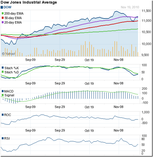
The 50 day EMA is still rising and supporting the index, but this consolidation within a triangle pattern after a fall is likely to lead to a downward break below the 50 day EMA. The technical indicators are also supporting a correction. The slow stochastic is below the 50% level. The MACD is barely positive and falling below the signal line. The ROC is negative. The RSI is falling below the 50% level and made a lower bottom – a negative divergence.

No need for panic, as long as the Dow remains above the rising 200 day EMA. In fact, an opportunity to buy the dip.

FTSE 100 Index Chart

image

The FTSE 100 index chart pattern continues to make a bearish pattern of lower tops and lower bottoms. The index lost a bit more than 1% on a weekly basis but managed to close on the 50 day EMA. Volumes were the highest on Tue. Nov 23 ‘10, which was a down day.

The technical indicators are bearish. The slow stochastic bounced off the oversold zone, but remains below the 50% level. The MACD is below the signal line and in negative territory. The RSI is below the 50% level. The ROC is rising, but remains in negative zone.

Bottomline? Both the Dow Jones (DJIA) and FTSE 100 index chart patterns are in corrective moods. Use the dip to buy selectively, but maintain stop-losses.

Saturday, November 27, 2010

BSE Sensex and NSE Nifty 50 Index Chart Patterns – Nov 26, ‘10

BSE Sensex Index Chart

Sensex_Nov2610

The BSE Sensex index chart pattern continued its sharp fall, as expected from the technical indicators last week. The fall was exacerbated by the housing finance scam, which was dispelled initially as ‘just a bribery scandal involving a few greedy PSU officials’. Now, several companies are being investigated for using ill-gotten loans to manipulate stock prices. The CBI, Enforcement Directorate, Income Tax department and SEBI have started separate enquiries.

Another technical support level – the 100 day EMA – has fallen by the way side. Twin supports from the rising 200 day EMA and the previous top of 18500 should halt the Sensex slide. Will they?

The last leg of the up move – from the May ‘10 low of 15960 to the Nov ‘10 peak of 21109 – covered 5149 points. A 50% Fibonacci retracement would mean a cut of 2575 points from the top. That gives a downside target of 18534. Since the market is aware of these technical support levels, there is a good chance that buying may emerge as the Sensex nears the 18500 mark.

What do the technical indicators say? The MACD is well below the signal line and dropping in negative territory. The ROC is in negative zone and well below its 10 day MA. But note that it has stopped falling. Both the RSI and slow stochastic are in their oversold zones. The market appears oversold.

I have learned the hard way not to bet against the Sensex trend. However, there is a good possibility of an upward bounce from the 18500 level. Provided, of course, that more cockroaches don’t emerge from the housing loan scam. Investment sentiment among FIIs will surely be affected by such regular revelations about scams and corruption.

NSE Nifty 50 Index Chart

Nifty_Nov2610

The Nifty 50 index chart has dropped on strong volumes on the last two days, and that is a concern for the bulls. The ease with which the Nifty dropped through the 100 day EMA suggests that a test of support at the 200 day EMA may be imminent.

The longer-term moving average is just below the previous top of 5550 and should halt the index fall – even if temporarily. The 50% Fibonacci retracement level of the last leg of the up move from the low of May ‘10 to the peak of Nov ‘10 is at 5562. In case the Nifty drops below the 200 day EMA, there is good support in the 5300-5400 zone.

The index has corrected just about 9% from its recent peak of 6338. But many stocks – even the ones that have not been tainted by the housing loan scam – have corrected a lot more. Investors would do well to make a short-list of the fundamentally strong companies that have taken bigger hits in their stock prices than the Nifty.

Bottomline? Both the BSE Sensex and Nifty 50 chart patterns are approaching strong support zones on the down side. The supports should hold. If they don’t, then a much bigger correction may unfold. Hold off on buying till the correction finds a bottom. 

Thursday, November 25, 2010

Chart Patterns of Housing Finance Companies

This week’s focus for the stock markets has been the LIC Housing Finance scam that queered the pitch further for the slipping stock markets.

Warren Buffett has said that there is never just one cockroach in the kitchen. Government mandarins tried to soft-pedal the scam by calling it a mere bribery scandal involving a handful of officials. But there is obviously more to it than meets the eye.

Now SEBI has started an investigation into insider trading and a figure of Rs 1000 Crores is being mentioned as the amount funnelled into stock trading by 5 companies. Wait for more cockroaches to emerge.

The LIC Housing Finance stock, along with bank and realty stocks, have taken a beating. It may be a good idea to take a look at the one year bar chart patterns of some housing finance stocks to check if some are faring better than the others.

Can Fin Homes

CanFinHomes_Nov2510  

After meandering sideways for 7 months, the Can Fin Homes stock broke out sharply on good volumes in Jun ‘10, and touched a peak in Aug ‘10. Thereafter, the stock has been drifting down making bearish lower tops and bottoms. Today, it has dropped down to seek support at the 200 day EMA and is looking the weakest technically. If the support from the long-term moving average gives way, the stock can drop to 100.

Dewan Housing Finance

DewanHsgFin_Nov2510

The Dewan Housing stock was in a strong bull rally through the past 12 months till it hit a peak of 347 earlier this month. The sharp correction has trimmed nearly 40% of its gains since the low of Feb ‘10. A drop to the 200 day EMA (at 256) is a possibility.

GIC Housing Finance

GICHsgFin_Nov2510

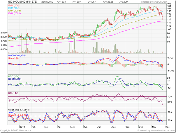
The GIC Housing Finance stock has a similar chart pattern to Can Fin Homes. The difference being a recent bearish double top formation and the subsequent quick drop towards the 200 day EMA. A fall below the long-term moving average may get support at 105.

GRUH Finance

GruhFin_Nov2510

An HDFC subsidiary, the GRUH Finance stock has performed very well to touch a high of 451 in Sep ‘10. The subsequent fall has corrected 31% of the rise from the low of Feb ‘10. Note that the stock has bounced up today from just below the 100 day EMA. Could be a good area to start accumulating.

HDFC

HDFC_Nov2510

HDFC is the all-time favourite stock of the FIIs and one of the best-managed companies in India. After reaching a peak of 780 in Sep ‘10 (adjusted for a 5:1 stock split), the stock has been consolidating in a ‘pennant’ pattern. Can be accumulated at all dips.

Bottomline? All stocks of housing finance companies are undergoing corrections, but HDFC and GRUH Finance have proved more resilient. If you like this sector, these two should be your top picks.

Wednesday, November 24, 2010

The LIC Housing Finance scam: bigger than Satyam?

The scale of the LIC Housing Finance scam is possibly bigger than the Satyam scam. The amount involved hasn’t been revealed yet. But the simultaneous raids in several cities by the CBI and arrest of senior officials of PSU banks and financial institutions point to a significantly larger operation.

A few months back, when the Sensex was consolidating in a sideways channel, a stockbroker friend had made a surprising comment: “Bull markets require a nice scam to shoot up to new highs.”

A reader commented: “The markets have NEVER peaked out on scams.” My counter argument was: “The Sensex hit recent bull market tops because of the excess liquidity created by the scams. The scams were detected much later - after the scamsters sold out and made huge profits.”

No doubt that FII inflows have provided the major fuel for the bull market rise. But what caused the sudden jump out of the year-long trading channel to an all-time high close above the 21000 level? Could it be that the ill-gotten loans were channeled into the stock market? Only a detailed investigation by SEBI may reveal that. I won’t be a bit surprised if the real estate sharks were dabbling in the stock market to quickly recover the bribes they paid to the PSU officials to get the loans.

As with all such scams in India, the big fish will probably get away and most of the money will vanish into thin air (or into Swiss bank vaults). And who will bear the brunt of the fall in stock prices? Small investors like us.

I could only sympathise with a reader who wrote the following email:

‘I had been investing in LIC housing finance for some time now and sitting on decent returns. And just when all looked rosy, here comes a housing scam involving it and as a result the share tanks 20% :(

No respite for us poor retailers. Wonder whether there is any sense in becoming a long term investor at all ... its like waiting for some scam to happen n wipe off your money!’

My advice? Sell tomorrow or switch to HDFC. Small investors are better off regularly investing in index funds or index ETFs, rather than in individual stocks.

Now a quick look at the one year bar chart pattern of LIC Housing Finance:

LICHsgFin_Nov2410

After touching an all-time high of 1496 on Sep 29 ‘10, the stock has been making a bearish pattern of lower tops and bottoms and had fallen below both its 20 day and 50 day EMAs. It bounced off the 100 day EMA yesterday, only to find resistance from the falling 50 day EMA.

As of yesterday (Nov 23 ‘10), the technical indicators were all bearish. The MACD was negative and below the signal line. The ROC was also negative and below its 10 day MA. The RSI was below the 50% level. The slow stochastic was in the oversold zone.

While the news of the scam caused a high volume drop below the 200 day EMA today, the stock was already on a down trend. Higher volumes on down days had given ample indications to investors to book profits. Was it insider selling? Only SEBI can answer that.

Buying and holding fundamentally strong stocks for the long term is an excellent investment idea, but one makes money only by selling. Partial profit booking near all-time highs can save some pain if sudden calamity hits.

Bottomline? Unforeseen situations do happen in the stock market. No one rings a bell to warn investors. Partially eliminate blows to your portfolio by following disciplined investment strategies: Partial profit booking is one; buying only the best is another (HDFC instead of LIC Housing Finance, or TCS instead of Satyam); basic knowledge of technical analysis often provides clues.

Tuesday, November 23, 2010

The Sensex and Nifty are correcting: is it a buying opportunity?

After closing at all-time high levels on Nov 5 ‘10, both the Sensex and Nifty indices have been undergoing corrections and have dropped below the 50 day EMA. However, both indices are well above their rising 200 day EMAs. That means both indices are bearish in the medium term and bullish in the long term.

In technical analysis, the 200 day EMA is taken as the trend decider. An index or stock trading above a rising 200 day EMA is in a bull market. If an index or stock is trading below a falling 200 day EMA, it is considered a bear market. As of now, there is no sign of a trend change, so bull market investing tactics should apply.

In a bull market, one should buy the dips. In bear markets, one should sell the rises. Since both the Sensex and Nifty are in bull markets, the answer to the question is an obvious ‘yes’. Less obvious is: when should one start buying?

That may depend on factors, such as:

Both indices are still quite a bit above their average P/E valuations. Then there is the old adage about not trying to catch a falling knife. When you combine the two, the smart move will be to wait for the correction to play out before buying. How does one know when the correction will get over?

That is another tough question. The honest answer is: no one really knows. The global economic and political news is increasingly turning negative. Europe is still in doldrums. Ireland has opted for a bail-out that is threatening the survival of its ruling coalition. The problems of Greece, Portugal, Spain have been postponed and not solved. They too may opt for bail outs – which means debt restructuring or money printing.

The second round of money printing (QE2, if you want to be nice) in the USA is surely going to devalue the dollar some more and cause US stock markets to rise. Year-end profit booking considerations of FIIs are likely to lead to selling in emerging markets. China’s likely belt-tightening has already caused a sharp drop in the Shanghai Composite. That is inducing a domino-effect on other Asian indices. The sudden heightened tension between North and South Korea is not good for the Asian markets in the near term.

The domestic political news is also casting a shadow over the Sensex and Nifty. The Commonwealth Games scam was bad enough. Now the telecom 2G licence scam has brought the opposition as well as a coalition partner together in cornering the government with the strident demand of a JPC (Joint Parliamentary Committee) probe. The Supreme Court has wrapped the knuckles of the Prime Minister. In a typical political tit-for-tat, the Congress party has upped the ante against the Karnataka BJP Chief Minister – forcing the Left parties to demand the CM’s ouster.

To cut a long story short, the environment is not conducive to a quick end to the ongoing corrections in the Sensex and Nifty. Remain patient, and hold on to your wallet. In last Friday’s post, I had mentioned different support levels for both the Sensex and the Nifty. Watch those levels closely for any upward bounces on good volumes. That will be the signal to start buying again.

Monday, November 22, 2010

Stock Index Chart Patterns – Dow Jones (DJIA) and FTSE 100 – Nov 19, ‘10

Dow Jones (DJIA) Index Chart

image

Two weeks back, the Dow Jones (DJIA) index chart had closed at a 2 year high. But negative divergences in the technical indicators had signalled a likely correction. I had advised investors to wait for a dip to the 20 day EMA before buying.

The correction did occur as expected, but deteriorating fundamental news led to a deeper correction down to the 50 day EMA. Fears of Chinese belt tightening and Irish sovereign default proved short-lived - as often happens in bull markets – and the Dow recovered to close above the 20 day EMA by the end of last week.

Such corrections are good for the overall health and sustainability of the bull market, and the bounce up from the 50 day EMA indicates that the bulls are ready to resume control. The technical indicators are also signalling that the correction may be over.

The slow stochastic is below the 50% level, but has started to move up. The MACD is below the signal line, but is in positive territory and has stopped falling. The ROC is at the ‘0’ line after dipping below it. The RSI has climbed back above the 50% level. The volume action is a concern. The highest volumes were on Tue. Nov 16 ‘10 – a ‘down day’. Friday’s higher close was on lower volumes.

The upcoming Thanksgiving holiday weekend could result in the Dow failing to make much headway, as the focus shifts to football and turkey dinner.

FTSE 100 Index Chart

image

The FTSE 100 index chart has been following the Dow for the past three months, but missed a step last week. The bounce up from the 50 day EMA took the index above the 20 day EMA on Thu. Nov 18 ‘10, only to slip below by the end of last week.

The RSI didn’t drop below the 50% level during the correction and has started to move up. That’s a bullish sign. Not so with the other three indicators. The slow stochastic is falling below the 50% level. The MACD is still in positive zone, but below the signal line and falling. The ROC has dipped below the ‘0’ line.

Some consolidation may be on the cards, before the bulls can gain back control.

Bottomline? The chart patterns of the Dow Jones (DJIA) and FTSE 100 indices are recovering after corrections down to the 50 day EMAs. Both indices are in bull markets, and such dips provide good entry opportunities.

Sunday, November 21, 2010

Stock Index Chart Patterns – Shanghai Composite, Jakarta Composite, Taiwan (TSEC) – Nov 19, ‘10

Shanghai Composite Index Chart

image

From the high of 3182 touched on Apr 15 ‘10, the Shanghai Composite index dropped more than 850 points to the low of 2320 on Jul 2 ‘10 before starting a rally. After spending almost 6 months below the 200 day EMA, the index broke above the long-term moving average on Oct 11 ‘10.

A sharp up move took the Shanghai Composite to a 7 month high of 3187 on Nov 11 ‘10. Just when it seemed that the bulls were back on top, fears of economic tightening brought the bears out of hiding. The index plummeted to the flattening 50 day EMA in three trading sessions, losing 9% (almost 300 points) from the recent high.

The technical indicators have turned bearish and the index may again fall below the 200 day EMA. The slow stochastic has dropped below the 50% level. So has the RSI. The ROC is in negative territory. The MACD is positive but below the signal line and falling.

If the 200 day EMA is unable to support the fall, there is good support in the 2650-2700 zone. Note that the RSI and ROC made much lower tops while the Shanghai Composite touched a new high. The negative divergences gave warning about an impending correction.

Taiwan (TSEC) Index Chart

image

Unlike its mainland counterpart, the Taiwan (TSEC) index chart is in a firm bull market. After touching a new high of 8474 on Nov 8 ‘10 the index is facing a correction and the index has been consolidating between the 20 day and 50 day EMAs for the past 4 trading sessions.

The technical indicators are looking weak, but there are signs that the TSEC may soon move above the 20 day EMA and resume the rally. The slow stochastic has fallen below the 50% level but trying to turn around. The ROC has moved up to the ‘0’ line after slipping below it. The RSI is just below the 50% level.

The MACD, ROC and RSI made lower tops as the TSEC moved higher. The negative divergences usually indicate that a correction is around the corner.

Jakarta Composite Index Chart

image

The Jakarta Composite index has been moving up strongly on good volumes, and corrections have been minor and well-supported by the rising 20 day EMA. Negative divergences visible in the technical indicators did not result in a deeper correction.

The technical indicators are recovering quickly. The slow stochastic and RSI have bounced off their 50% levels. The ROC has moved up after touching the ‘0’ line. The MACD is just below the signal line in positive territory.

While the BRIC (Brazil, Russia, India, China) nations have received greater attention from global investors, the Jakarta Composite has been one of the best performers – touching new all-time highs on a regular basis.

Bottomline? The chart patterns of Asian indices are displaying contrasting fortunes. China’s fastest growing economy has not resulted in a strong bull market, as it trades way below its all-time highs. Taiwan (TSEC) is faring better, but is also trading below its all-time high. Jakarta Composite is looking overbought in the long-tem charts. Booking some profits in Jakarta and deploying in Taiwan may be a good idea. China should be avoided for the time being.

Friday, November 19, 2010

BSE Sensex and NSE Nifty 50 Index Chart Patterns – Nov 19, ‘10

BSE Sensex Index Chart

SENSEX_Nov1910

In last week’s analysis of the BSE Sensex index chart pattern, I had indicated that the probability of the index falling below the 19772 support level was high. The Sensex dropped below the support level intra-day on Thu. Nov 18 ‘10, but managed a smart recovery by the end of trading. No such luck today. The index dropped below and stayed below – closing the holiday-shortened week at 19585. This was the second straight lower weekly close after the Sensex had closed at an all-time high level of 21005 two weeks back.

Will the correction continue next week? Yes, as per the technical indicators. The Sensex closed just below the flattened 50 day EMA on Thursday, and Friday’s high (also the opening level) touched the 50 day EMA. Once penetrated from above, the 50 day EMA has started to resist any up moves.

The MACD has dipped into negative territory, and is well below its signal line. The ROC has turned negative and its 10 day MA is about to follow. The RSI tried to cling on to the 50% level for a while before dropping below. The slow stochastic has fallen sharply to its oversold zone. All four indicators have turned bearish.

Is it time to short the index? It may not be a good idea – for three reasons:

1. The Sensex is in a bull market. The strategy in a bull market should be to buy the dips. Short only if you really know what you are doing and have the discipline to exit if your stop-loss is triggered.

2.  Note the slow stochastic. For the past 6 months, it has spent very little time in the oversold zone. Not unusual in a bull market. An upward bounce can happen soon.

3.  Today’s FII and DII trading data. Both were net buyers to the tune of Rs 668 Crores – and still the index dropped almost 350 points. Things can turn around quickly if they continue buying.

On any upward bounce, expect the 19772 level, the falling 20 day EMA and the flat 50 day EMA to provide resistance. On the downside, support can be expected from the 100 day EMA at 19300, the previous top at 18500 and the 200 day EMA at 18350. A close below the 200 day EMA will change the bullish equation, and open the door for a deeper correction.

NSE Nifty 50 Index Chart

Nifty_Nov1910

The NSE Nifty 50 index chart has closed below the support level of 5932 on good volumes and all four technical indicators have turned bearish. The chance of further correction next week is on the cards. Expect supports at 5800 (100 day EMA), 5550 (previous top) and 5500 (200 day EMA).

Q2 results have been good, but there are signs that higher raw material prices and rising interest rate may have adverse impacts on profitability in the next two quarters. The $600 Billion that Ben Bernanke has decided to pump in will stoke the fire of inflation globally. India may get singed, if not burned.

Bottomline? The BSE Sensex and Nifty 50 indices are undergoing a much-needed correction. Another 5-8% correction from current levels will be healthy for the bull market. For small investors, this is not a time to be active in the market. Identify fundamentally strong stocks that can be added on this dip, but wait for the indices to change direction before jumping in.

(Note: the telecom sector has been out of favour with investors, but I identified 2-3 stocks that are swimming against the bear tide.)

Thursday, November 18, 2010

About Asset Allocation – a guest post

Many small investors jump into the market – usually near bull market peaks – without doing any prior homework about how the stock market or mutual funds industry operates. They end up with a portfolio full of questionable investments that teaches them a very costly lesson – there are no short cuts in life, and definitely not in the field of investments.

Now that the stock market is hovering near its all-time peak, Nishit’s guest post addresses the important concept of asset allocation. Investing without an asset allocation plan is like going to a railway station and hopping on to the first train that is leaving a platform without knowing where it is headed. You may get somewhere, but it may not be a place you want to visit.

The thrill of adventure of not knowing where you are going – physically or financially – may be fun for a while, but expensive in the long run. Following an asset allocation plan takes away most of the uncertainty of your investment future, and ensures that you stay invested through the ups and downs of the market.

-------------------------------------------------------------------------------------------------------------

Today, we explore an important pillar of financial investing: asset allocation. Before we move further, let me ask you one of the most fundamental questions: Why do we work for a living? Why do we spend stressful hours commuting, tolerating unpleasant bosses, enduring long caffeine-fuelled meetings? Do we do it because we like doing it? Some of us may love our work greatly, but for most it is a way of earning money. The path to an early retirement is proper asset allocation.

Assets are of various types. They could be equity, debt, real estate, gold, and cash. The idea is to earn an optimum rate of return by taking the right amount of risk. The risk profile of every person is different. Riskier assets generally yield more returns, but not everyone can take the same amount of risk. A person aged 30, having a good job can withstand some capital erosion but a retiree at 65 with no avenues of earning money other than those generated from his assets can’t afford to lose money.

clip_image001

A thumb rule of asset allocation is that a person can invest upto (100 - age)% in equity. For example, a 30 year old can have 70% asset allocation to equity while a person who is 65 years old should avoid investing more than (100 - 65 =) 35% in equity. Now, thumb rules are meant to be only a guideline.

While making an asset allocation plan, one must also look at the ease of liquidation of the assets. How many days would it take to liquidate the assets and have hard cash in hand? Equities and gold ETFs normally take 3 days from the date of selling to get cash in hand. Debt can usually be redeemed in about a week’s time, be it mutual funds or fixed deposits – sometimes with a penalty of 1-2%.

The trickiest asset is real estate. It requires legal documentation, involves part transaction in ‘black’ money and has almost no transparency. Also, when the prices start falling you may find no buyers. I am a strong advocate of the policy of owning only the house you live in. Else, invest in REITs or stocks of real estate companies.

The trick is to treat all your assets as a fund and find out what the rate of return on the portfolio is. Any return above 16% (twice the 10 year government bond rate) is an excellent return on investment. The idea is to get rich slowly, step by step.

The cardinal rule to be followed is preservation of capital, followed by return on investment. For a 30 year old, the portfolio could be 20% gold, 40% equity and 40% fixed income. For a 60 year old the equity could be 20%, rest in gold and debt.

An example of retiring early and doing what one wants is Lakshmi Ramchandran, who blogs at http://vipreetinvestments.blogspot.com/. She took Voluntary Retirement from her bank in 2001 and is doing what she loves most. She does Technical Analysis, trades the market and enjoys life at her own pace.

Further insights on asset allocation can be found here: http://www.investopedia.com/articles/pf/05/061505.asp

-------------------------------------------------------------------------------------------------------------

(Nishit Vadhavkar is a Quality Manager working at an IT MNC. Deciphering economics, equity markets and piercing the jargon to make it understandable to all is his passion. "We work hard for our money, our money should work even harder for us" is his motto.

Nishit blogs at Money Manthan.)

Related Post

How to reallocate your assets

Tuesday, November 16, 2010

Should you invest in Telecom Sector stocks?

Regular readers of this blog may be aware of my bearish view about the telecom sector. I had written a post back in Oct ‘09, advising investors to switch out of telecom sector stocks. There were many reasons for such advice: commoditised services, strong competition from overseas players, regular capital expenditure, astronomical fees for new licences, falling ARPU (average revenues per user).

Adding to the litany of woes for the sector is the 2G licence scam that has cost the Telecom Minister his job. The government is under severe pressure from the opposition to act due to several recent scams involving massive sums of money. Any action may lead to fines and penalties on telecom service operators who either obtained their 2G licences through dubious means, or paid too little for it, or sold their licences to others at huge profits.

Does that mean all the stocks in the sector should be shunned? Given below are ten telecom sector stock charts – five of them are telecom service providers and the other five provide software services and network hardware. All the charts have a horizontal line representing the closing price of the stock on Oct 6 ‘09 (the day I wrote my bearish post on the telecom sector).

MTNL

MTNL

This PSU, which had a monopoly on fixed line services in Delhi and Mumbai, has fallen on hard times. It slipped into a loss last year and has dropped below the falling 200 day EMA. Both the RSI and slow stochastic are in oversold zones. Use any rises to sell.

Bharti Airtel

BhartiAirtel

Bharti Airtel is the jewel among the telecom pack, but has lost quite a bit of its lustre. Many investors are still bullish about the stock. However, barring a few days in Sep ‘10, the stock has remained below its Oct 6 ‘09 closing level of 359. The Zain acquisition in Africa is yet to add to the bottom line. The recent up move has ended with a head-and-shoulders bearish pattern with a neckline at 320. A pullback to the neckline may be an opportunity to sell.

Reliance Communications

RelComm

What can I say about the Reliance Communications stock chart? The Oct 6 ‘09 closing level of 269 seems a distant dream. Losses in three of the past four quarters. If you are holding this stock, ask yourself: Why?

Idea Cellular

IdeaCellular

What have we here? A telecom services company that is trading higher than its Oct 6 ‘09 price! Hand it to the management acumen of the Birlas and the innovative ad-campaign featuring the ‘baby B’  for turning the fortunes around at Idea Cellular. Steadily gaining market share, this stock is a good contrarian play – provided you wish to invest in the telecom sector.

Tata Teleservices (Mah.)

TataTele

Despite the Tata name and their best efforts, the bottom line is a sea of red. The stock has remained an underperformer. Sporadic moves above the falling 200 day EMA have been used as selling opportunities. Avoid.

Subex

Subex

The Subex stock – a favourite of investors in the previous bull market – got hammered during the economic downturn and slipped into the red. The telecom fraud management software provider has since turned around, and is forming a bullish cup-and-handle continuation pattern. The break out above the Oct 6 ‘09 closing price has been on strong volumes. The dip (forming the ‘handle’) can be used to add. The huge debt burden makes this a high-risk play.

OnMobile Global

OnMobile

Despite its strong pedigree, the OnMobile stock has remained expensive and an underperformer. The value-added software niche has promise that hasn’t yet been turned into performance. One of its big clients – Vodafone – is facing a huge income tax liability. Even now, it is trading at an expensive TTM P/E of 25. Only very patient long-term investors should think about entering this stock.

Geodesic

Geodesic

The Geodesic stock spent the better part of the past 13 months below the Oct 6 ‘09 closing price. Of late, it has moved up sharply to regain most of its lost ground. The stock appears fundamentally sound, but I have neither been able to figure out its business model nor the reason for its considerable unsecured loans. As the old saying in the market goes: if in doubt, stay out.

Tanla Solutions

Tanla

I really have no idea what they do, or who they do it to. Four straight quarters of losses and a chart that looks like a roller blader going down an icy road is enough to convince me not to give a second look to Tanla Solutions.

MRO-Tek

MROTek

This network hardware provider has been around for long, but achieved little. I hate to admit it, but I did own this stock for several months during the previous bull market and was fortunate to exit with a tidy profit. Only good for medium-term trading. Not an investment candidate.

Related Post

Should Indian investors switch out of Telecom Sector stocks?

American Index Chart Patterns – one year charts

Last month, I had taken a look at the 5 year chart patterns of American indices. The S&P 500 and the Canada TSX charts remained well below their all-time highs and were struggling to cross their Apr ‘10 tops. The Brazil BOVESPA chart was a little below its all-time high. The Mexico IPC and the Argentine MERVAL charts were at new all-time highs.

Some interesting changes have occurred since last month’s post, which the one year chart patterns of the American indices will reveal:

S&P 500 Index Chart

image

Last week, the S&P 500 index chart moved marginally above the intra-day and closing high levels touched in Apr ‘10. The 50 day and 200 day EMAs are rising with the index above them. Note that the 50 day EMA straddled the 200 day EMA for two months before moving up. The S&P 500 has made a bullish pattern of higher tops and higher bottoms. All point to a revival of the bull market.

That was the good news. Now the bad. By dropping below the 1200 level and failing to move significantly above the Apr ‘10 top on reduced volumes, the index may be forming a bearish double-top pattern. The double-top can be confirmed only if the index falls below the Jul ‘10 low. Should that happen, the S&P 500 index chart can drop to 900.

The bearish possibility will be negated if the index bounces up after finding support at the 50 day or 200 day EMA. Such an upward bounce will be an adding opportunity.

Canada TSX Composite Index Chart

image

The Canada TSX Composite index chart touched a new 52 week closing high of 13052 on strong volumes – well above its Apr ‘10 top of 12281. Like the S&P 500, it is facing a bit of correction.

Note that the 50 day EMA formed a bullish saucer-like pattern and didn’t fall to the 200 day EMA. The TSX Composite index had dipped below the 200 day EMA for only 7 trading sessions during the past 12 months and remains in a bull market. Use the dip to add.

Mexico IPC Index Chart

image

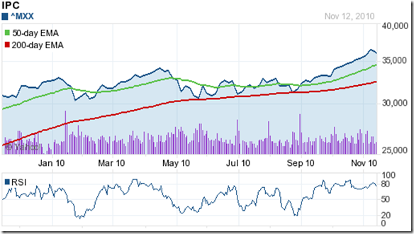
The Mexico IPC index chart touched a new all-time high of 36814 last week and ended up gaining almost 1600 points (4.5%) since my previous post.

Bulls are in complete command, and the dip following the new high is an adding opportunity. Note that the IPC index hasn’t dropped below the 200 day EMA even once during the past year.

Brazil IBOVESPA Index Chart

image

The Brazil IBOVESPA index chart comfortably crossed its Apr ‘10 intra-day and closing highs with more than 1000 points to spare, but fell 400 points short of its all-time high of 73517 (touched in May ‘08).

The bears launched a strong attack to take the index down to the 70000 level and the rising 50 day EMA. Note that the RSI has been rising while the IBOVESPA index has been correcting. The index is likely to resume its up move soon.

MERVAL Buenos Aires Index Chart

image

The Argentine MERVAL index chart pattern touched a new all-time high of 3381 on Nov 5 ‘10. The index has risen too steeply above the 50 day EMA and is looking overbought.

The RSI has been inside the overbought zone for the past three weeks, which is unusual. The correction may last a little longer.

Bottomline? The one year American index chart patterns are in bull markets of varying strengths. Stay invested with trailing stop-losses, or add the dips.

Sunday, November 14, 2010

Comparison of BSE Sensex and European Index Chart Patterns – FII inflows to continue?

The BSE Sensex index chart pattern has relied on substantial FII inflows to sustain its bull rally of the past 20 months. Will the FII inflows continue? A comparison with some of the 1 year chart patterns of the European indices (in blue) clearly show that the Sensex chart (in green) has outperformed all of them – thanks to the stronger growth of the Indian economy.

Austria ATX Index Chart

image

The Austria ATX index chart has barely gained during the past 12 months, but actually outperformed the Sensex through Dec ‘09. From May ‘10 onwards, the Sensex chart gradually pulled away.

France CAC 40 Index Chart

image

The CAC 40 index chart has made no progress in the past 12 months, though it had managed to track the Sensex till the middle of April ‘10. It was a no-contest thereafter.

Germany DAX Index Chart

image

The DAX index chart pattern has gained almost 20% – the best among the European indices. It outperformed the Sensex till July ‘10. The tables were turned from Aug ‘10 as the Sensex broke out above its long trading range.

Netherlands AEX General Index Chart

image

The AEX General index chart has gained about 9% in the past year, and stayed ahead of the Sensex till the middle of Jun ‘10. Once the Sensex took the lead, there was no looking back.

Oslo All Share Index Chart

image

The Oslo All Share index chart has been one of the better performers, and gained a creditable 15% during the last 12 months. It fell behind the Sensex from Jul ‘10 onwards

Stockholm General Index Chart

image

The Stockholm General index chart also performed well to gain 15%, and only fell behind the Sensex from Sep ‘10.

Swiss Market Index Chart

image

The Swiss Market index chart is bringing up the rear – along with the CAC 40 and the Austria ATX index charts – by barely gaining 2% during the past 12 months. It outperformed the Sensex during Feb ‘10 to Apr ‘10. It was a different story from Jun ‘10 onwards.

UK FTSE 100 Index Chart

image

The FTSE 100 index chart managed to touch the double figure mark in percentage gain during the past year, but has underperformed the BSE Sensex index since Jun ‘10.

Bottomline? The underperformances of the European index charts in comparison with the BSE Sensex index are likely to continue for a while longer. Till the European economies start showing strong signs of improvement, or the Indian economy starts slowing down drastically, the FIIs inflows are unlikely to reverse direction.

Saturday, November 13, 2010

Stock Index Chart Patterns – Hang Seng, Singapore Straits Times, Malaysia KLCI – Nov 12 ‘10

Hang Seng Index Chart

image

Four weeks back, the Hang Seng index chart pattern was looking very bullish. But the index had risen too fast and was more than a 1000 points above the rising 20 day EMA. I had written that bears could hope for a possible correction down to the 20 day EMA. That would be good for the sustenance of the bull market, and provide entry opportunities.

The index did drop down to the rising 20 day EMA, received good support there and moved up more than 2000 points to touch a new intra-day high of 24988 on Mon. Nov 8 ‘10. The rise was too steep, and the volumes were much higher when the Hang Seng had touched its previous peak in Oct ‘10. All four technical indicators made lower tops. The effect of the combined negative divergences, plus the sell off in Korea KOSPI and Shanghai Composite led to a sharp correction that brought the index down towards the rising 20 day EMA once again.

The technical indicators have weakened a bit but remain bullish. The slow stochastic has slipped down from the overbought zone. The MACD is positive and above the signal line. The ROC is positive and the RSI is above the 50% level. All three EMAs are moving up, and the Hang Seng remains in a bull market. The dip can be used to add.

Singapore Straits Times Index Chart

image

The Singapore Straits Times index chart pattern had dropped below the 20 day EMA in late Oct ‘10, stopped short of falling to the 50 day EMA and made a spirited rally to a new high of 3314 on Nov 9 ‘10. A bout of profit booking saw the index close the week at 3252.

The bull market is in tact with all three EMAs moving up. The technical indicators are all bullish, though the RSI is showing negative divergence. Use the dip to add.

Malaysia KLCI Index Chart

image

The Malaysia KLCI index chart pattern touched a new high of 1532 on Nov 10 ‘10, but closed the week just below the 20 day EMA and the 1500 level. Note the lower tops in the MACD and ROC as the index kept on moving higher for the past two months.

The correction on the last two days have been on strong volumes, which is a concern. The slow stochastic and RSI have dropped sharply from their overbought zones.The MACD is positive and hanging on to the signal line. The ROC has almost dropped to the ‘0’ line.

The index may drop down to the 50 day EMA. Use the dip to add.

Bottomline? The chart patterns of the Asian indices are facing corrections after touching new highs. These corrections are good for the sustenance of the bull markets, and investors can use the dip to add to their portfolios. But please don’t throw caution to the winds. Maintain adequate stop-losses.

Friday, November 12, 2010

BSE Sensex and NSE Nifty 50 Index Chart Patterns – Nov 12, ‘10

BSE Sensex Index Chart

Sensex_Nov1210

Last week, the BSE Sensex index chart pattern had closed at an all-time high just above the 21000 level, negating the bearish head-and-shoulders pattern discussed two weeks back. I had advised investors against celebrating the new high because of the negative divergences clearly visible in all four technical indicators – which made lower tops as the Sensex closed at an all-time high.

Was it purely technical reasons that caused the Sensex to slide by 850 points this week, or were there some fundamental reasons as well? Let me put it this way: technical analysis helped to provide an advance warning. A deterioration in the global economic scenario hastened the fall.

There is an old saying: misfortune never comes alone. The Sensex was no exception. First, there was the ripple effect of a sell off in South Korea’s KOSPI index because the USA and South Korea failed to sign off on an expected deal during President Obama’s visit. The ripple turned into a wave when the Shanghai Composite index sold off because of expected economic tightening due to rising inflation. Ireland’s cost of borrowing has reached new highs, and another bail-out by the European Union may be in the offing. Last, but not the least, was the poor IIP numbers in India.

The technical indicators continue to show weakness. The MACD is still in positive territory, but has slipped below the signal line and started to fall. The RSI has dipped below the 50% level. The slow stochastic is dropping fast and is just above its 50% level. The ROC is barely positive but has moved below its 10 day moving average.

On the down side, there is likely support at the 50 day EMA at 19950 and at 19772 – which corresponds to the neckline of the failed head-and-shoulders pattern. If that is broken, and the probability seems high, the next support is at the previous top of 18500 and below it, at the 200 day EMA at 18300. A fall to the 200 day EMA will be a good buying opportunity.

On a bounce to the upside, expect resistance from the 21000-21200 zone.  

NSE Nifty 50 Index Chart

Nifty_Nov1210

The NSE Nifty 50 index fell on strong volumes this week – which is cause for concern as it indicates that the correction may continue for a while. All four technical indicators are displaying weakness, though they stopped short of turning bearish.

The support levels on the down side are the 50 day EMA at 6000, the neckline of the failed head-and-shoulders pattern at 5932, the previous top of 5550 and the 200 day EMA at 5500. A break below the 200 day EMA is not expected, but should it occur then a change of strategy would be warranted.

On a bounce upwards, expect resistance from the 6340-6360 zone.

Bottomline? The chart patterns of the BSE Sensex and the Nifty 50 indices are correcting after reaching all-time closing highs. Bull market corrections are healthy and necessary for the upward move to continue. Stay invested in fundamentally good stocks, and refrain from chasing hyped ‘multibagger’ stocks that suddenly appear out of the woodwork near bull market tops. Start preparing a ‘buy list’ – or better still, get ready to add to the stocks already in your portfolio.