Thursday, April 29, 2010

Does the Dogs of the Dow theory also apply to the Sensex stocks?

What on earth is the Dogs of the Dow theory? Why would any one want to apply the Dogs of the Dow theory to the Sensex stocks? What if the theory does apply, and what if it doesn't? Let me try and answer those questions one by one.

What motivated me to even discuss such a topic? Too many new investors wanting to enter the stock market without a clear idea about what to do. Many don't even realise that making money in the stock market is a full time activity.

I have advised investors to buy index funds or index ETFs, and balanced funds - but to stay away from buying individual stocks unless they have the time and knowledge to pick their own stocks. But I know that many think I'm plain old-fashioned and prefer to enjoy the thrill of losing money quickly!

Now here is a stock investing plan that is so mechanical that it can run on auto-pilot with a maximum input of two hours effort once a year. Sounds too good to be true? It almost is - but it does seem to work.

Postulated by Michael O'Higgins in his book 'Beating the Dow', the Dogs of the Dow theory goes like this:

Every year pick 10 stocks that form the Dow Jones (DJIA) index and that have the highest dividend yield (i.e. dividend per share to price per share ratio). Allocate equal amounts of money for buying each of the 10 shares. Then sit tight for a year without even looking at your portfolio.

After one year, repeat the process by adding and deleting stocks from your portfolio in such a manner that equal amounts of money are allocated to those 10 stocks that have the highest dividend yield after one year.

Go on repeating the process for a few years - otherwise the benefits of this mechanical investing strategy may not bear fruit. Back-testing the theory with older data have apparently shown the efficacy of the theory.

From 1957 to 2003, the Dogs outperformed the Dow by about 3%, averaging a return rate of 14.3% annually whereas the Dow averaged 11%. The performance between 1973 and 1996 was even more impressive, as the Dogs returned 20.3% annually, whereas the Dow averaged 15.8%.

Why or how does the theory work? The simple assumptions are:-

1. If a stock constitutes the Dow Jones index, then it must be a 'good' stock to own;

2. If a stock is trading at a high dividend yield, then it's price may have been beaten down for some reason, or it may have substantially increased dividends (may be due to some one-off reason - like a big capital gain, or a special anniversary dividend);

3. Either way, the market will eventually recognise that a 'good' stock is going abegging and the price will rise substantially.

The problem with any mechanical or automated investing strategy is that eventually every one starts following it (if it works), and the likelihood of outperforming the Dow Jones index recedes.

So, will the Dogs of the Dow theory work for Sensex stocks? There is no reason why it shouldn't. Just flash back to 2007, near the peak of the bull market. Tata Steel acquired the much bigger Corus. The stock market gave the acquisition a big thumbs down and the stock was beaten out of shape.

Did it substantially reduce dividends? Not at all. It ended up trading at a high dividend yield, and was a prime candidate for any one choosing a Dogs of the Sensex theory.

Question for readers: Do you know of other such Sensex dogs? Do you own them? Will you buy them after reading this post?

Wednesday, April 28, 2010

Stock Chart Pattern - Dhanalakshmi Bank (An Update)

The stock chart pattern of Dhanalakshmi Bank was taking a well-deserved rest after a rapid climb from the low of 37 in Mar '09 to a high of 119 in Jun '09 - when I looked at it in July '09.

The stock not only outperformed the Sensex but kept up the bullish chart pattern of higher tops and bottoms till it made a high of 178 in Oct '09. The stock then developed a double-top bearish reversal and quickly dropped to 123, retracing 39% of the entire rise from 37 to 178 - close to the Fibonacci retracement level of 38.2%. It is quite amazing how the Fibonacci retracement levels keep acting as support/resistance time and again.

Let us take a look at the one year bar chart pattern of Dhanalakshmi Bank:

Dhanalakshmi_Apr2810 

After getting support at 123, the stock entered a long consolidation in a rectangular pattern between 123 and 155. Today's high just fell short of the upper boundary. Eventually, the stock will break out of this rectangular range.

In which direction? That is a good question. Theory of such consolidation patterns state that the break out will be in the direction of the previous trend. Logically, it should move above 155 on higher volumes.

Why? Because the rise from 37 to 178 was obviously a bull phase, and the 39% correction means that there has been no change of trend yet. What about the double-top at 178 in Oct '09? The lowest level between the two tops was at 154 (which is now acting as a resistance level to the consolidation).

Since the stock fell below 154 and met the lower target of the double-top when it hit 130 (178 - 154 = 24; 154 - 24 = 130), the conclusion is that the bull phase is in tact. So should you buy every time the stock falls near 130?

Only if you are planning to trade the rectangle. An investor should only buy on a clear break above 155. What are the chances of the stock falling below 123? In technical analysis, nothing can be ruled out because past patterns on which such analysis is based do not always repeat.

The MACD is above the signal line and rising in the positive zone. The RSI has dipped from the overbought zone. The slow stochastic is showing a bearish cross (%K below %D), but has not dropped from the overbought zone yet. Looks like the stock may remain in the rectangular consolidation band a while longer.

Fundamentally, the bank seems to be performing well - coming out of its shell of a slow regional bank to a more market savvy, growth oriented private bank. However, the indirect Anil Ambani connection is what makes this a slightly risky investment proposition.

Bottomline? The stock chart pattern of Dhanalakshmi Bank has been in a 6 months long sideways consolidation. Wait for a break out to take buy/sell decisions. In the private banking space, Yes Bank may be a better bet because of management pedigree.

Tuesday, April 27, 2010

Did you read my FREE eBook 'How to Become a Better Investor'? Really?

After emailing several hundred copies of my FREE eBook 'How to become a Better Investor', I was taken aback by a large number of reader responses that went like this:

'I've been too busy at work and haven't found the time to read the eBook yet'; or, 'The eBook got buried in my inbox, can you please forward another copy'; or, 'I've been travelling overseas and will read the eBook once I return to India.'

I had deliberately kept the chapters short and the total number of pages to around 30 so that readers will find it easy to read it through. So what happened? Are readers really too busy to read an eBook of 30 pages? Or, in this age of Internet, smart phones and TV, have investors forgotten their reading habits?

Whatever be the reasons, to become a successful investor, inculcating a regular reading habit is of utmost importance. It doesn't matter whether your portfolio is up by 10% or 200%. Looking at the ticker and counting your profits will not prevent investment mistakes.

By reading and re-reading the better known investment books, good investing tricks and strategies will gradually become ingrained in your brain. But before you can contemplate reading Graham's 600 page tome, 'The Intelligent Investor' (if you haven't read it yet, you really should!), you have to first practice by reading my 30 page eBook!

Even after investing for more than 25 years in the stock market I try to find interesting investment books to read - for new ideas and strategies. Why? Because no plan or strategy seems to work for a prolonged period. Just when you think that you've learned it all, the market surprises you with an unexpected jolt.

Recently, while reading William O'neil's 'How to make money in stocks', I came across a simple idea that I felt like sharing. This idea works better for short-term investing, but can be used for long-term investment with suitable modifications.

It is the 3-to-1 rule for setting stop-losses - some thing that every investor should learn, particularly in the current state of the stock market, which is moving sideways in a broad range. Here is the simple rule:

If you expect the stock to rise by 5%, set the stop-loss at 1.5%. If you are buying for a minimum 25% up move, set the stop-loss at 8%. On no account should the stop-loss be greater than 8%.

If you are buying a Rs 20 stock (which will be a pretty risky thing to do now) and expecting to sell at Rs 22 for a 10% profit, the stop-loss should be at Rs 19.40. If you are expecting to sell at Rs 25, set the stop-loss at Rs 18.40.

The stock should be sold as soon as the stop-loss is hit. What if the stock moves higher than expected? Increase the stop-loss by the same percentage (a trailing stop-loss).

Investors lose more money by sitting on their losses and rationalising the loss by saying that they are long-term investors. A loss is a loss - whether it is booked, or remains in your demat account. By limiting your loss to a maximum of 8%, you will not get swamped by a 2008-like tsunami of selling.

Chapter 2 of the FREE eBook describes how to set trailing stop-losses. Even if you don't read any other chapter, read that one and internalise the idea.

Monday, April 26, 2010

Dow Jones (DJIA) Index Chart Pattern - Apr 23, '10

The chart pattern of the Dow Jones (DJIA) index took just a day to recover from the sell off due to the Goldman Sachs fraud news, and continued on its upward march.

The bears must be a really frustrated lot by now. All their efforts to reign in the index rise since the low of Feb '10 have come to nought. By Friday, the Dow made a new intra-day high of 11247 and a closing high of 11204. Another higher close on a weekly basis.

Is there any logic behind this relentless rally on low volumes and without any significant correction? Is it relief at the fact that a total collapse of the financial system has been averted? Is it faith in the 'system' that everything will eventually turn out fine? Are those good enough reasons to continue to buy every time the Dow dips by a percentage point?

Seasoned investors don't worry too much about such questions. The stock market tends to move on sentiment. Logic has very little effect in the equation. The high tide lifts all boats.

At some point in time, in the not so distant future, the effects of the massive economic stimulus will need to get worked out of the system. The tide will turn. There is no point in worrying about it. Instead, like boy scouts, be prepared. By being disciplined about setting trailing stop-losses.

Let us have a look at the 6 months bar chart pattern of the Dow Jones (DJIA) index:-

Dow_Apr2310

The Dow and the three EMAs are moving up nicely together. It is more of a slow and steady up move with frequent support from the 20 day EMA. Volumes have picked up a bit during the last couple of weeks. Note that the highest volume of the month was on the previous Friday, a down day. Last Friday's new high was made on much lower volumes.

The slow stochastic is in the overbought zone. The MACD is positive and touching the signal line, but has not been moving up. The RSI is above the 50% level and exhibiting a clear negative divergence for a month - making lower tops as the Dow moved higher. The MFI is at the edge of the overbought zone but failed to make a new high.

Eventually, the combined effect of the negative divergences and the increasing distance between the 50 day and 200 day EMAs will take its toll on the bulls. Till then, sit back and enjoy the ride - but don't forget to take some profits off the table.

Bottomline? The chart pattern of the Dow Jones (DJIA) index has once again confounded the bears. The last of the bears and the fence-sitters are likely to jump into the fray anytime. A spurt in volumes will follow. That will be the signal for a proper correction.

Sunday, April 25, 2010

Stock Index Chart Patterns - FTSE 100, CAC 40, DAX - Apr 23, '10

FTSE 100 index chart

FTSE_Apr2310

The FTSE 100 index chart pattern had a bit of a struggle trying to fend off the bears - who used the twin excuses of the Goldman Sachs fraud news and the Greek sovereign default issues to mount a strong attack.

After managing to stay above the 20 day EMA during the first three days of the week, the FTSE 100 dropped below the flattened short-term average on Thursday. By Friday, the bulls mustered some courage and a bout of buying aided by short covering took the index back up to the 20 day EMA (Friday's trading not reflected in the chart).

The FTSE 100 closed 21 points lower on a weekly basis. That's not all. Volumes on Wednesday and Thursday - the two down days - were the highest during the week. Not a propitious sign for bulls.

The slow stochastic, RSI and MFI have all dropped to (or below) the 50% levels. The MACD is positive but falling and is below the signal line. The widening distance between the 50 day and 200 day EMAs is another cause of concern.

The bulls are not out of the woods yet. This week's round goes to the bears on points.

DAX index chart

DAX_Apr2310

The DAX index chart pattern had less problems dealing with the bears. In spite of a big increase in volumes during Thursday's down day, the index managed to close exactly on the 20 day EMA after dropping below it intra-day.

A spirited fight back by the bulls not only took the index above the 20 day EMA but also above the psychological 6200 level. The index closed more than 1% higher on a weekly basis.

The widening distance between the EMAs is signalling that the bears may be regrouping. The MFI and RSI have both slipped below the 50% level. The slow stochastic managed to bounce up from its 50% mark. The MACD is positive but a bit below the signal line. The bulls have the edge in the German index.

CAC 40 index chart

CAC_Apr2310

The CAC 40 index chart pattern is having trouble shaking off the bears. Except on Tuesday, it closed below the 20 day EMA. Thursday's high volume down day saw the CAC 40 dip below the 50 day EMA on intra-day basis before managing to close on the medium-term moving average. Friday's small up move could not prevent a lower weekly close below a drooping 20 day EMA.

The MACD is barely positive and is below the signal line. Both the RSI and MFI are below their 50% levels. The MFI has remained below the 50% level for a month. The slow stochastic has almost fallen to the oversold zone. The bears have won the week's round on points - giving them a 2-1 lead heading into the final week of April '10. Will investors sell and go away in May?

Bottomline? The chart patterns of the European indices faced a strong bear attack last week, but haven't suffered too badly. High volume down days are a sign of distribution, so investors should remain cautious. Buying should be very stock specific and in small quantities with strict stop losses. Continue to weed out non-performers in the portfolio.

Saturday, April 24, 2010

BSE Sensex Index Chart Pattern - Apr 23, '10

The BSE Sensex index chart pattern spent a volatile week which seemed particularly confusing for small investors - more so for those who are not yet familiar with basic technical analysis concepts. (Those who have been following this blog regularly may opt to skip reading the next few paragraphs.)

One of the easiest concepts to understand is stock market trends. It has been observed that markets tend to move in upward or downward trends - often called a 'bull market' or a 'bear market'. Some times the market is undecided and moves sideways. But eventually it will either start moving up or down.

It is imperative that investors have some idea about what the current market trend is, before jumping in feet first. A simple way to do that is to learn how to draw a trend line.

In an up trend, an upward sloping line is drawn to join the prominent and higher bottoms. In a down trend, a downward sloping trend line is drawn by joining the prominent and lower tops. Easy enough?

Now comes the interesting part. A 'break' of a trend line - i.e. a price chart falls below an up trend line (or rises above a down trend line) - means the end of the trend. Those favouring (or benefitting from) the existing trend - viz. bulls in an up trend and bears in a down trend - don't want to give up easily.

That is why we often see a 'pull back' to the trend line. That means, shortly after a trend line is broken, prices tend to go back or 'pull back' towards the trend line. During an up trend, a pull back gives an opportunity to sell. In a down trend, a pull back is an opportunity to buy.

Thanks for bearing with me through this trend line lecture. Its purpose will be apparent once we look at the one year bar chart pattern of the BSE Sensex index:-

Sensex_Apr2310

An up trend line (2) has been drawn from the most recent low of 15652 made on Feb 8 '10. Last Friday, Apr 16 '10 this up trend line was broken, but not quite convincingly. On Monday, Apr 19 '10 the FIIs sold heavily - thanks to the Goldman Sachs fraud news. The Sensex dropped more than 300 points to a low of 17277, stopping short of the 50 day EMA, before recovering to close at 17401 losing 190 points.

FIIs turned net buyers during the rest of the week and the Sensex pulled back towards the trend line (2). Note that the earlier up trend line (1) drawn through the lows of July and October '09 was broken in Jan '10. The entire rally from the Feb '10 low has remained below the earlier trend line (1), which is a sign of weakness.

A bear may look at the MACD and use the opportunity of the current pull back to sell. A bull may look at the slow stochastic - which has bounced off the oversold zone, and the RSI - which has moved up to the 50% level, and conclude that this is a buying opportunity. Such opposing views make the stock market such an interesting and challenging place to invest in!

I prefer to remain neutral and fully invested as per my asset allocation plan. Why? Observant readers will note that since the early Sept '09 low of around 15300 to the recent high of 18000, the Sensex has moved in a sideways band of 2700 points.

Friday's close of 17694 is just 237 points above the Oct 20 '09 high of 17457. A 1.35% gain in 6 months. Cash sitting idle in a savings bank account gives better returns! Till a clear trend emerges, there is no point in taking sides.

In a bull market, such a long consolidation should eventually lead to an upward breakout. But one can never be certain about the stock market. In case the Sensex decides to go down - less than expected results from Reliance could act as a trigger - watch for support from the 50 day EMA. If that doesn't hold, the zone between the previous lows of 15300-15650 should provide support.

Bottomline? The chart pattern of the BSE Sensex index is in a sideways consolidation phase, and may remain in this phase for a while longer. A clear trend will emerge only on a break above 18500 or a break below 15300. Till either happens, be patient and stock specific. Keep tight stop losses. Don't make huge bets in 'cheap' stocks - it can be very harmful to your wealth.

Friday, April 23, 2010

Stock Index Chart Patterns - Shanghai Composite, Taiwan TSEC, Hang Seng - Apr 23, '10

Shanghai Composite index chart

ShanghaiComp_Apr2310

Analysing the chart pattern of the Shanghai Composite index last week, I had cautioned that the bulls were not able to regain control from the bears as the index had a lower weekly close.

The crackdown by the Chinese authorities on property deals provided just the opportunity for bears to mount a fresh offensive. The weak bulls capitulated and the index plummeted below the 3000 level and the 200 day EMA.

Except for a brief respite on Wednesday, Apr 21 '10, the Shanghai Composite remained below the psychological 3000 level and the technically important 200 day EMA. The 20 day EMA has dropped to the falling 50 day EMA.

The technical indicators have all turned bearish. The slow stochastic has fallen below the 50% level. So has the RSI. The MACD has moved down into the negative territory and is below the signal line. The ROC has also entered the negative zone.

The saving grace for the bulls is that the index has not fallen too far below the long-term moving average, which means an upward bounce remains a possibility. But a drop below the Feb '10 low of 2890 will form a very bearish 'lower top - lower bottom' pattern.

Hang Seng index chart

HangSeng_Apr2310

The Hong Kong property market was jolted by the Chinese government crackdown. The Hang Seng index followed the Shanghai Composite by dropping below the 20 day EMA. It oscillated between the 20 day and 50 day EMAs for three days. Today's 200 point fall took the index below the 50 day EMA, and another lower weekly close.

Strong volumes on down days (last Friday and on Monday) is not a good sign for the bulls. A test of support from the 200 day EMA is quite likely. The slow stochastic has fallen sharply below the 50% level. The MACD is positive but has dipped below the signal line. The ROC has just entered the negative zone. The RSI managed to stay above the 50% level.

All is not lost for the bulls - yet.

Taiwan (TSEC) index chart

TSEC_Apr2310

The bears in the mainland may have used the property crackdown as an excuse to press sales. But the Taiwan (TSEC) index fell more in sympathy than for any fundamental or technical reason. After a sharp fall and a close below the 50 day EMA on Monday, the index gradually moved up and closed above the 20 day EMA and the psychological 8000 level today.

The slow stochastic has fallen below the 50% level. The MACD is positive but below the signal line. The ROC has entered negative territory. The RSI has moved above the 50% level after dipping below it.

Four weeks ago, I had mentioned that the Jan '10 highs will be tough barriers to climb. The recent high of 8190 on Apr 15 '10 fell short by more than 200 points.

Bottomline? After a respite of two months, the Asian indices are once again struggling to fend off the bears. Keep a close watch on the 200 day EMAs and the Feb '10 lows for possible support to the down moves. A convincing breach of either support could lead to deeper corrections.

Thursday, April 22, 2010

Which stock (or mutual fund) to buy?

"I have 2 lakhs to spare - which stock should I buy? Or, should I invest in a mutual fund?" These are typical questions I face from investors who enter the stock or fund investment arena for the first time.

May be it is not the first time. Investors may have burned their fingers in their initial attempts, and are now being cautious by seeking guidance. Either way, my answer is usually the same: If you have less than 5 lakhs and/or are not sure how to go about selecting stocks to buy, invest in mutual funds.

Should I be more 'helpful'? Should I just provide a list of fundamentally strong stocks and be done with it? Here are three reasons why I don't go down that path.

1. There are plenty of web sites, blogs and investment groups spewing out free stock 'buy' advice by the truckload every single day. Why add to the noise?

2.  The stocks I recommend to buy are the ones that are likely to make you rich slowly. They are stocks that have low debt, pay decent dividends and appear to be 'expensive'. Most new investors are interested in 'cheap' stocks that will make them rich quick.

3. This is a corollary to 2. If there isn't a substantial investible surplus, new investors usually buy a large quantity of a 'cheap' stock instead of a small quantity of a 'good' share. This quest for hitting it big usually leads to a big loss. (The fact that the Cals Refineries stock trades in such high volumes is an example.)  

With the Sensex hovering near its 52 week high for a few months and defying all attempts by the bears to engineer a correction, more and more new investors are flocking to the market with full pockets. Unfortunately, most of the low-hanging fruits have already been eaten.

So new entrants will either end up buying good stocks at inflated prices, or junk stocks that appear 'cheap'. Both are harmful to building your long-term wealth.

If you have money to spare and are not sure which stock to buy, look at an index fund or index ETF. You get to 'own' all the stocks in the index by just buying the fund units.

Better still, look at good balanced funds which can better protect the downside due to their debt component. Say an HDFC Prudence fund or a DSPBR Balanced fund that have proven performance records over the years.

Related Post

Should you invest in Balanced Funds?

Wednesday, April 21, 2010

Stock Chart Pattern - Indraprastha Gas (An Update)

Back in July '09 when I analysed the stock chart pattern of Indraprastha Gas, it had risen from its bear market bottom to a high of 154. A double-top like formation dropped the stock down to 126.

The stock had received support from the 50 day EMA and the up trend line from the bear market bottom. I had then suggested a minimum upside target of 180.

It is time for another look at the one year bar chart pattern of Indraprastha Gas, a fundamentally strong, debt free, dividend paying PSU growth stock with a near monopoly in gas supply to the greater Delhi area:

Indraprastha Gas_Apr2110

Note the two tops (one in Jun '09 and the other in Jul '09) at 154 near the lower bottom corner of the stock chart. After a brief correction, the stock quickly rose to attain the suggested minimum target by hitting 182 intra-day on Aug 14 '09.

Now, 182 happened to be the bull market top made in Jan '08. So it wasn't surprising that the Indraprastha Gas stock came under selling pressure at the previous all-time high. The stock slid down to 152, followed by a three and a half months long sideways consolidation.

Finally, on Dec 2 '09, the stock broke out of the sideways consolidation to make a new high of 192 and then made a bullish pattern of higher tops and bottoms culminating in a new high of 248 on Feb 6 '10.

Check out the RSI, MACD and slow stochastic in early Feb '10. They all made lower tops as the stock made a new high. The negative divergences from all three indicators led to a 10 weeks long sideways consolidation.

Today's trading was interesting, to say the least. The stock tried to break out from the long consolidation, tested the Feb 6 '10 high of 248 but fell back into the consolidation zone. But today's volumes were much lower than that of Feb 6 '10.

That meets the first criterion of a bearish double-top formation. The second criterion - a reasonable time-gap between the two tops - has also been met. The third and final confirmation will come if and when the stock drops below 205, which is the lowest price point between the two tops.

There is nothing wrong with the stock fundamentally. In fact, all serious long-term investors should think about adding this stock to their portfolios. But this is a good example of how technical analysis can help to time entry and exit.

Bottomline? The stock chart pattern of Indraprastha Gas shows a strong bull rally that is facing bearish headwinds. Existing holders can book partial profits. New entrants can await a likely dip, or buy after a convincing move above 248.

Related Post

Reversal Chart Patterns - Double Top and Triple Top

Tuesday, April 20, 2010

Is the correction in the Sensex over already?

Many small investors may be thinking about this question after the Sensex bounced up today after 5 straight down days. A simple 'yes' or 'no' answer will have 50% chance of success - but also a 50% chance of losing money if you bet on the wrong side.

In investing, one needs to tilt the odds in one's favour. The best way to do that is to keep yourself better informed and prepared. If you have made a proper investment and asset allocation plan then such ups and downs in the index should be ignored as mere 'noise'. The business channels and pink papers make a big deal out of it because it helps them to sell advertisements.

Let us look at the information available. The weekend's big news was the SEC fraud charges against Goldman Sachs. The quick denial by Goldman has not convinced any one. More such skeletons in the US banking and financial sector may come tumbling out. Asian and European indices had a sharp reaction.

The huge disruption in air traffic due to the volcanic eruption in Iceland caused discomfort and inconvenience to travellers. Import and export shipments also got badly affected. Clogged up trans-Atlantic air channels seem to be easing back to normalcy. The European markets greeted the news with good up moves.

Today, the RBI raised the repo, reverse repo and CRR rates by 25 basis points, which was along expected lines. How much it'll cool food inflation is debatable. But the market was apprehensive of a bigger 50 basis point raise. No wonder the Sensex shrugged off the rate hike.

Among Q4 results declared so far, Hero Honda came out with surprisingly strong results. Infosys and TCS have also reported good performances, though both are cautious about the outlook for this year - for two reasons. The appreciating Rupee, and the lack of big deals so far from the US and Europe markets.

The fundamentals of the Indian stock market seem to be in reasonably good shape, so there is no reason for the Sensex to drop any further. Right? I'm afraid not, because the technicals are getting a bit dodgy.

Yesterday, the FIIs were big net sellers, and the Sensex fell by 190 points. Today again, the FIIs were net sellers - but the Sensex went up by 60 points! What happened? The DIIs bought, and so did retail investors.

Yesterday, the Sensex took support at the 50 day EMA but was resisted by the falling 20 day EMA. Today, the index tried several times to move above the falling 20 day EMA, but failed. The technical indicators have also turned weak.

To cut to the chase, as long as the Sensex remains below the 20 day EMA, the correction is likely to continue. The support from the 50 day EMA was a positive, so watch the medium-term average closely. A fall below it could lead to a deeper correction.

Note: Read more about asset allocation in my FREE eBook.

Monday, April 19, 2010

Dow Jones (DJIA) Index Chart Pattern - Apr 16, '10

Last week's analysis of the Dow Jones (DJIA) index chart pattern was concluded with the following remarks:

'The Dow Jones (DJIA) index chart pattern continues to hover below the technically important resistance level of 11100. Unless it can go past it convincingly, the bears will remain in the game.' 

After two failed efforts on Monday and Tuesday, the Dow finally managed to rise, and close, above the 11100 level on the next two days. It made a new high of 11190 on Thursday. Just when the bulls were getting ready to uncork the bubbly, SEC's fraud charges against Goldman Sachs hit the bulls like a ton of bricks.

The index tested the new high but dropped below the 11000 level where it got support from the rising 20 day EMA. The bulls managed to save the blushes as the index edged above the 11000 level for a marginally higher weekly close.

The high volume down day, coupled with the negative sentiment in the global markets, and the fact that the index is just below the 61.8% Fibonacci retracement level of the bear market fall could well lead to a perfect storm, though the technical indicators in the 6 months bar chart pattern of the Dow Jones (DJIA) index hasn't weakened too much.

Dow_Apr1610 

All three EMAs are moving up, indicating bullishness. But the widening distance between the 50 day and 200 day EMA - now upwards of 500 points - could slow down the bull momentum.

The slow stochastic has just dipped below the overbought zone. The MACD has slipped a little but is touching the signal line. The RSI is almost touching the overbought zone, but made a lower top as the Dow made the new high. The MFI also failed to make a new high and dropped after touching the overbought zone.

Even as the US economy tries to limp back to normal, with March housing starts and industrial production showing an upward tick, unemployment figures are casting a pall of gloom on consumer sentiment - as per this article.

I reiterate what I mentioned last week: 'A decent correction at this stage, if it happens, will be good for the overall technical health of the market.'

Bottomline? The Dow Jones (DJIA) index chart pattern is poised for a much-needed correction. It may not be a bad idea to take some profits off the table and get rid of the duds in your portfolio. Use the likely dip in the market to enter.

Sunday, April 18, 2010

Stock Index Chart Patterns - FTSE 100, CAC 40, DAX - Apr 16, '10

FTSE 100 index chart

FTSE_Apr1610

The FTSE 100 index chart had a mild correction a week back that got support from a rising 20 day EMA. The index continued its bull rally on rising volumes and made a new high of 5834 on Friday, Apr 16 '10. Then came a bolt from the blue - the news of the SEC fraud charges against Goldman Sachs.

The FTSE 100 index dropped to the 20 day EMA on heavy volume and closed just above it (unfortunately the chart has not been updated with Friday's trade). That formed a 'reversal day' pattern (higher high and lower close) and the index closed about a half-percent lower on a weekly basis.

Next week's trading will be interesting. Note how all the technical indicators have made lower tops while the FTSE made a new high. This is what I had written last week:

'The negative divergence, combined with low volumes and the widening distance between the 50 day and 200 day EMA may be signalling a healthier correction in the near future.'

The Goldman fraud news may be just the trigger that the bears will use to pounce upon the charging bulls.

DAX index chart

DAX_Apr1610

The bull charge at the German DAX index came to a screeching halt, thanks to the Goldman fraud news. A huge volume spike (not updated in the chart), last seen 4 weeks back on another down day, caused the index to drop down to the 20 day EMA for support. The DAX ended up with a lower weekly close below the 6200 level.

The index made a new high of 6311 on Thursday, Apr 15 '10 - but the technical indicators failed to follow suit. The negative divergences could well lead to a decent correction. The similarity between the technical indicator patterns, back in Jan '10 just prior to the correction and now, should be noted.

Remember that technical analysis is not a science and there is no certainty that the index will correct next week. It may use the support from the 20 day EMA to bounce up again. So short the market at your own peril.

CAC 40 index chart

CAC_Apr1610

The CAC 40 chart pattern missed going past its Jan '10 high of 4088 by the proverbial whisker before the Goldman news poured cold water on the bull party. The index dropped below the 4000 level and the 20 day EMA on strong volumes, for a lower weekly close.

The MFI continues to be the weak link as it remained below the 50% level throughout the week. The MACD, RSI and slow stochastic have all started to move down.

Bottomline? The chart patterns of the European indices all exhibited similar high volume down days after the Goldman Sachs fraud news hit the markets. That could trigger off a bigger fall. Shorting a bull rally is always a risky affair. Book part profits, and await the market moves next week.

Saturday, April 17, 2010

BSE Sensex Index Chart Pattern - Apr 16, '10

In last week's analysis of the BSE Sensex index chart pattern, I had sounded ample warning about the long-term support-resistance zone of 18000-18500 which could provide resistance to the up move. The negative divergences in the RSI and slow stochastic technical indicators also helped the bear cause.

So, are we starting the long awaited correction or is this a ploy by the strong bulls to get rid of the last few bears and the weaker bulls? The jury is still out on that one. In the meantime, we can have a closer look at the evidence.

For a bull rally of more than a year's duration, we had three corrective moves - a 15% correction from 15600 to 13200 (in Jun-Jul '09); a 12.5% correction from 17500 to 15300 (in Oct-Nov '09); and a 13% correction from 17800 to 15500 (in Jan-Feb '10). None of these really qualify as a 'proper' bull market correction.

Anything more than 20% and up to 50% would be a 'proper' correction. (Anything more than that can push the Sensex back into a bear market. A low probability at this stage.) Without a 'proper' correction, the index will find it difficult to make new highs with good volumes. Why? Because stock prices need to fall to more attractive levels before wide-scale volume buying picks up.

For the long-term health of the bull market, we are overdue for a 'proper' correction - this one could very well be the start of it. Technically there is mounting evidence of a correction. Steadily receding volumes for the past month; a lower weekly close after nine straight higher weekly closes; also, the Sensex has dipped below the 20 day EMA after 7 weeks.

Let us look for more bearish evidence in the 6 months bar chart pattern of the BSE Sensex index:-

Sensex_Apr1610

The 50 day and 200 day EMAs are still moving up, though four days of lower index closes has flattened the 20 day EMA. The long-term bull market is in no danger of capitulating.

But the technical indicators have weakened considerably. The slow stochastic has dropped quickly from the overbought zone and is about to go below the 50% level. The MACD has started to fall and is below the signal line. The RSI is headed down towards the 50% level. So is the MFI.

Things aren't looking up on the news front either. Food inflation continues to remain high. The rising Rupee is a concern for the exporters and IT services companies. No wonder Infosys gave a not-so-great guidance for Rupee earnings next year.

The news of the SEC fraud charges on Goldman Sachs has not been discounted yet by the Sensex. The US economic recovery is looking shaky, though FIIs are still pouring money into our markets. Selling by DIIs and retail investors have started the slide. If the FIIs start selling, the Sensex could drop like a stone.

Bottomline? The chart pattern of the BSE Sensex index is showing signs of weakness after more than 2 months, during which it gained 15%. If you haven't booked part-profits yet, now is a good time to do so. Be very stock specific. Don't cut the flowers. Chop off the weeds.

Friday, April 16, 2010

Stock Index Chart Patterns - Shanghai Composite, Jakarta Composite, Hang Seng - Apr 16, '10

Shanghai Composite index chart

ShanghaiComp_Apr1610

The Shanghai Composite index chart pattern consolidated sideways in a very narrow range during the week, managing to stay above the 3100 level but closing 15 points lower on a weekly basis.

All the three EMAs are moving up slowly, with the index above them. The bulls are trying to wrest control away from the bears, but not with great success so far.

The slow stochastic is at the edge of the overbought zone. The MACD is positive and just above the signal line. The ROC is positive though unable to move up much. The RSI dropped after touching the overbought zone, but remains above the 50% level.

The index is trying to move up, but the bulls will require a lot more effort to take the index past the previous Jan '10 top of 3307.

Hang Seng index chart

HangSeng_Apr1610 

The Hang Seng index chart spent the first four days of the week comfortably above the 22000 level. Just when it looked like the bulls will be able to push the index beyond the Jan '10 top of 22672, the bears struck back on Friday. A near 300 points tumble took the Hang Seng below the 22000 mark and a lower weekly close.

All three EMAs are still moving up, and the technical indicators are all showing bullishness. The slow stochastic is in the overbought zone. The MACD is positive and above the signal line. The ROC is also positive. The RSI dipped a bit after touching the overbought zone.

The Hang Seng index is at the same level that it was in Oct '09 - making zero progress in 6 months.

Jakarta Composite index chart

Jakarta_Apr1610

When I checked the Jakarta Composite index 4 weeks back, it had just hit a new high and was looking overbought. Since then, the bulls have been on a roll as the index rallied strongly and made higher tops and bottoms. On Apr 7 '10, it made another new high of 2916.

But have a look at the ROC and RSI indicators - both made lower tops as the index made the new high. For the past month, these two indicators have been making lower tops and bottoms. The negative divergence is likely to take its toll soon.

All the three EMAs are moving up nicely. The slow stochastic is in the overbought zone. The MACD is positive and touching the signal line. In spite of the negative divergences, the ROC is positive and the RSI is above the 50% level.

Bottomline? The Asian index chart patterns are looking bullish but facing some headwinds. It remains to be seen if we are at the beginning of a period of correction, or experiencing a short blip in a long bull rally. Stay invested with trailing stop-losses.

Thursday, April 15, 2010

Why stock market, forex and commodity traders use a Pivot Point calculator

What is a Pivot Point anyway? Is a Pivot point calculator of any real use? As a confirmed long-term investor in the stock market, why should I bother about what forex and commodity traders do?

Lots of questions! Hopefully, I'll provide some reasonably cogent answers - in spite of my avowed aversion towards short-term trading. So, first things first. (We'll stick to the stock market since this blog is not about forex and commodities.)

A Pivot Point (P) is a technical analysis indicator used by traders to predict future direction of movement of a stock price (or an index level). It is a price level of a stock (or an index level) that is calculated by adding the previous trading day's high (H), low (L) and close (C) prices (or levels) and dividing the total by 3. In other words:

Pivot Point (P) = (H + L + C)/3.

Some times, a variation of this simple formula includes the previous day's or current day's open (O) price (or level). In which case, the calculation becomes:

Pivot Point (P) = (O + H + L + C)/4.

These formulas are so easy to calculate - why would we need a Pivot Point calculator? That is because we aren't done yet. Calculating the Pivot Point is only the first step. What is its significance?

If on the following trading day, the stock price (or index level) moves above the Pivot Point, it is considered bullish. If it moves below the Pivot Point, it is supposed to be bearish.

To add to the usability of this technical indicator, one needs to add support levels below, and resistance levels above, the Pivot Point. This is where the Pivot Point calculator becomes useful - because all these levels need to be calculated on a daily basis, not only for different indices but for hundreds and thousands of stocks!

The most significant support (S1) and resistance (R1) levels are calculated as given below:-

S1 = 2P - H; R1 = 2P - L

The next important support (S2) and resistance (R2) levels are:

S2 = P - (H - L); R2 = P + (H - L)

Some times a third and fourth set of support and resistance levels are also calculated, but for practical purposes, the Pivot Point coupled with two support levels and two resistance levels are adequate.

In a bull phase, the Pivot Point plus the two resistance levels define the price range (or index levels) above which a trend reversal becomes probable. Likewise, in a bear phase, the Pivot Point and the two support levels indicate a price range (or index levels) below which the bear phase may get terminated.

Do Pivot Points work for longer time frames? Apparently they do - though I've never had the chance or the inclination to use them. For those of you who like to trade daily, understanding the logic behind the support and resistance levels may be important.

I've included two links for those who want to dive deeper into the subject:-

1. http://en.wikipedia.org/wiki/Pivot_point - this link has nice charts

2. http://www.pivotpointcalculator.com/ - a Pivot Point calculator

(Thanks to reader Easwaran for suggesting this topic.)

Related Post

About Support and Resistance levels in stock chart patterns

Wednesday, April 14, 2010

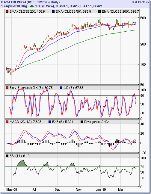
Stock Chart Pattern - Gayatri Projects Ltd (An Update)

My previous look at the stock chart pattern of Gayatri Projects was back in June '09 - almost 10 months ago. The stock had just completed a spectacular rise from a low near 40 to a high near 200 after 11 straight upper circuits!

The stock became hugely overbought - as is evident from the slow stochastic and RSI indicators - and entered a corrective phase that took it down below the 20 day EMA. From the technical indicators, I surmised a further correction down to the 140 level where possible support from the 50 day EMA was expected to kick in.

I have mentioned more than once that technical analysis is not a science. Similar chart patterns often do not produce similar outcomes. During bear phases, lower targets get penetrated further. In bull markets upper targets are often overshot.

During shorter time frames technical analysis becomes more of a 'hit and miss' affair, but on longer time frames it can turn out to be almost prophetic. A look at the one year bar chart pattern of Gayatri Projects will help clarify what I mean:-

Gayatri Proj_Apr1310

At the bottom left corner of the chart, note the 11 straight upper circuit days and the subsequent correction below the 20 day EMA. Instead of continuing to correct down to the 50 day EMA, the stock again moved up to the 200 level, before dropping down to seek support from the 50 day EMA. End result? The stock fell to a low of 153 and not to 140.

Now, here comes the 'prophetic' part. This is what I wrote in my earlier blog post:

'Reaching the all-time high any time soon may be a tall order. After the correction runs its course, the stock may hit upside targets of Rs 225/250/320 before facing major resistance. That means a possible 50-100% rise from the current level.'

The closing rate on June 25 '09 was 164. If you had been brave (or lucky) to heed my advice and buy the stock, you would be sitting today on handsome profits exceeding 150%!

The first top, after the correction took support at the 50 day EMA, was at 289 in early Aug '09 - surpassing the first two upper targets. The next top was 317 a month later. A brief consolidation was followed by a rise to 394 in the third week of Oct '09.

The stock ultimately made an intra-day top at 472 in Feb '10 - thereby correcting almost 66% of its huge 94% bear market fall from 696 (in Jan '08) to 42 (in Mar '09). Small and mid-cap stocks take a long time to recover from such massive falls - one of the inherent risks of investing in such stocks. Stupendous returns are often followed by soul-destroying collapses.

The Gayatri Projects stock has been in a sideways consolidation for the past three months, like several other stocks. Probably awaiting a trigger from Q4 results to decide which way to turn. The slow stochastic and RSI are indicating short-term weakness, though the MACD is positive and above the signal line.

Bottomline? The stock chart pattern of Gayatri Projects is in a 'pause' mode just below the 61.8% Fibonacci retracement level of the bear market fall. Existing investors can book partial profits. Fresh investments can be made after a correction, or after the stock clears the 486 level.

Tuesday, April 13, 2010

How to spot and avoid 'pump and dump' stock scams

Before I explain what a 'pump and dump' stock scam is and how you should avoid it, a brief digression may be in order. Such scams tend to proliferate during a particular environment and state of the stock market. And we are bang in the middle of exactly such an environment.

The Indian stock market has been on a one-way ride upwards ever since the global markets changed trend from bear to bull back in March '09. Stocks in practically all sectors have moved up by leaps and bounds.

The election results in May '09 provided a major boost to the bulls. But after gaining more than 100% from the Mar '09 low of 8000 to the Oct '09 high of 17500, the Sensex has hardly progressed much in the past 6 months. At today's close of 17822, the Sensex has gained a mere 1.8% over its Oct '09 high.

Most of the index stocks and the good non-index stocks have outperformed the index and are trading at prices that are considered 'too expensive' by small investors. Many new investors have heard stories about the phenomenal gains that can be made in stocks and are itching to jump in - or have already done so.

The stage has been set for scamsters to exhibit their bag of tricks. The first stage of the scam is well hidden from the unwary public. Promoters and associates of small, unknown companies trading at low prices join hands with a group of friendly brokers and start buying up their own shares.

Since the floating stock of such companies tend to be small, a few 'buy' orders help to 'pump up' the stock's price, which starts hitting upper circuit limits. A few judicious emails to various Internet investment groups and SMS messages to individuals reveal a huge upcoming order, or a phenomenal new technological breakthrough, or 300% growth in profits in the just-concluded quarter and a likely bonus issue.

That is enough to lure hordes of small investors to place large 'buy' orders in an effort not to miss out on a fantastic multibagger opportunity. The stock continues to hit upper circuits for a few more days. That is when the 'dumping' starts.

The promoters and their friends start unloading the stocks - in small quantities initially, which get easily absorbed in the buying frenzy. Then the big unloading happens, and suddenly the stock starts to hit lower circuits right at the beginning of the trading day. Most small investors are too inexperienced to get out, and remain stuck with large quantities of stocks that soon revert back to their earlier low-price, low-volume status.

The best way to avoid getting caught in a 'pump and dump' scam is to ignore free stock tips from unknown people. If it sounds too good to be true - it usually is. If it concerns a 'penny stock' (i.e. trading below Rs 10 for a stock with a face value of Rs 10) don't give it a second look.

Even if the stock seems interesting and is trading above its face value, don't neglect to do your due diligence. Check the debt/equity ratio and the cash flows from operations. A large debt and negative cash flows from operations are a given for these 'pump and dump' stocks.

Related Post

What does the Debt/Equity ratio indicate?

Monday, April 12, 2010

Dow Jones (DJIA) Index Chart Pattern - Apr 9, '10

For the past two weeks, the Dow Jones (DJIA) index chart pattern has been traipsing around the 11000 level, but has not forayed past the technically significant 11100 mark. What is the significance? It is the 61.8% Fibonacci retracement level of the entire bear market fall.

In technical parlance, that is the final hurdle that stands between a new bull market and a bear market rally. Market players know that and therefore, the hesitancy of the bulls is palpable and the repeated attempts to cross above is being resisted by the bears.

Four out of the five trading days last week, the Dow moved above the 11000 level, only to close below it on all 5 days. It hasn't come close to touching the 11100 mark yet. In the process, the technical indicators turned weaker but remain bullish.

A look at the 6 months bar chart pattern of the Dow Jones (DJIA) index shows negative divergence in the technical indicators, which should be a warning to investors about the increasing down side risks:-

Dow_Apr0910 

The Dow made a new intra-day high of 11032 on Friday, Apr 9 '10 but all four technical indicators failed to reach new highs. Even the volumes are giving contrary signals - the down day on Wednesday saw the highest volume during the week and the new high on Friday was formed on a lower volume day. Signs of 'distribution'?

All three EMAs are moving up nicely with the index above them. The bulls have no immediate worries. The slow stochastic is at the edge of the overbought zone and isn't showing any signs of slipping down. The MACD has dropped a bit in the positive territory and is touching the signal line. Both the RSI and MFI have dropped from their respective overbought zones but remain above the 50% level.

It may be worthwhile to take a re-look at the Dow and the technical indicators around the middle of Jan '10 when the index had made its top of 10767. Reminds me of one of Yogi Berra's quotes: it's deja vu all over again!

Bottomline? The Dow Jones (DJIA) index chart pattern continues to hover below the technically important resistance level of 11100. Unless it can go past it convincingly, the bears will remain in the game. A decent correction at this stage, if it happens, will be good for the overall technical health of the market. Stay invested with tight stop-losses, but take some profits home.

Sunday, April 11, 2010

Stock Index Chart Patterns - FTSE 100, CAC 40, DAX - Apr 9, '10

FTSE 100 index chart

FTSE_Apr0910

Last week, the FTSE 100 index chart pattern had come close but didn't breach the 5768 level (the 3% 'whipsaw' leeway above the Jan '10 high of 5600). That was the last straw for the bears.

The long Easter break gave the bulls renewed impetus that helped the index close above the 5768 level on Tuesday, and again on Friday - for a sixth straight weekly higher close. The bears might as well start looking for greener pastures.

All three EMAs are moving up with the index above them. But the volumes haven't been worth writing home about. The slow stochastic is hovering just below the overbought zone. The MACD is positive and touching the signal line.

The RSI has dipped after touching the overbought zone. The MFI has drifted down a bit. Note that the new high of 5790 touched on Tuesday, Apr 6 '10 was not accompanied by new highs on any of the technical indicators.

The negative divergence, combined with low volumes and the widening distance between the 50 day and 200 day EMA may be signalling a healthier correction in the near future.

DAX index chart

DAX_Apr0910

A mild correction slowed the upward momentum of the DAX index chart pattern, but by the end of the week the index managed a slightly higher weekly close on reasonable volumes. The low for the week was 6138 on Thursday - which was higher than the Jan '10 top of 6094. The previous top acting as a support is a bullish sign.

All three EMAs are moving up with the index above them. The slow stochastic is at the edge of the overbought zone. The MACD dropped a little, but remains positive and is touching the signal line. The RSI has slipped down from the overbought region. The MFI dropped to the 50% level, only to bounce up.

CAC 40 index chart

CAC_Apr0910

The CAC 40 index chart pattern continues to lag its European neighbours as Tuesday's high of 4065 fell short of the Jan '10 high of 4088. Going past the previous top is imperative before the bulls can fully regain control.

The short correction during the week saw the index take support from the 20 day EMA. All three EMAs are moving up nicely on decent volumes. The slow stochastic is just below the overbought zone. The RSI has dropped towards the 50% level after touching the overbought zone. The MACD is positive and touching the signal line. The MFI is the weak link as it failed to climb above the 50% level.

Bottomline? The chart patterns of the European indices are looking less overbought, thanks to the slight correction during the holiday shortened week. Stay invested, maintain trailing stop-losses and buy selectively. But keep in mind that this bull rally has continued for more than a year.

Saturday, April 10, 2010

BSE Sensex Index Chart Pattern - Apr 9, '10

The BSE Sensex index chart pattern flirted with the 18000 level throughout the week. Except for a brief test on Wed. Apr 7 '10 when it made an intra-day high of 18048, it didn't quite manage to clear the long-term support-resistance zone between 18000-18500.

Interestingly, the 3% whipsaw level for the Jan '10 top of 17790 lies smack in the middle of the support-resistance zone. The bears, whose cause seems all but lost, may try to make a last stand there. But please don't try to go short in a bull market.

The unabated FII buying has been responsible for the rise in the value of the rupee. This is not necessarily bad for the economy. The bottom line of exporters, including the software services sector, will get affected. But a rising rupee will help mitigate our bloated fiscal deficit by cushioning the burgeoning oil bill.

A young reader asked me where the Sensex was headed next. If the answer to such a question was readily available, millions could be easily made! The best answer I could give was: wherever the FIIs wish to take the index. That may sound like a cop-out. But the fact is that it is the unending flow of money from the FIIs that is setting the market direction in the near term.

The WPI and CPI are both in double digits. Oil price is rising. Steel prices have been hiked. Like wise with auto prices. Surely the RBI can't allow things to meander much longer, and another dose of monetary tightening could be around the corner. Those are negatives that positive Q4 results should overcome. Bulls will hope that the results will not be below the consensus positive expectations.

From a technical viewpoint, a bout of correction will help the market to rise higher. Otherwise, this slow upward grind may continue for some more time. Let us see what the 6 months bar chart pattern of the BSE Sensex index has in store:-

Sensex_Apr0910 

All the three EMAs are moving up with the index above them. The bulls continue to call the shots. But have a look at the RSI and slow stochastic. From the middle of Mar '10 onwards, the Sensex has been rising in a channel, making higher tops, whereas the slow stochastic and RSI has not made higher highs. A negative divergence.

Also worth noting is what happened after the Sensex made a lower low in Feb '10 (below the Jan '10 low). Both the RSI and slow stochastic made higher lows. The positive divergence heralded a 2400 point bull rally.

The MACD is well inside positive territory and marginally above the signal line. No negative signals have come from it yet.

Bottomline? The chart pattern of the BSE Sensex index is very near a long-term support-resistance zone. Without volume pressure it may find it difficult to go past the 18500 level. The downside risk seems higher. Stay invested but book part profits - particularly in mid and small cap stocks that have seen a sharp rise.

Friday, April 9, 2010

Stock Index Chart Patterns - Shanghai Composite, Korea KOSPI, Hang Seng - Apr 9, '10

Shanghai Composite index chart

ShanghaiComp_Apr0910

The Shanghai Composite index chart pattern continued to trade above the 3100 level, but an attempt to breach the 3200 level proved short-lived as the index only managed to touch the 3178 level intra-day on Tuesday, Apr 6 '10. The index closed the week at 3145, a 13 point drop on a weekly basis.

The bears aren't allowing the bulls to take complete charge of the market just yet. The technical indicators have weakened a bit, though they are still showing bullishness. The 20 day EMA has crossed above the 50 day EMA after spending more than 2 months below it. The 50 day and 200 day EMAs have started to move up ever so slowly.

The slow stochastic entered the overbought zone but is slipping. The MACD remains positive and above the signal line. The ROC has dropped down almost to the '0' line. The RSI almost touched the overbought zone but has dipped down.

As long as the index keeps making higher tops and bottoms, as it has done for the past two months, the bulls will be able to fend off the bears.

Hang Seng index chart

HangSeng_Apr0910

The bulls returned fully rejuvenated after a 5 days long Easter break and the Hang Seng index had a near 300 points gap-up opening on Wednesday, Apr 7 '10. Thursday saw some profit booking, but today's 340 point up move took the index firmly above the 22000 level after almost 3 months.

All three EMAs are moving up with the index above them. But the real bullish sign is the positive divergences in both the slow stochastic and the MACD indicators - both have moved higher than their Jan '10 tops even as the Hang Seng remains 450 points below its Jan '10 top.

The ROC bounced off the '0' line and has started to rise. The RSI has moved up after touching the 50% level. The bulls will have the Nov '09 high of 23100 in their sights now.

KOSPI (Korea) index chart

Kospi_Apr0910

The KOSPI (Korea) index had a gap-up in the chart pattern when I looked at it 4 weeks ago. That had created the possibility of a bearish island reversal pattern if the gap did not get filled. The gap got almost completely filled and the bulls haven't looked back since.

Today, the KOSPI index made a new high of 1737, but closed flat on a weekly basis. The decreasing volumes indicate a bit of hesitancy by bulls after reaching new highs (much like the BSE Sensex has behaved this week).

All three EMAs are swinging up smoothly with the index above them. The slow stochastic has remained inside the overbought zone for a month. The MACD is above the signal line and rising in the positive zone. The ROC is in positive territory but moving sideways. The RSI is just below the overbought zone.

Observant readers may notice the unusual but clearly discernible cup-and-handle pattern in the slow stochastic indicator (formed during Jan-Feb '10) which was a harbinger of the strong bull rally.

Bottomline? The chart patterns of the Asian indices are looking bullish. But remember that the bull run is now 13 months old. So any buying should be done very selectively, and with strict stop-losses.

Thursday, April 8, 2010

What caused the 250 points drop in the Sensex today?

Can you envisage tomorrow's headlines in the pink papers analysing the 250 points drop in the Sensex? 'Greek tragedy causes Sensex slip'; or, 'Inflation up - Sensex down'; or something equally eye-catching and ridiculous.

Before you start scoffing at the headline writers, please remember that they have to earn their bread and butter by selling papers and not necessarily by educating investors. Fortunately, I'm not under any such compulsion. So my short answer is: Who cares?!

The fact is, Greece continues to face a sovereign debt problem which they were trying to mitigate through an issue of government bonds. Apparently that issue has fallen flat raising the spectre of a bail-out by other members of the EU or the IMF.

European indices started tanking mid-day and probably had a rub-off effect on our indices. Food inflation figures continue to rise, and that may lead to more monetary tightening by the RBI in the near future. Markets may have anticipated a rise in interest rates - which is considered negative for bulls.

But the real reason may not have anything to do with fundamentals and be purely technical. If the Sensex moves up 4 straight days in a row, one should not get surprised or worried by one down day. Such down days are good for the overall health of the market as it corrects potential overbought situations.

A quick look at some of the Sensex indicators show that the MFI, RSI and slow stochastic had entered their respective overbought zones after the Sensex crossed the 17250 level, and have since been oscillating in and out of the overbought zones for the past 10-12 trading sessions while the Sensex gradually moved up towards the 18000 level. All three indicators are showing negative divergence as they failed to make new tops when the Sensex moved above the 18000 level on an intra-day basis yesterday.

The FIIs have been buying relentlessly since the budget and of late the DIIs joined the bull party. Obviously, some amount of 'index management' is happening, and today's announcement of SAIL's divestment could be a reason for the buoyancy in the index. It almost seems that the Sensex wants to fall but isn't being allowed to do so.

What should you be doing as an investor? Focus on the 20 day EMA at 17500 and the 50 day EMA at 17150. If the Sensex falls below the 20 day EMA, treat it as a second warning of a bigger correction. (The first warning happened today, when the index fell below 17790 - its previous top made on Jan '10.) The third, and final warning will be if and when the Sensex dips below the 50 day EMA.

Of course, these warnings are not for selling out but for booking part profits, and on the assumption that you are invested in index funds/ETFs (or in stocks with high weightage in the Sensex). At all times, you should concentrate on your individual portfolios and set appropriate stop-losses.  

Wednesday, April 7, 2010

Stock Chart Pattern - Indian Hotels (An Update)

The previous look at the stock chart pattern of Indian Hotels back in June '09 didn't seem particularly exciting for would-be investors in this leading company of the Indian hotels sector.

Why? Because the bull rally from the Mar '09 low was showing signs of fizzling out, consolidating at the 65-66 level after touching a high of 80. I had recommended that it was a good entry point for patient investors.

The woes of the hotels sector still continues, as occupancy rates and average room rates (ARRs) have not recovered to a great extent following the global economic downturn. Large capacity addition in the hotels sector is also likely to contribute to depressed ARRs.

The high-end properties of Indian Hotels depend a lot on big spending overseas business visitors and tourists. The flagship Taj Hotel that bore the brunt of the Nov '08 terrorist attack is yet to be fully operational. International properties of the largest Indian hotel chain are also not doing great. This led to disappointing Q3 '09 results.

The company is trying to de-risk its business model by concentrating on the more reasonably priced Ginger brand, and by doing away with the Residency brand. The newer Vivanta brand has been positioned in-between the Taj and the Gateway brands.

The current capacity of around 11500 rooms will be increased to 20000 rooms by financial year 2011. The number of Taj Safari jungle lodges (currently 4 - all in Madhya Pradesh) will be increased to 10 across the country. That should contribute to an increase in revenues and profits in the next couple of years.

A look at the 2 years bar chart pattern of Indian Hotels clearly shows that smart investors have been accumulating the stock:-

Indian Hotels_Apr0710

The stock chart consolidated in a triangle pattern between Jun '09 and Sept '09 before an upward break out on good volumes took it to a high of 110 in Jan '10. Why did it halt at 110? No prizes for correct guesses. It happens to be the 50% Fibonacci retracement level of the entire bear market fall from 180 to 35.

A correction ensued as the stock dropped to make two intra-day bottoms at 85 - below both the 20 day and 50 day EMAs. Note that both the MACD and RSI made lower tops as the stock hit a higher one. Negative divergences like these can be a signal for a correction - it happened in this case, but it may not happen always.

The double-bottom has led to a resumption of the up move that has taken the stock close to its Jan '10 high. If it can move above 110, it is likely to face resistance at 120 - the May '08 high. The 61.8% Fibonacci retracement level of the bear market fall is at 125.

The OBV indicator shows that there has been buying interest even during the correction in Jan '10. Those investors who heeded my advice to enter the stock at 65-66 and are still holding, can book partial profits if the stock hesitates near the 110-125 band. Long-term investors can keep a stop-loss at 100 and stay long. Any dips can be used to add to the holdings.

Bottomline? The stock chart pattern of Indian Hotels has risen steadily if not spectacularly. Crossing 125 convincingly will be the first indication that things are getting better. Full recovery in the fundamentals is still a year or two away. Patient investors will get their due rewards by holding on.

Tuesday, April 6, 2010

Should you be buying gold at current prices?

When I mention 'buying gold' I mean buying gold ETFs or a gold fund and not physical gold. During my previous analysis of the 1 year gold chart, I had noticed a possible formation of a bullish inverse head and shoulders pattern.

I had also cautioned about the previous tops at 1150 and 1212 that needed to be cleared before the bulls could regain total control. Let us first take a look at the 1 year gold chart pattern:-

Gold_Apr2010_1yr

The inverse head and shoulders turned out to be a failure as the gold chart oscillated around the 14 day SMA in a sideways consolidation pattern. The 200 day SMA continues to move up, so the advantage remains with the bulls.

How long can this consolidation continue? On the previous occasion, after the gold chart pattern reached a high of 980, it consolidated sideways in a band between 910 and 960 for 3 months from end May '09 to end Aug '09. It then broke out sharply upwards to make the high of 1212 in end Nov '09.

This time around, the sideways consolidation in a band between 1050 and 1150 has continued for almost 4 months. It would seem we are overdue for an upward breakout soon.

A look at a longer term (5 years) gold chart throws up a wholly different possibility:-

Gold_Apr2010_5yr

Note the period from around May '06 to Sept '07, soon after a new high of 720 was made. The gold chart consolidated sideways for more than 16 months between a band of 550 and 700 (ignoring the sharp spike in Dec '06) before breaking out upwards to make a new high above the 1000 mark in Mar '08.

What followed was another long period of sideways consolidation in a wider band between 700 and 1000. This time the consolidation lasted nearly 18 months before a sharp upward break out saw the gold chart pattern reach the all-time high of 1212.

So, what looked like a 3 months sideways consolidation (from May to Aug '09) in the 1 year chart was actually the tail-end of the much longer 18 months consolidation! A good reason why investors in gold should take a real long term view.

Also worth noting is that on both previous consolidation periods, the gold chart moved below the 200 day SMA and took support at the previous tops before resuming the up trend. A similar possibility opens up if the current consolidation continues longer.

Going back to our original question - if you should be buying gold at current prices or not. The answer is a definite 'maybe'. A decent point of entry would be if and when the gold chart falls below the 200 day SMA. In which case, it may drop to 1000 (the previous top).

Even if the gold chart pattern dips to 1000 and you do get in, you may have to wait a year before getting any returns. That is how long the current sideways consolidation may continue.

Monday, April 5, 2010

Dow Jones (DJIA) Index Chart Pattern - Apr 2, '10

The Dow Jones (DJIA) index chart pattern started hesitating as it approached the technically significant resistance level of 11100 mentioned in last week's analysis.

In a holiday-truncated week, the Dow made a high of 10983 on Thursday - a tad short of its previous high of 10985 made on Mar 25 '10 - and closed at 10927, 77 points higher on a weekly basis.

A look at the 6 months bar chart pattern of the Dow Jones (DJIA) index shows the beginning of a bullish ascending triangle formation from which a likely upward break out can take the index to the 11500 level:-

Dow_Apr0210 

The bears will try and grasp at the last straw - the 11100 level - and put up some sort of a fight. But it doesn't look like they have much ammunition left in their armoury.

All three EMAs are moving up with the index above them. The volumes have been pretty decent. The slow stochastic is at the edge of the overbought zone. So is the MFI. The MACD has flattened, but remains positive and above the signal line.

The RSI is showing negative divergence, and is the only concern for bulls. Note that just before the Dow's previous correction in Jan '10, the RSI, MFI and the slow stochastic almost simultaneously dropped from their overbought zones. No such 'confirmation' of any weakness is visible now. But forewarned is forearmed.

On the employment front, nonfarm payrolls increased by 162000 in March '10, the biggest monthly increase in 3 years. Is that a good reason for unbridled bullishness in the stock market? Read this article for a different perspective.

Bottomline? The Dow Jones (DJIA) index chart pattern hasn't yet cleared the technical hurdle of 11100. But it seems just a matter of time before it does so. Stay invested, maintain trailing stop-losses and start buying after a convincing move past the 11100 level.

Sunday, April 4, 2010

Stock Index Chart Patterns - FTSE 100, CAC 40, DAX - Apr 2, '10

FTSE 100 index chart

FTSE_Apr0210

In last week's analysis of the FTSE 100 index chart pattern, I had mentioned that it seemed game over for the bears, but they had a glimmer of hope for a fight back as long as the FTSE did not cross the 5768 level.

There was no correction - just some sideways consolidation in a holiday-shortened week. The FTSE struggled a bit to stay above the 5700 level, but it didn't fall below the Jan '10 top of 5600 either - keeping the possibility of a bearish head-and-shoulders pattern formation at bay.

The index ended the week with a new high and close of 5745. A fifth straight week of higher close on a week-on-week basis. All three EMAs are moving up with the index above them. Keep your eyes on the distance between the 50 day and 200 day EMA, which is approaching 400 points. There was a 10% correction in Jan '10 when the 50 day EMA moved too far above the 200 day EMA.

The MACD is positive but has slipped a little and is touching the signal line. The RSI is showing negative divergence, as it fell from the overbought region before bouncing off the 50% level. The MFI is above the 50% level but moving sideways. The slow stochastic dropped from the overbought zone, but is trying to get back up again.

DAX index chart

DAX_Apr0210

There seems to be no hesitancy in the onward and upward march of the bulls at the German DAX index chart. The index sailed past the 6200 level, made a new high at 6239 and closed more than 100 points higher on a weekly basis.

The technical indicators are looking more bullish than those of the FTSE. All three EMAs are rising with the index above them. The gap between the 50 day and 200 day EMAs is not as wide as to cause concern. But the index has moved quite a distance above the 20 day EMA, which could cause a slight correction.

The MACD is positive and above the signal line. The RSI is showing negative divergence, as it dipped below the overbought zone and failed to make a new high. The MFI is above the 50% level. The slow stochastic is well inside the overbought zone, where it has remained for the past four weeks.

CAC 40 index chart

CAC_Apr0210

A slightly more circumspect set of bulls are ruling the French CAC 40 chart pattern. The index has so far failed to move above the Jan '10 high of 4088. But it did manage to close above the 4000 level by the end of the holiday-shortened week. This was the first close above the 4000 level since the middle of Jan '10.

All three EMAs are moving up with the index above them. The MACD is positive and just above the signal line. The RSI is showing negative divergence - drifting down towards the 50% level after briefly entering the overbought zone. The MFI is below the 50% level but trying to move up. The slow stochastic dropped below the overbought zone but has re-entered it.

Bottomline? The chart patterns of the European indices are looking a little overbought. The negative divergences in the RSI continues to be a source of concern. Stay invested with tight stop-losses and be very selective in buying.