Thursday, December 31, 2009

eBook: How to become a better investor

One of the main reasons why I started to write this blog back in June 2008 was to help fresh and inexperienced entrants to the stock market learn about fundamental and technical analysis - and become better investors in the process.

It has been both an enriching and humbling experience for me. Enriching because of the regular interaction with readers of this blog - both young and old - that have helped me immensely in getting different perspectives about the market.

Humbling because some of the young readers are not only mature beyond their years, but they have knowledge, discipline and decision-taking ability that are as good as, and some times better than, my own.

There are plenty of web sites, blogs and investment groups that offer free stock tips. I have tried to avoid that - because just telling some one to buy a particular stock does not teach him why it is a stock worth buying.

I do write about stocks that are fundamentally strong, and some times not so strong. The objective being that readers can enhance their knowledge about how to use technical indicators and fundamental parameters.

Only through learning and experience can investors become better at knowing which stocks to track and which to avoid. If my blog posts have been of assistance, my efforts have been well worth their while.

Many of you have requested me over the past few months to compile some of my blog posts into an eBook for ready reference. Some suggested that I should charge for such an eBook. But after some thought, I decided to provide it to my blog readers for free - but on two conditions.

First, you need to specifically ask for the free eBook by sending me an email at mobugobu@yahoo.com with your full name. Hiding behind a pseudonym won't help! I would like to avoid spammers to the extent possible.

Second, you can ask your friends, relatives, colleagues to send me an email for the eBook (or send them a link to this blog post) - but please do not forward the eBook to others without my permission. I don't want the eBook to be freely circulated over the Internet.

Compiling the eBook from selected blog posts written between June 2008 and January 2009 took longer than I expected. Some of the posts had to be updated and rewritten. The basic concepts about the stock market, sector and portfolio selection, investment strategy and philosophy, common pitfalls, monetary policy and interest rates have been covered.

Anyway, to cut a long story short, the eBook: How to become a better investor, is finally ready for distribution. I'm relieved that it could be completed on the last day of the year. Please consider this as my small gift for the New Year. May it be a happy and prosperous one for all my readers.

Wednesday, December 30, 2009

Stock Chart Pattern - DLF Ltd. (An Update)

The previous look at the stock chart pattern of DLF Ltd. in Apr '09 had shown a nice saucer-like bottoming pattern after a near 90% fall from the top of 1225 on Jan 15 '08 to the bottom of 124 on Feb 4 '09.

The volumes were increasing as the stock struggled to cross the 250 level, after gaining 100% from the Feb '09 low. But I had concluded my analysis with the following comments:-

'If you haven't got rid of your DLF holding yet, you may get one more chance to do so. There is a possibility that this rally is taking a pause before trying to move higher again. But please do not harbour hopes about DLF reaching 1000 levels.'

Why and how did I arrive at that conclusion? Any stock that falls 90% from the top faces a lot of trouble getting back on its feet. When the stock belongs to an unreliable and unregulated sector which generates a large amount of 'black' money transactions, the chances of recovery are that much slimmer.

The last straw was the discovery of fraudulent profit booking by the company who were 'selling' to a subsidiary without getting any payment in return.

Let us take a look at the 9 months bar chart pattern of DLF Ltd.:-

DLF_Dec3009

There is something quite interesting at the left-most part of the DLF stock chart. Notice the consolidation during Apr-May '09 near the 250 mark as the OBV indicator kept rising. Then the massive volumes on a down day (May 13 '09).

Then, on the next four trading sessions, the stock jumped vertically upwards from a low of 222 on May 14 '09 to a high of 423 on May 19 '09. That was a great chance for existing holders to get out.

The stock did make a high of 491 as recently as Oct 21 '09, but that up move was not supported by the technical indicators. The OBV, MACD and RSI all moved sideways, and failed to make new tops.

The rise to 491 from the low of 124 retraced just 33.3% of the entire bear market fall, not even reaching the 38.2% Fibonacci retracement level. Technically, it means that the stock remains in a bear market.

The correction from the 52 week high has twice received support from the 200 day EMA - which is a small solace for the bulls.  The stock is struggling to clear the resistance from a falling 20 day EMA. The 50 day EMA is also falling.

The MACD is in negative zone and the RSI is below the 50% level, so expect the correction to continue.

Bottomline? The stock chart pattern of DLF Ltd. does not hold out much hope for the bulls. If you are still stuck at higher prices, continuing to hold may increase your losses. Investors should not go anywhere near this stock.

Tuesday, December 29, 2009

Is this a good time to take some profits from the stock market?

A lot of small investors must be asking themselves that question - valuations are no longer that attractive for fresh entry, neither is the market correcting in a major way. So, is this a good time to take some profits home?

The answer depends on what you did, or didn't do over the last two years. If you entered the market during Dec '07 to Feb '08, you are probably not in profit yet. The question of booking profits does not arise.

If you were smart or brave enough to invest during Oct '08 to Apr '09, you must have multiplied your investment 3 or 4 times, and have booked some profits already. If you haven't done so, this may be as good a time as any.

What about those who entered before Oct '07 or those who entered between Mar '09 and Sep '09? You are probably looking at smaller profits and are wondering whether to quit while ahead. 

For more than two months, the stock market has been facing headwinds every time it nears the 17500 mark on the BSE Sensex index. Despite buying by the FIIs, the index has not been able to make a new high.

Technically, there is long-term resistance in the 17500-18000 zone. That could be one of the reasons why the bears are pressing sales near the 17500 mark. Unless the BSE Sensex chart manages to cross the 18000 level convincingly, a new high may not be sustainable.

Like a mountain climber, who can't make it to the top of a peak in one go without resting, a bull rally needs to pause and some times even move down before making a new high. Why is that?

Because once a consensus begins to evolve that markets are richly valued, if not overvalued, investment experts start advising their clients not to make fresh investments and to book partial profits. As a result, volumes diminish and eventually prices tend to correct.

It may not be a deep correction. Even a 15-20% correction, and valuations start to look attractive, if not cheap. Fresh money starts to pour in again and that takes the index to a fresh high. Are we in a similar situation now?

The possibility can't be ruled out. Market prediction is not my forte. This is only an effort at pointing out the greater likelihood of an upcoming event. By taking some profits home, you may miss out on the last 4-5% of this rally. But isn't that better than being caught unawares when a sharp correction comes - which is likely sooner than later?

Don't sell out completely. Book profits partially and re-balance your portfolio. Set appropriate trailing stop-losses to protect your profits in case of a deeper correction.

Your asset allocation should determine whether you should sell 5% of your portfolio or 25%. If the index drops, you'll have some extra cash to reinvest. If it runs up and away, you will lose out on additional profits but will not face a loss.

Related Posts

How to make money when a market is trending sideways
How to reallocate your assets

Monday, December 28, 2009

Dow Jones (DJIA) index chart pattern - Dec 25, '09

In last week's analysis of the Dow Jones (DJIA) index chart pattern, I had mentioned the possibility of the index consolidating for a while longer. Not surprisingly, the Dow traded within the narrow band of 10300-10550 and closed 191 points higher for the week at 10520 - its highest close for the year.

But all is not well for the bulls as the pattern of higher tops and bottoms on all four days of a holiday-shortened week was on much reduced volumes. This bull rally continues to defy the weak fundamentals and technicals and there is no alternative to following the up trend indicated by the three rising EMAs using trailing stop-losses.

The 6 months bar chart pattern of the Dow Jones (DJIA) index shows that the technical indicators are showing more strength than last week:-

Dow_Dec2509 

The RSI has edged above the 50% level. The MFI is above the 50% level and moving up smartly towards the overbought zone. The slow stochastic bounced off the 50% level and is also rising towards the overbought zone. The MACD looks a little weak, moving up to touch the signal line in the positive zone.

While the Dow has been in a sideways consolidation, the RSI, slow stochastic and MACD are showing downward biases. The negative divergences may prevent a Santa Claus rally.

Bottomline? The Dow Jones (DJIA) index chart pattern continues to consolidate. Stay invested. Booking partial profits can also be a good idea.

Sunday, December 27, 2009

Stock Index Chart Patterns - FTSE 100, CAC 40, DAX - Dec 25, '09

FTSE 100 index chart

FTSE_Dec2509

The bulls managed to shrug off the bear attack as the FTSE 100 index chart scaled a new high of 5402 on Christmas Eve. The index bounced off the 50 day EMA once again and made higher tops and bottoms on all four trading days of a holiday-truncated week.

Is there more steam left in this rally, or is it the bulls' last hurrah? The pathetic volumes point towards the latter. The technical indicators are looking lukewarm, with only the slow stochastic bouncing sharply off the 50% level to reach the overbought zone. The RSI is barely above the 50% level. The MFI is at its 50% level. The MACD is positive and above the signal line. But all four indicators are displaying negative divergences as they failed to make new highs.

Looks like the bulls managed to trap the bears into covering their shorts. All three EMAs are moving up, so this rally on weak fundamentals and weaker volumes looks set to continue for a while longer.

DAX index chart

DAX_Dec2509

The DAX index chart pattern continued its bullish fervour last week, making another new high of 5988 on Dec 23 '09. Like the FTSE 100, the higher tops and higher bottoms formation during the week was on very low volumes.

The slow stochastic continued to move up in the overbought zone, but the other three technical indicators are showing negative divergences. The RSI moved sideways above the 50% level. The MFI is finding it difficult to move above its 50% level. The MACD is rising in the positive zone and is above the signal line.

All three EMAs are moving up and the index is well above them. A short correction may be in the offing. But the bull rally is under no immediate threat.

CAC 40 index chart

CAC_Dec2509

The CAC 40 index chart also joined the bull party and made a new high of 3931 on Dec 23 '09. The French index, like its European neighbours, made the new high on much reduced volumes.

The index is well above the three EMAs, which are all moving up. The bulls may continue their domination for a while longer, but be prepared for a quick correction.

The slow stochastic is moving up in the overbought zone. The MACD is rising in the positive zone and is above the signal line. The RSI is moving sideways above the 50% level. So is the MFI. The negative divergences in the MACD, RSI and MFI are also pointing towards a correction.

Bottomline? A Santa Claus rally seems to be unfolding in the European index chart patterns. Remember that the bull rally is almost 10 months old. New entry is not recommended at this point. Existing holders can set trailing stop losses and ride the rest of the rally, or book partial profits.

Saturday, December 26, 2009

BSE Sensex Index Chart Pattern - Dec 25, '09

Just when all the technical indicators were turning weak signalling a possible stronger correction in the BSE Sensex index chart pattern, the FIIs decided to step in and make their presence felt in a holiday shortened week.

At a time when they usually pack their bags and head out on vacation, strong buying by the FIIs trapped the bears, who quickly resorted to covering their shorts and took the BSE Sensex on a merry 500+ point Santa Claus rally on Dec 23 '09.

The bears are far from being routed. The rise was on higher volumes, but the volumes were lower than that seen in Sep and Oct '09. Only 5 Sensex stocks contributed to nearly 50% of the 500 point rally. Most importantly, the Sensex failed to clear its previous high of 17493 made on Oct 17 '09.

Next week is another holiday shortened one and a settlement week. Will the index make a new high during the last three trading days of the year? Let's have a look at the 6 months bar chart pattern of the BSE Sensex index:-

Sensex_Dec2509

After a brief dip below the 50 day EMA, the index regained its composure and made a new high for the month of Dec '09 at 17414 on Christmas eve. All three EMAs have started to move up again. The rounding-top pattern has been negated. The bulls have shrugged off yet another bear attack.

The technical indicators are beginning to favour a further up move. The slow stochastic has moved above the 50% level in a 'V' shaped rebound. The MACD is back in positive zone but hasn't managed to move above the signal line. The ROC has edged back into positive zone. The RSI has moved up nicely from near the oversold zone but stopped short of moving above the 50% level.

The bears are likely to take a different viewpoint. The up trend line connecting the bottoms of 15331 on Nov 3 '09 and 16210 made on Nov 27 '09 was broken on Dec 15 '09 when the BSE Sensex index fell below the 20 day EMA to 16836. The up move last week was merely a pull back to the up trend line - which is an opportunity to sell.

The bulls may counter that argument by taking a slightly longer term view, and drawing an up trend line through the lows of 14701 made on Aug 12 '09 and 15331 made on Nov 3 '09. This longer term up trend line has not been broken.

Bottomline? The BSE Sensex index chart pattern is still in a consolidation mood with an upward bias. Investors would do well to stay on the sidelines next week. Traders have the choice of using the 15000-17500 band to play around. The 17500-18000 band is likely to be a resistance zone for a further up move.

Friday, December 25, 2009

Stock Index Chart Patterns - Shanghai Composite, Hang Seng, Taiwan TSEC - Dec 25, '09

Shanghai Composite index chart

ShanghaiComp_Dec2409

This is what I had mentioned in last week's analysis of the Shanghai Composite index chart pattern:-

'The saving grace for the bulls is that the Nov 27 '09 low of 3081 has not yet been broken. That would have started a bearish sequence of lower tops and bottoms. But the reprieve may be temporary. The technical indicators are not supporting a fight back by the bulls next week... Bulls should watch out for support at the 3000-3100 zone and below that, near the 200 day EMA.'

The reprieve for the bulls turned out to be temporary after all, as the index broke and closed below the previous low of 3081 on Dec 22 and Dec 23 '09, thereby creating a bearish lower-top-lower-bottom pattern.

But the bulls managed to regroup in the mentioned 3000-3100 support zone and the index bounced up towards the falling 50 day EMA by the end of the week (chart not updated for Dec 24 and 25 '09 at the time of writing this post).

The technical indicators continue to look weak. The slow stochastic has dropped to the oversold zone. The MACD is in negative zone and below the signal line. The ROC is in the negative zone as well. The RSI is just below the 50% level.

Hang Seng index chart

HangSeng_Dec2409

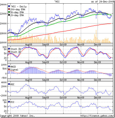
The Hang Seng index chart pattern managed to avoid breaking the Nov 27 '09 low of 21002 by a whisker. The index did drop below the 21000 level to 20933 on Dec 21 '09. But it immediately started to move upwards and formed a smart little bullish rounding bottom. So, technically, the earlier bottom can be considered as a support.

The up move on lower volumes is not too convincing. The Hang Seng index faced resistance from the confluence point of the 20 day and 50 day EMAs. But EMA confluence points can also act as a bullish signal. So we will need to observe the index closely in the near term.

The technical indicators were beginning to look really bearish, but there are signs of a turnaround. The slow stochastic has bounced up from the oversold zone. The MACD has started to rise, though it is in the negative zone and below the signal line. The ROC has started to rise sharply in the negative zone. The RSI stopped short of dropping into the oversold zone and is moving sideways.

Taiwan (TSEC) index chart

TSEC_Dec2409

During my last look 4 weeks back, the Taiwan (TSEC) index chart had dropped steeply below the 50 day EMA, threatening to halt the bull rally. But the bears could not sustain any follow through sales.

The TSEC index embarked on another leg of the strong bull rally that took it to a new high of 8009 today on rising volumes. All three EMAs are rising and the index is well above the three moving averages.

The technical indicators are supporting the bullishness. The slow stochastic has moved up into the overbought zone - a stark contrast to its mainland cousins' charts. The MACD is moving up in the positive zone and is above the signal line. The ROC is in the positive zone. The RSI is above the 50% level.

But there are dark clouds on the horizon. The index is looking overbought. The negative divergences in the MACD, ROC and RSI are hinting at another correction - which may not be too deep.

Bottomline? The chart patterns of the Shanghai Composite and Hang Seng indices are trying to recover from bear attacks. Investors may do well to wait and watch next week. The TSEC index, by contrast, is looking quite bullish. Partial profit booking may not be a bad idea.

Thursday, December 24, 2009

What is the Return on Assets (RoA) ratio?

The Return on Assets (RoA) ratio is a measure of profitability of a company relative to its total assets (which includes share capital plus all its short-term and long-term loans). It tells us how effectively and efficiently a company's management is utilising its assets to generate a profit.

There are a few different ways to calculate the RoA ratio (also called the Return on Investment ratio). The simplest is to divide the net profit during a 12 month period by the total assets. In other words,

Return on Assets (RoA) ratio = (Net profit / Total assets) x 100

If the Net profit of a company is Rs 5 Crores and total assets is Rs 100 Crores, then the RoA will be 5%. Another company may earn Rs 10 Crores on total assets of Rs 100 Crores. Its RoA will be 10%. Needless to say, the higher the RoA the better. Which means the company is able to generate more profits with less or equal amount of investment.

An RoA of 15% is considered the benchmark for profitability. But the figure is different for different industries. Therefore, the RoA should be used to separate the men from the boys within an industry or sector - and not used for comparing across sectors.

Why? Let us take a Bharti or RCom. They need to constantly invest in new equipment and towers for growth. Or, a Maruti or Tata Motors that need to innovate and invest in new models and infrastructure. Likewise, for power generating businesses like NTPC or Suzlon; airline companies like Jet and Kingfisher; metal producers. Such companies are asset-heavy. Therefore the RoA ratio tends to be 5% or lower.

Contrast these sectors with some asset-light ones like software services or travel services or brokerages. All you need are some furniture and computers and you are in business. Naturally, the RoA ratio is 20% or higher, because the real assets in these sectors are people.

The financial sector, particularly banks, need to constantly borrow money to loan it out again. So the RoA ratio can be as low as 1%. What is a small investor to do? Avoid banks and manufacturing, and only invest in services companies?

Obviously not. That would be putting all your eggs in one basket. Therefore, use the RoA ratio to find out which banks, or auto makers, or steel and power companies are more profitable than their peers in the same sector.

Some prefer to add the interest expenses to the net profit to calculate the RoA ratio. Others add the working capital requirements to the total assets. Which particular formula to use depends on the type of sector being analysed.

There is another formula to calculate RoA:

Return on Assets (RoA) ratio = (Net profit margin x Asset turnover ratio) x 100

where, Net profit margin = Net profit / Sales

and, Asset turnover ratio = Sales / Total assets

Mathematically, the second formula is the same as the first, but gives us a different view of a business. It shows that profitability can be attained in two different ways. The first is by increasing the net profit margin (by reducing costs, or better still, by charging premium prices - like the Tanishq retail stores of Titan). The second is by turning over your assets many times during the year (a practice followed by discount retail stores, like Pantaloon).

Related Post

How to distinguish between a good company and a great company
(Wishing all my blog readers from near and far a very merry Christmas and a happy 2010.)

Wednesday, December 23, 2009

Stock Chart Pattern - Navneet Publications

The stock chart pattern of Navneet Publications gives a clear indication that it is fancied by the investor community. And why not?

A four decade old publishing house in the educational segment that has steady growth, positive cash flows from operations, low debt, low P/E, regular dividend payments and more than 60% equity holding by the promoters are enough reasons for the stock to find a place in any long-term investor's portfolio.

The educational publication division generates more than 50% of the revenues and the bulk of the profits. But it is a low-growth business. The government supplying free books to school children under the 'Education for All' programme is a growth-dampener. Lack of regular revision in school syllabi also hampers growth. Add to that the problem of book piracy faced by all established publication houses.

The stationery side of the business is growing much faster, but it has low margins which is beginning to affect the overall profitability of the company.

Let us now take a look at the 1 year bar chart pattern of Navneet Publications:-

Navneet_Dec2309

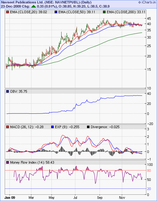
From the high of 66 (the 3:2 bonus-adjusted price of this Rs 2 face-value stock) made in Jan '08 the stock dropped to a low of 14 in Oct '08. The smart rally from Mar '09 took the stock all the way to a high of 45 in Sep '09, retracing nearly 60% of the entire bear market fall.

The resistance from near the 61.8% Fibonacci retracement level proved too strong. Thereafter, the stock has been in a flag-like sideways consolidation.

Such a pattern is usually a continuation formation which should end with an upward break out. But things are looking a bit bearish at the moment with the stock slipping below its 50 day EMA and dragging the 20 day EMA down with it.

The MACD has entered the negative zone and is marginally below the signal line. The MFI has bounced off the 50% level after a couple of visits below it. But bulls can take heart from the OBV which has been gradually rising during the consolidation phase.

Bottomline? The stock chart pattern of Navneet Publications is indicating accumulation by the smart money. Investors can buy in small lots with a stop-loss at 32. On an upward break out, the stock can move up to 70 in the medium term.

(A hat-tip to reader Ruy for suggesting this stock.)

Tuesday, December 22, 2009

Some do's and don'ts about Cost Averaging

One of the most common problems that many investors face is whether to sell or to resort to cost averaging when the price of a stock, or the NAV of a mutual fund, drops just after a purchase is made.

A typical question I face goes something like this: "I bought a stock at 80, and when it dropped to 40 I bought some more to bring my average cost price down to 60. Now the stock has dropped below 30. Should I sell to reduce further losses, or buy some more to bring the average cost down further, or just hold on till I get back my average cost price of 60?"

There are no easy answers to such a question. The answers will depend on the type of stock, the investor's risk tolerance and holding period. So, instead of providing answers, let me try to list out some do's and don'ts that can better prepare investors to face a similar situation.

Do's about Cost Averaging

  1. Before you pick any stock or fund, do a due-diligence. Find out as much as you can about the track record of the promoter or fund manager and the performance of the stock or fund through bull and bear periods
  2. Learn the rudiments of reading a price chart, or at the very least find out about the 52 week high and low values of the stock/fund; try to buy at, or near, a 52 week low
  3. Decide whether you will indulge in short-term trading or long-term investing
  4. Accordingly, set either a tight stop-loss or a wider stop-loss
  5. If the stop-loss is hit, be ruthless about selling the stock/fund
  6. If steps 4 and 5 are followed, the need for cost averaging won't arise if the price falls after purchase
  7. If the price rises after purchase and you are convinced about the future of the stock/fund, buy more. In other words, average your cost upwards.

Don'ts about Cost Averaging

  1. Don't ever buy a stock/fund just because a friend or colleague or TV analyst has suggested a 'buy'; learn to take responsibility and decide for yourself
  2. Don't buy a stock/fund trading at or near a 52 week high
  3. Don't be overconfident of your stock-picking skills just because you've tasted a few successes; always remember to set a stop-loss - whether you wish to trade or invest
  4. Don't become a long-term investor by default because your trade failed and the loss became too large, and you hesitated about selling at your stop-loss
  5. Never cost average downwards, as a general rule and particularly for mid-cap/small-cap stocks/funds (which tend to fall the most during bear markets)

Please remember that your cost price is known only to you. The market doesn't care two hoots about whether you are making a loss or a profit. So you need to develop an investment style that can minimise loss and maximise profit.

A related problem, though not quite as nerve-wracking, is when the price of a stock (or the NAV of a mutual fund) which hardly moves up or down for a prolonged period starts to move up as soon as an investor gets rid of it!

This problem is quite easily solved if you learn the art of partial profit booking.

Related Posts

How to lose less with a Stop-Loss
About Cost averaging and Value averaging strategies

Monday, December 21, 2009

Dow Jones (DJIA) index chart pattern - Dec 18, '09

Another week of an inconclusive tussle between the bulls and bears is reflected in the chart pattern of the Dow Jones (DJIA) index. The bullishness visible last week was somewhat negated by a strong bear attack.

The weekly close was 140 points lower. More importantly, the close was below the crucial 10360 level (the 50% Fibonacci retracement of the entire bear market fall). Any forays by the index above the 10500 level is being resisted stoutly by the bears.

The Dow has been range bound within a narrow band between 10300 and 10550 - a period of expected consolidation after a long bull rally. Such a continuation pattern is likely to end with the bulls regaining the upper hand, so the Santa Claus rally is not ruled out.

Let us take a look at the 6 months bar chart pattern of the Dow Jones (DJIA) index:-

Dow_Dec1809

The 50 day and 200 day EMA are still moving up, but the 20 day EMA has flattened. Stronger volumes on down days remain a concern. The consolidation may last for a while longer.

The technical indicators are looking weaker than the week before. The slow stochastic is at its 50% level but headed down. The MACD is positive but falling, and remains below the signal line. The ROC is in the negative zone. The RSI is at the 50% level.

The Dow made a new high of 10567 on Dec 14 '09, but none of the technical indicators came even close to a new high. This negative divergence will help the bear cause. Insider selling also indicates bearishness, as per this article.

Bottomline? The Dow Jones (DJIA) chart is in a consolidating mood. Keep a stop-loss at the 10000 level and stay put. Till interest rates are raised, the bull rally is likely to continue.

Sunday, December 20, 2009

Stock Index Chart Patterns - FTSE 100, CAC 40, DAX - Dec 18, '09

FTSE 100 index chart

FTSE_Dec1809

The battle between the bulls and bears is getting really interesting. The bears are pressing sales at every rise, and the bulls are fighting back every time the FTSE 100 index comes near the 50 day EMA.

The massive increase in volumes on Friday with the index closing at its low for the day and the week is a sign of buying exhaustion, which may finally tilt the scales in favour of the bears.

The technical indicators don't signal a Santa Claus rally. The RSI and MFI have both dipped below the 50% level. The slow stochastic is at the 50% level and headed down. The MACD is barely positive and below the signal line.

Watch the Nov 27 '09 low of 5104. A breach of that level can take the FTSE 100 index below the 5000 level.

DAX index chart

DAX_Dec1809

The DAX index chart is looking bullish compared to the faltering FTSE 100. The index actually made a new high of 5903 on Dec 16 '09, but could not sustain at the higher altitude.

The huge volumes on Friday turned out to be a 'reversal day' as the DAX index made a higher high but a lower close than on Thursday (Dec 17 '09). This is a sign of buying exhaustion, so be prepared for a bear attack.

The slow stochastic is in the overbought zone, but about to drop down. The MACD is positive and just above the signal line - but showing negative divergence, failing to make a new high. Negative divergences are also visible in the RSI, which is above the 50% level but falling and the MFI, which has dipped below the 50% level.

The bulls can take heart from the three EMAs which are still rising, with the index above all three moving averages.

CAC 40 index chart

CAC_Dec1809

The CAC 40 index chart also shows a 'reversal day' pattern on Friday on very high volumes, with the index closing at the lowest point of the day and the week.

The slow stochastic has dipped from the overbought zone. The MACD is still positive and above the signal line. The RSI and MFI are both above their 50% levels but falling.

The 20 day EMA provided good support during the week, but has flattened. The 50 day and 200 day EMA are both still rising but the upward momentum has slowed down considerably.

Bottomline? The European index chart patterns show that the bulls haven't given up the fight, but the bears are gaining ground. Some more sideways consolidation with a downward bias can be expected.

Saturday, December 19, 2009

BSE Sensex Index Chart Pattern - Dec 18, '09

In last week's analysis of the BSE Sensex index chart pattern, I had mentioned that the battle between the bulls and bears had remained inconclusive, but the index was showing signs of topping out.

The bulls continued their fight to keep the index propped up, using the strong support from the 50 day EMA. But the bears are gradually getting the upper hand. The rising food prices that may lead to some sort of monetary tightening by the RBI has aided the bear cause.

Let us have a look at the 6 months bar chart pattern of the BSE Sensex index:-

Sensex_Dec1809

The 200 day EMA is rising smartly and the index is well above it, so the long-term bull market is under no threat. But all the other technical signals are gradually turning weaker. I have been mentioning about the diminishing volumes, which do not augur well for the continuation of the bull rally.

The 20 day EMA has turned down and the 50 day EMA has flattened. The RSI has crossed above the 50% level, giving the bulls some hope of recovery. The MFI is moving sideways below the 50 % level. The slow stochastic has dropped from the overbought level and is headed down to the 50% level. The MACD is barely positive and below the signal line.

The most bearish sign of all is the 'rounding top' pattern that the BSE Sensex chart has formed since the recent low of 15331 made on Nov 3 '09. That is the level to watch out for. A break below may lead to a deeper correction.

Bottomline? The correction in the BSE Sensex index, much-awaited by those who missed out on the strong rally from Mar '09 onwards, seems to have started. Global indices are also showing signs of weakness. Book profits and wait for lower levels to re-enter.

Friday, December 18, 2009

Stock Index Chart Patterns - Shanghai Composite, Hang Seng, Korea KOSPI - Dec 18, '09

Shanghai Composite index chart

ShanghaiComp_Dec1709

The chart pattern of the Shanghai Composite index has become weaker than last week as the bears have once again made their presence felt. Today's close of 3114 has taken the index below the support of the 50 day EMA.

The saving grace for the bulls is that the Nov 27 '09 low of 3081 has not yet been broken, That would have started a bearish sequence of lower tops and bottoms. But the reprieve may be temporary. The technical indicators are not supporting a fight back by the bulls next week.

The slow stochastic has headed down to the 50% level with a bearish cross of the %K line below the %D. The MACD is barely positive and has gone below the signal line. The ROC is trying to cling to the '0' line. The RSI has moved below the 50% level.

Bulls should watch out for support at the 3000-3100 zone and below that, near the 200 day EMA.

Hang Seng index chart

HangSeng_Dec1709

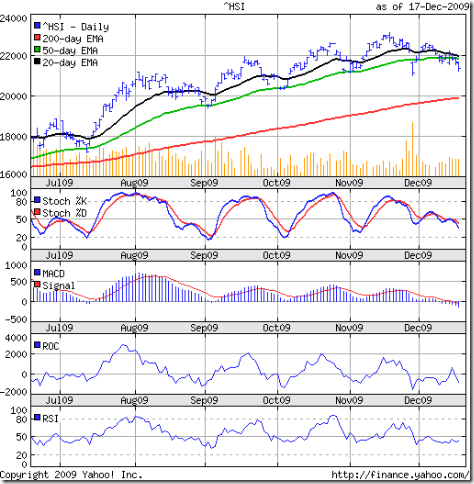
The Hang Seng index chart is looking distinctly bearish, though it managed to stay above the Nov 27 '09 low of 21002. The index has dropped well below the 50 day EMA and has dragged down the 20 day EMA to the flattened medium-term moving average.

The technical indicators are all bearish. The slow stochastic has dropped below the 50% level and heading towards the oversold zone. The MACD is in negative territory and below the signal line. The ROC has dropped sharply into the negative zone. The RSI is moving sideways below the 50% level.

The only hope for the bulls is possible support from the 200 day EMA.

KOSPI (Korea) index chart

Kospi_Dec1709 

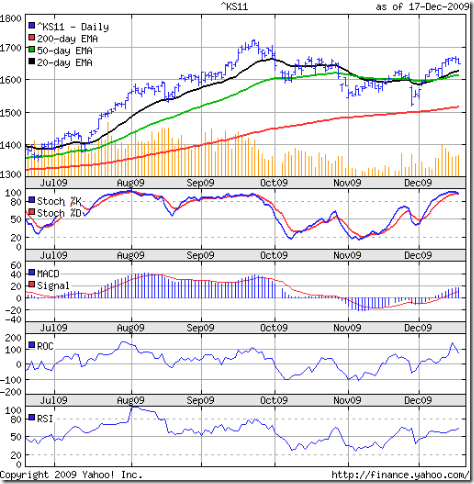
My last look at the KOSPI index chart was back in Oct 30 '09, when the bears were in full control. A revival effort by the bulls in Nov '09 was viciously beaten back as the bears took the index down close to the 200 day EMA by the end of the month.

The fight back by the bulls in Dec '09 has been quite spirited, but the index failed to cross the Oct 15 '09 high of 1672 - falling short by 2 points. The bears used that as an excuse to stall the rally.

But the technical indicators are hinting that the bulls may still have some fight left in them. The slow stochastic is in the overbought zone. The MACD is positive and above the signal line. The ROC is in positive zone but has turned down. The RSI is above the 50% level and rising.

Bottomline? Last week I had mentioned about the possibility of year-end profit booking by the FIIs. The bull rally in the Asian indices seem to be over for now. Continue to book profits.

Thursday, December 17, 2009

How to distinguish between a good company and a great company

If you are going to become a better investor you will not only need to distinguish between a good company from the not so good, but more importantly, learn to distinguish the merely good from the truly great company.

After all, it is your hard earned money. Why squander it on the not so good or a merely good company when you can let your money work for a truly great company?

So, how do you go about finding the truly great companies? In a mini-series on how to find out the financial health of a company, I had explained why I prefer to check the financial health prior to checking the profitability.

One of the major reasons is that profit figures are 'doctored' in a large number of companies. Cutting costs instead of increasing sales, calculating depreciation by different methods, valuing inventory differently, making inadequate provisions for taxes or debt or R&D expenses, using 'other income' or a one-off adjustment are some of the ways by which companies show 'profits'. And these are 'legal' methods!

Checking out the cash flow from operations and the other financial health ratios separates the good company from the not so good. But the cash flow from operations or the net profit margin does not provide any information about how much money is being used in the operations of the company.

We have to find out how much real profit a company is able to generate from the money it invests in the business. Almost all companies - whether listed or otherwise - borrow money from others (banks, financiers, relatives, friends, shareholders) and use that money to run its operations and generate a profit.

So the true differentiator between the great company and the merely good is how efficiently it can generate a higher profit relative to the amount invested in the business (also referred to as the 'capital employed').

In another mini series of forthcoming posts, I will discuss about financial efficiency and profitability ratios.

Related Post

What does the Interest Coverage Ratio signify?

Wednesday, December 16, 2009

Stock Chart Pattern - Infosys Ltd. (An update)

When I last took a look at the stock chart pattern of Infosys Ltd back in Apr '09, it had made a bullish saucer-like bottoming pattern but was under bear attack due to disappointing Q4 '09 results.

But you just can't keep a good company down. This impeccably and transparently managed company that has set the benchmark for financial reporting, and a perennial FII favourite, has since embarked on a strong rally that recently reached a life-time high (adjusted for bonus issues).

Let us have a look at the 9 months bar chart pattern of Infosys Ltd:-

Infosys_Dec1609

After hitting a high of 2400 in Sep '09, the stock entered a 6 weeks period of consolidation within a 'flag' pattern formation, which is a continuation pattern. That means the stock usually resumes the earlier (bullish) trend.

The 50 day EMA provided good support and the stock smartly broke out upwards from the 'flag' pattern and resumed the bull rally - almost doubling in value from the low of Apr '09.

The technical indicators show that there may be some more steam left in the rally. All three EMAs are moving up and the stock price is above them. The slow stochastic, MFI and RSI have just entered their overbought zones.

The stock hasn't been able to remain in the overbought zones for any length of time in the past 9 months. Also, the 50 day EMA is more than 350 points above the 200 day EMA. So a correction can be round the corner.

Bottomline? Existing holders can book profits partially. New investors can enter at the next dip. This is a stock that deserves to be in every long-term investor's portfolio.

Tuesday, December 15, 2009

Become a better investor by overcoming procrastination

What is procrastination, and why should an investor spend time and effort in overcoming procrastination?

There are two types of procrastination. One evolves out of habitual laziness and indiscipline. We put off doing tasks which we don't like to do because we find them distasteful or time consuming, or feel that we may be incompetent to perform the task to the satisfaction of peers/colleagues.

At some point in time in our lives, whether completing an assignment at school or college, or dealing with some problem at home or at our place of work, we are faced with situations which our instinct tells us to avoid. We may know that by delaying action, the problem may get worse. Still we leave it till the very last moment. Then the time pressure of completing the task creates additional stress.

The best and only way to overcome such procrastination is to convince yourself that if something needs to get done, it should be done now rather than a few days later. The corollary to this self-discipline is that if a task is worth doing - however distasteful it might be - it is worth doing well.

Now think about the average investor (if there is such a being!). He is probably your friend or cousin, and has been investing in mutual funds or stocks for a few years. How knowledgeable do you think he is about the market? About fundamental and technical analysis? (You only need to ask a few pointed questions to find out!)

Chances are that he is too busy with his daily activities to read or learn about investing. Some of the excuses may be: Fundamental analysis is too time consuming; there are thousands of shares - which ones to analyse? Technical analysis doesn't work - I've tried it and lost money. It is all about buying low and selling high, which any one can do without any analysis.

To be a successful investor over the long haul, you need to learn all about how the market works, how the economy, interest rates, forex rates affect stock prices, which companies/funds are good for the long-term portfolio, which companies/funds are only good for a short-term bet.

If you haven't started the learning process yet, the time to start is now. Not tomorrow, or the day after. If building wealth from the stock market was easy, the whole world would be doing it and the whole world will be full of wealthy people!

And here is a little-known secret that I will share with you. The more you learn about the market and how to analyse stocks, the better investor you will become. The better your chances against the average investors who are too lazy and indisciplined to make the effort. Because every time you buy and sell, there is a person at the other end of the deal who loses money or makes a smaller profit than you.

There is another type of procrastination, and that is a more insidious and tougher trait to overcome. There are some people that are excellent in planning and analysis. But when it comes to acting and putting the plan to work they get cold feet. They want to wait some more.

For investors, this kind of procrastination needs to be overcome quickly or it may become a disastrous behavioural trait to have. You may wait too long for a trend reversal to happen, for prices to drop (or rise) another 20% before buying (or selling), and miss a glorious opportunity.

This problem often gets compounded by a desire not to miss the bus, and you end up buying or selling too late - long after the window of opportunity has closed. There is a fine line between this kind of procrastination and patience, and as a smart investor you need to identify the line as early as possible.

Related Posts

How to generate income and build wealth
How to build wealth using a buy and hold strategy

Monday, December 14, 2009

Dow Jones (DJIA) index chart pattern - Dec 11, '09

The chart pattern of the Dow Jones (DJIA) index continues to face overhead resistance from the 10500 level, and closed twice below the crucial 10360 level during the week.

The battle between the bulls and bears remain inconclusive, as the index finished 82 points higher for the week - but at the same level where it closed on Dec 1 '09.

Last week I had mentioned about the formation of a bullish ascending triangle pattern that should have an upside breakout. Let us see if the 6 months bar chart pattern of the Dow Jones (DJIA) index is supporting such a bullish prognosis:-

Dow_Dec1109

The 20 day EMA provided good support to the index last week as the bears tried to wrest back the initiative from the bulls. The 50 day and 200 day EMAs are moving upwards. The bulls are under no immediate threat.

The declining volume on down days are a concern. But the technical indicators are showing signs of bullishness. Both the RSI and MFI have moved above their 50% levels. The slow stochastic bounced up from its 50% level and the %K line had a bullish cross above the %D. Only the MACD is looking weak - positive but below the signal line.

Bottomline? The Dow Jones (DJIA) index is all set up for a Santa Claus rally. The up tick in November retail sales may be just the trigger. Keep trailing stop-losses and enjoy the ride.

Sunday, December 13, 2009

Stock Index Chart Patterns - FTSE 100, CAC 40, DAX - Dec 11, '09

FTSE 100 index chart

FTSE_Dec1109

Two week's back, I had mentioned that the European indices were under bear attack. The bulls were not quite ready to give in easily and mounted a spirited fight back.

The FTSE 100 closed lower for the week, and below the 5300 level, but managed to regain the level of the flattening 20 day EMA after seeking support at the 50 day EMA. The 200 day EMA continues to move up, so the bull rally isn't over yet.

Volumes on down days continue to be higher than that on up days. The index has also failed to breach the Nov 16 '09 high of 5397. Those are concerns for the bulls.

So are the negative divergences in the technical indicators, which are looking weak. The RSI, MFI and slow stochastic are at their 50% levels - reflecting the stalemate between the bears and bulls. The MACD is barely positive and below a falling signal line.

DAX index chart

DAX_Dec1109

The chart pattern of the DAX index is looking slightly more bullish than that of the FTSE 100. Though the index closed lower for the week, it managed to move above the 20 day EMA. The 50 day and 200 day EMA continue to move up.

The slow stochastic is above the 50% level and trying for a bullish cross. The RSI and MFI have just about moved above their 50% levels. The MACD is touching the signal line and is positive. The Oct 20 '09 high of 5888 needs to be crossed for the bull rally to sustain.

CAC 40 index chart

CAC_Dec1109

The CAC 40 index chart pattern is looking the most bullish of the three. The index also closed lower for the week, but above the 20 day EMA. The falling volumes on up days on Thursday and Friday is a concern for the bulls. So is the inability of the CAC 40 to breach the Oct 20 '09 high of 3914.

The slow stochastic is above the 50% level and the %K has made a bullish cross above the %D line. The RSI and MFI have both moved above their 50% levels. The MACD is marginally positive and just above the signal line.

Bottomline? The bulls seem to have fended off the bears pretty well. But the bull rally in the European indices have definitely lost momentum. Some more sideways consolidation is likely. Continue partial profit booking at every rise.

Saturday, December 12, 2009

BSE Sensex Index Chart Pattern - Dec 11, '09

Two week's back, I had written about the possibility of a deeper correction in the BSE Sensex index due to the weakness in the technical indicators and the lack of follow-up buying.

Instead, the Sensex got into a sideways consolidation pattern that received excellent support from the 20 day EMA. The tussle between the bulls and bears remains inconclusive, with volatile daily trading.

World wide, indices are showing a similar indecision among market players. The global bull rally has continued for several months on dwindling volumes and weak fundamentals. The threat of a recession has subsided. But the stock markets have discounted that well in advance.

The time for reckoning has come. The Indian economy is getting back to its earlier growth path, but stock valuations in frontline companies are no longer reasonable. The tendency to shift to mid-cap and small-cap stocks with better valuations is apparent.

That is a sign that this particular rally is topping out. The fact that many market experts have started discussing higher targets is another sign. The 6 months closing chart pattern of the BSE Sensex index is still looking reasonably bullish:-

Sensex_Dec1109  

All three EMAs are moving up and the index is above them. That means the bulls are very much in control. But look at the volume bars. Newer highs without volume support remains questionable.

The technical indicators are a bit mixed - which isn't surprising because of the sideways consolidation. The slow stochastic is moving sideways at the border of the overbought zone. The MACD is positive but unable to move up. It is touching the flat signal line. The RSI has moved down form the overbought zone and is at the 50% level. The MFI has slipped below the 50% level and moving down.

A two year bar chart pattern of the BSE Sensex index gives a better perspective about why the index is struggling near the 17500 level despite several attempts to cross it:-

Sensex_Dec1109_2

There is long-term resistance at the 17700 level, which was the high made in May '08. It is interesting to note how long-term supports and resistances come into play. The Aug '08 high of 15600 provided resistance during Jun and Jul '09. Once it was crossed in Sep '09 it provided support during the correction in Nov '09.

Bottomline? The 17500-18000 zone will be the level to cross before the BSE Sensex chart can rise to greater heights. The 17800 target mentioned in my gap-analysis falls right in the middle of the resistance zone. On the down side, the Nov '09 low of 15330 and the 200 day EMA at 15000 should provide support. Keep trailing stop-losses and book partial profits wherever available.

Friday, December 11, 2009

Stock Index Chart Patterns - Shanghai Composite, Hang Seng, Singapore Straits Times - Dec 11, '09

Shanghai Composite index chart

ShanghaiComp_Dec1009

The recovery from the Dubai-induced bearishness by the Shanghai Composite index chart pattern has been less than robust. The index did spring upwards from support at the 50 day EMA, but failed to regain the recent Nov 24 '09 high of 3361.

The 20 day EMA provided good support this week. All three EMAs are moving up and the index remains above them. So the bull market continues. But the momentum won't be regained till the high of 3478 made on Aug 4 '09 is convincingly crossed.

The technical indicators are looking weak. The slow stochastic is about to show a bearish cross, with the %K touching the %D line. The MACD is positive but below the signal line. The ROC has dipped below the '0' line. The RSI is about to move below the 50% level.

Hang Seng index chart

HangSeng_Dec1009

The Hang Seng index chart pattern is looking a lot weaker than the Shanghai Composite. The gap-down day below the 50 day EMA on Nov 27 '09 - on huge volumes - was the first time that the index closed below its medium-term average since July '09.

The upward recovery from an 'island reversal' pattern wasn't convincing at all. Volumes dropped as the index tried to rise. Five straight down days took the Hang Seng below the 50 day EMA once again. Today's 200 point gain could not prevent a 2.5% lower close for the week.

The technical indicators are looking quite bearish. The slow stochastic had a bearish cross and dropped below the 50% level. The MACD is in the negative zone and below its signal line. The ROC has been in the negative zone since the Dubai-induced sell-off. The RSI is below the 50% level and moving down.

Straits Times (Singapore) index

Straits Times_Dec1009

The bullishness in the Straits Times index chart pattern is quite a contrast to the Chinese indices. The index is forming an ascending-triangle pattern from which an upward breakout above the 2800 level is a possibility.

All three EMAs are moving up and the sequence of higher tops and bottoms continues. The bull market is apparently under no threat. But the technical indicators show some concerns.

The slow stochastic is in the overbought zone, but showing signs of falling. The MACD is in the positive zone, but has stopped rising and is below the signal line. The negative divergence is quite apparent as the MACD has failed to make a new high.

The ROC is at the '0' line, and also showing negative divergence. The RSI is above the 50% level but moving down, and also showing negative divergence.

Bottomline? The Asian indices are showing signs of fatigue after a prolonged bull run. Year-end profit booking considerations of FIIs are probably affecting the bull fervour. Some profit booking may not be a bad idea. But don't short these markets.

Wednesday, December 9, 2009

Stock Chart Pattern - Ratnamani Metals and Tubes

The stock chart pattern of Ratnamani Metals and Tubes had a spectacular run from a low of 32 on Mar 16 '09 to a high of 118 on Sep 16 '09 - gaining more than 250% in 6 months. The stock has subsequently been in a corrective mood.

Before getting into the nitty-gritty of the technicals, a few words about the fundamentals. A two-decade long presence in the stainless steel pipes and tubes segment; profit making and dividend paying, with positive cash flows from operations; low debt/equity ratio; low P/E; nearly 60% of the Rs 9 Crores equity held by the promoters; a recent order of Rs 150 Crores from GAIL; clients include IOC, HPCL, Reliance, BHEL.

All point to a stock that smart investors may want to include in their portfolio. Now let us see whether the one year stock chart pattern of Ratnamani Metals and Tubes is supporting the fundamentals or not:-

Ratnamani_Dec0909

After hitting the recent high of 118, the stock has been in a sideways correction, well-supported by the 50 day EMA. Today's lower close has sent the slow stochastic tumbling into the oversold zone. The RSI has also dropped below the 50% level. Both indicators are suggesting a continuation of the correction.

The on-balance volume gives a completely different picture. For nearly three months, the stock has made a sequence of lower tops and bottoms. But the OBV is moving higher - a positive divergence and a clear indication of accumulation. So why am I not enthusiastically recommending a 'buy'?

Let us look at a more longer term chart pattern:-

Ratnamani_Dec0909_2

The stock made a high of 302 on Jan 4 '08, from where it fell 89% to 32 in Mar 16 '09. Small cap stocks usually have trouble recovering from such a massive fall. At its recent high of 118, the stock retraced less than 32% of its entire fall of 270. Compare that with the Sensex, which retraced more than 70% of its bear market fall.

This is one of the reasons why investing in small cap stocks is so risky, and best avoided by small investors. The returns may be huge if you can enter at the early stages of a bull phase. But the fall in a bear phase can be soul-destroying.

Bottomline? Enter only if you have very high risk tolerance. If it can clear the recent high of 118, then it may reach 150 and even 180. If you like the pipes and tubes segment, there may be better opportunities elsewhere.

(Note: Thanks to reader Abhijit for suggesting this stock.)

Tuesday, December 8, 2009

How to make money when a market is trending sideways

When a stock market index starts to trend sideways after a sharp up move, it is usually a sign of consolidation. As if the market is stopping a while to catch its breath. The buying pressure eases some what - and that is reflected by lower volumes.

In other words, bears and bulls (read, supply and demand) reach an equilibrium state with neither getting the upper hand. There is no discernible pattern to the daily or weekly moves. This is a frustrating time for investors and traders.

How does one make money in such a sideways trending market? If you are a trader, then you need to identify the support and resistance levels - either for individual stocks, or for an index. Then buy near the support level and sell near the resistance level. Easier said than done.

What if you are a short-term investor? Your nimbleness and investing acumen will be tested. You need to identify sectors or stocks that have not performed great in the bull rally so far. Buy into them, and book profits quickly.

This is a time when savvier players with deep pockets tend to indulge in sector rotation. If it is tea this week, then next week it may be sugar. Banks one week, and metals the next. It may not be possible or feasible to catch each move. So concentrate on a handful of sectors.

For long-term investors, sideways trends need not be very stressful. Most will probably sit this period out, or book partial profits in stocks that were bought at lower prices earlier. This is also a good time to research individual stocks that have strong fundamentals.

By now the market has digested the half yearly results and formed a pretty good idea about the rest of the year. Retail, real estate, textiles, export-oriented industries are still not out of the woods. Infrastructure, capital goods, autos are doing better. Hospitality, travel and tourism are emerging from the doldrums. FMCG, healthcare are down turn proof. Telecom is facing headwinds.
Consolidation periods are usually followed by a resumption of the previous trend. In this case, upwards. Some times, these turn out to be distribution phases and end up with a reversal of trend. A look at the on-balance volume technical indicator can provide clues.

The smart thing to do is not to bet the barn on an upward or downward breakout. That would save one from huge losses. Be patient and track your researched stocks on a regular basis. The stock market always gives opportunities to buy at reasonable, if not cheap, prices. Set realistic targets and book partial profits when you achieve those targets.

Related Posts

About Volume and On-Balance Volume (OBV)
About Support and Resistance levels in stock chart patterns

Monday, December 7, 2009

Dow Jones (DJIA) index chart pattern - Dec 4, '09

The Dow Jones (DJIA) index chart pattern moved all over the place last week. Four days in a row, the index moved above the 10500 level, making a new high of 10549 on Fri, Dec 4 '09. Each time, the bears fought back strongly to force the index down.

The Dow closed only 79 points (less than 1%) higher for the week, and barely 30 points above the crucial level of 10360. The bears seem to be intent on defending the 50% Fibonacci retracement level of the entire bear market fall.

The bulls are equally determined to retain the upper hand, and the 6 months bar chart pattern of the Dow Jones (DJIA) index appears to confirm that:-

Dow_Dec0409

The sequence of higher tops and bottoms have been maintained, with the 20 day EMA providing solid support to prop up the index against a vicious bear attack. The high volumes on the last two days of the week indicate strong selling.

The three EMAs are still moving up and the Dow is above them. The bulls continue to take the index upwards on a wave of liquidity and positive sentiment. The fundamentals have a long way to catch up.

Bears will try to regroup, using the weakening technicals. The RSI is just above the 50% level and moving sideways. The MFI dropped below the 50% level but has managed to inch back up. The slow stochastic has fallen from the overbought zone. The MACD is positive but falling, and has slipped below the signal line.

Bottomline? The chart pattern of the Dow Jones (DJIA) index is beginning to form a bullish ascending triangle pattern that could propel it above the 11000 mark. Fasten your seat belts. But don't forget to book partial profits.

Tuesday, December 1, 2009

Become a successful investor by avoiding 'herd mentality'

There are many ways and means to become a successful investor. One way is to be aware that certain behavioural flaws exist in human beings - like 'herd mentality' - and avoid them.

It is logical to expect that a group of people can become successful investors by taking better investment decisions. Why? As more information gets shared and different view points and experiences get discussed and assimilated, the process of deciding which stocks are good 'buys' and which stocks are 'duds' become easier.

The large number of investment groups on the Internet, some with several thousand members, point to the popularity of such joint investment decision making. So the members of these investment groups should be rolling in money, right?

The reality is otherwise. Some times group decision making can be flawed, specially if enough research, or an opposing view, is not taken into consideration. A few individuals, regarded as knowledgeable by group members, can mislead the group inadvertently.

A good example is the mad rush to buy infrastructure and real estate stocks in the later stages of the bull market in 2007. Many investors entered these stocks when they had risen way past the prices that discounted huge growth expectations well into the future.

'Land banks' was added to the investment vocabulary, just as 'eyeballs' were added during the dot.com boom at the turn of the century and 'replacement costs' were touted for pushing overpriced stocks during the Harshad Mehta scam in the early 1990s.

Even seasoned fund managers are not immune to such 'herd mentality' - and the price is paid by legions of small investors. The plethora of 'infrastructure funds' launched in 2006-07 are mostly languishing while the BSE Sensex has gained more than 100% in the past 9 months.

A quick look at the top holdings of popular diversified equity funds is equally revealing about the 'herd mentality' that leads to poor investment performance:-

  1. HDFC Top 200 - SBI, ICICI Bank, Infosys, ONGC, L and T
  2. DSPBR Top 100 - TCS, L and T, SBI, Reliance, ITC
  3. Sundaram Select Focus - SBI, ICICI Bank, Reliance, Sterlite, Shree Renuka Sugars
  4. HSBC Equity - SBI, Infosys, Reliance, ITC, BHEL.

Investors buying into these four funds may think that risk has been mitigated through diversification. But they have actually invested in the same stocks (with one or two exceptions).

Herd mentality is further compounded by bad timing. Money is literally poured into fund houses when the BSE Sensex is at or near a top, and pulled out by cart loads when the index is languishing near the bottom.

One of the tricks to being a successful investor is to avoid the herd mentality. Particularly when the herd is talking about esoteric investment ideas like alternative energy and water management. Stick to the knitting - invest in what you know and understand.

Related Posts

About Confirmation Bias in the Stock Market
Some practical examples of Behavioural Finance

Monday, November 30, 2009

Dow Jones (DJIA) index chart pattern - Nov 27, '09

The Dow Jones (DJIA) made another attempt to climb away from the important 10360 level, mentioned last week as the barrier to cross for the bull rally to sustain. In a holiday-shortened week, the Dow twice moved above the 10500 level, but Friday's profit booking brought the index down below the 10360 level. It finally closed marginally lower for the week.
The 6 months bar chart pattern of the Dow Jones (DJIA) index isn't looking that different from a week back:-


The bull rally on lower volumes continues as the bulls have managed to brush aside all efforts by the bears to bring the index down. All three EMAs are still moving up and the index is above them.
The technical indicators are looking slightly weaker. The slow stochastic is in the overbought zone, where the %K has moved slightly below the %D. The RSI moved down after touching the overbought zone. The MFI is above the 50% level but moving down. The MACD has moved down a bit and is touching the signal line.
So is it time for the bears to throw in the towel? As per this article, market sentiments are turning overly bullish, which could provide just the contrarian opportunity that the bears could try and exploit. Fundamentals are yet to catch up with a market that has been driven upwards by a flood of liquidity and dollar carry-trade.
Bottomline? The Dow Jones (DJIA) index chart pattern is maintaining the bullish sequence of higher tops and bottoms. Ride the rally, but keep booking partial profits.

(Note: At the time of writing this post, the Dow is marginally up but still below the 10360 level.)


Sunday, November 29, 2009

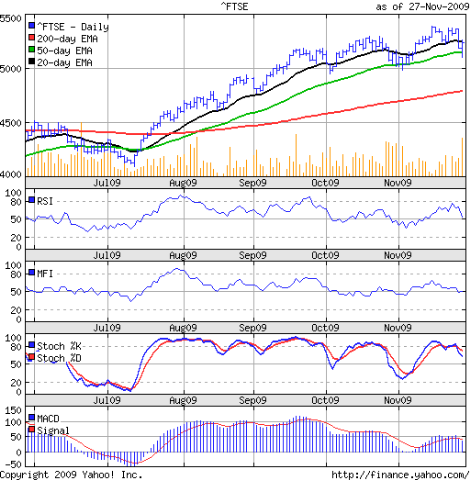
Stock Index Chart Patterns - FTSE 100, CAC 40, DAX - Nov 27, '09

FTSE 100 index chart

FTSE_Nov2709

Last week's analysis of the FTSE 100, CAC 40 and DAX index chart patterns was concluded with the following comments:-

'The technical indicators in the European indices are favouring the bears. The bull rally is under real threat.'

The FTSE 100 chart made a valiant attempt to go past the previous top of 5397. Four days in a row, it came within handshaking distance but failed to move higher.

The Dubai loan re-scheduling news tilted the scales towards the bears. The index once again closed the week marginally lower and below the 5300 level. Friday's sharp drop below the 50 day EMA was followed by a rapid recovery back up to the 20 day EMA. That, and the rising 200 day EMA should give the bull's some encouragement.

The technical indicators may belie their hopes. The volumes on down days continue to be higher. The RSI and MFI have both dropped to their 50% levels and show negative divergence. The slow stochastic has dropped from the overbought zone after entering it earlier in the week. The MACD has slipped below the signal line and also shows negative divergence.

DAX index chart

DAX_Nov2709

The DAX index chart actually managed to close 22 points higher for the week, but failed to get past even its Nov 18 high of 5843. The Dubai effect caused almost identical price action to that of the FTSE 100 on the last two days of the week - sharp falls on higher volumes.

The slow stochastic has dropped from the overbought zone. The RSI is headed down to the 50% level. The MFI is at its 50% level. The MACD is barely above the signal line. For the bull rally to sustain, the German index needs to cross its Oct 20 '09 high of 5888 soon.

CAC 40 index chart

CAC_Nov2709

The bears seem to have mauled the CAC 40 index chart the worst. A bearish lower-top-lower-bottom pattern has formed. The French index dropped close to the 200 day EMA and closed marginally lower for the week, just below the 50 day EMA.

The slow stochastic has dropped to the 50% level. The RSI has slipped below its 50% level, while the MFI is barely clinging on. The MACD has moved into the negative zone and below the signal line.

Bottomline? The European indices are under bear attack. Watch out for the lows made in the first week of Nov '09. If those levels get violated, the indices will fall deeper. Book profits.

Saturday, November 28, 2009

BSE Sensex Index Chart Pattern - Nov 27, '09

In last week's analysis of the BSE Sensex index chart pattern, I had mentioned some concerns about the continuation of the bull rally, even as the technical indicators were looking bullish. These included:-

  • low volumes that indicated lack of follow-up buying
  • slowing momentum near the 17000 level
  • double-whammy of settlement day in India and the Thanksgiving holiday in the USA that could lead to FII selling

All of the above contributed to the sharp correction on higher volumes on Thursday and Friday (Nov 26 and 27 '09). But the real trigger for the world-wide selling was the Dubai World loan repayment re-scheduling. A classic case of the 'butterfly effect'!

The question is: Will the FIIs continue with their profit booking due to end-of-year considerations, or will they use this dip to start buying? Let us have a look at the 6 months bar chart pattern of the BSE Sensex index to find the answer:-

Sensex_Nov2709

Observe the volume bars in Jun '09 and Jul '09, and compare them with those of Oct '09 (when the Sensex made a new high of 17493) and Nov '09 (the high last week was 17290 on Wed, Nov 25 '09). Bull markets can't sustain on low volumes.

Remember that the BSE Sensex index had broken downwards from a bearish 'rising wedge' formation in Oct '09. A pull-back attempt in Nov '09 failed to reach the previous high, and provided an excellent opportunity to sell. FIIs and smart investors did exactly that by using the Dubai fiasco as an excuse.

The correction dropped the index below the 50 day EMA but short covering ensured a close above the medium-term average. For the week, the BSE Sensex closed 390 points (2.3%) lower. The 200 day EMA is still moving up and the Sensex is more than 1100 points above it, so the bull market remains in tact.

The technical indicators have turned a lot weaker. The RSI has fallen from its overbought zone. So has the slow stochastic. The MFI has dropped to the 50% level. The MACD is falling but remains positive and just above the signal line.

Bottomline? The BSE Sensex index chart pattern looks poised for a deeper correction. Watch out for the previous low of 15331. If that gets broken, the index may fall to the Jul '09 low of 13220. Likely support will be at the 200 day EMA. Those levels will provide good opportunities to re-enter.

Friday, November 27, 2009

Stock Index Chart Patterns - Shanghai Composite, Hang Seng, Taiwan TSEC - Nov 27, '09

Shanghai Composite index chart

ShanghaiComp_Nov2709

Another clear instance of how relying totally on technical analysis can be hazardous to your wealth! Last week, the technical indicators of the Shanghai Composite index chart was looking very bullish, and the only question was when it would go past the previous high of 3478.

Out of nowhere, the bears attacked viciously, as a 'reversal day' pattern on Tue, Nov 24 '09 brought the renewed bull rally to a quick halt. An attempt at a recovery the next day proved short-lived. The bears used the news of the Dubai loan default to take the index below the 20 day EMA. The week ended with the index dropping down to the 50 day EMA.

The technical indicators turned around quickly from strongly bullish to bearish. The RSI dropped steeply from the overbought zone. So did the slow stochastic. The ROC has slipped into the negative zone. The MACD has started to fall and dropped below the signal line.

Hang Seng index chart

HangSeng_Nov2709

When the big brother sneezes, the younger brother and cousin catch a cold - or so it seems from the chart pattern of the Hang Seng index. Actually, the Hong Kong index started to correct in the previous week after making a new high of 23100 on Nov 18 '09.

The fall on Thur, Nov 26 '09 had taken the index below the 20 day EMA and today's near 5% drop meant the index closed below the 50 day EMA for the first time since July '09. Will the Hang Seng be able to bounce up from the support of the 50 day EMA, as it has done several times during this bull rally?

The technical indicators don't seem to suggest that. The slow stochastic is moving down towards the 50% level. The MACD is falling and has gone below the signal line. The ROC has dropped into the negative zone. The RSI showed negative divergence by failing to make a new high and is moving sideways above the 50% level.

Taiwan (TSEC) index chart

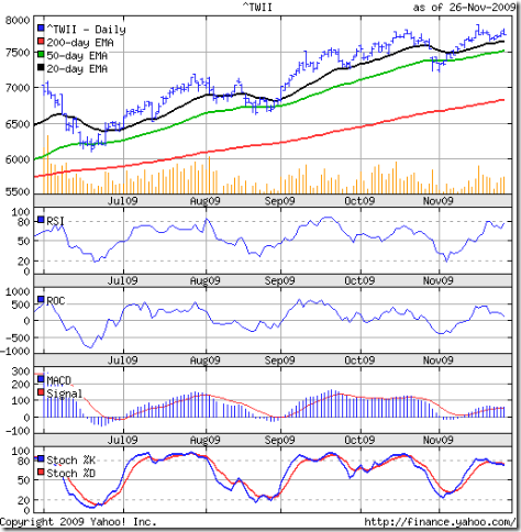
TSEC_Nov2709

The Taiwan (TSEC) index was looking quite bullish as it recovered from a drop below the 50 day EMA to make a new high of 7875 on Nov 17 '09. A brief correction down to the 20 day EMA was followed by another up move. Today's near 250 points (3.2%) drop once again forced a close below the 50 day EMA.

As long as the index remains well above the rising 200 day EMA, there is no threat to the bull market. The technical indicators are looking less bearish than the two mainland indices.

The RSI is just below the overbought zone. The ROC is falling but remains in the positive zone. The slow stochastic has fallen less sharply from the overbought zone. The MACD is positive and above the signal line, but note the negative divergence as it failed to make a new high.

Bottomline? The Asian indices suffered from FII selling. I had hinted about the possibility last week. The Dubai loan default news was used as a trigger for the selling, but not entirely without reason. HSBC bank is reported to have a big exposure in Dubai. All three indices are near their 50 day EMAs. An upward bounce could be on the cards next week. Adopt a wait-and-watch policy.